
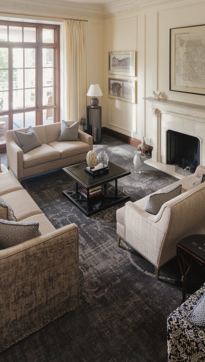
Short answer: the carpet colors that look best with cream walls are a warm beige a little darker than the wall, taupe, a warm greige, sage green and a medium brown.
If you want more drama, charcoal, navy and a muted terracotta work too.
The one I’d be careful with is plain cool gray, the color most lists put first.
If your walls are beige rather than cream, I’d start from the same list, since beige is cream’s slightly darker cousin.
Gray feels like the safe answer, the one nobody can argue with.
But “safe” and “good” aren’t the same thing, and some of the colors everyone treats as backup options (terracotta, charcoal, even plain brown) are the ones that make cream walls look like money.
Here’s how I’d sort through it.
Start With Your Wall’s Undertone, Not The Carpet Swatch

Cream isn’t one color.
It’s a dozen colors wearing a trench coat.
Some creams lean yellow, some lean pink, some go almost gray when the light hits them wrong.
Figuring out which one is on your wall matters way more than finding a carpet that also has the word “cream” or “beige” on the label.
The easiest way to check: hold a swatch (carpet sample, paint chip, whatever) right up against the wall at midday, then do it again at night under your usual lamp.
The color will shift.
It almost always does.
A wall that looks buttery and warm at noon can go kind of gray and sad under a cool-white bulb at 9pm.
If you only check once, you’ll never know.
Give it 3 days.
Room direction changes things too.
In the northern hemisphere, north-facing rooms tend to pull cream colder, because the light coming in is indirect and cooler.
South-facing rooms tend to warm everything up, sometimes to the point where a “neutral” cream starts looking yellow by 2pm.
Size plays into it, too: a 10×12 bedroom with one window reads completely different than an open living room with vaulted ceilings and light pouring in from three directions.
Same wall color, same carpet, totally different mood.
My actual take, and I’ll say it early because it applies to basically every section below: undertone matters more than the label on the sample.
Two “beiges” from two different stores can clash with the exact same cream wall because one’s got a pink base and the other’s got yellow.
Matching words instead of undertones is how people end up with a floor and a wall that technically match and somehow still look wrong together.
Beige Carpet: The Safe Pick That Can Still Go Flat


Beige-on-beige with cream walls works.
It genuinely does, in the right space.
Small hallways, rental bedrooms, anywhere you’re optimizing for resale over personality, tonal beige is low-risk and it photographs fine for listing photos.
That’s not nothing.
But here’s where I’ll push back on basically every other list: matching the beige carpet almost exactly to the cream wall is the laziest move in the whole lineup.
Honestly, it reads cheap way more often than it reads luxurious.
When the floor and the wall sit at nearly identical value and undertone, the eye has nothing to grab onto.
The room goes a little blurry.
It stops looking intentional and starts looking like whatever was on sale at the flooring place, the builder-grade stuff nobody actually chooses on purpose.
What actually works is picking a beige that’s a little darker than the wall instead of chasing an exact match.
That small gap gives the room a floor and a plane again, instead of one continuous beige fog.
Toss in a rug with some pattern, or furniture in a contrasting wood tone, and suddenly that same safe beige carpet looks chosen instead of just left over.
Gray Carpet: Riskier With Cream Than Everyone Admits


Gray gets recommended as the safe neutral all the time, and it’s the one I’d push back on hardest.
True cool gray, the kind with a blue or blue-violet base, fights cream’s warmth instead of complementing it.
Cream is a warm color even when it’s trying to act neutral.
Put a cool gray next to it and you’re asking two undertones to get along that just don’t.
The combo that actually works is a warm greige, something with a hint of brown mixed into the gray rather than a blue base.
That version plays nice with cream because it’s not actually fighting the warmth, it’s just toning it down a notch.
Where this goes wrong fastest is a north-facing room with not much natural light to begin with.
Low light plus cool gray plus cream walls is a recipe for the whole room looking a little dingy, a little tired, even right after you’ve cleaned it.
The mistake is assuming any gray is fine because gray is “neutral.”
Plenty of samples labeled “greige” are really just gray with a fancier name.
It’s not neutral the second you put it next to a yellow-based cream.
A blue gray next to a yellow cream usually goes muddy.
I’d skip it.
Dusty Rose Carpet: Soft Color That Needs Warm Light


Dusty rose next to cream walls is genuinely romantic, in that soft, slightly old-fashioned way that works really well in a bedroom and almost nowhere else.
The key word is muted.
You want a rose that’s been grayed down a little, not a pink with a cool blue base hiding in it, because that version turns chalky fast.
Lighting makes or breaks this one, too.
A bedroom with a warm-toned lamp, the kind that casts that golden, slightly amber glow, lets dusty rose do its whole soft-and-cozy thing.
Swap that for a bright white ceiling fixture and the same carpet suddenly looks cold and a little sickly, like the color lost all its warmth overnight.
It didn’t.
The light changed — and honestly, this is my whole soapbox: overhead lighting ruins more rooms than bad paint ever does.
I wouldn’t put this in a big open living room.
It can feel overwhelming at that scale, like you’re sitting inside a color instead of in a room that happens to have color in it.
Small and warm-lit is where this one lives.
Navy Blue Carpet: Bold Contrast That Can Overpower A Small Room


Navy against cream is dramatic in the good way, the kind of rich, moody color I love in a study or a living room that’s got some square footage to work with.
The undertone to watch for is purple.
A navy that leans purple instead of green-ish gets weirdly cold and almost bruised-looking next to warm cream, whereas a navy with a hint of green in it stays grounded and rich.
A study with a window is the sweet spot here.
Enough natural light coming in keeps the navy from going flat, and enough contained square footage makes the color feel intentional instead of accidental.
Small and dim is where this falls apart.
A small bedroom with navy carpet and not much natural light can feel like the walls are closing in.
The color swallows the space instead of grounding it, the way it does in a bigger room.
Great color, wrong room, and the room loses.
Sage Green Carpet: The Nature Pairing That’s Having A Moment


Sage and cream is one of those pairings that just feels calm.
Earthy, settled, the kind of room you want to sit in with coffee.
It works in living rooms, it works in bedrooms, and it looks especially good against wood furniture with real natural light hitting the floor.
Go gray-green, not grassy green.
A bright, saturated green next to cream stops reading as “nature” and starts reading as a themed daycare.
The muted, almost dusty sage is what gets you the expensive-looking version.
One thing nobody mentions: if your room is already full of green houseplants, sage carpet can actually compete with them instead of complementing them.
All that green starts flattening into one note instead of layering.
I love plants.
But if you’re going sage on the floor, maybe don’t also go wild with the fiddle leaf figs in the same room.
Taupe Carpet: Warmer Than Gray, Safer Than Beige


Taupe is the middle child of this whole list and it honestly doesn’t get enough credit.
It does what gray is supposed to do for cream walls without the risk of tipping cold.
Because taupe sits between warm and cool, it reads as neutral without picking a fight with cream’s warmth the way a true gray can.
It’s especially good in an open-plan living and dining area.
You need a floor color that can carry across two different functions of a room without feeling disjointed.
In rooms with cooler light, lean toward a taupe with slightly more gray than brown in it — that small adjustment keeps it from looking muddy under flat daylight.
Furniture matters here too.
Black or dark wood pieces anchor a taupe floor in a way that keeps the whole room from floating off into sameness.
Without some darker anchor, taupe can start blending into everything around it.
Here’s the mistake, and it’s basically the beige problem again: picking a taupe so close to the wall’s own undertone that the room loses all its definition.
You want taupe to relate to the wall, not disappear into it.
Charcoal Carpet: Underused Drama That Beats Navy For Modern Rooms


Charcoal gets overlooked constantly in favor of navy, and I think that’s a mistake.
For modern or minimalist rooms, charcoal is actually the better pairing with cream walls — but don’t skip the undertone check just because it’s dark.
Charcoal is still gray underneath, which means it’s still carrying a blue or brown base somewhere in there, same as any other gray on this list.
The darkness just mutes how loud that undertone shows up, so it’s easy to assume there’s nothing to check.
There is.
Navy has that purple-versus-green undertone issue out in the open, where you can see it coming.
Charcoal hides the same kind of issue instead of skipping it, so you have to look a little closer to catch it.
Look for a charcoal with a slight brown warmth in it rather than a true black-gray.
That tiny shift keeps it from going stark, and it plays much better with a warm cream wall than a cold, flat gray-black would.
This works best in a minimalist living room with large windows.
There needs to be enough light coming in to keep the dark floor from swallowing the room whole.
Skip the light accents and charcoal goes heavy fast.
Light-colored throw pillows or a pale rug layered on top break up all that dark floor, and the room stays grounded instead of turning into a cave.
Forget those accents in a room with little natural light to begin with and, no joke, you’ve basically built yourself a bunker.
Light Blue Carpet: Fresh Look That Can Turn Cold Fast

Light blue carpet next to cream walls has this airy, clean feeling that works really well in a nursery or a guest bedroom.
It’s somewhere you want things to feel fresh rather than cozy.
The undertone you want is a soft gray-blue, not a bright sky blue.
Sky blue next to cream starts looking almost artificial, like a daycare again (sorry, I keep coming back to that comparison, but it’s accurate).
Warm wood trim helps a ton here.
A nursery or guest room with some warm wood (a dresser, a changing table, window trim, whatever) keeps the light blue from going sterile.
Where it goes wrong: pile on a bunch of cool white trim and stainless steel or chrome fixtures and the whole room tips cold instead of fresh.
There’s a difference between airy and sterile, and light blue carpet is right on that line.
Too much cool white and metal pushes it over.
Terracotta Carpet: Earthy Warmth That Needs Breathing Room

Terracotta looks like a risk on paper.
I get why people skip past it on these lists.
But next to cream, it’s honestly one of the warmest, most expensive-looking combinations you can put together, and most people are just too scared to try it.
A muted clay terracotta, not a bright pumpkin-orange, sitting under cream walls reads like something out of a sunroom in a much nicer house than mine.
It wants natural materials around it.
Wood and rattan furniture in a sunroom or a living room let the warmth of the floor extend outward instead of sitting there on its own, isolated.
The thing that kills it: chrome or glass furniture.
Cool metal and glass fight the earthy warmth of terracotta instead of complementing it, and suddenly a warm, inviting floor looks like it’s at war with a coffee table.
If you’re going terracotta, commit to the warm materials around it.
Don’t half-do it with a glass-top dining set in the middle of the room.
Ivory Carpet: Nearly Monochrome, And That’s The Point

Ivory carpet next to cream walls is about as close to monochrome as you can get while still technically having two different colors in the room.
And that’s kind of the appeal.
It’s a quiet, formal look, best suited to a dining room or a sitting room, somewhere that’s not getting daily foot traffic.
Go slightly warmer than your wall’s cream, not an exact match.
Ivory with just a touch more warmth than the wall keeps the two from blurring into one pale haze, and it reads intentional instead of like you ran out of other ideas.
Dark wood furniture is basically required here.
Without it, an all-pale room starts to feel like one long blur, nothing to catch the eye, nothing grounding the space.
I would never put this in a high-traffic family room, full stop.
A formal dining room that’s rarely walked on with shoes can handle ivory carpet just fine.
A family room with kids, a dog (with Biscuit shedding on everything, I wouldn’t dare) and snacks on the couch?
Stains show up on that pale tone almost instantly.
It stops looking luxurious and starts looking like you need to call someone about a spill from three weeks ago.
Gold And Mustard Carpet: Retro Risk With Real Payoff

This one’s not for everybody, and I’ll say that upfront.
Gold and mustard carpet against cream walls has a bold, vintage warmth to it.
It works really well in a room that’s already leaning eclectic — secondhand furniture, mismatched lamps, that kind of energy.
The undertone matters a lot here, too.
A muted mustard, not a bright school-bus yellow, is what keeps this from tipping into costume territory.
If there’s already thrifted or vintage furniture in the mix, muted mustard carpet slots right in like it was always part of the plan.
What tips this into looking dated instead of rich is going too bright.
A true bright yellow-gold next to cream walls starts looking like a 1970s rec room, and not in the fun way.
Also watch what art and decor you’re pairing with it.
Cool-toned art or accessories can actually fight the warmth of a mustard floor instead of balancing it, so lean warm there too if you’re committing to this one.
And honestly, ask yourself whether you’d still love it in 10 years.
Brown Carpet: The Grounding Color Everyone Forgets

Brown carpet gets treated like the boring fallback, the thing you pick when you can’t think of anything else, and honestly, that’s unfair.
It does more for cream walls than half the trendy colors people reach for first.
There’s something about a classic warm brown under cream walls in a den or a family room that just feels settled, like the room’s been lived in a long time (in a good way).
Go medium and warm, not dark chocolate and not red-heavy.
A medium warm brown works with cream’s own warmth instead of sinking the room into shadow.
Light matters a lot here too.
A den or family room with a lot of natural light can handle brown carpet beautifully — it keeps the room grounded without making it feel small.
Put a dark, almost-black brown in a room with limited light, and the whole space feels heavier and smaller than it actually is.
Light curtains or a rug layered over the brown breaks it up and keeps the floor from reading as one giant dark slab.
Lavender Carpet: The Boldest Pairing On This List

I’ll be honest, lavender carpet is the one I’d hesitate on the longest, but it’s also kind of the most interesting one on here.
It’s a unique soft-bold look, best in a bedroom or nursery that’s meant to feel calm rather than busy or loud.
Grayed, dusty lavender is the move, not a bright violet.
A true violet next to cream can look almost costume-like, where a grayed-down lavender settles into something much softer and more livable.
The undertone clash to watch for: a very yellow-leaning cream wall paired with a cool, bright lavender.
Those two fight.
The yellow in the wall and the cool purple in the carpet compete instead of complementing each other.
The room ends up feeling a little off in a way that’s hard to pinpoint if you don’t know to look for it.
Stick to the grayed, dusty version and that tension mostly disappears.
Have Cream Carpet Instead? Here’s The Short Answer On Walls

If you’ve got cream carpet already and you’re trying to figure out the wall color instead, here’s the short version: skip stark white.
It’ll make your cream carpet look yellow by comparison.
A soft warm white or a greige wall works with the carpet instead of against it.
For contrast, a muted sage or a dusty blue wall does the job without clashing, since both stay soft enough to not fight the warmth underfoot.
That’s the flip side of this post, and Dreamy covers it here: 9+ Paint Colors That Make Cream Carpets Look Expensive.
Pick The Color That Survives Your Worst Light, Not The Trend

Most “best carpet color” lists pretend there’s one universal answer that works in every room, every light, every house.
There isn’t.
The only real test is your own light at 7am and 7pm, in your actual room, not a showroom.
Showroom lighting is designed to make everything look good.
That’s its whole job.
Your bedroom at 6pm in October with the lamp on is a completely different test, and it’s the one that actually matters.
So test the sample properly.
Ask for one at least 12 inches square, so you can actually see the texture, and lay it flat on the floor.
Don’t just hold it up against the wall like a paint chip — carpet reflects and absorbs light totally differently lying flat than it does standing up.
Do it with a coffee in hand if that helps: check the sample at 7am, then again under the lamp after dinner.
Check it in the morning sun for 5 minutes or so.
Check it again under your evening lamp.
Leave it down for 48 hours.
If it still looks good both times, in your actual room, you’ve found your color.
If it only looks good once, keep looking.
More from Dreamy:
- People Are Rethinking Farmhouse Style After Seeing These Navy Blue Homes
- Inspiring Light Sage Green Bedroom Ideas For Serenity
- What Color Carpet Goes with Taupe Walls
- Top 13+ Carpet Colors That Complement Charcoal Gray Walls
- Light Blue Walls? Here’s How to Choose the Perfect Carpet Color
- Top 15 Carpet Colors for Terracotta Orange Walls?
- Top 15 Carpet Colors For Creamy Ivory Walls?
- Transform Your Living Room with Perfect Carpet Colors for Your Mustard Sofa
- Brown Furniture? Here Are Carpet Colors That Work Magic
Related read: Things I Wish I Knew Before I Decorated My First Home — Instant PDF + Kindle download. Secure checkout by Stripe