I recently moved into a new house with beautiful terracotta orange walls in the living room.
While I loved the unique wall color, I struggled to figure out what carpet color would complement it best.
After doing some research and experimenting with carpet samples, I finally settled on my top 15 carpet color recommendations for terracotta walls.
My favorite ended up being light Gray, because it creates an elegant contrast and really lets the orange walls pop.
Ivory is a close second – it enhances the warmth of the orange without clashing.
Did you know that the wrong carpet color can make a room look dirty, small or cluttered?
I learned the hard way with some of my first attempts.
That’s why I wanted to share my trial-and-error learnings here, so you don’t make the same mistakes!
✨Click to Get My 101 FREE Designer Room Ideas
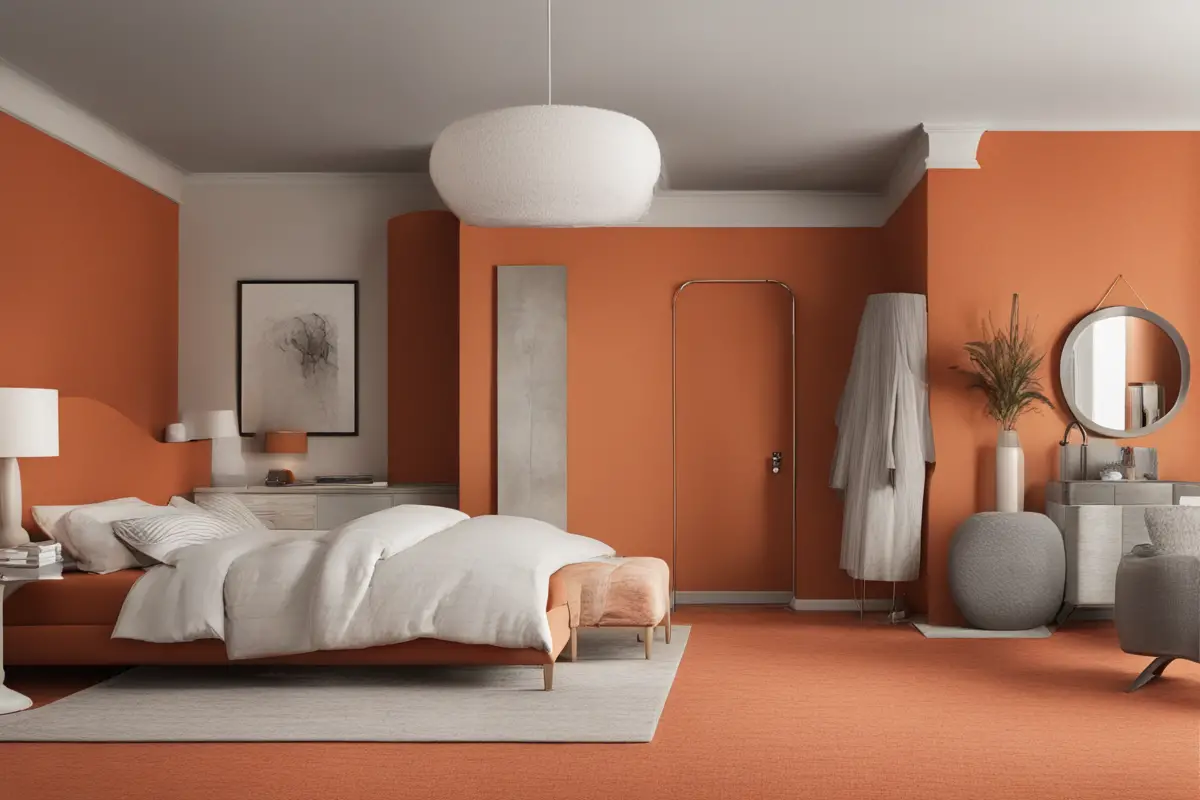
Light Gray
Light gray creates an elegant contrast against the warm, earthy tones of the terracotta orange walls.
The cool undertones of light gray balance out the fiery warmth of the orange, keeping the look sophisticated rather than clashing.
At the same time, light gray enhances the vibrancy of the orange walls by providing a muted, neutral background.
This allows the terracotta color to take center stage in the room.
A bolder carpet color could compete too much.
The subtle gray also adds a modern touch to the traditional terracotta walls, blending seamlessly rather than fighting the orange.
This gives a stylish yin and yang balance.
Additionally, light gray has enough depth and personality to not look washed out or boring next to the strong orange walls.
A darker gray would be too harsh, while a white carpet could look dull.
Overall, the cool yet muted tones of light gray bring out the best in terracotta walls – complementing without clashing, contrasting without competing.
The blend of warm and cool results in a sophisticated, elegant look that lets both colors shine.
Ivory
Ivory has a warm, creamy undertone that enhances the orange walls rather than clashing with them.
The ivory brings out the golden tones in the terracotta for a coordinated look.
While stark white could look harsh next to such a bold orange, ivory is muted and soft enough to complement without cancelling out the vibrancy.
The ivory allows the orange to take center stage.
Both ivory and terracotta orange are natural, earthy tones inspired by sandy clay and sunsets.
Their tones are harmonious, taken straight from the palette of the natural world.
Ivory adds a lightness and brightness that keeps the mood uplifted rather than dark and dreary, which can be a danger with deeper orange hues.
It maintains that sunny, optimistic feeling.
The ivory carpet helps warm up the terracotta shade, making it feel welcoming and cozy.
It brings out the orange’s personality rather than muting it down.
While Gray adds sleek contrast, ivory enhances the warmth and authenticity of the terracotta in a soft, inviting way.
It feels approachable and livable.
So in summary, ivory carpet blends seamlessly with terracotta walls by drawing out the colors’ shared warm undertones for a naturally coordinated look and feel.
The ivory spotlight shines on the best qualities of the orange walls.

Navy Blue
Navy has the same depth and richness as the terracotta orange, so the two colors complement each other well instead of clashing.
The bold, dramatic blue brings out the vibrancy of the orange walls.
It amplifies the impact rather than competing with it.
While both colors are strong, their Undertones are different enough to contrast – the orange is fiery and warm, the navy is cool and moody.
This adds visual interest.
When used together, the terracotta orange and navy blue create an upscale, sophisticated color scheme that feels elegant.
The navy grounds the orange and lends some traditional masculinity and maturity, keeping the look refined rather than playful.
Navy adds subtle dimension that allows the orange walls to advance and draw the eye.
This creates depth and layers within the space.
Accenting with metals like bronze or gold would tie the palette together beautifully and enhance the sophisticated style.
Navy can feel heavy, so be sure to incorporate some lighter neutral furnishings to brighten up the space.
Avoid making it too dark.
Overall, navy carpet speaks to the terracotta walls in a bold, commanding way.
The colors share similar intensities but differ in undertone, creating stylish contrast with a polished, upscale vibe.

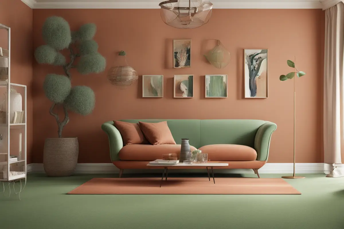
Sage Green
The muted, earthy tone of sage green has both warm and cool undertones, allowing it to bridge the gap between the fiery orange walls and cooler accents.
Both sage green and terracotta orange are grounded, nature-inspired colors derived from plants and minerals.
This gives them an inherent harmony.
The green has enough grayness to contrast the orange, keeping the palette visually interesting rather than too matching.
When paired together, these two colors create an organic, peaceful ambiance with a spa-like feel.
It’s an unexpected but beautiful combination.
Sage green’s natural relaxing properties balance out the energy of the bold orange, resulting in a soothing yet lively space.
Accenting with wood, stone or metallic finishes could enhance the earthiness of this color scheme beautifully.
Sage green adds a pop of color without overwhelming the terracotta walls, giving them room to shine as the focal point.
The green has enough warmth not to look jarring next to the fiery orange but still creates enough contrast.
Overall, sage green carpet complements terracotta walls by drawing out their shared natural qualities for a harmonious, grounded look and feel.
The mix feels familiar yet unique.
✨Click to Get My 101 FREE Designer Room Ideas
Brick Red
Brick red has a deep, earthy undertone that complements and enhances the terracotta shade.
The tones are harmonious rather than clashing.
Both colors are rich and bold, but brick red isn’t so overpowering that it competes with the vibrancy of the orange walls.
The red undertones in brick red carpet bring out the red undertones in the terracotta, making both colors look richer.
Brick red adds warmth and energy to balance out the relaxing qualities of terracotta.
The combo feels cozy yet lively.
Matching the orange walls with a “cousin color” on the floor creates a seamless, monochromatic look that feels enveloping.
Too dark of a red could feel heavy and cave-like, so brick red’s medium-depth is ideal to mix and match with the orange.
Accent colors like charcoal Gray and wood brown would complement brick red and terracotta nicely in a space.
The pairing has an organic, raw look reminiscent of clay, sunsets, and the natural world that feels inviting.
In summary, brick red carpet blends seamlessly with terracotta walls by drawing out their shared earthy qualities and boldness, while keeping the look cozy and bright.
The complementary colors strike the right balance.
Mustard Yellow
Mustard yellow has enough warmth in its undertone to connect with the fiery orange walls, while still providing enough contrast.
The muted, mellow quality of mustard yellow enhances the terracotta without competing for attention.
It lets the orange shine.
Pairing mustard and orange evokes images of fall leaves, sunsets, and Tuscan landscapes.
The color combo feels organic.
Mustard’s golden tone brings out the richness and vibrancy of the terracotta shade.
It feels harmonious rather than clashing.
Too bright of a yellow could look dated or circus-like, so mustard’s calm earthiness gives the palette a sophisticated depth.
Accents in materials like wood, clay and brass would further enhance the warm, natural color scheme.
Mustard grounds the terracotta while adding a pop of cheery color.
This creates an uplifting, welcoming ambiance.
The mustard prevents the space from feeling too red-dominated.
It adds balance.
Overall, mustard carpet adds sunny contrast and draws out the warm undertones of terracotta walls for an earthy, golden-hued harmony.
The laidback pairing feels organic and inviting.
Chocolate Brown
Chocolate brown has enough depth and richness to stand up to the bold terracotta shade without clashing or competing.
The tones feel cohesive.
Both chocolate and terracotta have warm, earthy red undertones that connect the palette for a natural, blended look.
The chocolate brown adds a sense of grounding and gravitas that enhances the vibrancy of the terracotta walls nicely.
Together, these colors create an intimate, den-like ambiance that feels enveloping, moody and sophisticated.
Chocolate brown has a timeless, traditional feel that matches well with the classic terracotta walls for a put-together look.
Too light of a brown could look dull next to terracotta, so chocolate’s depth is ideal for contrast without dimming the orange.
Accenting with lighter woods, creams and metals keeps the chocolate-terracotta palette feeling bright and welcoming.
The brown hue is flexible enough to work in both traditional and modern spaces, depending on accent colors.
In summary, chocolate brown complements terracotta walls by drawing out their shared earthiness in a bold yet balancing way.
The cocooning color scheme feels elegant and intimate.
Soft Pink
Though very different colors, soft pink and terracotta orange share enough warmth in their undertones to complement each other.
The tones blend nicely.
Pink adds a delicate femininity that balances out the earthiness of the bold orange walls.
It softens the look.
The soft pink prevents the space from feeling too heavy or rustic.
It lends a cheerful, uplifting quality.
When used creatively, the pink and orange give off a Southwestern vibe.
Think Santa Fe sunsets.
Too bright or super saturated pink could clash, so a muted blush shade is ideal to complement the terracotta.
Accents in materials like clay, wood and wicker would enhance the natural color scheme.
Soft pink has enough color to hold its own next to the strong orange without competing or overpowering.
The pink brings out the red undertones in the terracotta, making both colors feel more vibrant.
Overall, a muted pink carpet can brighten up terracotta walls in an unexpected yet beautiful way.
The colors share just enough undertone harmony without blending too catchy.
✨Click to Get My 101 FREE Designer Room Ideas
Lavender
Lavender has enough depth of color to hold its own next to the bold orange walls without clashing or overwhelming them.
The cool undertones of lavender contrast nicely with the warm terracotta, creating visual interest through color temperature differences.
When paired creatively, the lavender and orange give off a bright, cheerful spring or summer vibe.
Think fresh flowers.
The light and airy quality of lavender prevents the space from feeling too heavy or rustic.
It balances the earthiness.
Lavender adds a pop of color that draws out the vibrancy of the terracotta shade.
They play off each other.
Too pale of a lavender could look washed out next to the orange.
A medium depth is best for balance.
Accents in natural woods and clay accents could enhance the organic nature of this palette.
The whimsical femininity of lavender softens the traditional terracotta walls for an unexpected charm.
Overall, lavender carpet can provide an uplifting, colorful contrast to terracotta walls.
The interplay between lavender’s cool tones and terracotta’s warmth creates visual interest.
Olive Green
Olive green has both cool and warm undertones, allowing it to bridge the gap between the fiery terracotta walls and any cooler accent colors.
The muted, earthy olive tone connects to the natural clay look of the terracotta walls for an organic and harmonious feel.
Olive has enough grayish coolness to contrast the orange walls and prevent a completely monochromatic look.
When paired creatively, the olive and terracotta give off an inviting Tuscan or Mediterranean vibe.
Olive’s natural, relaxing qualities balance out the energy and boldness of the terracotta orange.
The green adds a subtle pop of color without competing with the main orange walls.
Accent colors like wood, cream, and bronze would enhance the earthiness of this natural color palette.
Olive prevents the space from feeling too rustic or old-fashioned.
The green modernizes it a bit.
Overall, olive green carpet complements terracotta walls by drawing out their shared natural, earthy qualities while providing some modern contrast through its coolness.
The blend feels organic, warm and harmonious.
Light Tan
Light tan has enough warmth in its undertones to connect with the fiery orange walls, while still providing enough contrast.
The muted, neutral quality of light tan allows the bolder terracotta color to take center stage without competition.
Light tan enhances the orange rather than clashing with it, bringing out the vibrancy of the terracotta shade.
Both light tan and terracotta orange evoke natural clay tones.
Their earthiness makes them feel harmonious together.
Light tan adds brightness and lightness that prevents the space from feeling too dark or rustic.
The tan carpet helps warm up the orange walls and give the space a welcoming, sun-drenched look and feel.
Accent colors like cream, wood tones, and brass would complement the light tan and terracotta beautifully.
Too stark of a white could look dull next to the orange, so light tan provides warmth while brightening.
Overall, light tan carpet complements terracotta walls by enhancing the orange tones and filling the space with warmth and brightness.
The natural connection makes them a seamless match.
Medium Gray
Medium gray provides more contrast than light gray, adding visual interest against the warm orange walls without clashing.
The muted, neutral gray tone allows the vibrant orange walls to take center stage without competition.
Medium gray has enough depth of color to stand up to the boldness of the terracotta shade.
The cool undertones of medium gray balance out the fiery warmth of the orange, keeping the palette sophisticated.
Together, the medium gray and terracotta orange create an elegant, modern color combination.
The gray grounds the space and lends some maturity and refinement to contrast the playfulness of orange.
Accenting with black and wood tones allows the medium gray and orange to shine as bold neutrals.
Medium gray can feel nondescript on its own but takes on personality next to the terracotta walls.
Overall, medium gray carpet complements terracotta walls by contrasting enough without dulling the vibrancy.
It creates the perfect refined, modern backdrop for the orange to take center stage.
✨Click to Get My 101 FREE Designer Room Ideas
Beige
Beige has a warm, subtle undertone that connects with the orange walls without overpowering them.
It blends seamlessly.
The muted, neutral quality of beige allows the bolder terracotta color to stand out as the focal point in the room.
Both beige and terracotta are natural, earthy tones that feel harmonious together, like sand and clay.
Beige adds a soft, subtle brightness that enhances the terracotta walls without dulling their saturated hue.
The flexibility of beige allows it to work in both traditional and modern spaces, complementing the classic terracotta walls.
Beige grounds the orange walls while still feeling light and airy enough not to drag down the vibrancy.
Accent colors like cream, black, and wood tones would complement the beige and terracotta palette nicely.
The warmth of beige brings out the orange undertones of the terracotta, making both colors feel richer.
Overall, beige carpet complements terracotta walls by subtly enhancing the orange tone and giving it center stage, while connecting seamlessly through their shared natural, earthy qualities.
Black
The high contrast between black and orange makes both colors pop.
The black intensifies and highlights the vibrancy of the terracotta.
Black grounds the space and adds gravitas, keeping the orange from feeling too playful or psychedelic.
The mix feels bold and sophisticated.
Black’s severity is offset by the warmth and energy of the orange.
Together they balance each other out beautifully.
The blend of black and orange has an edgy, contemporary vibe that feels modern and artful when done right.
Black carpet adds definition that makes the orange walls the obvious focal point.
It frames the orange nicely.
Going too dark and moody can feel oppressive, so lighter furniture and accents keep the space bright.
Blacks and oranges are complementary on the color wheel, so they inherently work in harmony.
The terracotta adds enough softness to prevent an icy cold feeling from all black everything.
Overall, black carpet complements fiery terracotta walls by boldly contrasting and accentuating the vibrancy of the orange.
Handled creatively, the dramatic combo feels modern and edgy.
Terracotta
Matching the walls and flooring creates a super cohesive, monochromatic look that feels bold and immersive.
The seamless flow of the same earthy, rustic color throughout provides a relaxing, grounded feel.
Doubling up on the terracotta accentuates its boldness and gives it the full spotlight in the space.
The color connection draws the eye across the room for a feeling of visual continuity and flow.
Too much of the same color can feel monotonous, so adding accent rugs in contrasting hues prevents that.
Matching wall and floor color helps make a space feel larger and more expansive.
The terracotta carpet enhances the vibrancy of the orange walls through repetition.
Variations in texture between the smooth walls and fluffy carpet provide subtle contrast.
Overall, terracotta carpet complements and enhances terracotta walls by doubling the bold color impact.
Accent rugs add pops of contrast to keep it from feeling one-note.
The cohesive look feels warm, organic and enveloping.
In conclusion, selecting the right carpet color to pair with bold terracotta orange walls requires some thoughtful consideration.
The goal is to find a shade that both complements the walls and adds visual interest through contrast.
Warm, earthy tones like brick red, chocolate brown, and terracotta itself can blend seamlessly for a cohesive look.
Cooler colors like gray, sage green, or navy blue create sophisticated contrast through their different undertones.
Whimsical colors like soft pink or lavender add feminine charm and brightness.
Ultimately, trust your instincts and aim for balance – the carpet should neither compete with nor fade into the terracotta walls, but should harmonize with them to create a stylish, uplifting space.
With the right carpet color choice, your terracotta walls will feel vibrant, put-together, and undeniably chic.
