Are you staring at your cream carpet wondering what wall color will make your room shine?
The soft, neutral backdrop of cream carpeting offers endless possibilities for creating a beautiful space.
The perfect paint shade can transform your cream-carpeted room from ordinary to magazine-worthy.
Here you’ll learn how different lighting affects these color combinations and which shades work best for different room types.
So Let’s go:
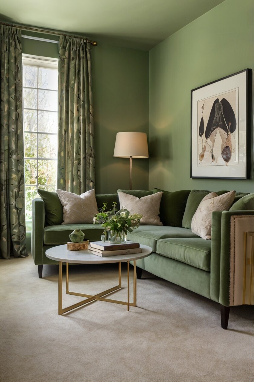
1. Soft Sage Green


Sage green offers a natural, calming presence that pairs beautifully with cream carpets.
This gentle, muted green brings the outdoors in, creating a fresh and serene atmosphere.
When paired with cream carpeting, sage creates a soft, earthy palette that feels both timeless and on-trend.
Benjamin Moore’s “Saybrook Sage” or Sherwin Williams’ “Clary Sage” are excellent options to achieve this look.
These specific paint colors have just the right amount of gray undertones to prevent the green from feeling too vibrant against your cream carpet.
Your room will benefit from this combination in any space where you want to create a peaceful retreat.
Sage green works particularly well in bedrooms and living rooms with cream carpeting.
You can enhance this color scheme by adding natural wood tones and botanical elements to complete the organic feel.
Consider incorporating brass or gold accents to add warmth and sophistication to the sage and cream combination.
The contrast between the soft green walls and neutral cream floor creates visual interest without overwhelming the space.
Even in rooms with limited natural light, sage green maintains its soothing presence without darkening the space too much.
For a more dynamic look, consider creating an accent wall in a slightly deeper sage tone while keeping the remaining walls lighter.
This color combination works well with both contemporary and traditional furniture styles, making it highly versatile.
Your cream carpet will appear richer and more intentional when paired with sage green, as the colors naturally complement each other.
During different times of day, you’ll notice sage green walls shifting subtly in tone, adding dimension to your space.
This versatile color also pairs beautifully with navy blue, rust orange, or burgundy accent pieces if you want to add more color to your room.
2. Warm Taupe
Taupe creates a sophisticated, cohesive look when paired with cream carpeting.
This versatile neutral bridges the gap between gray and beige, offering warmth without overwhelming the space.
Your cream carpet will appear deliberately chosen rather than builder-grade when complemented by taupe walls.
Sherwin Williams’ “Accessible Beige” or Benjamin Moore’s “Revere Pewter” provide that perfect taupe balance with cream carpets.
These colors have enough depth to create contrast with cream flooring while maintaining a harmonious overall look.
The subtle contrast between taupe walls and cream carpeting creates visual interest while keeping the room feeling spacious and cohesive.
You’ll find this combination particularly effective in open-concept spaces where flow between rooms is important.
Taupe works well in both north-facing rooms (where it adds warmth) and south-facing rooms (where it maintains its neutral character without yellowing).
Your furniture options remain unlimited with this versatile backdrop – both light and dark woods pair beautifully with the taupe and cream combination.
For added interest, consider incorporating textural elements like grasscloth wallpaper or textured art in complementary neutral tones.
The taupe and cream pairing creates an excellent backdrop for more colorful accessories if you like to change your accent colors seasonally.
In home offices or dining rooms with cream carpeting, taupe walls provide a focused, grounded energy without feeling too dark or heavy.
Your cream carpet will appear more luxurious against taupe walls, especially when you add layered lighting to enhance the subtle variations in both colors.
This color combination works equally well in traditional and contemporary spaces, making it a truly timeless choice.
If you’re preparing your home for sale, this neutral but intentional color scheme appeals to many potential buyers while still looking polished.
Taupe walls allow the eye to notice architectural details in your space rather than focusing on the contrast between wall and floor colors.
3. Soft Sky Blue
Sky blue creates a refreshing, expansive feeling when paired with cream carpeting.
This color combination evokes clear skies and brings a sense of tranquility to any room.
Your cream carpet grounds the airy blue walls, creating perfect balance in the space.
Benjamin Moore’s “Blue Veil” or Sherwin Williams’ “Borrowed Light” offer that perfect soft sky blue to complement cream carpets.
These specific shades have a hint of gray that prevents them from appearing too childlike or pastel when paired with cream.
The contrast between cool blue walls and warm cream flooring creates a pleasing visual harmony that works in most lighting conditions.
Your room will feel larger with this color combination, as light blues tend to make walls visually recede.
Sky blue works exceptionally well in bedrooms with cream carpeting, promoting feelings of restfulness and calm.
You can enhance this color scheme with white trim and ceiling to create a light, airy feeling reminiscent of coastal designs.
For a more sophisticated take, incorporate navy blue accents through pillows, throws, or artwork to add depth to the palette.
The sky blue and cream combination suits bathrooms and children’s rooms particularly well, creating a fresh, clean atmosphere.
Your cream carpet will appear brighter and cleaner when contrasted with soft blue walls, especially in rooms with good natural light.
This color pairing works beautifully in home offices, as blue promotes focus and productivity without feeling too intense.
Consider adding natural elements like jute, rattan, or light woods to enhance the organic, breezy feeling of this color scheme.
Even in smaller spaces, this combination helps rooms feel open and uncluttered, making it ideal for apartments or compact homes.
Your guests will feel instantly welcomed and relaxed in spaces featuring this harmonious color pairing.
Both traditional and modern furniture styles work beautifully against sky blue walls and cream carpeting, making this a versatile choice for any decor style.
4. Soft Terracotta
Terracotta brings warm, earthy energy that beautifully complements the softness of cream carpeting.
This rich, clay-inspired hue adds instant character and warmth to any space.
Your cream carpet helps balance terracotta’s intensity, preventing the room from feeling too dark or heavy.
Sherwin Williams’ “Pottery” or Benjamin Moore’s “Warm Sienna” capture that perfect terracotta tone to pair with cream carpets.
These specific paint colors have the right balance of orange and brown undertones to create a sophisticated, rather than overly bright, appearance.
The contrast between warm terracotta walls and neutral cream flooring creates a grounded, inviting atmosphere perfect for gathering spaces.
Your living room or dining area can benefit tremendously from this combination, especially if you entertain frequently.
Terracotta works beautifully in rooms with northern exposure, where its warmth counteracts cooler natural light.
You can enhance this color scheme with natural elements like wood, leather, and woven textiles for an organic, cohesive look.
For a global-inspired space, incorporate patterns and textiles from around the world against this warm, neutral backdrop.
The terracotta and cream combination creates excellent flow between indoor and outdoor spaces, making it ideal for homes with patios or gardens.
Your cream carpet will appear richer and more intentional when paired with this earthy tone, elevating the overall design of your space.
This color pairing works well with both brass and black metal accents, offering flexibility in your hardware and fixture choices.
Consider adding plants with deep green foliage to complete the natural palette created by terracotta and cream.
Even in modern, minimalist spaces, terracotta adds warmth without cluttering the clean aesthetic you might prefer.
Your room will transform throughout the day as terracotta walls capture and reflect changing light, creating a dynamic living experience.
This combination works especially well in climates where you want your interior to feel cozy and inviting regardless of outdoor temperatures.
5. Crisp Navy Blue
Navy blue creates dramatic contrast against cream carpeting for a classic, sophisticated look.
This deep, rich color brings instant character to rooms that might otherwise feel plain or unfinished.
Your cream carpet brightens and softens the intensity of navy walls, creating perfect balance.
Benjamin Moore’s “Hale Navy” or Sherwin Williams’ “Naval” provide that perfect navy tone to complement cream carpets.
These specific shades have enough depth to make a statement without appearing black in lower lighting conditions.
The strong contrast between dark navy walls and light cream flooring creates architectural interest even in rooms without distinctive features.
Your furniture will stand out beautifully against this high-contrast background, especially lighter colored pieces.
Navy blue works particularly well in dining rooms with cream carpeting, creating an elegant, intimate atmosphere for gatherings.
You can soften the contrast by incorporating cream-colored curtains, artwork, or accessories that pull the floor color up onto the walls.
For a traditional look, pair with brass fixtures and classic furniture styles that enhance the timeless quality of this color combination.
The navy and cream pairing works equally well in contemporary spaces when you add clean-lined furniture and minimal accessories.
Your cream carpet will appear brighter and more deliberate when contrasted with navy walls, especially with proper lighting.
This color combination creates excellent separation in open floor plans, helping to define different functional areas while maintaining flow.
Consider using navy as an accent wall if you’re hesitant about going dark on all four walls of a room with cream carpeting.
Even in smaller spaces, navy can work beautifully when balanced with cream carpeting and ample lighting.
Your mood board for this color scheme might include coastal elements, as navy and cream naturally evoke nautical themes.
Both children’s rooms and adult spaces benefit from this versatile color pairing, which can be styled to suit any age group or preference.
6. Dove Gray
Dove gray offers a soft, sophisticated neutral that pairs effortlessly with cream carpeting.
This versatile color creates subtle contrast without overwhelming the space.
Your cream carpet appears warmer and more dimensional when complemented by cool dove gray walls.
Benjamin Moore’s “Balboa Mist” or Sherwin Williams’ “Repose Gray” achieve that perfect dove gray tone alongside cream carpets.
These specific paint colors have the right balance of warm and cool undertones to prevent the gray from appearing too cold against cream.
The gentle contrast between gray walls and cream flooring creates a calming backdrop for any design style.
Your artwork and furniture will stand out beautifully against dove gray walls without competing with the floor color.
Dove gray works well in any room with cream carpeting, from bedrooms to home offices to living spaces.
You can easily change accent colors with this neutral backdrop, making seasonal decorating changes simple and effective.
For a more layered look, consider incorporating different shades of gray through textiles and accessories throughout the room.
The dove gray and cream combination suits both traditional and modern aesthetics, making it a truly versatile choice.
Your cream carpet will appear deliberately chosen rather than builder-grade when paired with thoughtfully selected gray walls.
This color pairing creates an excellent backdrop for colorful furniture or art collections if you prefer to add personality through accessories.
Consider adding metallic accents in silver, gold, or copper to enhance the sophisticated nature of this color combination.
Even in rooms with challenging lighting, dove gray maintains its character without shifting dramatically throughout the day.
Your space will feel both current and timeless with this pairing, as gray continues to be a designer favorite year after year.
This combination works particularly well in spaces where you want to create a sense of calm and focus, like home offices or bedrooms.
7. Rich Emerald Green
Emerald green creates a luxurious, dramatic backdrop that makes cream carpeting look intentional and upscale.
This jewel tone adds instant personality and depth to any room in your home.
Your cream carpet provides the perfect neutral base that allows emerald walls to shine without overwhelming the space.
Benjamin Moore’s “Essex Green” or Sherwin Williams’ “Emerald Isle” capture that perfect rich green tone to pair with cream carpets.
These specific paint colors have the depth and richness needed to create a truly sophisticated look.
The contrast between bold emerald walls and soft cream flooring creates a dynamic yet balanced visual experience.
Your furniture pieces will appear more distinctive against this rich background, especially neutrals and wood tones.
Emerald green works particularly well in dining rooms and living spaces with cream carpeting, creating an inviting atmosphere for gathering.
You can enhance this color scheme with brass or gold accents, which naturally complement both emerald and cream.
For a more eclectic look, incorporate vintage furniture pieces that gain new life against this dramatic color backdrop.
The emerald and cream combination feels both timeless and current, making it a worthy investment for years to come.
Your cream carpet will appear more luxurious when paired with emerald, especially when you add proper lighting to highlight both elements.
This color pairing creates excellent dimension in rooms that might otherwise feel flat or characterless.
Consider using emerald on all four walls for maximum impact, or as an accent wall if you prefer a more subtle approach.
Even in smaller spaces, emerald can work beautifully when balanced with cream carpeting and thoughtful furniture placement.
Your room will transform into a sophisticated retreat with this color combination, especially when complemented by rich textures.
This dramatic pairing works well in both traditional spaces and more contemporary environments, depending on your styling choices.
8. Warm Beige
Warm beige creates a seamless, harmonious look when paired with cream carpeting.
This subtle color combination builds a layered neutral palette that feels sophisticated and intentional.
Your cream carpet gains definition and purpose when complemented by slightly deeper beige walls.
Sherwin Williams’ “Kilim Beige” or Benjamin Moore’s “Manchester Tan” provide that perfect warm beige to accompany cream carpets.
These specific paint colors have enough depth to create distinction from the floor without stark contrast.
The subtle difference between beige walls and cream flooring adds dimension without creating harsh visual breaks.
Your artwork and furniture become the focal points against this neutral, supportive background.
Warm beige works wonderfully in transition spaces like hallways and open-concept areas with cream carpeting.
You can easily build upon this foundational palette with accent colors through accessories, artwork, and textiles.
For added interest, consider incorporating textural elements like grasscloth wallpaper or venetian plaster finish on beige walls.
The beige and cream combination creates excellent flow between rooms, making it ideal for whole-house color schemes.
Your cream carpet will appear more luxurious against carefully chosen beige walls, especially in well-lit spaces.
This color pairing works with virtually any design style, from traditional to contemporary to transitional.
Consider adding darker wood tones or black accents to create depth and prevent the space from feeling too monotone.
Even in rooms with challenging lighting, beige maintains its warm character without shifting dramatically throughout the day.
Your space will feel both current and timeless with this pairing, as layered neutrals continue to be a designer favorite.
This combination works particularly well in homes where you want to create a sense of calm and cohesion throughout connected spaces.
9. Pale Lavender
Pale lavender offers a unique, unexpected partner for cream carpeting that adds subtle color without overwhelming.
This soft purple hue brings a touch of sophistication and tranquility to any space.
Your cream carpet grounds the ethereal quality of lavender walls, creating perfect balance.
Benjamin Moore’s “Violet Mist” or Sherwin Williams’ “Inspired Lilac” capture that perfect pale lavender to complement cream carpets.
These specific paint colors have enough gray undertones to prevent them from appearing too sweet or childlike.
The gentle contrast between lavender walls and cream flooring creates a soothing, elegant atmosphere.
Your bedroom or home office can benefit tremendously from this calming color combination.
Pale lavender works surprisingly well as a neutral, pairing beautifully with many accent colors against cream carpeting.
You can enhance this color scheme with silver or brushed nickel accents for a cool, contemporary feel.
For a more romantic look, incorporate vintage furnishings and floral patterns that complement the lavender and cream palette.
The lavender and cream combination suits both traditional and modern aesthetics when styled appropriately.
Your cream carpet will appear richer and more deliberate when paired with this unexpected wall color.
This color pairing creates a subtle sophistication that visitors might not immediately identify but will certainly appreciate.
Consider how lavender walls can enhance the mood of spaces where you seek relaxation or creative inspiration.
Even in smaller spaces, lavender adds character without making rooms feel closed in or overly colorful.
Your design choices with this palette show creativity and confidence without resorting to bright or trendy colors.
This combination works especially well in spaces that receive good natural light, where the lavender can show its subtle shifts in tone throughout the day.
10. Butter Yellow
Butter yellow creates a cheerful, sunny atmosphere that pairs beautifully with cream carpeting.
This warm, golden hue adds instant warmth and character to any room.
Your cream carpet provides the perfect neutral foundation for this happy wall color without competing for attention.
Benjamin Moore’s “Hawthorne Yellow” or Sherwin Williams’ “Blonde” offer that perfect butter yellow to complement cream carpets.
These specific paint colors have the right undertones to prevent them from appearing too bright or acidic in varied lighting.
The gentle contrast between yellow walls and cream flooring creates an inviting, cohesive look that feels intentionally designed.
Your kitchen, breakfast nook, or sunroom can particularly benefit from this cheerful color combination.
Butter yellow works wonderfully in rooms with northern exposure, where its warmth can counteract cooler natural light.
You can enhance this color scheme with white trim and natural wood tones for a classic, timeless feel.
For a more contemporary look, incorporate gray or black accents that provide modern contrast to the warm yellow and cream palette.
The butter yellow and cream combination creates an excellent backdrop for both modern and traditional furniture styles.
Your cream carpet will appear deliberately chosen rather than builder-grade when paired with thoughtfully selected yellow walls.
This color pairing works well in spaces where you want to create an energetic yet comfortable atmosphere.
Consider how yellow walls can enhance spaces where family and friends gather, promoting conversation and positive emotions.
Even in rooms with limited natural light, butter yellow brings a sense of sunshine and warmth year-round.
Your mood will likely be positively affected by this cheerful color combination, making it ideal for spaces you use frequently.
This pairing works particularly well in climates with long winters, where interior color choices become especially important for maintaining good spirits.
11. Charcoal Gray
Charcoal gray creates dramatic contrast against cream carpeting for a bold, modern look.
This deep, sophisticated neutral adds instant architectural interest to any space.
Your cream carpet softens and balances the intensity of charcoal walls, preventing the room from feeling too dark.
Benjamin Moore’s “Kendall Charcoal” or Sherwin Williams’ “Peppercorn” provide that perfect charcoal tone to pair with cream carpets.
These specific paint colors have rich depth without appearing flat or black in varied lighting conditions.
The striking contrast between dark charcoal walls and light cream flooring creates a designer-worthy look that feels intentional and current.
Your furniture and artwork will pop dramatically against this high-contrast background.
Charcoal gray works particularly well in media rooms or home offices with cream carpeting, where the darker walls can reduce glare.
You can soften this bold contrast by incorporating cream-colored textiles and accessories that pull the floor color up into the room.
For a contemporary look, pair with chrome or stainless steel accents that enhance the modern appeal of this color combination.
The charcoal and cream combination creates excellent visual separation in open floor plans while maintaining design cohesion.
Your cream carpet will appear brighter and more luxurious when contrasted with charcoal walls, especially with proper lighting.
This color pairing makes a statement while still functioning as a neutral backdrop for your furnishings and accessories.
Consider using charcoal as an accent wall if you’re hesitant about going this dark on all four walls in a cream-carpeted room.
Even in larger spaces, charcoal creates intimacy and focus without making the room feel closed in when balanced with cream flooring.
Your guests will notice and remember spaces decorated with this bold yet sophisticated color combination.
This pairing works particularly well in spaces where you want to create drama and impact without resorting to bright colors.
12. Dusty Blue-Gray
Dusty blue-gray offers a versatile, sophisticated option that beautifully complements cream carpeting.
This complex color bridges the gap between blue and gray, adding subtle character to any room.
Your cream carpet provides the perfect warm counterbalance to the cooler blue-gray walls.
Benjamin Moore’s “Boothbay Gray” or Sherwin Williams’ “Misty” capture that perfect dusty blue-gray to pair with cream carpets.
These specific paint colors have enough depth to create distinction without overwhelming the space.
The gentle contrast between blue-gray walls and cream flooring creates a calming, cohesive look that works in most lighting conditions.
Your living spaces, bedrooms, or bathrooms can all benefit from this versatile color combination.
Dusty blue-gray works equally well in north-facing rooms (where it adds character) and south-facing rooms (where it maintains its cool presence).
You can enhance this color scheme with natural wood tones that warm up the cooler walls while complementing the cream carpet.
For a coastal-inspired look, incorporate lighter blues and whites as accent colors throughout the space.
The blue-gray and cream combination creates an excellent foundation for both traditional and contemporary design styles.
Your cream carpet will appear deliberately chosen rather than builder-grade when paired with this thoughtfully selected wall color.
This color pairing creates a sophisticated backdrop that allows your furniture and accessories to stand out beautifully.
Consider how blue-gray walls can transform the mood of a space, adding depth and interest without overwhelming other design elements.
Even in smaller spaces, blue-gray adds character without making rooms feel closed in or too colorful.
Your home will feel current yet timeless with this color combination, as blue-grays continue to be designer favorites year after year.
This pairing works particularly well in spaces where you want to create a sense of calm and relaxation while maintaining visual interest.
13. Rich Burgundy
Burgundy creates a bold, luxurious statement that pairs surprisingly well with cream carpeting.
This rich, wine-inspired hue adds dramatic depth and warmth to any space.
Your cream carpet balances the intensity of burgundy walls, creating a sophisticated, well-designed look.
Benjamin Moore’s “Townsend Harbor Brown” or Sherwin Williams’ “Burgundy” offer that perfect deep red tone to complement cream carpets.
These specific paint colors have enough brown undertones to feel sophisticated rather than bright or overwhelming.
The striking contrast between deep burgundy walls and light cream flooring creates a classic, timeless aesthetic with modern appeal.
Your dining room or study can be transformed into an intimate, elegant retreat with this color combination.
Burgundy works particularly well in rooms that you use primarily in the evening, where it creates a warm, embracing atmosphere under artificial light.
You can enhance this color scheme with gold or brass accents that highlight the richness of both the burgundy and cream.
For a traditional look, incorporate dark wood furniture pieces that complement the depth of the burgundy walls.
The burgundy and cream combination offers excellent seasonal versatility, feeling cozy in winter and rich in summer.
Your cream carpet will appear more luxurious and deliberate when paired with this sophisticated wall color.
This color pairing makes a statement while still functioning as a surprisingly versatile backdrop for varied decorating styles.
Consider using burgundy on all four walls for maximum impact, or as an accent wall if you prefer a more subtle approach.
Even in larger spaces, burgundy creates intimacy and drama without feeling overwhelming when balanced with cream carpeting.
Your mood board for this color scheme might include classic elements like leather, velvet, and aged metals that enhance its timeless quality.
This combination works particularly well in spaces where you want to create a sense of history and permanence in your home’s design.


