our beige carpet might seem limiting at first, but it actually works with many different paint colors.
The right paint can completely transform how your room feels and looks.
Beige carpets come in many shades – from warm tan to cool greige (gray-beige).
What works best depends on your carpet’s specific undertone.
Cool beige carpets pair beautifully with blues and greens, while warmer beige looks amazing with earth tones.
Your personal style matters too – are you drawn to bold colors or more subtle shades?
Do you want your space to feel cozy and intimate or bright and airy?
Let’s find out.

Soft White


White paint might seem too simple, but it’s actually one of the most versatile options for rooms with beige carpet.
A soft white like Benjamin Moore’s “White Dove” or Sherwin-Williams’ “Alabaster” creates a clean backdrop that lets your beige carpet warm up the space.
Unlike stark whites that might create too much contrast, these soft whites have subtle warm undertones that complement beige beautifully.
This combination creates a bright, airy feeling that makes rooms look bigger and more inviting.
White walls also give you freedom with other decorating elements – you can add colorful furniture, art, and accessories without worrying about clashing.
This color pairing works especially well in rooms that get plenty of natural light, as the sunlight enhances the warmth of both the beige carpet and soft white walls.
For a cohesive look, consider adding beige and cream accents throughout your space to tie the floor and walls together.
Texture becomes extra important in white and beige rooms – consider adding natural woven elements, plush textiles, and plants to add visual interest.
If you’re worried about the space feeling too bland, add black accents for contrast through picture frames, light fixtures, or furniture.
Small touches of metal – whether gold, silver, or bronze – can also add sophistication to this simple color scheme.
The great thing about white walls with beige carpet is how timeless this combination feels – it won’t look dated in a few years.
This palette particularly shines in bedrooms and living rooms where you want a calm, peaceful feeling.
Even in kitchens and bathrooms adjoining beige-carpeted areas, white creates a seamless flow between spaces.
Professional designers often recommend this combination because it photographs beautifully and appeals to almost everyone.
Remember that not all whites are equal – always test paint samples in your space to make sure the undertones work with your specific beige carpet.
Tap to Explore These Beauties
See my ideas in action 👇 Tap any image to explore full details.
Warm Gray
Warm gray paint creates a sophisticated, contemporary look when paired with beige carpet.
Colors like Sherwin-Williams’ “Agreeable Gray” or Benjamin Moore’s “Revere Pewter” have subtle warm undertones that connect beautifully with beige.
This combination feels modern yet timeless, avoiding the cooler grays that might clash with your carpet’s warmth.
The contrast between the gray walls and beige carpet adds visual interest without being too dramatic or jarring.
Warm gray creates a versatile backdrop that works with virtually any accent color you might want to introduce.
This pairing is perfect for those who appreciate a subtle, understated look with just enough contrast to be interesting.
In spaces with limited natural light, warm gray keeps rooms from feeling too dark or cave-like while still adding depth.
Designers recommend this combination for open-concept homes where you want a cohesive flow between different areas.
For a complete look, consider furniture in deeper beiges, creams, or even soft blues and greens which all pair beautifully with this color scheme.
Wood tones – especially medium and light woods – stand out beautifully against warm gray walls and beige carpeting.
This color combination works exceptionally well in home offices, dining rooms, and hallways where you want a sophisticated feel.
To enhance this palette, incorporate different textures through curtains, throw pillows, and decorative objects.
Consider adding plants to bring life to this neutral palette – the green provides a perfect accent to the gray and beige tones.
Warm gray can make traditional furniture look more contemporary, while making modern pieces feel more approachable and less stark.
Lighting fixtures in brass or bronze add warmth to this color scheme and create gorgeous shadows on gray walls.
If your beige carpet has yellow undertones, choose a gray with similar warm undertones to ensure they complement each other.
For a more dramatic look, you could even paint one accent wall in a deeper shade of gray while keeping the other walls lighter.
Sage Green
Sage green paint creates a naturally soothing environment when paired with beige carpet.
This soft, muted green has earthy qualities that connect beautifully to the natural tone of beige.
Colors like Benjamin Moore’s “October Mist” or Sherwin-Williams’ “Clary Sage” offer the perfect balance between color and neutrality.
This combination works because both colors exist commonly in nature, creating a harmonious feeling that instantly makes rooms more relaxing.
Sage green has been growing in popularity because it adds color without overwhelming a space.
Your beige carpet grounds the room while the sage walls add gentle interest and character.
This color pairing works exceptionally well in bedrooms, living rooms, and reading nooks where you want to create a peaceful retreat.
Sage green walls make beige carpet look intentional rather than just a neutral background element.
To enhance this nature-inspired palette, incorporate natural materials like wood, rattan, and linen into your décor.
Plants thrive visually against sage walls, their varied green tones creating a layered, sophisticated look.
This combination feels especially relevant now as more people seek to bring elements of the outdoors into their homes.
For a complete look, consider adding accents in cream, terracotta, or even soft lavender, all of which pair beautifully with sage and beige.
Light-colored wood furniture stands out beautifully against sage walls while harmonizing with the beige carpet below.
The versatility of this color scheme means it works with many different decorating styles, from farmhouse to modern to boho.
Sage green has been shown to reduce stress and promote calmness, making it perfect for today’s busy households.
For spaces that transition between rooms with beige carpet and hard flooring, sage green provides a consistent element that ties spaces together.
In rooms with abundant natural light, sage green walls will shift subtly throughout the day, creating a living, breathing space.
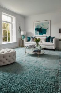
Soft Blue
Soft blue paint creates a refreshing contrast with beige carpet that feels both calming and uplifting.
Colors like Benjamin Moore’s “Breath of Fresh Air” or Sherwin-Williams’ “Rain” bring a touch of sky and water into your space.
This combination works because blue and beige represent sky and sand – a naturally occurring color pairing that feels right to our eyes.
The cool tones of blue balance the warmth of beige carpet, creating a harmonious temperature balance in your room.
This color pairing makes spaces feel larger and more open, as light blues tend to recede visually.
Your beige carpet becomes more interesting when paired with blue, as the contrast highlights the carpet’s warm undertones.
This color combination works exceptionally well in bedrooms, bathrooms, and home offices where a sense of calm is beneficial.
Soft blue has been shown to lower blood pressure and heart rate, making it perfect for spaces where you want to relax.
To enhance this palette, incorporate natural elements like driftwood, seashells, or beach glass that reinforce the coastal connection.

Find Your Room’s Color Palette
Tap a vibe — get a curated 5-color palette with hex codes you can copy ✨
💭 I Wrote a Book About My Biggest Decorating Mistakes!
When I decorated my first home, I thought I knew what I was doing. Spoiler: I didn’t. 😅
💸 I bought a sofa way too big for my living room. Paint colors that looked amazing in the store but terrible on my walls.
White trim and ceiling paint make both the blue walls and beige carpet look more vibrant and intentional.
For a cohesive look, pull in accents that blend both colors – perhaps throw pillows with both blue and beige tones.
This color scheme accommodates many decorating styles, from coastal and farmhouse to contemporary and traditional.
Light-colored wood furniture works beautifully with this palette, as do natural fibers like cotton, linen, and jute.
For rooms that don’t get much natural light, soft blue can bring a sense of daylight and openness.
If your beige carpet has golden undertones, choose blues with a slight gray or green undertone to create harmony.
The soft blue and beige combination creates a perfect backdrop for silver, chrome, or glass accessories that reflect light.
This color pairing is timeless rather than trendy, meaning your room won’t look dated in a few years.
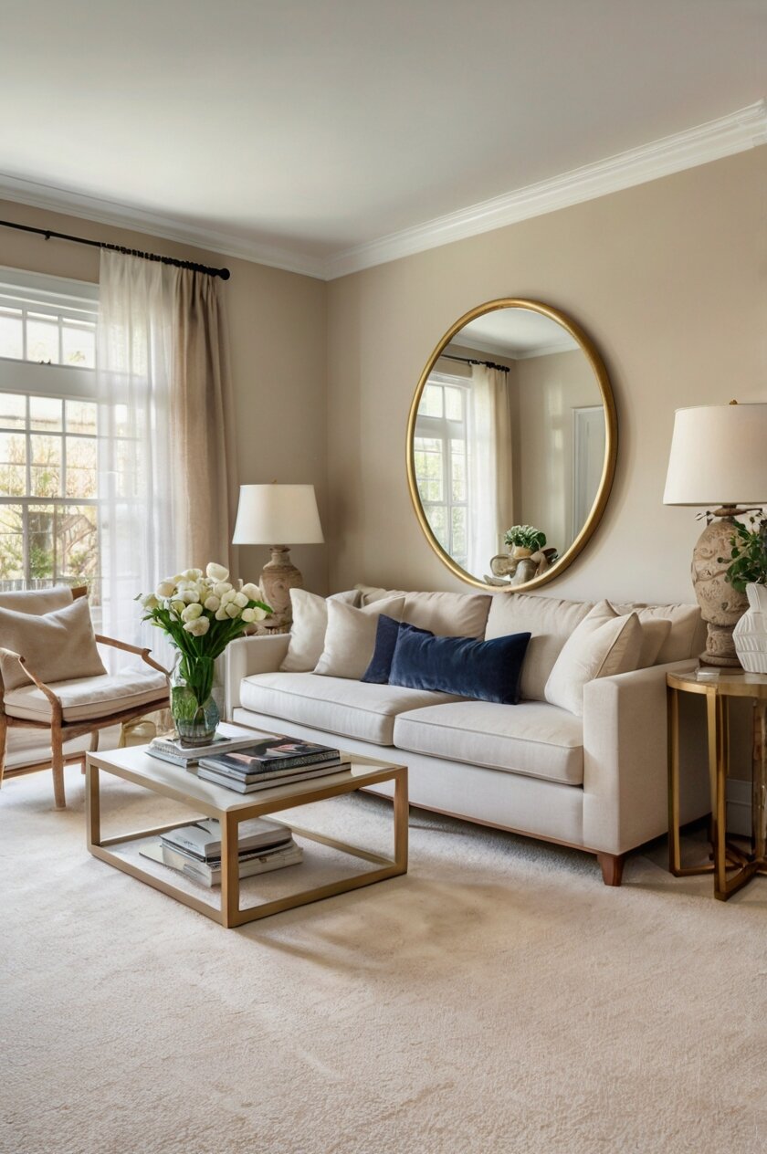
Warm Taupe
Warm taupe paint creates a sophisticated tone-on-tone look when paired with beige carpet.
This color combination gives your space depth without high contrast, creating a serene, wrapped-in-warmth feeling.
Colors like Benjamin Moore’s “Manchester Tan” or Sherwin-Williams’ “Accessible Beige” complement beige carpet beautifully.
This monochromatic approach feels cohesive and intentional, like your room was designed by a professional.
Warm taupe walls make your space feel cozy and inviting, perfect for living rooms and family rooms where people gather.
The subtle difference between your taupe walls and beige carpet creates gentle visual interest without being overwhelming.
This color pairing serves as a perfect neutral backdrop for artwork, allowing paintings and photographs to stand out.
Your furniture and accessories become the stars in a room with this subtle background palette.
To enhance this look, introduce varied textures – smooth leather, nubby linen, glossy ceramics – that add dimension to the monochromatic color scheme.
Wood tones of all varieties work beautifully with taupe and beige, making this a versatile foundation for most furniture.
This subtle color scheme creates a luxurious atmosphere, especially when you add touches of cream and soft metallics.
For those who find choosing colors stressful, this foolproof combination guarantees a cohesive, pulled-together look.
Warm taupe walls make beige carpet look intentional rather than like a compromise or something you’re stuck with.
This combination works particularly well in open floor plans where you want consistent flow between spaces.
Lighting becomes especially important with this palette – incorporate various light sources to create depth and prevent the space from feeling flat.
For visual interest, consider using taupe in different finishes – perhaps eggshell on walls with semi-gloss trim in the same color.
This sophisticated neutral palette has staying power, unlikely to feel dated even as color trends come and go.
Gentle Lavender
Gentle lavender paint brings unexpected sophistication when paired with beige carpet.
Far from being just for children’s rooms, soft lavender like Benjamin Moore’s “Organdy” or Sherwin-Williams’ “Enchant” creates a subtle, refined look.
This combination works because lavender’s cool tones balance beautifully with the warmth of beige.
The result is a space that feels both calm and unique, with just enough color to be interesting without becoming overwhelming.
Your guests might not immediately identify the walls as purple – instead, they’ll notice how peaceful and elegant the room feels.
This color pairing works especially well in bedrooms, sitting rooms, and spaces where you want to create a serene atmosphere.
Lavender has historically been associated with luxury and royalty, bringing a subtle sense of refinement to your beige-carpeted room.
The violet undertones in lavender can make beige carpet look richer and more sophisticated than it might with other wall colors.
To enhance this palette, incorporate natural elements like light woods, cream textiles, and silver or chrome accents.
Gray furniture looks particularly striking against lavender walls while harmonizing with the neutral beige carpet.
For a cohesive look, consider accessories that blend lavender and beige tones to tie the floor and walls together.
This color combination is unexpected enough to feel special but subtle enough to have staying power beyond passing trends.
In rooms with northern exposure that might otherwise feel cold, the subtle warmth in both lavender and beige creates balance.
This palette takes on different qualities throughout the day, appearing more gray in shadow and more distinctly purple in direct light.
For those wanting to experiment with color without committing to something bold, gentle lavender offers the perfect middle ground.
Designers often use this combination in spaces meant for relaxation, as lavender is known to promote restfulness and calm.
Consider adding plants with gray-green foliage like eucalyptus or lamb’s ear that enhance this sophisticated color scheme.
What’s Your Decor Personality?
5 questions · 30 seconds · Instant style match 🏡
Butter Yellow
Butter yellow paint creates a cheerful, sunny atmosphere when paired with beige carpet.
This warm, golden yellow like Benjamin Moore’s “Hawthorne Yellow” or Sherwin-Williams’ “Decisive Yellow” brightens any space instantly.
The combination works because both colors share warm undertones, creating a harmonious, welcoming feeling.
Your beige carpet grounds the brightness of butter yellow walls, preventing the space from feeling overwhelming.
This color pairing is perfect for rooms that don’t get much natural light, as the yellow walls create a sense of sunshine.
Morning rooms like kitchens, breakfast nooks, and east-facing spaces benefit particularly from this uplifting combination.
Children’s play areas and family rooms also come alive with butter yellow walls above beige carpet.
Yellow has been shown to promote happiness and optimism, making this an excellent choice for spaces where you want to boost mood.
To enhance this sunny palette, incorporate white trim and ceiling to provide clean definition between the yellow walls and beige floor.
Natural wood tones pair beautifully with this combination, as do touches of green from houseplants or accessories.
For a cohesive look, consider adding textiles and decorative elements that include both yellow and beige tones.
This color pairing works with many decorating styles, from country and farmhouse to mid-century modern.
In open concept homes, butter yellow walls can define specific areas while the continuous beige carpet creates flow between spaces.
This combination creates rooms that feel warm regardless of the season or weather outside.
For those who find all-neutral rooms too boring but fear bold colors, butter yellow offers the perfect middle ground.
White furniture pops beautifully against this background, while darker wood pieces feel grounded and substantial.
Consider adding blue accents for a classic complementary color scheme that feels balanced and complete.
Soft Coral
Soft coral paint brings warmth and energy when paired with beige carpet.
This muted peachy-pink like Benjamin Moore’s “Pleasant Pink” or Sherwin-Williams’ “Coral Reef” adds personality without overwhelming.
The combination works because coral’s warm undertones complement the natural warmth in beige carpeting.
Your space will feel welcoming and embracing with this color pairing, perfect for creating memorable rooms.
This combination flatters skin tones, making people look and feel their best in the space – ideal for gathering places like dining rooms.
Coral has associations with both sunset and sunrise, bringing a sense of natural beauty and transition to your room.
The contrast between coral walls and beige carpet creates visual interest while maintaining a harmonious overall feeling.
This color pairing works beautifully in spaces where you entertain, as it creates an energizing yet comfortable atmosphere.
To enhance this palette, incorporate natural elements like light woods, plants, and textural elements in neutral tones.
💭 Ever wondered what your room would actually look like rearranged?
I built a free tool that lets you drag furniture around a 2D floor plan. No signup, no catch.
See the Room Planner →Gold, brass, and copper accents shine particularly beautifully against coral walls while complementing beige carpet.
For a sophisticated look, consider furnishings in cream, charcoal, or navy that provide contrast to the warm background.
This color combination feels fresh and current while having enough warmth to avoid feeling trendy or temporary.
In rooms with northern exposure that might otherwise feel cold, coral walls counteract the cool light beautifully.
This palette takes on different qualities throughout the day, appearing more vibrant in daylight and more cozy and intimate in evening light.
For those looking to experiment with color without going overly bold, soft coral offers the perfect balance of personality and livability.
Designers often use this combination to create spaces that feel both energizing and relaxing at the same time.
Consider adding touches of green through plants or accessories for a naturally complementary color combination.
Navy Blue
Navy blue paint creates dramatic contrast and timeless elegance when paired with beige carpet.
This rich, deep blue like Benjamin Moore’s “Hale Navy” or Sherwin-Williams’ “Naval” makes a confident design statement.
The combination works because navy’s depth and coolness perfectly balances the lightness and warmth of beige carpet.
Your space gains instant sophistication with this pairing, as navy has long been associated with classic, enduring style.
This color combination works particularly well in home offices, dining rooms, and libraries where you want a formal, focused atmosphere.
The contrast between dark walls and light carpet creates architectural interest, even in rooms without distinctive architectural features.
Navy blue has been shown to promote productivity and focus, making it perfect for spaces where work gets done.
Light-colored furniture and accessories pop dramatically against navy walls while harmonizing with the beige carpet below.
To enhance this palette, incorporate brass, gold, or chrome accents that shine brilliantly against the dark blue background.
White trim becomes especially important with navy walls, creating crisp definition and preventing the space from feeling too dark.
For a cohesive look, consider adding accessories that blend navy and beige tones to tie the walls and floor together.
This color combination works with many decorating styles, from traditional and nautical to contemporary and transitional.
In smaller rooms, consider using navy on just one accent wall with lighter neutral colors on other walls to prevent the space from feeling closed in.
This palette takes on a cozy, intimate quality in evening light while maintaining sophistication during daylight hours.
For those who appreciate classic design that won’t feel dated quickly, navy and beige offers timeless appeal.
This combination creates a perfect backdrop for artwork and family photos, which stand out beautifully against navy walls.
Consider adding touches of coral, red, or emerald green for accent colors that complement this strong foundation palette.
This or That?
Pick your fave — see what other readers chose! 👀
Rich Green
Rich green paint creates a natural yet sophisticated environment when paired with beige carpet.
Colors like Benjamin Moore’s “Green Thumb” or Sherwin-Williams’ “Evergreen” bring the outdoors in while maintaining elegance.
This combination works because green and beige are found together throughout nature, creating an instinctively harmonious pairing.
Your beige carpet serves as neutral ground while the green walls make a confident color statement.
This color pairing works particularly well in dining rooms, home offices, and living spaces where you want to create a distinctive atmosphere.
Green has been shown to reduce stress and promote concentration, making this an excellent choice for today’s busy households.
The depth of rich green walls creates a sense of embrace and coziness, while the light beige carpet keeps the space from feeling too dark.
This combination bridges traditional and contemporary styles, working equally well with antiques or modern furniture.
To enhance this palette, incorporate natural wood tones, especially medium and dark woods that stand out against both the walls and carpet.
💭 I Wrote a Book About My Biggest Decorating Mistakes!
When I decorated my first home, I thought I knew what I was doing. Spoiler: I didn’t. 😅
💸 I bought a sofa way too big for my living room. Paint colors that looked amazing in the store but terrible on my walls.
Brass and gold accents shine particularly beautifully against green walls while complementing the warmth of beige carpet.
For a cohesive look, consider adding textiles and decorative elements that include both green and beige tones.
This color combination creates rooms that feel grounded and timeless rather than trendy or temporary.
In rooms with abundant natural light, rich green walls take on different qualities throughout the day, creating a living, breathing space.
Plants become part of your color scheme rather than just accessories, creating a layered, sophisticated look.
For those wanting to make a color statement without choosing something that might quickly feel dated, rich green offers enduring appeal.
White trim and ceiling paint provide important contrast with the deep green walls, preventing the space from feeling too enclosed.
Consider adding touches of burgundy, navy, or mustard as accent colors that complement this strong foundation palette.
Warm Terracotta
Warm terracotta paint creates an earthy, welcoming atmosphere when paired with beige carpet.
This rich, clay-inspired color like Benjamin Moore’s “Audubon Russet” or Sherwin-Williams’ “Cavern Clay” adds instant warmth and character.
The combination works because both colors share earthy origins, creating a grounded, natural feeling throughout your space.
Your beige carpet serves as a neutral foundation while terracotta walls make a subtle yet distinctive color statement.
This color pairing works especially well in gathering spaces like living rooms, dining rooms, and family rooms where you want to create connection.
Terracotta has associations with the American Southwest and Mediterranean regions, bringing a sense of warmth and hospitality.
The depth of terracotta walls creates an embracing feeling, while the lighter beige carpet prevents the space from becoming too dark or heavy.
This combination bridges rustic and sophisticated styles, working equally well with casual or more formal furniture.
To enhance this palette, incorporate natural elements like wood, leather, and textural fabrics in complementary earth tones.
Black metal accents and dark woods create beautiful contrast against terracotta walls while harmonizing with the overall earthy scheme.
For a cohesive look, consider adding textiles and decorative elements that include both terracotta and beige tones.
This color combination creates rooms that feel timeless rather than trendy, with roots in traditional design across many cultures.
In rooms with northern exposure that might otherwise feel cold, terracotta walls counteract the cool light beautifully.
This palette takes on different qualities throughout the day, appearing more vibrant at midday and more muted and cozy in evening light.
For those looking to create spaces with character and depth, terracotta and beige offers the perfect balanced foundation.
Plants with blue-green foliage create stunning contrast against terracotta walls while maintaining harmony with the overall natural palette.
Consider adding touches of turquoise, cobalt blue, or olive green as accent colors that complement this strong foundation palette.
Quick Design Dilemma
Cast your vote — see what other readers think! 🤔
Pale Blush Pink
Pale blush pink paint creates a subtle, sophisticated look when paired with beige carpet.
This soft, muted pink like Benjamin Moore’s “Pink Bliss” or Sherwin-Williams’ “Romance” adds warmth without being overly feminine.
The combination works because both colors share warm undertones, creating a harmonious, welcoming feeling.
Your beige carpet grounds the delicacy of blush walls, preventing the space from feeling too precious or juvenile.
This color pairing works particularly well in bedrooms, sitting rooms, and spaces where you want to create a serene atmosphere.
Blush has gained popularity in recent years as a “new neutral,” offering subtle color that pairs easily with many other design elements.
The softness of blush walls creates a flattering light throughout the room, complementing skin tones and making the space feel inviting.
This combination bridges traditional and contemporary styles, working equally well with antiques or modern furniture.
To enhance this palette, incorporate natural elements like light woods, rattan, and textural fabrics in neutral tones.
Gold, brass, and copper accents shine particularly beautifully against blush walls while complementing beige carpet.
For a sophisticated look, consider furnishings in cream, charcoal, or navy that provide contrast to the soft background.
This color combination creates rooms that feel timeless and elegant rather than trendy or temporary.
In rooms with harsh overhead lighting, blush walls soften the effect, creating a more flattering environment.
This palette takes on different qualities throughout the day, appearing more distinct in daylight and more subtle in evening light.
For those wanting to experiment with color without committing to something bold, blush pink offers the perfect middle ground.
Designers often use this combination in spaces meant for relaxation, as soft pink is known to have a calming effect.
Consider adding touches of sage green or soft gray through accessories for a naturally complementary color combination.
Light Greige
Light greige paint creates a sophisticated, modern look when paired with beige carpet.
This hybrid color – a mix of gray and beige – like Benjamin Moore’s “Edgecomb Gray” or Sherwin-Williams’ “Agreeable Gray” offers subtle depth.
The combination works because greige connects the warmth of your beige carpet with cooler gray tones for a balanced feel.
Your space gains instant designer credibility with this pairing, as greige has become a go-to for professional decorators.
This color combination works beautifully in any room of your home, creating a consistent, cohesive flow throughout.
The subtle contrast between walls and carpet creates visual interest without being jarring or attention-seeking.
Greige has staying power beyond passing trends, making it perfect for those who don’t want to repaint frequently.
This neutral foundation allows artwork, furniture, and accessories to stand out while maintaining a pulled-together look.
To enhance this palette, incorporate varied textures – smooth leather, nubby linen, polished metals – that add dimension to the neutral color scheme.
Wood tones of all varieties work beautifully with greige and beige, making this a versatile foundation for most furniture.
For a contemporary look, consider adding punches of color through accessories that can be easily changed when you want a refresh.
This subtle color scheme creates a sophisticated atmosphere, especially when you add touches of cream and soft metallics.
In open-concept homes, greige walls maintain continuity while the beige carpet defines separate zones.
This palette takes on different qualities throughout the day, absorbing and reflecting light in ways that keep your space feeling alive.
For those who appreciate understated elegance that won’t quickly feel dated, greige and beige offers timeless appeal.
This combination provides the perfect backdrop for both colorful and neutral furniture, adapting to your existing pieces with ease.
Consider adding plants with varied green tones to bring life and energy to this sophisticated neutral palette.