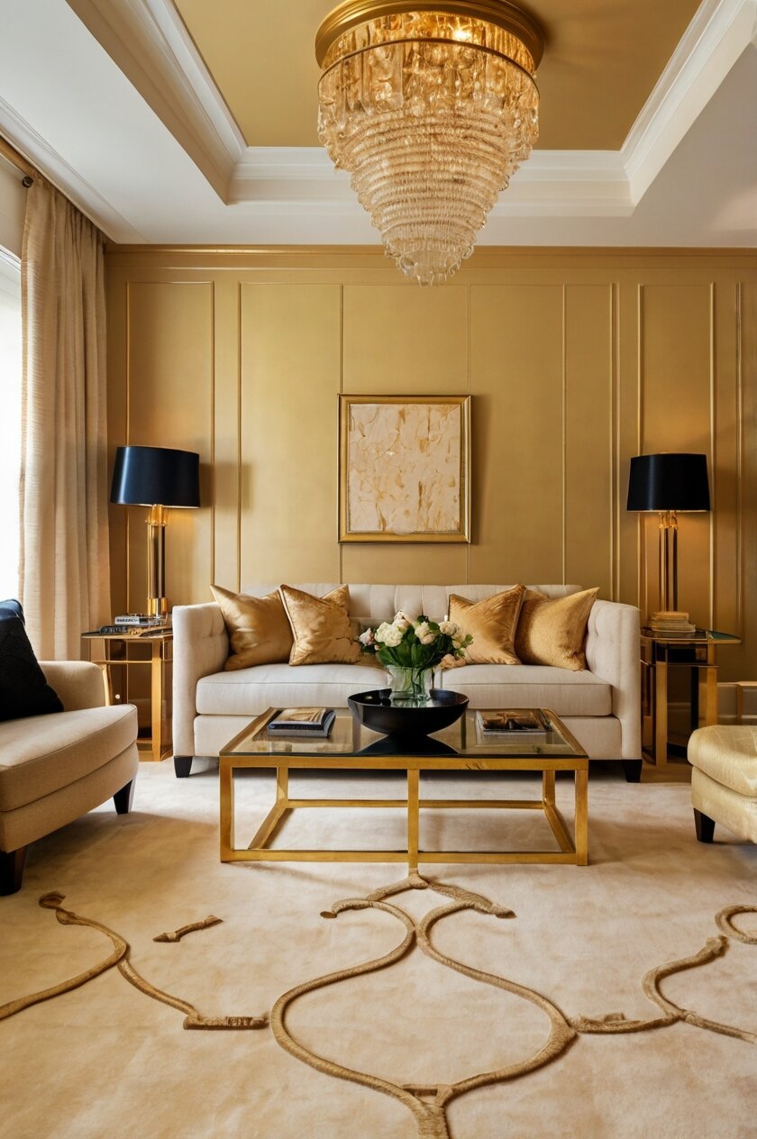
old walls create a warm, luxurious feeling in any space.
But how to choose the perfect carpet?
The wrong choice might clash or make your room feel off-balance.
The right choice will make your gold walls shine even brighter.
My guide will help you find that perfect match for your home.

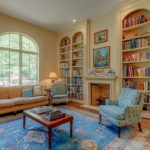
Cream Carpet: A Timeless Companion for Gold


Have you ever noticed how cream and gold create an instantly elegant combination?
A cream carpet offers the perfect backdrop for gold walls without competing for attention.
This pairing works because cream is a warm neutral that enhances gold’s natural glow.
When you choose cream carpeting, you’re creating a foundation that feels both luxurious and timeless.
The soft, neutral base allows your gold walls to be the star of the show.
Designers often recommend cream carpets because they make rooms feel more spacious and airy.
With gold walls, this effect becomes even more pronounced as light bounces between the surfaces.
Cream comes in many shades, from ivory to beige-tinged options.
Each variation offers a slightly different feel when paired with gold.
For brighter, more yellow-toned gold walls, a cream with slight yellow undertones creates harmony.
If your gold walls lean more toward bronze or copper, consider a cream with the faintest pink undertone.
Texture matters too when selecting your cream carpet.
A plush, high-pile carpet adds richness and depth to the pairing.
Alternatively, a low-pile Berber style offers a more contemporary, streamlined appearance.
Cream carpets do require more maintenance to keep looking fresh.
Consider stain-resistant treatments if you have children or pets.
The payoff is worth it—this combination creates a bright, open feeling that works in any room of your house.
Living rooms with cream carpets and gold walls feel welcoming yet sophisticated.
Bedrooms become peaceful retreats that glow softly in both natural and artificial light.
This color combination works with nearly any furniture style, from traditional to modern.
Dark wood furniture creates beautiful contrast against this light palette.
If your gold walls have a pattern or texture, a simple cream carpet provides the perfect balance.
You can also use area rugs with subtle patterns over your cream carpet to add visual interest.
For the finishing touch, add accessories in black or dark brown to ground the space.
Tap to Explore These Beauties
See my ideas in action 👇 Tap any image to explore full details.
Deep Blue Carpet: Bold Contrast That Wows
Have you ever seen how the sky looks against a sunset?
That’s the magic you get when pairing deep blue carpet with gold walls.
This combination creates a stunning contrast that immediately catches the eye.
Blue and gold sit opposite each other on the color wheel, making them complementary colors.
When you choose deep blue carpeting, you’re making a confident design statement.
Navy, sapphire, or royal blue options all work beautifully against gold walls.
This pairing brings a sense of luxury and drama to any room in your home.
Deep blue grounds the space while gold walls add warmth and radiance.
Together, they create a balanced room that feels both energizing and welcoming.
Designers love this combination for living rooms and dining areas where you entertain guests.
The rich contrast creates an unforgettable impression that people will remember.
In bedrooms, this pairing offers a cozy yet sophisticated retreat from the world.
The deep blue carpet absorbs light, creating a sense of calm against the reflective gold walls.
When selecting your deep blue carpet, consider how much natural light your room receives.
Rooms with lots of windows can handle darker navy blues without feeling too heavy.
For rooms with less natural light, consider a slightly brighter blue to maintain balance.
Texture plays an important role in this pairing as well.
A plush, velvet-like carpet enhances the luxurious feel of this color combination.
For furniture, consider lighter neutrals like cream or beige to break up the intensity.
Gold or brass accessories will echo your wall color and tie the whole room together.
Wood tones in medium finishes work particularly well against this color scheme.
For a truly regal look, add burgundy or purple accents through pillows or artwork.
This color combination works well with both traditional and contemporary design styles.
In traditional spaces, the pairing feels timeless and elegant.
In modern rooms, it creates a bold, artistic statement that showcases your design confidence.
Remember that this is a high-contrast look that makes a strong impression.
If you want a room that people notice and remember, this color combination delivers every time.
Chocolate Brown Carpet: Rich and Grounding
Have you ever walked into a room that instantly felt warm and welcoming?
Chocolate brown carpet paired with gold walls creates exactly that feeling.
This rich, earthy combination brings to mind luxury and comfort in equal measure.
Brown and gold naturally complement each other, creating a palette inspired by nature.
When you select chocolate brown carpeting, you’re adding a grounding element to your space.
The deep, rich tone provides a solid foundation that makes gold walls glow even more intensely.
This combination works particularly well in living rooms and family spaces.
The warmth of both colors creates an atmosphere that feels inviting and comfortable.
Chocolate brown carpet hides footprints and minor stains, making it practical for high-traffic areas.
The depth of brown also adds visual weight to rooms with high ceilings.
Gold walls catch and reflect light, while brown carpet absorbs it, creating perfect balance.
This pairing works with many different decorating styles, from traditional to rustic modern.
For furniture, consider lighter neutrals like cream or beige to provide contrast.
Wood tones that match your carpet create a cohesive look throughout the space.
Texture becomes important with this color combination.
A plush, soft carpet enhances the luxurious feel of the room.
For a more contemporary look, choose a brown carpet with subtle patterns or variations.
This color pairing creates a perfect backdrop for artwork and decorative elements.
Add pops of jewel tones like emerald green or sapphire blue for visual interest.
Plants and natural elements thrive against this earth-toned background.
Lighting choices become especially important with this combination.
Warm-toned lighting enhances the golden glow of the walls.
Cool-toned lighting creates more contrast between the warm walls and rich carpet.
In bedrooms, this pairing creates a cocoon-like atmosphere perfect for relaxation.
Home offices benefit from the focus and stability this color combination provides.
The timelessness of this pairing means you won’t need to redecorate as trends change.
Consider the specific undertones in your gold walls when choosing your brown carpet.
Warm gold pairs beautifully with chocolate brown that has red undertones.
Cooler gold shades work well with browns that have slight gray undertones.
Emerald Green Carpet: Luxurious Jewel Tones
Have you ever noticed how emeralds look even more stunning when set in gold?
The same principle applies when you pair emerald green carpet with gold walls.
This combination creates a rich, opulent look that feels both bold and timeless.
Emerald green brings the freshness of nature indoors while maintaining a sense of luxury.
When you choose this carpet color, you’re making a confident design statement.
Green and gold have been paired together throughout design history for good reason.
These colors create a natural harmony that feels both energizing and balanced.
Emerald green carpet provides a strong foundation that complements rather than competes with gold walls.
The depth of emerald green allows gold walls to reflect more light throughout the space.
This pairing works exceptionally well in formal living rooms and dining areas.
It creates an atmosphere of sophistication perfect for entertaining guests.
In bedrooms, this combination offers a unique alternative to more expected neutrals.
The richness of both colors creates a cocoon-like effect that feels both protective and special.
This color pairing adapts well to different design styles, from Art Deco to contemporary.
For furniture, consider neutral creams or light beiges to balance the intensity.
Wood furnishings in darker finishes like walnut or mahogany enhance the luxurious feel.
Brass or gold metal accents create continuity throughout the space.

Find Your Room’s Color Palette
Tap a vibe — get a curated 5-color palette with hex codes you can copy ✨
💭 I Wrote a Book About My Biggest Decorating Mistakes!
When I decorated my first home, I thought I knew what I was doing. Spoiler: I didn’t. 😅
💸 I bought a sofa way too big for my living room. Paint colors that looked amazing in the store but terrible on my walls.
When selecting your emerald green carpet, consider the specific shade of your gold walls.
Brighter, yellow-toned golds pair beautifully with true emerald greens.
Deeper, more antique golds work wonderfully with slightly darker forest greens.
Texture plays an important role in this luxurious pairing.
A plush, velvety carpet enhances the jewel-like quality of the emerald tone.
For a more contemporary look, consider a carpet with subtle patterns or variations.
This color combination creates an excellent backdrop for artwork and decorative objects.
Black and white photography stands out dramatically against this rich palette.
Plants thrive visually against this background, adding another layer of green to the space.
Lighting choices become particularly important with this combination.
Warm lighting enhances the cozy aspects of this pairing.
Cooler, brighter lighting brings out the vibrant nature of the emerald green.
This color combination makes a statement about your design confidence.
It shows you understand color theory and aren’t afraid of rich, saturated hues.
For a truly cohesive look, repeat small touches of emerald green in accessories around the room.
Burgundy Carpet: Regal and Dramatic
Have you ever wanted your home to feel like a royal palace?
Burgundy carpet paired with gold walls creates exactly that majestic atmosphere.
This color combination has historic roots in castles and grand estates across Europe.
When you select burgundy carpeting, you’re embracing a bold, confident aesthetic.
The deep red tones complement gold walls beautifully, creating a warm, rich environment.
This pairing works because both colors share warm undertones that harmonize naturally.
Burgundy provides a strong foundation that allows gold walls to shine without overwhelming.
The depth of burgundy creates visual weight, perfect for anchoring larger spaces.
This combination makes a dramatic statement in formal living rooms and dining areas.
In home libraries or studies, it creates a sophisticated, intellectual atmosphere.
Burgundy carpet with gold walls feels particularly appropriate in older or historic homes.
The richness of this pairing creates instant character in newer construction as well.
When selecting your burgundy carpet, consider the specific shade of your gold walls.
Brighter golds pair beautifully with burgundies that have slight purple undertones.
Deeper, more antique golds work wonderfully with burgundies that lean toward brown.
This color combination adapts to many different furniture styles.
Dark wood furnishings enhance the traditional elegance of this pairing.
Cream or ivory upholstery creates beautiful contrast against the rich background.
For a more contemporary look, add furniture with clean lines and minimal ornamentation.
Texture plays an important role in this luxurious combination.
A plush, velvety carpet enhances the regal quality of the burgundy tone.
Lighting choices significantly impact how this color pairing feels in your space.
Warm lighting enhances the cozy aspects of this rich combination.
Cooler lighting brings out more contrast between the walls and carpet.
Accessories in gold or brass finish tie the room together beautifully.
Consider artwork with gold frames to continue the theme throughout the space.
For visual interest, add touches of deep green or navy blue through accessories.
This color combination makes a memorable impression on guests.
It conveys confidence and a strong sense of style.
The timelessness of this pairing means you won’t need to redecorate as trends change.
For balance, incorporate some lighter elements through window treatments or pillows.
This color combination works year-round but feels particularly appropriate during fall and winter.
The warmth and richness create a cozy sanctuary during colder months.
Light Gray Carpet: Modern and Versatile
Have you ever wondered what could make your gold walls feel more contemporary?
Light gray carpet provides the perfect modern counterpoint to warm gold walls.
This unexpected pairing creates a sophisticated look that bridges traditional and contemporary styles.
Gray acts as a neutral canvas that allows gold to truly shine.
When you choose light gray carpeting, you’re creating balance in your color scheme.
The coolness of gray tempers the warmth of gold, resulting in a harmonious space.
This combination feels fresh and current while honoring the classic beauty of gold.
Light gray carpeting makes rooms feel more spacious and airy.
The subtle contrast keeps the eye moving throughout the space.
This pairing works particularly well in living rooms and bedrooms.
It creates a serene backdrop for both relaxation and entertaining.
In home offices, this combination promotes focus while maintaining visual interest.
Light gray carpet offers practical benefits beyond just looks.
It hides dust and minor dirt better than darker or lighter extremes.
This makes it perfect for busy households with children or pets.
When selecting your light gray carpet, consider the undertones in your gold walls.
Warmer golds pair beautifully with grays that have slight beige undertones.
Cooler, more metallic golds work well with pure, cool grays.
💭 Ever wondered what your room would actually look like rearranged?
I built a free tool that lets you drag furniture around a 2D floor plan. No signup, no catch.
See the Room Planner →Texture becomes especially important with this more subtle color pairing.
A plush, high-pile carpet adds tactile comfort to the visual serenity.
For a more contemporary look, consider a gray carpet with subtle patterns or variations.
This color combination creates the perfect backdrop for bold furniture choices.
Jewel-toned furniture like sapphire blue or emerald green pops beautifully against this palette.
Black accents add dramatic punctuation to this softer color scheme.
Wood furniture in any finish works well against this versatile background.
For a cohesive look, incorporate metallic accessories in gold, brass, or bronze.
This echoes your wall color and ties the room together.
The versatility of this pairing allows for seasonal decor changes without clashing.
Summer accessories in bright colors look fresh against this neutral foundation.
Winter decor in deeper tones adds coziness without overwhelming the space.
Lighting plays a crucial role in how this combination feels in your home.
Warm lighting enhances the gold walls and adds coziness to the gray carpet.
Cooler lighting emphasizes the contemporary aspects of this pairing.
This combination works in any room size, from small apartments to spacious homes.
It’s a designer favorite for its ability to feel both timeless and current.
What’s Your Decor Personality?
5 questions · 30 seconds · Instant style match 🏡
Black Carpet: Bold Sophistication
Have you ever wanted to make a truly dramatic statement in your home?
Black carpet paired with gold walls creates undeniable impact and luxury.
This bold combination exudes confidence and sophistication.
When you choose black carpeting, you’re creating a strong foundation that grounds your space.
The contrast between warm gold and deep black creates visual tension that designers love.
This pairing works because it balances light and dark in perfect harmony.
Gold walls reflect light, while black carpet absorbs it, creating dynamic energy.
This combination feels particularly appropriate in formal living rooms and dining areas.
It creates an atmosphere of elegance perfect for entertaining guests.
In home theaters or media rooms, black carpet serves a practical purpose while looking stylish.
The dramatic contrast makes architectural features stand out beautifully.
Black carpet provides the perfect backdrop for furniture and accessories to shine.
Light-colored furniture creates striking contrast against the dark floor.
Wood furniture in medium to light finishes pops beautifully against black carpet.
Gold or brass accessories echo your wall color and create continuity.
When selecting your black carpet, consider the specific texture that best suits your space.
A plush, velvet-like carpet enhances the luxurious feel of this bold combination.
For a more contemporary look, choose a black carpet with subtle patterns or variations.
This adds dimension without compromising the dramatic effect.
Lighting becomes especially important with this high-contrast pairing.
Strategic lighting prevents the black carpet from making spaces feel smaller.
Table lamps, floor lamps, and wall sconces create pools of light that balance the darkness.
This combination works best in rooms with ample natural or artificial light.
In spaces with limited light, consider black area rugs over a lighter base carpet.
This gives you the dramatic effect while maintaining brightness in the room.
Black and gold create a timeless palette that transcends passing trends.
This combination works well with many design styles, from Art Deco to modern.
For visual interest, add a third accent color like emerald green or deep purple.
This creates depth and prevents the space from feeling two-dimensional.
The boldness of this pairing makes a statement about your design confidence.
It creates memorable spaces that guests will admire and remember.
Though dramatic, this combination can still feel welcoming when balanced with softer elements.
Consider adding texture through pillows, throws, and window treatments.
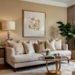
Beige Carpet: Warm and Harmonious
Have you ever noticed how some color combinations just feel naturally right?
Beige carpet with gold walls creates that perfectly harmonious feeling.
This pairing works because both colors share warm undertones that complement each other.
When you choose beige carpeting, you’re creating a cohesive look that flows beautifully.
The subtle contrast allows both elements to contribute to the overall warmth of the space.
Beige isn’t boring when paired with gold—it’s sophisticated and timeless.
This combination creates rooms that feel instantly welcoming and comfortable.
The warmth of both colors makes spaces feel cozy regardless of size.
This pairing works exceptionally well in living rooms and family spaces.
It creates an inviting atmosphere perfect for gathering with loved ones.
In bedrooms, this combination offers a serene retreat that promotes relaxation.
Beige carpet provides a neutral foundation that allows your gold walls to shine.
This color pairing adapts to changing decor styles and seasonal accessories.
It works beautifully with virtually any furniture style, from traditional to contemporary.
Wood furnishings in any finish complement this versatile background.
For visual interest, add textural elements through furniture and accessories.
When selecting your beige carpet, consider the specific undertones in your gold walls.
Warmer, yellow-toned golds pair beautifully with beiges that have yellow undertones.
More antique or bronze-toned golds work well with beiges that have pink or taupe undertones.
Texture plays an important role in preventing this combination from feeling flat.
A plush, high-pile carpet adds dimension and tactile comfort.
For a more contemporary look, consider a beige carpet with subtle patterns or variations.
This color combination creates the perfect backdrop for artwork and decorative objects.
Colorful art pops against this neutral foundation without competing.
Plants and natural elements thrive visually against this warm-toned background.
Lighting enhances the cozy aspects of this pairing, especially in the evening.
Warm-toned lighting makes the space glow with inviting ambiance.
For balance, incorporate some cooler tones through accessories or artwork.
This prevents the room from feeling too warm or one-dimensional.
The timelessness of this pairing means you won’t need to redecorate as trends change.
It’s a designer favorite for creating spaces that feel both current and enduring.
This combination works well in any room size or shape.
It makes small spaces feel more open and large spaces feel more intimate.
This or That?
Pick your fave — see what other readers chose! 👀
Sage Green Carpet: Calm and Refreshing
Have you ever walked through a garden at sunset and felt perfectly at peace?
Sage green carpet paired with gold walls recreates that tranquil, natural feeling.
This subtle combination brings the outdoors in, creating spaces that feel refreshing and balanced.
When you choose sage green carpeting, you’re introducing an element of nature to your interior.
The soft, muted green provides gentle contrast to warm gold walls.
This pairing works because it combines warmth and coolness in perfect harmony.
Gold walls provide energy while sage green offers calm—a balanced visual experience.
This combination feels particularly appropriate in bedrooms and sitting rooms.
It creates a restful atmosphere perfect for relaxation and rejuvenation.
In home offices, this pairing promotes focus and creativity without overstimulation.
The subtle contrast allows both colors to contribute without competing for attention.
Sage green carpet provides a soft foundation that complements rather than overwhelms.
This color combination adapts beautifully to different design styles.
For a traditional look, pair with antique wood furniture and classic patterns.
For contemporary spaces, combine with clean lines and minimal accessories.
When selecting your sage green carpet, consider the specific shade of your gold walls.
Brighter golds pair beautifully with sage greens that have more yellow undertones.
Deeper, more antique golds work wonderfully with sage greens that lean toward gray.
Texture becomes especially important with this subtle color pairing.
A plush, soft carpet enhances the peaceful quality of the sage tone.
For added interest, consider a sage carpet with subtle patterns or variations.
This color combination creates a perfect backdrop for natural materials.
Wood, stone, and plant elements thrive against this nature-inspired palette.
For furniture, consider warm neutrals or light wood tones that bridge both colors.
Accessories in deeper greens create depth and visual layering.
Touches of cream or ivory brighten and lighten the overall effect.
This color pairing has timeless appeal that transcends passing trends.
It creates spaces that feel current yet connected to nature and tradition.
Lighting choices significantly impact how this subtle combination reads in your space.
Warm lighting enhances the gold walls and adds coziness to the green carpet.
Natural daylight brings out the fresh, organic quality of this pairing.
This combination works well year-round but feels particularly appropriate in spring and summer.
The freshness creates a cool sanctuary during warmer months.
For a cohesive look, incorporate small touches of sage green in accessories around the room.
Lavender Carpet: Unexpected Elegance
Have you ever wanted a room that feels both luxurious and uniquely yours?
Lavender carpet paired with gold walls creates an unexpected combination that exudes elegance.
This sophisticated pairing brings together warmth and coolness in perfect harmony.
When you choose lavender carpeting, you’re making a distinctive design statement.
The soft purple tones complement gold walls beautifully, creating visual interest.
This pairing works because purple and gold have historically been associated with royalty.
Together, they create spaces that feel special and curated rather than ordinary.
Lavender adds a cool counterpoint to warm gold, resulting in perfect temperature balance.
This combination feels particularly appropriate in bedrooms and dressing areas.
It creates a romantic, dreamy atmosphere perfect for personal spaces.
In formal living rooms or dining areas, this pairing offers unexpected sophistication.
The subtle contrast allows both colors to contribute without competing for attention.
Lavender carpet provides a soft foundation that lets gold walls glow.
This color combination adapts beautifully to different design styles.
For a traditional look, pair with antique furnishings and classic patterns.
For contemporary spaces, combine with clean lines and minimal accessories.
When selecting your lavender carpet, consider the specific shade of your gold walls.
Brighter golds pair beautifully with lavenders that have more pink undertones.
Deeper, more antique golds work wonderfully with lavenders that lean toward gray.
Texture becomes especially important with this distinctive color pairing.
A plush, soft carpet enhances the luxurious quality of the lavender tone.
For added interest, consider a lavender carpet with subtle patterns or variations.
This color combination creates a perfect backdrop for gold or brass accessories.
Metallic elements tie the space together, creating continuity between walls and decorative items.
For furniture, consider cream, white, or light wood tones to keep the space feeling open.
Deeper wood tones create more dramatic contrast against this delicate palette.
This combination feels feminine without being overly girly or childish.
It creates sophisticated spaces with personality and visual interest.
Lighting choices significantly impact how this unique combination reads in your space.
Warm lighting enhances the gold walls and softens the lavender carpet.
Cooler lighting brings out the purple tones for a more dramatic effect.
This pairing shows design confidence and a willingness to step beyond ordinary choices.
It creates memorable rooms that guests will admire and remember.
For balance, incorporate some neutral elements through furniture and larger accessories.
💭 I Wrote a Book About My Biggest Decorating Mistakes!
When I decorated my first home, I thought I knew what I was doing. Spoiler: I didn’t. 😅
💸 I bought a sofa way too big for my living room. Paint colors that looked amazing in the store but terrible on my walls.
Charcoal Gray Carpet: Modern Contrast
Have you ever noticed how a dark frame makes artwork stand out more dramatically?
Charcoal gray carpet creates that same effect for your gold walls.
This bold pairing brings together warm and cool tones for striking visual impact.
When you choose charcoal gray carpeting, you’re creating strong foundation that anchors your space.
The deep gray provides dramatic contrast that makes gold walls appear more luminous.
This combination works because it balances light and dark in perfect harmony.
Gold walls reflect light while charcoal carpet absorbs it, creating dynamic visual energy.
This pairing feels particularly appropriate in living rooms and entertaining spaces.
It creates a sophisticated atmosphere that feels both current and timeless.
In home offices, this combination promotes focus while maintaining visual interest.
The strong contrast creates clearly defined spaces that feel intentional and designed.
Charcoal gray carpet provides a neutral foundation that lets your gold walls be the star.
This color combination adapts beautifully to different design styles.
For a contemporary look, pair with clean-lined furniture and minimal accessories.
For traditional spaces, combine with classic furniture shapes and patterns.
When selecting your charcoal carpet, consider the specific shade of your gold walls.
Brighter golds create more dramatic contrast against deep charcoal.
Deeper, more antique golds offer a more subtle pairing with rich sophistication.
Texture becomes especially important with this high-contrast color pairing.
A plush, soft carpet adds tactile comfort to the visual drama.
For added interest, consider a charcoal carpet with subtle patterns or variations.
This color combination creates a perfect backdrop for both neutral and colorful furniture.
Light-colored furniture stands out dramatically against the dark floor.
Wood furniture in any finish works beautifully against this versatile background.
For accessories, consider incorporating elements that bridge both colors.
Metallics in silver or brushed nickel add contemporary flair.
Gold or brass accessories create continuity with your walls.
This combination works well in any room size, though it’s particularly effective in larger spaces.
In smaller rooms, this pairing can still work if balanced with adequate lighting.
Strategic lighting prevents the charcoal carpet from making spaces feel closed in.
This color pairing has staying power that transcends passing trends.
It creates spaces that feel current yet connected to classic design principles.
For balance, incorporate some mid-tone elements through furniture and accessories.
This prevents the room from feeling too starkly divided between light and dark.
Quick Design Dilemma
Cast your vote — see what other readers think! 🤔
Teal Carpet: Vibrant and Fresh
Have you ever seen how peacock feathers shimmer with teal and gold?
Teal carpet paired with gold walls recreates that magical, eye-catching combination.
This vibrant pairing brings together two rich colors that enhance each other beautifully.
When you choose teal carpeting, you’re making a confident color statement.
The blue-green tone provides gorgeous contrast to warm gold walls.
This combination works because teal and gold sit across from each other on the color wheel.
Complementary colors create natural visual harmony and excitement.
Teal adds a cool counterpoint to warm gold, resulting in perfect temperature balance.
This pairing feels particularly appropriate in living rooms and entertaining spaces.
It creates an energetic atmosphere that sparks conversation and feels lively.
In bedrooms, this combination offers a unique alternative to more expected neutrals.
The rich contrast creates spaces that feel both cozy and invigorating.
Teal carpet provides a strong foundation that complements rather than competes with gold walls.
This color combination adapts beautifully to different design styles.
For a bohemian look, add textural elements and global-inspired accessories.
For contemporary spaces, combine with clean lines and minimal ornamentation.
When selecting your teal carpet, consider the specific shade of your gold walls.
Brighter golds pair beautifully with vibrant, clear teals.
Deeper, more antique golds work wonderfully with slightly muted or dusty teals.
Texture plays an important role in this rich color pairing.
A plush, velvety carpet enhances the jewel-like quality of the teal tone.
For added interest, consider a teal carpet with subtle patterns or variations.
This color combination creates a perfect backdrop for neutral furniture.
Cream, beige, or gray furniture provides relief from the color intensity.
Wood furniture in medium to dark finishes grounds this vibrant pairing.
For accessories, consider incorporating elements in coral or peach.
These colors complement both teal and gold, creating a cohesive color story.
Plants and natural elements thrive visually against this rich background.
Lighting choices significantly impact how this vibrant combination reads in your space.
Warm lighting softens the contrast and creates a cozy ambiance.
Bright, natural light brings out the full vibrancy of both colors.
This pairing shows design confidence and a strong understanding of color.
It creates memorable spaces that express personality and visual interest.
For balance, incorporate some neutral elements through furniture and larger accessories.
This prevents the room from feeling overwhelmingly colorful or busy.
Ivory Carpet: Soft and Elegant
Have you ever noticed how museum artifacts look stunning against ivory backgrounds?
Ivory carpet creates that same effect for your gold walls.
This classic pairing brings together two soft neutrals that enhance each other beautifully.
When you choose ivory carpeting, you’re creating an atmosphere of quiet elegance.
The subtle cream-white tone complements gold walls without competing for attention.
This combination works because both colors share warm undertones that harmonize naturally.
Ivory adds brightness while maintaining the warm feeling that gold walls provide.
This pairing feels particularly appropriate in formal living rooms and bedrooms.
It creates a sophisticated atmosphere that feels both timeless and fresh.
In dining rooms, this combination offers an elegant backdrop for entertaining.
The subtle contrast allows architectural details and furnishings to stand out.
Ivory carpet provides a soft foundation that makes gold walls appear even more luminous.
This color combination adapts beautifully to different design styles.
For a traditional look, pair with classic furniture shapes and patterns.
For contemporary spaces, combine with clean lines and minimal accessories.
When selecting your ivory carpet, consider the specific shade of your gold walls.
Brighter golds pair beautifully with true ivories that have yellow undertones.
Deeper, more antique golds work wonderfully with ivories that have slight pink undertones.
Texture becomes especially important with this subtle color pairing.
A plush, soft carpet adds dimension and prevents the combination from feeling flat.
For added interest, consider an ivory carpet with subtle patterns or variations.
This color combination creates a perfect backdrop for bold furniture and accessories.
Jewel-toned furniture pieces become focal points against this neutral background.
Wood furniture in any finish works beautifully with this versatile pairing.
For a cohesive look, incorporate gold accessories that echo your wall color.
Mirrors and glass elements enhance the bright, reflective quality of this combination.
Plants and natural elements provide welcome contrast against these light tones.
Lighting choices enhance the airy, open feeling of this pairing.
Both natural and artificial light make these spaces glow with warmth.
This combination makes rooms feel larger and more spacious.
It’s particularly effective in smaller rooms or spaces with limited natural light.
The timelessness of this pairing means you won’t need to redecorate as trends change.
It creates spaces that feel both current and enduring.
For added dimension, incorporate textural elements through furnishings and accessories.
This prevents the room from feeling too flat or one-dimensional.