
Upload a photo of your room, tap a wall, and see it in a new color with your room’s own light and shadows. Your photo never leaves your device.
Tap a wall to paint it
1Your room
2Pick a color
3Tap a wall
Tap an open spot of a wall. Missed a patch? Tap it too. Paint on the sofa? Move Spread left, or wipe it with the eraser.
Quick answer: to see a paint color on your own walls before you buy it, upload a photo of your room, tap a wall and pick a color. The visualizer above finds the wall and repaints it, keeping the light and shadows that are already in your photo, so the color sits in your room the way paint would. It is free and runs in your browser: your photo is never uploaded anywhere.
How to use the paint visualizer
- Add your room. Tap Upload or take a photo. On a phone you can take the picture right there. No photo handy? Start with one of the sample rooms.
- Pick a color. Browse the six color families, or type any color code (like
#a9b59b) if you already have one from a paint chip or a photo. - Tap a wall. The whole wall changes color. Tap another wall to paint it too. Missed a patch next to a window or behind a lamp? Tap that patch as well: the same color joins the same wall.
- Fix the edges. If the paint spread onto a sofa or the ceiling, move Spread to the left and it redoes your last tap tighter. For the last bits, use the Eraser, or the Brush to paint by hand.
- Compare and keep it. Before/after puts a slider across the photo. Save image keeps the result, and Copy link shares a sample room with your colors.
How the visualizer keeps your room’s light
A flat color pasted over a wall looks like a sticker, because real walls are never one color: they are brighter by the window, darker in the corners, and warmer under a lamp. The visualizer keeps all of that. It measures how bright every point of the wall is compared with the wall’s average, and gives the new color the same light and shade. A shadow stays a shadow, and the glow from a lamp stays a glow, in the new color.
To find the wall, it grows outward from where you tapped over pixels that match the wall and stops where it meets an edge or a clearly different color, like a picture frame, a door or a sofa. It pays more attention to color than to brightness, because the same wall in shadow is still the same wall.
The rules that decide how a color will look
LRV: how much light a color gives back
Every paint chip lists an LRV, or light reflectance value, from 0 (black, which absorbs all light) to 100 (a perfect white, which reflects all of it). The visualizer shows the LRV of the color you pick, worked out from the color itself. Colors with an LRV of 55 or more bounce light around a room and make it feel larger. Mid-tones (20 to 54) read clearly as a color. Colors under 20 absorb more light than they return, so they make a room feel smaller and cozier, and they need good light to avoid looking flat.
Warm, cool and neutral
A color’s undertone is the hue that shows once it is on a big wall. Warm colors lean red, orange or yellow and feel cozy. Cool colors lean green, blue or violet and feel calm and fresh. A neutral has almost no hue at all. The visualizer labels each color warm, cool or neutral by its hue, so two whites that look alike on a tiny swatch are easy to tell apart.
The light in your room changes the paint
In the Northern Hemisphere, north-facing rooms get cooler, bluer daylight all day, so cool colors can look cold there and warm colors balance them. South-facing rooms get warm, bright light that makes warm colors look stronger. Bulbs matter too: 2700K bulbs give a warm yellow light, and 4000–5000K bulbs give a whiter, cooler one. Take your photo in the light you actually live in, because that is the light the visualizer keeps.
Colors by LRV: chart
A few colors from the swatch board, with the LRV and undertone the visualizer shows for each:
| Color | Code | LRV | Reads as |
|---|---|---|---|
| Soft White | #F4F1EA | 88 | light, neutral |
| Greige | #D6CFC4 | 63 | light, warm |
| Sage | #A9B59B | 44 | mid-tone, cool |
| Coastal Blue | #8FA9B8 | 38 | mid-tone, cool |
| Terracotta | #C0704F | 23 | mid-tone, warm |
| Forest | #3E5446 | 8 | dark, cool |
| Navy | #2B3A55 | 4 | dark, cool |
How to take a photo that paints well
- Use daylight, and turn off lamps with a very different color of light, so the wall is lit one way.
- Stand in a corner and show as much wall as you can. The more of the wall is in the picture, the better you can judge the color.
- Skip the flash. It flattens the shadows the visualizer keeps and puts a bright spot on the wall.
- Keep it sharp and level. A blurry photo blurs the edges where the paint has to stop.
Three worked examples
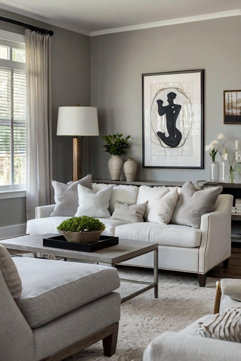
A gray living room in sage. In the sample living room, one tap in the middle of the back wall turns it Sage while the sofa, the cushions and the picture frame stay as they are. A second tap on the window wall paints it the same color, and a third in the shaded strip behind the lamp joins it, because the same color on the same walls is treated as one paint.
A kitchen accent wall. In the sample kitchen, a tap on the wall beside the doorway paints it Terracotta while the green cabinets stay green. Before/after shows how much warmer the room feels. Tap the island’s panels in Navy to try the cabinets too, and use the Brush on any trim the tap missed.
The outside of a house. The same steps work on a photo of your siding, trim or front door: tap the siding for the body color, then the trim, then the door. The exterior house color visualizer has sample houses and starts on the Textured setting, so one tap covers a whole wall of siding, shingle or brick.
Common mistakes when choosing paint colors
- Choosing from a tiny chip. A color looks darker and stronger across a whole wall than on a two-inch square. See it on the whole wall first.
- Ignoring the undertone. Two grays can look the same on the chip and turn out green and purple on the wall. Check the warm, cool or neutral label.
- Judging it in the wrong light. Paint changes from morning to night and under different bulbs. Look at your photo in the room’s real light.
- Trusting the screen for the final decision. Screens and phone cameras shift colors. Use the visualizer to narrow it down to two or three, then paint samples at least 2 ft square on two walls and look at them in the morning, the afternoon and at night.
- Forgetting the fixed things. Floors, counters, tile and big furniture stay. Keep them in the photo, so the new color is judged against them.
Picked your color? The free paint calculator tells you how many gallons to buy, and the 2D room planner lays out the furniture.
Plan the room freeRead next
- Greige paint colors that settle the warm versus cool debate
- Warm neutral paint colors that never read cold
- Living room paint color ideas
- Paint colors for small rooms
- Accent walls in the living room
Paint visualizer questions
What is a paint visualizer?
A paint visualizer shows a paint color on a photo of a room, so you can see it on real walls before you buy paint. This one lets you use a photo of your own room, finds the wall you tap and keeps the light and shadows of your photo, so the color looks like paint rather than a flat patch.
How can I see paint colors in my room?
Take a photo of the room in daylight, upload it to the visualizer above, pick a color and tap the wall. You can try as many colors as you like and compare each one with the original using the before/after slider. Once you have two or three favorites, paint large samples on the real wall to decide.
Can I upload a photo to a paint visualizer?
Yes. Tap Upload or take a photo. On a phone you can take the picture right there. The photo is opened in your own browser and never uploaded to a server, so it stays private, and nothing is stored after you close the page.
Is there a free paint visualizer app?
This visualizer is free and works in the browser on any phone, tablet or computer, so there is nothing to install. Save the result with Save image: on a phone it opens the share sheet, where you can keep it in your photos or send it to someone.
Can I use it as an exterior house color visualizer?
Yes. Upload a photo of the outside of your house and tap the siding, then the trim, then the front door, each in its own color. A photo taken on a bright, overcast day works best, because hard shadows can make one wall look like two.
What color should I paint my living room?
Start with the light. North-facing living rooms suit warm whites, greige and warm mid-tones, while south-facing rooms can take cooler greens and blues. A color with an LRV of 55 or more keeps a room bright, and deeper colors make it cozier. Try your shortlist on a photo of the room, then paint samples.
Why does paint look different on the wall than on the chip?
A whole wall shows a color much bigger than a chip, so it looks darker and stronger, and the light in your room changes it through the day. Nearby colors also change how it reads: a floor or a sofa can pull a gray toward green or purple. That is why seeing it on your own room’s photo helps.
How accurate is a paint visualizer?
It is accurate about where the color goes and how the room’s light falls on it, which is what makes a shortlist. The exact shade depends on your screen and camera, which both shift colors a little. Use it to narrow down the choice, and make the final decision with a real sample on the wall.