
Pick your wall color and see four trims with it, painted on a room: a white with your walls’ undertone, black, the same color as the walls, and two shades deeper. Each shows whether it frames the room or melts into the walls, and the closest Sherwin-Williams, Benjamin Moore and Behr paint. Your photo never leaves your device.
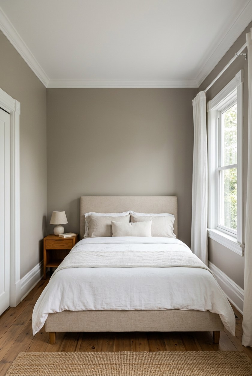
Pick your wall color, then a trim
1Your room
2Pick your wall color
3Pick a trim
Colored walls: white trim lets the wall color be the star, or wrap the room in it, trim and all, to be more immersed in the color.
For cool walls Benjamin Moore suggests White Heron OC-57 or Decorator’s White OC-149.
Closest paints to this trim
Paint the trim one sheen higher than the walls: Benjamin Moore names satin, semi-gloss and high gloss as the popular trim sheens. A screen shows each brand's digital version of a paint: check a real chip on your trim before you buy. We are not connected to any of these brands.
4Tap to paint
On a sample room the walls and the trim are painted for you (the crown molding stays with the ceiling). On your own photo, tap each wall in your wall color, then pick a trim above and tap each piece: the baseboards, the door and window casings. Thin trim is easier with the brush.
Quick answer: there are four trim colors for any wall: a white that shares the walls’ undertone (the classic), black (crisp lines, strongest on white walls), the same color as the walls in a higher sheen (calm, no frame) and a shade deeper (a tonal frame). Whether a trim frames the room or melts into the walls depends on how far its LRV is from the walls’: more than 30 points frames the room in any light, under 20 melts. Pick your wall color above to see all four on a room, with their gaps and the closest real paints.
How to use the trim color picker
- Pick your wall color. Tap a swatch, type its color code from a paint chip, or use the color picker. On a sample room the walls repaint at once.
- Say how big the room is. In a small room (a bath, a hall, a small bedroom) the picker suggests the same color or a deeper shade first; in an average or large room, it goes by the wall color.
- Tap a trim. Each of the four shows its LRV, its gap from the walls and what that gap does: frames the room, frames it in a bright room, or melts into the walls. On a sample room the baseboards and the door and window casings are repainted in it.
- Read the paints. Under the trims are the closest Sherwin-Williams, Benjamin Moore and Behr colors to the one you chose, and Benjamin Moore’s own whites for your walls’ undertone.
- Try your own room. Use your photo, tap the walls in your wall color, then pick a trim and tap each piece of trim. Thin trim is easier with the brush.
The four trims, in Benjamin Moore’s words
Benjamin Moore’s trim guide, Interior Trim Paint Color Ideas & Inspiration, covers each of the picker’s four options.
- A white with your walls’ undertone.
Look to the undertone of your wall paint color to determine which shade of white will look best on your trim. If your wall color is warmer—with undertones of red, yellow, or orange—choose a white trim color with a similar undertone. If your walls are a cooler color—blue, green, or purple—stick with a crisp white hue.
- Black.
Black trim against white walls is hugely popular for interiors and exteriors.
- The same color as the walls.
When using one color for the walls and trim, we love painting the interior doors the same color as well for a completely uninterrupted look
, says Benjamin Moore color expert Arianna Barone. - A shade deeper.
Painting the walls and trim different shades of the same color can help make smaller spaces feel larger. This monochromatic approach blurs the edges of the room and tricks the eye, a great choice for pantries, entryways, bathrooms, and smaller bedrooms.
The picker makes each one from your wall color. The white is a near-white in the walls’ own hue (CIELAB lightness 94, a chroma of 4 at most). The black is a soft black, #2B2A29. “The same color” is the wall color itself. “A shade deeper” is two steps darker, 20 points of CIELAB lightness, in the same hue. Those recipes are ours, not Benjamin Moore’s.
Frames the room, or melts into the walls
LRV is how much light a color reflects, from 0 for black to 100 for a perfect white. How far apart two LRVs must be before one surface stands out against another is set out in the UK’s building guidance for accessible buildings. Approved Document M, Volume 2, paragraph 0.26 defines “contrast visually” like this:
“the difference in light reflectance value between the two surfaces is greater than 30 points. Where illuminance on surfaces is greater than 200 lux, a difference in light reflectance value should be a minimum of 20 points.”
It was written so people with low vision can find a door. It is not a rule for decorating, but it is a measured answer to “will my trim show”, so the picker uses it as a yardstick:
- Over 30 points: frames the room in any light. The trim outlines the doors, the windows and the floor line.
- 20 to 30 points: frames it in a bright room. In daylight the trim reads; on a dull evening it fades toward the walls.
- Under 20 points: melts into the walls. That is the point of the same-color look: no frame, one color.
One result surprises people: white trim on light greige or Light Gray Walls is only 22 to 26 points away, so it frames the room in good light but goes soft at dusk. White trim on mid-tone walls (pewter, sage, terracotta, navy) clears 30 easily.
Trim colors by wall color
The LRV gap between each trim and the walls, what it does, and the two trims the picker suggests trying first in an average or large room. “Frames” = over 30 points, “bright room” = 20 to 30, “melts” = under 20.
| Walls | LRV | White trim | Black trim | A shade deeper | Try first |
|---|---|---|---|---|---|
| Bright White #F8F8F5 | 94 | 1 · melts | 92 · frames | 41 · frames | same color, black |
| Soft White #F4F1EA | 88 | 7 · melts | 86 · frames | 39 · frames | same color, black |
| Greige #D6CFC4 | 63 | 22 · bright room | 61 · frames | 31 · frames | white, deeper |
| Dove Gray #C9CAC6 | 59 | 26 · bright room | 57 · frames | 30 · bright room | white, deeper |
| Pewter #A3A5A1 | 37 | 48 · frames | 35 · frames | 21 · bright room | white, deeper |
| Sage #A9B59B | 44 | 41 · frames | 42 · frames | 24 · bright room | white, same color |
| Powder Blue #B9CDD8 | 59 | 26 · bright room | 57 · frames | 29 · bright room | white, deeper |
| Warm Sand #DCC7A6 | 59 | 26 · bright room | 57 · frames | 30 · bright room | white, same color |
| Terracotta #C0704F | 23 | 62 · frames | 21 · bright room | 14 · melts | white, same color |
| Navy #2B3A55 | 4 | 81 · frames | 2 · melts | 3 · melts | white, same color |
The same color as the walls is always a gap of 0: it melts by design. Color names here are the picker’s own, not a paint brand’s; the picker names the closest brand paints for the trim you choose.
Which white for your trim
Benjamin Moore’s rule is the undertone: a warm wall (red, yellow or orange in it) gets a white with a similar warmth, a cool wall (blue, green or purple) a crisp white. Its own picks: Cloud White OC-130 and Simply White OC-117 are both great choices for trim next to warmer wall colors
; White Heron OC-57 and Decorator’s White OC-149 are two favorite trim paint colors for walls with cool undertones
; and for a goes-with-anything soft white trim
, White Dove OC-17. The picker reads your walls’ undertone from their CIELAB hue (our reading: a hue under 105° or from 345° is warm, the rest cool, a chroma under 3 has none) and names those whites under the trims.
The sheen: one step up from the walls
Benjamin Moore: There is no such thing as “trim paint.” The quality paint you use on your walls or ceiling is perfectly fine to use on trim, with many homeowners opting for a higher sheen to differentiate from the paint on their walls.
For trim, popular choices include satin, semi-gloss, and high gloss
. With the same color on walls and trim, the sheen is the only thing that sets the trim apart, so do not skip it. The paint sheen finder picks the sheen for each surface.
Three worked examples
Sage walls in a bedroom. Sage (LRV 44) sits mid-scale. A white with its cool undertone (LRV 85) is 41 points away and black 42: both frame the room in any light. Two shades deeper (LRV 20) is 24 away, a soft frame in daylight. The sample opens with the white trim; tap Black trim to see the same room outlined.
White walls, black trim. Bright White walls (LRV 94) and a soft black trim (LRV 2) are 92 points apart, the strongest contrast the picker can show. A white trim on white walls is 1 point away: that is the all-white look, set apart by sheen alone.
Greige walls, white trim. Greige (LRV 63) with a warm white trim (LRV 85) is a gap of 22: the classic pairing, but the trim reads clearly only in a bright room. If you want it to show at dusk too, a shade deeper (31) or black (61) does it.
Common mistakes when choosing a trim color
- A cool white trim against warm walls (or the reverse). Against a warm beige, a blue-white trim can look gray and cold. Match the undertone, as Benjamin Moore says.
- The same color in the same sheen. Walls and trim in one color need different sheens, or the trim disappears completely.
- Black trim in a dark room. On navy, forest or charcoal walls black trim is within a few points: it melts rather than outlines.
- Judging the trim from a chip. Trim is thin, so a color reads stronger on a chip than on a baseboard. Paint a sample on a piece of the trim and look at it at night as well as by day.
- Forgetting the ceiling. Crown molding usually goes with the ceiling. The ceiling color picker runs the same idea for the ceiling.
Painting the whole room? The room paint visualizer paints every wall on your photo, and the color drenching visualizer paints walls, trim and ceiling in one color. Planning the furniture too? The free 2D room planner lays out the room.
Paint the whole roomRead next
- Ideas for white walls with black trim
- Black trim ideas for an interior
- What color walls go with black trim
- Dark doors with white trim
- Wall moulding ideas
- Picture frame molding
Trim color questions
Should trim be the same color as the walls?
It can be. Walls and trim in one color give a calm, uninterrupted look that suits small rooms; Benjamin Moore suggests painting the doors the same color too. Use a higher sheen on the trim so it still reads as trim.
What color trim goes with white walls?
Either the same white in a higher sheen, for the all-white look, or black, which on white walls gives the strongest contrast there is (92 LRV points on the picker’s Bright White). A second, slightly different white melts into the walls.
Does black trim look good with white walls?
It is the strongest frame you can give a white room, and Benjamin Moore calls black trim against white walls hugely popular. It draws the eye to every door and window, so it suits rooms with good trim and simple furniture.
What is the best white for trim?
The one that shares your walls’ undertone. Benjamin Moore suggests Cloud White OC-130 or Simply White OC-117 next to warm walls, White Heron OC-57 or Decorator’s White OC-149 next to cool ones, and White Dove OC-17 as a soft white that goes with anything.
What color trim goes with gray walls?
White is the classic, in a white that shares the gray’s undertone. On light gray it is only about 26 LRV points away, so it frames the room in good light; on a mid gray like pewter it clears 30 easily. A shade deeper or black gives a stronger frame.
What sheen should trim paint be?
One step higher than the walls: satin, semi-gloss or high gloss are the popular choices for trim, in Benjamin Moore’s words. A higher sheen also stands up better to scrubbing, which baseboards need.
Is colored trim a good idea?
Yes, especially against white or neutral walls, where Benjamin Moore says colored trim adds character and depth. A shade deeper than the walls is the gentle version; a contrasting color is the bold one.
Can I try trim colors on my own room?
Yes. Upload a photo, tap the walls in your wall color, then pick a trim and tap each piece of trim. Your photo never leaves your device: the painting happens in your browser.