
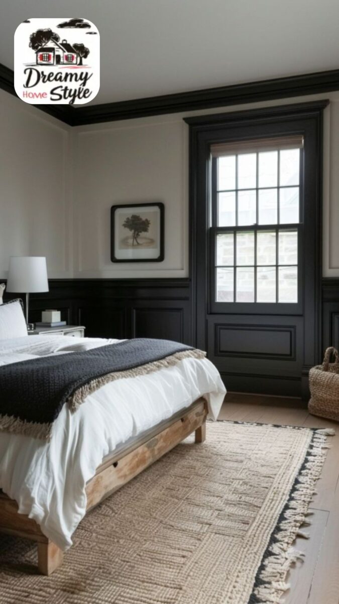
As an Amazon Associate I earn from qualifying purchases. This post contains affiliate links. If you buy through them we may earn a commission at no extra cost to you.
Product prices and availability are accurate as of the date and time indicated and are subject to change. Any price and availability information displayed on Amazon at the time of purchase will apply to the purchase of this product. Certain content that appears on this site comes from Amazon. This content is provided "as is" and is subject to change or removal at any time.
Short answer: almost any light wall works with black trim, so the better question is how loud you want that black to be.
On bright white it reads like a line drawn with a marker.
On taupe it sits back and acts more like a picture frame.
Here are 13 wall colors matched to real Benjamin Moore paints you can ask for by name.
Each one gets its LRV from the maker’s own page, and the list runs loudest black first.

LRV’s the number that matters here.
Benjamin Moore calls it the percentage of light reflected from a surface, on a scale from 0 for absolute black to 100 for pure white.
So a wall at LRV 90 sends back about 90 percent of the light that hits it, and a black at LRV 4.56 sends back under 5 percent.
The gap is just your wall’s number minus your trim’s, figured with Benjamin Moore’s Black 2132-10.
Our picker draws the lines.
Over 30 points, the trim frames the room in any light.
From 20 to 30, it frames it in a bright room.
Under 20, it melts into the walls.
(That yardstick comes from UK guidance on accessible buildings, so it isn’t a rule for decorating, but it’s a handy way to tell if your trim will show.)
And here’s the nice part: all 13 of these land over 30.
The softest one still has a gap of 40, so there’s no wrong answer on this list.
You’re really just picking a mood.
All 13 at a Glance, Loudest Black First

| Wall | Paint I’d start with | LRV | Gap to black |
|---|---|---|---|
| Bright white | Chantilly Lace OC-65 | 90.04 | 85 |
| Warm white | Simply White OC-117 | 89.52 | 85 |
| Pale yellow | Windham Cream HC-6 | 79.04 | 74 |
| Light pink | First Light 2102-70 | 75.86 | 71 |
| Sky blue | Harbor Fog 2062-70 | 74.75 | 70 |
| Robin’s egg blue | Arctic Blue 2050-60 | 70.86 | 66 |
| Light peach | Inner Peach 1150 | 66.11 | 62 |
| Light gray | Gray Owl OC-52 | 64.51 | 60 |
| Light sand | Manchester Tan HC-81 | 63.24 | 59 |
| Lavender gray | Portland Gray 2109-60 | 60.21 | 56 |
| Soft green | Soft Fern 2144-40 | 56.67 | 52 |
| Light sage green | Saybrook Sage HC-114 | 45.46 | 41 |
| Soft taupe | Pashmina AF-100 | 44.2 | 40 |
Gaps are rounded to the nearest point.
(Our picker uses a black at LRV 2, so you’ll see slightly bigger gaps there.)
Got a softer black in mind?
It changes less than you’d think.
Black Satin 2131-10 is LRV 4.58 and Onyx 2133-10 is 4.99, so those gaps barely move.
Wrought Iron 2124-10 is 8.17, and Benjamin Moore calls it “relatively soft.”
That takes about 3.6 points off every gap, which still leaves Pashmina at around 36.
So buy the black you like.
Bright White Walls

This is as loud as black trim gets.
Chantilly Lace OC-65 has an LRV of 90.04, so you get a gap of 85, the biggest on this list.
Benjamin Moore says it “elicits images of fresh cotton and pure silk.”
To my eye, there’s nothing in that wall to soften the line.

With walls this white, the trim does all the talking.
So I’d treat the room like a drawing and let those lines show.
I’d also go plainer on the curtains than the squiggly ones in that picture, because anything loud up there has to fight the black around it.

If this is your combo, we’ve got 13 more ideas for white walls with black trim.

The one risk?
All that contrast can feel a little cold.
Wood and a bit of texture fix that fast, to my eye, and a jute rug’s the easy place to start.
It brings warmth without adding one more color to argue with the black.

$139.98 Only 5 left in stock - order soon.
Paid link · price checked November 12, 2026 09:25
Warm White Walls


If bright white sounds too stark, here’s some good news: going warm costs you almost nothing.
Simply White OC-117 is LRV 89.52, so its gap rounds to 85 too.
Benjamin Moore says “the slightest hint of warmth” is what makes it a favorite, and that’s about all you’re changing.
The black stays just as loud.
The room just gets a bit softer around it.
White Dove OC-17 is a lovely second choice.
It’s LRV 83.16, for a gap of 79, and Benjamin Moore’s own color combinations put it right beside Onyx.
(Its page calls it a “clean and classic white,” though, so don’t buy it expecting cream.)
One to skip if warmth’s the whole point: Decorator’s White OC-149.
Benjamin Moore says it has “a touch of cool gray.”
Pale Yellow Walls

This is the first real color on the list, and the black’s still plenty loud.
Windham Cream HC-6 sits at LRV 79.04, which means it sends back about 79 percent of the light, for a gap of 74.
Benjamin Moore describes it as “a sunlit, luscious cream color with a whisper of peach,” and it files it under yellow.

I went with a cream on purpose.
Soft yellow next to hard black is the fun part, I think.
But if that’s too quiet for you, Hawthorne Yellow HC-4 is LRV 71.33, for a gap of 67, and Benjamin Moore calls it “a bold yet balanced yellow.”

Yellow sits on the warm side of the color wheel, and Benjamin Moore’s handbook says a palette from one half of the wheel “tends to be more harmonious.”
So I’d stay warm with the extras.
Oak and rattan both fit, and so does a brass lamp.

What about the ceiling?
Benjamin Moore’s own combinations pair Windham Cream with Simply White, so that’s the one I’d try up there.


Then repeat the black a little.
A lamp base helps, or a few thrift-store frames painted to match (budget decorating at its best).
It makes the trim look planned instead of stranded.
Light Pink Walls

Pink can go sugary in a hurry, and to my eye a hard black line is the quickest cure.
First Light 2102-70 is LRV 75.86, so it sends back about 76 percent of the light, for a gap of 71.
Benjamin Moore calls it “a refreshing alternative to white or beige” and says it “plays well with other colors,” which is exactly what you want from a wall that’s about to share a room with black.

Its page also pairs it with Chantilly Lace and Amherst Gray HC-167, so there’s a ceiling color and a gray waiting for you.

I’d lean into the contrast with the furniture.
An iron chandelier and a black-framed mirror would both keep the pink from taking over.


Doing a bedroom?
Here are our pink bedroom ideas.

Sky Blue Walls


Harbor Fog 2062-70 is the one for this.
Benjamin Moore calls it “a soft, floaty sky blue with a calming effect.”
It’s LRV 74.75, about 75 percent of the light, for a gap of 70, so the black stays crisp.
Now, if you’d like it with a bit of green, Palladian Blue HC-144 is a “soft, airy blue-green that conjures clear skies.”
It’s darker at LRV 60.4, for a gap of 56, which means a quieter black.
Harbor Fog’s page pairs it with White Heron OC-57, which Benjamin Moore describes as a bright white with “the slightest cool cast,” and with Charcoal Slate HC-178.
I’d take that hint.
A cool white on the ceiling, then charcoal or navy in the pillows, so the black isn’t the only dark thing in the room.
Robin’s Egg Blue Walls


Benjamin Moore doesn’t call this one robin’s egg.
When I picture a robin’s egg, I picture a blue with a little green in it, and Arctic Blue 2050-60 is “an eye-pleasing light blue touched with crisp green undertones.”
It’s LRV 70.86, for a gap of 66.


Blue’s on the cool side of the wheel, and Benjamin Moore’s handbook says that pairing two colors opposite each other “adds a dash of invigorating tension.”
That’s my excuse for brass.
A brass sconce or a warm wood sideboard gives this room something to do besides stare at the trim.


The paint’s page pairs it with White Ice OC-58, White Heron OC-57 and White Wisp OC-54, so those are the chips I’d grab for the ceiling.

Light Peach Walls


Peach isn’t the first color I’d think of with black, and that’s a shame, because I think it’s a sleeper.
Inner Peach 1150 is LRV 66.11, for a gap of 62.
Benjamin Moore says “soft notes of rosy brown make this muted hue feel fresh and sophisticated,” and muted’s what I like here, since the walls and the trim aren’t both shouting.
Prefer something cleaner?
Pink Harmony 2013-60 is “a crisp, light orange with peach undertones.”
It’s LRV 76.46, for a gap of 72.
Benjamin Moore’s picks for Inner Peach include Manchester Tan HC-81 and Chantilly Lace, and I’d carry that tan-and-white mood into oak or ash furniture.
Black and White photos are a nice touch too.
They repeat the trim without adding a new color.
Light Gray Walls

Gray Owl OC-52 is “a use-anywhere light gray with a cool, crisp cast.”
It’s LRV 64.51, for a gap of 60.
And Benjamin Moore’s own color combinations put it with Onyx, so you’re in good company.

The thing is, gray’s not just gray.
Here’s what changes across three of Benjamin Moore’s chips:
- Cool: Gray Owl, gap 60.
- Warm: Collingwood OC-28, which it calls “a widely appealing warm gray,” LRV 61.52, gap 57.
- In between: Stonington Gray HC-170, with “relatively neutral undertones,” LRV 59.36, gap 55.

That’s only about five points from top to bottom, so the black reads about the same on all of them.
Pick by undertone, not contrast.
Choosing the right undertone gets a proper explanation in our $17 decorating book, along with how to test paint.

On gray, I’d let the accents carry the color.
Navy pillows look sharp on a cool gray, and brushed gold keeps it from going icy.

Light Sand Walls


Benjamin Moore’s handbook lists sand with the neutrals, the “natural combinations that keep you grounded,” and that’s the mood here.
Manchester Tan HC-81 is “a fresh, sophisticated beige that conjures stately sandstone façades.”
It’s LRV 63.24, about 63 percent of the light, for a gap of 59.
The same handbook makes the case for this wall in one line: a black trim like Black Satin “against a neutral wall is a striking way to showcase a room’s unique architecture.”
So if your house has good bones, this is a good way to show them off.
I’d keep the rest easy.
Linen curtains and a jute rug both sit happily in the same family as the walls.
Lavender Gray Walls


Portland Gray 2109-60 is my pick.
It’s “a lavender-tinged gray” that Benjamin Moore actually files under neutrals, at LRV 60.21, for a gap of 56.
If you want more purple in it, Winter Gray 2117-60 is “equal amounts of gray and violet,” at LRV 61.69, for a gap of 57.
This is the color I’d test hardest.
A wall sitting between gray and purple can tip either way as the light moves, so check it at night too.
Portland Gray’s page pairs it with White Heron OC-57 and Oyster 2115-70, so you don’t have to fear a clean white here.
Silver and pewter suit it well, to my eye.
And if you want a bedroom to feel a little dressed up, this is a good one for it.
Soft Green Walls

Soft Fern 2144-40 is “a pleasing pale green misted with gray tones.”
That gray’s the reason I like it with black, since the green stays calm instead of turning bright.
It’s LRV 56.67, for a gap of 52.

Want it warmer?
Guilford Green HC-116 is “a gentle green hue with pleasing warm undertones,” at LRV 57.22, for a gap of 53.
That’s the same contrast with a different mood, so hold both chips up in your room and go with your gut.


What about a deep emerald?
That’s a different project, and I’ll get to it under taupe, because it’s the darkness that matters there.
Green walls are also the easiest ones here to dress.
Plants and natural wood look right at home, and so does a sisal rug.

Light Sage Green Walls
Don’t let the word “light” fool you.
Saybrook Sage HC-114 is “a soothing aloe hue cooled with a splash of gray,” and at LRV 45.46 it sends back about 45 percent of the light, or about half of what Chantilly Lace does.
So the gap drops to 41, and this is where black stops being a line and starts being a frame.

I love it for that.

Want more sage for a bedroom?
Our light sage green bedroom ideas have plenty, though they don’t cover black trim.

The paint’s page suggests Paper White OC-55 and Smokestack Gray 2131-40 as partners.
I’d add wood shelves and a little antique brass, and maybe a few deep green pillows to bridge the walls and the trim.

Soft Taupe Walls


This is the softest black on the list.
Pashmina AF-100 is LRV 44.2, about 44 percent of the light, for a gap of 40, and Benjamin Moore says it’s “perfectly balanced between warm and cool.”
So you still get a clear frame around the room, only with no sharp edge to it.
Texture’s your friend here.
Linen and rough wood help, and a black and white pillow or two will keep taupe from turning sleepy.
Where black starts to fade
Go darker and the math catches up with you.
Weimaraner AF-155 is “a lush, popular neutral with pleasing brown and taupe tones,” at LRV 30.99, so about 31 percent of the light.
That’s a gap of 26, which by our picker’s lines only frames the room in a bright room.
On a dull evening, the picker says, a gap in that range fades toward the walls.
With Black 2132-10, you cross the 30-point line at a wall of about LRV 35, and the 20-point line at about LRV 25.
The picker’s own black buys you a couple of points: its terracotta at LRV 23 gets a gap of 21 (bright rooms only), and its navy at LRV 4 melts with a gap of 2.
So check any deep wall first, deep emerald included.
Before You Buy the Gallon

Sheen first.
Benjamin Moore’s finish guide lists matte for living rooms, dining rooms and bedrooms, and eggshell for high-traffic walls.
For trim it goes shinier, from low lustre up through semi-gloss and gloss.
Matte or eggshell on the walls, satin on the trim.
Benjamin Moore warns that gloss “can accentuate blemishes” and says to avoid it on areas that aren’t completely smooth, and I wouldn’t want black showing off every dent.
Not sure about your room?
Try our Paint Sheen Finder.
Then test.
Benjamin Moore’s handbook says to buy a sample, paint a board (foam core will do) and move it around the room at different times of day.
“Time of day matters,” says its color and design expert Andrea Magno.
The handbook adds that direct midday sun brightens any hue, and that artificial light adds a warm glow.
Here’s how I’d do it.
Paint a board about 12 inches square in your wall color and a second one black, then stand them together, since the pair is what you’re really buying.
Look at them with your morning coffee, then again after dinner, for at least 2 days.
And every one of those color pages says “Screen colors may differ,” so trust your boards over my table.
Painting trim that’s already there in a house built before 1978?
EPA says homes that old are more likely to have lead-based paint, so read the checks in our black trim guide before you sand a thing.
Got carpet to work around?
We’ve got carpet shades for black trim too.
Still can’t choose?
Mine would come down to how the room’s used.
Simply White if I wanted it graphic, Manchester Tan if I wanted it cozy.
Either way, that black’s going to look great.