
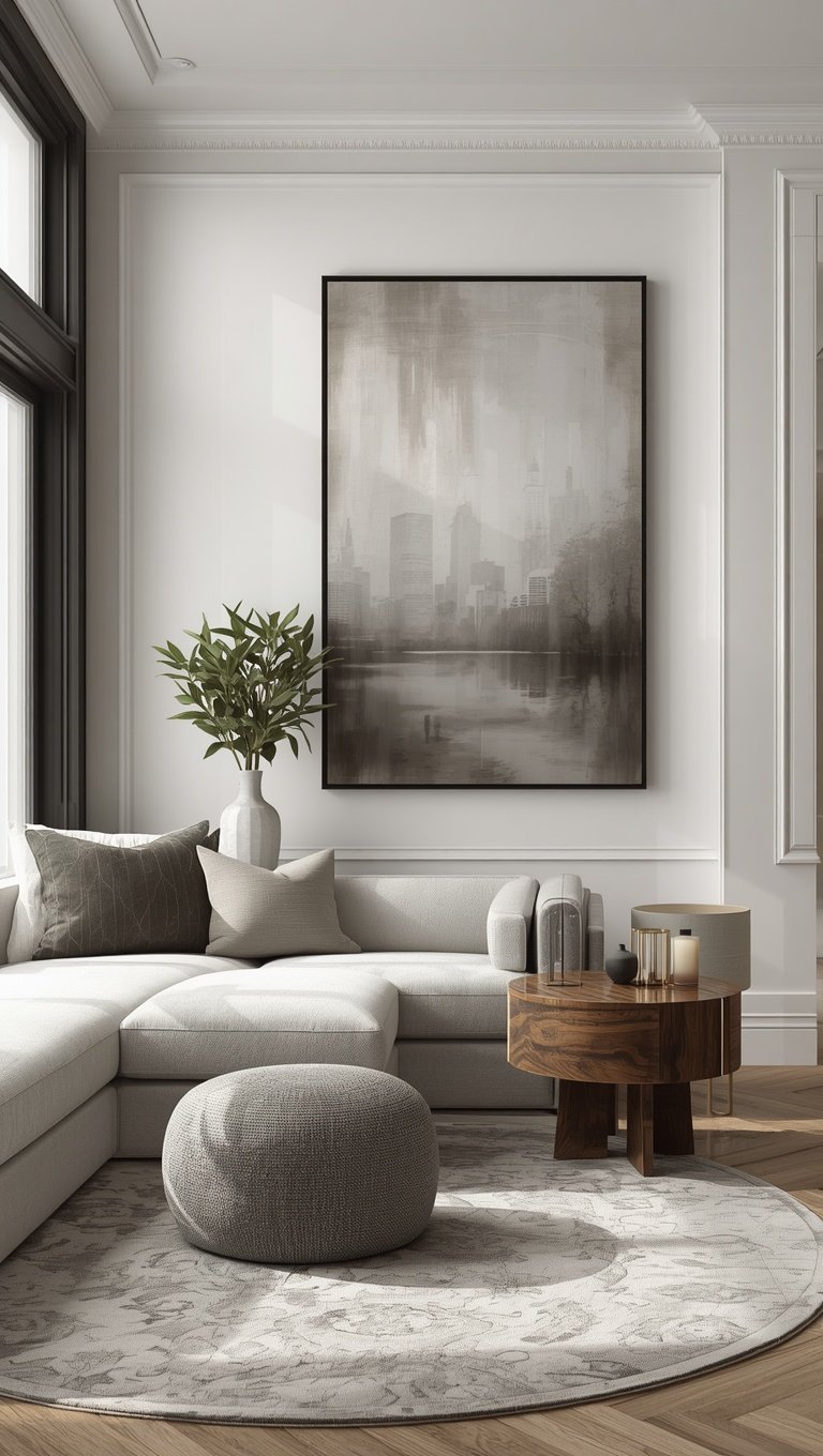

I stood in my dining room at 11pm with a level in one hand and a glass of wine in the other, and I almost cried.
Not the bad kind of crying.
The kind where you finally look at a wall you’ve hated for three years and it looks back at you like it belongs somewhere else entirely.
Somewhere with tall windows and creaky wood floors and a name like “the drawing room.”
My dining room is a boring rectangle in a boring builder-grade house, and I am kind of obsessed with the fact that a few strips of trim made it look like it has history it does not actually have.
That’s the whole magic trick of picture frame molding.
It’s cheap, it’s a weekend project, and it lies so beautifully about your home’s age that guests ask what year the house was built.
I tell them.
They don’t believe me.
So let’s talk about how I did it, why it works, and where I’d start if I were you.
Why Picture Frame Molding Fools The Eye So Well

Old European interiors were never just flat drywall with a couch shoved against it.
They had layers.
Wainscoting, panel molding, ornate trim that caught shadow and light in a way that made a wall feel like it had depth.
Picture frame molding is basically a shortcut to that same visual trick.
You’re not adding square footage or real architecture.
You’re adding shadow lines.
And shadow lines are what your brain reads as “old” and “intentional” instead of “new construction.”
When I added mine, I noticed the light in my dining room actually changed throughout the day.
Morning light would catch the top edge of each frame and throw this soft little line of shadow underneath.
By afternoon that shadow would shift, and honestly, I’d catch myself staring at it while my coffee went cold.
It’s such a small detail but it’s the kind of thing that makes a room feel considered.
Like someone loved it on purpose.
That’s the emotional trick behind the visual trick, if that makes sense.
We’re not just faking age, we’re faking intention.
And intention is what makes a house feel like a home instead of a place you’re renting from yourself.
If you take nothing else from this post, take that.
Depth and shadow read as history, even when the paint is still wet.
The Exact Layout I Used (And Why Proportion Is Everything)

Okay, confession: my first attempt at spacing was a disaster.
I eyeballed it.
I did not measure twice, and I definitely did not cut once.
My frames ended up too small and too close together, and the whole wall looked busy instead of elegant.
So here’s what actually worked once I started over.
I used a 3:2 ratio for each panel, meaning the height was one and a half times the width, roughly.
That ratio is what old world paneling almost always leans on, and it’s the reason those rooms feel calm instead of chaotic.
I left about 4 inches between each frame and about 6 inches from the ceiling and floor trim.
Small gaps make it look choppy, and honestly, huge gaps make it look like an afterthought.
Four to six inches is the sweet spot, at least in my experience.
I taped everything out with painter’s tape first.
Every single line.
Then I lived with it for two days before committing, because tape is cheap and regret is not.
If your room has outlets or switches, plan your panel lines around them instead of through them.
Mine has one outlet dead center on one wall and I just made that panel slightly wider to hide it inside the frame.
Nobody notices.
I only notice because I put it there.
My Honest Cost Breakdown (It’s Cheaper Than You Think)

I spent just under 200 dollars on my dining room, and that included buying extra trim because I messed up two cuts.
MDF primed trim is your best friend here, and I will die on this hill.
It’s cheaper than real wood, it’s already smooth, and it takes paint beautifully.
I bought mine in the paint department section, the pre-primed kind, and each piece was under ten dollars.
Caulk was maybe six dollars total.
Wood filler, another five.
The miter box and hand saw I already owned from a previous project, but if you don’t have one, a cheap one runs about twenty dollars and works completely fine for this.
Liquid nails or a brad nailer will run you more if you don’t already own one, and that’s honestly where most people’s budgets creep up.
I rented a brad nailer from my local hardware store for the day instead of buying one, and that saved me a good chunk of change.
Paint was the last expense, and I already had leftover trim white from another room.
So realistically, if you’re starting from zero on tools, budget closer to 250 to 300 dollars for a full wall.
If you already have basic tools, you’re looking at closer to my number.
Either way, compared to real architectural millwork, which can run into the thousands, this is such a steal.
It’s the kind of project where the cost feels almost silly next to the transformation.
The Paint Trick That Makes It Look Custom-Built

Here’s the part nobody tells you, and it changed everything for me.
Don’t paint your molding a different color than your wall.
I know, I know, it feels counterintuitive.
But when I painted my frames the exact same color as the wall behind them, in the same sheen, the whole thing suddenly looked built-in instead of applied.
Like it had always been there.
Like a contractor did it in 1920 and everyone just forgot.
If you paint the trim white and the wall a color, your eye immediately clocks it as “trim added later,” and that breaks the illusion completely.
Same color, same sheen, and suddenly your brain can’t tell the difference between molding and architecture.
I used a soft eggshell in a warm off-white, and I did both the wall and the trim in that same can.
One coat on the wall around the frames, two thin coats on the molding itself because MDF drinks up paint like it’s thirsty.
Caulk every seam before you paint, always.
Every gap, every corner, every spot where trim meets wall.
It takes ten extra minutes and it’s the difference between “handmade project” and “was this always here.”
I use my finger for smoothing caulk lines because it works better than any tool I’ve tried, and yes, my finger was covered in caulk for a full day afterward.
Worth it.
Rooms Where This Works Best (And One Where It Doesn’t)

Dining rooms are basically made for this, and that’s where I’d tell you to start if you’re nervous.
Hallways are my second favorite, especially long boring ones that need a little rhythm.
Primary bedrooms work beautifully too, especially behind the headboard wall, where it almost mimics a real upholstered or paneled headboard nook.
I did a mini version in my powder room last spring and it made that tiny space feel like a jewel box instead of an afterthought.
Where I’d pump the brakes is a heavily textured wall, like real popcorn ceiling adjacent walls or heavy orange peel texture.
The clean lines of the molding fight with the texture instead of complementing it, and it can look sort of off rather than intentional.
If your walls are textured, you’ll want to skim coat first, which adds cost and time.
I’d also say skip it in a room with a ton of existing trim detail already, like crown molding plus chair rail plus baseboards all fighting for attention.
Sometimes less really is more, and picture frame molding needs a little visual breathing room to do its job.
My rule of thumb now is one “hero” trim moment per room.
Pick your star, and let everything else stay quiet around it.
Small Personal Tips I Wish Someone Had Told Me

Sand your MDF edges before painting, even the pre-primed stuff, because factory edges are rougher than they look.
Use a level, not your eye, even if you think your eye is good.
Mine is not, apparently, and I learned that the hard way on a crooked panel I had to redo.
Buy ten percent more trim than your math says you need.
Cuts go wrong, mistakes happen, and running back to the store mid-project kills momentum.
Cordless brad nailers are worth every penny if you’re doing more than one room, because dragging a compressor around gets old fast.
If you’re renting, removable options exist now, like adhesive-backed trim strips, though I haven’t tried those myself so I can’t personally vouch for how they hold up long term.
Keep a damp rag nearby the entire time you’re caulking, because dry caulk on your hands is its own special kind of annoying.
Music helps.
I listened to the same playlist for both weekends I worked on this and now certain songs make me think of sawdust.
Give yourself grace on the first cut.
Mine was crooked, I cursed a little, and the wall still turned out gorgeous in the end.
Perfection is not the goal here, rhythm is.
Color Palettes That Feel Old World Without Feeling Dated

Warm whites are my forever favorite for this look, something with a hint of cream rather than stark bright white.
Bright white can feel a little clinical against the softness we’re going for.
Sage green is having such a moment right now and it genuinely does look gorgeous with molding, giving off a real old library or countryside cottage feeling.
Deep terracotta is another one I’m loving, especially in a dining room where you want that cozy, wine-and-candlelight kind of mood.
Soft greige works if you want something safe that still photographs beautifully.
I’d avoid true black unless you’re very confident, because it can read modern rather than old world, which is the opposite of what we’re going for here.
If you want a hint of drama without full commitment, try painting just the inside of each panel a soft contrasting tone, almost like a whisper of color peeking through.
I tried this in a guest room with a dusty blue inside the panels and cream on the frame itself, and it felt like something out of a French countryside home.
Sconces on either side of a molding wall take this whole thing to another level, by the way.
Warm bulb temperature only, please, nothing cool or blue toned.
That warm glow against the shadow lines from the trim is honestly one of my favorite things in my whole house right now.
What I’d Do Differently If I Started Over Today
I would measure my ceiling height before buying anything, because mine is slightly lower than standard and my first panel proportions felt just a touch too tall for the room.

I would measure my ceiling height before buying anything, because mine is slightly lower than standard and my first panel proportions felt just a touch too tall for the room.
I would also buy a better miter saw from the start instead of trying to save money with a hand miter box.
It cost me more time than it saved me in dollars, honestly.
I’d prime my cut edges before installing rather than after, because painting in place around outlets and corners is fiddly and frustrating.
If I had a small hallway right now, this is exactly what I’d do first, before touching anything else in that space.
Hallways are so often neglected and they’re honestly one of the easiest wins for this technique.
I’d also spend more time studying reference photos before starting, old European homes, historic hotel lobbies, even old movie sets.
Pinning a folder of these images helped me understand proportion way more than any tutorial did.
I did not do enough of that before my first wall, and it showed.
Lastly, I would trust the process of living with painter’s tape longer before committing to nails.
I rushed one wall because I was excited, and I ended up patching two extra nail holes because I changed my mind on spacing.
Patience is not my strong suit, but this project rewards it generously.
Optional Variations To Make It Your Own

Squares instead of rectangles give a totally different, more modern-meets-classic vibe, almost like a checkerboard feeling on the wall.
I did this in my home office and it feels so different from my dining room, even though it’s technically the same technique.
Adding a thin inner reveal line, basically a second smaller frame inside the main one, gives an even more ornate, layered look if you’re feeling ambitious.
Ceiling application is one I haven’t tried yet but am kind of dying to, where you bring the same molding pattern up onto a flat ceiling for a full jewel box effect.
Mixing molding profiles, like a flat panel with a slightly curved outer trim, adds dimension without adding much cost.
You could also skip paint entirely and stain the wood a rich espresso tone against a lighter wall for more contrast and drama.
I haven’t done the stained version myself, but I’ve seen it in a friend’s entryway and it took my breath away a little.
Gold or brass thin trim inlay is another one on my someday list, just a whisper of metallic along the inner edge of each frame.
It feels a little Parisian apartment, a little too fancy for my current life, but a girl can dream.
Whatever variation you pick, the bones of the technique stay the same.
Frame, shadow line, proportion, paint.
Everything else is just personality.
Why This Project Feels So Different From Other Home Upgrades

Most home projects I’ve done feel like maintenance.
New faucet, fresh caulk in the shower, patching a hole from moving furniture around too many times.
This one felt like decorating in the truest sense of the word.
It felt like I was giving my house a personality it didn’t have before, instead of just fixing something that was broken.
There’s something so satisfying about walking into a room you’ve lived in for years and suddenly seeing it differently.
I catch myself looking at that dining room wall more than I probably should.
Not because it’s perfect, because it isn’t, there’s a slightly uneven caulk line by the window if you look close enough.
But because it feels like mine now, in a way it didn’t before.
Like I made a decision about who this house is instead of just accepting who it came as.
That’s the real reason I keep coming back to trim projects like this one.
It’s not really about the shadow lines or the proportions or even the old world look, even though I do love all of that.
It’s about the feeling of walking into a room and thinking, yeah, I did that, and it’s so much more me now.
If you’ve been eyeing a plain wall in your own home, wondering if it could be something more, I think you already know the answer.
Related read: Things I Wish I Knew Before I Decorated My First Home — Instant PDF + Kindle download. Secure checkout by Stripe

