
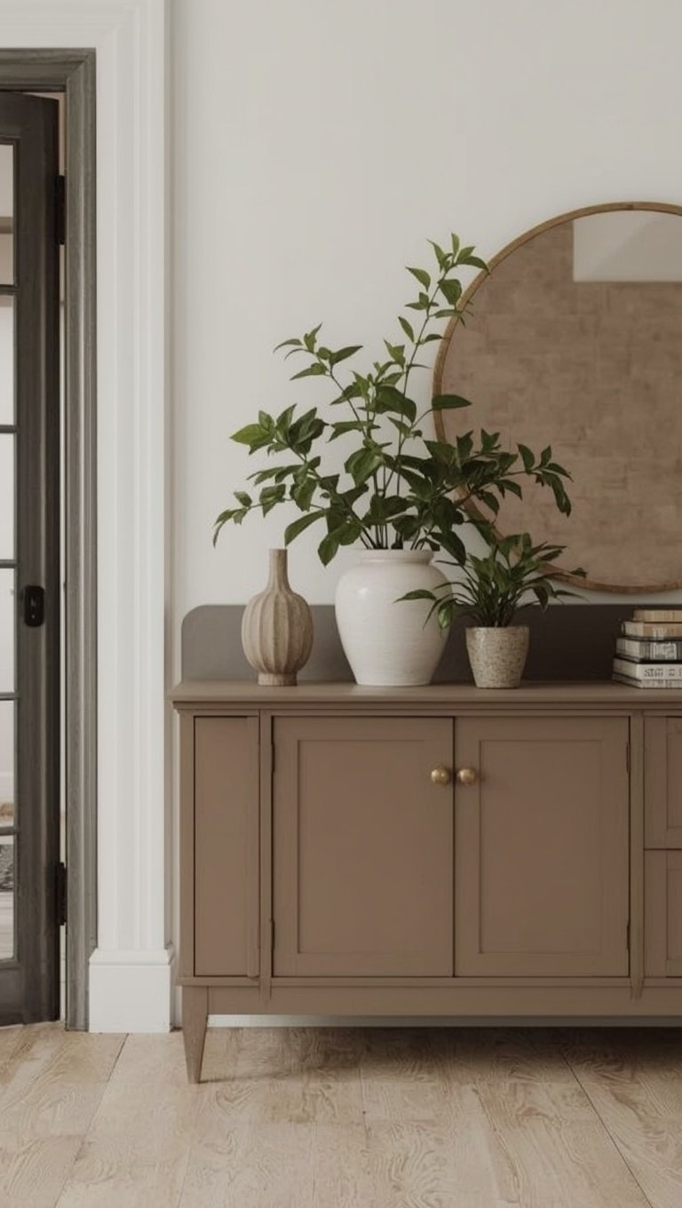

I painted my living room wall four times before I admitted the truth.
I wasn’t picking a color.
I was picking a fight.
Warm greige on one side, cool greige on the other, and me standing in the middle with a paintbrush and a headache.
And honestly?
That little standoff taught me more about paint than any color chart ever could.
So if you’ve ever stood in the aisle holding two swatches that look identical until you get them home, and then suddenly one looks pink and the other looks like a sad puddle, I get it.
I’ve been there.
I’ve cried a little there, if we’re being honest.
This post is everything I wish someone had told me before I wasted a weekend and a full gallon of paint.
Why Greige Even Causes This Drama in the First Place

Okay so here’s the thing nobody tells you.
Greige isn’t one color.
It’s a whole family, and every member of that family has a different personality.
Some lean warm, with a little beige or tan hiding underneath.
Some lean cool, with gray or even a whisper of blue or green tucked in there.
And the wild part is that your lighting decides which personality shows up.
North-facing rooms pull cool undertones forward, so a greige that looked warm and cozy in the store can suddenly feel a little flat and gray on your wall.
South-facing rooms do the opposite, they warm everything up, sometimes too much.
I learned this the hard way in my first apartment.
I picked a greige that looked perfectly balanced under the store’s bright white lights.
Got it home, and under my warm little lamp glow, it looked almost taupe-pink.
Not bad, just not what I signed up for.
So the fight isn’t really warm versus cool.
It’s your room versus the paint chip, and the room always wins.
Once I understood that, everything got so much easier.
Test Samples the Way I Wish I Had From Day One

I used to slap a swatch on the wall and call it done.
Huge mistake.
Paint chips are tiny, and tiny things lie.
Now I paint a poster-board sized sample, not directly on the wall.
That way I can move it around the room and watch how it shifts from morning to night.
I tape mine near the window, then by the closet, then right where the couch will sit.
It sounds like overkill, I know.
But greige changes so much throughout the day that judging it in one spot at one time is basically setting yourself up to be disappointed.
Morning light is honest and a little cool.
Afternoon light gets warm and golden.
Evening light, especially with lamps on, can turn things moody in the best or worst way depending on the shade.
If I had one hack to give you, it’s this one.
Live with the sample for at least three full days before you commit.
I know that feels slow when you’re excited to just get painting already.
But trust me, three days of patience beats three coats of regret.
Warm Greige Colors I Genuinely Love

Warm greige is my comfort zone, if I’m being honest with you.
It’s the shade that makes a room feel like it’s hugging you a little.
Benjamin Moore’s Revere Pewter is the one everyone talks about, and for good reason.
It has just enough beige to feel soft without ever tipping into tan.
Sherwin Williams Perfect Greige is another one I’ve used, and it does exactly what the name promises.
It’s cozy, grounded, and it plays so nicely with wood tones.
If you’ve got warm oak floors or a lot of natural wood furniture, this is the direction I’d point you.
I used a warm greige in my last dining room, paired with brass hardware and linen curtains.
The whole space felt like golden hour, all day long.
That’s the emotional pull of warm greige.
It doesn’t shout, it just quietly makes you want to curl up somewhere in it.
My only gentle warning is south-facing rooms.
If your space already gets a lot of warm afternoon sun, a warm greige can occasionally tip into looking more beige than gray by evening.
Still lovely, just something to know going in.
Cool Greige Colors That Feel Crisp Without Being Cold

Cool greige is a different kind of beautiful.
It’s the one I reach for when I want a room to feel clean, current, and just a little editorial.
Sherwin Williams Repose Gray is basically the industry darling for a reason.
It reads gray in most light but never feels sterile or clinical.
Benjamin Moore Stonington Gray is another favorite of mine, especially in kitchens.
It has this soft blue-gray whisper that pairs so well with white cabinetry and black fixtures.
I did a small guest bathroom in a cool greige last year, and with White Subway Tile and brushed nickel, it looked like something out of a boutique hotel.
Cool greige tends to shine in north-facing rooms because it doesn’t fight the existing cool light, it just settles right into it.
If your room already leans cool, a cool greige will feel effortless.
But if your room is warm and sunny, a cool greige can sometimes feel a little flat or gray by midday.
Not bad, just worth testing first.
The emotional feeling of cool greige, to me, is a deep exhale.
It’s calm, it’s tidy, it’s the visual version of a made bed.
The Balanced Greiges That Split the Difference

These are the unicorns, honestly.
The greiges that genuinely sit in the middle and read neutral in almost any light.
Behr’s Perfect Greige lives up to its name more than most paints I’ve tried.
It doesn’t scream warm or cool, it just quietly adapts to whatever room it’s in.
Sherwin Williams Agreeable Gray is probably the most famous balanced greige out there, and I understand the hype completely.
I’ve seen it in beach houses and I’ve seen it in mountain cabins, and it worked in both.
That kind of flexibility is rare.
If you’re someone who moves furniture around a lot, or you’re not totally sure what direction your room faces, a balanced greige is your safest bet.
It’s the paint equivalent of a good pair of jeans.
Goes with everything, never feels wrong, ages beautifully.
I used a balanced greige in my own hallway because that space gets almost no natural light at all.
It needed something that wouldn’t lean too hard one way, and it’s honestly one of my favorite decisions in the whole house.
Sometimes the safest choice is also the most satisfying one.
How Your Flooring Should Guide Your Undertone Choice

Nobody talks about this enough, so let’s talk about it.
Your floor is basically voting on your wall color whether you like it or not.
Warm wood floors, think honey oak or golden pine, tend to clash a little with very cool greige.
The two undertones sort of argue with each other, and you end up with a room that feels slightly off without knowing why.
If your floors are warm, lean into a warm or balanced greige and let them agree with each other.
Cooler floors, like gray-washed wood or dark walnut with cool undertones, tend to love a cool or balanced greige right back.
When I redid my own bedroom, I had these warm honey floors from the original house.
I tried a cool greige first because I loved it on a friend’s Pinterest board.
It looked muddy and strange against my floors, no matter the lighting.
Switched to a warm greige, and suddenly the whole room clicked into place.
That’s the part people skip when they’re just chasing a trendy color.
Your existing materials get a say too.
Let them.
Undertones Hiding in Your Furniture and Decor

Your walls don’t exist in isolation, and neither does your color decision.
Look at your biggest pieces first.
Your sofa, your rug, your dining table.
Do they lean warm, with browns and creams and golds?
Or cool, with grays, blacks, and crisp whites?
I like to gather a little pile of fabric swatches, pillow covers, even a throw blanket, and hold them up against my paint sample.
If everything is warming up together, gorgeous.
If your cool gray sofa is fighting your warm greige wall, you’ll feel that tension even if you can’t name it.
I made this mistake with a rug once.
Beautiful rug, but it had cool blue undertones I hadn’t noticed in the store lighting.
Against my warm greige wall, it looked slightly wrong, like two outfits that almost match but don’t.
Swapped the wall color instead of the rug, because let’s be honest, rugs are expensive and paint is not.
Lesson learned.
Let your favorite pieces lead the undertone conversation.
My Honest Opinion on Trendy Greiges Right Now

I have feelings about this, so let’s get into it.
Warmer greiges are having a real moment again, after years of everything leaning cool and almost blue-gray.
Honestly, I’m here for it.
There’s something so comforting about walking into a warm greige room after a long day.
It feels like the design world remembered that homes are supposed to feel like homes, not showrooms.
That said, I don’t think cool greige is going anywhere either.
It’s too classic, too easy to pair with Black and White kitchens and modern furniture.
My real advice, and I say this gently, is don’t pick your undertone based on what’s trending.
Pick it based on your light, your floors, and how you actually want to feel in the room.
Trends shift every few years.
Your north-facing bedroom does not.
If I had to bet, I’d say the pendulum keeps swinging warmer for the next little while, especially in living rooms and kitchens.
But cool greige bathrooms and cool greige offices still feel timeless to me.
Follow the feeling, not the feed.
Small Rooms Versus Large Rooms and How Undertones Behave Differently

This one surprised me the first time I noticed it.
Small rooms amplify undertones.
There’s less wall space for the color to breathe, so any warm or cool lean shows up faster and stronger.
Large open rooms tend to soften undertones a little, because the color has room to spread out and blend with more light sources.
So in a small powder room, I’d actually lean toward a balanced or slightly warm greige, since a strong cool undertone can feel a little cave-like in a tight space.
In a big open living area with tons of windows, you have a little more freedom to experiment with a stronger cool or warm greige, because the space naturally dilutes it.
When I painted my own tiny laundry nook, I chose something almost too warm on the chip.
In that small enclosed space, it settled into the perfect cozy tone.
If I’d used that same color in my open living room, it might have felt like too much.
Room size is basically a volume knob for undertone.
Turn it down in small spaces, you can turn it up a little in bigger ones.
Lighting Bulbs Matter More Than You Think

Here’s a detail that changed everything for me.
The lightbulbs in your lamps and fixtures are not neutral players in this story.
Warm white bulbs, usually labeled around 2700K, will push any greige a little warmer and cozier.
Cool white or daylight bulbs, closer to 4000K or 5000K, will pull that same greige toward gray and crisp.
I once repainted a room because I thought the color was wrong.
Turns out my bulbs were the actual problem the whole time.
Swapped a few daylight bulbs for warm white ones, and the “wrong” greige suddenly looked exactly like what I wanted originally.
Saved myself an entire weekend of repainting.
So before you blame the paint, check your bulbs first.
It’s such a simple fix and people skip it constantly.
If you love a warm greige, stick with warm white bulbs throughout the space.
If you’re leaning cool, daylight bulbs will support that undertone instead of undercutting it.
Small swap, honestly one of my favorite cheap tricks in the whole home world.
Pairing Greige With Trim and Ceiling Colors

Your trim color has more influence than most people give it credit for.
A stark white trim against a warm greige wall can sometimes make the wall look slightly more pink or beige by comparison.
A slightly warmer, creamier white trim tends to soften that contrast and let the greige feel more balanced.
On the cool side, a bright, true white trim actually supports a cool greige beautifully, keeping everything crisp and cohesive.
I like using the same brand’s “off-white” trim option that’s designed to sit next to their greige, because paint companies usually engineer those pairs to work together already.
Ceilings are their own little secret too.
A plain white ceiling can sometimes feel disconnected from a warm greige room.
I’ve started tinting ceilings a whisper of the wall color, maybe at quarter strength, and it makes the whole room feel wrapped instead of boxed.
It’s such a small move but it changes the emotional feeling of a space so much.
Cozier, more intentional, less like an afterthought.
If you only change one thing from this section, try the ceiling trick.
It’s subtle but it’s one of those things guests notice without knowing why.
Related read: Things I Wish I Knew Before I Decorated My First Home — Instant PDF + Kindle download. Secure checkout by Stripe

