

I painted my living room gray four years ago and I cried a little the first winter I sat in it.
Before you head to the paint store, run your room through the free paint calculator.
Not dramatic tears, just that quiet “why does this room feel like a waiting room” kind of sad.
It looked so pretty on Pinterest.
In real life, on a cloudy Tuesday, it read blue and flat and honestly kind of sad.
So I repainted, and that repaint changed how I choose every single color now.
If you’ve ever stood in front of a wall of paint chips feeling completely overwhelmed, I get it, truly.
This is everything I wish someone had told me before I picked up that first sad gray brush.
Why Warm Neutrals Just Feel Different

There’s a reason warm neutrals are having such a moment right now, and it’s not just trend-chasing.
Cool tones can look sophisticated in photos, but in person, on an overcast day, they can feel a little sterile.
Warm neutrals do the opposite.
They soak up whatever light you give them and somehow make it feel like golden hour, even at 2pm on a gray Tuesday.
I’m obsessed with how a warm wall makes a room feel lived in, like someone actually loves being there.
It’s the difference between a house and a home, honestly.
When I walk into a space with the right warm neutral, my shoulders literally drop.
That’s not a small thing.
Your home should feel like a hug, not a hotel lobby.
And warm neutrals, when you get them right, do exactly that.
They’re forgiving too, which matters so much more than people admit.
They hide scuffs, they play nice with mismatched furniture, and they make your existing stuff look intentional instead of thrown together.
That’s the quiet magic of it.
Understanding Undertones Before You Buy Anything
Okay, this is the part nobody explains well, so let’s slow down here.

Every “neutral” paint has an undertone hiding underneath it, and that undertone is the whole story.
Some grays lean blue or green without announcing it on the label.
Some whites lean pink or yellow in ways you only notice once they’re already on your wall.
The trick I use now is holding the paint chip against a plain white piece of paper.
Suddenly the hidden undertone jumps out at you, I promise.
Warm neutrals usually have a base note of yellow, peach, or soft red running underneath them.
That’s what keeps them from turning icy in low light.
I learned this the hard way with that gray living room I mentioned.
It had a barely-there blue undertone that I could not see on the chip, only on the wall.
So now I test everything against paper first, every single time, no exceptions.
It takes thirty extra seconds and it saves you an entire weekend of repainting.
Trust me on this one.
Undertones are sneaky, but once you know to look for them, you’ll never unsee them again.
My Go-To Warm White For Almost Any Room

If you forced me to pick just one color to recommend to every friend who texts me in a panic, it’s a soft warm white with a whisper of beige underneath.
Not stark white, not cream, somewhere gentle in between.
I used this exact type of color in my own dining room and the light in there now looks like it’s always late afternoon.
It’s the kind of color that doesn’t shout for attention but somehow makes everything else in the room look better.
Furniture pops, art pops, even my slightly mismatched thrifted chairs suddenly look curated.
That’s the emotional reason this works so well, if you’re wondering.
A warm white acts like a soft frame around your life instead of competing with it.
It’s quiet, but never boring, which is honestly such a hard balance to strike.
My small tip here is to always get a sample pot before committing to the gallon.
Paint a piece of poster board, not directly on the wall, and move it around the room across a full day.
Morning light, afternoon light, and lamp light all change how warm whites read.
I learned that trick from a contractor and it has saved me more than once.
If a plain warm white feels too safe for your personality, that’s valid too.
There are deeper options coming up later in this post.
How I Actually Test Paint Before Committing

Can we talk about how most people test paint wrong?
I used to slap one coat directly on the wall and judge it within the hour, which, looking back, was such a rookie move.
Paint needs real time and real light to show its true colors, no pun intended.
My method now is simple but it works every time.
I paint large poster boards, at least two coats, and let them dry completely overnight.
Then I move that board around the room for a full day, morning through evening.
You’d be shocked how different a warm neutral looks at 8am versus 8pm under a lamp.
Sometimes a color I loved in the morning goes slightly muddy by night, and I’d rather know that before four gallons are on my wall.
Here’s a little hack.
If I had a small hallway or a room with barely any natural light, this is what I’d do first.
I’d tape the board right next to the trim and the flooring, because paint never lives in isolation.
It’s always talking to whatever wood tone or fabric is already in the room.
So test it in context, not in a vacuum.
This one habit alone has saved me from at least three regretful repaints, and I don’t say that lightly.
The Warm Neutral I’d Choose For a Living Room
Living rooms carry so much emotional weight in a house, don’t they?

It’s where you curl up after a long day, where guests linger, where actual life happens.
For this room specifically, I lean toward a warm greige, that soft in-between of gray and beige with a golden undercurrent.
When I redid my own living room after the great gray disaster, this is the direction I went, and it finally felt right.
It’s sophisticated enough to feel intentional but warm enough that it never reads cold, even in January.
The emotional reason this works is subtle but real.
A warm greige gives you a grown-up backdrop without making the room feel like a stiff showroom.
It lets your worn-in leather couch and your grandmother’s lamp coexist beautifully.
My favorite variation, if you want a little more coziness, is going one shade deeper on an accent wall behind the sofa.
It adds depth without overwhelming the whole space.
And if you’re nervous about committing to a whole room, start with that one wall.
It’s low commitment, high impact, and honestly kind of a confidence builder before you tackle anything bigger.
Warm Neutrals That Make a Bedroom Feel Like a Hug

Your bedroom is not the place for anything trendy or loud, in my humble opinion.
It’s the one room that should exist purely for rest, for softness, for exhaling.
I always steer people toward warmer, dustier neutrals in here, think soft clay or muted warm taupe.
These colors have almost no cool undertone, so even at night under lamp light, they stay soft instead of turning bluish and sad.
When I painted my own bedroom a warm dusty taupe, it genuinely changed how I sleep, and I know that sounds dramatic, but it’s true.
The room stopped feeling like a place I just crashed in and started feeling like somewhere I actually wanted to be.
Sensory detail matters so much here.
Picture soft linen sheets against a wall the color of toasted almonds, catching just a little lamp glow at night.
That’s the vibe you’re going for.
My personal tip is to keep the ceiling a soft warm white rather than stark white in this room specifically.
A crisp white ceiling can feel jarring against warm walls, almost like a spotlight where you don’t want one.
A gentle warm white up top keeps the whole room feeling wrapped and cohesive.
It’s a small detail, but it’s the kind of thing that makes people say “I don’t know why I love this room so much.”
The Kitchen Cabinet Color I Keep Recommending

Kitchens are tricky because they usually have so much going on already, tile, hardware, countertops, all competing for attention.
So the wall or cabinet color needs to be a steady hand in the room, not another loud voice.
My favorite move lately is a warm off-white or soft butter tone on cabinets, paired with warm wood open shelving.
I did something close to this in my own kitchen and it makes the whole space feel like it’s always mid-afternoon, sunny and easy.
It’s such a small shift, but it makes stainless steel appliances look softer instead of clinical.
The emotional reason behind this pick is pretty simple, actually.
Kitchens are where people gather, so the color should feel inviting, not sterile like an operating room.
A warm off-white does that instantly.
A tip I always give friends is to pair this cabinet tone with brass or warm gold hardware instead of chrome.
Chrome can pull the whole palette cooler than you intended, even if the paint itself is warm.
Brass keeps everything singing the same warm song.
If you want a little more personality, a warm sage or muted terracotta on a kitchen island is such a fun variation.
It stays grounded because the surrounding cabinets are still neutral, so it never feels overwhelming.
That contrast is honestly one of my favorite kitchen tricks.
My Trick For a Narrow Hallway or Entryway

Hallways get so overlooked, and it kind of breaks my heart a little.
They’re the first thing you see walking in the door, so they set the whole emotional tone for your home.
If I had a small, dark hallway, this is what I’d do first, no question.
I’d go one or two shades warmer and slightly deeper than my main living space, not lighter like everyone assumes.
Going too pale in a dark hallway can actually make it look dingy instead of bright, which sounds backwards but it’s true.
A warmer, richer neutral gives the space confidence instead of apologizing for its size.
I did this in my own entryway with a warm caramel-toned beige and it instantly felt intentional instead of like leftover space.
The sensory shift was immediate, honestly.
Walking in now feels warm and grounding, like the house is greeting you.
My little hack here is adding a warm-toned mirror or brass sconce to bounce light around.
Paint alone can only do so much in a room with little natural light.
But paired with the right warm glow from lighting, a deeper warm neutral in a small hallway stops feeling cramped and starts feeling cozy and cocoon-like instead.
That’s such a good feeling to come home to.
Pairing Trim and Ceiling With Warm Walls

Nobody talks about trim enough, and I think that’s a mistake.
Trim and ceiling color can make or break a warm neutral, even when the wall color itself is perfect.
My rule of thumb is to never pair a warm wall with a stark, bright white trim.
That kind of cool white trim can fight with the wall and make the whole room feel a little disjointed, like two different rooms had an argument.
Instead, I go with a soft warm white on trim, just a touch lighter than the wall itself.
It creates this gentle, cohesive glow instead of a harsh contrast.
I did this throughout my own downstairs and it made every room feel connected, like one continuous warm hug instead of separate boxes.
The ceiling gets the same treatment in my house.
A soft warm white up top instead of bright white keeps your eye from snapping up and noticing a mismatch.
My personal tip, if you only change one thing this weekend, change your trim white before you even think about repainting walls.
It’s such a low-cost, high-impact fix.
So many rooms that feel “off” are actually suffering from a trim and wall color that were never meant to be together in the first place.
Why Your Lightbulbs Matter As Much As Your Paint

This one surprises people every single time I bring it up.
You can pick the most perfect warm neutral in the world, and cool-toned lightbulbs will still ruin it completely.
Those bright white or daylight bulbs cast a blue-ish cast that fights every warm undertone in your paint.
I learned this after obsessing over a paint color for weeks, only to realize my old bulbs were the actual problem the whole time.
So now I only buy soft white or warm white bulbs, somewhere around that cozy 2700K range.
It sounds like such a tiny detail, but the difference is honestly kind of shocking.
My living room went from feeling flat and slightly clinical to warm and golden with the exact same paint color, just from swapping bulbs.
That’s the emotional reason this matters so much.
Light is the filter your paint color gets seen through, every single hour of the day.
My tip is to bring a lightbulb box with you when you’re paint shopping, so you can check the Kelvin number before buying anything.
And if you’re testing paint samples at home, test them under your actual lamps at night too, not just daylight.
That one extra check will save you from a color that looks perfect at noon and strange after dinner.
The Mistake That Turns Warm Neutrals Into “Builder Beige”

Okay, I have to be honest about this one because I see it constantly.
Warm neutrals get a bad reputation because people pick the wrong warm neutral, not because warm neutrals themselves are boring.
The mistake is going too yellow, too flat, with zero depth or complexity in the color.
That’s how you end up with the dreaded builder beige that every renter has seen a hundred times.
The fix is choosing a warm neutral with a little more nuance in it, something with a hint of gray, taupe, or even a whisper of pink underneath the warmth.
Those complex undertones are what separate a rich, cozy color from a flat, tired one.
I made this exact mistake in my first apartment and the whole place felt dated within a year.
So now I always look for paint names that mention “greige” or “warm taupe” rather than plain “beige.”
It sounds like a small distinction, but it changes everything about how sophisticated the final room feels.
My tip is to squint at the paint chip from a few feet away.
If it reads as flat and one-note, keep looking.
The best warm neutrals almost seem to shift slightly depending on the light, and that subtle movement is exactly what keeps a room feeling alive instead of dated.
Pairing Warm Neutrals With Wood, Metal, and Textiles

A paint color never lives alone, and I think people forget that constantly.
It’s always in conversation with your floors, your furniture, your hardware, everything in the room.
Warm neutrals are honestly the easiest palette to build around, which is part of why I love them so much.
They play beautifully with Warm Wood Tones, think honey oak, walnut, or even reclaimed barnwood.
For metals, I always reach for brass, gold, or aged bronze instead of anything silver or chrome.
Chrome next to a warm wall can feel like a strange, cold interruption in an otherwise soft space.
For textiles, I lean into nubby linen, soft boucle, and warm-toned wool throws.
Those textures add richness that paint alone just can’t give you.
In my own living room, I paired my warm greige walls with a walnut coffee table, brass lamps, and a chunky cream throw, and the whole room feels like it belongs together instead of assembled piece by piece.
That’s the goal, always.
My tip is to pull one warm accent color from your textiles, like a rust pillow or a terracotta vase, and let that guide your paint choice.
Working backwards from something you already love makes the whole process feel so much less overwhelming.
Deeper Warm Neutrals For When You Want Something Bolder

Not every room needs to whisper, and honestly, some rooms want to talk a little louder.
If you’re someone who gets a little bored by soft neutrals, I completely understand that feeling.
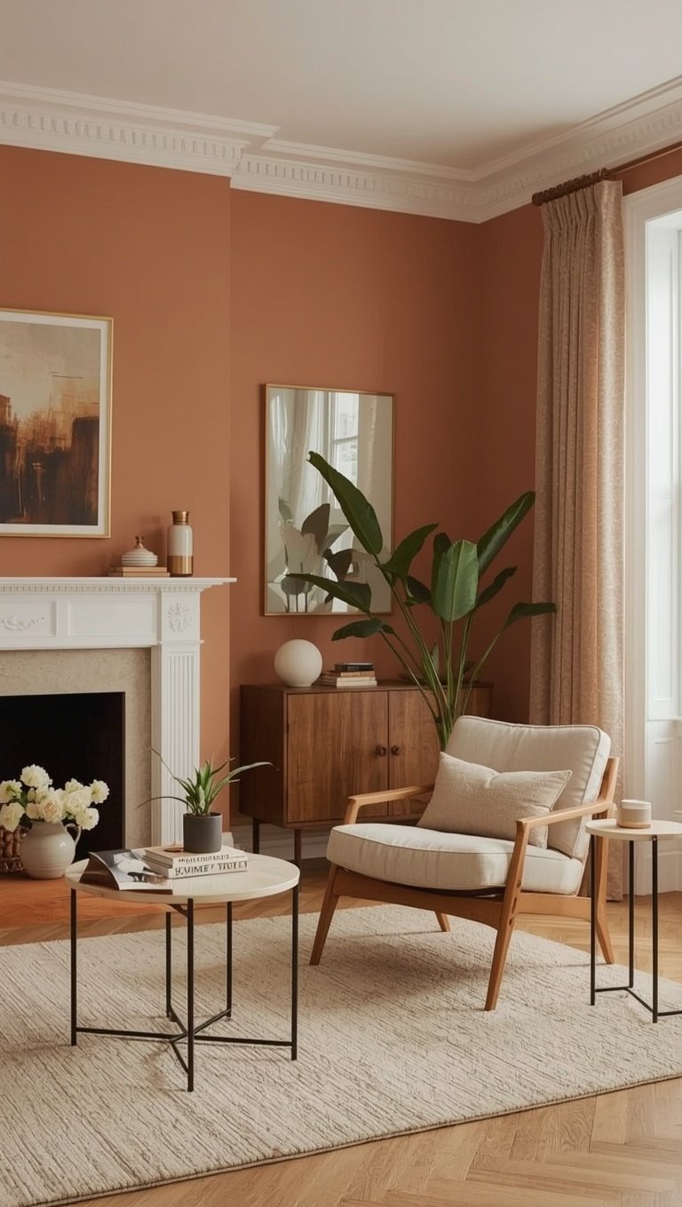
This is where deeper warm tones come in, things like a rich clay, a warm chocolate brown, or a deep terracotta.
These colors still fall under the warm neutral umbrella, they’re just turned up in intensity.
I used a deep warm clay in my home office and it feels like the coziest little cave, in the best possible way.
It’s moody without ever feeling cold, which is exactly the balance I was chasing.
The emotional reason this works is that depth creates intimacy.
A deeper warm wall pulls the room in around you instead of pushing outward like a pale color does.
It’s perfect for a den, an office, or even a small powder room where you want a little drama.
My tip is to pair a deep warm neutral with plenty of warm lighting, like table lamps instead of overhead lights.
That combination keeps the depth feeling rich instead of heavy.
And if you’re nervous, start small, a powder room or a single accent wall is such a low-risk way to test whether bold warm neutrals are your thing before committing to a bigger room.
Related read: Things I Wish I Knew Before I Decorated My First Home — Instant PDF + Kindle download. Secure checkout by Stripe

