
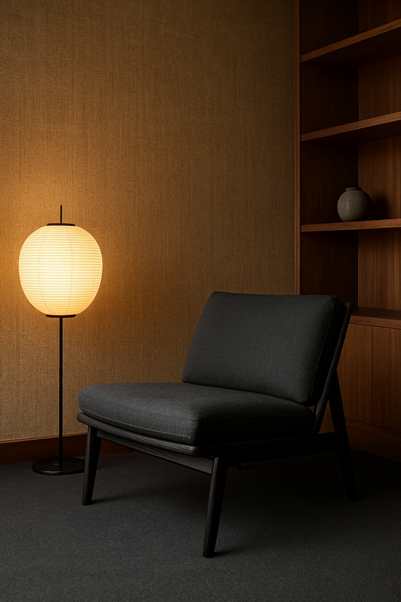
Short answer: sage green and chocolate brown are the two carpet colours I’d trust most with natural hessian walls, and a warm honey-beige is the easy, quiet pick.
Charcoal grey, olive green and cream work well too.
Navy, white, lavender and coral can work, but only with the right hessian in the right room.
Not sure which carpet color works with your walls? Pick the wall color and see each carpet on a room in the free carpet color tool.
Which one is right for you depends on how your hessian actually reads in your own light: golden, ashy, or somewhere in between.
Hessian Has Three Different Undertones, Not One

Every “hessian wall” is really three different walls depending on the light hitting it, and that’s the one detail every carpet-matching guide conveniently skips.
Look at the same patch of hessian at 9am and again at 7pm and you’d swear someone swapped the wallpaper.
Nobody did.
The light moved.
Here’s how I sort it: natural hessian tends to read one of three ways.
There’s golden-honey jute, which leans warm and almost amber when the sun hits it right.
There’s ash-grey flecked weave, where the fibers read cooler, almost driftwood-ish, with little silvery threads breaking up the surface.
And then there’s the muddy mid-tone, which is sort of the mutt of the three.
Not clearly warm, not clearly cool.
Just a soft, indeterminate brownish-grey that refuses to commit to anything, kind of like me trying to pick a paint color on a Sunday with no coffee left in the pot.
Most colour-matching guides are useless because they treat hessian as one fixed beige, like it’s a paint chip you can pull up on a phone screen and match forever.
It’s not paint.
It’s woven fiber.
And fiber has texture, and texture catches light unevenly.
That’s the whole point and the whole problem.
So how do you actually tell which way your wall leans?
Check it in direct daylight first, around 10 or 11am, no lamps, curtains open if you have them.
Golden hessian looks warm and toasty, almost glowing when the sun’s right on it.
Ash hessian stays cooler and flatter, closer to a dry stone colour.
Then check again under evening lamp light, ideally a warm-bulb lamp, not some harsh LED.
This is where things get interesting, because warm bulbs make most hessian look warmer than it does in daylight, even the ash-grey kind.
That’s not the wall changing identity.
That’s just incandescent light doing what it does.
The fleck and fibre variation in the weave itself is doing a lot of quiet work here too.
Hessian isn’t a flat surface.
It’s got slubby little irregularities, thicker threads crossing thinner ones.
Depending on the angle the light’s coming from, those variations throw tiny shadows that shift the overall colour read.
Stand close and tilt your head and you’ll see it: the same 6 inches of wall can look noticeably different just by changing your angle.
That’s the mistake almost everyone makes — assuming “natural hessian” is one specific shade you can match from a photo online.
You’re matching a living, shifting material that behaves differently in your house than it did in whatever stock photo you saved to Pinterest.
Beige Carpet: The Safe Choice That Can Still Go Flat

Beige is the laziest pairing on every single list, not the safest.
And honestly?
It’s often kinda the most boring one once it’s actually on your floor.
That said, it’s not wrong exactly.
It can work.
But “beige” isn’t one thing either, which is the part everyone glosses over.
Warm honey-beige carpet leans into golden hessian nicely, pulling the same amber undertone up off the wall and onto the floor.
Cool greige does the opposite job for ash-grey hessian, keeping things calm and stony rather than warming things up unnecessarily.
And then there’s pink-toned beige, which is its own weird category entirely.
It can work against a muddy mid-tone hessian if the room has warm wood furniture to tie it together.
But against golden hessian it can start to look faintly dusty-rose in a way that wasn’t intended.
Realistically, this pairing belongs in bedrooms and quiet living rooms, spaces where you want low visual noise and don’t need the floor doing any work.
It’s a rest-your-eyes colour, not a statement one.
Here’s the actual risk, though.
When the carpet’s undertone matches the wall’s undertone too closely, and there’s nothing else in the room providing contrast (no dark wood, no contrasting textile), you get a washed-out, edgeless room.
Everything blurs into the same temperature and value, and the space loses its sense of definition.
It doesn’t look serene.
It looks unfinished, like you ran out of budget halfway through.
Picking beige purely because it’s labeled neutral is the trap.
You skip checking whether it’s actually going to erase the wall’s texture instead of complementing it, and you end up with a room that photographs fine and feels like nothing in person.
Chocolate Brown Carpet: Grounding a Room That Has No Hard Edges

Chocolate brown is underrated because people assume dark carpet automatically reads dated.
Against hessian, though, it reads intentional.
Deliberate, even.
There’s something about a soft, fibrous wall sitting above a deep, solid floor that just makes sense structurally.
The wall stays airy and textured.
The floor grounds it.
Undertone matters a lot here.
Warm chestnut brown, the kind with a reddish cast, pairs beautifully with golden hessian because they’re singing from the same warm songbook.
Cooler near-black espresso brown is a different animal.
It works better against ash-grey or muddy hessian, where you want contrast in value (dark floor, lighter wall) without a clash in temperature.
This pairing earns its keep in living rooms and home offices, plus dens or studies, assuming there’s at least a couple hours of decent natural light coming in.
Hessian’s soft, fuzzy fiber texture has no hard edges on its own, and chocolate brown gives the room something to visually lean against.
It stops things from floating.
But, and this is a real but, in small or north-facing rooms with limited natural light, this combination can turn into a cave.
Fast.
All that deep brown just eats the available light instead of bouncing any of it back, and the hessian’s texture, instead of softening the room, starts contributing to a general murkiness.
I’d skip this pairing in a room that barely sees direct sun.
Avoiding brown carpet purely because of its reputation ignores the real issue.
Some decade decided dark floors meant outdated, but the actual light in the actual room is what decides this, not a vibe from a magazine a decade removed.
Sage Green Carpet: The Pairing Everyone Recommends and Mostly Gets Right

Sage is popular because it actually works, not because it’s trendy.
This is the rare case where I’ll admit the crowd got it right.
It’s one of the few combinations on this whole list where my caveat is a small one.
Grey-leaning sage is the safer, cooler-toned option and it plays especially well against ash-grey hessian, since both have that dusty, almost dried-herb quality that feels calm without feeling sterile.
Yellow-leaning sage, which has more warmth baked into it, pairs more naturally with golden hessian, picking up that honeyed undertone and softening it with green rather than fighting it.
Living rooms and bedrooms aiming for a calm, organic feel are the obvious home for this one.
It feels a little like bringing the outside in, without going full botanical-print-everywhere (not that there’s anything wrong with that, it’s just a different mood).
The one place it goes wrong (and it’s a specific trap) is when both the sage and the hessian lean yellow with nothing cooler in the room to break it up.
That’s when the whole combination tips from “organic and calm” into muddy and swampy, like the room’s color temperature got stuck in a humid afternoon.
If your hessian is clearly golden and you’re set on sage, lean toward the grey-based sage rather than the yellow-leaning one, just to keep one foot in cooler territory.
It’s a one-shade adjustment but it keeps the room from sliding into mush.
Honestly?
Sage is my pick.
Navy Blue Carpet: A Riskier Contrast Than the Mood Boards Admit

Navy gets recommended too casually online.
People treat it like an automatic win, a sophisticated-by-default colour you can drop into any room and walk away from.
It’s not.
Against hessian specifically, navy is one of the harder colours to get right, not an easier one.
The split here matters more than usual.
True navy (deep, almost ink-like) needs a bridge to work with warm hessian.
On its own it’s cold and the hessian is warm, and the two don’t meet in the middle — they just sit next to each other awkwardly.
Grey-based navy, which has a dustier, less saturated quality, has a much easier time bridging that gap, especially against ash-grey or muddy hessian where the temperatures are already closer together.
When it works, it works for drama: smaller studies and dining rooms where you actually want some visual weight and contrast rather than a calm, blended look.
This isn’t a pairing for people chasing serenity.
It’s a pairing for people who want a room with a bit of edge.
Where it falls apart is exactly where the mood boards never admit it will: a cold, true navy against a strongly honey-warm hessian wall just looks disjointed.
Jarring, even.
Like two rooms got mashed together.
There’s no shared temperature to anchor the combination, so your eye keeps bouncing between “warm wall” and “cold floor” without ever settling.
Treating navy as a universally sophisticated, safe choice — the way basically every one of these guides does — skips a step.
You actually have to check how warm your hessian is first.
Skip that step and you might end up with a floor and wall that are technically both “nice colours” and still look wrong together.
White Carpet: Gorgeous in Photos, a Genuine Headache in Real Rooms

White carpet is the most oversold pairing on Pinterest, full stop.
It photographs beautifully: bright, airy, that whole “fresh linen” look everyone’s chasing.
In real life, with real households, it’s a genuine headache, especially with a dog in the house (mine, Biscuit, sheds on everything).
White carpet and a shedding dog?
Nope.
Bright cool white carpet pairs nicely with ash-grey hessian, both leaning crisp and clean in the same direction.
Warm ivory-white does better against golden or muddy hessian, since it’s got just enough yellow in it to not clash with the wall’s warmth.
But the realistic use case for this pairing is narrow: low-traffic formal rooms, maybe an adult bedroom with no kids or pets involved, period.
That’s basically it.
Any household with kids, or a dog that sheds (hi), or honestly just regular foot traffic and regular life, is going to see marks and hair and general wear show up on white carpet fast.
It’s not a durability problem exactly, it’s a visibility problem.
Every single thing shows.
Choosing white because it photographed beautifully in someone else’s living room is one of the more expensive style mistakes you can make.
You skip thinking through how your actual household actually lives in a room, and replacing carpet isn’t cheap and isn’t quick.
Dusty Blue Carpet: The Quiet Middle Ground Between Navy and Grey

I think dusty blue is a better “safe” choice than navy for most people.
It gets you the calm without the commitment, which is honestly what most people actually want when they say they want navy: they want blue’s cooling effect, not blue’s drama.
There’s a meaningful split here.
Blue-grey dusty blue stays quiet and recedes into the background nicely against ash-grey hessian.
The slightly lavender-leaning dusty blue has a touch more personality, and it tends to suit a muddy mid-tone hessian better, since the hessian’s ambiguity gives the lavender undertone somewhere to land.
This pairing belongs in bedrooms, nurseries, reading rooms, and guest rooms, spaces where you want softness without starkness, calm without the room going cold and flat.
The risk is subtle but real: a very pale dusty blue against a pale ash-grey hessian can wash out entirely, losing all its presence.
If there’s no depth difference between the two (same lightness, same mutedness), the room just reads as a blur of nothing, no contrast, no definition.
If your hessian is on the paler, ashier end, pick a dusty blue two shades more saturated than you think you need.
It’s an easy adjustment and it keeps the pairing from disappearing on you.
Burgundy Carpet: Old-House Warmth That Can Tip Into Heavy

Burgundy gets dismissed as old-fashioned more than almost any other colour on this list.
That’s a shame, because it’s genuinely one of the most flattering dark colours for older homes with hessian walls.
There’s something about the depth of burgundy against the soft, fibrous texture of hessian that feels lived-in and settled rather than dated.
Burgundy is one of the few dark colours I’d trust in an older home.
Brick-leaning burgundy, with its warmer, more orange-adjacent undertone, suits golden hessian especially well, since they share that same earthy warmth.
Purple-leaning burgundy, more saturated overall, works better against ash-grey or muddy hessian, where it can read as rich without clashing in temperature.
Dining rooms and studies are the natural home for this (a room you sit in for 1 hour at dinner can carry more drama than one you live in all day), ideally with high ceilings or a decent amount of natural light to keep the depth from closing in.
Burgundy has presence, and presence needs room to breathe.
Which is exactly the issue in small, low-light rooms: nothing to balance that much depth of colour against, and the whole space can tip from warm and grounded into heavy and oppressive.
It’s not the colour’s fault so much as a scale mismatch — big colour commitment, not enough light to offset it.
Assuming burgundy only belongs in strictly traditional or formal decor is the real mistake here.
It can sit just fine in a more relaxed, lived-in space too, as long as the room has the light and the size to carry it.
Lavender Carpet: The One Everyone’s Scared to Try

Lavender is the pairing people are most afraid of, and it deserves far more credit than it gets.
I get why people hesitate.
It sounds like a kinda risky, maybe slightly twee choice on paper.
In practice, against the right hessian, it’s quietly one of the more interesting combinations on this whole list.
Grey-lavender, the dustier version, works well against ash-grey or muddy hessian, where the cool undertones align and nothing feels out of place.
Pink-toned lavender is trickier.
It can be lovely against a muddy mid-tone hessian, where the ambiguity of the wall gives the pink room to exist without clashing, but it gets riskier the warmer the hessian gets.
Bedrooms, nurseries, guest rooms and reading corners are the low-risk places to actually try this.
It’s not a pairing I’d push into a big open living space on a first attempt, but in a smaller room it has room to be a little unexpected without taking over your whole house.
The clash to watch for: a cool pink-lavender sitting against a very warm honey-gold hessian can read slightly sickly, like the two colours are actively arguing rather than coexisting.
If your hessian leans strongly golden, skip the pink-lavender and go grey-lavender instead, or just skip lavender altogether and revisit the sage section.
But don’t skip lavender out of nerves alone.
It’s more forgiving than its reputation suggests.
Charcoal Gray Carpet: Cool Enough to Fight the Wrong Hessian

I think charcoal is the most reliable dark neutral for hessian walls — more reliable, honestly, than black, which I think reads too stark and too flat against a textured natural fiber like hessian.
Charcoal has enough softness in it to feel grounded without feeling like a hard stop.
Blue-based charcoal, slightly steely, pairs naturally with ash-grey hessian: same cool family, easy harmony.
True neutral charcoal, without a strong blue cast, is far more flexible and can sit comfortably against golden or muddy hessian too, since it’s not pulling hard in any one temperature direction.
This one works in living rooms, home offices, dens, and contemporary-styled spaces generally, anywhere you want a grounded, slightly modern foundation without going full black-and-white.
Where it goes sideways is specific.
Force a blue-leaning charcoal against a strongly golden hessian and you get a stark cold-versus-warm standoff — not unlike the navy problem, but slightly less severe, because charcoal’s darker value at least gives the room some grounding even while the temperatures argue.
If your hessian leans golden, go with the true neutral charcoal rather than the blue-based one.
It’s a small swap that avoids the whole standoff entirely.
Terra Cotta Carpet: Leaning Into the Honey Undertone Instead of Fighting It

Terracotta barely shows up on carpet lists, which baffles me, because it might be the single most natural pairing with warm hessian that exists.
It’s basically agreeing with the wall instead of negotiating with it.
This one’s specific though: it works with golden, honey-toned hessian specifically, not ash-grey hessian.
There isn’t really a cooler version of terracotta that saves this pairing the way there was with navy or charcoal.
Terracotta is inherently warm, full stop, so the match depends entirely on the wall meeting it halfway.
Living rooms, sunrooms, reading nooks, and breakfast nooks that want warmth are the obvious candidates, especially rooms that already get plenty of direct sun.
Terracotta tends to glow rather than sit flat when the sun actually hits it.
Against ash-toned hessian, though, this pairing just clashes.
An orange floor under a cool grey wall reads jarring rather than warm, like the two elements got assigned to the wrong room.
There’s no bridging undertone to soften that gap the way grey-based navy could bridge warm hessian.
If your hessian isn’t clearly golden, this is one of the few pairings on this list I’d just skip rather than try to adjust around.
Olive Green Carpet: Sage’s Moodier, Deeper Cousin

Olive is the better choice for anyone who finds sage too soft or, frankly, too trendy at this point and wants something with a bit more depth and history to it.
It reads older, more settled.
Less Pinterest board, more actual old house.
Brown-leaning olive has real warmth to it and suits golden hessian nicely, deepening the wall’s honey undertone rather than contrasting it.
Yellow-leaning olive is brighter and a touch more saturated, and it does better against muddy mid-tone hessian, where it can stand out a bit without clashing.
This is a studies, dens, dining rooms, and home-office colour, spaces where you want a richer, moodier green rather than the calm, airy feeling sage tends to bring.
In low-light rooms, though, olive can turn drab fast.
Instead of reading rich and deep, it goes murky and dull, losing the complexity that makes it interesting in better light.
This is a colour that genuinely needs light to perform.
Without it, you’re just left with a flat, muddy green that doesn’t do anything for the room.
Check how much direct daylight the room really gets before committing here.
It matters more here than with sage, which is a bit more forgiving in dimmer conditions.
Coral Carpet: A Trend Colour That Needs the Right Hessian to Work

Coral only belongs in small doses with hessian.
A whole-room coral carpet is a trend trap, not a timeless decision.
A lot of people who go full coral likely regret it once the trend cycle moves on and they’re left living with it daily.
Ask yourself whether you’d still want it underfoot in 10 years.
Muted dusty coral is the far more wearable option, and it can work in a small dose against golden or muddy hessian, where the warmth lines up.
Bright, saturated coral is a much bigger commitment, and it needs a very specific context to not overwhelm, mainly because it’s loud in a way almost nothing else on this list is.
That context is small or secondary rooms, not full open-plan living areas.
A reading nook, a small guest room, maybe a kid’s room.
Somewhere contained.
Cover a large floor area in bright saturated coral and the effect stops feeling playful and starts feeling almost costume-like, like you’ve walked onto a stage set rather than into someone’s actual living room.
Scale is the whole problem with coral, more than undertone even.
Treating coral as a main living-room colour instead of what it really is, an accent-scale risk, is how a fun idea turns into a carpet you’re stuck disliking for a decade.
Cream Carpet: Nearly Beige, But Not the Same Decision

Cream and beige get lumped together constantly, like they’re basically the same choice with a different name.
But cream is actually the riskier, higher-maintenance pick of the two, and I think that distinction gets lost way too often.
Yellow-leaning cream, buttery, pairs well with golden hessian, amplifying that honeyed warmth.
Almost-white cream, noticeably paler, suits ash-grey or muddy hessian better, keeping things light without going fully stark the way bright white would.
Bedrooms and formal living rooms with lower daily traffic are the realistic home for cream, for basically the same reasons white needed low traffic, just a little less severely, since cream hides a touch more than pure white does.
Here’s the part that actually matters long-term: pale cream shows stains and traffic marks much sooner than a true beige does.
Beige is a shade or two darker, and a darker carpet hides everyday dirt better.
Assuming cream and beige are interchangeable decisions skips right past this.
They might look similar on a sample card, but they age completely differently, and that’s the detail that should actually drive the decision, not the wall colour alone.
Reading Your Room Before You Read a Colour Chart

Nobody should choose a carpet colour from a chart, or someone else’s Pinterest board, or honestly even from this post without doing a bit of homework in their own actual room first.
The room’s real light and real traffic matter more than any formula I or anyone else can hand you.
Start by checking the hessian’s undertone at two different times of day, say 10am and after dinner, not just once.
Morning or midday daylight tells you one story.
Evening lamp light tells you a different one, sometimes a noticeably different one, especially if your lighting runs warm.
Don’t make a decision off a single glance at a single hour.
Give it 3 days if you can.
Next, match the carpet’s undertone to the room’s existing wood tones and furniture, not just to the wall.
A wall and floor can technically “match” and still look wrong if the room’s wood furniture (a dining table, a thrifted dresser, whatever’s already in there) pulls in a completely different direction.
The wall is one input.
It’s not the only one.
Finally, weigh the room’s actual traffic before committing.
High-traffic rooms (hallways, anywhere kids or pets spend real time) need a completely different colour strategy than rarely-used formal rooms.
In those quieter rooms you can afford to take more risks, since wear and mess just aren’t as big a factor.
A colour that’s perfect for a guest room you use twice a year might be a disaster in a mudroom-adjacent living space.
Match the ambition of the colour to how hard the room actually gets used.
Picking One Without Seeing a Sample Is the Real Mistake

There is no single best colour for hessian walls.
Anyone claiming otherwise, any list promising one universal winner, simply hasn’t accounted for how much hessian itself actually varies from wall to wall, batch to batch, even hour to hour depending on the light.
The only real fix is placing an actual carpet swatch (ask for one at least 12 inches square, because a tiny chip can’t show texture) against the actual wall in the actual room it’s going to live in.
Not in a showroom under fluorescent lights that flatten everything into the same bland sameness.
And not against a totally different wall in a totally different room of the house.
The specific wall.
The specific light.
And do it twice.
Honestly, treat it like a little weekend project — hold the swatch up with your morning coffee, then come back and look again under evening lamp light, a good 2 hours after sunset, before you decide anything.
Leave it taped there for 48 hours.
If the swatch still looks good in both lights, you’ve probably found your match.
If it looks great at noon and strange at 8pm, you’ve just saved yourself from a decision you’d have been annoyed with for years.
Undertone-matching, done properly, in your own room, under your own light, beats any single “best colour” claim every time.
Trusting a universal top-colour recommendation over actually checking your own wall and your own light is, honestly, the one mistake every other guide is quietly setting you up to make.
More from Dreamy:
- Dreamy’s free 2D room planner
- What If I Told You The Right Carpet Could Make Your Bedroom Feel Like A Cozy Haven?
- 12+ Versatile Living Room Furniture Arrangement Ideas For Every Style
- 13 Stunning Brown And Blue Living Room Ideas
- Going Crazy Over Carpet Textures? Top 13+ Styles You Gotta Know
- Homes Of The Future Ideas You’ll Want Sooner Than You Think
- Don’t Let Your Home Miss Out On These 9 Life-Changing Houseplants!
- How You Can Choose Mid Century Modern Light Fixtures That Elevate Your Space
- Privacy Focused Bathroom Window Curtains That Still Let Light In
- Pickin’ Out Some Far-Out New Carpet for Your Pad
- Anyone Ignoring These Mood Lighting Living Room Hacks Regrets It
- How to Choose the Perfect Carpet Color for Your Bedroom Oasis
- Check Out These Clever Multipurpose Rooms For Your Home