
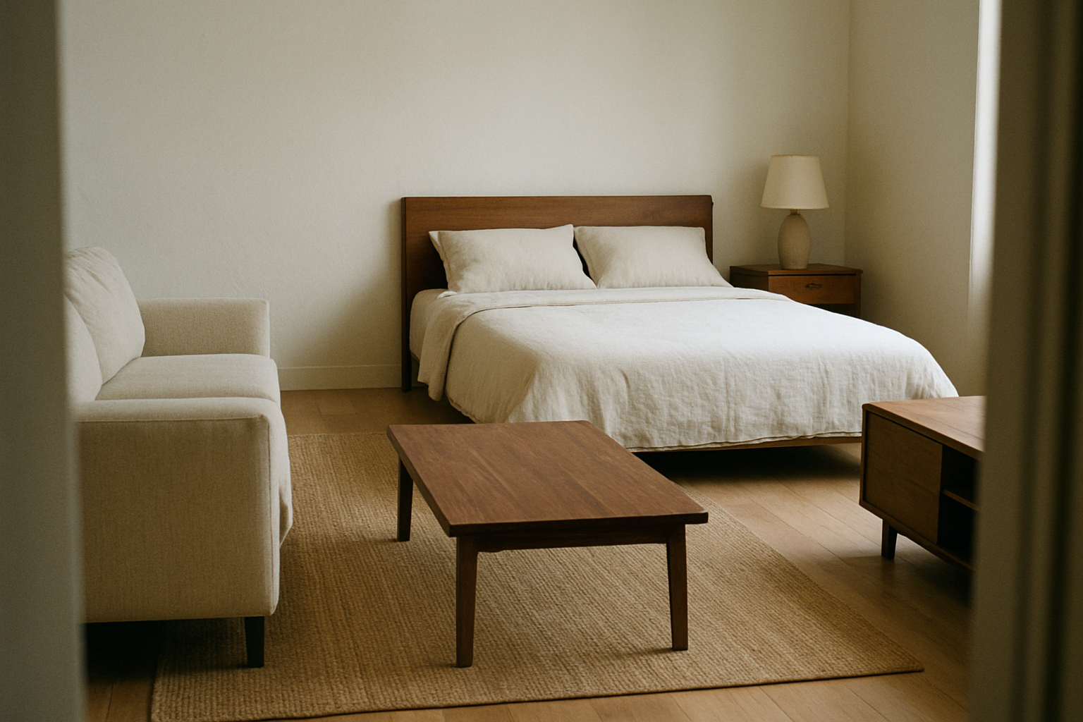

This post walks through how to make a studio apartment stop reading as one big room: where the bed should go, how the sofa can pull double duty as a divider, why rugs and lighting need to split up by zone, and where storage actually belongs.
There’s also a free plan at the end you can open and rearrange to try the ideas out yourself.
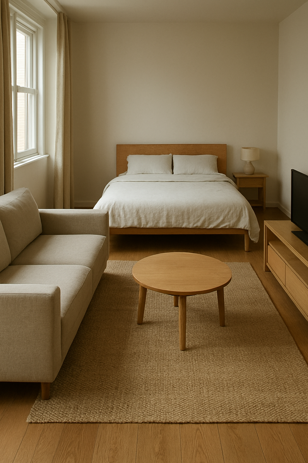
Free floor plan: Open this studio apartment layout in the free room planner — furnished, to scale, and yours to move around →
Stand at Your Front Door Before You Buy Anything
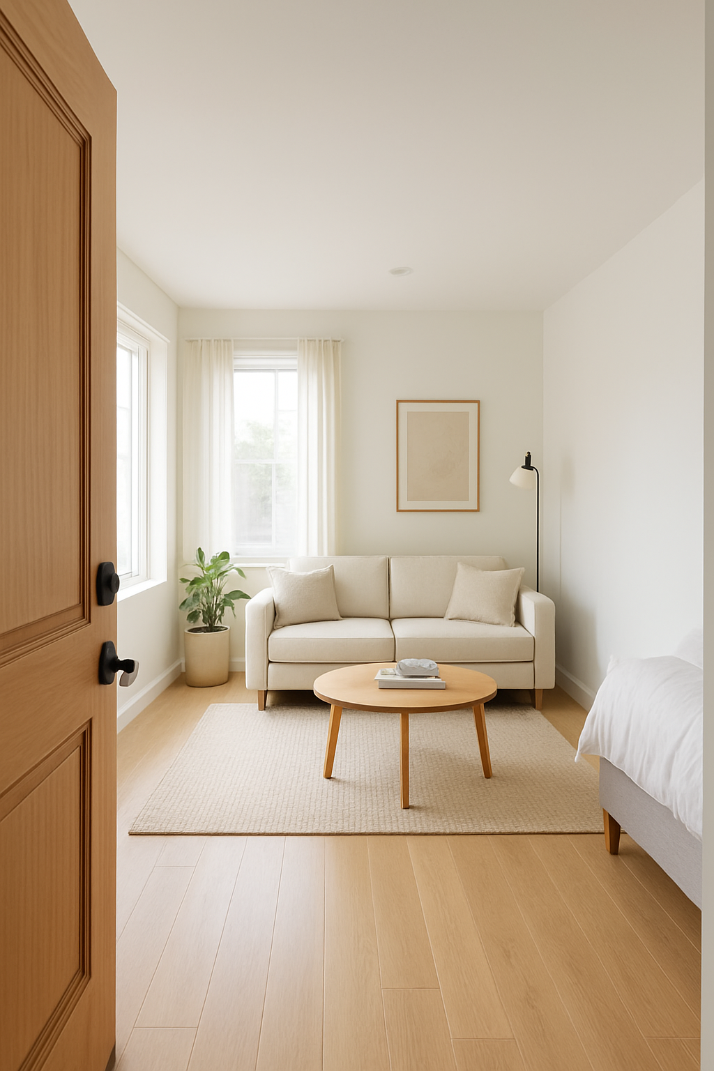
Here’s the test nobody runs.
Open your front door, actually walk in like you’re a guest who’s never seen your place, and stop right there in the entry.
What do you see first?
Not what you think is decorated nicely.
What your eyes land on in the first half-second.
If it’s the bed, that’s it.
You’ve got a bedroom with some other stuff happening around the edges.
Doesn’t matter how good the throw pillows are.
I’ve been the guest at enough studio apartments to know this instantly, and so has everyone else who walks through your door.
They just don’t say it out loud.
They’re too polite, but they clock it.
A main walkway from a front door into a room runs about 36 inches, and whatever’s lined up along that path is basically doing PR for your whole apartment, whether you meant it to or not.
And the mistake people make here is trying to fix a sightline problem with styling.
New bedspread, a piece of art over the headboard, a fancy throw.
None of it touches the actual issue, which is that the bed is the first noun in the sentence your room is saying.
You have to move the sentence, not decorate the word.
Push the Bed to the Farthest Corner From the Entry
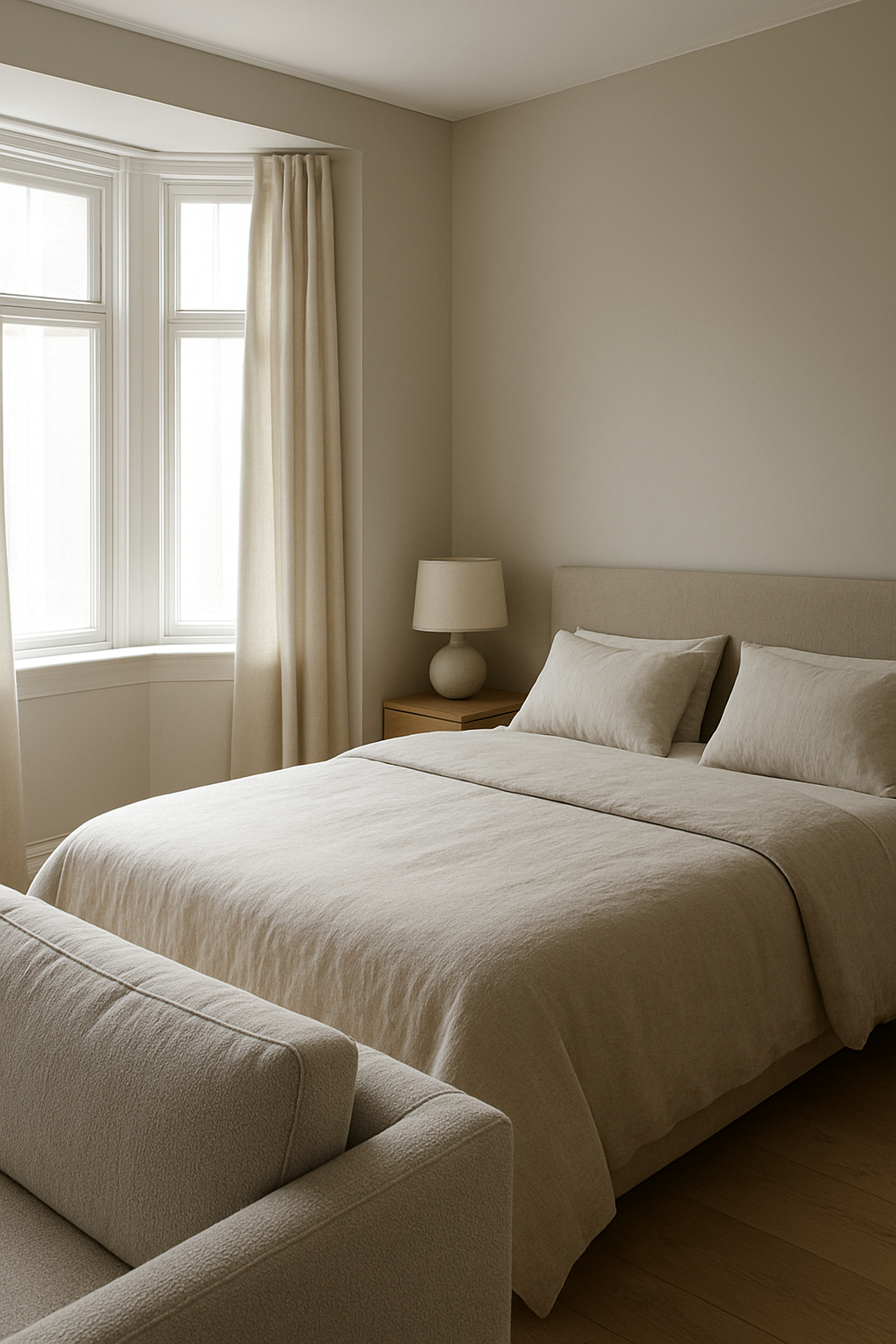
Once you know what the sightline is telling on you, the fix is almost embarrassingly simple: move the bed as far from the door as your walls allow.
Farthest corner.
Ideally tucked behind or beside whatever piece is already doing visual blocking (more on that in a second).
This is going to feel wrong at first, honestly, because we’re trained to think the bed is the star of the bedroom and deserves the good spot.
In a studio, it doesn’t get the good spot.
It gets the corner.
You want 24 to 36 inches of walkway beside the bed and at its foot, enough to actually move around and make it without stubbing a toe on a nightstand, but not one inch more than that.
Every extra inch of clearance you give the bed is floor space you’re stealing from the zones that need to be visible.
The bed should be the least convenient piece in the whole apartment to get to.
That’s not a punishment, it’s the whole strategy.
Comfort of access matters so much less here than what your guest’s eyes hit first, and I’ll die on that hill too, right next to the one about overhead lighting.
Let the Sofa’s Back Do the Wall’s Job
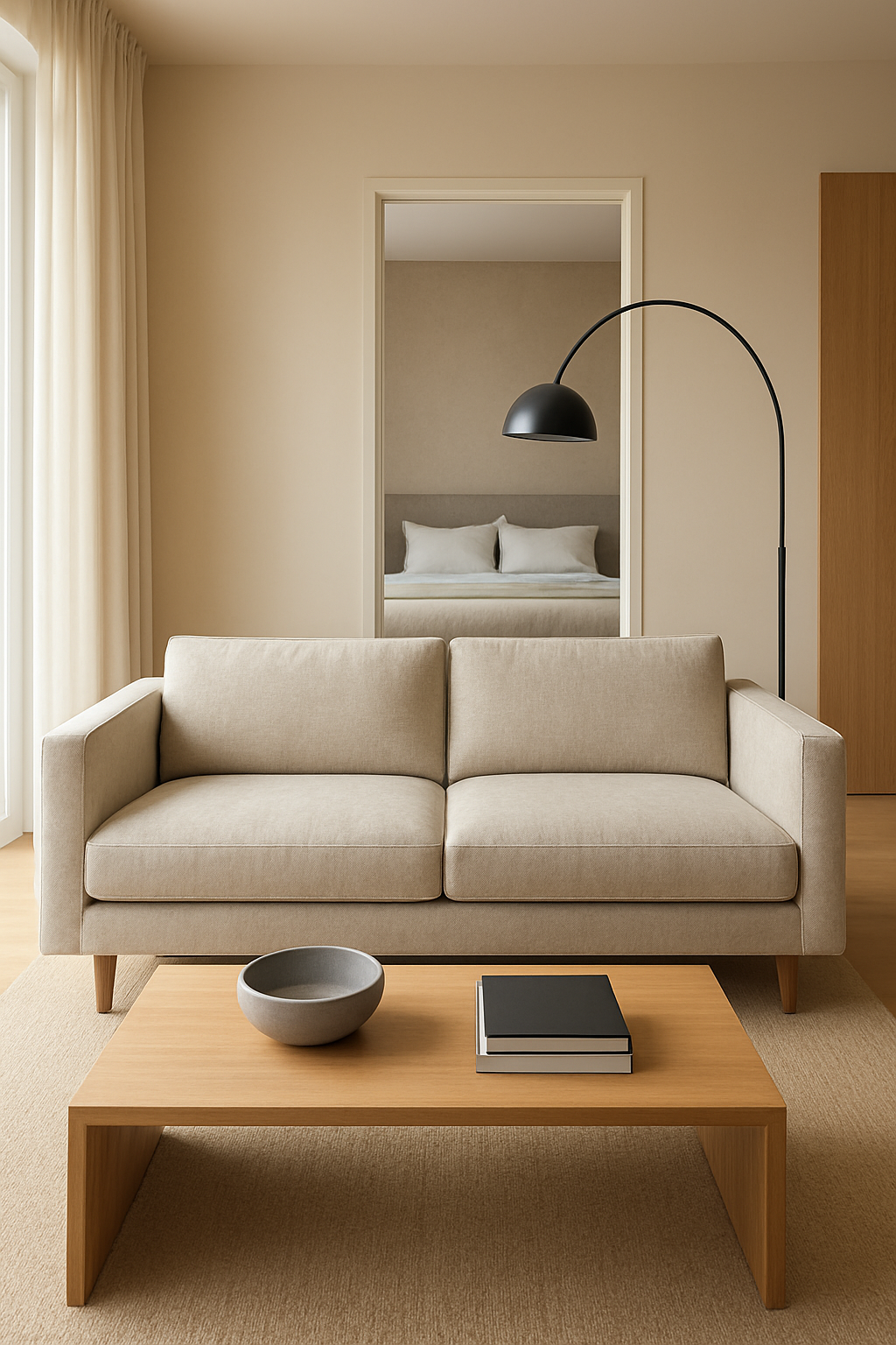
This is the part every other studio-layout post skips completely, and it drives me a little nuts.
They’ll tell you to buy a bookshelf marketed as a “room divider,” or hang a curtain on a tension rod, or get one of those folding screens that looks nice in a catalog photo and then just sits there catching dust and fur from a dog who sheds in real life.
Before you spend a dollar on any of that, turn your sofa around.
Back of the sofa faces the entry and sleeping side.
Front faces into the sitting zone.
That back cushion line, at sofa height, blocks the sightline almost as well as an actual wall would, and it costs you exactly nothing because you were already buying a sofa.
Anchor the sitting zone with a coffee table sitting about 14 to 18 inches from the sofa’s front edge, close enough to reach your coffee without unfolding yourself off the cushions, and now you’ve got a defined room on the far side of that “wall” you didn’t pay for.
Buying a divider before you’ve tried turning your sofa around is buying a solution to a problem you never actually attempted to solve for free.
I get why the product exists.
I just think it’s worth trying for free before you spend on it.
Read next: Studio apartment ideas
Give Each Zone Its Own Rug
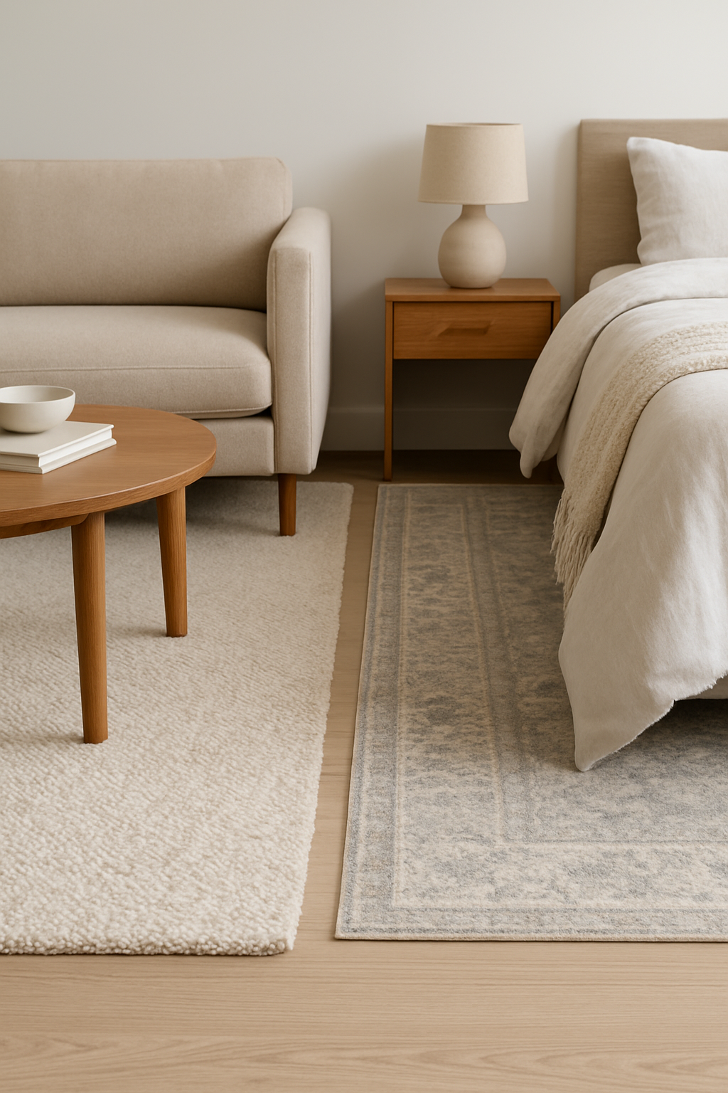
One giant rug under the bed, the sofa, and the desk all at once is, and I say this with love, the fastest way to make a studio look like a dorm room.
A single rug reads as a single room.
Every time.
Zones need their own floor.
The sleeping area gets a rug sized to hold the bed and nightstand inside its edges, something like an 8×10 under a queen.
The sitting area gets its own, maybe a 5×7 under the sofa and coffee table.
If you’ve got a desk zone too, even a small 3×5 rug there helps.
Leave a real walkway between them, about 36 inches for the main path through the room, and 24 to 30 inches is fine for a secondary path that doesn’t get as much traffic.
That gap of bare floor between rugs is doing as much work as the rugs themselves.
It’s the visual comma between rooms.
I used to think matching rugs everywhere looked “cohesive.” Turns out cohesive and undifferentiated are not the same thing, and I had it backwards for a while.
Free calculator: Find the right rug size for this room →
Skip the Dining Table and Build a Real Desk Zone
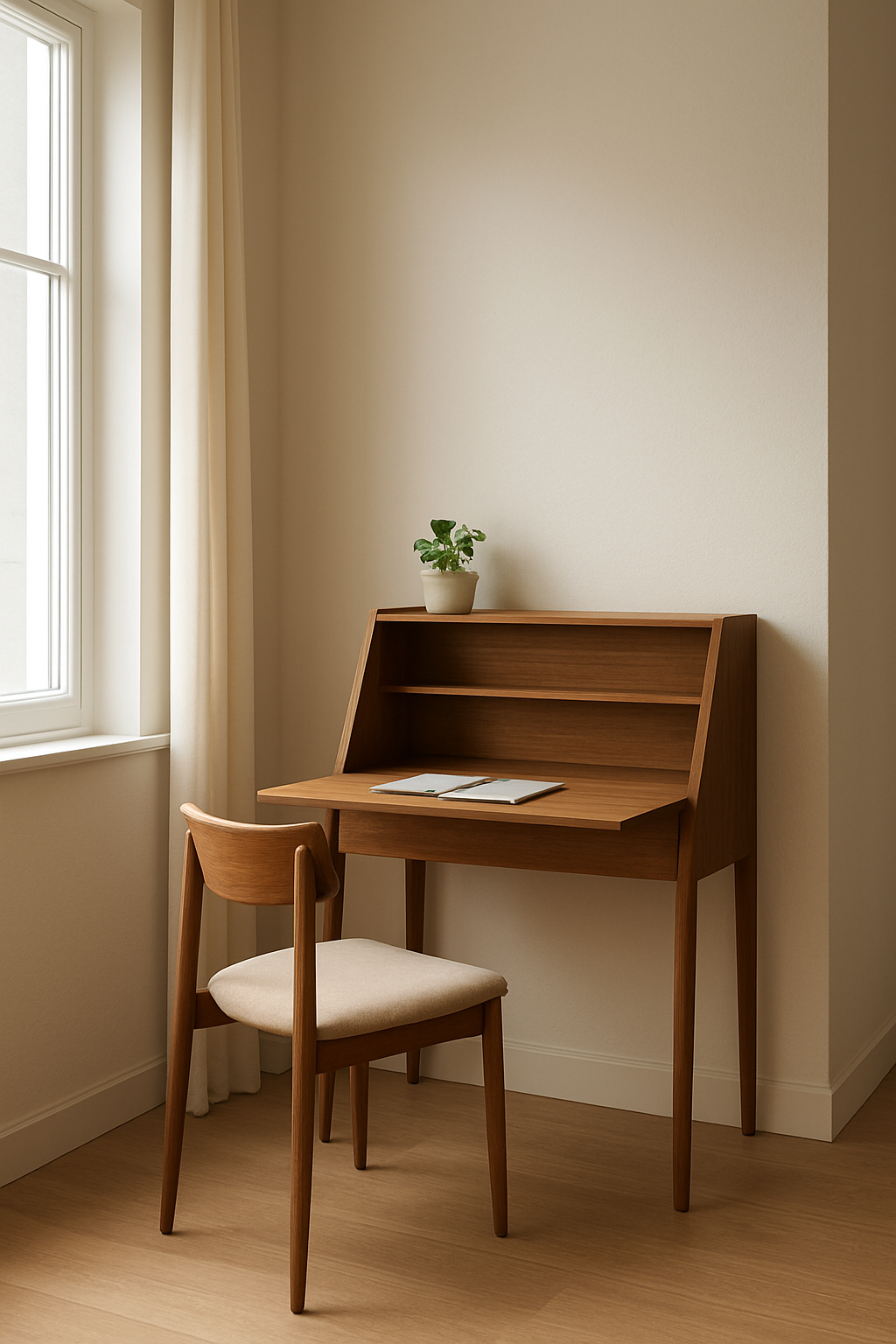
A dining table that also functions as your desk sounds efficient on paper.
In practice, neither job gets done well.
You end up eating dinner next to a stack of mail and a laptop charger, and then working with a placemat under your keyboard, and somehow it always feels a little unfinished no matter how you style it.
Give the work zone its own small footprint instead.
A 30-inch-wide secretary desk and a proper desk chair, nothing bigger than that, positioned so the back of the desk (or a bookcase set beside it) becomes a third visual boundary in the room, alongside the sofa back and the bed placement you’ve already sorted out.
Now you’ve got three zones each with their own edge, instead of one table quietly trying to be two rooms and mostly failing at both.
“I have a table” is not the same sentence as “I have a work zone,” even though they get used interchangeably a lot.
A work zone has its own light, its own chair, its own boundary.
A table with a laptop on it is just a table with a laptop on it.
Kill the Overhead Light and Give Every Zone Its Own
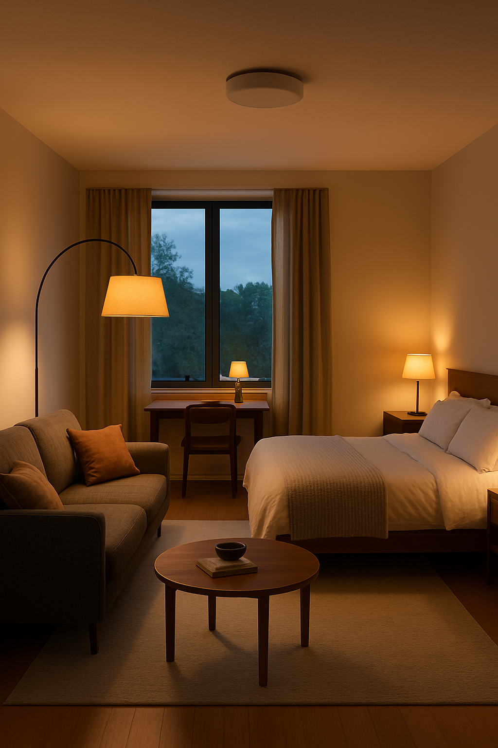
Overhead lighting is the enemy of everything you just built.
I mean that.
One ceiling fixture washes the whole room in the same flat light, and every boundary your furniture worked so hard to create gets erased the second you flip that switch, because suddenly the sleeping corner and the sitting corner and the desk are all lit identically, like a showroom, like nowhere anyone actually lives.
Give each zone its own light instead.
An arc floor lamp for the sitting area, positioned near the sofa rather than dead center in the room where it’ll light everything equally and defeat the whole point.
A task light on the desk.
A bedside light by the bed, same warm 2700K bulb as the rest so the pools of light actually match.
Three different pools of light instead of one flood.
People assume brighter is automatically better, and I get it, I like a well-lit room too.
But a single bright overhead in a studio doesn’t make the space feel bigger or cleaner.
It just proves there’s only one room here, which is exactly the impression you’re trying to avoid.
Tuck Storage Under and Behind Instead of Adding a Dresser
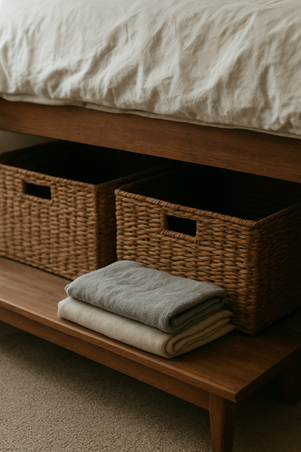
There is no square inch in a studio that gets to just be storage and nothing else.
Every piece needs to already be doing a job (anchoring a zone, holding a boundary, giving you somewhere to sit) before it’s allowed to also hold your stuff.
So skip the dresser.
A dresser eats a walkway and doesn’t earn its footprint.
Use what’s already there instead: under the bed (look for a frame with at least 6 inches of clearance for bins), behind the sofa, and closed storage pieces you were buying anyway.
A nightstand with a drawer.
A media unit with doors instead of open shelving.
Both are already sitting in the room doing zone-defining work, and both quietly swallow the folded sweaters and cable clutter that would otherwise need their own furniture.
That’s the whole trick, honestly.
Nothing new gets added.
You just ask more of what’s already standing there.
Open the Free Plan and Move the Pieces Yourself
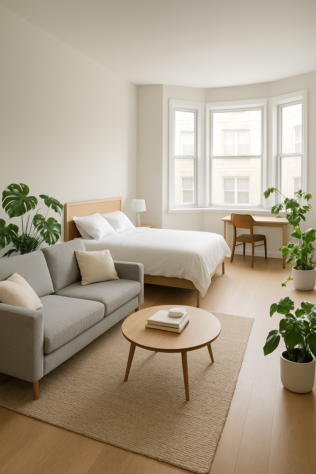
Dreamy has a free furnished plan built around exactly this: sleeping, sitting, and working zones, no kitchen pieces cluttering it up.
The full piece list is a living area rug, sofa, coffee table, media unit, queen bed, nightstand, secretary desk, desk chair, a monstera, a pothos, an arc floor lamp, a bay window, a bedroom window, and the front door as the sightline reference point.
Open it and don’t treat the dimensions as a target to hit.
That’s the mistake people make with templates, they try to match the plan’s exact measurements to their own walls like it’s a recipe.
It’s not a recipe.
It’s a layout logic: sofa back to the entry, bed in the far corner, rugs marking their own territory, desk pulling a third boundary.
You’re supposed to tear it apart and resize every piece to your actual room the second you open it.
The plan only earns its keep once you’ve moved something in it.
Drag the sofa.
Push the bed further than it starts out.
Swap the monstera for whatever plant you can actually keep alive.
Use it as a starting sketch, not a finished answer, and then go stand at your own front door and check the sightline one more time.
Related read: The IKEA Kallax Bible — Instant PDF + Kindle download. Secure checkout by Stripe

