


I repainted my living room three times in two years.
Three.
Times.
The first color was a greige I thought would look ‘warm and neutral’ and instead it looked like a hospital waiting room had a baby with a sad cardboard box.
The second was a deep teal that I genuinely loved for about four days until I realized it made every single thing I owned look wrong.
The third time, I finally got it right — and it was because I stopped chasing trends and started paying attention to how colors actually talk to each other.
These are the combinations I wish someone had shown me before I bought that first can of mediocre greige.
Warm Terracotta + Creamy White + A Touch of Brass
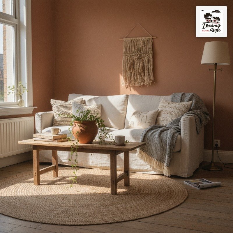
This one stopped me cold the first time I saw it in person.
A friend had painted her living room in this dusty, burnt-orange terracotta — not the bright pumpkin kind, the soft kind that looks like old Italian pottery — and her cream-colored sofa just glowed against it.
The brass details were small.
A floor lamp.
A couple of picture frames.
But they pulled everything together in a way that felt genuinely old and expensive, not like she’d just discovered Pinterest.
I’ll be honest: terracotta reads very differently depending on your light.
Mine gets cold northern light in the morning and it looked muddy until afternoon.
So if your room doesn’t get warm sun, test this one first.
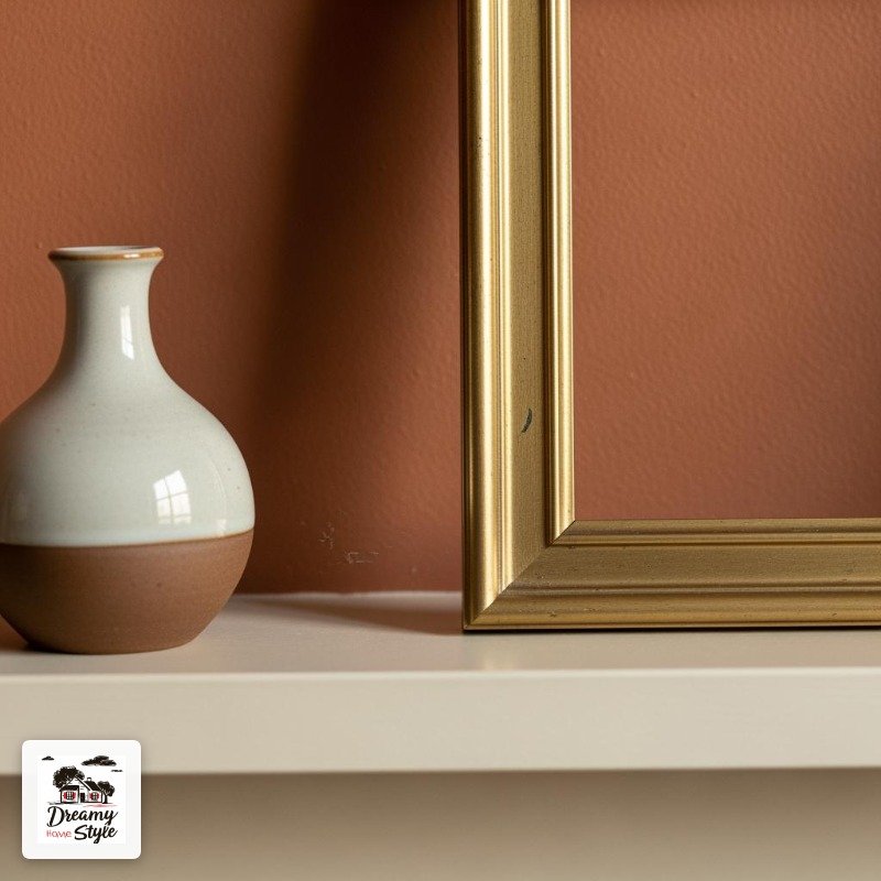
The secret is keeping the whites warm.
Cool, bright white next to terracotta looks like a mistake.
Go ivory.
Go cream.
Go ‘this-was-probably-off-white-before-it-yellowed’ and you’ll be so happy.
Sage Green + Warm Linen + Weathered Wood
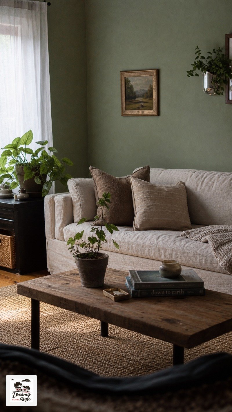
Sage green is having a moment and I don’t even care because it deserves it.
It’s the color that somehow works with literally everything — wood floors, rattan, velvet, concrete.
I’ve never seen it fight with a room.
The linen has to be warm though.
That’s non-negotiable.
Pale, cold linen next to sage starts to feel clinical, almost like a spa that’s trying too hard.
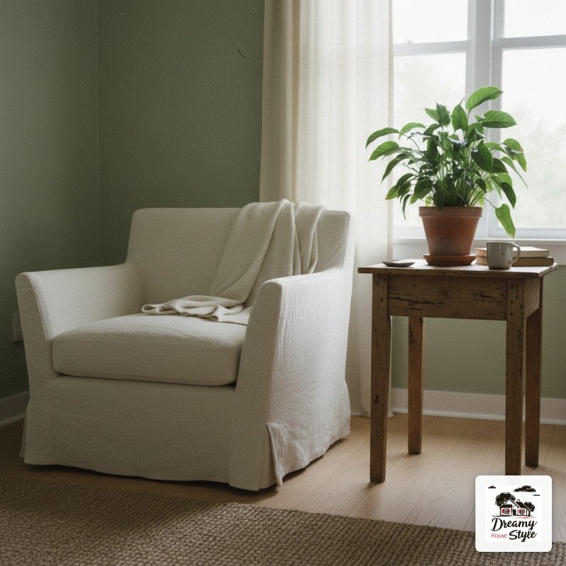
Weathered wood is the third piece — and this doesn’t mean you need to buy expensive reclaimed barn boards.
My old thrift-store coffee table has this beat-up, slightly gray oak finish and it looks absolutely perfect against the sage walls in my hallway.
This combo feels calm without feeling boring.
That’s a hard thing to pull off.
Navy Blue + Warm White + Natural Rattan
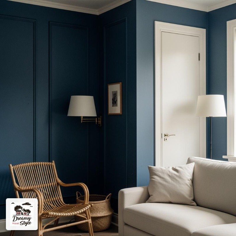
People are scared of navy and I genuinely don’t understand why.
It’s basically the little black dress of wall colors — it makes everything look more intentional.
I tried navy in my old apartment’s tiny living room and people always assumed it was way bigger than it was.
The depth of the color made the room feel like it had layers.
Warm white trim is crucial here (I learned this the expensive way when I used a bright white and it looked like a navy boat with harsh fluorescent lighting).
And rattan — a rattan coffee tray, a rattan chair, even just a basket — breaks up the formality beautifully.
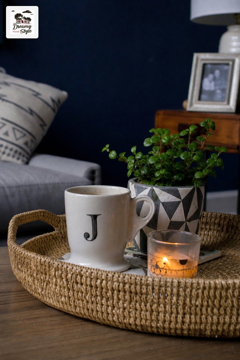
It doesn’t read beachy the way you’d expect.
It reads classic.
Maybe slightly English countryside, which I am fully here for.
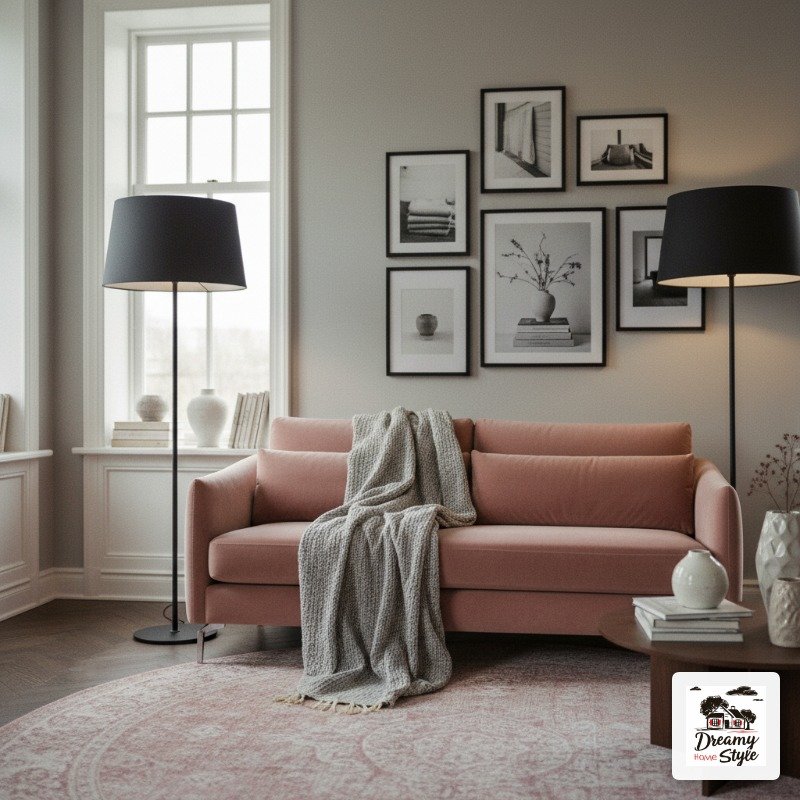
Dusty Rose + Warm Gray + Matte Black Accents
” />
Before you click away — I promise this isn’t a 2014 wedding Pinterest board.
Dusty rose done right is sophisticated.
It’s almost a neutral.
The version I’m talking about is so muted it’s nearly a blush beige.
Paired with a warm medium gray (not cold, not blue-gray, warm), the two colors sort of wrap around each other in this really grown-up way.
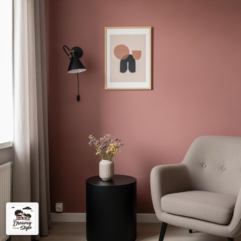
Matte black accents keep it from going too soft.
A black metal lamp base.
Black picture frames.
Even just a black tray on the coffee table.
It adds a little edge.
My main caveat: this combination photographs extremely differently than it looks in real life.
In photos it looks super feminine.
In a real room with real furniture it reads quiet and elevated.
Don’t judge it by the Pinterest photo.
Deep Forest Green + Cognac Leather + Aged Brass
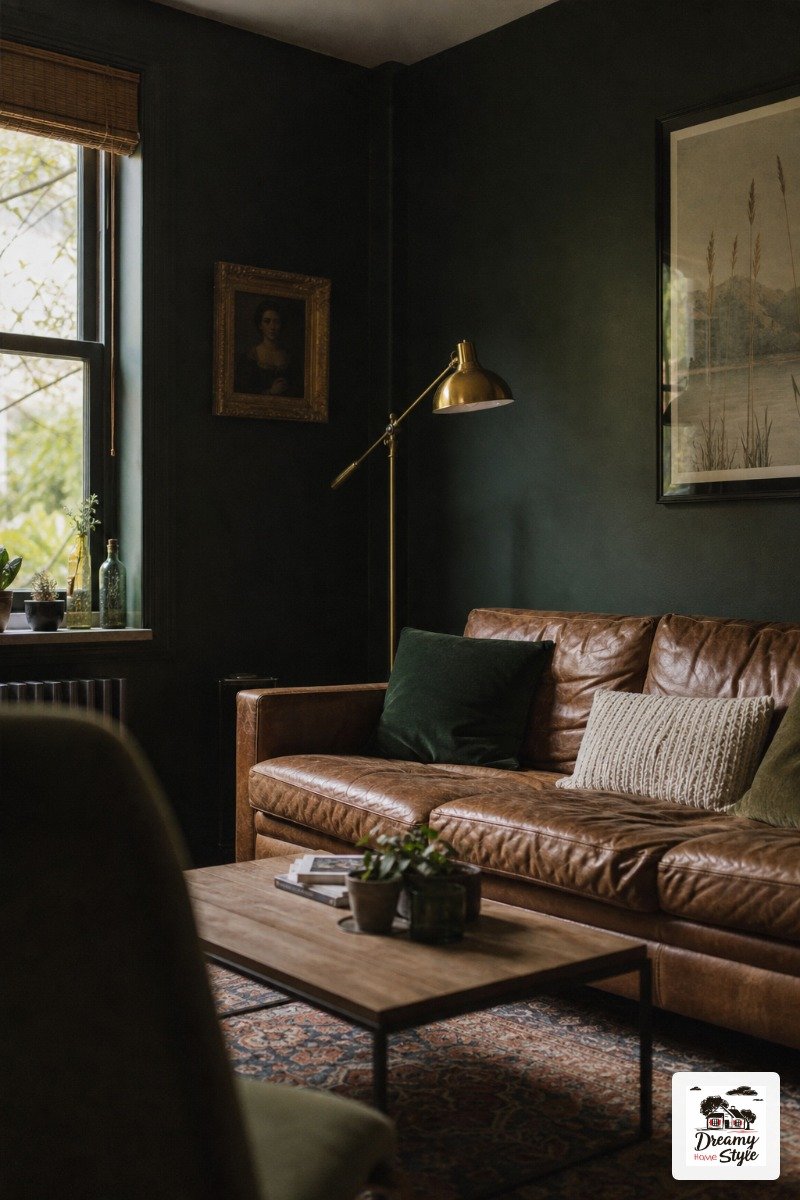
This combination is genuinely moody in the best way.
It’s the color palette of a library in a house that has secrets, and I mean that as the highest compliment.
Deep forest green walls — not emerald, not olive, but that dark, almost-black green — make cognac leather look incredibly rich.
Like the color just woke up.
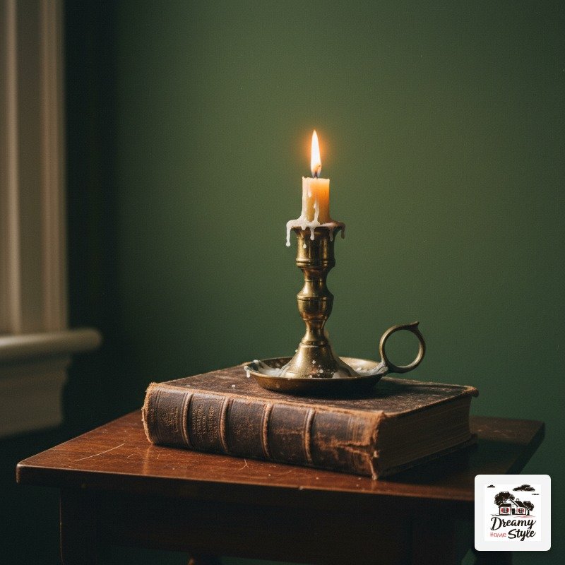
The aged brass is the part people get wrong.
Shiny brass looks out of place here.
You want the old, slightly tarnished kind.
Or unlacquered brass that will tarnish on its own over time (which, honestly, is kind of fun to watch).
This isn’t a bright, airy room.
That’s the point.
It’s meant to feel like somewhere you go to stay.
Warm Charcoal + Oatmeal + Rust Orange Pops
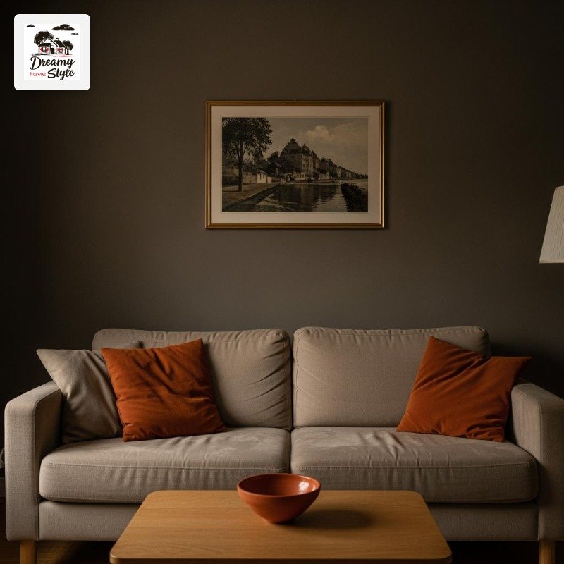
This is my personal living room right now and I’m still a little smug about how it turned out.
The walls are a warm charcoal — specifically a gray that has a brown undertone, not a blue one.
Blue-gray charcoal is cold and a little harsh.
Brown-based charcoal feels like a warm cave.
Very different vibe.
My oatmeal sofa (which Biscuit has absolutely destroyed, but we’re not talking about that) sits in front of it and the contrast is just right.
Not stark.
Soft.
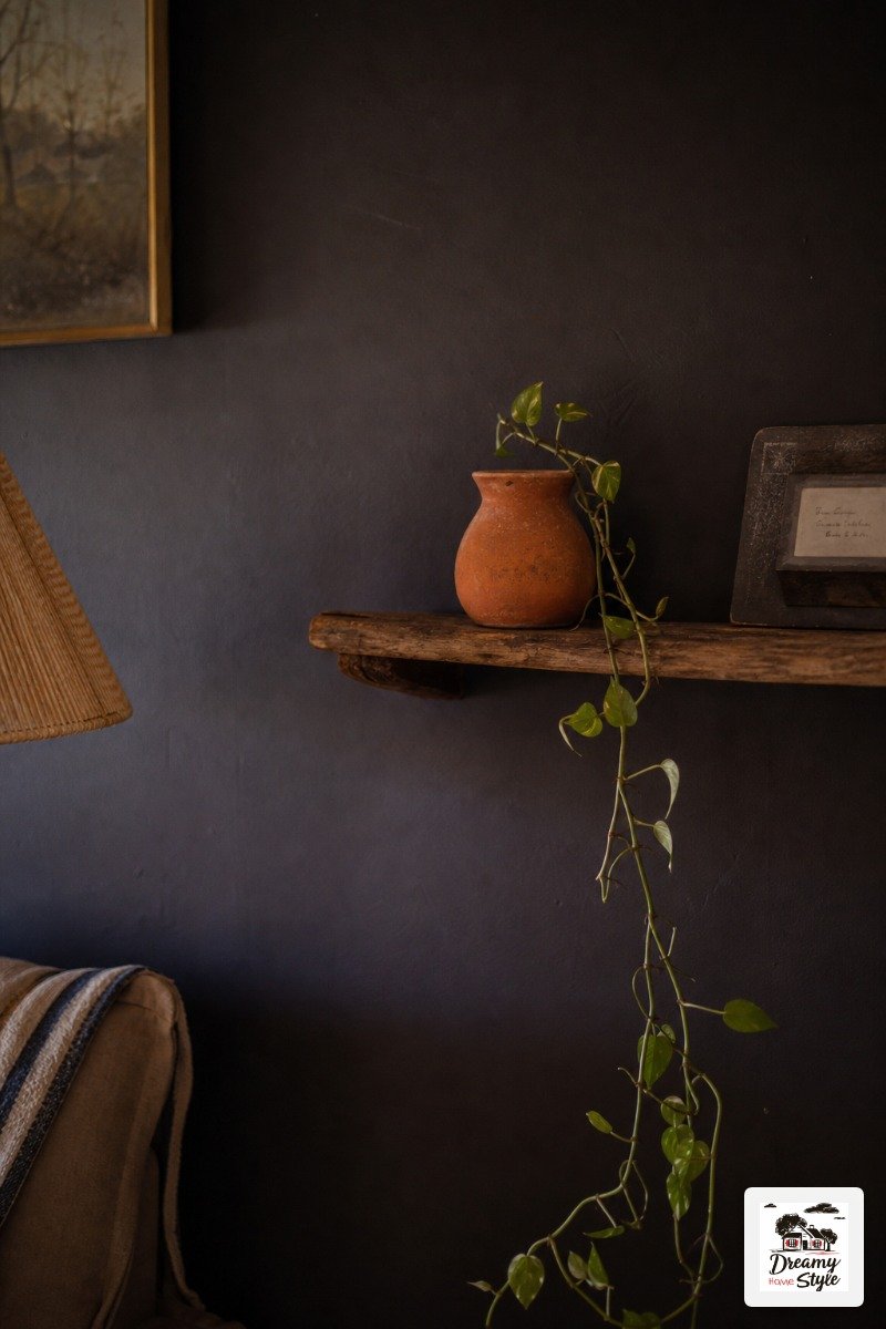
The rust orange is just accent pieces — a vintage throw pillow I found for four dollars, a little terracotta bowl, a secondhand lamp with an orange shade.
Small hits of it.
Enough to make the room feel alive without screaming.
All-White With Warm Wood and Texture Layers
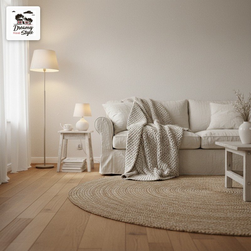
I know, I know.
All-white sounds safe and boring and like you’ve never committed to anything.
But done right, it’s genuinely gorgeous.
The trick is that it can’t actually be all-white.
The walls can be white, but you need at least three or four different textures to keep it from feeling sterile.
A chunky knit.
A jute rug.
A linen sofa.
A rough wood coffee table with visible grain.
And the white tones have to be consistent.
Mixing a cool bright white with a warm cream on different surfaces is the fastest way to make an all-white room look dirty and accidental.
Pick a temperature and commit.
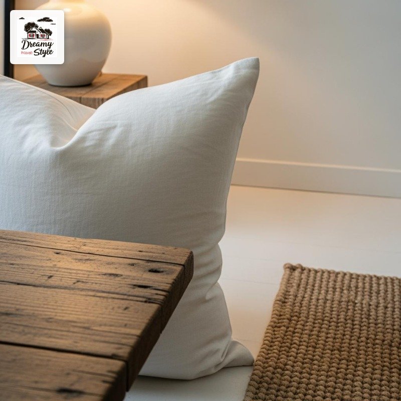
Overhead lighting will absolutely ruin this look.
(I feel very strongly about overhead lighting in general.) Lamps only.
The shadows they create are what make texture visible.
Caramel Brown + Dusty Blue + Warm White
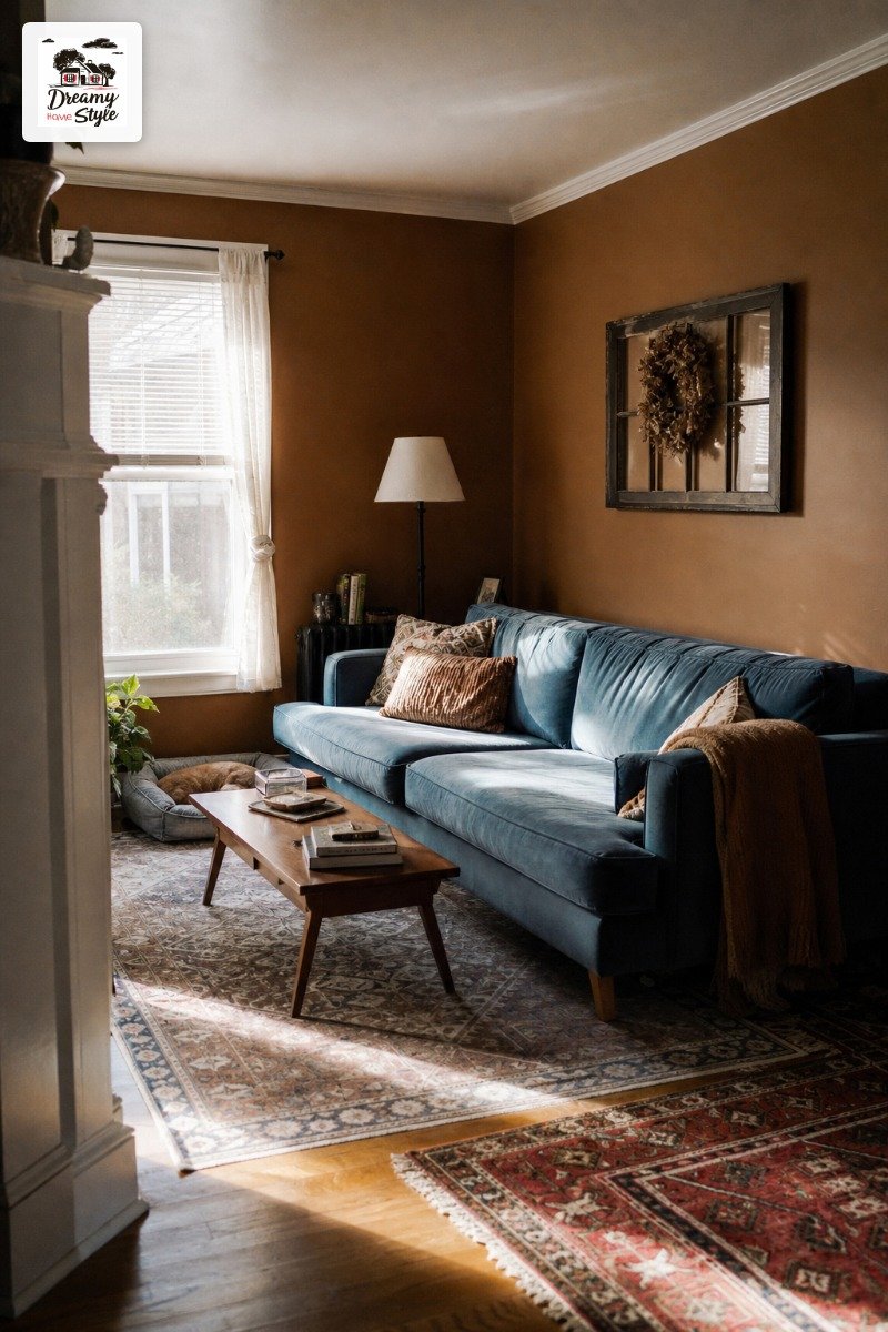
This one takes a little confidence to pull off but it’s worth every ounce of it.
Caramel brown is basically a warm neutral that’s trying slightly harder than beige.
It’s the color of a great leather notebook or a really good latte.
On the walls, it wraps the room in this incredibly cozy warmth.
Dusty blue is the unexpected element — not baby blue, not bright blue, but that faded, almost-gray blue that looks like an old denim jacket.
A sofa in this color, or even just a big area rug, against caramel walls is a combination that stops people.
Warm white keeps both colors from fighting for attention.
It’s the referee.
You need it.
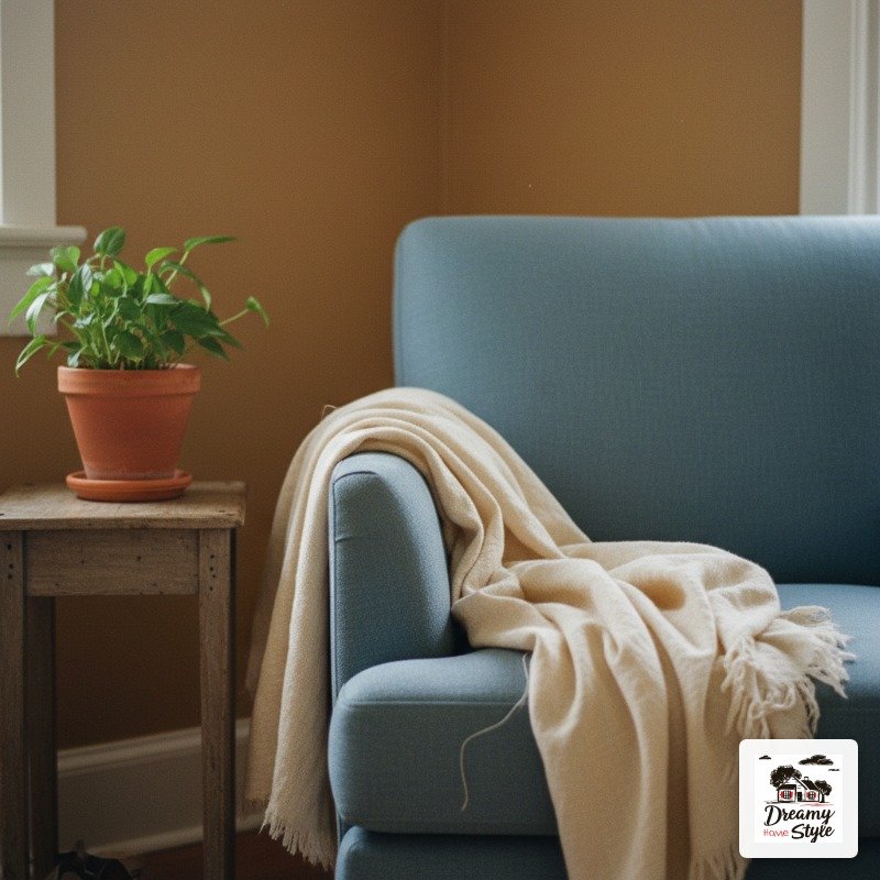
Soft Black + Warm Metallics + Natural Fiber
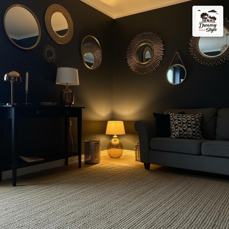
Soft black is not the same as harsh black.
I want to be very clear about this.
Soft black has just enough warmth in it that it doesn’t feel like a void.
Paint companies call it things like ‘Soot’ or ‘Off-Black’ or ‘Wrought Iron’ — and those tiny differences matter enormously when you’re covering four walls.
Against this backdrop, warm metallics do something magical.
Gold, bronze, a slightly rose-gold metallic finish on a mirror.
They glow.
They genuinely look like they’re lit from within.
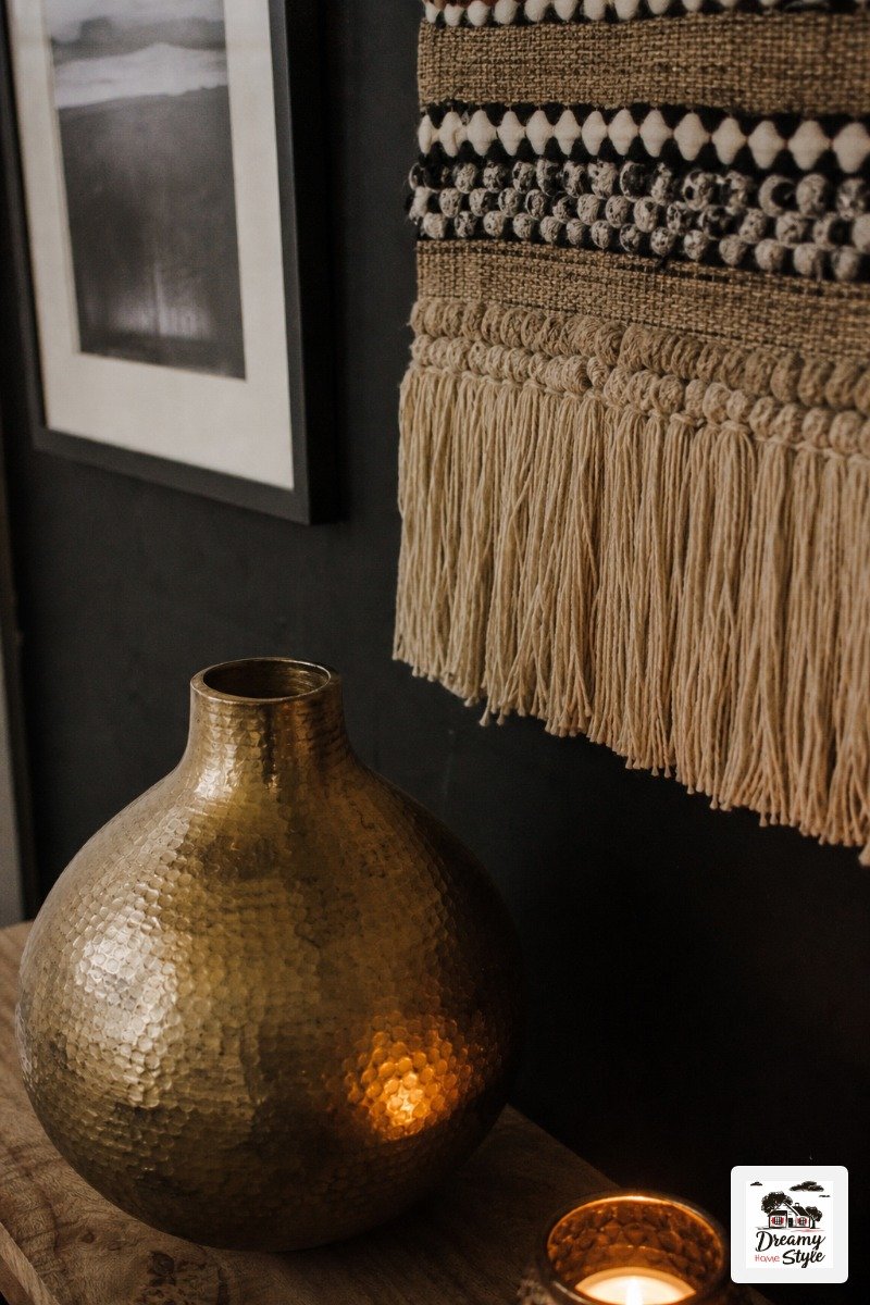
Natural fiber pulls it all back to earth.
A thick jute rug.
A woven wall hanging.
Without that grounding texture, the combination starts to feel more nightclub than living room.
(I’ve made this mistake.
My den had a phase.)
Pale Lavender + Warm Cream + Walnut Wood
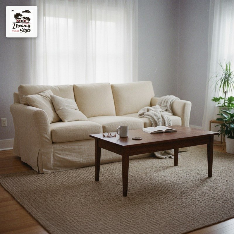
This is one I thought I’d hate and now I’m kind of obsessed with it.
Pale lavender — the super-muted kind, almost gray — feels surprisingly grown-up in a living room.
It’s not a child’s bedroom purple.
It’s a color that looks different in every light: gray in the morning, slightly purple by afternoon, almost mauve in lamp light.
Warm cream upholstery keeps it from feeling cool or clinical.
And walnut wood tones add exactly the right weight and warmth to balance all that softness.
Honestly, the thing I love most about this combination is that nobody expects it.
It looks effortful without being try-hard.
Warm Beige + Chocolate Brown + Deep Plum
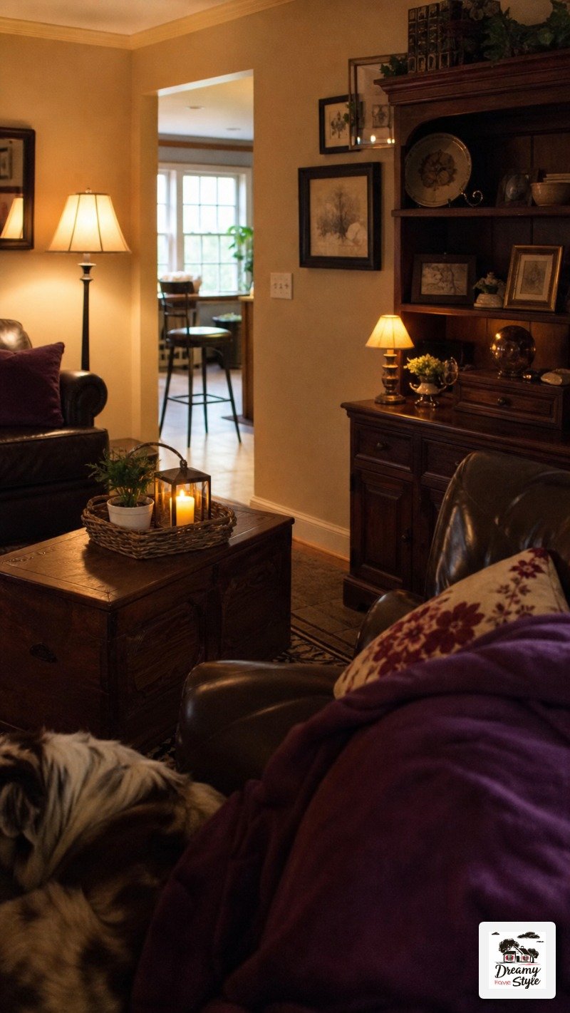
Okay so this sounds like a Thanksgiving table but bear with me.
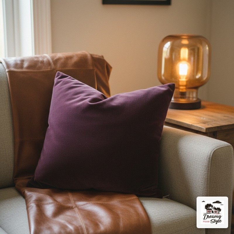
The key is ratios.
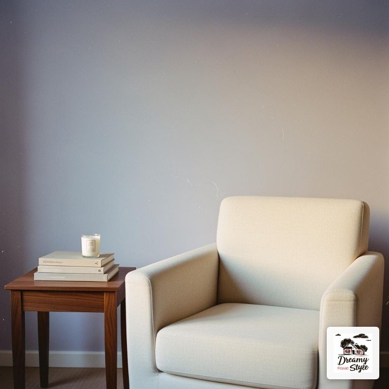
Warm beige is the dominant color — walls, floors, the big sofa.
Chocolate brown comes in through wood furniture and maybe one accent chair.
And then deep plum is used sparingly.
One throw.
One pillow.
A small vase.
When you do it that way, the plum reads as rich and intentional instead of heavy.
It gives the whole room this sort of autumn-all-year feeling that I find incredibly cozy.
This combination layers beautifully with warm lamp light specifically.
Overhead lighting kind of flattens it.
But a few good floor and table lamps and this room genuinely glows.
Coastal Blue-Gray + Warm Sand + Whitewashed Wood
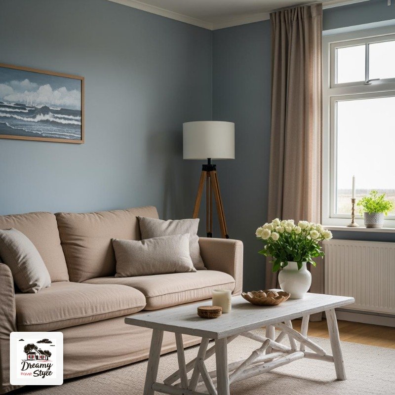
Not the nautical-stripes-and-anchor kind of coastal.
The quiet, real-coastline kind.
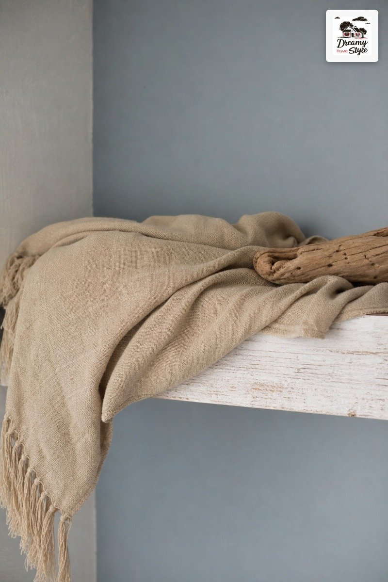
A cool blue-gray on the walls evokes overcast sky over water, which sounds depressing but in a room with warm sand-colored textiles it feels incredibly peaceful.
Like breathing out.
Whitewashed wood keeps everything light and casual.
A whitewashed coffee table.
A light wood bookcase.
Even just a couple of whitewashed frames on the wall.
It adds brightness without competing with the color palette.
This is one I’d specifically recommend for rooms that don’t get a ton of natural light.
The blue-gray shade actually feels more interesting in lower light than a lot of other colors do — it gains depth instead of looking flat.
Butter Yellow + Soft Gray + Washed Linen
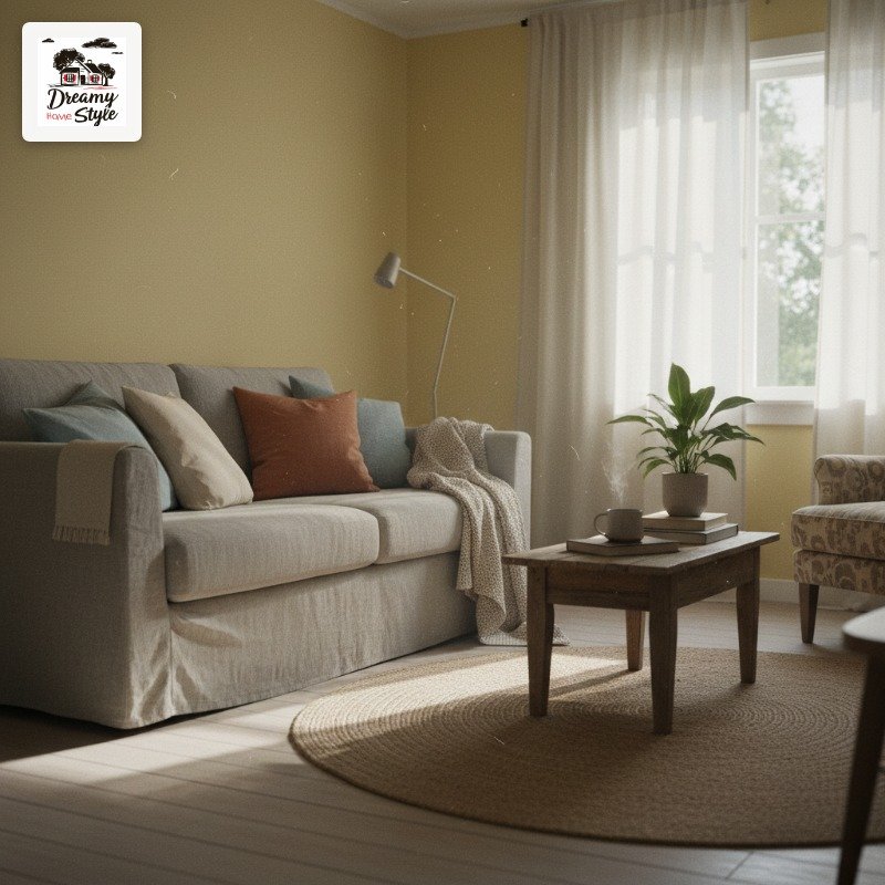
Butter yellow is a risk.
I won’t pretend it isn’t.
The wrong yellow looks like a fast food restaurant or a toddler’s playroom, and nobody wants that in their living room.
But the right yellow — that pale, almost-creamy, barely-there butter shade — is honestly one of the happiest colors you can put in a room.
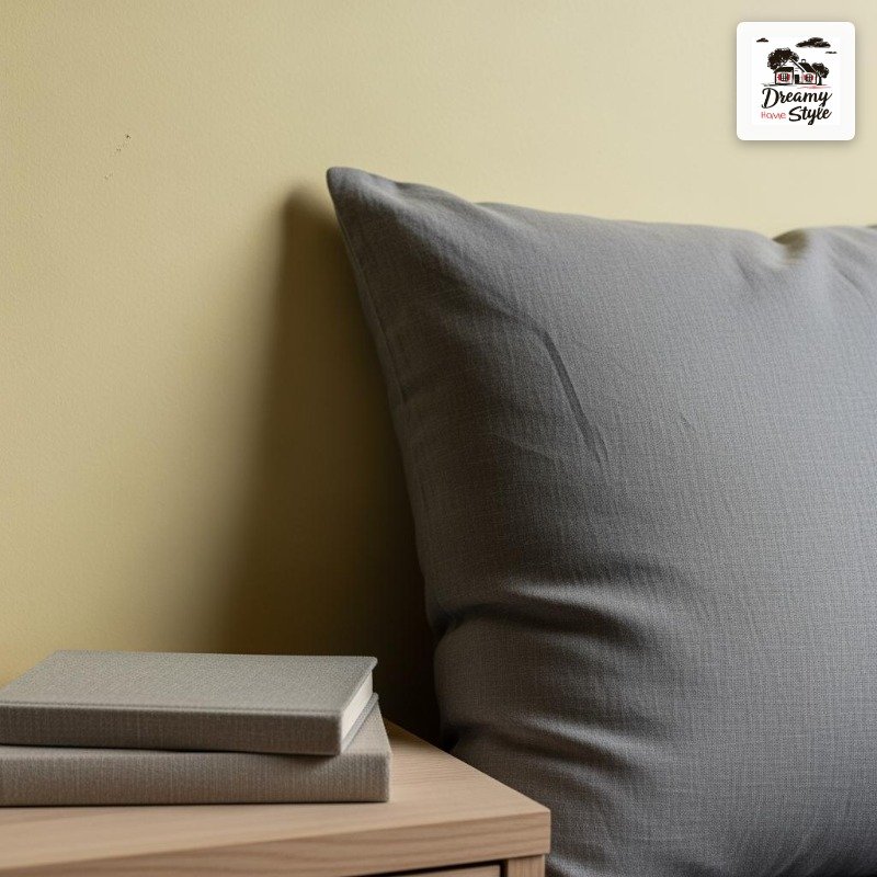
Soft gray is the calming hand on the shoulder that keeps yellow from going too far.
Gray sofa, gray rug, gray accents.
It takes the sweetness down just enough.
Washed linen textures add the final piece — that slightly rumpled, lived-in quality that keeps the whole room from feeling too cute.
Too polished.
Too Pinterest-perfect in a way that nobody actually lives like.
Deep Burgundy + Blush Pink + Warm Brass
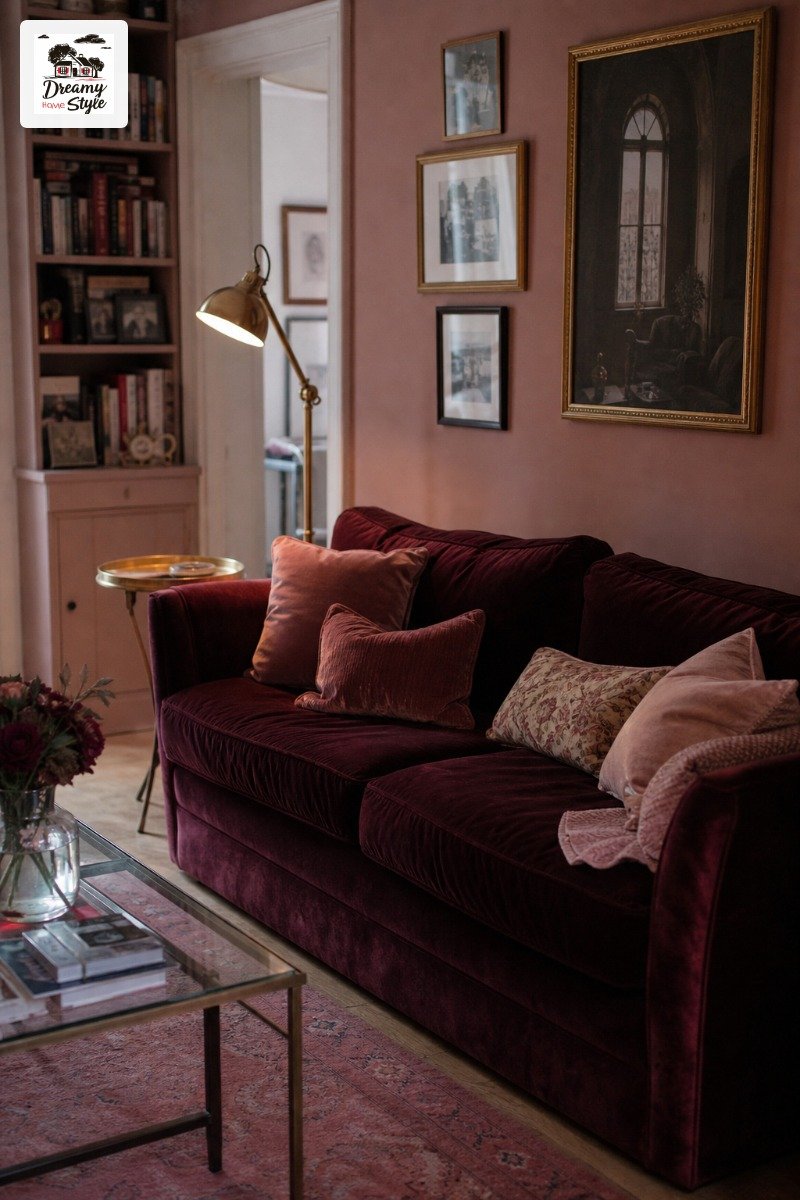
This is the combination I recommend to people who want something dramatic but are scared of going too dark.
The key is using the burgundy in a contained way.
An accent wall, not all four walls.
Or even just through textiles — a big burgundy velvet sofa against light walls is genuinely stunning.
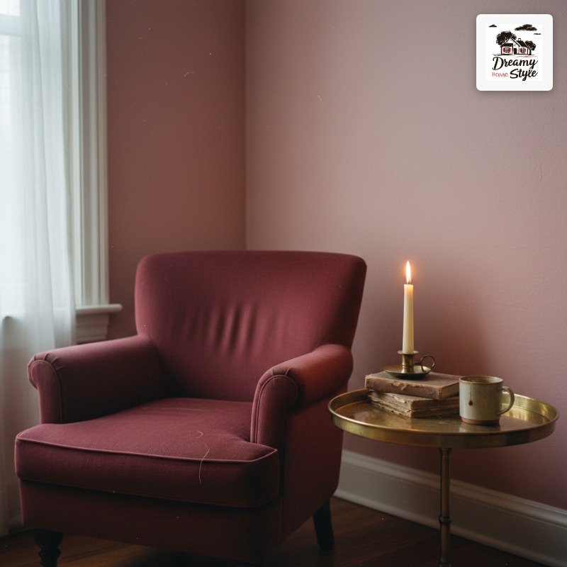
Blush pink is the unexpected partner that makes it work.
It softens the burgundy without diluting it.
I once saw this done with blush walls and a burgundy sofa and it looked incredible — like a very chic jewel box.
Warm brass is, as usual, doing a lot of heavy lifting here.
It bridges the tones and adds just enough warmth to keep everything from looking moody in a bad way.
Warm White + Olive Green + Honey Oak
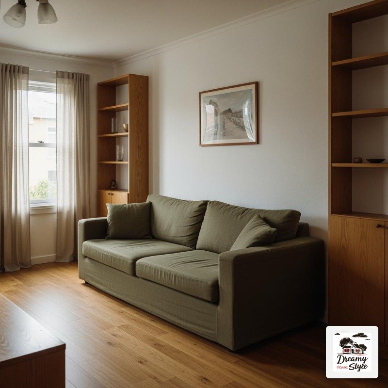
I have a soft spot for this one because it’s the combination I’m planning for my next room refresh.
I’m fully in the research-and-longing phase right now.
Warm White Walls are a great starting point for people who want flexibility — they read different with every accent color you bring in.
With olive green and honey oak, they feel earthy and grounded without being heavy.
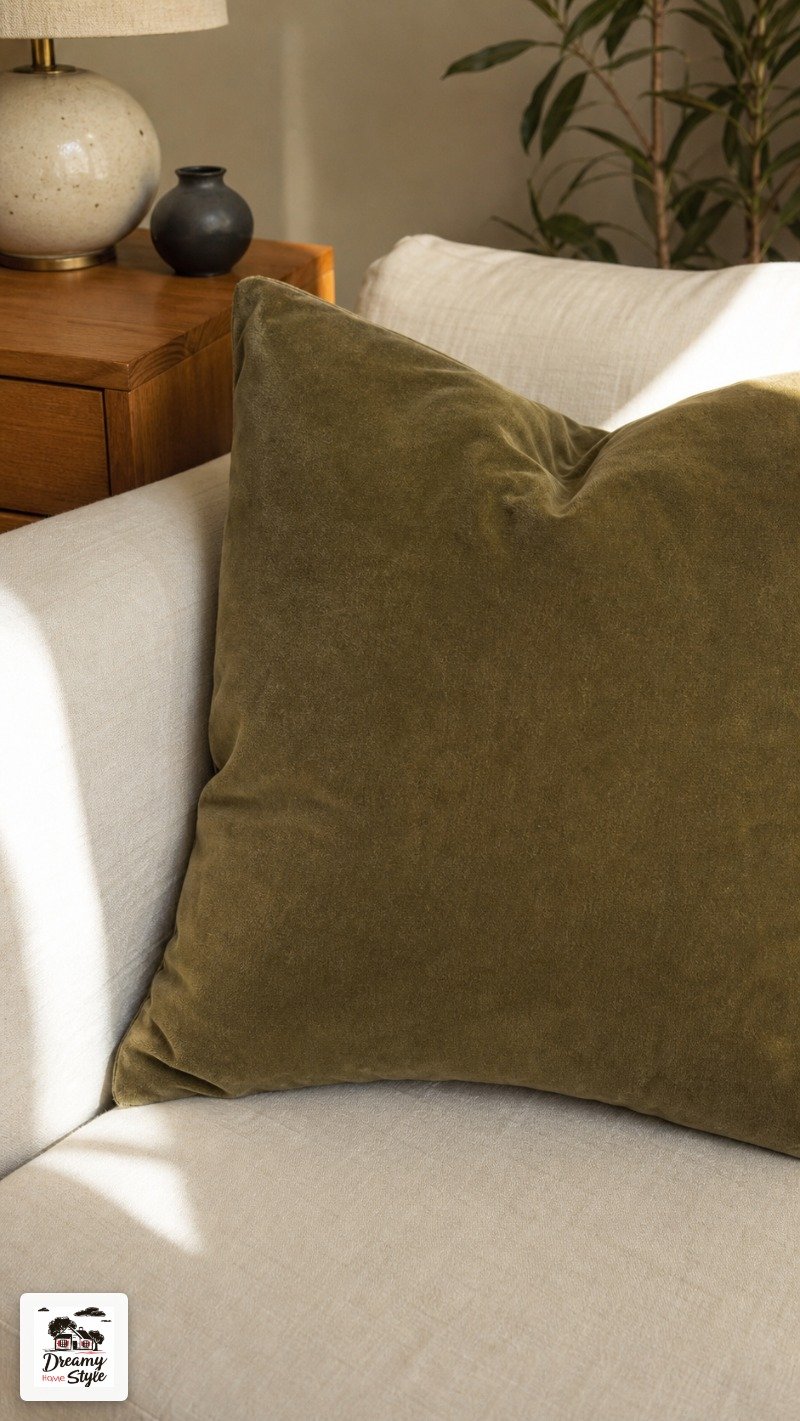
Olive green works best in this combo as a textile.
An olive linen sofa or a velvet olive armchair.
On the walls it can get a little murky unless you have great natural light.
Honey oak is having a revival and I’m thrilled about it.
I grew up surrounded by honey oak cabinets that were ‘dated’ and apparently they’re cool again.
My childhood home was just ahead of its time.
Charcoal + White + Unexpected Terracotta
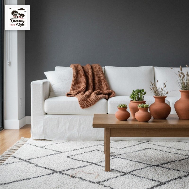
Charcoal and white together is classic.
It’s crisp, it’s clean, it works.
But on its own it can start to feel a little cold.
That’s where the terracotta comes in as the complete third-wheel wildcard that somehow makes the whole thing work better.
Just a pop of it.
A terracotta ceramic pot on the coffee table.
A rust-colored throw draped over an arm.
A framed print with warm earthy tones.
The terracotta doesn’t need to be loud.
In fact it works better when it’s quiet — one or two pieces, not a whole collection of orange stuff fighting for attention.
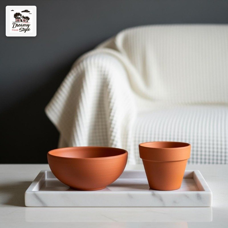
This is genuinely a good starting point if you have existing charcoal and white furniture already.
You don’t need to buy anything new, just introduce the warmth.
I did this with a single $8 thrift-store vase and the room completely shifted.
Dusty Blue + Warm Terracotta + Natural Linen
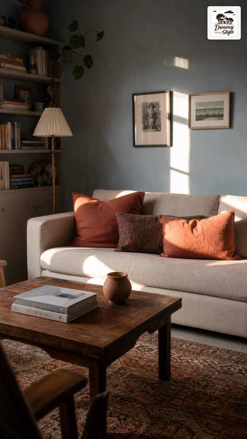
I saved this one for last because it’s my absolute favorite combination on this entire list and I think it’s criminally underused.
Dusty blue and terracotta are technically complementary colors — they sit across from each other on the color wheel — and the tension between them is what makes the pairing so alive.
Cool and warm at the same time.
It just hums.
Natural linen is the bridge that keeps them from fighting.
A linen sofa, linen curtains, linen throw — it’s soft and neutral enough to sit between the two stronger colors without losing its own texture.
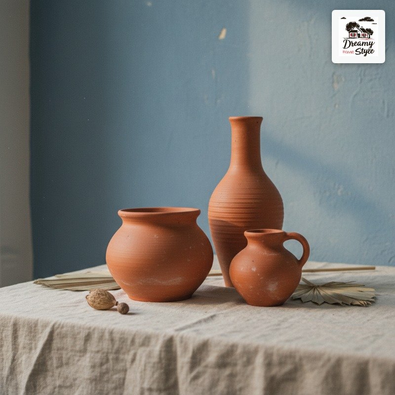
I’ve seen this done with dusty blue walls and terracotta cushions, and I’ve seen it done the other way.
Both work.
But my personal vote is blue walls with terracotta accents because the room then has this quality of feeling warm even though the walls are cool.
It’s a little bit of a magic trick and I love it every single time.

