
Upload a photo of a room you love and get its color palette: the main colors, their names and codes, and how to use them in your own room. Your photo never leaves your device.
Tap any spot to make it your accent
Quick answer: to get a color palette from a photo, upload the photo and the generator above finds its 4–6 main colors, names each one with its color code and LRV, and turns them into a 60-30-10 plan: which color to use on the walls, which on the furniture and which as the accent. Tap any spot of the photo to make that color your accent. It is free and your photo never leaves your device.
How to use the palette generator
- Add a photo. Tap Use your photo: a room you love from a magazine, a hotel, a friend’s house or your own screenshot. No photo handy? Try one of the samples.
- Read the palette. The strip shows each color at the size it covers in the photo. Every color has a name, its code (like
#B5AEA5), its LRV and whether it runs warm, cool or neutral. - Choose how many. Four colors is a calm palette; six catches the smaller notes, like wood tones and brass.
- Pick your accent. Tap a pillow, a vase or a door in the photo and it becomes the 10% accent in the plan.
- Keep it. Try it puts a color on your own walls in the room paint visualizer. Save palette image saves the photo with its colors, and Copy color codes copies them all.
How it finds the colors
The generator groups the photo’s pixels by how similar they look (k-means clustering in the CIELAB color space, which measures color the way eyes see it), then keeps the groups that matter. A room photo is mostly shadow, so a plain “most common colors” list comes back as five grays. This one prefers colors that are both big and colorful, gives near-black shadows less weight, and skips any color too close to one it already has, so every color in the palette is one you would actually point at.
The 60-30-10 rule
| Share | Role | Where it goes | Which palette color |
|---|---|---|---|
| 60% | The main color | Walls, the sofa, a big rug | The biggest color in the photo that is not a shadow |
| 30% | The support | Furniture, curtains, bedding, cabinets | The next biggest |
| 10% | The accent | Pillows, art, a door, a lamp | The most colorful of the rest, or the spot you tap |
The split is a guide, not a law: it keeps one color in charge, so a room reads as calm instead of busy. Wood, metal and plants count too; a brass lamp can be the whole 10%.
Three worked examples
The sample kitchen. The plan comes out greige for the walls, khaki (the olive-toned cabinets) for the 30%, and light brown, from the wood tones, as the accent.
The sample brick house. Burgundy brick leads, dusty orange, the same brick in the sun, supports it, and the leaves bring a light olive accent. The warm off-white of the trim is in the palette too: tap the trim to make it the accent instead.
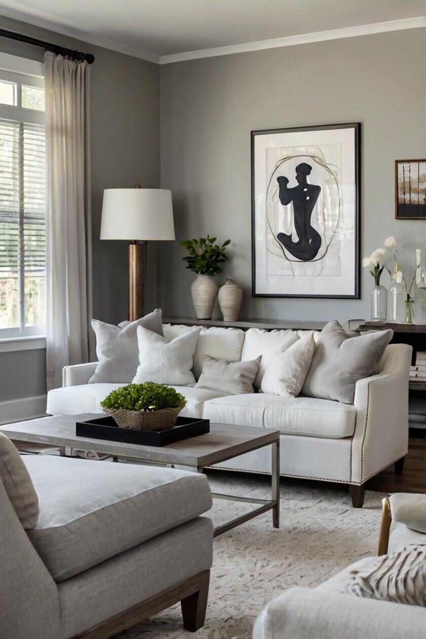
The sample living room. A room of grays: greige walls, light charcoal furniture, and, since there is no strong color, the generator picks the color that contrasts most, black, for frames and lamps. Tap the green of the plant to try a green accent instead.
Common mistakes with a photo palette
- Copying the colors exactly. A photo’s light changes every color. Treat the codes as a starting point and check paint samples on your own wall.
- Using a dark photo. A dim photo turns everything brown and gray. Use one taken in daylight.
- Giving every color equal space. Six colors at one-sixth each looks like a patchwork. Let one lead.
- Skipping the undertone. A warm greige and a cool gray clash even when they look alike. The warm, cool or neutral label next to each color tells you which is which.
Got your colors? See one on your own walls in the room paint visualizer, name any single color with the paint color matcher, and plan the room in the free 2D room planner.
Plan the room freeRead next
- Gray sofa living room color schemes
- Exterior color palette ideas
- Alpine oat neutral decor ideas
- Whole house colors that flow from room to room
Color palette questions
How do I get a color palette from an image?
Upload the image to the generator above. It finds the 4–6 main colors, gives each one a name and a color code, and shows how much of the picture each covers. Tap any spot to add that exact color as your accent.
How do I get a color palette from a photo of a room?
Use a photo taken in daylight, with the whole room in the frame. The generator gives less weight to shadows, so the palette shows the room’s real colors: the walls, the furniture, the wood and the accents, not five shades of shadow.
How do I find the color scheme of a picture?
Upload the picture and read the palette strip: the widest color is the main one, the next ones support it, and the most colorful small one is the accent. That is the picture’s color scheme as a 60-30-10 plan you can copy.
What is the 60-30-10 rule in decorating?
Use one main color for about 60% of the room (walls, big pieces), a second for about 30% (furniture, curtains, bedding) and an accent for about 10% (pillows, art, a lamp). It keeps one color in charge, so the room feels planned.
Can I match a palette color to a paint?
Every color comes with its code and LRV. Tap Try it to see it on your own walls. To buy it, take a sample of the color (a printout, a fabric, the object itself) to a paint store: most can scan a sample and mix a close match. Check a painted swatch on your wall before you commit.
Is my photo uploaded anywhere?
No. The photo is read inside your browser and never sent to any server. A shared link carries only the color codes, not the photo.