

The rug was $140 on Facebook Marketplace, and it was gorgeous.
Rust and cream, a little faded in that expensive-looking way.
I drove 40 minutes to pick it up, rolled it out in my living room, and it fought with everything I owned.
My sofa is a cool gray.
The rug was warm orange-brown.
Each one was fine alone.
Together they looked like two different people had decorated the room, which, honestly, they had: past me and present me.
I sold it a month later for $90.
A $50 lesson, plus gas.
Since then nothing big comes into my house until it’s passed the board.
Here’s how I make a mood board for one room, on a budget and mostly with stuff you already have, and how I use it to say no to things I’d otherwise drag home.
What a Room Mood Board Is Really For

A mood board for a room isn’t a collage of rooms you love.
Those are fun, and I have about 40 of them saved, but they don’t tell you a thing about your room.
A room board has one job.
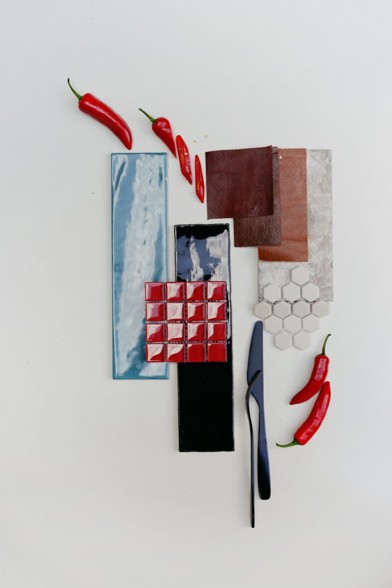
It holds the real colors and textures of the room you live in, so you can hold a new thing up against them before you pay for it.
Paint, fabric, wood, a photo of the floor you can’t change.
If something looks wrong next to the board, it’ll look wrong in the room, and you find that out on a Tuesday night at your kitchen table instead of after a 40-minute drive.
Think of it as a filter.
It turns “ooh, cute” into “cute, but does it go with the sofa?”
That one question has saved me more money than any sale ever has.
Start With the One Thing You’re Keeping

Every room has an anchor you’re stuck with.
In a rental it’s usually the floor, the countertops and the walls you’re not allowed to paint.
In my house it’s a big gray sofa I’m not replacing until it falls apart (Biscuit is working on it, one cushion at a time).
Start the board there.
Take a photo of the anchor in daylight, print it, and write what it is under it: “gray sofa, cool undertone, nubby weave.”
If you can get a real sample, grab it.
A spare tile, a leftover plank of flooring, the fabric tag tucked under a cushion.
A real swatch beats a photo every time, because every screen shows color a little differently and a swatch doesn’t care what phone you have.
Then add the other things that are definitely staying.
The coffee table, the curtains, your grandma’s lamp.
Only the stuff that’s actually staying, though.
If you’re “maybe” replacing the armchair, leave it off.
Maybes muddy the whole board, and you’ll end up matching new things to a chair that’s gone by spring.
Pull Three Colors, Then Split Them 60-30-10

Once the keepers are on, look for three colors.
The anchor usually hands you the first one.
Then split them with the 60-30-10 rule.
The American Society of Interior Designers spells it out simply: about 60% of the room in your dominant color, 30% in a secondary color and 10% in an accent.
ASID says the dominant color is the one you paint your walls.
The secondary one goes on area rugs, curtains, furniture or an accent wall.
The accent is the small stuff, like throw pillows, lamps, candles and collectibles.
On a board, that means the colors don’t get equal space.
I make the wall color the biggest swatch, the secondary color a medium chunk and the accent a skinny strip along the edge.
Then I squint at it.
If the strip is shouting, it’s too loud to cover even 10% of a room.
If it disappears into the big swatch, it’s too close to the main color to count as an accent at all.
It’s a rule of thumb, not the law, and I bend it all the time in small rooms.
But it’s the fastest way I know to see whether a palette is balanced before a single gallon gets opened.
For the 10% part, my throw pillow combinations are the mixes I keep coming back to.
Paint Samples Go on a Board, Not a Chip


Here’s where most boards go wrong.
A paint chip the size of a postage stamp tells you almost nothing about a whole wall.
Benjamin Moore’s 8 oz color sample covers about a 2 ft by 2 ft area with two coats, and the brand says to brush it on the wall or on foam board and test how the color changes in different light.
Back in my rental days I couldn’t paint test squares on the walls, so I started painting foam boards instead.
I never stopped.
You can move a board, and you can’t move a wall.
My routine is boring and it works.
Two coats on a white foam board from the dollar store.
Let it dry overnight.
Then I carry it around the room: next to the window, beside the sofa, in the darkest corner, up against the trim.
The same color can look like three different colors in one room, and the corner by the bookcase is always the one that surprises me.
Don’t skip the second coat.
With one coat the white board peeks through and the color looks lighter than it will on your wall.
Benjamin Moore recommends two, same as regular paint.
A 2 ft by 2 ft square is way too big to pin to a mood board, so I lean the painted board against the wall right next to it and cut a thin strip of the same color for the board itself.
Touch Everything: Fabric, Wood and Metal


Color is half the board.
The other half is texture, and you can’t judge texture from a screen.
Plenty of fabric shops will mail you swatches if you ask, and some do it for free.
For wood, I’ll bring home a stain sample from the hardware store, or I’ll ask a seller on Facebook Marketplace for one more photo of the table in daylight, right next to a white sheet of paper.
Metal is the easy one.
A drawer pull, a brass candlestick from the thrift store, anything in the finish you’re thinking about.
Then live with it for a week.
Rub the fabric.
Leave it on the sofa.
If you have a dog, let the dog lie on it, because Biscuit is my unofficial durability tester.
Anything that comes off the sofa covered in blond fur after five minutes is off the board, no matter how pretty it is.
Rugs get the same treatment, and my wool rug guide covers what I look for before I let one near the dog.
This is also where you catch the too-many-textures problem.
Boucle plus velvet plus a shaggy rug plus a chunky knit throw is a lot.
On a board you see it right away.
Let one or two textures lead and keep the rest smooth and quiet, the way warm minimalist rooms do it.
Check the Board at Night, Under Lamps

This is the step I will die on a hill for.
You spend most of your living room hours in the evening, under lamps.
So that’s when you need to look at the board, not just at noon.
And please, not under the overhead lighting.
Overhead lighting is a crime against every color you just picked.
It flattens all of it.
Turn on the lamps you really use and look at the board there.
The bulb matters more than people think.
Feit Electric’s color temperature guide puts 2700K, which it calls soft white, in bedrooms, living rooms and dining areas, and 5000K, daylight, in garages, basements and security lights.
It also points out that color temperature doesn’t change how bright a bulb is.
That’s lumens.
So a 5000K bulb in a living room isn’t brighter, just bluer, and it can turn a warm beige board kinda gray.
If a sample looks great at noon and sad at 9 p.m., believe 9 p.m. That’s when you’ll be sitting there with your coffee (fine, sometimes wine).
Corkboard, Pinterest Board or a Shoebox?


Any of them work.
I use all three, for different jobs.
Pinterest is where I collect the look.
I save rooms I love, then scroll back through and figure out what they have in common: the same Warm White Walls over and over, or a lot of black metal, or one rust-colored thing in every single photo.
That’s inspiration, and it’s useful.
But a screen can’t tell you what a real swatch looks like in your room, so it can’t be the final board.
The real board is a corkboard I got at the thrift store for a couple of dollars.
Swatches get pinned, paint strips get pinned, and a printed photo of the sofa goes in the top corner.
Before I go shopping I snap a photo of it with my phone, so the palette comes with me.
The shoebox is for small stuff that won’t pin.
A tile, a piece of rope, a drawer pull, a scrap of leftover wallpaper.
Every swatch I’ve ever collected lives in that box.
It’s a mess and I love it.
When the Board Says Yes, and When It Says Stop

Now the board does its real work.
Before anything goes in the cart, it has to answer these:
- Does it fit one of my three colors, or is it a fourth?
- Does it still look good next to the board at night, under a lamp?
- Is it replacing something, or just piling on?
- Am I sure I’m keeping the thing it has to match?
A fourth color doesn’t lose automatically.
It has to replace something on the board, though, not get stacked on top.
That rule would have saved me the rug money.
Since I started using it, it’s also talked me out of three “perfect” pillows, a green velvet chair (I still think about that chair) and a whole set of brass frames that would have fought with the black hardware in my kitchen.
The board isn’t forever.
I redo mine whenever a big piece changes, and the old swatches go back in the shoebox.
So pick one room this weekend, gather everything that’s staying, and start with the anchor.
Related read: Things I Wish I Knew Before I Decorated My First Home — Instant PDF + Kindle download. Secure checkout by Stripe