
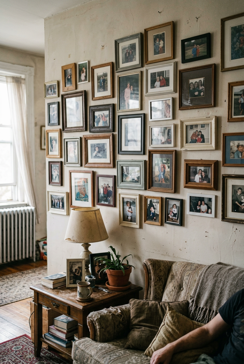

I’ll be honest — I spent two full weekends hanging and re-hanging frames on my living room wall before I finally admitted it looked, well, kind of sad.
Everything was straight.
The frames matched.
I’d even used a level.
But something about it felt like a college dorm situation, not the warm, layered look I’d been pinning for months.
It wasn’t the art.
It wasn’t the frames.
It was the spacing.
And once a designer friend pointed out the one thing I was doing wrong, I fixed the whole wall in about forty minutes without buying a single new thing.
The Real Reason Gallery Walls Go Wrong
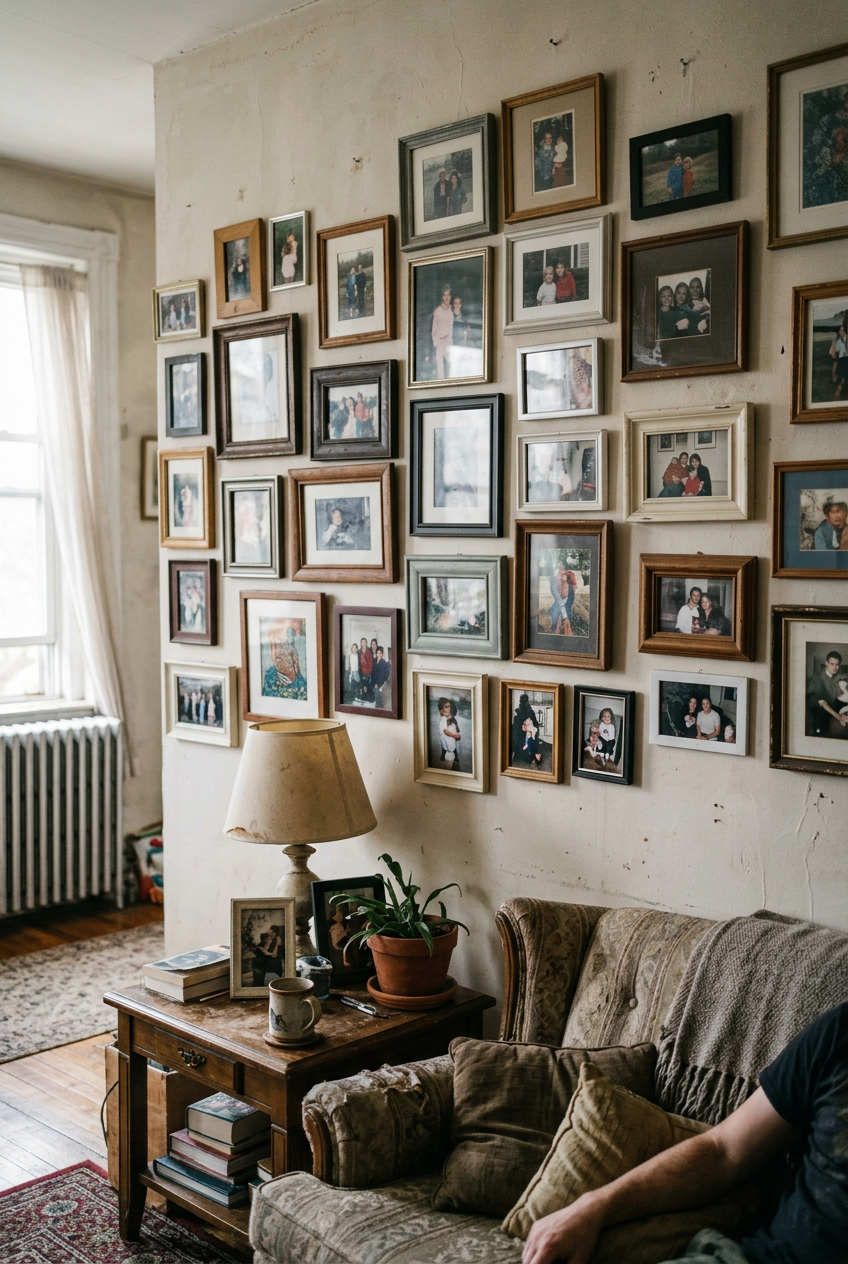 Gallery Walls Go Wrong
Most people assume a cheap-looking gallery wall is about the art.
Wrong frames, wrong colors, mismatched styles.
But honestly?
I’ve seen breathtaking walls built from thrift-store finds and printer paper.
The art almost never is the problem.
It’s spacing.
Every single time.
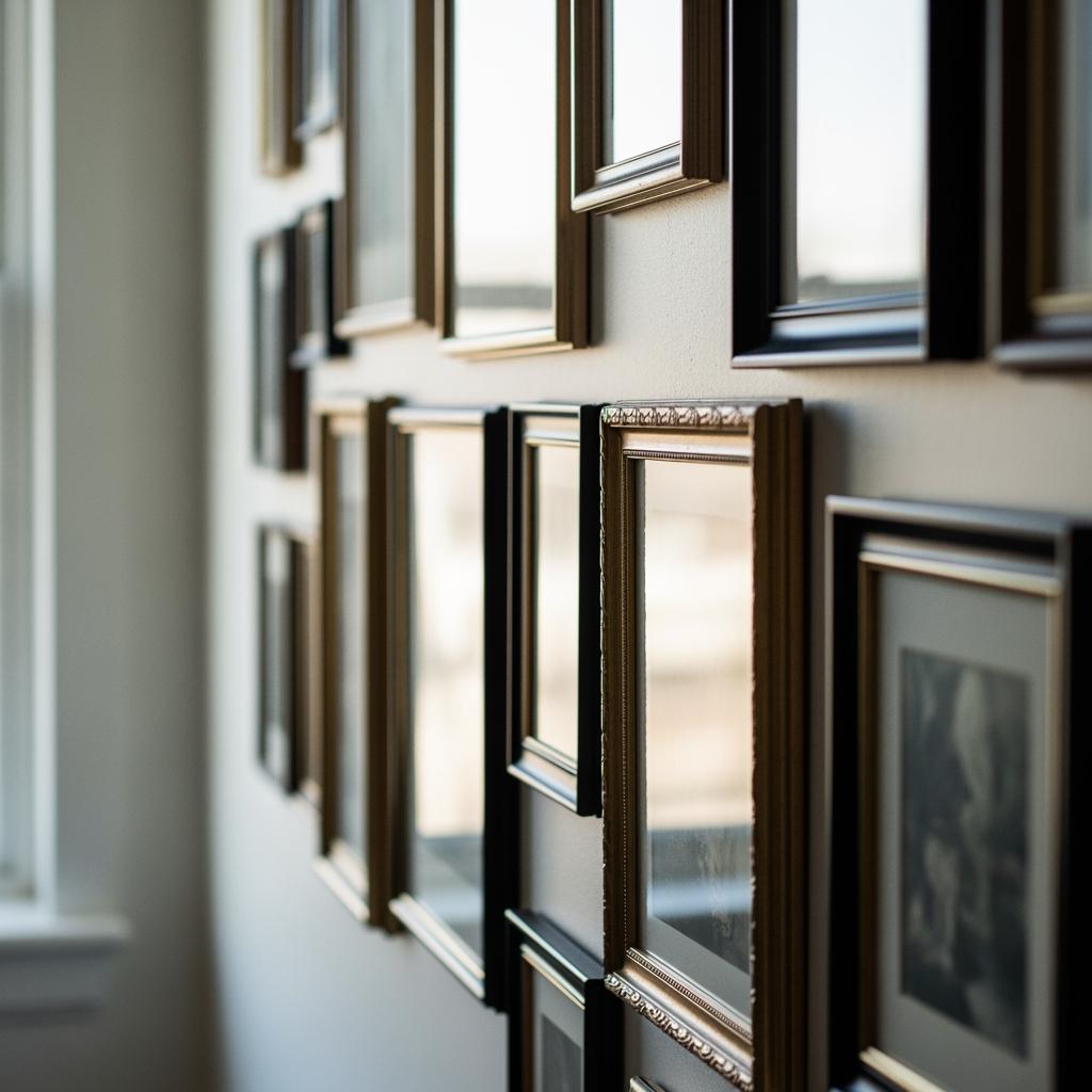
When gaps between frames are inconsistent, your eye can’t settle.
It bounces around looking for a pattern that isn’t there, and the whole thing reads as cluttered or, worse, accidental.
Your brain registers ‘mess’ before it registers ‘art.’
And the frustrating part is nobody tells you this.
Every tutorial focuses on layout and frame styles.
The spacing part gets one vague sentence like ‘leave a few inches between frames.’ That’s not enough.
That’s the advice that left me with a wall that looked like a yard sale display.
What ‘Designer Spacing’ Actually Means
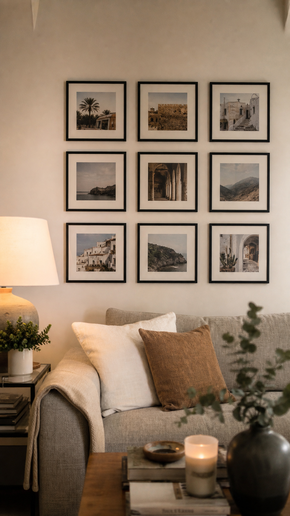
Here’s the thing designers know that the rest of us don’t: the space between frames is part of the design.
It’s not dead air.
It’s breathing room, and it has to be intentional.
The magic number most interior designers use is between two and three inches between every frame, consistently.
Not roughly.
Consistently.
That uniformity is what your eye reads as ‘expensive’ or ‘intentional’ even if you can’t consciously name why.
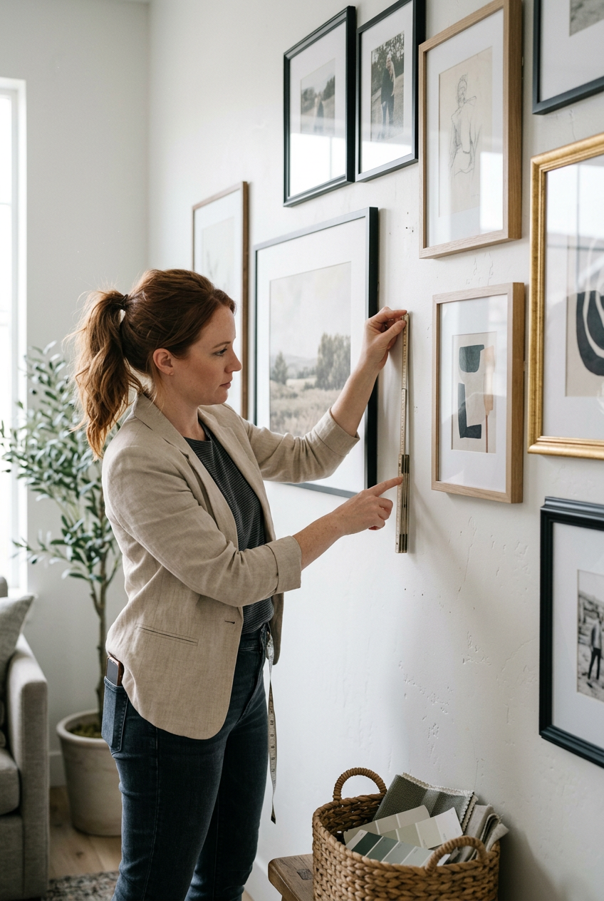
I used to eyeball it.
Big mistake.
When I actually measured and kept every gap at two and a half inches across my whole wall, the difference was so obvious I genuinely laughed out loud.
Same frames.
Same art.
Completely different feeling.
It goes from ‘stuff on a wall’ to ‘this person has taste.’ And you don’t spend a cent to get there.
The Paper Template Trick Designers Swear By
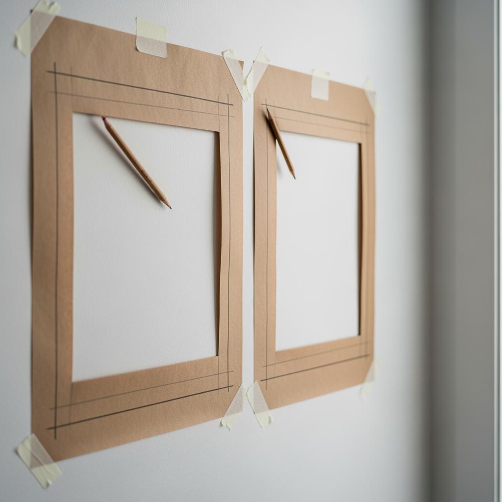
Before you hammer a single nail, trace every frame onto kraft paper or newspaper and cut out the shapes.
Tape those paper templates to the wall first.
This is the move.
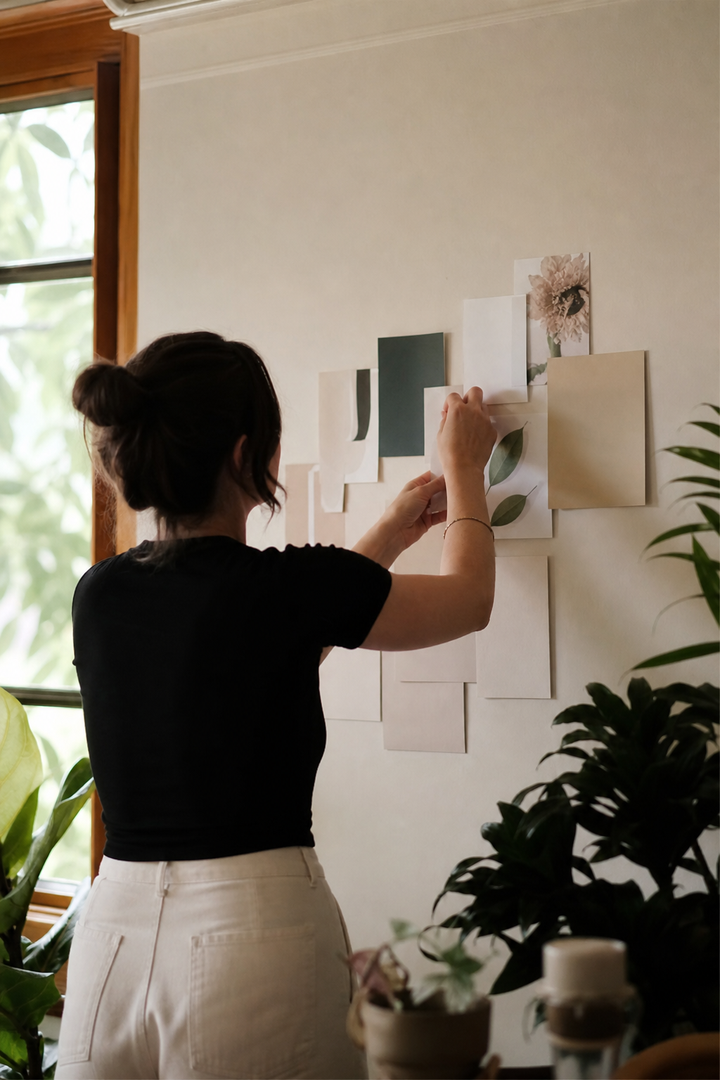
I resisted doing this for literally years because it seemed fussy.
Then I tried it.
You can shift everything around, adjust your spacing, step back and look — all without a single hole in the wall.
It’s kind of life-changing if you’ve ever had to spackle over seventeen wrong nail holes (I’ve been there).
Mark where the nail goes on the paper template before you tape it up.
That way when you’re ready, you just nail right through the paper and peel it off.
Clean, easy, accurate.
This method also helps you see if your overall shape — the silhouette of the whole arrangement — is working before you commit.
Why Your Eye Keeps Getting Fooled by Uneven Gaps
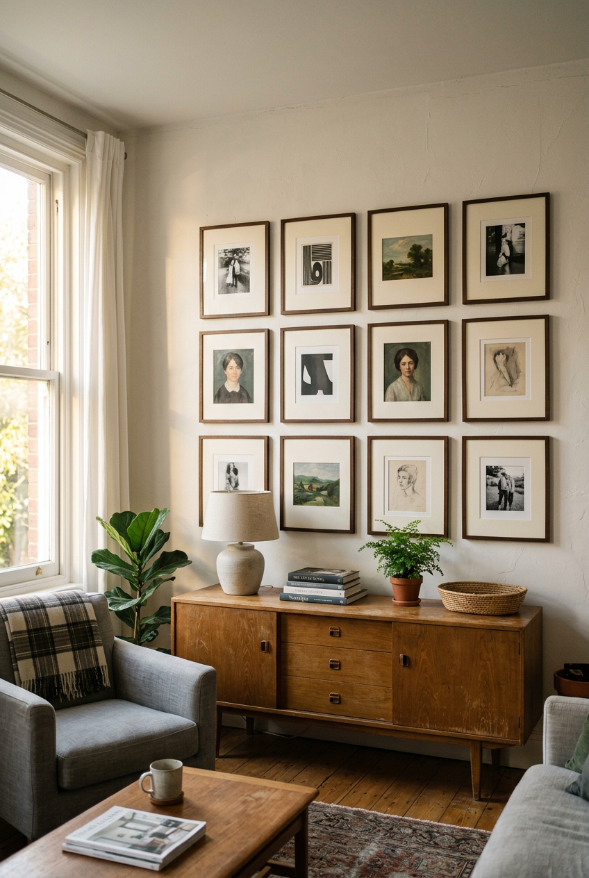
There’s a visual perception thing happening here that’s worth understanding.
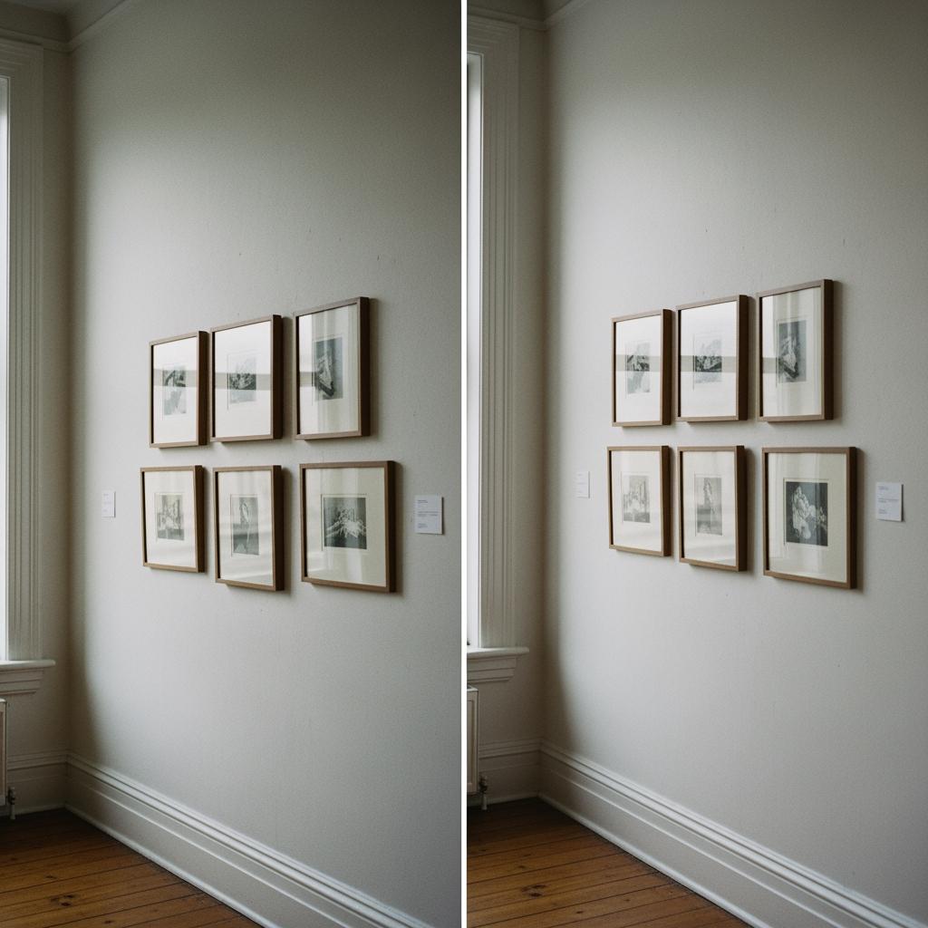
When gaps vary even slightly, like two inches in one spot and four in another, your brain perceives the tighter grouping as one ‘cluster’ and the loose pair as floating separately.
The wall breaks into fragments.
Uniform spacing creates a visual field.
The frames feel like they belong to the same family.
That’s the warmth you’re sensing on those perfectly styled walls you save to your phone at midnight.
It’s sort of the same reason a perfectly set dining table feels more inviting than one where everything’s just sort of pushed around.
Rhythm matters.
Consistent spacing also makes the wall feel larger.
A little counterintuitive, but true — order creates the perception of space.
The Free Tool Already Sitting in Your Junk Drawer
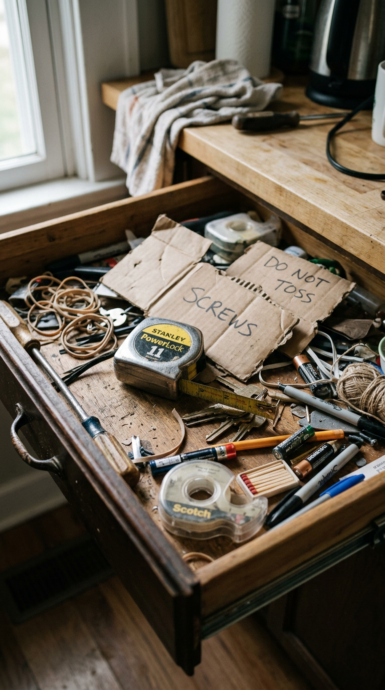
You don’t need a fancy laser level or some gadget from a home improvement store.
You need a piece of cardboard.
Cut a strip the width of your desired gap — say, two and a half inches wide.
Use it as a physical spacer between every frame as you hang.
Just hold it up against the edge of the already-hung frame and you instantly know where the next one goes.
I keep mine taped to the back of my tape measure now.
When I tackled my own cramped guest room last fall, this cardboard strip saved me probably an hour of measuring and rechecking.
It sounds almost too simple.
It works almost too well.
You can also use sticky notes in a pinch.
Three overlapped sideways gets you pretty close to a standard gap.
Choosing a Shape for Your Arrangement (Before You Touch a Nail)
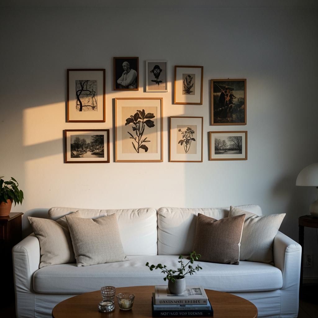
The outer silhouette of your gallery wall matters almost as much as what’s inside it.
A clean rectangular or square arrangement reads as polished.
An organic, loosely oval cluster reads as relaxed and layered.
Neither is wrong.
But you have to choose.
If I had a small hallway, this is what I’d do first — decide on the overall shape and tape it out with painter’s tape on the wall.
That boundary keeps everything from creeping and gives the wall a sense of intention.
Spreading your arrangement too wide or letting it get too tall without anchoring it to furniture below makes it look unmoored.
Gallery walls want a relationship with the room, not just the wall.
Anchor yours above a sofa, console table, or even a single bench.
Something below gives the whole thing a ground line to live on.
Why the Center Frame Is So Important
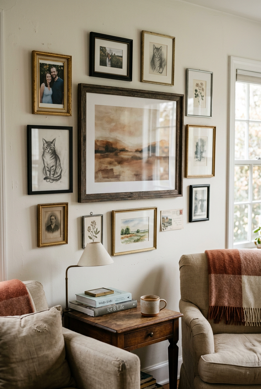
Start with your largest or most visually weighted piece and center the whole arrangement around it.
Not center it on the wall necessarily — center your composition around that anchor piece.
I once tried building a gallery wall by starting from the top left corner and working my way across.
It looked fine in theory.
On the wall, one side felt heavy and the other felt like an afterthought.
Learned that lesson the hard way.
Your eye naturally looks for a focal point in any grouping.
Give it one.
The rest of the frames should feel like they’re gathered around that anchor, not competing with it.

If you don’t have one obvious ‘hero’ frame, create visual weight another way — a darker mat, a slightly larger frame, or a piece with bolder colors sitting in the center of your arrangement.
Mixing Frame Sizes Without Making It Look Random
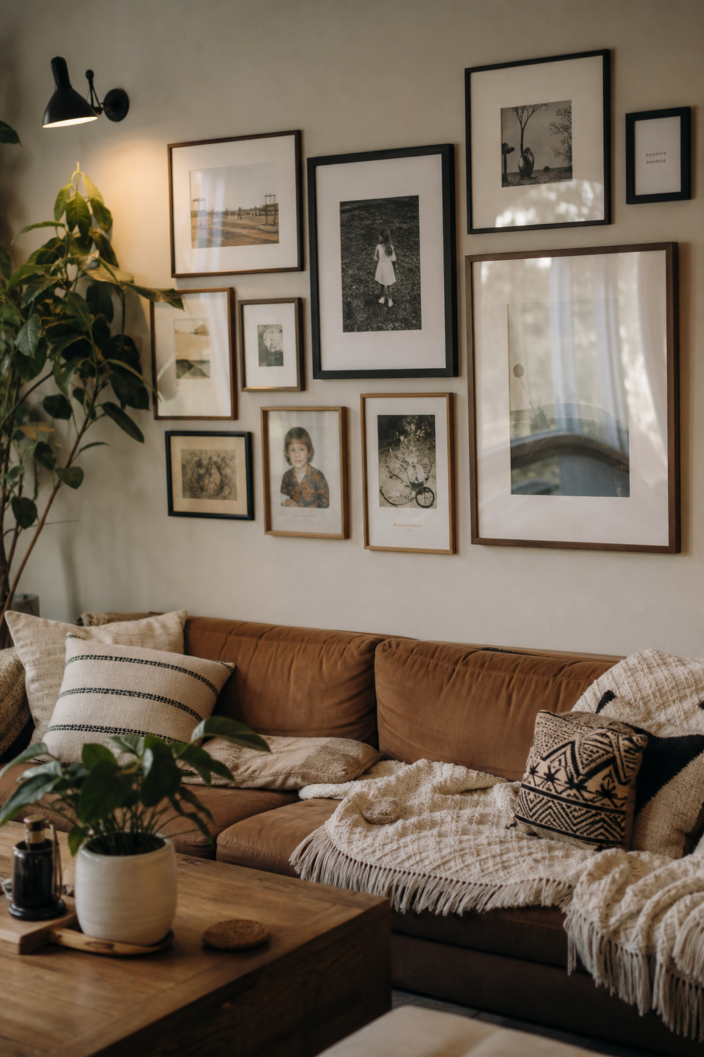
Mixing frame sizes is good.
Great, even.
But there’s a difference between intentional variation and just hanging whatever you have.
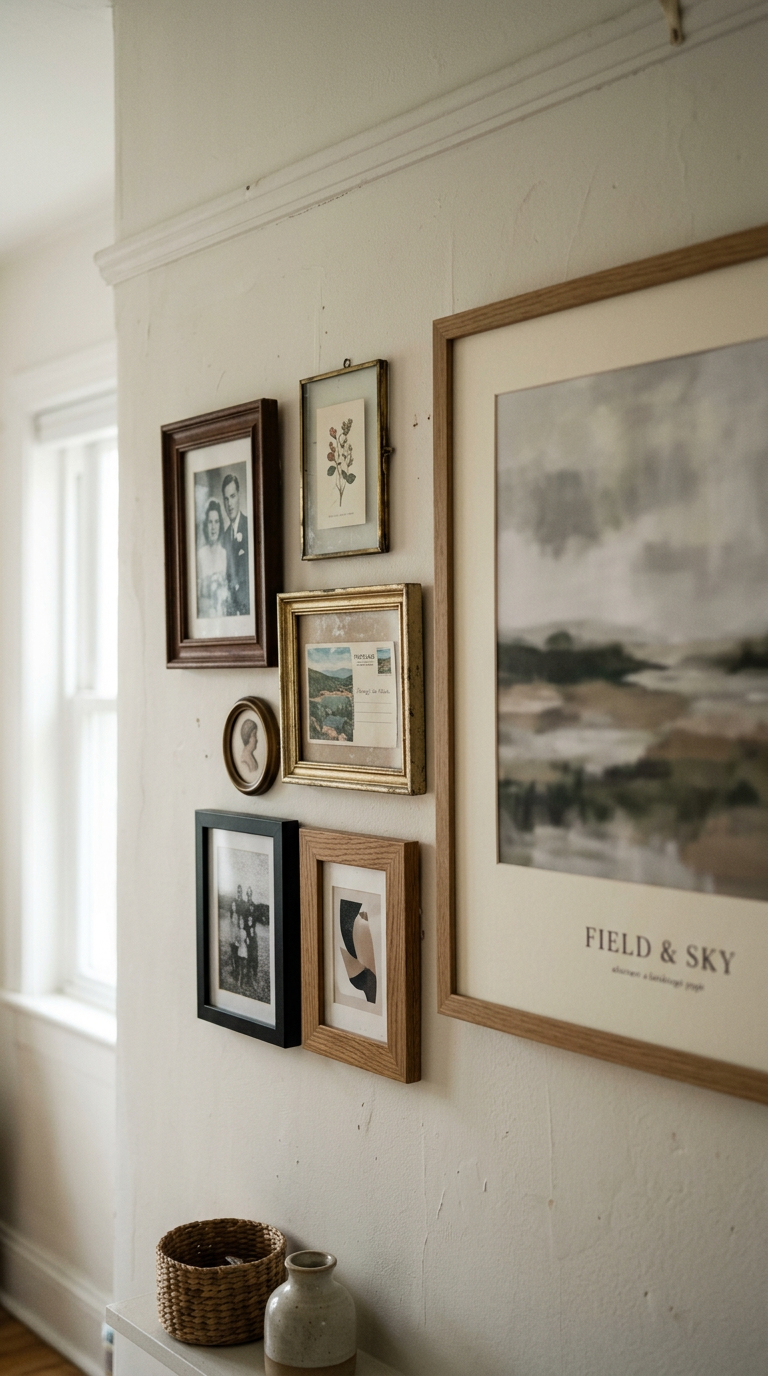
A good rule I follow: vary the sizes but keep something consistent.
That might be frame color, mat style, or even just the art medium — all photography, or all prints, or all watercolor.
One unifying thread lets the variety read as curated rather than chaotic.
I’m obsessed with the look of mixing a few large frames with clusters of smaller ones.
The small frames grouped together can hold the same visual weight as a large piece, which helps balance the composition.
And honestly?
Even if your frames don’t perfectly match, consistent spacing will do more for cohesion than matching every single detail.
Spacing is the great equalizer.
The Height Question Everyone Gets Wrong
Hanging art too high is one of the most common mistakes in home decor, full stop.
It’s even more obvious on a gallery wall.
The industry standard for single pieces is the center of the artwork at about eye level, which for most rooms is roughly fifty-seven to sixty inches from the floor.
For a gallery wall, you want the visual center of the whole arrangement to sit around that height.
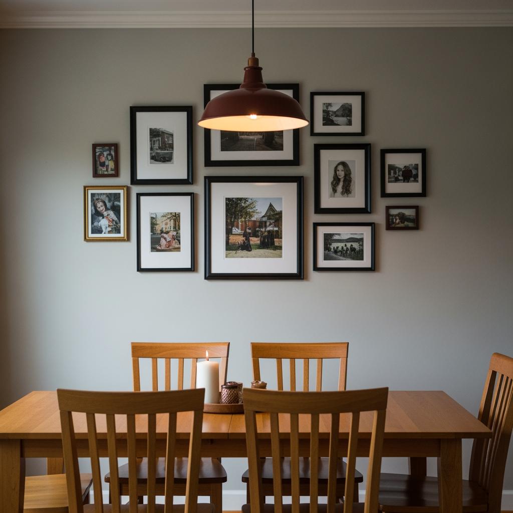
When I first hung my dining room gallery wall, I had the whole thing about four inches too high.
It felt like the frames were floating near the ceiling, disconnected from the table below.
Lowering it completely changed the room.
The wall and the furniture finally had a conversation.
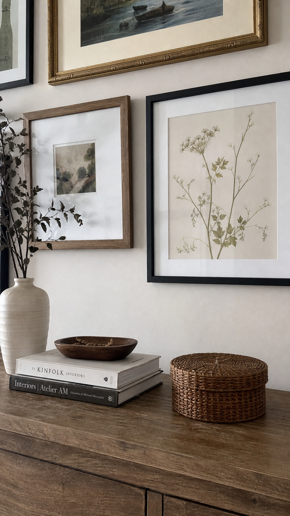
If you’re hanging above furniture, aim for six to eight inches of space between the top of the furniture and the bottom of the lowest frame.
Not a foot.
Not two.
Six to eight.
What to Do If Your Wall Is Already Hung (and It’s Not Working)
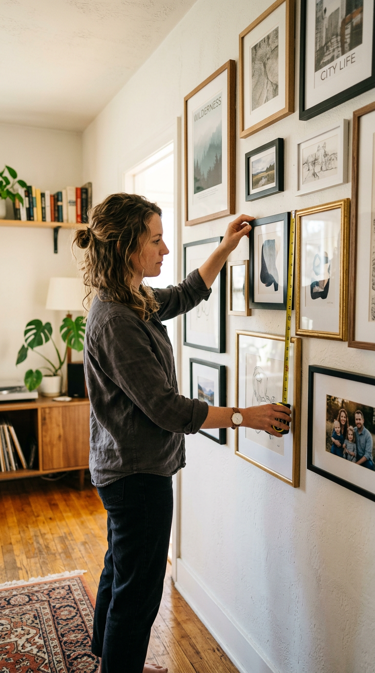
Don’t panic.
Don’t take everything down.
Start by measuring your current gaps and finding the average.
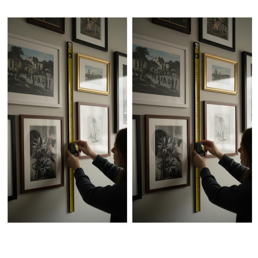
Pick the frame that’s most centered or most prominent and call that your anchor.
Then, using your cardboard spacer, adjust the frames around it one by one to match your target gap.
You might only have to move a few.
I’ve fixed gallery walls this way with only two or three new nail holes.
It’s so much less dramatic than it sounds.
The hardest part is resisting the urge to completely restart.
Sometimes a small, surgical adjustment is all it takes and the wall you worked so hard on is suddenly exactly what you pictured.
When Asymmetry Is Actually the Point
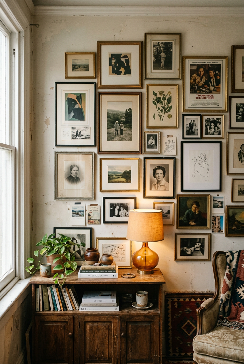
Not every gallery wall needs to be symmetrical.
Sometimes asymmetry is the whole vibe.
But there’s a difference between planned asymmetry and accidental chaos, and that difference is, again, spacing.
Asymmetrical arrangements work when they have a strong visual anchor and the negative space (the empty wall around and between frames) is used deliberately.
If your gaps are consistent, an irregular shape or layout still reads as intentional.
I love an asymmetrical salon-style wall that leans slightly to one side but has perfect internal spacing throughout.
It feels relaxed and layered without feeling messy.
That’s the sweet spot.
Think of the negative space as part of your design.
It’s not nothing.
It’s what makes your frames breathe.
Lighting Your Gallery Wall Like a Designer
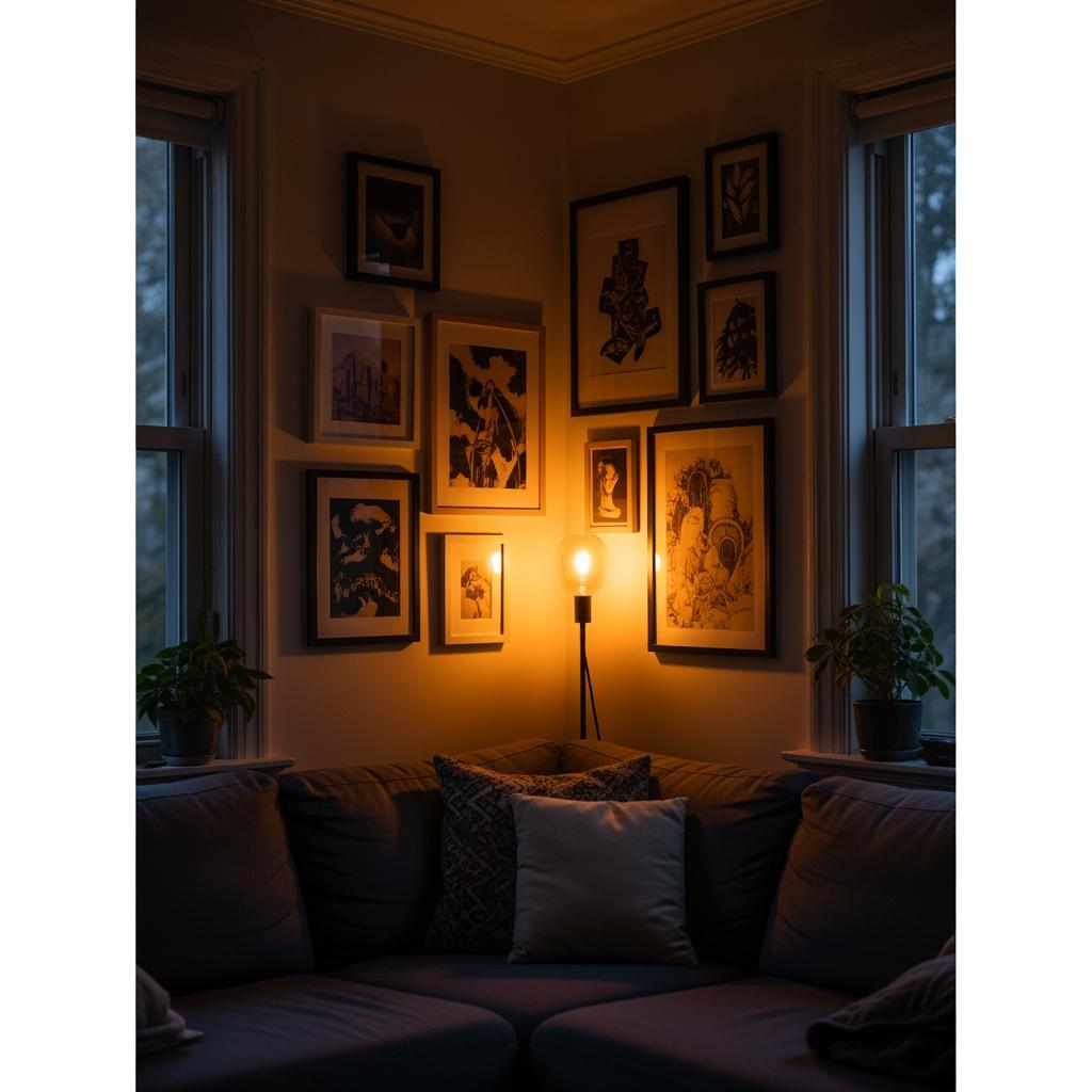
Once your spacing is right, lighting is the next thing that separates a good gallery wall from a great one.
And most people skip it entirely.
If your wall gets harsh afternoon light from a nearby window, it can wash out lighter prints and create weird glare on glass frames.
I dealt with this in my own office.
Switching to matte glass on those frames fixed about eighty percent of the problem.
For evenings, a picture light mounted above the arrangement or a small arc floor lamp aimed at the wall adds so much warmth.
Even a $12 thrift-store lamp with a warm-toned bulb does wonders.
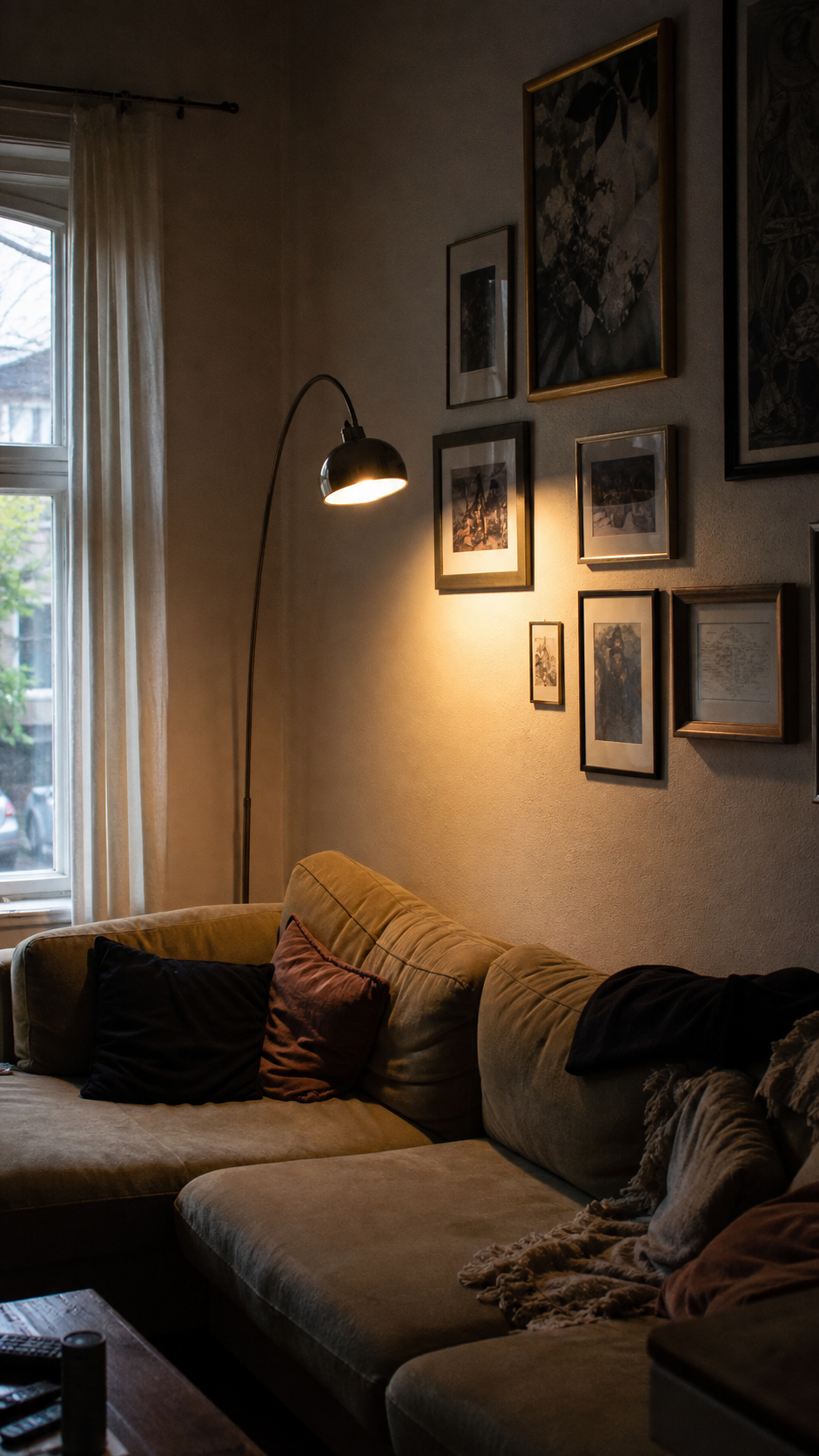
Light gives the wall dimensionality.
Without it, even a perfectly spaced, beautifully arranged gallery wall can look flat by seven in the evening.
The Texture Trick That Makes Frames Pop
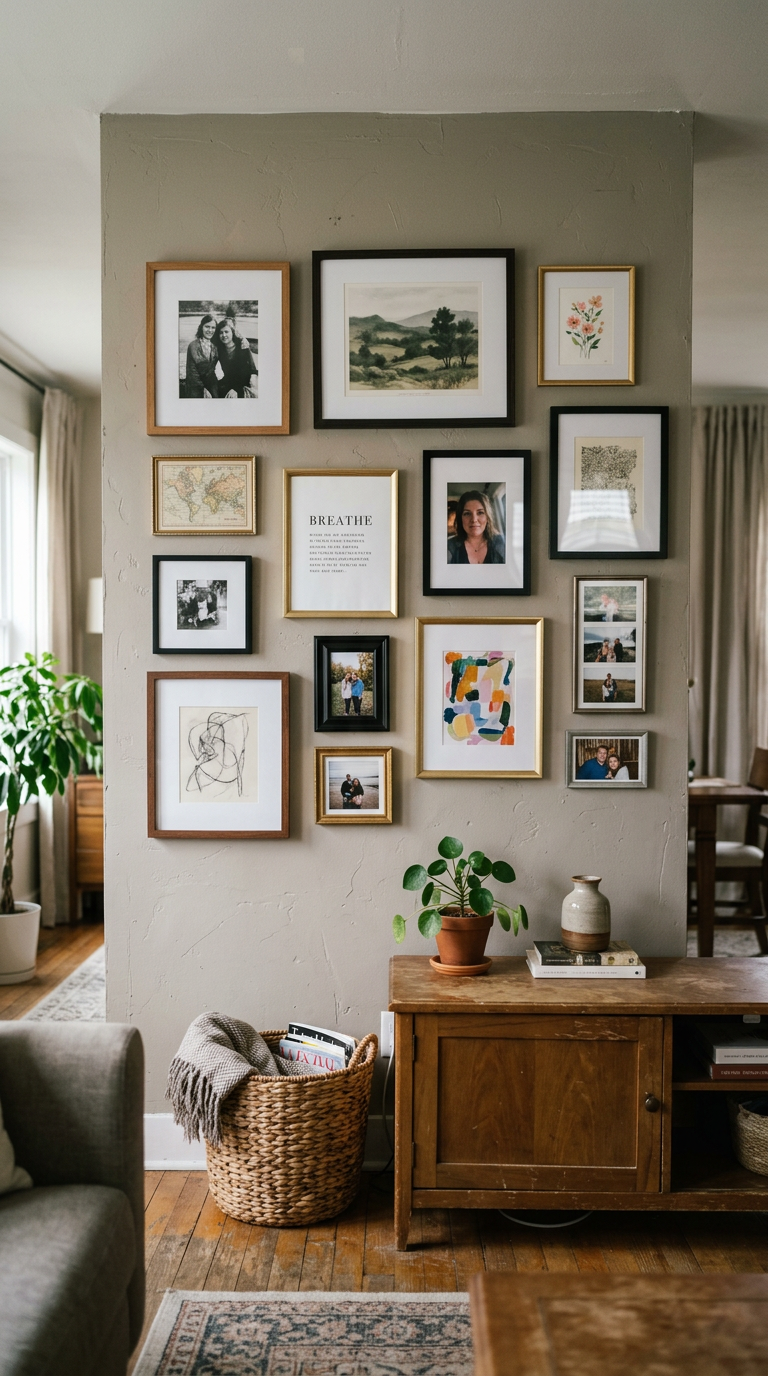
I don’t see people talk about this enough: wall texture behind your gallery wall matters.
Flat white drywall is fine, but it’s sort of baseline.
A soft limewash, a painted accent color, or even just a textured wallpaper behind the arrangement adds depth that makes every frame read more vividly.
It’s like the difference between displaying jewelry on bare glass versus on velvet.
My own gallery wall sits against a wall I painted in a warm greige tone a few shades deeper than the rest of the room.
It costs almost nothing extra if you’re already painting, and it makes the whole wall feel like it was designed rather than assembled.

Even a single sample pot of paint, tested and rolled in the shape of your arrangement before you hang anything, can tell you immediately whether a color shift is right for your space.

