I spent three months scrolling through peel and stick designs before I finally hit “add to cart.”
Three.
Entire.
Months.
The options were honestly overwhelming—geometric, floral, textured, marble, wood grain, abstract.
Every pattern seemed perfect until I imagined it on my actual wall, and then the panic set in.
What if I chose wrong?
What if it looked cheap?
What if the style didn’t match my furniture?
But then one Saturday morning, I just went for it and ordered a soft sage geometric pattern for my bedroom.
And that single decision completely transformed not just my room, but how I think about decorating.
Now I’ve tried seven different peel and stick designs throughout my house, and I’m genuinely obsessed with each one for different reasons.
Let me walk you through my favorite accent wall ideas so you don’t spend months overthinking like I did.
Subtle Textured

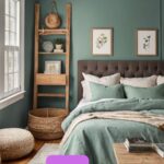
Okay, so my bedroom needed to feel like a calm, cozy retreat.
I didn’t want anything too bold or busy because I stare at that wall every single morning when I wake up.
I went with a textured linen look in a soft cream color, and it’s absolutely perfect.
It looks like expensive grasscloth wallpaper but cost a fraction of the price.
The subtle vertical texture catches light beautifully throughout the day—sometimes it looks almost white, other times it has this warm, honey glow.
What I love most is how it adds dimension without screaming for attention.
It’s sophisticated and calming, exactly what a bedroom should feel like.
I paired it with white bedding, natural wood nightstands, and some greenery, and the whole space feels like a boutique hotel.
This style works beautifully if you want to add visual interest but keep things serene and neutral.
It’s also perfect for small bedrooms because it doesn’t overwhelm the space.
The texture creates depth, making the room feel bigger and more layered.
If you’re hesitant about pattern or color, start here.
Textured neutrals give you that elevated look without any risk.
You literally cannot go wrong with a soft linen or grasscloth texture.
Tap to Explore These Beauties
See my ideas in action 👇 Tap any image to explore full details.
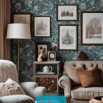
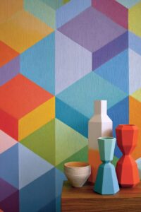
Bold Geometric Patterns

After the bedroom success, I got braver.
My living room needed personality, so I chose a charcoal and gold geometric pattern for the wall behind my couch.
And wow, the drama it created is everything.
Geometric designs work so well in living spaces because they add structure and visual interest without being too feminine or too masculine.
They’re kind of universally appealing, you know?
Mine has these overlapping hexagons with metallic gold accents that catch the light.
It makes my neutral furniture pop and gives the room this modern, sophisticated vibe.
The key with geometric patterns is scale.
Larger patterns make a bold statement and work great on bigger walls.

Smaller, more intricate patterns add interest but don’t overwhelm.
I’ve seen gorgeous chevron designs, modern triangles, abstract circles, and layered shapes.
They all bring different energy to a space.
If your room feels boring or lacks a focal point, a geometric accent wall instantly solves that problem.
It anchors the space and gives your eye somewhere interesting to land.
I paired mine with brass accents, velvet throw pillows, and a chunky knit blanket to play up the cozy-modern vibe.
Geometric patterns are also super versatile—they work in contemporary spaces, mid-century modern rooms, even transitional designs.
Moody Botanical Prints

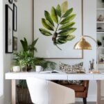
I work from home, so my office needed to feel inspiring but not distracting.
I went with a large-scale botanical print—these gorgeous oversized palm leaves in deep emerald green on a cream background.
It’s basically like working in a tropical paradise, but not in a cheesy way.
Botanical prints are having such a moment right now, and I totally understand why.
They bring nature indoors and create this fresh, organic feeling.
My particular design has a watercolor quality that feels artistic and sophisticated.
What I love about botanical accent walls is how calming they are.
Looking at leaves and greenery while I’m working genuinely makes me feel more relaxed and creative.
There are so many options—delicate ferns, bold monstera leaves, trailing vines, blooming flowers.
You can go subtle with muted tones or bold with vibrant colors.
For a home office, I’d recommend sticking with greens and neutrals.
They’re energizing but not overstimulating.
Save the bright florals for spaces where you want more playfulness.
I paired my botanical wall with a natural wood desk, white shelving, and lots of real plants.
The mix of the printed leaves and actual greenery creates this layered, jungle-inspired look that I’m obsessed with.
It makes sitting at my computer all day so much more pleasant.
Find Your Room's Color Palette
Tap a vibe — get a curated 5-color palette with hex codes you can copy ✨
Wood Plank Texture (Cozy Guest Bedroom)

I wanted my guest bedroom to feel warm and inviting, like a cabin retreat.
So I chose a weathered wood plank design in soft gray tones.
It looks exactly like real shiplap but took me two hours to install and cost way less.
Wood texture accent walls are perfect for adding rustic charm without the commitment or expense of real wood.
They work beautifully in bedrooms, living rooms, even dining spaces if you want that farmhouse vibe.
Mine has this gorgeous grain detail that looks so realistic.
I paired it with white bedding, cozy plaid blankets, and some vintage-inspired decor.
The room feels like a mountain cottage now.
What I love about wood plank designs is how versatile they are.
You can go whitewashed for a beachy feel.

💭 I Wrote a Book About My Biggest Decorating Mistakes!
When I decorated my first home, I thought I knew what I was doing. Spoiler: I didn't. 😅
💸 I bought a sofa way too big for my living room. Paint colors that looked amazing in the store but terrible on my walls.
Weathered gray for modern farmhouse.
Dark walnut for a more masculine, lodge-inspired look.
They all bring warmth and texture to a space.
And because they’re neutral, they work with basically any color palette.
I’ve changed my guest room bedding and decor multiple times, and the wood wall still works perfectly with everything.
If you love that cozy, layered, rustic aesthetic, this is your design.
It makes any room feel instantly more inviting and lived-in.
And people are always shocked when I tell them it’s peel and stick.
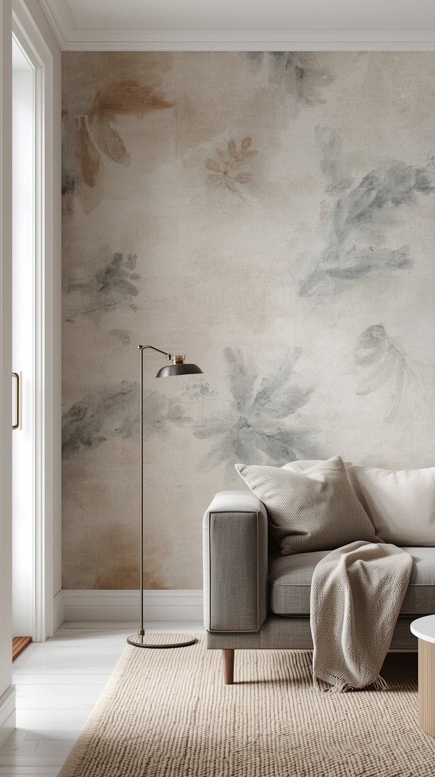
Abstract Brushstroke Art

My dining room needed something artistic and unexpected.
I found this incredible abstract brushstroke design—soft blush pink, cream, and gold strokes that look like an oversized watercolor painting.
It’s basically art and wallpaper combined, and I’m obsessed.
Abstract designs are perfect if you want something unique that shows off your personality.
They work especially well in dining rooms, entryways, or any space where you want to make a statement.
Mine creates this beautiful, feminine energy without being too sweet.
The brushstrokes have movement and depth, so the wall never looks flat or boring.
I’ve seen gorgeous abstract designs in every color palette imaginable.
Moody blues and blacks for drama.
Soft pastels for romance.
Vibrant oranges and teals for energy.
The beauty of abstract patterns is they don’t follow rules.
You can mix them with basically any decor style because they’re art.
I paired mine with a simple wood table, modern chairs, and brass light fixture.
The wall does all the talking, so I kept everything else minimal.
If you’re someone who loves art but doesn’t want to commit to large expensive pieces, an abstract accent wall gives you that same impact.
It transforms your wall into a focal point.
And you can change it whenever your style evolves.
What's Your Decor Personality?
5 questions · 30 seconds · Instant style match 🏡
Ombré Color Fade (Teen Bedroom Magic)

My niece wanted something cool and different for her bedroom.
We found this dreamy ombré design that fades from deep purple at the bottom to soft lavender at the top.
It’s like a sunset on her wall, and she absolutely loves it.
Ombré designs are perfect for kids’ rooms, creative spaces, or anywhere you want something playful and unique.
They create this beautiful gradient effect that adds depth and interest.
The one we chose has a soft, watercolor quality that feels artistic rather than juvenile.
What’s great about ombré is it works with any color palette.
Blues that fade from navy to sky.
Pinks that go from blush to white.
Greens that transition from forest to mint.
They all create this calming, dreamy effect.
We paired hers with white furniture and colorful bedding, and the wall anchors everything beautifully.
Ombré designs also photograph really well, which is important if you have a teen who loves taking photos in their room.
I’ve seen adults use subtle gray or beige ombré in bedrooms for a softer, more sophisticated version of the look.
It still creates visual interest but in a more understated way.
If you want something different from traditional patterns but not too bold, ombré is a beautiful middle ground.
It adds color and movement without being overwhelming.
Black And White Contrast (Modern Entryway)

My entryway was basically a hallway with a door.
No personality, no impact.
So I went bold with a black and white striped pattern—wide horizontal stripes that make the space feel larger.
And wow, the difference is incredible.
Black and white designs create instant drama and sophistication.
They’re graphic, modern, and work with literally any color palette because they’re neutral.
Stripes are classic, but I’ve also seen gorgeous black and white florals, geometric patterns, and abstract designs.
They all bring that high-contrast, editorial look.
What I love about using black and white in an entryway is it sets the tone for your entire home.
It tells people you’re not afraid of bold choices.
I paired mine with a simple bench, a large mirror, and some greenery.
The contrast makes everything else in the space pop.
Black and white accent walls also photograph beautifully.
They’re timeless, so you won’t look back in five years and cringe.
If you’re nervous about color but want something bold, black and white is the perfect choice.
It’s dramatic without being risky.
And you can layer in any accent color through decor, artwork, and accessories.
The wall becomes this perfect neutral backdrop that makes everything else look more intentional.
This or That?
Pick your fave — see what other readers chose! 👀
Metallic Accents (Glam Bedroom Touch)

I wanted something special for the wall behind my vanity area.
So I chose a soft blush design with gold metallic geometric accents.
When the light hits it, the gold shimmer creates this beautiful, glamorous effect.
Metallic accent walls are perfect if you love a little sparkle and luxury.
They work beautifully in bedrooms, dressing rooms, even dining spaces for a formal feel.
Mine catches morning light from the window, and it honestly makes getting ready feel more special.
The blush and gold combination is feminine without being too sweet.
What I love about metallics is how they change throughout the day.
In bright light, they shimmer and shine.
In dim light, they’re subtle and sophisticated.
They add this layer of interest that flat patterns just can’t achieve.
💭 Ever wondered what your room would actually look like rearranged?
I built a free tool that lets you drag furniture around a 2D floor plan. No signup, no catch.
See the Room Planner →I’ve seen stunning silver metallics paired with cool grays.
Bronze metallics with warm creams.
Rose gold with soft pinks and whites.
They all bring that glam, upscale vibe.
The key is not going overboard.
One accent wall with metallic details is elegant.
An entire room can feel overwhelming.
I paired mine with a white vanity, a vintage-style mirror, and soft pink accents.
It feels like a dressing room in a boutique hotel.
If you love glamour and sophistication, metallic accent walls are your answer.
Concrete Or Industrial Texture (Modern Basement)

My basement needed a modern, masculine vibe.
I didn’t want it to feel cold, but I wanted something edgy and different.
So I chose a faux concrete texture in soft gray tones.
It looks exactly like real concrete but obviously way easier to install and remove.
Industrial textures are perfect for basements, home gyms, media rooms, or modern lofts.
They bring this urban, minimalist feel that’s super on-trend right now.
Mine has subtle variations in tone that make it look authentic.
I paired it with black furniture, metal accents, and some warm wood to soften the look.
The space feels like a cool urban apartment now.
What’s great about concrete and industrial textures is they work beautifully with both warm and cool color palettes.
Add leather and wood for warmth.
Add metal and glass for a sleeker look.
I’ve seen people use brick texture patterns for a similar vibe.
They all bring character to spaces that might otherwise feel unfinished or boring.
If you have a basement or bonus room that needs personality, industrial textures are a perfect choice.
They’re neutral enough to work long-term but interesting enough to make a statement.
And they photograph really well if you’re into creating cool, moody spaces.
One accent wall completely changed how I feel about my basement.
Quick Design Dilemma
Cast your vote — see what other readers think! 🤔
Mixing Patterns (What Actually Works)

Here’s something I’ve learned through trial and error: you can absolutely mix different peel and stick patterns in one home.
But there are rules.
Stick to a cohesive color palette across all your accent walls.
My house has cream, sage green, and soft gray throughout, so even though my patterns vary, they all feel connected.
Vary the scale of your patterns.
If you have a large geometric in the living room, choose a smaller, more subtle texture in an adjacent space.
Mix pattern types—combine florals with geometrics, or pair textured neutrals with bold graphics.
This creates visual interest without feeling chaotic.
I have textured linen in my bedroom, bold geometric in my living room, and botanical in my office.
They’re all different, but because they share similar tones and I’ve balanced scale, my house still feels cohesive.
💭 I Wrote a Book About My Biggest Decorating Mistakes!
When I decorated my first home, I thought I knew what I was doing. Spoiler: I didn't. 😅
💸 I bought a sofa way too big for my living room. Paint colors that looked amazing in the store but terrible on my walls.
What doesn’t work?
Too many bold patterns fighting for attention in open-concept spaces.
Or mixing too many different color stories that don’t relate to each other.
My advice is to choose one or two main colors and weave them throughout your accent walls in different patterns.
It creates this beautifully layered look that feels intentional and designed.
Your home becomes interesting and personal without feeling overwhelming.
That’s the sweet spot.