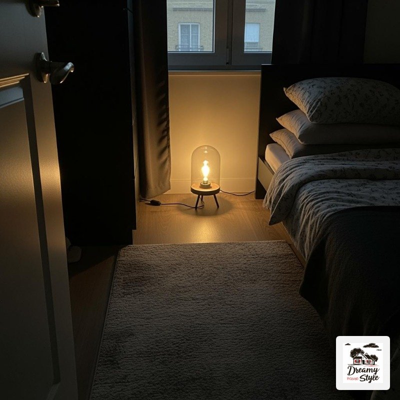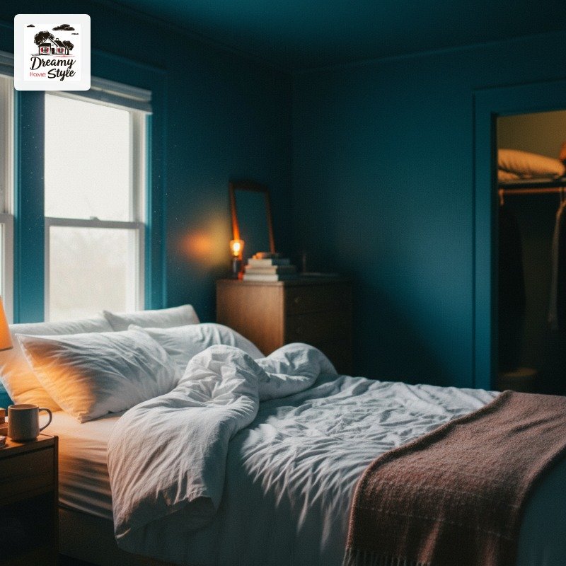

I repainted my bedroom ceiling at 11pm on a Tuesday and cried a little when I turned the lamp on and saw it.
Not sad crying.
The other kind.
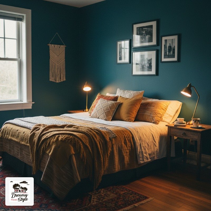
I’d gone full deep teal — walls, ceiling, even the trim — and it looked like sleeping inside a piece of sea glass.
I’d been scared of color for years, doing the whole greige thing because it felt ‘safe.’ But safe was also making me feel nothing every morning.
Color drenched rooms are having a serious moment on Pinterest right now, and honestly?
I get it.
Once you go bold, beige feels like a punishment.
What ‘Color Drenched’ Actually Means (And Why It’s Not Just Painting Walls)
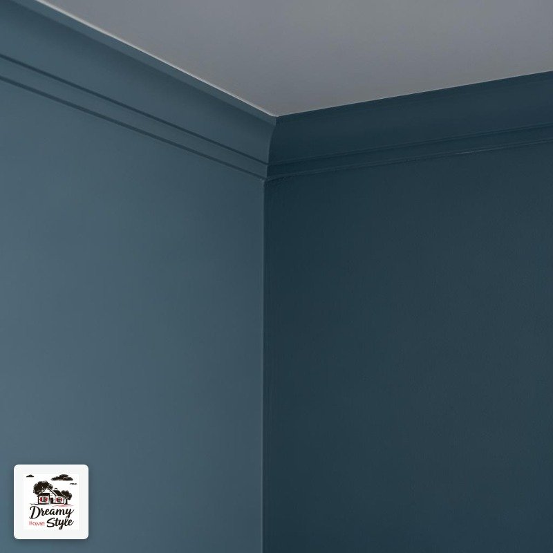
Color drenching is when you take one color and apply it to basically everything in a room — walls, ceiling, trim, sometimes even the furniture.
No relief, no white break, no contrast.
Just one deep committed hue wrapping you like a blanket.
It sounds intense.
It kind of is.
But that’s the whole point.
The magic trick is that when everything is the same color, your eye stops chopping the room into pieces and reads it as one unified space.
Small rooms actually feel bigger.
Awkward corners disappear.
That weird bump-out where the closet is?
Gone.
Visually, anyway.
I kept seeing it everywhere and dismissing it as a trend for people with nicer houses than mine.
Then I tried it in my tiny spare bedroom with a $34 can of Benjamin Moore ‘Newburyport Blue’ and literally could not stop standing in the doorway staring at it.
Deep Forest Green: The Color That Started My Obsession
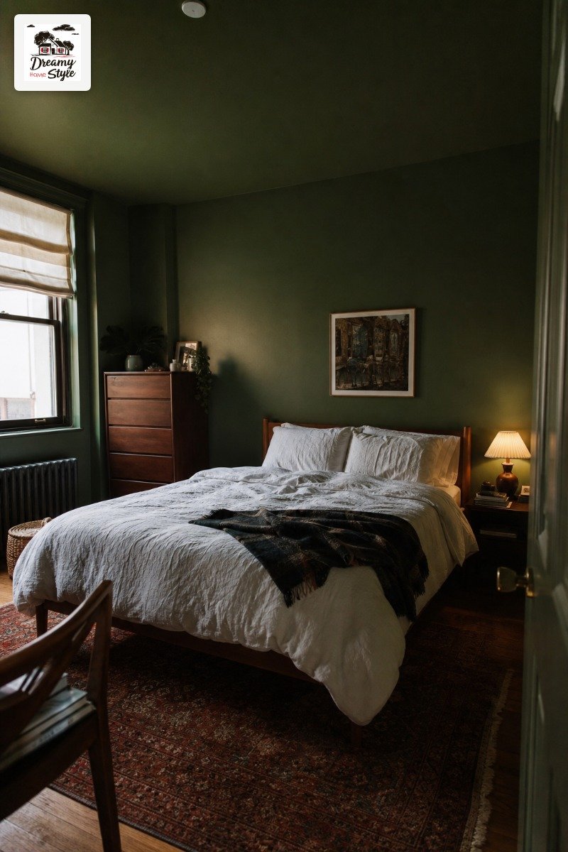
If there’s one color that broke Pinterest first, it’s deep forest green.
Not sage.
Not olive.
I’m talking the kind of green that looks like it belongs in a 19th century library where someone is reading by candlelight.
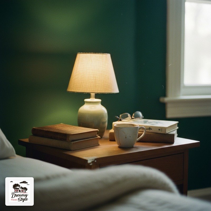
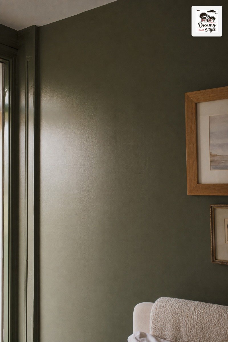
I used Farrow & Ball ‘Calke Green’ in my bedroom and I will never fully recover.
It makes every single light source in the room feel warmer.
White linen bedding glows against it.
Wood furniture suddenly looks intentional instead of ‘I found this at Goodwill’ (which I did, for $40, but that’s beside the point).
The one thing I’d warn you about: it photographs dark on your phone.
In person it’s stunning.
In a quick snap it looks like a cave.
Don’t let that scare you off.
Go darker than you think.
Seriously.
The color chips always look scary and the actual room always proves you right.
Moody Navy Blue That Feels Like Sleeping Inside a Cloud
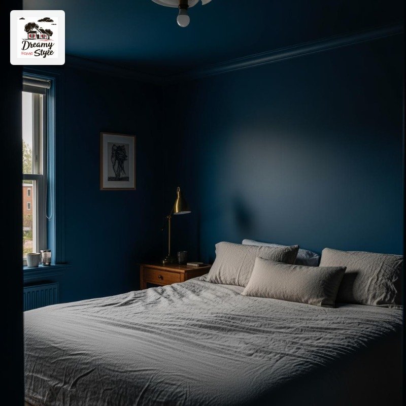
Navy is the color people try first because it still feels ‘safe-ish.’ And I don’t mean that as a knock — it earns that reputation because it almost always works.
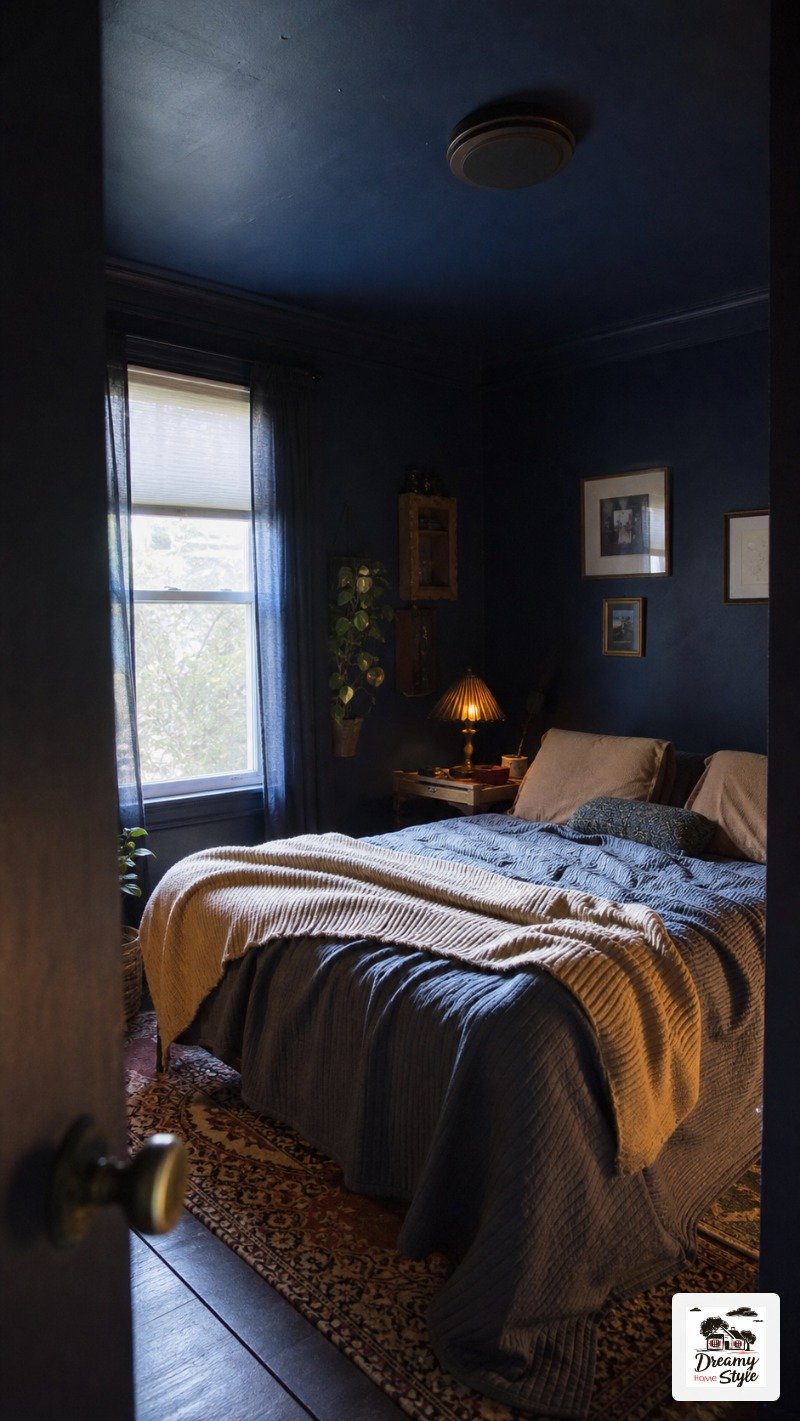
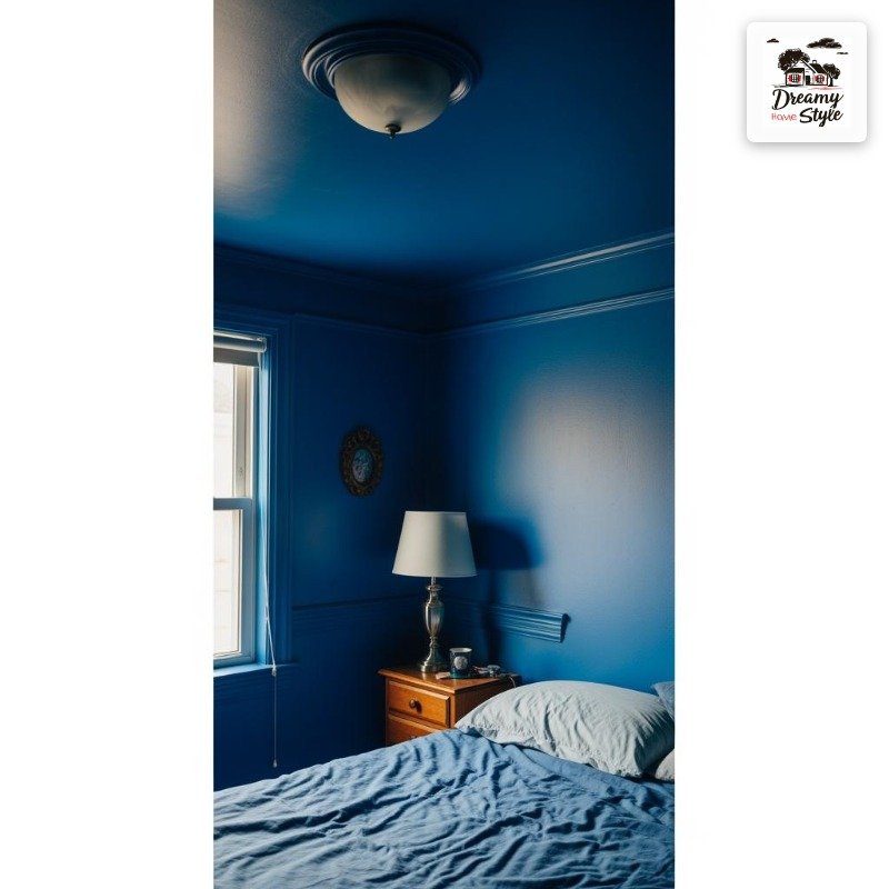
When you drench a room in navy, something interesting happens at night.
With lamps on (overhead lighting is still a crime, I stand by this), the room takes on this deep inky quality that makes everything feel hushed and private.
It’s genuinely the best sleeping environment I’ve ever been in.
The ceiling is non-negotiable here.
Paint it too.
If you leave the ceiling white with navy walls you’ve just made yourself a very fancy box.
Carry the color up and suddenly you’ve got atmosphere.
I’d pair it with brass hardware and natural linen.
Not because it’s trendy — because the warmth of those materials keeps navy from reading as cold or masculine, which it can skew without a little softness in the room.
Dusty Rose Done Right (Not the ’80s Way, I Promise)
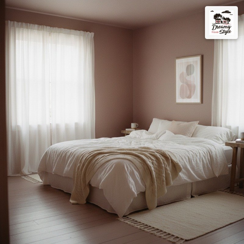 Dusty Rose Done Right
I resisted dusty rose for two years because I kept picturing that particular shade of pink that lived in every grandmother’s bathroom in 1987.
That’s not this.
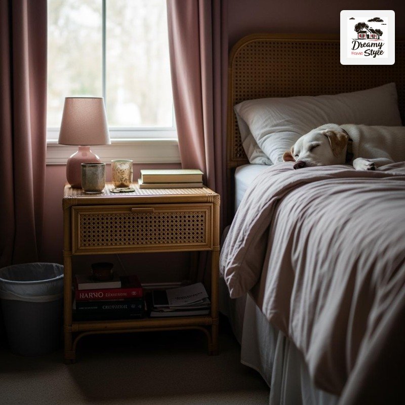
Modern dusty rose is more mauve than pink.
It leans gray.
It looks incredible in morning light — like the room is blushing.
And when you drench it top to bottom, it stops reading as ‘pink bedroom’ and starts reading as ‘sophisticated color environment that happens to be pink-adjacent.’
Biscuit, my dog, has white fur.
She sheds on everything.
In the dusty rose bedroom she somehow looks intentional, like a decorative element.
I’m counting this as a win.
If you’re nervous, try it in a room with good natural light.
Dusty rose in a dark room can go slightly depressing.
But in a bright south-facing room?
Honestly gorgeous.
Rich Terracotta: The Warm-Toned Room That Feels Like Italy (Or at Least Like a Good Candle)
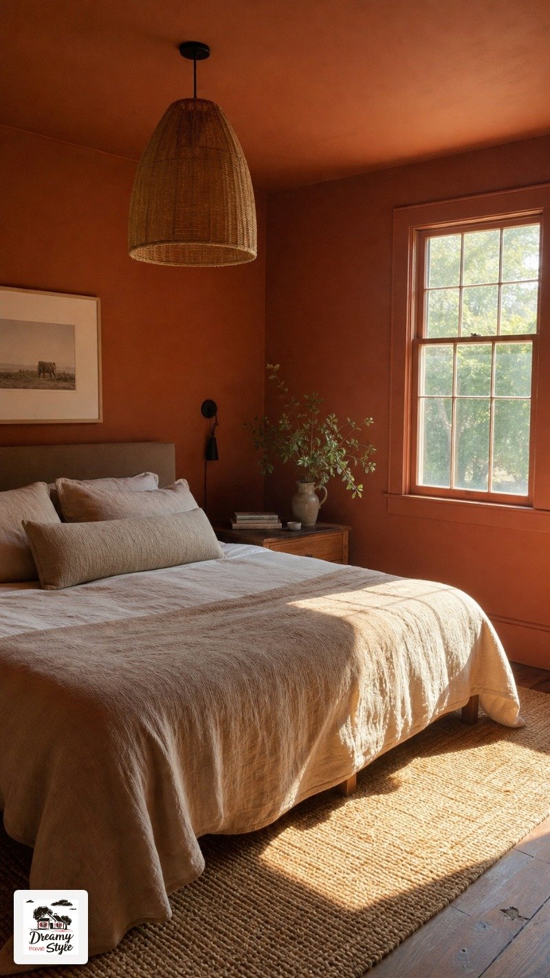
Terracotta hit hard a few years back and then people declared it ‘over.’ I think those people were wrong and also probably have cold homes.
A fully drenched terracotta bedroom has this warmth that you feel before you even really see the color.
It’s the room equivalent of putting on a sweater.
Especially in winter, when the outside light is grey and flat — the terracotta walls seem to generate their own warmth.
I used it in the room that gets really harsh afternoon light from the west window.
That orange-leaning light that washes out most colors and makes pale walls look radioactive.
Terracotta just absorbs it.
Drinks it right in.
The room looks perfect from noon to sundown.
Pair with natural textures — jute rug, linen, unfinished wood.
Skip the chrome and nickel hardware in here.
It fights.
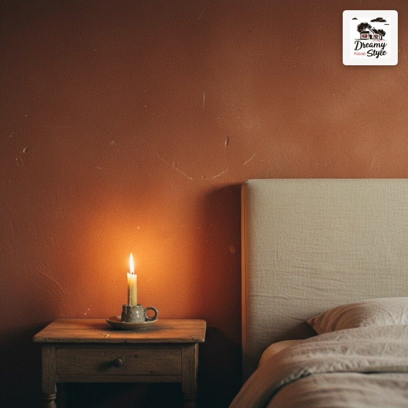
Inky Black Bedrooms That Are Somehow Not Depressing
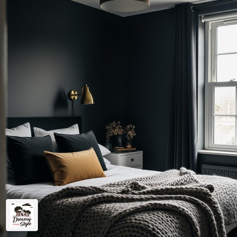 Inky Black Bedrooms
I know.
I know.
But stay with me.
A black bedroom sounds like a teenage decision you’d regret.
But there’s a version of this — charcoal black, not flat black, specifically — that is the most dramatic and cocooning sleep space I’ve ever seen in person.
The first time I walked into one at a friend’s house I stood there with my mouth open for an embarrassing amount of time.
The trick is layering a ton of texture and warm light.
Velvet pillows, a chunky knit throw, brass and warm-toned metals.
The dark color recedes and all those textures come forward.
It reads as luxurious, not gloomy.
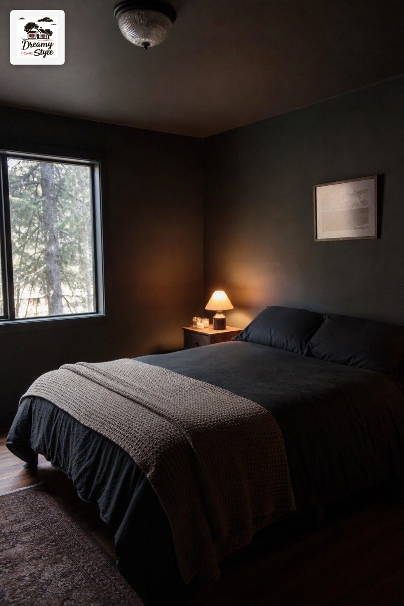
Flat black paint is too harsh.
Look for something with a tiny bit of warmth or depth — ‘Wrought Iron’ by Benjamin Moore is the one I see people coming back to.
It’s almost black but not quite, and that ‘not quite’ is everything.
Lavender and Plum: The Unexpected Color That Hits Different
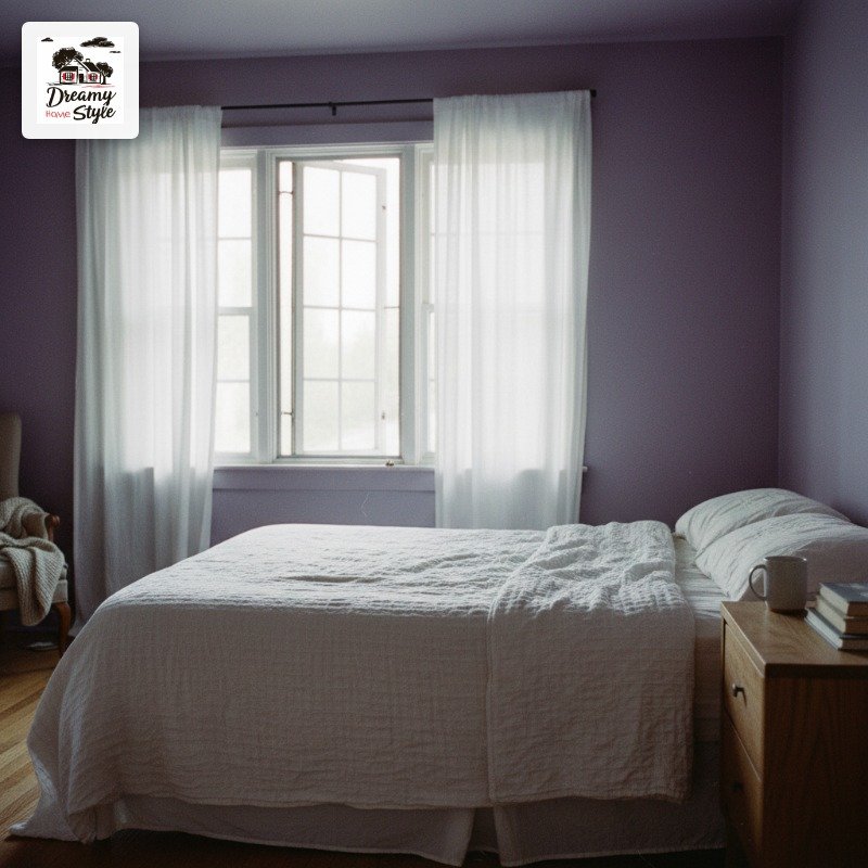
Purple gets dismissed constantly and I think it’s because people are picturing the wrong purple.
Barney purple.
Easter egg purple.
That’s not what we’re talking about.
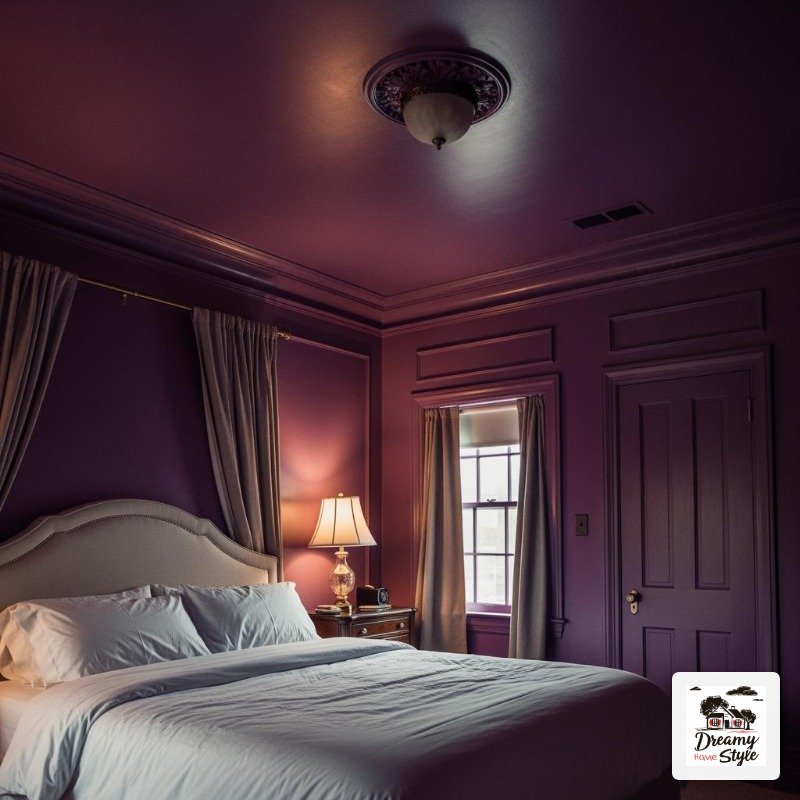
Deep plum is incredibly sophisticated.
It has the same cocooning quality as navy but warmer.
And soft lavender — when you drench a whole room in it — reads almost like a neutral.
It’s one of those colors that photographs beautifully in the golden hour light and people in the comments always ask ‘what color is that?’
I’ve seen a dusty lavender drenched bedroom that stopped me mid-scroll every single time it came across my feed.
Paired with warm wood tones and off-white bedding.
Nothing matching exactly.
Just that soft purple envelope of a room.
This one is specifically great for east-facing bedrooms that get that cool morning light.
The lavender and the cool light actually complement each other instead of fighting.
The Butter Yellow Room That Feels Like Actual Sunshine
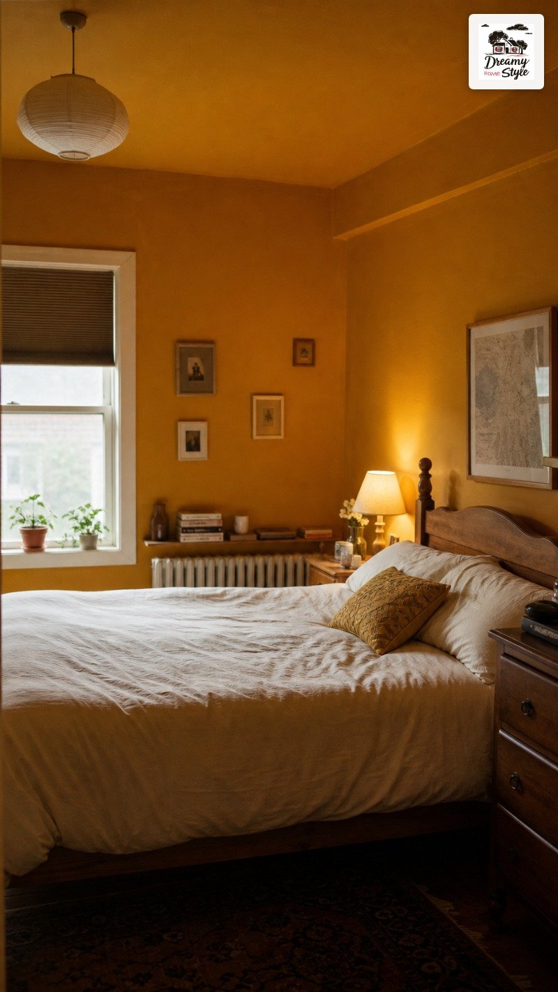
Yellow gets a bad rap and I’ve been guilty of writing it off.
But a specific kind of yellow — deep, aged, almost ochre — does something extraordinary in a bedroom.
It’s not lemon.
It’s not nursery yellow.
Think old European plaster walls that have had two hundred years of sun on them.
That golden, slightly grayed-out yellow that looks like it’s warm even when the light is flat.
I tried this in a room that gets almost no natural light.
North-facing, one small window, the kind of room that feels sad no matter what you do.
The deep butter yellow didn’t fake sunlight exactly, but it made the room feel warm instead of cold.
That’s the best way I can describe it.
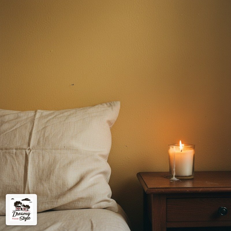
It’s especially good under lamplight in the evening.
The whole room glows.
Every single time I walk in I feel a little better, which is a lot to ask of paint but apparently not too much.
Warm Chocolate Brown: The Color That Feels Like a Hug
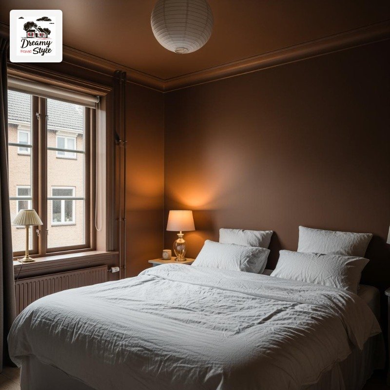
Brown is back and I’m so relieved.
There was a decade where brown was basically banned from interiors and we all lived in gray boxes pretending we didn’t miss warmth.
A deep warm chocolate brown bedroom is cocooning in a way that almost nothing else is.
Not dramatic-cocooning like black.
Just quietly, deeply warm.
Like someone already lit a fire and poured you something.
The key — and I say this as someone who painted a brown room that looked muddy and had to repaint it (there went a weekend) — is to go warm brown, not cool brown.
Warm browns have red or orange undertones.
Cool browns have gray in them and they read as depressing in a bedroom context.
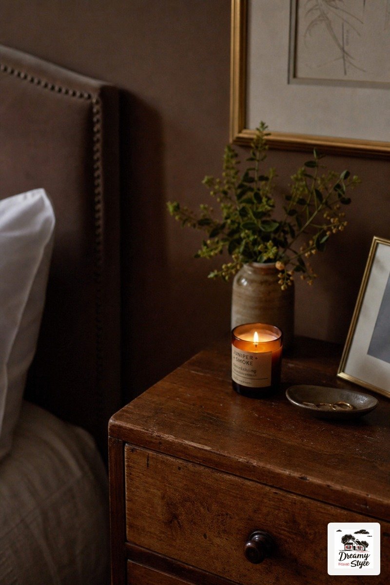
White bedding.
That’s all I’ll add.
White bedding against chocolate brown walls is one of the best things in home decor, full stop.
Sage Green’s More Intense Sister: Olive Drenched Bedrooms
Everyone did sage.
I did sage.
Sage is fine.
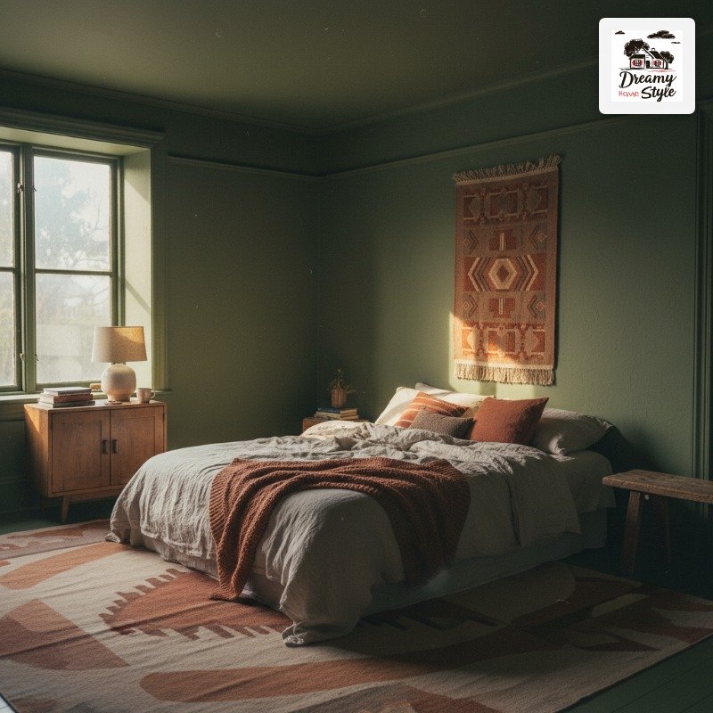
But olive is what happens when sage grew up and got a little more complex.
Deep olive green has yellow in it, which gives it warmth that straight sage doesn’t have.
It feels botanical.
Earthy without being terracotta, green without being minty or cold.
When you take it all the way up the ceiling and into the trim it looks genuinely expensive.
I’ve seen it paired with rust-colored textiles and it’s one of those combinations that shouldn’t work on paper and then does, completely.
The contrast is high enough to be interesting but both colors are in the same earthy family so nothing clashes.
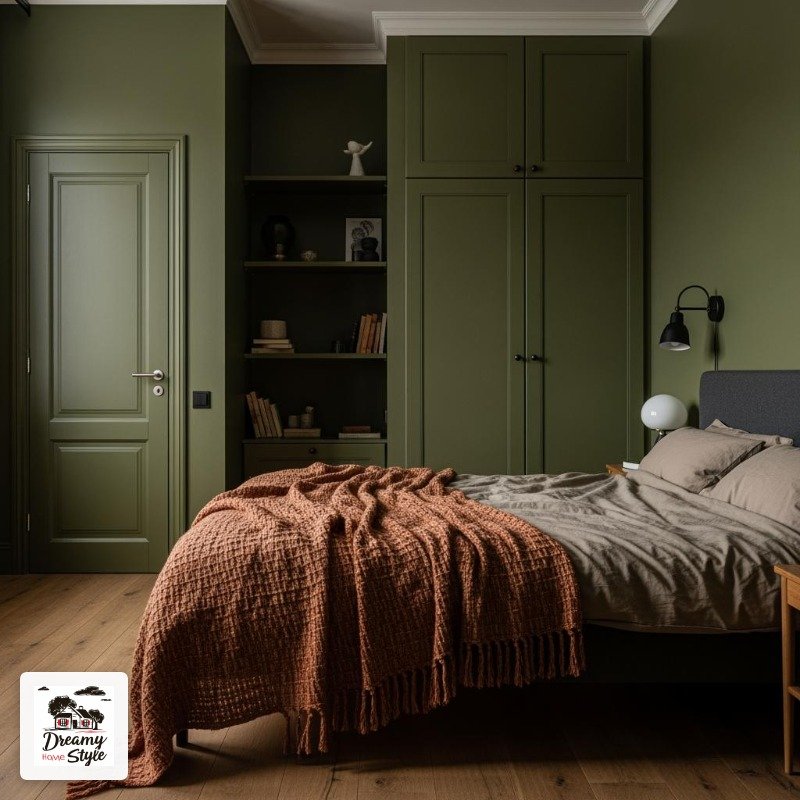
This is also one of the better choices if you’re nervous about going dark — olive is forgiving.
It doesn’t close a room in the way navy or black can.
It just deepens it.
How to Actually Choose Your Drench Color (Without Buying 12 Sample Pots)
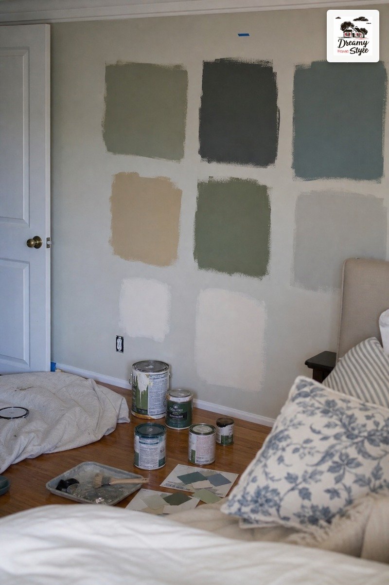
I bought nine sample pots for my bedroom before I committed.
Nine.
That’s a waste of money and also a good way to make your walls look like a personality quiz.
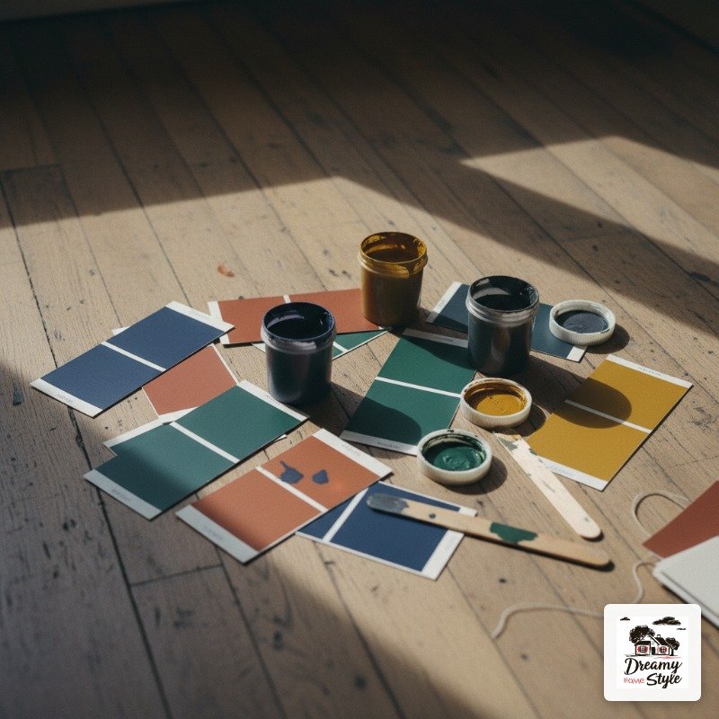
Here’s what I do now: figure out what direction your bedroom faces first.
North-facing rooms get cool, flat light all day.
Warm colors — terracotta, butter yellow, chocolate brown — are your best friends.
South-facing rooms can handle cooler colors like navy or green because the light is warm and rich enough to balance them.
Then look at what you have to work with in the room.
The furniture you’re keeping, the flooring, any fixed elements like tile or built-ins.
Pick a drench color that’s in conversation with those pieces, not fighting them.
Get one sample pot, paint a big sheet of cardboard, and move it around the room at different times of day.
Morning light versus afternoon light versus lamp light will all read differently.
Give it at least two full days before you decide.
The Mistakes I Made So You Don’t Have To
The biggest mistake: stopping at the walls.
If you paint the walls a deep color and leave the ceiling white, the ceiling floats away from the room and looks weird.
It looks unfinished.
Paint the ceiling.
I know it’s annoying.
Do it anyway.
Second mistake: going matte on everything.
Matte walls are gorgeous but a matte ceiling is hard to clean and scuffs easily.
I use eggshell on my ceilings now.
It’s barely a sheen but it makes a practical difference.
Third thing I got wrong: skipping the second coat.
Deep colors especially need two full coats or the coverage is uneven and you end up with this patchy situation that catches the light and shows every roller mark.
I learned this the hard way on my green room and spent an extra Saturday fixing it.
Also — and this is a smaller thing — don’t forget to paint the inside of the closet doors if they’re visible from the bed.
Nothing breaks the drench illusion faster than a white door swinging open in your beautiful color cave.
Making It Feel Cozy and Not Claustrophobic
The number one fear I hear from people about color drenching is that the room will feel smaller and darker.
And I get it — logically, covering everything in a dark color sounds like it should shrink the space.
But here’s the thing that surprised me the first time I tried it: because the color goes everywhere including the ceiling and trim, your eye doesn’t find the edges anymore.
The room doesn’t have hard visual boundaries.
It actually feels more expansive, in a dreamy sort of way.
The piece that makes it feel cozy instead of closed-in is layering warm light sources.
Bedside lamps, a floor lamp, maybe a small table lamp in a corner.
Multiple low light sources spread warmth around the room in a way that makes the color look intentional and beautiful.
A single overhead light will make a dark drenched room feel oppressive.
Mirrors help too, but honestly, if the lighting is right you won’t need them.
Get the lighting right first.