ou know that feeling when you walk into someone’s home and instantly want to kick off your shoes and stay forever?
I used to wonder what that magic ingredient was.
I’d buy all the candles, all the throw blankets, every single “cozy” thing Pinterest told me to buy.
But my living room still felt… off.
Like it was trying too hard but missing something fundamental.
Then one Saturday afternoon, I was scrolling through my phone at the paint store (procrastinating a completely different project), and it hit me.
The walls.
It was always the walls.
No amount of fluffy pillows can fix the wrong paint color.
But the right paint color?
It does half the coziness work for you before you even add a single piece of furniture.
So I started testing, painting, and basically turning my house into a giant color experiment.
These are the shades that actually delivered on the cozy promise—the ones that make you want to brew tea and settle in for hours.
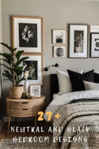
My Favorite Warm Neutrals

Warm neutrals are where I always start when I want instant coziness.
I’m talking about those soft, creamy shades that feel like they’re giving you a hug the second you walk in.
My top pick?
A greige with just a hint of taupe undertone.
It’s not boring beige, and it’s not cold gray—it’s that perfect middle ground that makes everything look better.
I used this in my guest bedroom, and people literally comment on how “restful” it feels.
The trick is to look for paint swatches that have a warm base—think more sand, less concrete.
If you hold the swatch next to pure white and it looks slightly peachy or creamy, you’re on the right track.
These colors work because they reflect light softly instead of bouncing it around harshly.
And honestly?
They make your furniture look more expensive.
Pro tip: test your paint sample at different times of day.
Morning light can make warm neutrals glow, while evening light makes them feel even cozier.
I learned this the hard way when a color I loved at noon looked completely different at dinner time.
Tap to Explore These Beauties
See my ideas in action 👇 Tap any image to explore full details.
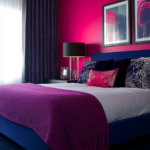
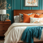
Deep, Moody Blues

Okay, hear me out on this one.
Dark blue walls might sound dramatic, but they’re actually incredibly cozy—especially in bedrooms or reading nooks.
I painted my home office a rich navy last fall, and it transformed the space into this intimate little cocoon.
The key is choosing a blue with warm undertones, not icy cool ones.
Look for navy shades that lean slightly toward indigo or have a hint of gray mixed in.
These deeper blues trick your eye into feeling like the walls are wrapping around you.
It’s the same reason restaurants use dark colors—they create intimacy.
And here’s something I didn’t expect: dark blue makes white trim absolutely pop.
Suddenly my basic baseboards looked intentional and crisp.
If you’re nervous about going full dark blue, try one accent wall first.
I did this behind my bed, and it became the coziest spot in my entire house.
Layer in warm metallics like brass or copper, and add soft textiles in cream or rust.
The contrast is chef’s kiss.
💭 Ever wondered what your room would actually look like rearranged?
I built a free tool that lets you drag furniture around a 2D floor plan. No signup, no catch.
See the Room Planner →Soft Terracotta Tones

Terracotta is having such a moment right now, and I’m here for it.
This warm, earthy orange-brown feels like perpetual golden hour in your room.
I tested a soft terracotta in my dining room, and it made every meal feel more special somehow.
The color brings this Mediterranean warmth that’s impossible to replicate with accessories alone.
What I love most?
It works in literally any season.
Summer?
It feels sun-baked and relaxed.
Winter?
It adds warmth when everything outside is gray.
The trick with terracotta is going softer than you think.
Skip the bright burnt orange and look for shades that are more muted, almost dusty.
These tones pair beautifully with natural wood, cream linens, and even unexpected pops of pink or sage green.
When the evening light hits terracotta walls, they glow.
Like, actually glow.
I find myself just staring at the walls sometimes during sunset.
If terracotta feels too bold, try it in a smaller space first—a powder room or hallway can handle the drama.
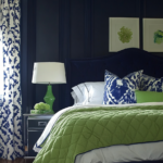
Earthy Sage Greens

Sage green is my secret weapon for creating calm, cozy spaces.
There’s something about this muted, grayish-green that feels both organic and sophisticated.
I painted my main bathroom in a soft sage, and now it feels like a mini spa.
The color has this natural grounding effect—probably because it mimics the outdoors.
It works especially well in rooms where you want to relax: bedrooms, bathrooms, even kitchens.
The beauty of sage is that it’s neutral enough to work with almost any decor style.
Modern?
Yes.
Farmhouse?
Absolutely.

Find Your Room’s Color Palette
Tap a vibe — get a curated 5-color palette with hex codes you can copy ✨
💭 I Wrote a Book About My Biggest Decorating Mistakes!
When I decorated my first home, I thought I knew what I was doing. Spoiler: I didn’t. 😅
💸 I bought a sofa way too big for my living room. Paint colors that looked amazing in the store but terrible on my walls.
Vintage?
It’s perfect.
I’ve paired mine with warm wood tones, black accents, and lots of white, and it all just flows.
One thing I learned: not all sage greens are created equal.
Some lean too gray and feel cold.
Others are too yellow and look dated.
You want that perfect balance—more herb garden, less hospital corridor.
Test your samples next to your flooring and existing furniture.
The color should feel soft and organic, never harsh or clinical.
Warm Taupe

Taupe gets a bad reputation for being boring, but that’s only if you pick the wrong one.
The right warm taupe is anything but dull—it’s sophisticated, cozy, and endlessly versatile.
I used a creamy taupe with pink undertones in my living room, and it’s become the most-used space in my house.
This color creates the perfect backdrop for everything.
Your art looks better.
Your throw pillows pop.
Your whole room just feels pulled together without trying too hard.
Warm taupe works because it’s basically a chameleon.
In bright light, it reads as a soft neutral.
In dim light, it feels warm and enveloping.
The secret is finding a taupe that leans warm, not cool.
Cool taupes can look muddy or even slightly purple (trust me, I’ve been there).
Warm taupes have beige or pink undertones that make them feel inviting.
I love pairing warm taupe with crisp white trim, natural textures like jute and linen, and metallic accents in gold or brass.
It’s one of those colors that makes any room feel instantly grown-up and cozy at the same time.
What’s Your Decor Personality?
5 questions · 30 seconds · Instant style match 🏡
Blush Pink

I know, I know—pink walls can feel risky.
But a soft, dusty blush is one of the coziest colors I’ve ever used.
I painted my daughter’s room in a muted blush, and even I want to hang out in there now.
The key word here is muted.
We’re not talking hot pink or bubblegum.
Think more like faded rose petals or the inside of a seashell.
These subtle pinks create this warm, gentle atmosphere that feels nurturing and calm.
Blush works surprisingly well in grown-up spaces too.
I’ve seen it in dining rooms, bedrooms, even home offices, and when done right, it’s elegant.
The trick is balancing it with cooler tones.
Pair blush walls with gray bedding, black accents, or even navy pillows.
This keeps it from feeling too sweet or juvenile.
And here’s a bonus: blush pink is incredibly flattering.
It makes everyone’s skin look good, which is why it’s such a genius choice for bathrooms or bedrooms.
The evening light makes these walls glow with warmth.
If you’re hesitant, try it in a smaller space first—you might be surprised how much you love it.
Warm Grays (Yes, Really)

Gray gets a bad rap for feeling cold, but warm grays are completely different.
I’m talking about grays with beige or brown undertones—sometimes called “greige.”
These colors give you the modern feel of gray without the chilly vibes.
I used a warm gray in my entryway, and it makes coming home feel like a reset.
The space feels clean and calm, but not sterile.
Warm grays are perfect if you want something contemporary but still cozy.
They work beautifully with both cool and warm accent colors.
I’ve paired mine with blush, navy, terracotta, and sage—everything looks good.
The biggest mistake people make with gray is going too cool.
Cool grays can feel harsh and unwelcoming, especially in rooms without tons of natural light.
Always test your gray sample in the actual room at different times of day.
If it starts looking blue or purple, it’s too cool.
You want a gray that feels soft and slightly warm, like a cozy sweater.
Layer in warm wood tones, soft textiles, and warm metallics to enhance the coziness factor.
Creamy Off-Whites

If you want the brightness of white but with actual warmth, creamy off-whites are your answer.
Pure white walls can feel stark and cold—like a blank canvas waiting to be filled.
But a soft, creamy white?
That’s a warm embrace.
I painted my kitchen in a buttery off-white, and it transformed the space from clinical to cozy.
The subtle warmth makes a huge difference, especially in rooms with lots of natural light.
These colors work because they reflect light beautifully while still feeling soft and inviting.
Look for whites with names that include words like “cream,” “linen,” or “vanilla.”
These hint at the warm undertones you’re after.

Avoid whites with names like “polar” or “ice”—those are going to read cold.
I love pairing creamy whites with natural wood, warm metals, and colorful accents.
The neutral backdrop lets everything else shine without competing.
One of my favorite tricks?
Use creamy white on the walls and a slightly deeper warm neutral on the trim.
It creates subtle depth that makes the room feel more layered and intentional.
These colors make small rooms feel bigger and dark rooms feel brighter, all while maintaining that cozy vibe.
This or That?
Pick your fave — see what other readers chose! 👀
Rich Chocolate Browns

Dark brown walls might sound intense, but trust me—they’re incredibly cozy.
I’m talking about rich chocolate or espresso shades that create instant warmth.
I used a deep warm brown in my library nook, and it feels like a luxurious hideaway.
Brown walls make everything feel grounded and substantial.
There’s something about being surrounded by this rich, warm color that’s just inherently comforting.
It’s like being wrapped in a cashmere blanket.
The key is choosing browns with warm red or orange undertones, not cool gray ones.
You want chocolate, not mushroom.
Pair dark brown walls with crisp white trim to keep things from feeling too heavy.
Add in brass or gold accents for a touch of glamour.
Layer lots of soft textures—velvet, linen, wool—to play up the coziness.
And don’t skip the lighting.
Dark walls need good layered lighting to feel warm rather than cave-like.
I have a mix of ambient, task, and accent lighting in my brown-walled spaces, and it makes all the difference.
This is also where candles become your best friend—the warm glow against dark walls is pure magic.
Soft Butter Yellow

A gentle, buttery yellow can make any room feel like perpetual sunshine.
Not bright, school-bus yellow—we’re talking about soft, muted shades that feel warm and happy.
I painted my breakfast nook in a pale butter yellow, and mornings there are just… better.
The color creates this cheerful, optimistic atmosphere without being overwhelming.
It’s like the walls are smiling at you.
Soft yellows work beautifully in kitchens, sunrooms, or any space where you want to boost the mood.
The warmth is instant and undeniable.
Here’s the thing with yellow: undertones matter enormously.
You want yellows that lean more cream or butter, less lemon.
Cool-toned yellows can look harsh or dated.
Warm-toned yellows feel cozy and timeless.
Test your samples carefully—yellow can look dramatically different depending on your lighting.
North-facing rooms tend to cool down colors, so a warm yellow can help balance that.
South-facing rooms get tons of warm light, so yellow walls will just glow.
I love pairing soft yellow with white trim, natural wood, and touches of gray or blue for contrast.
The combination feels fresh but still super cozy and inviting.
Quick Design Dilemma
Cast your vote — see what other readers think! 🤔
💭 I Wrote a Book About My Biggest Decorating Mistakes!
When I decorated my first home, I thought I knew what I was doing. Spoiler: I didn’t. 😅
💸 I bought a sofa way too big for my living room. Paint colors that looked amazing in the store but terrible on my walls.
Dusty Mauve

Mauve is basically the sophisticated cousin of blush pink.
It’s a little more purple, a little more mysterious, but still incredibly warm and cozy.
I tested a dusty mauve in my walk-in closet (yes, I paint everywhere), and now getting dressed feels like a treat.
This color has such a soft, romantic quality that makes spaces feel special.
It works surprisingly well in bedrooms, powder rooms, or any intimate space.
The purple undertones add depth without feeling heavy or dark.
What I love about mauve is how it shifts throughout the day.
Morning light makes it feel soft and rosy.
Evening light brings out the purple, making it feel more moody and dramatic.
The key is finding a mauve that’s dusty and muted, not bright or vibrant.
You want something that feels like a vintage velvet cushion, not a purple crayon.
Pair mauve walls with cream bedding, gold accents, and natural textures.
Add in some greenery to keep it from feeling too monochromatic.
The combination is cozy, elegant, and just a little bit unexpected.
This is one of those colors that makes people stop and ask what it is—it’s distinctive without being overwhelming.
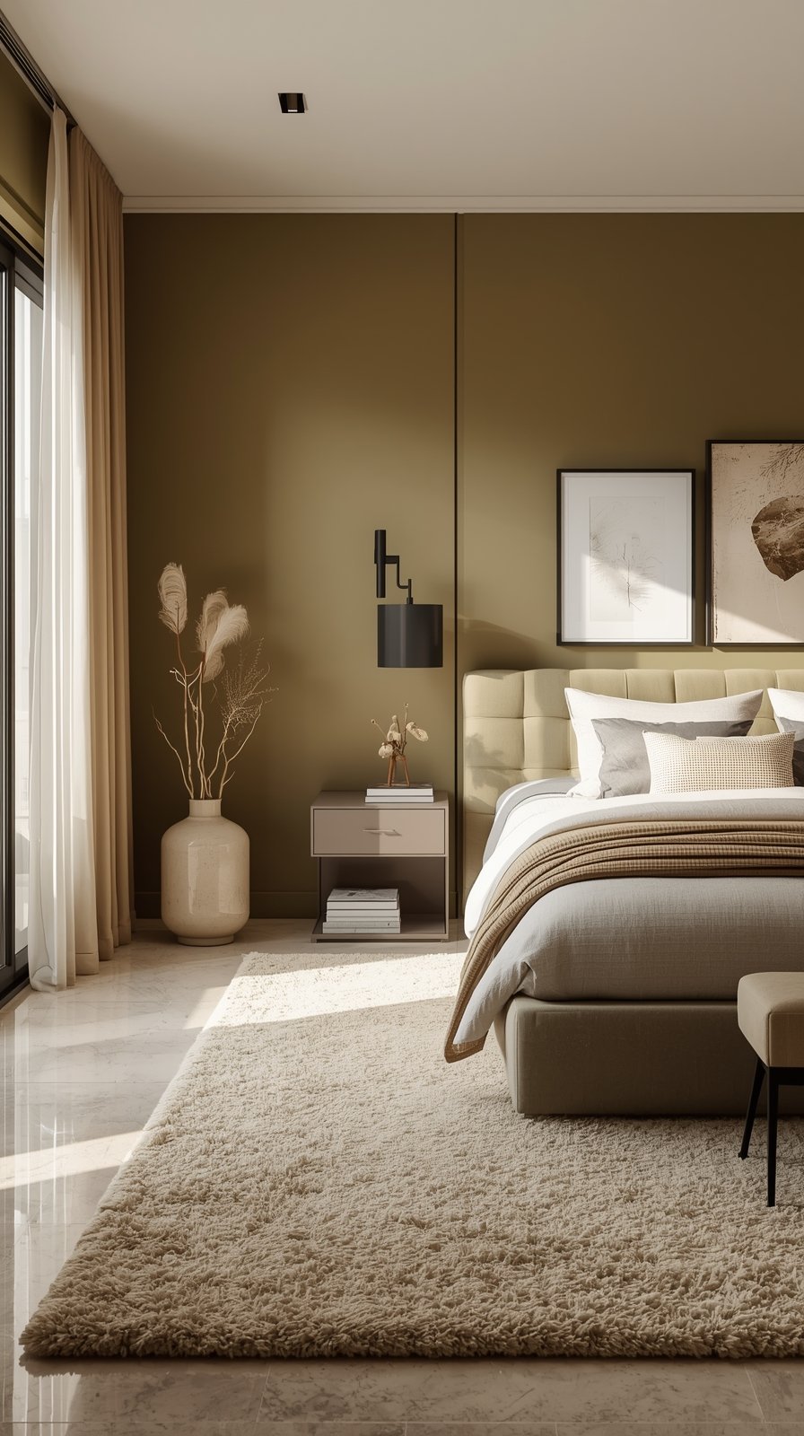
Warm Olive Green

Olive green is having such a renaissance right now, and I’m completely on board.
This earthy, warm green creates an instant connection to nature.
I painted my reading corner in a soft olive, and it’s become my favorite spot in the entire house.
The color has this grounding, calming effect that’s perfect for spaces where you want to relax.
It feels organic and timeless, never trendy or dated.
Warm olive works beautifully in living rooms, bedrooms, or even kitchens.
It pairs naturally with wood tones, cream, terracotta, and black accents.
The trick with olive is making sure it leans warm, not army-green cool.
You want it to have brown or yellow undertones, not gray.
This keeps it feeling cozy rather than utilitarian.
I love how olive creates a sophisticated backdrop without being boring.
It’s interesting enough to stand on its own but neutral enough to work with lots of different styles.
Layer in plenty of natural textures—linen curtains, jute rugs, wood furniture.
Add warm lighting and maybe some brass fixtures.
The result is this effortlessly cozy space that feels both current and classic.
Olive is one of those colors that just makes everything else in the room look better.
The coziest color for your room is the one that makes you feel at home.
I’ve given you my favorites, the ones that work in my spaces and make me want to cancel plans just to stay in.
But your perfect cozy color might be completely different.
And that’s exactly how it should be.
Start with what makes you feel good.
Grab samples of colors that speak to you—not what’s trending, not what you saw on Instagram.
Paint big swatches on your walls and live with them for a few days.
Watch how the light changes them.
Notice how you feel when you walk into the room.
Trust your gut.
The right color will make you breathe a little deeper, relax a little easier.
And remember: paint is just paint.
If you try something and it doesn’t feel right, you can always change it.
That’s the beauty of it.
Happy painting, and here’s to creating spaces that feel like the coziest version of home.