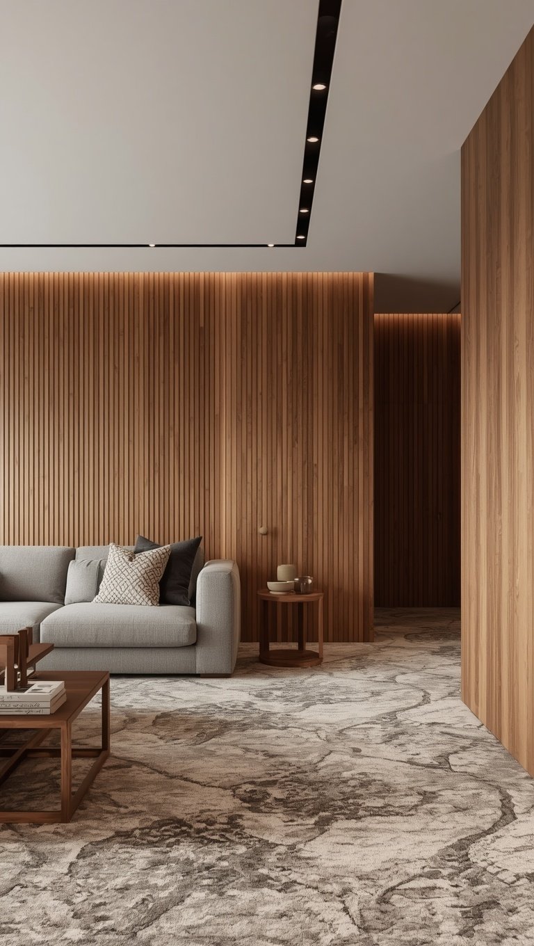
Short answer: pick a carpet that’s clearly lighter or clearly darker than your paneling.
Never the same depth.
For the wall-to-wall part, I’d stay in the wood’s own color family or a quiet neutral.
Then put the blue, the green or the cool gray on a rug you can swap.
Most guides agree on the first rule (the two holdouts are both at Hunker).
On the second one, they flat-out argue, so you’ll get both sides.
Why the floor matters so much with paneling
Paneling is a lot of wall.
It’s grain and grooves from corner to corner, and the floor has to live with all of it.
Chris Deziel put it well in his Hunker guide to flooring with paneling.
Wood paneling “already supplies plenty of visual stimulation,” he writes.
So his rule for the floor is simple: “a simple pattern or none at all,” in his words.
And he likes carpet for the job.
“Carpeting usually works very well,” particularly in a color “chosen to harmonize and not contrast with the paneling,” he writes.
With knotty pine he goes further and calls carpet “probably the best flooring” for it, since those walls are “so busy they almost demand a floor that disappears from view,” as he puts it.
So yes, the picture above breaks his rule with a loud geometric rug.
To my eye it only gets away with it because the room is huge, with a quiet gray floor and sofa and a wall of windows.
In a small den with paneling on all four walls, I wouldn’t try it — not with a rug that loud.
Next question.
What kind of paneling is it?
If yours is in a basement or a rec room, it might date from paneling’s big years.
In the 1950s, paneling “was a staple in American interior design,” says Hunker’s paint guide, and in the 1970s it “peaked and quickly fell out of vogue,” the guide adds.
Apartment Therapy ties the boom to the post-WWII housing rush.
It says builders kept using synthetic wood paneling into the ’70s.
Engineer Fix says those 4 ft by 8 ft sheets were often under 1/4 inch thick, with a photo of wood grain printed on the surface.
And over time, the print “often faded, peeled, or yellowed due to light exposure,” it says.
So whatever color yours was back then, the color that counts is the one it is now.
Read your wood’s lean before you shop
Engineer Fix’s guide to colors with paneling starts with the undertone (the color hiding under the brown).
Warm wood usually shows “noticeable hints of red, orange, or yellow,” it says, often in oak or cherry.
Cool wood reads as “gray, ash, or a deep, neutral brown that lacks any strong reddish pigment,” like gray-washed boards or some maples.
Its trick for telling them apart costs nothing.
Hold “a pure white piece of paper next to the wood,” and the red or the gray gets easier to spot.
Do it in daylight, because artificial light “can sometimes cast a misleading yellow or blue tint,” the guide warns.
Then look at the wall as it is today.
Real wood keeps changing color.
In Woodworking Network, Gene Wengert (“The Wood Doctor”) wrote that color changes in lumber happen naturally, “often with dark woods getting darker, and light woods getting lighter or darker,” he explained.
Depending on light, “or being partially sheltered from light, the color change can be fast and/or erratic,” he added.
Alex Wiedenhoeft of the U.S. Forest Products Laboratory told Wood Floor Business much the same.
Cherry and mahogany deepen with light, and they “will change much more quickly in direct sun than in the dark or under indoor lighting,” he explains.
The article even shows a Brazilian cherry floor that still showed where an area rug had been.
So the strip behind your bookcase may not match the open wall.
When you hold up carpet samples, hold them where the carpet will actually meet the paneling, out in the open.
In this picture, by the way, the rug stays in the wood’s warm family.
Some of its triangles are paler than the oak and some are a deeper terracotta.
The rule most guides agree on: a clear step
Here’s where most of the sources line up.
Ballard Designs answered a reader about hardwood floors under paneling.
“We don’t recommend trying to match the paneling,” it said.
Its advice was to go a lot darker or a lot lighter than the paneling “so there’s enough distinction between the two.”
Engineer Fix says the same about carpet.
Pick a color that is “either significantly lighter or dramatically darker than the paneling, such as a pale cream or a rich navy,” it says.
And our own carpet color tool puts a number on it for painted walls: a carpet at least 10 LRV points lighter or darker.
LRV is light reflectance value (a 0 to 100 scale for how much light a color reflects).
Paneling doesn’t come with an LRV, so for wood I’d trust your eye.
Put the sample on the floor against the wall and squint.
If the two melt together, go lighter or darker.
Deziel is one holdout.
He wants a carpet that harmonizes with the paneling rather than one that contrasts.
And next to busy knotty pine, he wants a floor that “disappears from view,” he says.
Hunker’s paint guide is the other.
In a dining room it shows, dark wood paneling “matches the hardwood flooring,” and the guide says that match “also anchors the space.”
That’s one accent wall over a wood floor, though, not a paneled room over carpet.
My take is to harmonize the color but still step the lightness.
That’s why, for wall-to-wall, I’d stay in the wood’s family, just clearly lighter or darker.
This picture shows the lighter route.
The rug is a near-white cream, clearly paler than the honey oak behind it, so the two don’t blur.
Light paneling can go the other way, too, and that’s the way I’d lean.
In its paint advice, Engineer Fix says light pine or birch “often benefits from the weight and grounding provided by deep, saturated colors,” it says.
And Mohawk, the carpet maker, says deeper colors “can ground a room and absorb light.”
Our tool doesn’t have a wood row.
But to my eye its tan and light brown wall row is the closest stand-in for light paneling, and it suggests charcoal, dark brown, cream or light gray.
Why lean darker?
Off-white and cream carpets “are not the best at hiding dirt and spills,” Mohawk admits.
In a basement rec room with kids or a dog, I’d keep cream to a rug.
Rust and terracotta: warm on warm, carefully
Now the warm side.
“Natural earthy tones like terracotta and warm browns ground a room with their inviting warmth,” Mohawk says.
Ballard’s hardwood advice is to stay in the wood’s own hue.
For very warm paneling, Caroline McDonald of Ballard suggested “either a lighter or darker wood but in that same warm tone,” replying to a reader.
For neutral brown paneling, Ballard says to avoid a floor that’s redder or greener.
So by that rule, I’d only bring rust in next to wood that’s already warm.
But trying “to perfectly match warm-toned paneling with a warm-toned floor often results in a visually muddy space,” Engineer Fix warns.
Honestly, those two don’t clash.
The key word is “match.”
The rug in this picture is warm next to warm walnut slats, but it’s brighter and more orange than the wood.
That’s the step.
The muddy one would likely be a rust carpet against orange-stained pine.
Same warmth, same depth, nothing to tell them apart.
And notice it’s a rug, not wall-to-wall.
That’s a much easier thing to undo.
Sage and green: try the furniture first
Look closely at this one.
The green is on the furniture and the curtains.
The rug is a pale gray shag.
That’s the move I’d copy.
Green and wood get a lot of love in paint guides.
In Hunker’s paint guide, Lisa Barton of Soeur Interiors suggests paint “with a cooler base tone to offset the warmth occurring in the wood.”
Her pick?
“Soft blues or greens can pop really nicely against the wood without fighting the beauty of it,” she says.
Engineer Fix likes sage or forest green paint around warm paneling, “because green is directly opposite red on the color wheel,” it explains.
Mohawk says “cool hues like blues and greens on walls and furniture will highlight your beautiful floors” when they’re classic, medium-toned wood.
See where all that green goes?
Walls and furniture.
None of those three lines is about carpet.
Green floors do come up elsewhere.
Engineer Fix lists “muted greens” among floor colors for warm paneling.
And Mohawk says you can “transform any room into a peaceful oasis with a carpet in just the right green,” so it’s no enemy of green carpet either.
Our tool only offers sage carpet as “a bold floor” against quiet walls, like light gray.
Paneling is anything but quiet.
So if you love sage, start with furniture or a rug.
Live with it a while before you carpet a whole room in it.
Charcoal and dark gray: moody, with a catch
This is the dramatic route.
A dark gray or charcoal carpet can “still offer drama while also allowing art and other home decor to shine,” says Mohawk.
It also says deep, moody colors layered through a room “can help quiet a space.”
The catch is temperature.
Deziel at Hunker is blunt about it.
“It isn’t a good idea to upset the color balance by introducing cool colors, such as blue, gray or off-white,” he writes.
He does leave one door open, “unless you have a good reason,” and I’ll come back to that.
But grays “can be cool or warm,” Mohawk points out.
So with orange or red paneling, I’d look for a charcoal with some brown in it, not a blue-ish one.
Hold a warm sample and a cool one side by side against the wall and pick with your own eyes.
Mind the depth, too.
On dark walnut, charcoal can land at almost the same darkness as the wood, and that breaks the step rule.
I’d save charcoal for light or mid-tone paneling.
The picture shows that problem in small.
The rug’s paler gray patches stand out against the dark stone floor, but its darkest parts nearly disappear into it.
Texture and flecks (and pets)
Color is half of it.
The other half is the surface.
Deziel’s simple-pattern rule from earlier counts for carpet too.
So I’d look at plain carpet or a quiet fleck, like the speckled rose carpet in this picture.
Engineer Fix points to low-pile loop or Berber carpet here, for its “dense, uniform texture” that also absorbs sound.
Got a dog or cat?
“Generally speaking, low, cut pile carpet is ideal for pets,” says Shaw Floors.
It’s “less likely to be damaged by pet nails snagging the carpet fibers,” Shaw explains.
And “a style with a textured visual or fleck of color can help hide dirt or debris,” it adds.
Then there’s the dirt itself.
CleanLink, writing for building owners and managers, says “darker-colored carpet will show less soil” in general.
But if “dust or lint is a concern,” a dark color “may not be the right choice,” warns Mark Baxter of U.S. Products.
His advice is to “know the color of your soil first, and then select the color of the carpet.”
Sandy yard?
Red clay?
A cat that sheds?
Pick the carpet that hides what actually comes through your door.
Start with a rug if you’re not sure
A rug is the easiest way to test a color.
In a rental, it may be the only floor you get to change.
There’s “no rule to say you can’t layer them over carpet,” says Ideal Home.
It says a rug can be “a godsend for protecting high-traffic areas or disguising carpet in a rented property,” too.
Kirsty Barton of Alternative Flooring calls layering “a versatile, renter-friendly option.”
A rug is also where I’d put the bold stuff.
The one in this picture mixes reds and rusts with navy and blue, in front of plank walls.
It’s busy, sure.
But it sits in one spot, and you can roll it up.
So if you’re torn between a warm carpet and a cool one, here’s my pick.
Lay the warm or neutral one wall-to-wall and try the cool color as a rug.
Love it after a few months?
Great.
If not, it’s just a rug.
Blue: where the guides argue
Blue is where the sources split.
On one side, Deziel says cool colors on the floor upset the room’s balance.
Engineer Fix takes the other side.
Warm paneling “generally pairs well with floors that lean toward cool undertones like grays, blues, or even muted greens to create a pleasing tension,” it says.
Lisa Barton’s paint advice leans cool as well.
Mohawk leans cool, with a caveat.
It says blues and greens on walls and furniture “will highlight” medium-toned wood floors.
But “too many cool tones can make a space feel cold,” its carpet guide warns.
With a cool-toned carpet, it says to look for other ways to bring in touches of warmth, and to my mind, warm paneling is a big one.
Here’s how I square it.
Deziel has an exception, framed as feng shui (bringing a water element into a room that lacks it).
Picture a sunny room with blonde maple paneling that “may feel too dry and hot.”
There, he says, “a gray or blue floor covering could balance this beautifully.”
Sherwin-Williams makes a related point about paint.
North-facing rooms get “the least amount of light throughout the day,” it says.
There, it’s “best to avoid colors with cool undertones since those cool tones will make the room appear colder,” Sherwin-Williams says.
South-facing rooms tend to get “consistent warm light throughout the day,” and there, it says, cool colors can look more neutral.
That’s for homes north of the equator, so flip it if you live south of it.
That’s paint advice, but I’d apply it to carpet too.
So for blue: wall-to-wall blue under warm paneling only in a bright, sunny room, and only a clear step lighter or darker than the wood.
In a north-facing den, I’d keep the blue to a rug or a sofa.
This picture goes all in.
There’s a blue carpet with a cream band and a teal-blue sofa, against two woods (one pale, one dark walnut).
Check it in your own light
Carpet color is slippery.
Get samples, says Mohawk, and “look at them in your space at various times of the day, in different lighting, with the shades open and closed.”
Its reason?
A color “that looks perfect in a showroom can come off completely different in your home.”
Ballard says much the same.
For wood floor samples, it says to “lay them up against the walls and live with them for a few days,” because the light changes as the sun moves.
So give your samples a weekend at least.
Check them in the morning and again at night.
At night, the bulbs take over.
On the Kelvin scale, “lower numbers mean the light appears yellowish and higher numbers mean the light is whiter or bluer,” says ENERGY STAR’s bulb checklist.
Its chart steps through 2700K, 3000K, 3500K, 4100K, 5000K and 6500K. The low end is “Warm White, Soft White,” and the top is “Natural or Daylight.”
Same carpet, different bulbs, different-looking carpet.
Sherwin-Williams has a rule for paint in rooms with little or no daylight, and I’d borrow it for nighttime.
If you opted for warm lighting, “choose colors as if you would for a south facing room,” it says.
Then judge each sample under the light you’ll actually sit in at night.
If that’s one overhead fixture, judge it there.
But here’s my hot take: overhead lighting is a crime — and a paneled room shows it.
One flat light from above makes all that wood look dull to me.
About this picture: it’s an orange carpet against walnut, warm on warm, in a room full of daylight from big glass doors.
It would likely look browner and heavier in a north-facing room.
Test before you commit.
A rug over carpet, and my checklist
If you already have carpet you can’t change, layer a rug on top.
Ruggable advises against a rug on high-pile carpet.
It “may lack sufficient support, potentially causing tripping hazards or sliding underfoot,” the rug maker says.
On low-pile carpet, it says a rug pad can stop the rug from shifting, and “rug tape or placing the rug under furniture” keeps it anchored.
For looks, Ruggable says a plain carpet can take “a striking or bold pattern,” while a patterned carpet wants “a more subtle rug in a complementary color.”
Pattern on pattern?
“Ensure to vary scale.”
In this picture, a gold rug sits on a dark gray carpet in front of dark wood.
The gray stays out of the way and the gold picks up the wood’s warmth.
A calm base with the color on top — that’s pretty much my whole approach in one picture.
Here’s my checklist before you buy:
Hold white paper against the paneling in daylight. Hints of red or yellow mean warm; gray means cool.
Judge the wall as it is now, where the floor will meet it.
Go clearly lighter or clearly darker than the wood. Never the same depth.
For wall-to-wall, start in the wood’s color family or a neutral. Keep a cool blue or green to a rug unless the room gets lots of sun.
Keep it plain or flecked, and low, cut pile if you have pets.
Whatever your budget, get real samples. Live with them a few days, in daylight and under your own lamps.
Carpet comes off a roll 12 ft wide (13.5 ft or 15 ft on some styles), so work out the square yards and the seams with our carpet calculator.
I write our decor guides: room ideas, color schemes and budget-friendly refreshes that feel beautiful, soft and totally you. Behind the byline is a small team: Claire Donovan answers the 2D Room Planner’s support, Ethan Walsh builds the free tools and Rachel Hart checks the numbers.