
Short answer: if your knotty pine is the usual honey-to-orange color, go with a soft sky blue, a cool gray, a muted sage or a beige that’s clearly lighter than the wood.
And skip wall-to-wall mustard, copper or terracotta.
That’s warm on warm, so I’d keep those to a rug.
All 16, in short:
- Yes, start here: sky blue, gray, sage green, beige, sand.
- Yes, with a catch: cream, wheat, navy blue, olive green, seafoam green, dusty lavender.
- Only in a very quiet room: dusty rose.
- Rug only: salmon, mustard yellow, copper, terracotta.
The best guides on knotty pine are about paint, not carpet, so some carpet picks here carry a paint rule over.
First, work out which knotty pine you’ve got

The wood decides everything here, so look at your wall before you look at carpet.
Hunker’s guide to knotty pine splits it in two.
Traditional knotty pine runs “warm yellow to orange,” and it’s often stained and varnished.
That’s the kind in the picture above, with a light beige carpet.
The contemporary kind is lighter.
It’s often bleached or whitewashed, and Hunker says it “reads as cool white or gray.”
If yours is in an old den, you’ve got company.
Retro Renovation calls pickwick pine paneling “massively popular in American homes after World War II.”
But here’s the catch.
Your wall may not look the way it once did.
“Pine will go darker with exposure to light, especially sunlight,” Michael Dresdner wrote in Woodworker’s Journal.
He was answering a question about cabinets, but it’s the same wood.
His last line?
“Eventually, the sun always wins.”
So don’t go by an old photo or a stain name.
Go by the wall as it looks today.
Then find your kind:
- Honey, amber or orange: my list up top is for you.
- Whitewashed, bleached or gray: Hunker says to match cool pine with cool colors, so try light grays and icy blues and greens. Reds and oranges can work here too, which is the opposite of the orange kind. That’s paint advice.
- Painted: then it’s really just a painted wall. Put your paint code into our carpet colors tool and see what it suggests.
The neutrals that blend: cream, beige, sand, wheat

Neutrals are the safe pick, and for once, safe is fine.
Hunker says neutrals blend well with both kinds of knotty pine, and it suggests lighter ones like off-white or beige with darker pine.
That’s paint advice, but I’d follow it for a floor too.
Engineer Fix has a guide to flooring under knotty pine walls.
It likes cream, taupe or beige, but it adds one smart rule: pick floors that are warm but “lack the specific yellow or orange undertones found in the pine.”
So here’s my test.
Set the sample on the floor against the wall.
If it suddenly looks yellow, it’s too close.
Beige. This is my safest pick.
It’s warm enough to feel at home with the wood, and it’s plain enough to give your eye a rest from all those knots.
Sand. Think beige with a little more depth.
Watch for sands that lean yellow, because those fade into the wall.
Cream. That’s the carpet in the picture above, under smooth honey-toned wood with no knots.
Mohawk says light neutrals “brighten up a space,” and that’s handy if your pine is dark.
But it also says off-white and cream “are not the best at hiding dirt and spills.”
So if coffee lives in that room, I’d think twice.
Wheat. This is the pale wood tone on the list, and it’s the nearest thing here to the wall itself.
Our carpet tool’s rule is a carpet that’s clearly lighter or darker than the walls, in their undertone or a neutral.
Wheat has to be clearly lighter, or the room turns into one flat color.
Got pets?
Shaw says a low cut pile is less likely to snag on nails, and a textured look or a fleck of color can help hide dirt.
That goes for every color here.
Blues and grays: the ones that calm the orange

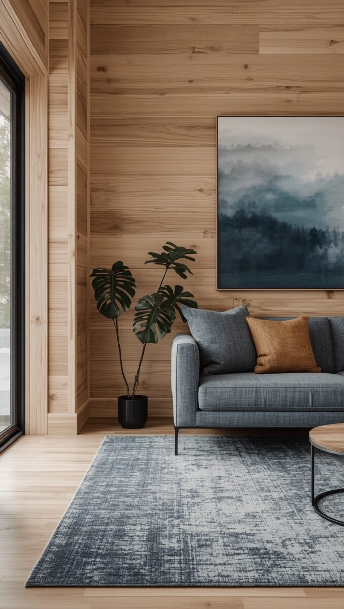
The picture above puts a blue-gray rug in front of light pine planks, with a blue-gray sofa to match.
To my eye, that pine reads warm but not loud.
Hunker’s general rule is warm shades with warm pine, and that’s part of why the neutrals came first.
It counts sage green and country blue paint as warm enough for traditional pine, so the cooler blue-gray I like here goes past Hunker.
Here’s the theory.
Benjamin Moore’s guide to complementary colors puts orange and blue opposite each other on the color wheel, one warm and one cool.
It also says those pairs make “high contrast, dynamic spaces,” which isn’t exactly calm.
The calming idea comes from Engineer Fix.
It says colors from the opposite side of the wheel “neutralize the pine’s golden-orange hues,” and that cool tones like pale gray, soft blue or deep slate “visually push the walls back.”
Mohawk makes a related point about classic, medium-toned wood floors.
It says blues and greens on the walls and furniture will highlight them, while oranges and reds give less contrast.
I’m flipping that: wood on the walls, blue on the floor.
So the trick is keeping the blue quiet, and Benjamin Moore has two paint rules for that.
If one color is bold, pick a muted version of its partner.
And don’t go 50/50: make one color dominant.
Your pine is the bold, dominant one here.
So on the floor, go soft and a bit grayed, not bright.
Sky blue. Hunker’s paint pairing is country blue, and a soft sky blue is a near neighbor.

Navy blue. In the picture above, navy runs wall to wall past a pine doorway.
Mohawk says deeper colors “can ground a room and absorb light,” and that they can make an oversized room feel cozier.
So navy suits a big room.
In a small, dark den, pine plus navy is a lot of dark.
CleanLink, which writes for the cleaning trade, says darker carpet shows less soil in general.
But if dust or lint is your worry, as in a retail store, it says dark may not be the right choice.


Gray. The two pictures above show both ends: a light gray shag rug in front of knotty pine, and charcoal carpet tiles next to light wood.
Mohawk says grays “can be cool or warm.”
I’d pick a cool one, since that’s the kind pushing against the orange.
Benjamin Moore’s paint-chip tip helps here: hold similar shades next to each other to see the undertone.
I’d do that with carpet samples.
Mohawk also warns that too many cool tones can make a space feel cold, but with a whole room of orange wood around it, I wouldn’t lose sleep over that.
(A north-facing room is the exception.
More on that below.)
The greens: sage, olive, seafoam

Hunker says blues and greens “need careful selection,” and then it gives you the easy one: traditional knotty pine is often paired with sage green paint.
Retro Renovation is a fan of green too: “We love the way deep emerald green looks with knotty pine.”
That line was about a kitchen table, not a floor, but I think the idea carries.
The picture above takes it to the floor: a deep green carpet against brown wood panels.

Sage green. This is my favorite green here, and it’s the carpet in the picture above.
It’s already muted, so to my eye it won’t fight the wall.
Olive green. Olive has more yellow in it, so to my eye it blends more and calms less.
And go easy.
I’d let an olive carpet be the only big green thing in the room.
Seafoam green. Hunker says cool, icy blues and greens suit contemporary pine, and that deeper turquoise or aqua gives Mid-Century Modern decor a dramatic look.
That’s paint talk again.
So to my eye, pale seafoam is an easy match for whitewashed pine.
On orange pine it’s a bold retro move, and I’d try it in a small room first.
Benjamin Moore suggests smaller rooms too, if you’re new to high-contrast pairs.
The pinks, the reds and the lavender: harder than they look

Hunker says red and yellow paint (orange too) is “generally not recommended with the red-orange traditional shades.”
Dusty rose. Rose is a soft red, so it’s on that warning list, in my book.
Only try it if everything else in the room stays quiet.
The picture above keeps it to a faded rose rug and a cream chair, with only the art and a few flowers picking up the same pink.
Salmon. It’s a close cousin of orange.
So it’s a rug, at most.
Dusty lavender. Benjamin Moore lists yellow and purple as opposites.
So if your pine leans more yellow than orange, a grayed lavender could work, though that’s pure color-wheel reasoning.
Test this one hard.

And burgundy? That’s the carpet in the picture above, wall to wall under honey-toned wood.
It isn’t one of my 16.
Burgundy is a deep red, so on orange pine it’s on that same red warning list, in my book.
Mustard, copper, terracotta: rug, not wall to wall

The picture above runs terracotta wall to wall, next to a wall of wood slats.
It’s pretty in a picture.
Now put your orange pine on all four walls around it.
That’s why these three stay small.
Mohawk says that with a classic wood floor, yellows and oranges (reds too) give less contrast and make the whole room warmer.
Your walls have already done the warm part.
Remember Benjamin Moore’s rule about making one color dominant?
It’s written for opposites, and these three are neighbors of your pine.
But the idea holds: the pine leads, the accent stays small, and the accent is a rug.
Mustard yellow. It’s yellow on yellow.
Hunker’s one exception is a light lemon yellow in a country kitchen, and that’s a paint color, not a floor.
Copper. It’s a lovely metal in this kind of room, and Hunker suggests brass or copper fixtures for a country kitchen.
As a floor, it’s just one more orange.
Terracotta. Mohawk says earthy tones like terracotta “ground a room with their inviting warmth,” and I believe it.
I’d just do that with a rug on top of a beige or sand carpet.
A thrifted rust rug is the budget way to try it, and it rolls up if you change your mind.
If you’re in a rental, that may be the only floor change you get anyway.

The picture above shows the layering, with a patterned brown and cream rug on a dark brown carpet, and its mustard stays on one pillow.
Next to honey pine, I’d go lighter on the carpet underneath.
How to test a carpet sample against your pine

The picture above has a tan shag rug in front of a honey wood wall.
Tan on honey is about as close as I’d go.
So test right where your carpet will meet your wood, because that’s the line that matters.
Here’s how I’d test yours:
- Get real samples. Mohawk says it’s “amazing how a color that looks perfect in a showroom can come off completely different in your home.”
- Put them on the floor, against the wall. Hunker’s paint advice is to hold samples against the pine “in several positions around the room.” I’d do the same with carpet.
- Give it several days. That’s Hunker’s advice for paint, and I’d start on a Friday so the weekend’s daylight gets a say. Mohawk says to look at various times of day, in different lighting, with the shades open and closed.
- Check it at night. My hot take: judge it under your overhead lighting, because that’s when you’ll be sitting in there. ENERGY STAR’s bulb guide puts warm white at 2700K to 3000K and daylight at 5000K to 6500K, and it says lower numbers look yellowish. So I’d expect the pine to shift with the bulb.
- Know which way the room faces. Sherwin-Williams says north-facing rooms “receive the least amount of light throughout the day,” and that it’s best to avoid cool undertones there, because they make the room look colder. That’s paint advice, but in a north-facing den I’d lean toward beige or sand, and I’d test any blue-gray hardest.
Pulling up old flooring in an older house?
Stop and get it checked first.
Retro Renovation warns that old materials and their layers can hold lead and asbestos, and it says to get a licensed professional to assess what you have.
Then, once you’ve got a color, measure.
Carpet comes off a roll 12 ft wide (15 ft on some styles), so on a 12 ft roll, a 14 ft by 12 ft room takes one strip with no waste.
Our carpet calculator works out any other room size, along with the seams.
Want a second opinion?
Our wider guide on what shades pair best with wood paneling looks past pine to oak, cherry and gray-washed boards, and it’s wary of a rust carpet next to orange pine too.
On gray, it would pick a charcoal with some brown in it over my cool one.
Read both, then trust your sample.
And if what you really can’t stand is the orange itself, no carpet will fix that.
You can paint the paneling instead.
Our guide to painting wood paneling covers the primer that keeps stains from bleeding through.
But that job includes sanding, so if your house was built before 1978, stop first.
The EPA says homes that old are more likely to have lead-based paint, and it says to hire a certified inspector or simply assume it’s there.
Then hire a lead-safe certified contractor.
The EPA does have lead-safe DIY steps for your own home, but it also says not to try removing lead-based paint yourself.
With a whole room to sand, I’d hire it out.
All 16 colors at a glance
| Carpet color | Call | Watch for |
|---|---|---|
| Sky blue | Yes | Go soft and grayed, not bright |
| Gray | Yes | Pick a cool one |
| Sage green | Yes | Keep it muted |
| Beige | Yes | Clearly lighter than the wall |
| Sand | Yes | Yellow-leaning sands fade into the wall |
| Cream | With a catch | Shows dirt and spills |
| Wheat | With a catch | Too close to the wall |
| Navy blue | With a catch | A lot of dark in a small room |
| Olive green | With a catch | Blends more than it calms |
| Seafoam green | With a catch | Bold on orange pine |
| Dusty lavender | With a catch | Only if your pine leans yellow |
| Dusty rose | Quiet rooms only | Keep the rest neutral |
| Salmon | Rug only | A close cousin of orange |
| Mustard yellow | Rug only | Yellow on yellow |
| Copper | Rug only | Better as metal |
| Terracotta | Rug only | Orange on orange |
Related read: Things I Wish I Knew Before I Decorated My First Home — Instant PDF + Kindle download. Secure checkout by Stripe