
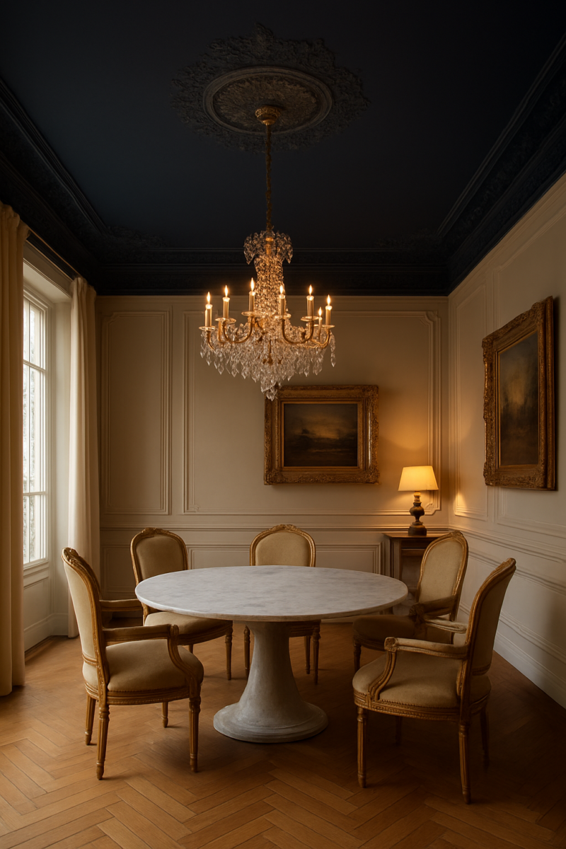
Short answer: the bold ceiling paint colors that work in the most rooms are Deep Navy Blue, charcoal gray and forest green.
Black, burgundy and plum are the dramatic ones, and they’re fine even in a small room as long as the lighting is right.
Metallic gold, orange, red and ombre are the hard ones.
And whatever you pick, the sheen matters as much as the color: flat hides flaws, gloss shows every one.
A ceiling is the fifth wall, and almost nobody treats it that way, which is exactly why a painted one still lands.
You don’t need tall ceilings to pull it off either (though if you have them, Dreamy has ideas for decorating tall walls in high-ceiling rooms).
So here’s how to pick, then each bold color with the rooms it suits, the walls to pair it with, the sheen, and the one way it goes wrong.
Picking the right bold color for your ceiling

Before you fall in love with a swatch (or try a few on the free ceiling color picker), you need to answer four boring questions.
And I mean actually answer them, not skim past them because the paint chip looked pretty under store lighting.
What’s your trim doing: is it warm white, stark white, stained wood?
What’s your floor doing?
How much daylight does the room actually get, not how much you wish it got?
And what’s your ceiling height: true 8-foot standard, the 9-to-10-foot range a lot of newer builds have, or vaulted?
Each of those changes how a color behaves overhead, where the ceiling mostly catches light bounced off the walls and floor instead of direct light from the window.
But here’s my actual hot take: sheen matters more than color.
A flat navy ceiling and a satin navy ceiling in the same exact room, same exact paint can, read as two completely different decisions.
Flat absorbs light and goes quiet, almost velvety, and it hides the little imperfections every old ceiling has.
Satin bounces light around and announces every bump, every seam, every spot where the drywall guy was having a bad day.
For ceilings you’ve basically got four realiztic choices: flat or matte (the forgiving ones), eggshell (a little more washable, a little more sheen risk), satin (brighter, riskier, shows flaws), and gloss.
I’ll just say now, gloss belongs on trim, not overhead, and we’ll get into exactly why when we hit black.
Here’s the mistake almost everyone makes.
They pick the color first and the sheen as an afterthought, like it’s a formality at the paint counter.
It’s backwards.
Sheen decides whether the flaws already up there (roller lines from whoever painted it last, that faint texture from old popcorn removal, hairline cracks) disappear into the color or get spotlighted by it.
And don’t skip the practical stuff.
Two coats minimum on any ceiling color, full stop.
Going from white to something dark?
Do a tinted primer coat first, or you’ll be on coat four wondering where your Saturday went (and your budget, honestly).
Check the coverage on the can against the size of your ceiling before you buy.
Navy blue ceiling: calm enough to live under

Navy is the one I’d tell a nervous friend to start with, and that’s not me being boring, it’s me being honest.
In a bedroom it does something genuinely soothing, like sleeping under a sky that never quite goes black.
In a living room it adds weight without turning the space into a cave.
Go flat or matte, basically always.
It kills the roller lines and any texture inconsistency, and navy especially shows those under satin because the pigment is so saturated it catches every shadow.
What I actually like about navy: it works on a standard 8-foot ceiling just as well as in a taller room.
Pair it with warm white, pale gray, or linen-toned walls and it looks intentional, like you knew what you were doing.
Here’s where people blow it though: they pair navy with a cool-gray wall thinking gray is “safe” and neutral enough to go with anything.
It isn’t.
To me, cool gray plus navy can make a bedroom feel more like a basement rec room than a retreat, even with good light.
That’s my taste talking, but warming it up is the safer bet.
Navy is, I’ll say it, the safest bold choice on this whole list, and that’s not an insult.
It’s the one that still looks intentional five years later when the kids’ room went orange is sitting in a time capsule from a trend.
Black ceiling: the one that needs light, not height

This is the one people are scared of for the wrong reason.
Everybody assumes black needs a huge room with soaring ceilings or it’ll feel like you’re trapped in a coffin.
Wrong worry.
Black actually does beautifully in small, cozy spaces (dining rooms, black powder rooms, a snug little den or a home theater) because in those rooms it’s not fighting for attention, it’s wrapping around you on purpose.
What black genuinely needs is light.
Good light, at eye level, from more than one source.
A single overhead fixture and nothing else is how you end up with the cave everyone’s afraid of.
(Overhead lighting is my nemesis anyway.)
Sheen is non-negotiable here: matte or flat only.
Any gloss on a black ceiling turns it into a literal mirror reflecting every light fixture, every lamp, every weird shadow from the ceiling fan.
It stops looking dramatic and starts looking like a bad nightclub.
Layer your lighting instead (a bright floor lamp, a couple of table lamps, maybe sconces or one of these dining room light fixtures) And pair the black with warm wood trim or white walls rather than gray.
Gray flattens the contrast and makes the whole thing feel muddy instead of crisp.
Height matters less than people think.
Lighting matters more, and that’s the correction nobody online wants to make because “get more lamps” is a less satisfying warning than “your ceiling is too low.”
Gold ceiling: a specialty finish, not a paint-store color

I need to be blunt about this one because it’s the most misrepresented item on every list like this.
Real metallic gold isn’t a regular paint in a gold color.
It’s a specialty metallic paint or glaze, and most makers suggest a solid base coat under it first (often a warm tan or ochre), with the metallic layer going on once that base has dried.
So plan on two steps, and know it behaves nothing like rolling on a flat color.
Metallic glaze also covers a lot less than regular paint, so read the coverage before you buy.
What actually catches the eye is how it reacts to light.
Shimmer needs something to bounce off of.
So this works best in dining rooms and entryways that get daylight or warm lamp light moving across the surface through the day.
In a windowless hallway with one flush-mount fixture (Dreamy has better hallway lighting ideas), true metallic gold just looks flat and kind of sad, honestly, which defeats the entire point.
Sheen-wise you’re looking at satin or an actual metallic finish.
There’s no flat version of real metallic, that’s a contradiction in terms.
And this is the thing that annoys me most scrolling through “gold ceiling inspiration” photos: most of them aren’t metallic at all.
They’re a plain mustard flat paint photographed under warm staged lighting that’s doing all the heavy lifting.
That’s a totally different, much easier project: just a yellow-gold flat color, no metallic component, no glaze technique.
Nothing wrong with doing that version!
But know which one you’re signing up for before you buy supplies, because without the metallic element, a yellow-gold paint just reads as yellow.
Not gold.
Yellow.
Burgundy ceiling: warmer and harder to get right than people think

Burgundy is the color I think gets the worst rap in photos and the best reception in person, and the gap between those two things trips people up constantly.
In pictures, camera flash and screen compression flatten its warmth into something closer to maroon or dusty plum, and it can look muddy or dated on a screen.
Stand under it in a dining room with warm wood floors, or a den with wood trim, and it’s a completely different story.
Rich, warm, like the inside of a wine bottle.
I love it.
Go flat or matte here, always.
Low sheen diffuses the light instead of throwing it straight back at you, and that’s what hides roller marks and the texture every ceiling seems to develop after a few years.
It also keeps you from getting that harsh specular glare right over your head that a shinier finish gives you the second a lamp hits it wrong.
Pair it with cream or warm gray walls, not stark white, which makes the contrast too harsh and competitive instead of complementary.
The real pitfall is undertone.
Some burgundies lean pink, and under daylight bulbs a pink-leaning burgundy drifts toward mauve over the day.
Not the mood you were going for.
Warm 2700K bulbs keep it anchored as burgundy instead of sliding into something closer to Pepto-pink.
Test this one under your actual bulbs before you commit, not under the store’s fluorescents.
A sample pot and a painted board will save you from an expensive mistake.
Forest green ceiling: the one that plays nicest with nature-adjacent rooms

This is genuinely the most underused color on this whole list and I don’t get why.
Everyone jumps to navy or black because they feel like the “safe bold” choices, and forest green gets skipped, but it does something those two can’t.
It makes a room feel outdoors-adjacent instead of just moody.
In a sunroom, a kitchen with a lot of plants, or really any room with wood tones already happening, it settles in like it’s always been there.
Eggshell is actually more forgiving with forest green than it is with most other bold colors.
That’s a sheen-and-value thing, not a lighting thing.
Eggshell’s moderate sheen on a mid-tone green doesn’t show texture and roller marks nearly as much as it would on a near-black navy or true black, where every flaw gets outlined.
Pair it with cream, warm white, or let it sit against Natural Wood Tones and it looks effortless (I hate that word for marketing copy but here it’s just accurate).
Undertone is where this one lives or dies.
A yellow-green leaning forest shade reads woodsy and warm.
A blue-green leaning one next to cool gray walls looks sickly, almost institutional, like a hospital hallway trying to cosplay as a cabin.
Check the undertone against your actual wall color, not just in isolation on the chip.
Orange ceiling: loud, and only right in specific rooms

I’ll be the one to say it since apparently nobody else will: orange is the color this whole bold-ceiling trend oversells.
It looks fantastic in a small handful of room types and genuinely bad almost everywhere else, and most roundups just gloss right over that because “orange ceiling, so fun!” gets more clicks than “orange ceiling, proceed with caution.”
It belongs in breakfast nooks, kids’ rooms, sunrooms, places that are small and bright, somewhere you’re not spending hours at a stretch staring up at it.
Sheen is flat, no exceptions, none.
Any amount of sheen on orange amplifies it past “warm and inviting” into “traffic cone,” and I mean that pretty literally.
I’d hesitate on it for a bedroom or a living room where you’re under it for real time.
The intensity that’s charming for 15 minutes over coffee and breakfast gets exhausting fast in a room you live in all day.
Pair it with white, cream, or warm wood.
Never gray.
Gray fights orange’s undertone directly and the result looks like a clash rather than a pairing, almost like the two colors are actively arguing with each other.
The other mistake, and this one’s sneaky: people reach for a true, saturated orange instead of a terracotta or rust-leaning shade.
True orange ages fast, in a way terracotta just doesn’t, because terracotta already reads as earthy and grounded rather than trend-driven.
Purple ceiling: the undertone decides everything here

Purple has a split personality and almost nobody separates the two halves of it when they’re giving advice.
Deep plum or aubergine, done in two coats of flat sheen, reads as genuinely sophisticated (it’s the same family as a jewel tone living room) — moody, rich, almost indistinguishable from a good burgundy in warm light, just with a slightly cooler edge to it.
Lighter violet or lavender shades read younger, period, regardless of what sheen you put them in.
You can’t satin your way out of a lavender ceiling looking like a nursery.
This is honestly the color I think people are most afraid of and the least need to be.
The fear is usually “purple ceiling” conjuring images of a tween’s bedroom circa whenever, but a dark plum in the right room doesn’t read that way at all.
It suits bedrooms and powder rooms more than living or dining rooms.
The intimacy of the color needs a small room to land in.
Think a small powder room, not a long great room.
Pair it with warm gray, cream, or a soft blush wall.
Skip pure white.
Against stark white, purple goes cartoonish fast, like a kid’s toy packaging instead of a grown-up room.
The mistake I see constantly: someone wants “dramatic but soft,” so they go light-violet thinking that splits the difference.
It doesn’t.
On a ceiling specifically, light purple reads as a nursery almost every time, not a gentle version of drama.
If you want soft, go a different color.
If you want purple, go dark.
Red ceiling: commit fully or don’t bother

Red is the most polarizing color on this entire list and I mean that as a genuine warning, not a dare.
It suits dining rooms, libraries (a moody home library is practically made for it), small powder rooms, rooms you’re in for a defined stretch of time, not rooms where you’re lying under it for 8 hours trying to sleep.
Undertone splits it into brick-leaning or true-red-leaning, and that choice should follow your trim and floor, not just whatever’s trending.
Matte or flat, always.
Gloss red on a ceiling looks like a stage set, genuinely, like you walked onto a theater production instead of into someone’s dining room.
Pair it with cream, deep wood tones, or black trim if you’ve got it.
Not pastel walls.
Pale blue or mint next to red turns the whole room into a Christmas display, and I don’t think that’s the “bold statement” most people are going for in July.
Here’s the one place I’d push back hardest against conventional wisdom: a halfway red, something muted to “ease into it,” backfires completely on a ceiling.
It doesn’t read as a gentler red.
It reads as pink, or honestly kind of dirty, like the color didn’t quite commit to being anything.
Red on a ceiling is a color that needs full saturation to make sense visually.
Go all the way or skip it, there’s not really a comfortable middle option here the way there is with navy or green.
Charcoal gray ceiling: the compromise color, and that’s not a knock

Charcoal is what people actually want when they say they want a black ceiling but get cold feet at the paint counter.
And genuinely, there’s nothing wrong with that.
It’s the bridge between black’s drama and gray’s total safety.
It works in almost any room and at almost any ceiling height, including a standard 8-foot room where black might’ve felt like too much.
If I had to pick one for my living room, it’d be this.
Flat or matte sheen keeps it from reading blotchy under mixed light.
Charcoal is especially prone to that, because it sits in an in-between zone where lighting shifts show up more than on true black or true white.
Undertone matters a lot here too: a blue-gray charcoal pairs beautifully with soft blue walls, while a warmer, greige-leaning charcoal wants white or Warm White Walls to keep from looking flat.
The mistake that trips people up: mixing a cool-undertone charcoal with warm wood trim.
Instead of looking intentional, it just makes both the ceiling and the trim look slightly off, like they’re from two different projects that got forced together.
Match your undertones on purpose, don’t just grab “a gray” and assume gray is universally neutral, because it isn’t, not even close.
Ombre ceiling: a technique, and an honestly difficult one

I want to be straight with you on this one because I think it gets sold dishonestly online constantly.
Ombre isn’t a color, it’s a technique, and it’s a genuinely hard one.
You need at least two to three closely related colors blended together while the paint is still wet, which means working section by section, in strips, timing your coats so one color doesn’t dry before you’ve blended the next into it.
This is not a casual Saturday project with a podcast playing in the background.
Realistically it’s a full weekend once you count drying time between coats.
It’s also most forgiving on simple ceiling shapes: no exposed beams, no popcorn texture, no recessed lighting breaking up the surface into awkward zones.
Every obstruction on your ceiling is a place where the blend has to stop and restart, and that’s exactly where it tends to fall apart visually.
The giveaway of an ombre gone wrong is a hard line between colors instead of a blend.
A visible seam where it’s obvious someone stopped.
Treating this like an easy weekend DIY technique is how people end up disappointed, comparing their own ceiling to a photo of a professional’s work.
And on a textured or popcorn ceiling it’s close to a guaranteed letdown.
The blend just can’t read smoothly over bumpy texture, no matter how slow you go.
Committing to the color once you’ve picked it
The real risk with a bold ceiling was never the color itself.
It’s picking one without ever actually looking at it under your room’s own lighting first.
A paint chip in a store, or worse, a photo on a screen, tells you almost nothing about how a color will sit above your specific room with your specific windows facing whatever direction they face.
Get a real test patch up, at least 24 inches square, and check it in early morning light and again 1 hour after dark.
Sit under it for 10 minutes each time.
Ceiling color shifts more under changing light than wall color does, because it catches light from every angle in the room.
Then live with the patch for 1 week before you buy the gallons.
A color that looks moody and perfect at 7am can go flat and gray by 3pm, or vice versa.
Let it dry completely before you judge it either way.
Decide your sheen before you buy anything, not after, going back to that first point about sheen being the real variable.
And go in accepting that this is a long-term decision, not a weekend accent you can casually swap out next season.
If you change your mind later, repainting a ceiling back to white takes two coats, sometimes three, same as the bold color did going on in the first place.
People repaint ceilings way less often than walls, so whatever you pick will probably outlast most other decorating decisions in that room.
Worth sitting with that for a minute before you commit.
Related read: Things I Wish I Knew Before I Decorated My First Home — Instant PDF + Kindle download. Secure checkout by Stripe