
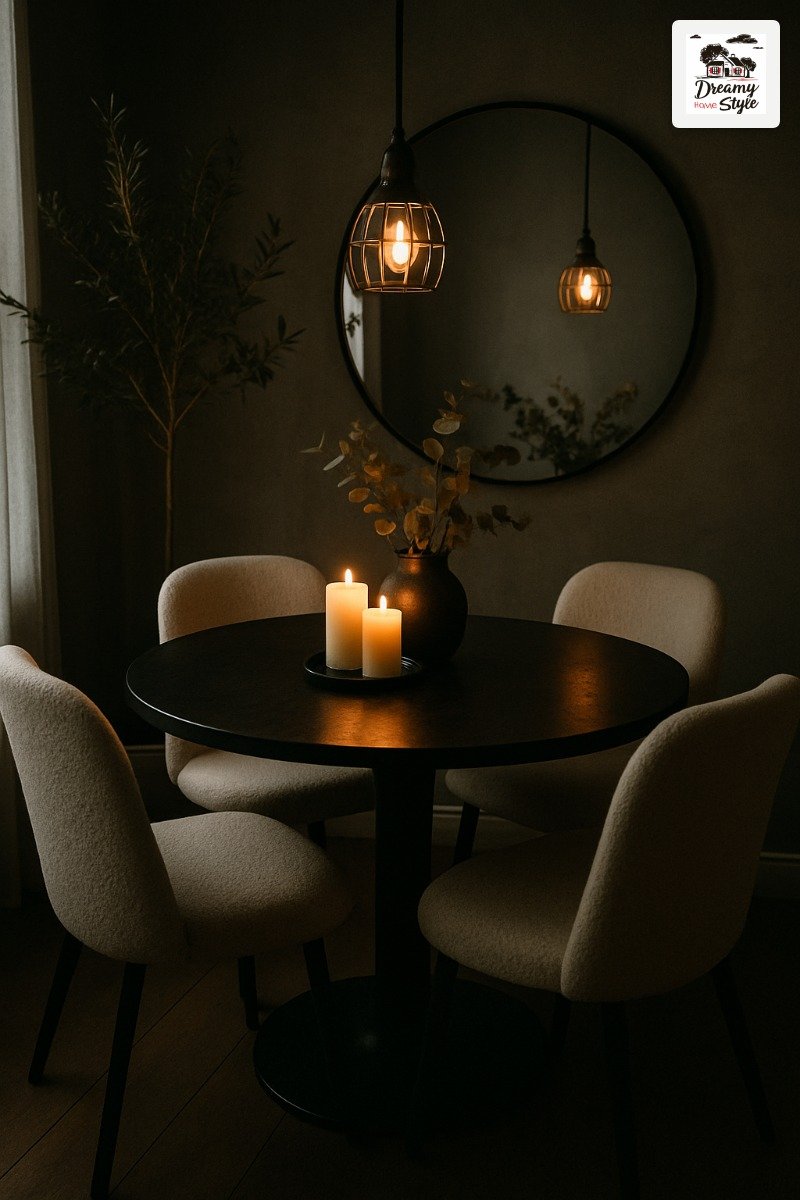

I almost painted my dining room a safe greige.
I had the sample on the wall, the roller in my hand, and then I looked at a photo of a black round table against a white wall with this one perfect pendant light and I just… put the roller down.
That was eight months ago and I’ve been slowly piecing together this black and white dining room ever since.
It’s the most confident my house has ever looked.
Not sterile, not cold — actually warm in a way I didn’t expect.
If you’ve been circling this palette and talking yourself out of it, this post is my attempt to talk you back in.
Start With the Table — Everything Else Follows
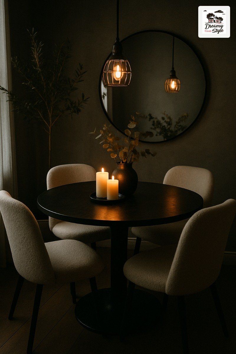
The round matte black pedestal table is the whole thing.
I’m not being dramatic.
Once that piece landed in my dining room, every other decision got easier because I finally had something to react to.
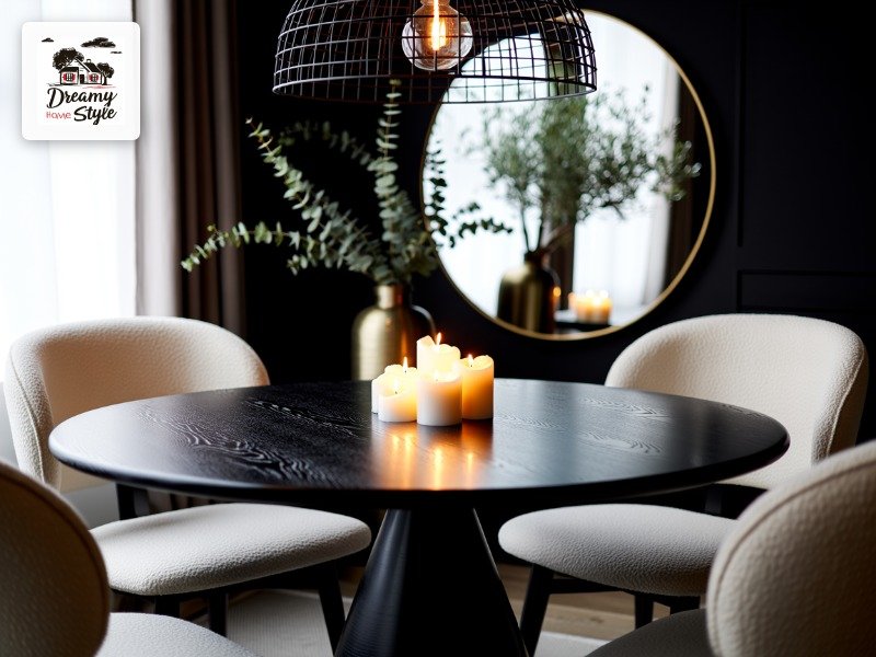
Round matters more than you’d think.
It softens all that high-contrast Black and White, makes the room feel less like a chessboard and more like a place people actually want to sit.
A rectangular black table in an all-white room can read cold.
Round reads intimate.
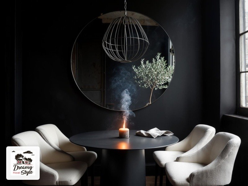
Pedestal base specifically.
Four legs under a dark table get visually busy fast, and you lose that clean, grounded look.
One solid base keeps the eye moving upward.
I found mine at a furniture consignment shop for $180 and it had a tiny chip on one edge that I filled with a black furniture marker.
(Nobody has ever noticed.
Not once.)
The Chair Decision That Changes Everything
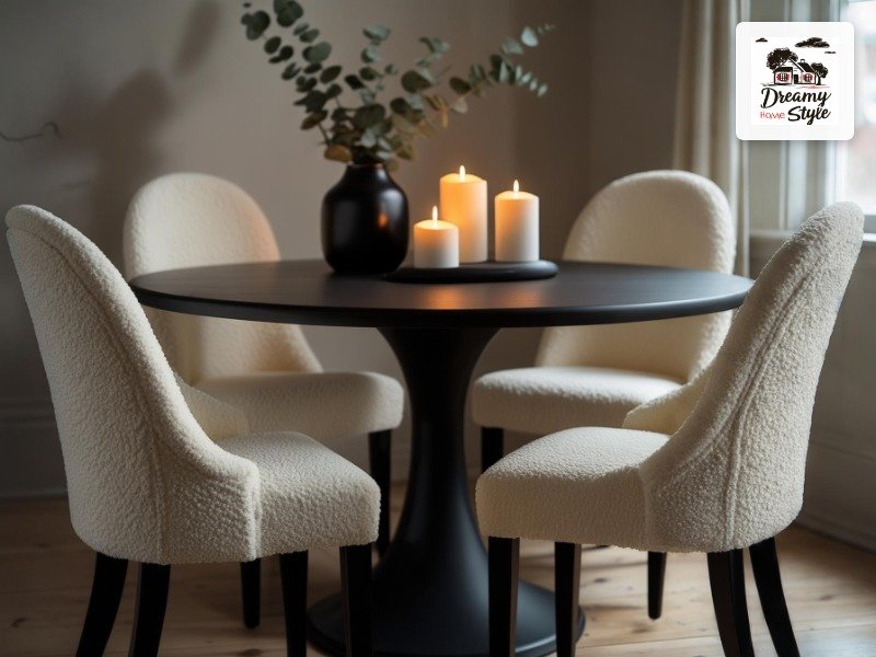
Cream bouclé chairs.
That’s my answer and I’m sticking with it.
I know white chairs feel risky, especially if you have a dog like Biscuit who treats every upholstered surface as a personal invitation.
But hear me out.
Against a black table and in a high-contrast palette, white chairs are what keep the room from feeling like a cave.
They bounce light.
They look intentional.
Bouclé specifically adds texture to a palette that could otherwise feel flat.
Black and white without texture is just a printer malfunction.
The nubby, soft quality of bouclé pulls warmth into the room even when there’s no color.
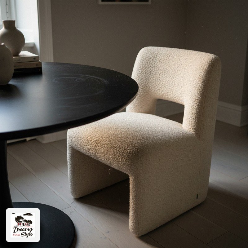
I got mine in sets of two from a big-box home store, and I keep a washable slipcover on the one Biscuit has claimed as his throne.
Practical and pretty.
Mostly.
Avoid dining chairs with too much chrome or shiny metal detail in this palette — it tips from moody into diner.
Matte finishes all the way.
The Pendant Light is Non-Negotiable
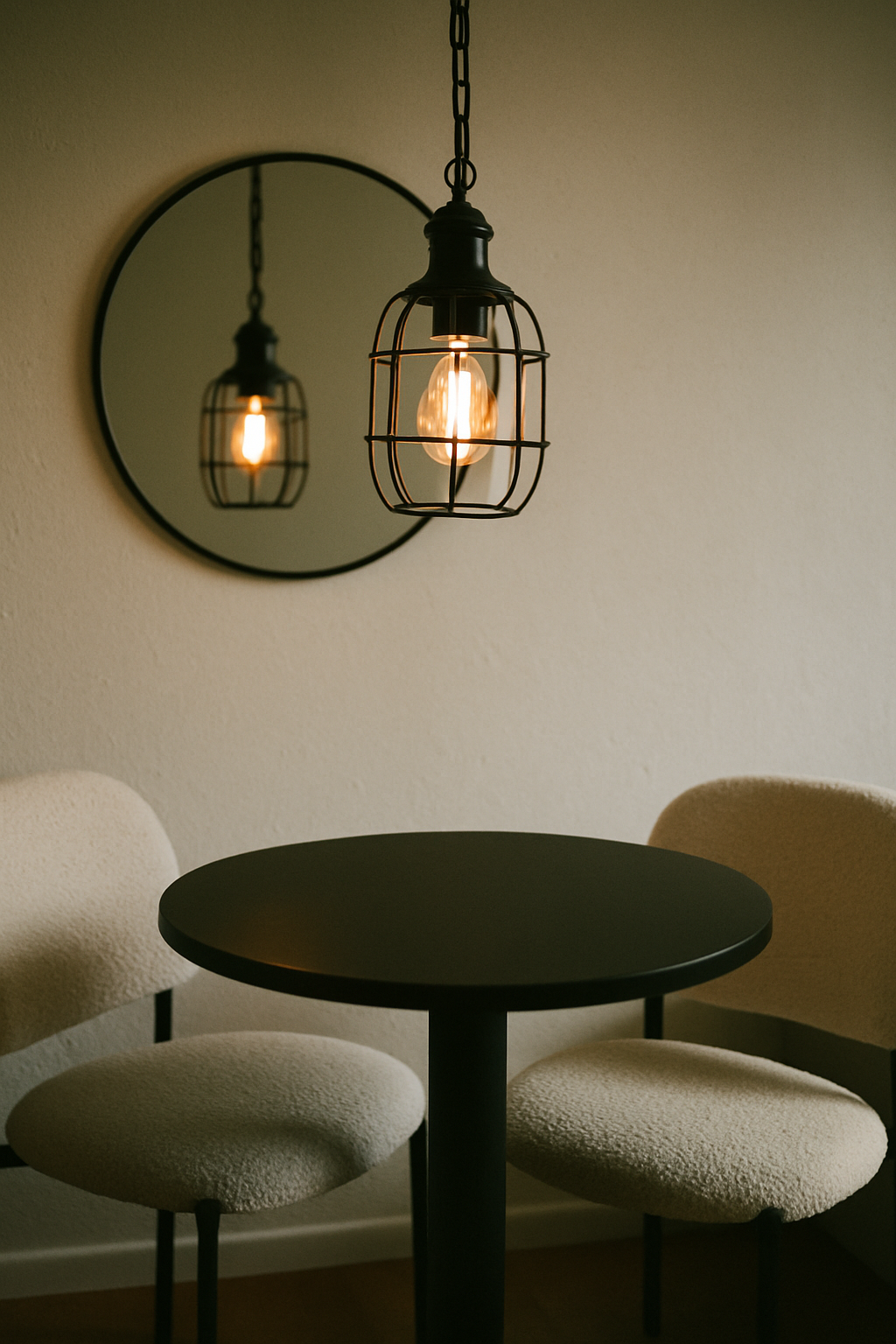
I will go to my grave saying overhead lighting is a crime — but a single pendant over a dining table is the one exception I allow myself.
Industrial cage pendant.
Black metal.
Ideally with a warm Edison-style bulb inside so the light it throws is amber, not white.
White light in a black and white room reads like a hospital.
Amber light reads like a restaurant you’d actually want to stay in for three hours.
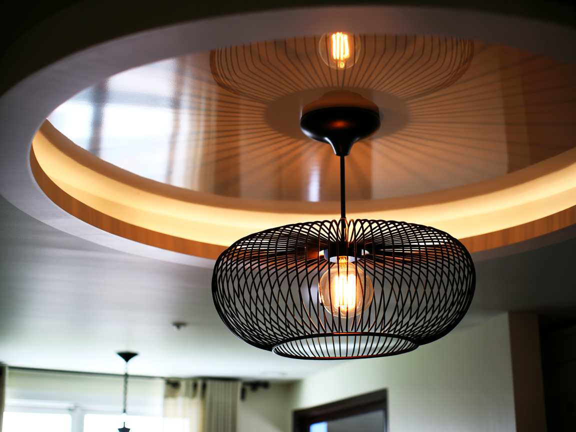
Hang it lower than you think.
I’m talking 30 to 34 inches above the tabletop for a standard ceiling.
Most people hang pendants way too high and then wonder why their dining room doesn’t feel cozy.
It’s this.
It’s always this.
I got a cage pendant at HomeGoods for $34 and it looks like something from a boutique hotel.
The trick is the bulb.
A $6 warm LED filament bulb and suddenly it’s moody and perfect.
The Mirror That Does All the Work
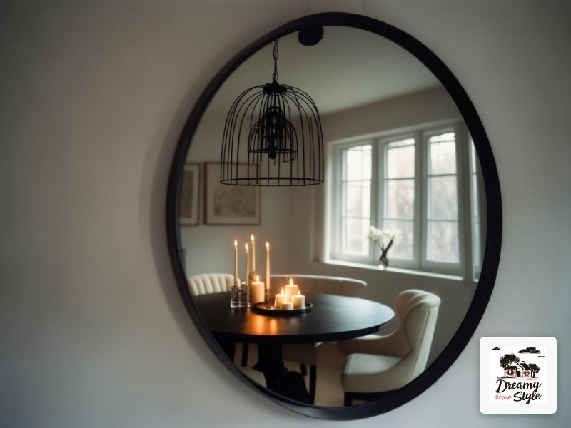
A large circular mirror on the wall behind the table is the single highest-return thing I’ve done in this room.
It doubles the candlelight.
It makes the pendant look intentional.
It adds a round shape that echoes the table and creates this visual rhythm I didn’t even plan — I just got lucky.
Size up more than feels comfortable.
I almost bought a 24-inch mirror and then my friend Jen convinced me to get the 36-inch one instead.
She was right.
A too-small mirror in this context just looks like a decorating afterthought.
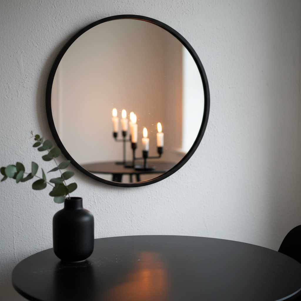
Thin black metal frame.
Not ornate, not gold, not chunky.
Just a simple thin black circle.
It disappears into the palette and lets the reflection do the talking.
The specific placement: centered horizontally on the wall, with the bottom of the mirror about 6 inches above the top of any console or sideboard below it.
Or just above the back of the chairs if it’s bare wall.
Trust the scale.
Bring In Something Living
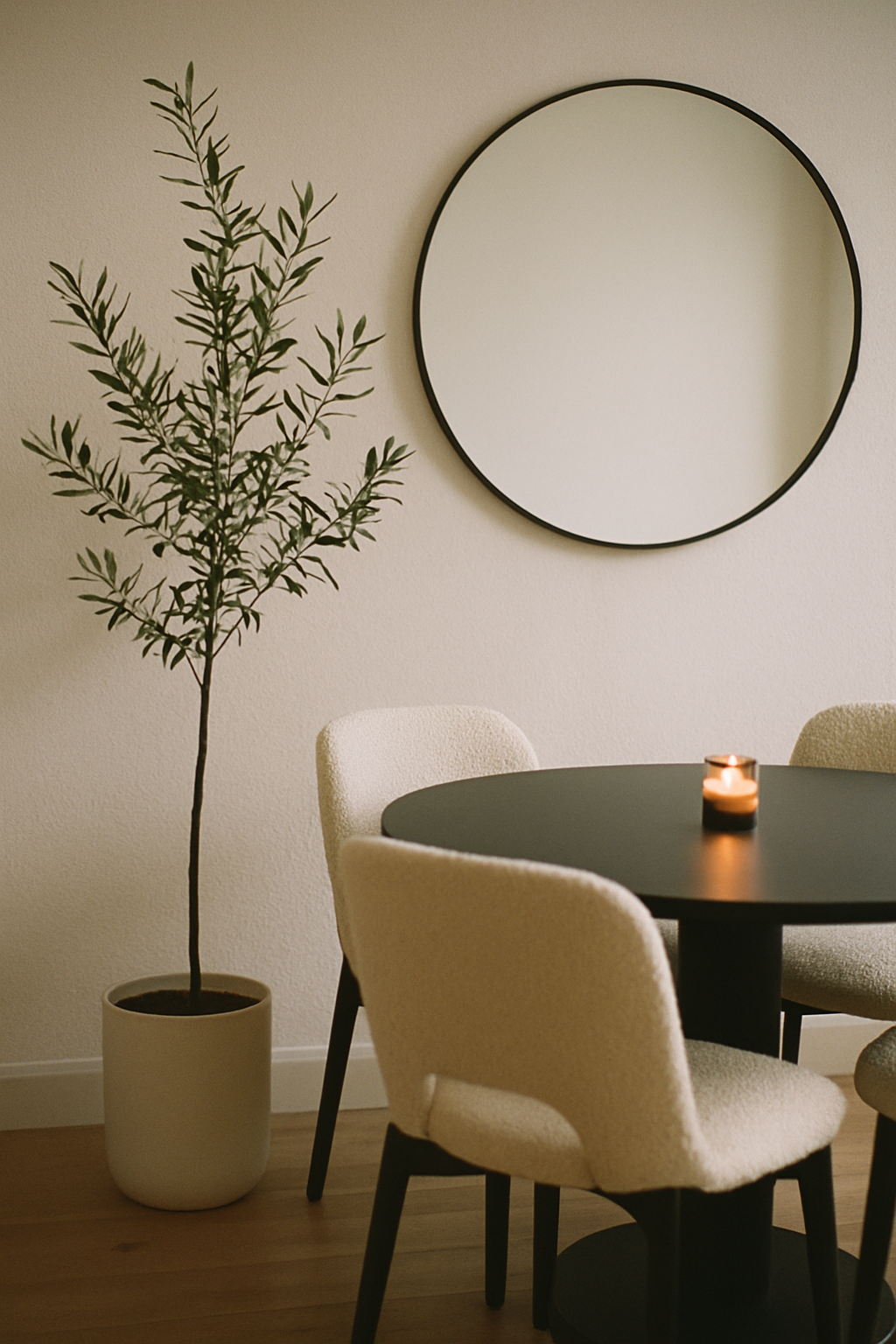
A black and white room without a plant is just a concept.
It needs something alive to keep it from feeling like a magazine spread nobody actually eats in.
An olive tree in the corner is my top pick.
The silvery-green leaves are quiet enough not to compete with the palette but warm enough to pull the whole thing together.
They’re also pretty forgiving if your grow light situation is, like mine, a single east-facing window and pure optimism.
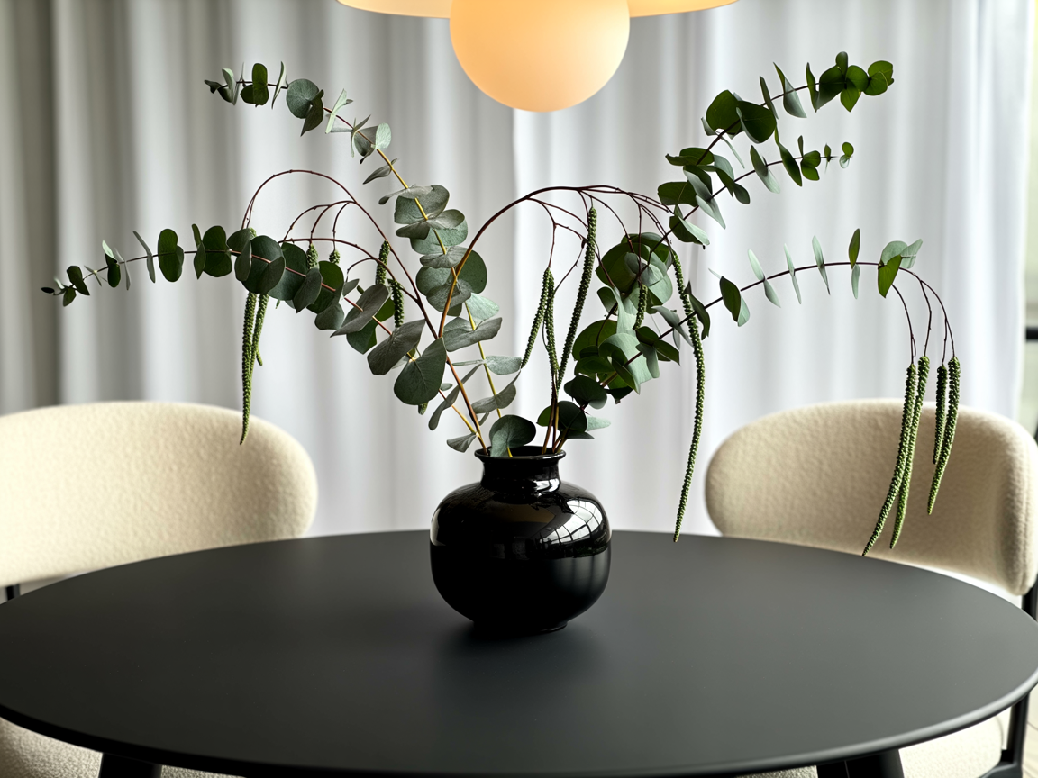
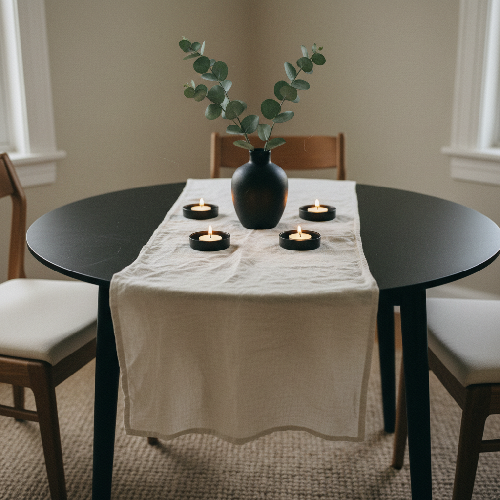
Eucalyptus stems in a black ceramic vase on the table work as a lower-profile option.
They add that same gray-green softness without taking up floor space, and dried eucalyptus honestly lasts forever.
I’ve had the same bunch in my dining room since spring and it still looks intentional.
Avoid bright green tropical plants here.
A big glossy monstera will fight with the palette instead of settling into it.
Candles: More Than You Think You Need
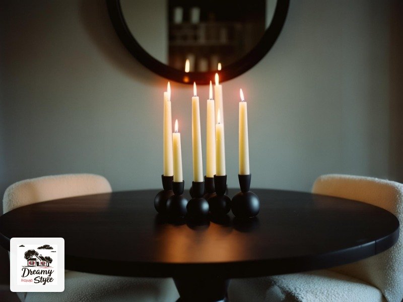
More.
Always more candles.
I’m not negotiating.
The black and white palette reads dramatic in daylight and absolutely beautiful by candlelight.
It’s one of those rooms that transforms after dark in a way that sort of takes your breath away, and candles are responsible for about 80% of that.
Use a mix of taper candles in black holders and pillar candles in white or cream.
Group them in odd numbers — three tapers together, one big pillar near the olive tree.
Don’t line them up in a row like a birthday cake.
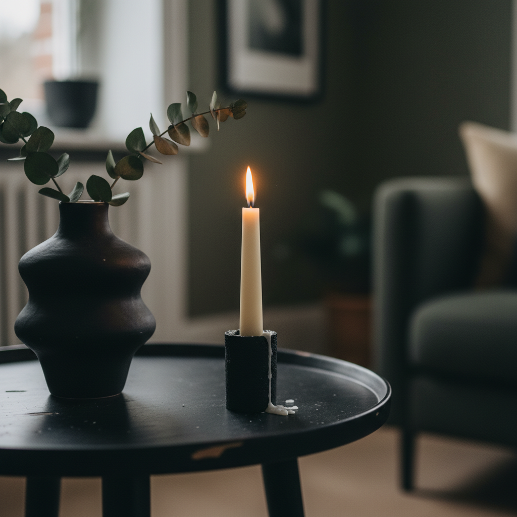
LED flame candles work too, especially if Biscuit is a tail-wagger (he is, catastrophically).
I have two real pillar candles and four LED ones on my table and genuinely cannot tell the difference from across the room.
Black candleholders and white candles, or white holders and black candles.
Either works.
Both together is intentional, not chaotic.
The Floor Situation Matters More Than I Wanted It To
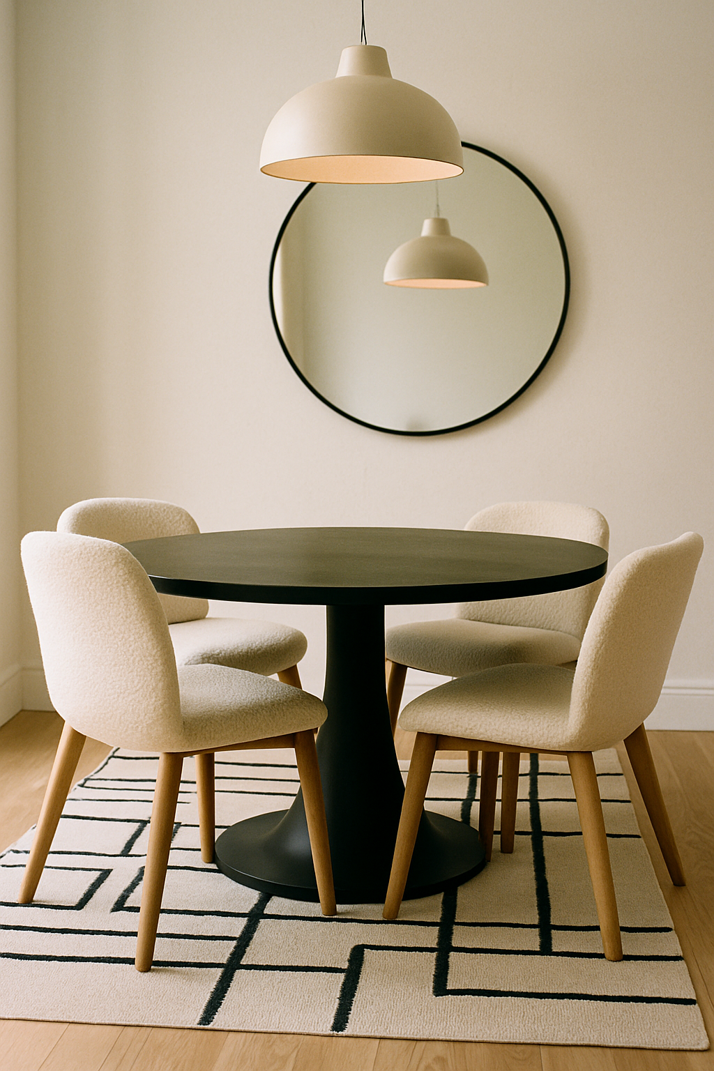
I’ll be honest — I didn’t want to think about the floor.
I just wanted to style the table and call it done.
But the floor is really visible in a dining room and it’s doing a lot.
Pale hardwood or light-toned LVP underneath a black table looks stunning.
The contrast is intentional and clean.
If your floors are dark, the table can disappear a little, so layer in a light area rug to create definition.
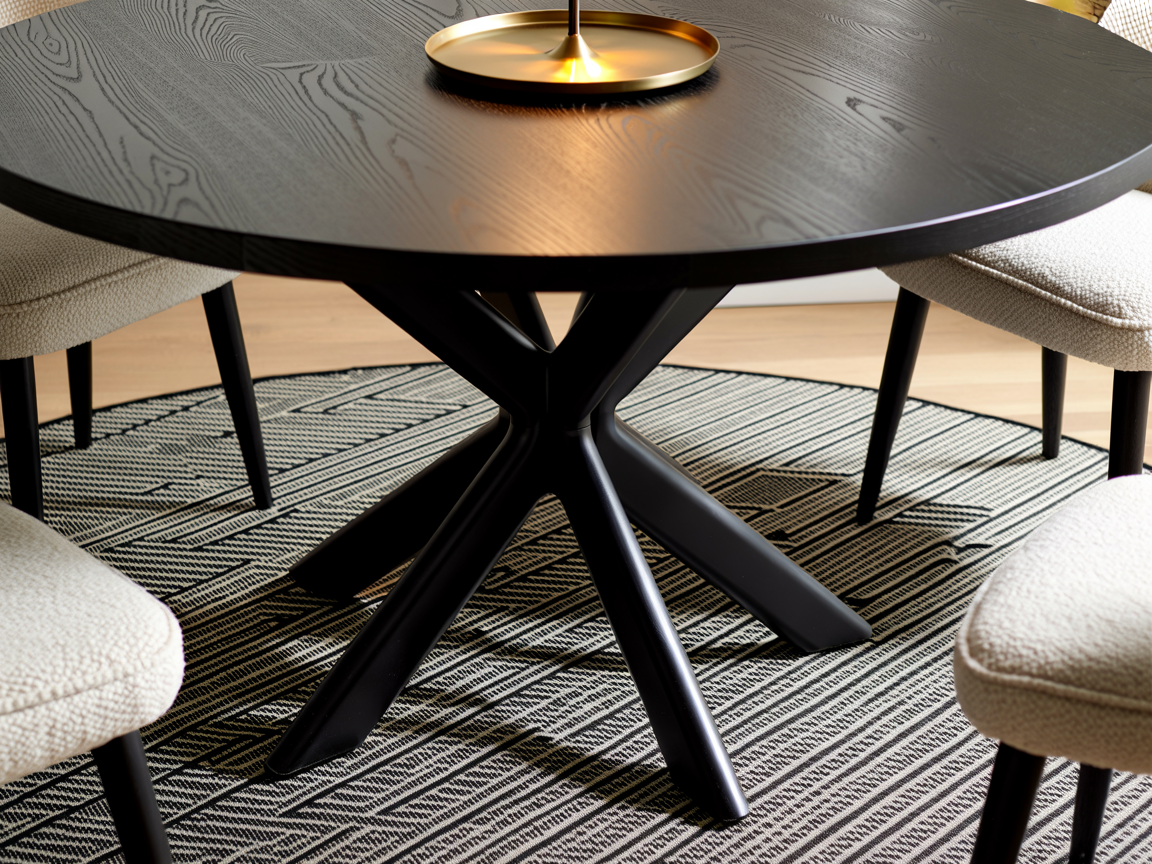
A black and white geometric rug under the table is the most obvious choice, and honestly, it’s obvious because it works.
Just make sure it’s big enough — the back legs of your chairs should stay on the rug even when someone pulls their chair out to sit down.
I got this wrong the first time and had to exchange mine for the next size up.
Natural fiber rugs in jute or seagrass also work and add warmth.
Not the first choice I’d make, but not wrong.
What to Do With the Walls
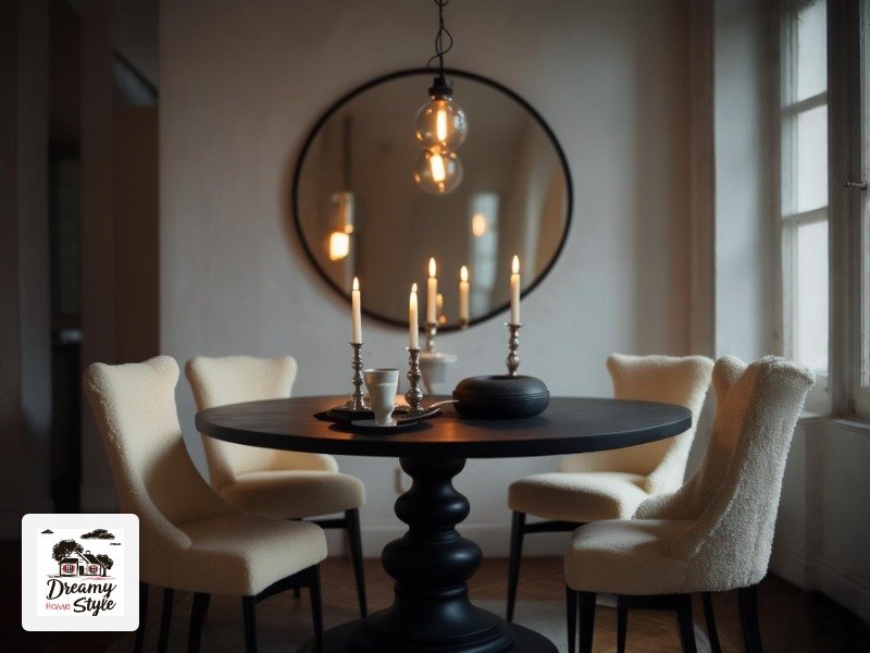
White.
Just white.
I know that sounds boring but I promise it isn’t — the black furniture does all the work and the white wall is the canvas that lets it pop.
I used a warm white, not a stark cool white.
There’s a huge difference.
Cool white with black furniture can feel clinical.
Warm white with matte black reads like a cozy European bistro.
Specifically I used a paint color described as ‘soft linen white’ and it made everything look more expensive.
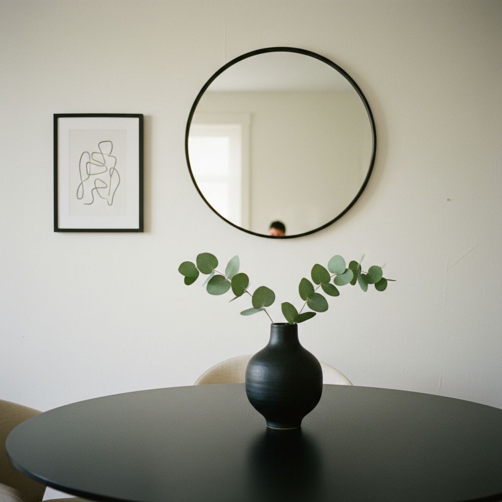
One thing I’d skip: black accent walls in this setup.
I know it’s popular.
I tried it with peel-and-stick wallpaper before I committed, and it swallowed the table instead of highlighting it.
The black needs something light to push against.
If you want something on the walls besides the mirror, a single piece of black and white art in a thin black frame works.
One piece, not a gallery wall.
The room already has visual interest.
Table Styling That’s Actually Functional
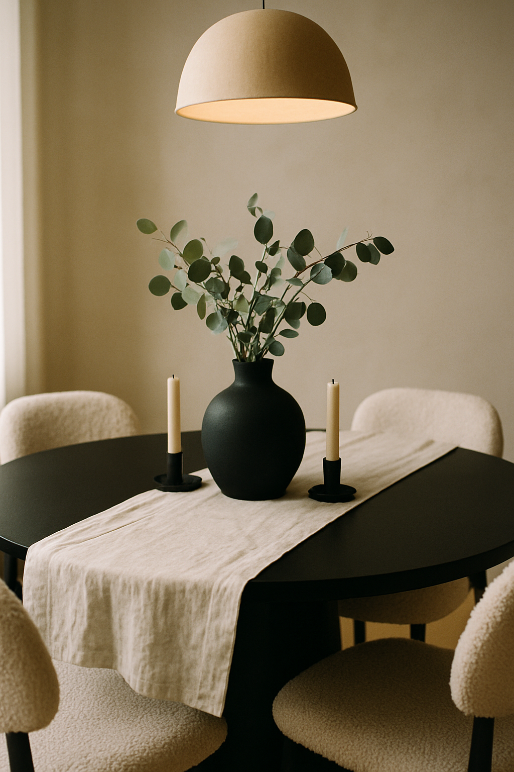
I change my table styling roughly once a month, but a few things stay constant: the black vase with eucalyptus, a small cluster of candles, and a linen table runner in cream or off-white.
The runner grounds the center of the table without covering the beautiful dark surface.
Lay it across the diameter of the round table, slightly off-center if you’re feeling brave.
It reads casual and intentional at the same time.
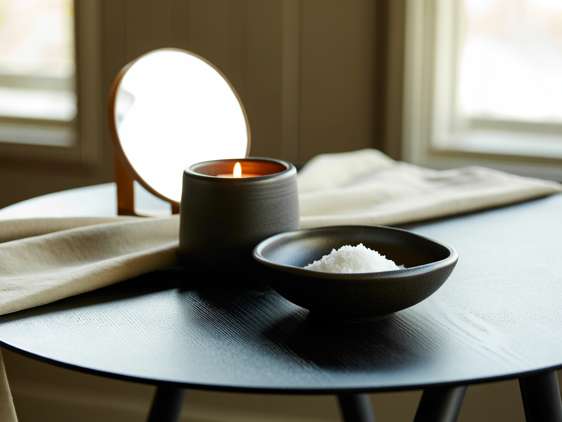
Black ceramic serving pieces left on the table during non-meal times look like styling pieces.
A black salt cellar, a matte black napkin ring, a dark stoneware bowl with some walnuts in it.
These tiny details make it feel like a room that’s lived in, not staged.
What I’d leave off: a centerpiece that’s too tall.
You want to see across the table.
The moment a centerpiece starts blocking eye contact it becomes an obstacle, not a focal point.
Layering Texture So It Doesn’t Feel Flat
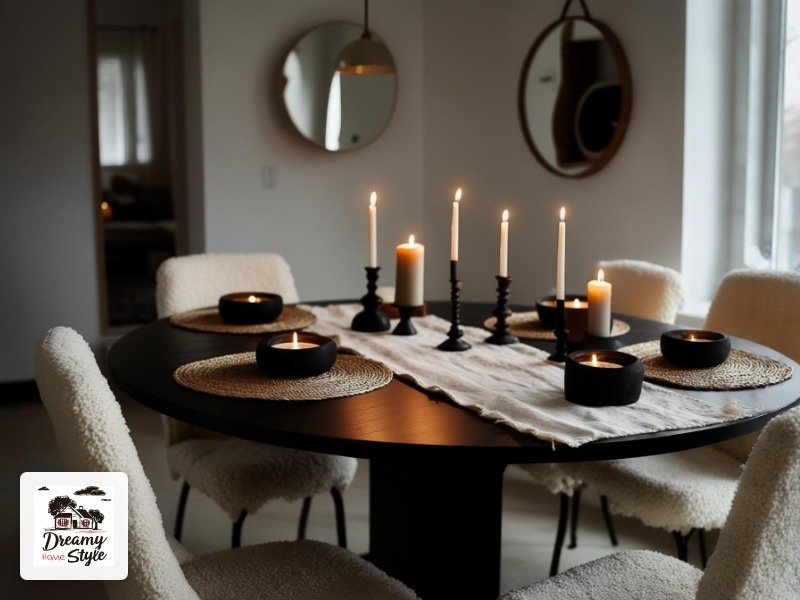
This is the part people skip and then wonder why their black and white room feels cold.
Texture is doing what color usually does — it creates depth and warmth.
You’ve got bouclé on the chairs.
Good.
Now add a linen runner.
A ceramic vase.
A woven placemat in natural fiber.
A pillar candle with an uneven handmade surface.
Each of these things catches light differently and together they give the room this rich, layered feeling that straight-up flat surfaces can’t achieve.
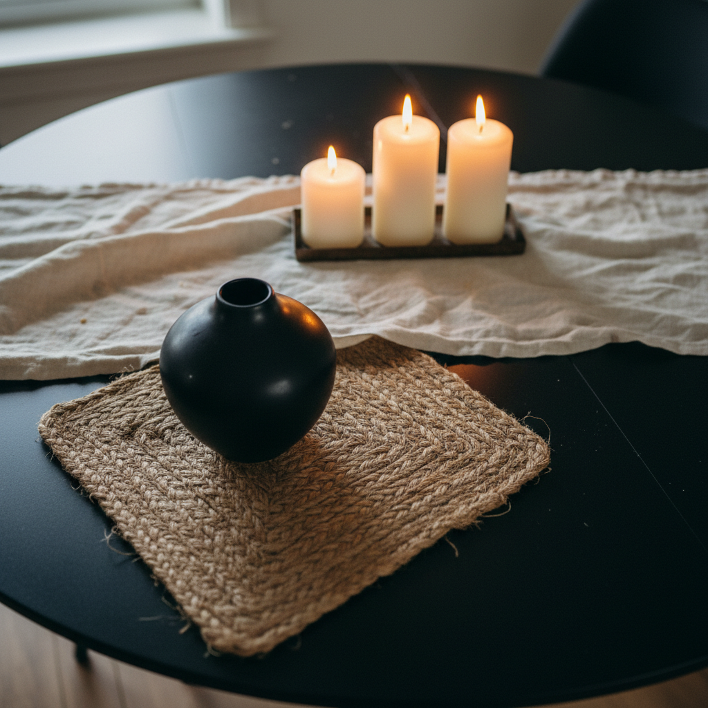
Matte finishes over shiny ones, almost always.
Matte black absorbs light softly.
Shiny black reflects harshly.
In a moody dining room, you want absorption.
The exception is the mirror, which is intentionally reflective and does its job because everything else is matte.
I also have a chunky cream knit throw draped over one chair in the corner.
Not a typical dining room thing, I know.
But it makes the room feel like a place you’d linger in after dinner, which is the whole point.
The Role of Imperfection (This Is the Good Part)
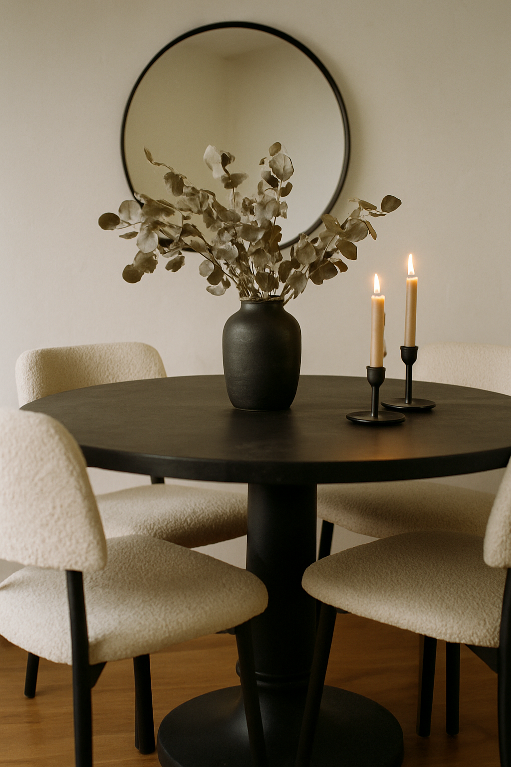
My dining room doesn’t look like a showroom.
It looks like someone actually eats there, and I think that’s better.
The chairs have a tiny Biscuit-hair situation I’ve accepted.
The eucalyptus is a little dried out and still perfect.
One of my candle holders has a wax drip on the side I keep forgetting to clean off.
None of this makes the room look bad — it makes it look real.
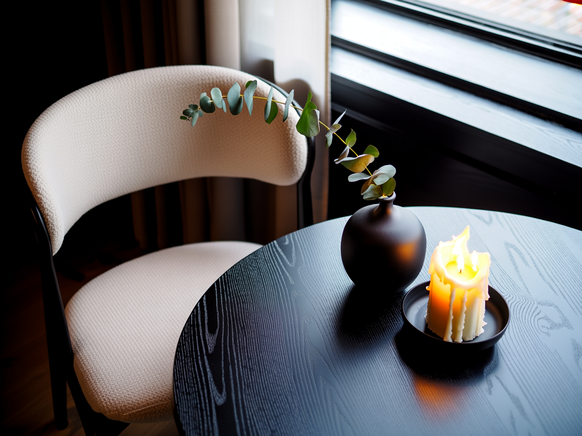
Black and white as a palette is forgiving in this way.
Because it’s so graphic and intentional-feeling, small imperfections read as character instead of mess.
A scuff on a white wall in a pale pink room is noticeable.
In a high-contrast black and white space, your eye goes to the composition, not the details.
I think about this every time I’m tempted to ‘finish’ the room.
The slightly undone feeling is part of the charm.
Budget Reality Check, Because Someone Has to Say It
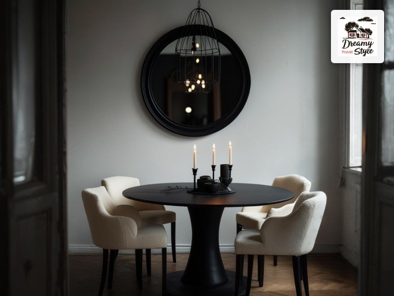
I didn’t do this all at once.
That’s important to say because the finished photos never show the six months of collecting pieces and living with weird placeholder items.
The table was $180 consignment.
The four chairs were two sets of two from a big-box store, $89 per pair.
The pendant was $34 HomeGoods.
The mirror I found at a thrift store for $22 and spray-painted the frame matte black with a $5 can of Rust-Oleum.
The olive tree was $45 from a local nursery.
Total investment for the main pieces: somewhere around $500, stretched over months.
The room looks like it cost well over $2,000.
That gap is the whole reason I’m obsessed with this stuff.
The vase, the candles, the runner — all under $15 each, and that’s being generous.
Don’t let the aspirational photos fool you into thinking this requires a designer budget.
It really, genuinely doesn’t.
The Night Shift — How It All Looks After Dark
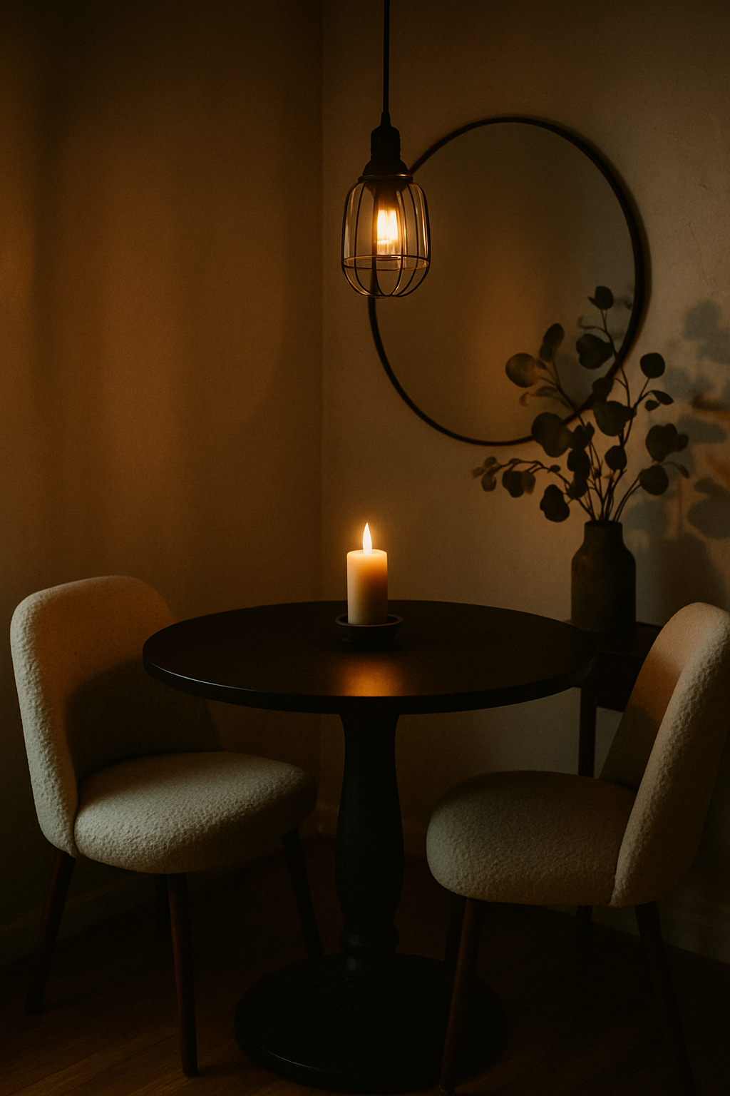
Daytime this room is crisp and graphic and I love it.
But after dark, with the candles lit and the pendant on, it becomes something else entirely.
Something that makes people walk in and go ‘oh wow’ in a quiet voice.
The circular mirror doubles every flame.
The matte black table surface picks up the amber glow in a way that feels almost luminous.
The cream chairs go golden.
The eucalyptus casts soft shadows on the white wall.
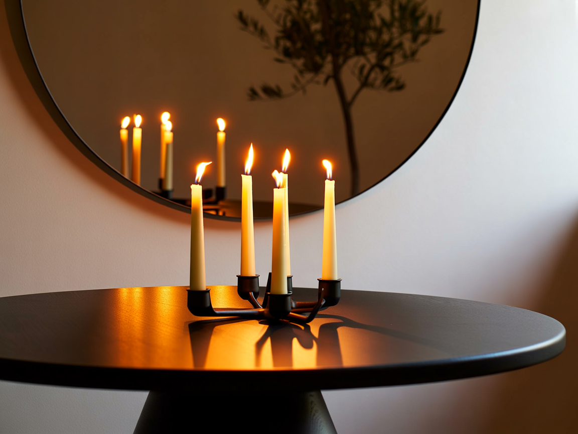
It’s the kind of room that makes dinner feel like an occasion even when you’re just eating pasta on a Tuesday.
That’s what I was chasing when I put down that greige paint roller, and it’s what I found.
If you’re going to do one thing before you try this palette, do it at night with a few candles in the space.
See what high contrast does in low light.
You’ll be putting down your paint roller too.

