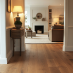
I’ll never forget the day I moved into my first real grown-up apartment.
The dark brown hardwood floors were gorgeous—rich, warm, and exactly what I’d dreamed of.
But within a week, I realized I had no idea what to do with the walls.
Everything I tried felt wrong.
Too stark.
Too dark.
Too… blah.
I must have brought home thirty paint samples, taping them up and staring at them for hours, trying to figure out why nothing felt right.
Maybe you’re in that exact spot right now—loving your dark brown floors but feeling stuck on what wall color will actually make your space feel cohesive and beautiful instead of heavy or disconnected.
After years of trial and error (and honestly, a few paint disasters), I’ve finally cracked the code.
These are the wall colors that actually work with dark brown floors—the ones that make your space feel intentional, modern, and like you hired a designer.
Trust me, I’ve done the hard work so you don’t have to.
Design Your Dream Room in Minutes! – By Madison
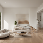
🏡 Start Creating FREE →Soft White With Warm Undertones

This is hands down my favorite pairing with dark brown floors.
But here’s the thing—not just any white.
You need a white with warm undertones, something that reads creamy rather than stark.
I painted my bedroom in a soft white with just a hint of yellow undertone, and it completely changed how I felt about the space.
The contrast between the dark floors and pale walls creates this airy, sophisticated vibe that feels both modern and cozy.
The floors become this gorgeous anchor instead of overwhelming the room.
What I love most is how the natural light plays off the walls throughout the day.
Morning light makes everything feel fresh and clean.
Evening light gives the room this warm, glowing quality that makes you want to curl up with a book.
If you’re nervous about going too stark, test your white paint samples at different times of day.
Some whites can look too cold or too yellow depending on your lighting.
I learned this the hard way when I picked a white that looked perfect in the store but turned weirdly blue in my north-facing hallway.
The warmth in the undertones is what makes this work—it echoes the natural warmth in the wood floors without competing with them.
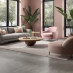
Warm Beige That Feels Like A Hug

Beige gets a bad reputation, but the right beige with dark brown floors is pure magic.
I’m talking about a warm, buttery beige that has depth to it.
Not flat contractor beige—something richer.
When I redid my guest room, I went with a warm beige that had subtle taupe undertones, and people always comment on how inviting the space feels.
The walls and floors create this monochromatic warmth that’s incredibly soothing.
It’s like the whole room is wrapped in cashmere.
The key is making sure your beige has enough warmth to complement the brown floors rather than clash with them.
I hold paint swatches directly against my floorboards to see how they play together.
Sometimes a beige that looks perfect on a white paint chip looks too gray or too pink next to actual dark wood.
What I really love about this combo is how it makes a room feel bigger without going full white.
The subtle contrast gives your eye places to rest while keeping everything cohesive and calm.
It’s especially gorgeous in bedrooms and living spaces where you want that enveloping, peaceful vibe.
And honestly, it makes styling so much easier because everything you put in the room just works.
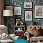
Sage Green For That Fresh Modern Look

Okay, I’m obsessed with sage green right now.
And with dark brown floors?
Chef’s kiss.
I painted my home office in the softest sage green last fall, and it’s like bringing the outdoors in.
The color has this fresh, organic quality that makes the brown floors feel even more natural and grounded.
It’s modern but not trendy—more like timeless with a contemporary edge.
The cool undertones in sage green create the most beautiful contrast with warm brown floors.
Your floors pop in the best way, and the whole space feels balanced and calm.
I find myself actually wanting to spend time in that room now, which wasn’t true when the walls were a boring off-white.
If you’re worried about sage being too bold, start with one accent wall.
That’s what I did initially, and then I loved it so much I did the whole room.
The color changes throughout the day too—sometimes it reads more gray, sometimes more green, which keeps things interesting.
What really makes this work is choosing a sage that’s muted and soft rather than bright or minty.
You want something that whispers rather than shouts.
Test it in your space because lighting makes a huge difference with greens.

💭 I Wrote a Book About My BIGGEST Decorating Mistakes!
When I decorated my first home, I thought I knew what I was doing. Spoiler alert: I DIDN’T. 😅
💸 I bought a sofa that was WAY TOO BIG for my living room. I chose paint colors that looked amazing in the store but terrible on my walls. I spent THOUSANDS on pieces that didn’t work together. Sound familiar?
“Things I Wish I Knew Before I Decorated My First Home” is your shortcut to avoiding ALL my costly mistakes. ✨ Inside, you’ll find practical, NO-NONSENSE advice that will save you time, money, and a whole lot of decorating regret. 🏡
Design Your Dream Room in Minutes! – By Madison
🏡 Start Creating FREE →Soft Gray With Warm Notes

Gray can be tricky with dark brown floors, but when you get it right?
Stunning.
The secret is choosing a gray that leans warm rather than cool.
Cold gray next to brown floors can look disconnected and sort of sad.
But a warm gray—maybe one with slight beige or taupe undertones—creates this sophisticated, gallery-like backdrop.
I used a warm gray in my hallway, which has dark brown hardwood throughout, and it made the space feel so much more intentional.
The gray is light enough to keep things bright, but it has just enough warmth to tie into the floors.
It’s that perfect neutral that makes everything else in the space look more elevated.
My vintage rug pops, my artwork stands out, and the wood trim looks intentional rather than dated.
The thing about warm gray is it works with almost any decorating style.
If you’re into modern minimalism, it’s perfect.
If you love cozy traditional spaces, it still works beautifully.
I think that’s why I recommend it so often—it’s incredibly versatile while still feeling current.
Just make sure you’re testing samples in your actual space.
What looks warm in the paint store can sometimes read cool in your home, especially if you have a lot of natural light or predominantly cool-toned lighting.
Warm Taupe For Ultimate Coziness

Taupe is kindda my security blanket color.
It’s that perfect in-between of gray and beige, and with dark brown floors, it creates the coziest atmosphere.
I painted my den in a warm taupe a few years ago, and it’s still my favorite room in the house.
The color has just enough gray to feel modern and enough beige to feel warm.
Against dark brown floors, it creates this layered, textural look even before you add any furniture or decor.
What I love is how forgiving taupe is.
It doesn’t show dirt or scuffs as much as lighter colors.
And it makes the room feel finished without being boring.
The warmth in the taupe echoes the warmth in the brown floors, creating this harmonious flow that makes your whole space feel cohesive.
It’s especially beautiful in living rooms and family spaces where you want that lived-in, comfortable vibe.
When I curl up on my couch in that room, everything just feels right.
The taupe doesn’t compete with the floors—they work together to create this wrapped-up, cozy feeling.
If you’re someone who loves texture and layers in your decorating, taupe walls with brown floors give you the perfect neutral foundation.
You can add pops of color through pillows and art, or keep everything tonal for a super sophisticated look.
Pale Blush For Unexpected Warmth

I know what you’re thinking—pink walls?
But hear me out.
A pale, barely-there blush pink with dark brown floors is absolutely stunning.
It’s warm, it’s soft, and it’s way more sophisticated than it sounds.
I did this in my daughter’s room, and even my husband (who was very skeptical) admitted it looks amazing.
The key is going super pale—we’re talking almost-white with just a hint of pink.
Nothing bright or Barbie-esque.
The subtle pink undertones bring warmth to the space while still feeling light and airy.
Against dark floors, it creates this romantic, elegant vibe that feels both modern and timeless.
The brown grounds all that softness, so it never feels too sweet or precious.
What surprised me most is how this combo makes the whole room feel more expensive somehow.
Maybe it’s the unexpected color choice or the way the warmth plays off the rich floors.
Either way, it works.
If you’re nervous about pink, test it first.
The right blush can transform a space, but the wrong one can feel too juvenile.
Look for pinks with beige or peach undertones rather than cool or purple undertones.
And honestly?
This works in any room, not just bedrooms.
I’ve seen it look gorgeous in dining rooms and even home offices.
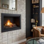
Soft Powder Blue For A Calming Contrast

Blue might seem like an odd choice with brown, but a soft powder blue creates this beautiful, calming contrast.
I used this in my main bathroom, which has dark brown luxury vinyl flooring, and I’m in love with the result.
The cool blue and warm brown create a balanced, serene atmosphere.
It’s like bringing a little bit of sky into your space.
The contrast makes both colors look better—the blue feels softer and more sophisticated, and the brown floors feel richer and more intentional.
What I appreciate about this combo is how calming it feels.
Blue has that naturally soothing quality, and when it’s paired with the grounding warmth of brown floors, you get this perfect balance of energy.
It’s especially nice in bedrooms, bathrooms, or any space where you want to feel relaxed.
The powder blue I chose is quite pale—almost a whisper of color.
If you go too saturated or too bright with blue, it can feel disconnected from the brown.
But keep it soft and muted, and the whole space feels cohesive and thoughtful.
Test your blue at different times of day because blues can shift dramatically depending on lighting.
Some can look too gray, too purple, or too green in certain lights.
Hold your sample directly next to your flooring to see how they interact.
Design Your Dream Room in Minutes! – By Madison
🏡 Start Creating FREE →Greige For The Indecisive

Can’t decide between gray and beige?
Greige is your answer.
It’s literally the best of both worlds, and with dark brown floors, it’s perfection.
I went with greige in my open-concept main floor, and it ties everything together beautifully.
The gray keeps things feeling contemporary and clean.
The beige adds warmth that connects to the brown floors.
Together, they create this sophisticated neutral that works with absolutely everything.
My modern furniture looks great, my rustic decor looks great—it all just works.
What I really love about greige is how it adapts to different lighting.
In morning light, it reads more beige and warm.
In evening light, it looks more gray and sophisticated.
It’s like having two different colors that both happen to be perfect.
The continuity of using one greige throughout multiple rooms with dark brown floors creates amazing flow.
Your eye travels smoothly from space to space without any jarring color changes.
If you’re doing a whole-house paint project, this is my top recommendation.
It’s neutral enough to work everywhere but interesting enough that your walls aren’t boring.
And it makes those dark brown floors look absolutely intentional and luxurious throughout your entire home.
Warm Ivory For Timeless Elegance

Ivory is like white’s more sophisticated older sister.
It has more depth, more warmth, and more personality.
With dark brown floors, warm ivory creates a timeless, elegant look that never goes out of style.
I painted my formal living room in a warm ivory, and it feels like a room from a magazine.
The soft, creamy walls let the beautiful dark floors be the star while keeping everything light and bright.
There’s something about ivory that feels expensive and intentional.
Maybe it’s the subtle warmth or the way it plays with natural light.
Whatever it is, it elevates a space without being showy about it.
What I appreciate most is how forgiving ivory is.
It doesn’t show every little imperfection like pure white can.
And it works with literally any color accent you want to add.
Bold jewel tones look amazing, soft pastels work beautifully, and even neutral decor feels elevated.
The brown floors ground all that lightness, creating balance and visual interest.
If you love classic, traditional style, this combination is perfect.
But honestly, it works just as well for modern spaces.
The key is in how you style it—ivory walls and brown floors are just a beautiful, versatile foundation.
Choose an ivory that leans warm rather than cool for the best results with brown floors.
💭 I Wrote a Book About My BIGGEST Decorating Mistakes!
When I decorated my first home, I thought I knew what I was doing. Spoiler alert: I DIDN’T. 😅
💸 I bought a sofa that was WAY TOO BIG for my living room. I chose paint colors that looked amazing in the store but terrible on my walls. I spent THOUSANDS on pieces that didn’t work together. Sound familiar?
“Things I Wish I Knew Before I Decorated My First Home” is your shortcut to avoiding ALL my costly mistakes. ✨ Inside, you’ll find practical, NO-NONSENSE advice that will save you time, money, and a whole lot of decorating regret. 🏡
Pale Terracotta For Earthy Warmth

This one’s for my earthy, bohemian-loving friends.
A pale, dusty terracotta with dark brown floors creates the most inviting, grounded space.
I tried this in my dining room, and it’s become everyone’s favorite room to gather in.
The color has this sun-baked, organic quality that feels both modern and ancient at the same time.
It’s warm without being overwhelming, and it makes the brown floors feel even more natural and beautiful.
The two warm tones together create this layered, textural effect that’s incredibly cozy.
What I love is how this combo makes me feel like I’m somewhere else—maybe a villa in Tuscany or a desert retreat.
It’s transportive in the best way.
The pale terracotta brings just enough color to be interesting without being bold.
It’s sophisticated and unexpected, which I’m all about.
If you’re worried about it being too much, go paler than you think.
A whisper of terracotta goes a long way, especially against dark floors.
The brown grounds all that warmth, so it never feels too orange or too much.
This combo works especially well if you have a lot of natural materials in your space—rattan, wicker, linen, ceramic.
Everything feels cohesive and intentional when your walls and floors are both warm, earthy tones.
Just make sure your terracotta leans more beige-pink than bright orange.
Soft Buttery Yellow For Sunshine Vibes

I was terrified to try yellow walls, but I’m so glad I did.
A soft, buttery yellow with dark brown floors is like permanent sunshine in your room.
I painted my breakfast nook in the palest butter yellow, and it makes my morning coffee taste better.
Okay, maybe that’s an exaggeration, but the room genuinely makes me happy every single time I walk in.
The warm yellow and warm brown create this enveloping, cheerful atmosphere that’s impossible to be grumpy in.
The key is keeping the yellow really soft and muted.
Think butter, not lemon.
Think sunrise, not highlighter.
The dark floors keep all that warmth from feeling too bright or overwhelming.
They ground the lightness and add sophistication.
What surprised me is how well this combo works for creating a cozy, intimate feeling.
You’d think yellow would make a space feel bigger and more open, but paired with dark floors, it actually creates this warm, wrapped-up vibe.
It’s perfect for kitchens, breakfast nooks, and any space where you want to feel happy and energized.
I’ve even seen it look gorgeous in bathrooms.
If you’re nervous about yellow, test it carefully.
Yellows can shift dramatically in different lighting—some go green, some go orange, some go chalky.
Find one that stays true and warm in your specific space.
Design Your Dream Room in Minutes! – By Madison
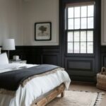
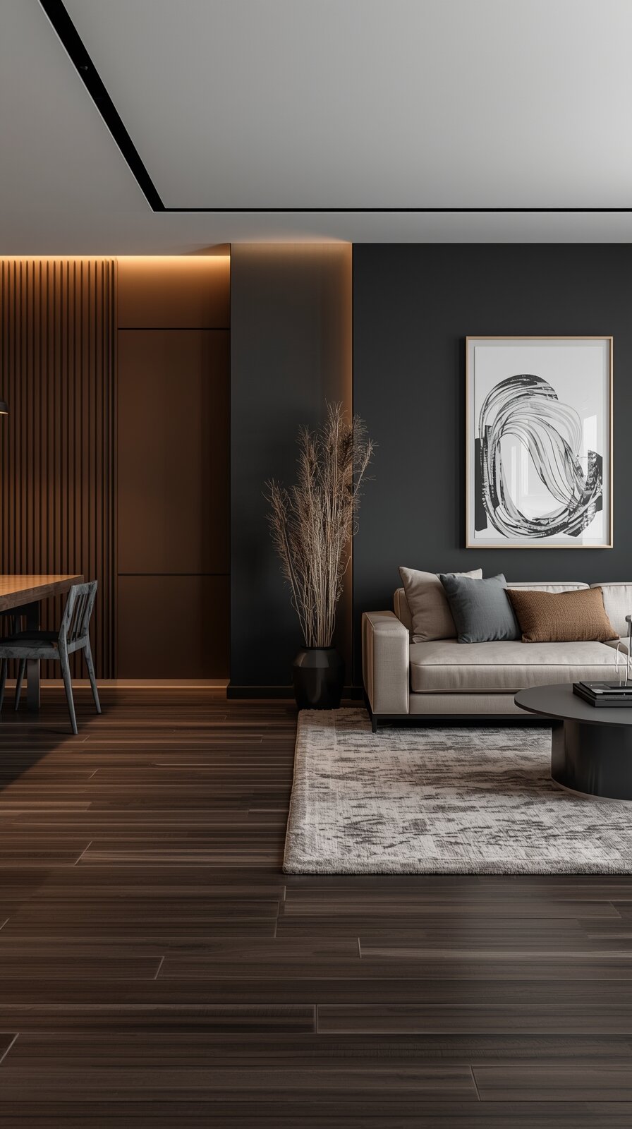
🏡 Start Creating FREE →Dramatic Charcoal For Bold Contrast

Okay, this one’s for the bold decision-makers out there.
Charcoal walls with dark brown floors sounds like it would be too dark, right?
But if you have good natural light, it’s absolutely stunning.
I did one accent wall in my bedroom in deep charcoal, and it’s become my favorite design choice I’ve ever made.
The dark-on-dark creates this moody, sophisticated, cocoon-like feeling.
It’s dramatic but not overwhelming because the brown adds warmth to balance the cool gray charcoal.
What makes this work is having enough light—either natural light from windows or good artificial lighting.
Without adequate light, it can feel cave-like.
But with proper lighting?
It’s pure luxury.
The space feels intentional, designed, and honestly kind of sexy.
The key is choosing a charcoal with slight warm undertones rather than a pure cool gray.
That warmth ties it to the brown floors and keeps everything cohesive.
I added brass fixtures and warm-toned textiles, and the whole space feels like a boutique hotel room.
If you’re not ready to commit to a whole room, try an accent wall first.
Or use charcoal in smaller spaces like a powder room or home office where the coziness feels appropriate.
This combo definitely isn’t for everyone, but if you love drama and sophistication, it’s worth considering.
So there you have it—my tried-and-true wall colors that actually work with dark brown floors.
The thing I’ve learned through all my painting adventures is that there’s no one perfect answer.
It depends on your light, your style, and honestly what makes you feel good when you walk into the room.
Trust your gut, test your samples at different times of day, and remember that paint is just paint.
You can always change it if it doesn’t feel right.
Happy painting!