Your dark brown carpet grounds your space with rich, earthy energy.
But the big question remains – what color should you paint those walls?
Let’s have a look at my favorites here:
Crisp White: Creating Dramatic Contrast


White walls with dark brown carpet create a striking contrast that feels modern and clean.
The stark difference between light walls and dark flooring creates visual interest immediately.
This pairing works particularly well in rooms that receive plenty of natural light.
When sunlight bounces off white walls, it creates an airy feeling that balances the heaviness of dark brown carpet.
Benjamin Moore’s “Simply White” or Sherwin-Williams’ “Pure White” are excellent choices that provide brightness without harsh blue undertones.
The beauty of white walls lies in their versatility with furniture and accessories.
You can introduce virtually any accent color when working with this neutral foundation.
Consider adding pops of blue, green, or even coral through throw pillows, artwork, or window treatments.
With white walls and dark brown carpet, your furniture becomes the middle ground that connects these contrasting elements.
Medium-toned wood furniture works beautifully in this setting, creating a natural transition between the dark floor and light walls.
This combination particularly shines in contemporary and Scandinavian-inspired spaces.
The clean lines of these design styles complement the crisp contrast created by white walls against dark brown carpeting.
For added dimension, consider incorporating textural elements like woven baskets, natural fiber rugs layered over the carpet, or textured throw blankets.
These details add visual interest without complicating your color palette.
In smaller spaces, white walls help prevent the dark carpet from making the room feel closed in.
The reflective quality of white paint helps bounce light around, creating the illusion of more space.
To keep this look from feeling too stark, incorporate warm metallic accents like brass or gold in your lighting fixtures or decorative objects.
These warm metals complement the brown tones in your carpet while adding a touch of elegance.
White walls with dark brown carpet also provide an excellent backdrop for gallery walls or statement art pieces.
The neutral background allows your art to stand out without competing with wall color.
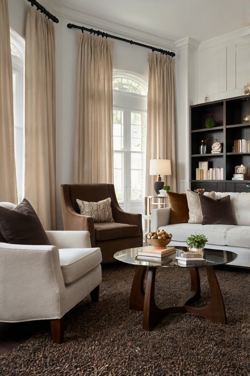
Soft Beige: Creating Natural Harmony
Beige walls create a natural companion to dark brown carpet, establishing a cohesive, monochromatic feeling in your space.
This harmonious pairing feels organic and grounded, perfect for creating a calm, serene atmosphere.
Beige comes in countless variations, from warm sand tones to cooler greige (gray-beige) options that can complement the specific undertone of your carpet.
Sherwin-Williams “Accessible Beige” or Benjamin Moore’s “Manchester Tan” offer versatile options that work well with most brown carpets.
The beauty of this pairing lies in its subtlety – the colors don’t compete but instead create a flowing, connected feeling.
This gentle color transition from floor to wall creates visual continuity that can make your space feel larger and more intentionally designed.
In rooms with limited natural light, warmer beige tones help create a cozy, inviting atmosphere without making the space feel closed in.
The warmth of beige walls prevents the dark brown carpet from feeling too heavy or dominant in the room.
When working with this color combination, incorporate varying textures to add visual interest and prevent the space from feeling flat.
Consider linen curtains, woven furniture pieces, or textured throw pillows to add dimension to your beige and brown palette.
This wall color pairing works exceptionally well with natural materials throughout your decor.
Wood furniture in medium to light tones, rattan accessories, and jute rugs layered over your carpet all enhance the organic feeling of this color scheme.
For accent colors, look to nature for inspiration – olive greens, soft terracottas, or muted blues add interest while maintaining the serene quality of your space.
Soft beige walls also provide an excellent backdrop for highlighting architectural details like crown molding, wainscoting, or built-ins.
The subtle contrast between the beige walls and white trim draws attention to these features without overwhelming the space.
In south-facing rooms, beige walls take on a warm, golden glow that beautifully complements dark brown carpeting throughout the day.
This combination creates a particularly inviting ambiance during golden hour when natural light enhances the warmth of both colors.
For a slightly more contemporary take on this pairing, consider beige walls with gray undertones (greige) alongside sleek furniture with clean lines.
This creates a sophisticated, updated look while maintaining the harmony between your walls and carpet.
Pale Blue: Adding Refreshing Contrast
Pale blue walls create a refreshingly unexpected partner for dark brown carpet, bringing a sense of airiness and serenity to your space.
This color combination works beautifully because blue and brown are complementary colors that naturally enhance each other.
The coolness of blue walls balances the warmth of dark brown carpet, creating a visually balanced and pleasing environment.
Light blue shades like Benjamin Moore’s “Breath of Fresh Air” or Sherwin-Williams’ “Rainwashed” introduce a subtle hint of color without overwhelming the space.
This pairing evokes natural landscapes – think clear blue skies above rich earth – making it feel inherently harmonious and grounding.
In bedrooms especially, this combination creates a tranquil retreat that promotes relaxation and restful sleep.
The gentle contrast between cool walls and warm flooring creates visual interest without sacrificing the calm atmosphere.
When decorating a room with pale blue walls and dark brown carpet, incorporate elements that bridge these colors.
Navy blue accents can create depth while connecting to your wall color, while caramel or tan accessories reference your carpet’s warmth.
Natural wood furniture in medium tones works exceptionally well in this color scheme, serving as a visual bridge between the cool walls and warm floor.
For a coastal-inspired look, lean into the blue and brown combination with nautical elements like rope details, woven textures, and natural linens.
These additions enhance the breezy, relaxed feeling created by your pale blue walls.
This color combination also works wonderfully in home offices or study areas, as blue promotes focus and productivity while the brown grounds the space.
The result is a balanced environment that feels simultaneously stimulating and comfortable.
Lighting plays a crucial role in rooms with this color pairing – warm-toned bulbs (2700-3000K) help prevent the blue walls from feeling too cool, especially in the evening.
This creates a cozy ambiance that balances the naturally cool tone of the blue paint.
For a more dramatic interpretation of this combination, consider using a slightly deeper blue on just one accent wall, creating a focal point while maintaining the airy feeling in the rest of the space.
This approach works particularly well behind a bed or sofa.
Pale blue walls also provide an excellent backdrop for artwork featuring warm tones that can tie back to your brown carpet.
Landscapes, abstract pieces with earthy elements, or vintage botanical prints all enhance this color scheme beautifully.
Soft Sage Green: Bringing Nature Indoors
Soft sage green walls create a nature-inspired haven when paired with dark brown carpet, evoking the peaceful feeling of forests and natural landscapes.
This combination feels inherently organic and restful, perfect for creating a restorative atmosphere in any room.
The gentle green tones complement the richness of dark brown carpet because these colors naturally occur together in the outdoors.
This pairing creates an instant connection to nature that feels both refreshing and grounding.
Sherwin-Williams’ “Sea Salt” or Benjamin Moore’s “Saybrook Sage” offer subdued green options that work beautifully with dark brown flooring.
These colors have gray undertones that keep them sophisticated rather than overly vibrant or juvenile.
In living spaces, this color combination encourages relaxation and conversation, making it perfect for areas where you entertain or unwind.
The calming properties of sage green help balance the visual weight of dark brown carpet, creating harmony throughout the space.
This palette naturally lends itself to incorporating houseplants, which both enhance the nature-inspired theme and improve indoor air quality.
The green walls make plant foliage pop while creating a cohesive look throughout the room.
For furniture, consider natural materials like wood, rattan, or bamboo in medium tones that bridge the sage walls and dark carpet.
These materials reinforce the organic quality of your color scheme while adding textural interest.
Accent colors that work beautifully with this combination include terracotta, mustard yellow, or dusty blue – all colors found in natural landscapes.
These additions create depth without disrupting the serene quality of your sage and brown foundation.
In rooms with limited natural light, sage green with warmer undertones prevents the space from feeling too cool or cave-like when combined with dark brown carpet.
The warmth in the green paint helps the room feel inviting rather than shadowy.
This color pairing works particularly well in transitional design styles that blend traditional comfort with contemporary simplicity.
The timeless quality of both colors creates a foundation that can evolve with changing decor trends.
For window treatments, consider natural materials like woven wood blinds or linen curtains in ivory or oatmeal tones.
These options enhance the nature-inspired theme while filtering light beautifully through the space.
Metallic accents in brushed brass or antique gold add subtle warmth that complements both the sage walls and brown carpet.
These touches elevate the space without detracting from its natural, calming ambiance.
Warm Terracotta: Creating Mediterranean Warmth
Terracotta walls paired with dark brown carpet create a rich, enveloping atmosphere reminiscent of Mediterranean villas and desert landscapes.
This bold pairing makes a confident design statement that feels simultaneously timeless and on-trend.
The warmth of terracotta creates a natural progression from your dark brown carpet, establishing a cohesive color story throughout the space.
Colors like Sherwin-Williams’ “Copper Mountain” or Benjamin Moore’s “Audubon Russet” capture this earthy, sun-baked quality perfectly.
This combination creates rooms that feel like they’re perpetually bathed in golden hour light – warm, inviting, and instantly comfortable.
The richness of both colors creates a cocooning effect that makes even large spaces feel intimate and conversation-friendly.
When working with this warm color palette, incorporate plenty of texture through natural materials to add visual interest and depth.
Handmade ceramics, woven baskets, and textured textiles prevent the space from feeling flat despite the similar warmth of both colors.
For contrast and balance, incorporate touches of cream or off-white through furniture upholstery, throw pillows, or window treatments.
These lighter elements provide visual relief from the intensity of your terracotta and brown palette.
This color combination pairs beautifully with design styles ranging from Spanish revival to modern bohemian, demonstrating its remarkable versatility.
The key is selecting furniture and accessories that reinforce your specific style direction while working within this warm color family.
In dining rooms, terracotta walls create an especially inviting atmosphere that enhances mealtime and encourages lingering conversations.
The warm glow makes food look more appetizing and creates a naturally convivial environment.
For accent colors, look to nature-inspired complements like olive green, deep teal, or burnished gold.
These additions create depth without competing with the strong foundation established by your terracotta walls and brown carpet.
This color pairing also works well with rustic design elements like Exposed Wood Beams, wrought iron fixtures, or stone accents.
These features enhance the old-world quality that terracotta naturally brings to a space.
To prevent the room from feeling too heavy, incorporate adequate lighting through multiple sources – overhead fixtures, wall sconces, and table lamps.
This layered approach ensures the space feels warm rather than dark, even in the evening.
For a contemporary twist on this traditional color combination, incorporate black accents through light fixtures, picture frames, or furniture legs.
These touches add graphic punch and prevent the space from feeling overly rustic or dated.
Light Gray: Creating Modern Sophistication
Light gray walls create a sophisticated, contemporary backdrop that balances beautifully with dark brown carpet.
This combination feels inherently refined and works well in virtually any room of your home.
The coolness of gray walls creates an interesting counterpoint to the warmth of dark brown carpet, resulting in a balanced, harmonious space.
Versatile grays like Benjamin Moore’s “Gray Owl” or Sherwin-Williams’ “Repose Gray” adapt well to changing light conditions throughout the day.
This pairing creates a neutral foundation that allows your furniture and accessories to take center stage.
The restraint of this color combination makes it perfect for showcasing art collections or statement furniture pieces.
In contemporary homes, this color pairing feels especially appropriate, creating clean lines and a gallery-like atmosphere that still feels inviting.
The contrast between cool walls and warm flooring prevents the space from feeling too austere or clinical.
When working with light gray walls and dark brown carpet, incorporate varying textures to add visual interest and prevent the space from feeling flat.
Velvet furniture, chunky knit throws, or textured wallpaper on an accent wall all add dimension to this neutral palette.
This color combination provides exceptional versatility with accent colors – virtually any hue from bold jewel tones to subtle pastels can be incorporated through accessories and artwork.
This adaptability makes seasonal decorating updates simple and effective.
For a cohesive look, choose furniture in mid-tone woods or upholstered pieces in fabrics that bridge your gray walls and brown carpet.
Taupe, greige, or charcoal upholstery creates natural transitions between these contrasting neutrals.
In home offices or creative spaces, this color combination promotes focus without distraction, creating an environment conducive to productivity.
The balance of cool and warm elements prevents the space from feeling either too stimulating or too relaxing.
Light gray walls also provide an excellent backdrop for metal finishes in mixed tones – chrome, nickel, brass, and bronze can all work within this neutral foundation.
This flexibility allows you to incorporate family heirlooms or vintage finds regardless of their metallic finish.
For a more dramatic interpretation of this pairing, consider painting just one wall in a deeper charcoal gray, creating a sophisticated focal point while maintaining the lighter feeling throughout the rest of the space.
This approach works particularly well in dining rooms or behind headboards in bedrooms.
To warm up this potentially cool color scheme, incorporate plenty of lighting with warm-toned bulbs (2700-3000K) and natural elements like wood, leather, and plants.
These additions create balance between the cool walls and warm flooring.
Buttery Yellow: Adding Cheerful Energy
Buttery yellow walls transform rooms with dark brown carpet into sunny, uplifting spaces filled with positive energy.
This combination feels inherently cheerful without being overwhelmingly bright or juvenile.
The warmth of yellow walls complements the richness of dark brown carpet, creating a space that feels simultaneously cozy and refreshing.
Gentle yellows like Benjamin Moore’s “Hawthorne Yellow” or Sherwin-Williams’ “Convivial Yellow” provide warmth without becoming too intense or overwhelming.
This color pairing works exceptionally well in rooms that don’t receive abundant natural light, as the yellow walls create the illusion of sunshine even on cloudy days.
The reflective quality of yellow paint helps brighten spaces that might otherwise feel cave-like with dark brown carpeting.
In kitchens and dining areas, this combination stimulates appetite and encourages conversation, creating naturally convivial gathering spaces.
The psychological effects of yellow – increased energy and optimism – make these rooms especially inviting.
When decorating with yellow walls and dark brown carpet, incorporate white trim and ceiling to provide visual relief and prevent the space from feeling too enclosed.
This approach creates balance while enhancing the architectural details of your room.
For furniture, consider medium-toned woods that bridge the gap between your yellow walls and dark carpet.
Cherry, walnut, or oak pieces create natural transitions between these contrasting elements.
This color combination works beautifully with country, farmhouse, or traditional design styles, creating spaces that feel timeless rather than trendy.
The warmth of both colors reinforces the welcoming, unpretentious quality of these design approaches.
To prevent the yellow from becoming too dominant, incorporate plenty of neutrals through furniture upholstery, window treatments, and larger accessories.
Cream, beige, or white elements help balance the visual impact of the yellow walls.
For accent colors, navy blue or deep green create sophisticated contrast that prevents the yellow from feeling too childlike or simplistic.
These deeper tones add visual weight and maturity to the cheerful foundation.
In home offices or creative spaces, yellow walls promote optimism and productivity while the brown carpet grounds the space and prevents it from feeling too stimulating.
This balance creates an environment conducive to focused, positive work.
For a contemporary take on this traditional color pairing, incorporate black accents through picture frames, light fixtures, or furniture details.
These graphic elements prevent the space from feeling overly rustic or dated.
In bedrooms, this color combination can be toned down with plenty of white bedding and window treatments, creating a cheerful yet restful retreat.
The key is balancing the energizing yellow with elements that promote relaxation.
Pale Lavender: Creating Unexpected Elegance
Pale lavender walls create an unexpectedly elegant pairing with dark brown carpet, introducing a subtle hint of color that feels both sophisticated and unique.
This combination works beautifully because the cool purple tones in lavender complement the warm undertones in brown carpet.
Delicate lavender shades like Benjamin Moore’s “Organdy” or Sherwin-Williams’ “Destiny” add just enough color to be interesting without overwhelming the space.
These subtle purples create rooms that feel both refined and slightly unconventional, perfect for those who appreciate nuanced design.
In bedrooms, this color pairing promotes restfulness and relaxation while maintaining visual interest and personality.
The soothing qualities of lavender make it particularly well-suited for spaces dedicated to rest and rejuvenation.
When working with lavender walls and dark brown carpet, incorporate plenty of white through trim, ceiling, and larger furniture pieces to prevent the space from feeling too dark or enclosed.
This approach creates necessary contrast and visual breathing room.
For furniture and accessories, silver or chrome finishes enhance the cool undertones in lavender while adding a touch of glamour.
These metallic elements create beautiful light reflection that makes the space feel more expansive.
This color combination works especially well in traditional or transitional design styles, where the unexpected color choice adds interest to otherwise classic forms.
The juxtaposition creates spaces that feel both timeless and personal.
For accent colors, deeper purples, soft grays, or even touches of blush pink create a sophisticated palette that enhances the lavender without competing with it.
These additions create depth while maintaining the elegant feeling of the space.
In powder rooms or smaller spaces, this color pairing creates jewel-box rooms that feel intentionally designed and unexpectedly luxurious.
The intimate scale of these spaces allows the subtle color combination to make a stronger impact.
With this color pairing, lighting becomes particularly important – incorporate multiple light sources to ensure the lavender reads true rather than gray, especially in the evening.
Warm-toned bulbs (2700-3000K) help prevent the cool lavender from feeling too cold or clinical.
For a more dramatic interpretation of this combination, consider incorporating eggplant or deep purple accessories that create visual connection to your wall color.
These deeper tones add richness without overwhelming the subtlety of your pale lavender walls.
In home offices or creative spaces, this color combination promotes thoughtful focus and creative thinking through its balanced blend of stimulation and serenity.
The result is a productive environment that doesn’t feel sterile or overly corporate.
For window treatments, consider white sheers that filter light beautifully through lavender walls, creating an ethereal quality throughout the day.
This approach enhances the elegant, slightly feminine quality of this color combination.
Rich Teal: Making a Bold Statement
Rich teal walls paired with dark brown carpet create a dramatic, jewel-toned space that makes an unmistakable design statement.
This combination feels luxurious and intentional, perfect for those who aren’t afraid of color.
The depth of teal creates a beautiful complement to dark brown carpet, as both colors share a rich, saturated quality that feels cohesive despite their difference.
Bold teals like Benjamin Moore’s “Galapagos Turquoise” or Sherwin-Williams’ “Oceanside” create rooms with undeniable personality and flair.
This color pairing works particularly well in spaces where you entertain, like dining rooms or living areas, creating an instant conversation starter.
The dramatic nature of this combination sets the stage for memorable gatherings and helps define the character of your home.
When decorating with teal walls and dark brown carpet, incorporate plenty of light-colored elements through furniture, artwork, or accessories to prevent the space from feeling too dark.
Cream, ivory, or white additions provide necessary visual relief from the intensity of your color foundation.
For a cohesive look, choose furniture that bridges these contrasting colors – medium wood tones or upholstery in neutral grays create natural transitions between your bold walls and floor.
These middle-ground elements help the eye move comfortably throughout the space.
This color combination pairs beautifully with metallic accents in warm tones like brass, gold, or copper.
These additions enhance the luxurious quality of both colors while adding dimension through light reflection.
In libraries or reading nooks, this rich color pairing creates enveloping spaces that invite lingering and contemplation.
The cocooning effect of deep teal walls feels particularly appropriate for areas dedicated to quiet reflection.
For accent colors, coral, mustard yellow, or even deep pink create sophisticated complements that enhance the jewel-toned quality of your teal walls.
These additions prevent the space from feeling monochromatic while maintaining its bold character.
To balance this strong color combination, incorporate plenty of texture through natural materials like wool, linen, or jute.
These textural elements add depth without introducing competing colors that might complicate your design scheme.
In smaller spaces like powder rooms or entryways, this dramatic color pairing creates memorable moments within your home’s overall design.
These jewel-box spaces leave lasting impressions on guests while expressing your design confidence.
For a slightly less dramatic interpretation of this combination, consider using the teal as an accent wall, balanced by neutral walls in the rest of the space.
This approach creates a focal point while preventing the rich color from overwhelming the room.
With this bold color pairing, adequate lighting becomes essential – incorporate multiple light sources at different heights to ensure the space feels intentionally dramatic rather than simply dark.
This layered approach to lighting enhances the sophisticated quality of your teal and brown palette.
Warm Taupe: Creating Subtle Sophistication
Warm taupe walls create a sophisticated neutral backdrop that beautifully complements dark brown carpet while adding warmth and dimension.
This combination feels inherently elegant without calling attention to itself, perfect for creating serene, timeless interiors.
The gray undertones in taupe balance the warmth of dark brown carpet, creating visual harmony that feels intentionally designed rather than accidental.
Versatile taupes like Benjamin Moore’s “Pale Oak” or Sherwin-Williams’ “Agreeable Gray” adapt beautifully to changing light conditions throughout the day.
This color pairing works exceptionally well in open-concept spaces where visual flow between rooms becomes particularly important.
The subtle transition from taupe walls to dark brown carpet creates cohesion without monotony throughout connected living areas.
When decorating with taupe walls and dark brown carpet, incorporate varying textures to add visual interest and prevent the space from feeling flat.
Nubby linens, smooth leathers, and rough ceramics create dimensional spaces despite the restrained color palette.
For furniture, consider pieces in slightly lighter brown tones that create a natural progression from your dark carpet to the lighter walls.
This gradual transition helps the eye move comfortably throughout the space.
This color combination provides remarkable versatility with accent colors – from subdued blues and greens to bolder corals or mustards.
This adaptability makes taupe and brown an excellent foundation for seasonal decorating changes or evolving style preferences.
In bedrooms, this subtle color pairing creates restful retreats that promote quality sleep while maintaining sophisticated design integrity.
The nuanced neutrals create spaces that feel simultaneously calming and elegant.
For a more layered approach to this combination, consider incorporating patterns that feature both taupe and brown, such as botanical prints or abstract artwork.
These additions create cohesion while adding visual complexity to your neutral foundation.
This color pairing works beautifully across design styles from traditional to contemporary, demonstrating its remarkable versatility.
The key is selecting furniture and accessories that reinforce your specific style direction while working within this neutral color family.
To prevent the space from feeling too neutral or bland, incorporate strategic pops of color through artwork, throw pillows, or decorative objects.
These colorful elements create focal points within your sophisticated neutral backdrop.
In home offices or productive spaces, this color combination creates focused environments free from visual distraction.
The subtle sophistication promotes clear thinking without the starkness of more minimalist color schemes.
With this neutral pairing, lighting takes on particular importance – incorporate fixtures with character that add personality to your restrained color palette.
Statement chandeliers, sculptural table lamps, or interesting sconces become important design elements in these subtly colored spaces.
Classic Navy: Creating Timeless Depth
Navy blue walls create a timeless, sophisticated pairing with dark brown carpet that feels both bold and enduringly classic.
This combination exudes confidence and creates rooms with unmistakable character and depth.
The richness of navy creates a beautiful complement to dark brown carpet because both colors share a similar visual weight and saturation.
Deep navy shades like Benjamin Moore’s “Hale Navy” or Sherwin-Williams’ “Naval” create spaces that feel simultaneously cozy and sophisticated.
This color pairing works particularly well in studies, home offices, or dining rooms where the enveloping quality creates focused, intimate environments.
The formality of this color combination sets the stage for both productive work sessions and elegant entertaining.
When decorating with navy walls and dark brown carpet, incorporate lighter elements through furniture, artwork, or accessories to prevent the space from feeling too heavy.
Cream upholstery, white trim, or light-colored curtains provide necessary contrast and visual relief.
For a cohesive look, incorporate warm woods in medium tones that bridge the coolness of navy walls and the warmth of brown carpet.
These natural elements create harmony between your contrasting color foundation.
This color combination pairs beautifully with brass or gold accents that stand out dramatically against the deep navy backdrop.
These warm metallic touches prevent the space from feeling too cool while adding a touch of luxury.
In smaller spaces like powder rooms or walk-in closets, this dramatic color pairing creates jewel-box moments within your home.
The intimate scale of these spaces allows the rich colors to envelop without overwhelming.
For accent colors, coral, mustard yellow, or emerald green create vibrant counterpoints that prevent the space from feeling too somber or masculine.
These brighter additions provide energy and prevent the navy-brown foundation from feeling too heavy.
To soften this potentially dramatic color combination, incorporate plenty of texture through natural materials like wool, linen, or jute.
These textural elements add warmth and dimension without complicating your color scheme.
This pairing works well across design styles from traditional to coastal to contemporary, demonstrating its remarkable versatility.
The timeless quality of navy blue ensures this combination won’t quickly feel dated or trendy.
In bedrooms, this color combination creates sophisticated retreats when balanced with plenty of white bedding and adequate lighting.
The key is creating contrast that prevents the space from feeling too dark or cave-like.
For a less dramatic interpretation of this combination, consider using navy on just one accent wall or through substantial built-ins or cabinetry.
This approach incorporates the rich color while maintaining a lighter feeling throughout the rest of the space.
With this bold color pairing, window treatments become particularly important – consider white or cream options that provide contrast while allowing maximum natural light.
This approach prevents the navy walls and brown carpet from creating spaces that feel too enclosed or dark.
Coral Pink: Adding Unexpected Warmth
Coral pink walls create an unexpectedly beautiful pairing with dark brown carpet, introducing warmth and personality that feels both fresh and timeless.
This combination works beautifully because the warmth in coral harmonizes with the brown tones while the contrast in intensity creates visual interest.
Sophisticated coral shades like Benjamin Moore’s “Coral Gables” or Sherwin-Williams’ “Jovial” add energy to rooms without becoming overwhelming or juvenile.
These warm pinks create spaces that feel simultaneously current and connected to classic color traditions.
In living spaces or bedrooms, this color pairing creates environments that feel inherently cheerful and inviting.
The unexpected combination signals design confidence while creating rooms that lift the spirits of anyone who enters.
When decorating with coral walls and dark brown carpet, incorporate plenty of white through trim, ceiling, and larger furniture pieces to provide visual relief.
This approach prevents the space from feeling too intense or overwhelming.
For a cohesive look, choose furniture and accessories in natural materials that reference both colors – rattan, leather, or terracotta elements bridge your walls and flooring beautifully.
These additions create harmony throughout the space.
This color combination pairs exceptionally well with design styles ranging from bohemian to mid-century modern, demonstrating its remarkable versatility.
The key is selecting furniture and accessories that reinforce your specific style direction while working within this warm color family.
For accent colors, turquoise, emerald green, or deep navy create sophisticated complements that enhance the coral walls without competing with them.
These cooler tones provide balance to the warmth of your coral-brown foundation.
In dining rooms, this color pairing creates energetic, convivial spaces perfect for entertaining and memorable gatherings.
The warmth of coral enhances both food presentation and complexions, creating a naturally flattering environment.
To prevent this bold combination from feeling too chaotic, maintain restraint in patterns and additional colors.
Let the coral walls be the star, supported by neutral furnishings that create visual calm within the energetic space.
This color pairing works particularly well in spaces where you want to make a confident design statement – powder rooms, entryways, or dining areas.
The unexpected combination creates memorable moments within your home’s overall design scheme.
For a more subtle interpretation of this combination, consider using coral as an accent wall balanced by neutral walls in the rest of the space.
This approach incorporates the energetic color while preventing it from overwhelming the room.
With this vibrant color pairing, incorporate plenty of plants to add a natural element that softens the intensity.
The green foliage creates beautiful contrast with coral walls while adding life and dimension to the space.
In creative spaces or children’s rooms, this color combination promotes imagination and positive energy without the visual chaos of primary colors.
The result is a space that feels simultaneously sophisticated and joyful.
Light Cream: Creating Spacious Elegance
Light cream walls open up rooms with dark brown carpet, creating an airy, expansive feeling that balances the visual weight of your flooring.
This combination feels inherently elegant and timeless, perfect for creating sophisticated interiors that never go out of style.
The subtle warmth in cream walls complements the richness of dark brown carpet while significantly brightening the overall feeling of your space.
Versatile creams like Benjamin Moore’s “Swiss Coffee” or Sherwin-Williams’ “Alabaster” provide warmth without the starkness of pure white.
This color pairing works exceptionally well in rooms with limited natural light, as the reflective quality of cream paint helps bounce available light throughout the space.
The brightness of the walls prevents dark brown carpet from making the room feel closed in or cave-like.
When decorating with cream walls and dark brown carpet, incorporate plenty of texture through natural materials to prevent the space from feeling flat.
Linen upholstery, woven baskets, or textured throws add dimension without complicating your refined color palette.
For furniture, consider pieces in varying wood tones that create a natural bridge between your light walls and dark flooring.
This approach creates visual flow throughout the space while adding warmth and character.
This color combination provides remarkable versatility with accent colors – from subtle blues and greens to bolder jewel tones or even black accents.
This adaptability makes cream and brown an excellent foundation for evolving style preferences or seasonal decorating changes.
In formal living spaces, this color pairing creates sophisticated environments perfect for both everyday living and special occasions.
The timeless quality prevents these important rooms from quickly feeling dated or trendy.
For a more layered approach to this combination, consider incorporating patterns that feature both cream and brown, such as traditional rugs or botanical prints.
These additions create cohesion while adding visual complexity to your elegant neutral foundation.
This color pairing works beautifully across design styles from traditional to farmhouse to contemporary, demonstrating its remarkable versatility.
The key is selecting furniture and accessories that reinforce your specific style direction while working within this neutral color family.
In bedrooms, this combination creates serene retreats that promote restful sleep while maintaining sophisticated design integrity.
The brightness of cream walls balances the coziness of dark brown carpet, creating spaces that feel simultaneously open and comforting.
With this neutral pairing, lighting fixtures become particularly important design elements that add personality to your restrained color palette.
Statement chandeliers, unique table lamps, or interesting sconces become focal points within these elegantly neutral spaces.
To prevent cream walls from feeling too plain or builder-grade, consider adding architectural interest through applied mol


