o you have beige floors.
Maybe they came with the house, or maybe you chose them because they felt safe and versatile.
But now you’re standing there with a paint swatch fan in your hand, totally paralyzed, wondering what on earth to put on those walls.
I’ve been there.
When I moved into my last apartment, the entire place had this soft honey-beige laminate, and I spent weeks agonizing over whether my walls should be white, gray, or something bolder.
So let me walk you through my actual favorite wall colors that I’ve either used myself or totally want to steal from friends’ houses.

Light Aqua


When my friend Martina painted her bedroom light aqua with honey-beige floors, I thought she was being kinda bold.
But then I walked in and it felt like stepping into the softest, most calming spa.
The aqua is cool and fresh, right?
And it creates this gorgeous contrast with the warmth coming from those beige floors.
It’s not like, turquoise-y or bright.
More like a whisper of ocean.
I ended up doing a really pale aqua in my guest room last year, and now I never want to leave that room.
The vibe is serene but still interesting—not boring at all.
If you’re scared (which, fair), just do one accent wall first.
I’m telling you, once you see how the light plays off that soft aqua against your beige floors, you’ll be obsessed.
Pro tip: Go for aqua that has a tiny bit of green in it, not that blue-blue from the ’90s.
Tap to Explore These Beauties
See my ideas in action 👇 Tap any image to explore full details.
Light Gray


Okay, light gray is probably my most-recommended combo ever.
Light gray walls calm down the warmth of beige floors and create a balanced visual experience that brightens the room.
I have light gray walls in my living room right now paired with these warmish beige hardwoods, and it just works.
Everyone who comes over is like “wow, this feels so open” even though the room is kinda small.
The trick with gray?
Understanding undertones.
Some grays lean purple (avoid those unless you’re into that), some lean blue, and some have this beautiful greige thing happening.

For beige floors, I love a gray that’s got just a hint of warmth—not icy, not too taupe-y.
Gray is everywhere right now and looks fantastic with beige floors while making your home feel more modern and sophisticated.
And honestly, this pairing is perfect for small spaces because it opens everything up without feeling cold.
I’d say test at least three different grays in your actual space before committing.
The lighting in your home will make them look totally different than they do on that little paint chip.
Off-White


Can we just appreciate off-white for a second?
It’s not boring, I promise.
Off-white creates a soft and inviting backdrop that complements the warmth of beige flooring while introducing a touch of sophistication.
I used off-white in my dining area and it’s like the whole room is wrapped in this cozy, elegant cloud.
The thing about off-white is it doesn’t fight with your beige floors—it enhances them.
Your art looks better, your furniture pops more, and the whole vibe feels effortless.
White walls work with everything and make a room look larger and brighter, but off-white does that without the stark hospital vibe.
But here’s the thing: there are countless shades of white paint with different undertones, so you’ll need to choose one that complements your specific beige floors.
Grab samples.
Paint big swatches on your wall.
Look at them in morning light, afternoon light, evening light.
If your beige leans peachy-warm, go with a warmer off-white.
If it’s more gray-beige, you can go a touch cooler.
I learned this the hard way after painting my bathroom a cool white that looked absolutely terrible with my warm beige tile.
Pale Yellow


Okay hear me out before you think “yellow walls, really Madison?”
Pale yellow with beige floors is like living in perpetual golden hour.
I did the softest buttery yellow in my breakfast nook last spring and I swear my coffee tastes better in there now.
It’s warm-on-warm, which sounds like too much, but when you keep the yellow really really soft—like cream with a kiss of sunshine—it’s magic.

Beige can have undertones of yellow, so if your floors already lean that way, pale yellow walls just enhance what’s there.
It creates this cozy, enveloping feeling that’s happy without being overwhelming.
The key is pale.
Like, barely-there pale.
Not lemon.
Not school bus.
Think vanilla pudding with a hint of sunlight.
And if you’re worried it’ll feel too warm, just add some cooler elements—gray pillows, blue ceramics, white linens.
That balance makes the whole thing sing.
I’m kinda obsessed with this combo for kitchens and breakfast areas especially.
Find Your Room’s Color Palette
Tap a vibe — get a curated 5-color palette with hex codes you can copy ✨

💭 I Wrote a Book About My Biggest Decorating Mistakes!
When I decorated my first home, I thought I knew what I was doing. Spoiler: I didn’t. 😅
💸 I bought a sofa way too big for my living room. Paint colors that looked amazing in the store but terrible on my walls.
Dusty Blue


Dusty blue is my comfort color, I think.
Light pale blue is one of the ideal wall paint colors to complement beige flooring, and I could not agree more with this.
I’ve used dusty blue in two different homes and both times I’ve been SO happy with it.
There’s something about cool sophisticated blue meeting warm beige floors that just feels right.
It’s classic but also current, you know?
The blue brings calm—like that deep-breath feeling you get at the ocean—but the beige floors keep it from feeling cold or sterile.
I love this in bedrooms.

It creates the kind of restful vibe that makes you actually want to go to sleep instead of scrolling your phone for three hours.
Make sure you’re going dusty though, not bright.
Think faded denim, not cobalt.
The softer and more muted, the better.
And it works in basically any style home—modern, traditional, farmhouse, whatever.
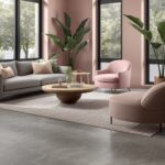
Blush Pink


Okay so I know pink walls sound kinda scary.
But blush pink with beige floors?
Chef’s kiss.
I was terrified to try this in my home office last year, but now it’s genuinely my favorite room in my entire house.
The blush is just enough color to feel special and pretty without being overwhelming or too girly.
Against beige floors, it creates this warm, sophisticated cocoon that still feels grown-up.
The secret is keeping it really soft—like the inside of a seashell, not bubble gum.
You want barely-there pink.
Almost-neutral pink.
This works especially well if your beige floors have any peachy or rosy undertones themselves.
Everything just flows together.
And honestly?
In a world where everything is gray and white, a little blush feels fresh.
Add some brass light fixtures, white bedding, and maybe a jute rug, and you’ve got a space that’s cozy and chic at the same time.
I get so many compliments on my office now.
Sage Green


I’m currently in my sage green era and I cannot get enough.
Muted sage green tones blend beautifully with beige flooring, creating a fresh yet cohesive atmosphere.
I used sage in my living room last fall and it completely changed how I felt in that space.
It went from generic and blah to serene and collected-looking.
Sage has this incredible thing where it feels both warm and cool somehow.
Like it has enough gray to be sophisticated, but enough green to feel alive and organic.
Against beige floors?
So good.
It creates this earthy, grounded vibe that I’m completely here for.
And it works in literally any room—I’ve seen it look amazing in kitchens, bedrooms, bathrooms, hallways.
If you’re into that cottagecore, modern farmhouse kind of vibe, sage and beige is your color scheme.
Add some natural wood furniture, linen curtains, maybe some dried pampas grass in a vase, and you’re basically living in a Pinterest board.
But like, the good kind of Pinterest board.
What’s Your Decor Personality?
5 questions · 30 seconds · Instant style match 🏡
Light Taupe


Light taupe creates harmony and balance being so closely matched to beige yet with enough distinction.
The subtle neutral contrast is sophisticated and pulls the space together for a polished look.
Light taupe works with masculine or feminine styles and serves as a versatile foundation.
Pairs nicely with pale wood furnishings, crisp white trim, and subdued décor elements.
Creates an elegant backdrop for art, photographs, or design accents to stand out.
Both the taupe and beige flatter natural light and allow textures to shine through.
Covers imperfections seamlessly while maintaining visual depth over time.
Choose a cooler undertone taupe if your beige floors lean warm to balance the tones.
A versatile neutral that transitions effortlessly between styles and design eras.
Works for living rooms, bedrooms, or minimalist modern spaces seeking a spa-like vibe.
Highlights luxury materials like marble, wood, or mixed media floors to perfection.
Soft Purple

Soft purple livens up neutral beige floors with a delicate pop of feminine color.
The pale, muted purple tone provides gentle contrast without overwhelming the space.
Works well for bedrooms, nurseries, or lavender-inspired spaces seeking tranquility.
Pairs beautiful with white or off-white moldings/trims for a cohesive look.
Soft purple photographs nicely against the beige backdrop.
Combines well with blush pink, mint green, or soft gray accents.
Brings a romantic, dreamlike feel to the space without strong color saturation.
Choose a very pale lilac or lavender purple for maximum softness.
Over time the subtle purple blends harmoniously into the beige floors.
Flatters light-filtering beige flooring materials like wood, sisal, or seagrass.
Creates a soothing, relaxed vibe that feels graceful rather than overtly feminine.
Large windows allow the pastel tones to glow with natural light.

Pale Orange


I’d like to share with you how using a pale orange wall color can beautifully complement beige flooring.
As a neutral beige floor provides a lovely foundation and backdrop in a room, pairing it with a very soft orange tone on the walls infuses a sense of warmth and welcome.
Orange is such a cheerful, uplifting color, but using it in a light, subdued shade prevents it from overwhelming the space.
The subtle contrast between the pale orange and beige creates lovely visual interest without either color competing for attention.
When choosing an orange, I suggest selecting one with hints of peach or coral undertones to ensure it coordinates seamlessly with beige flooring’s vanilla, sandy hues.
Proper lighting is also key – you want the pale orange to glow without looking too bright against the floors.
This muted pairing resonates especially well for warm, inviting spaces like dining rooms and kitchens.
In my experience designing rooms with this soft color scheme, clients always comment on how the pale orange seems to make the beige floors “pop” while maintaining an understated elegance.
It’s a timeless combination that feels relaxed and tailored all at once.
For those wanting to infuse some warmth and personality into their neutral palette, pairing pale orange walls with beige floors is a beautiful design choice.
This or That?
Pick your fave — see what other readers chose! 👀
💭 I Wrote a Book About My Biggest Decorating Mistakes!
When I decorated my first home, I thought I knew what I was doing. Spoiler: I didn’t. 😅
💸 I bought a sofa way too big for my living room. Paint colors that looked amazing in the store but terrible on my walls.
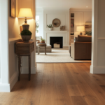
Light Brown


Light brown introduces subtle warmth without being overpowering like a dark brown.
The slight contrast of tones adds visual depth and definition to the space.
Choosing a tawny, putty, or sand-colored light brown ensures cohesion with beige undertones.
Together they create a cocooning, comfortable ambiance that feels polished and inviting.
Furniture stands out while maintaining a peaceful, unified color story.
Works well for living rooms, bedrooms, home offices – anywhere coziness is key.
Transitions seamlessly between modern and traditional styles.
Sits comfortably with warm woods, creams and earthy décor elements.
Over time the similar hues wear evenly for a blended appearance.
Proper lighting prevents the space from feeling flat given the tone-on-tone palette.
A beautiful choice for those seeking a tailored yet soothing neutral scheme.
Well, light brown pairs beautifully with beige floors through subtle contrast that enhances visuals without clash.
Pale Mint


Pale mint infuses a soft pop of cool color while respecting the warm tones of beige.
The subtle contrast creates visual interest without overwhelming the neutral palette.
Choosing an icy mint tone with hints of aqua ensures it plays nicely with beige’s sandy hues.
Together they conjure feelings of a seaside retreat or lush garden oasis.
Works beautifully in bedrooms, living rooms and spa-like bath spaces.
Furnishings stand out against the soothing mint-beige backdrop.
Consider pale coral, blush or white accents that highlight the breath of fresh air.
Over time, marks wear into both colors for a cohesive fade.
Large windows allow the soft tones to bounce natural light beautifully.
Elevates beige from dull to serenely light-filled through an organic pop of pale green.
A prime color choice for those cultivating an aura of tranquil respite.
Pale mint offers serenity and uplift when paired judiciously with beige floors.
✦ You Might Love This
Anyone Not Using Peel And Stick Accent Walls Is Missing Out Big Time Keep Reading →Pale Lavender


Pale lavender infuses a soft romantic touch without overwhelming the neutral palette.
The gentle contrast creates visual interest while respecting the beige undertones.
Choose a light periwinkle or blush lavender tone that nuances nicely with beige.
Together they conjure feelings of tranquility, like drifting on a cloud.
Works beautifully in bedrooms, nurseries, powder rooms – any space where calm is key.
Furnishings and decor stand out beautifully against the ethereal lavender-beige backdrop.
Consider pale pink, mint or blush accents that lift the dreaming vibe.
Over time, the similar tones wear harmoniously for a seamless fade.
Large windows allow the peaceful tones to bounce light like a watercolor.
Elevates beige from plain to serenely dreamy through an ethereal pop of pale purple.
A perfect color choice for cultivating an aura of relaxation and repose.
In essence, pale lavender pairs tastefully with neutral beige floors, imparting an tranquil, feminine ambiance.
Quick Design Dilemma
Cast your vote — see what other readers think! 🤔
Soft Peach


Soft peach introduces a hint of warm sunshine without being overly dramatic.
The subtle contrast creates visual interest while respecting the neutral undertones of beige.
Choose a very pale blush peach tone that has tan or apricot undertones to mesh with beige.
Together they impart a relaxed, coral resort vibe without departing from the palette.
Works beautifully for kitchens, dining rooms, living spaces where entertaining is key.
Furnishings stand out vibrantly against the soothing peach-beige backdrop.

Consider pale aqua, blush or mint green accents that highlight the breath of summer.
Over time, the similar tones wear harmoniously for a cohesive fade.
Large windows allow the breezy tones to bounce warm, natural light.
Elevates neutral beige from plain to glowing through an infusion of soft peach.
Perfect for cultivating an ambiance of relaxed delight and carefree ease.
In essence, soft peach pairs beautifully with beige floors, imparting a feeling of calm sunshine.
Dusty Rose

Dusty rose introduces a touch of soft femininity without overwhelming the neutral palette.
The subtle contrast between the two muted tones creates visual interest and definition.
Choosing a pale blush or antique rose hue ensures it coordinates seamlessly with beige undertones.
Together they evoke feelings of vintage charm and romance in a relaxed way.
Works beautifully for bedrooms, living rooms, powder rooms – anywhere peace is key.
Furnishings and accents stand out beautifully against the rosy-beige backdrop.
Consider pale lavender, blush or antique white accents to highlight the vintage vibe.
Over time, the similar tones will wear evenly together for a cohesive fade.
Large windows allow the peaceful hues to blend with natural light beautifully.
Elevates neutral beige from plain to romantically vintage through a touch of dusty rose.
A lovely choice for cultivating an atmosphere of poetic daydreaming.