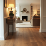
ray floors completely changed how I think about decorating.
They’re this beautiful neutral foundation that somehow works with almost everything, but picking the right wall color?
That’s where I used to freeze up.
I’d stand there with paint swatches, second-guessing every choice, wondering if I was about to make my space feel cold or boring.
But here’s what I’ve learned: gray floors are actually incredibly forgiving, and the wall colors you pair them with can create entirely different moods.
I’ve tested so many combinations in my own spaces.
Some made my rooms feel like a cozy hug, others brought in energy I didn’t know I needed.
I’m sharing all my favorites with you—the ones that truly work.

Crisp White Walls

White walls with gray floors create this clean, modern look that I’m honestly obsessed with.
The contrast is fresh without being harsh, and it makes your space feel bigger and brighter instantly.
I love how white reflects natural light, which is perfect if your gray floors are on the darker side.
Cool-toned grays pair beautifully with pure whites, while warmer grays look stunning with off-white or whites with subtle warm undertones.
This combination works in literally every room—I’ve done it in bedrooms, living rooms, even bathrooms.
One thing I always do: I test the white paint in different lighting throughout the day because some whites can look too stark or even bluish against certain gray tones.
My personal tip?
Add texture through your décor—chunky knit throws, wooden furniture, or linen curtains—so the space doesn’t feel too sterile.
White walls give you the freedom to play with colorful accessories and art without overwhelming the room.
If you want a timeless, versatile backdrop that’ll never go out of style, this is it.
Tap to Explore These Beauties
See my ideas in action 👇 Tap any image to explore full details.
Soft Cream or Ivory Walls

Cream walls bring this warmth that gray floors sometimes need.
I used this combo in my living room, and it completely transformed the vibe from cold to cozy.
The soft, buttery tones of cream create a gentle contrast with gray without competing for attention.
This pairing works especially well if your gray floors have cool undertones—the cream adds balance and prevents the room from feeling too icy.
I love how forgiving this combination is with different lighting situations.
Morning light makes the cream glow softly, and evening light creates this warm, inviting ambiance that feels like a hug.
If you have warm gray floors, go for ivory instead of cream—it’s slightly cooler and won’t clash.
My hack?
Layer in whites and taupes through your furniture and textiles to create depth.
This color scheme is perfect for bedrooms where you want that restful, serene feeling.
I always recommend getting large paint samples and observing them next to your flooring for at least 24 hours before committing.
Warm Beige and Taupe Walls

Beige and taupe walls are my go-to when I want sophistication with warmth.
These earthy neutrals complement gray floors so naturally, creating a cohesive, pulled-together look.
I especially love this pairing in open-concept spaces where the floors flow throughout.
The warm undertones in beige prevent gray floors from feeling cold or industrial.
Taupe is slightly grayer than beige, so it creates this seamless transition that feels intentional and designed.
If your gray floors lean warm (with brown or beige undertones), this combination is perfection.
I’ve used greige-taupe shades in hallways and entryways—they’re incredibly welcoming.
My personal trick?
Go one or two shades lighter on the walls than you think you need because taupe can sometimes feel heavier in enclosed spaces.
This color palette works beautifully with both modern and traditional furniture styles.
Add pops of white trim and molding to keep everything feeling fresh and defined.
I always style these rooms with natural materials—jute rugs, wood accents, linen—to enhance that organic, grounded feeling.

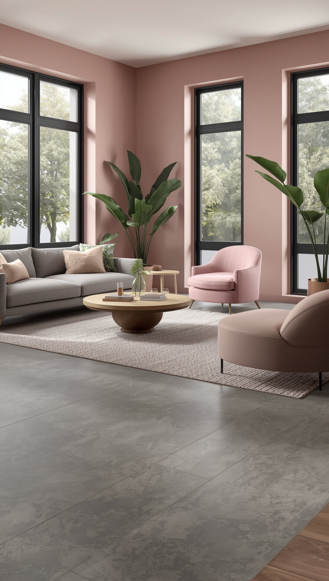
Blush Pink Walls


Blush pink might sound bold, but trust me on this one.
Soft blush walls with gray floors create the most romantic, calming spaces I’ve ever designed.
The coolness of gray floors balances the warmth of blush perfectly—it’s this gorgeous dance between masculine and feminine.
I did this in my bedroom, and I’ve never slept better or felt more at peace in a space.
Blush adds just enough color to make the room feel special without being overwhelming or childish.
This combo works best with light to medium gray floors; darker grays can make blush look too contrasting.
My trick?
Keep your furniture neutral—whites, creams, light woods—so the blush can be the star.
I love adding gold or brass accents because they complement both the pink and gray beautifully.
This pairing is also stunning in bathrooms or dressing rooms where you want a spa-like, luxurious feel.
If blush feels too pink for you, try a dusty rose or mauve shade instead.
Test your paint in different lights—some blushes can look peachy or too bright depending on the time of day.

Find Your Room’s Color Palette
Tap a vibe — get a curated 5-color palette with hex codes you can copy ✨
💭 I Wrote a Book About My Biggest Decorating Mistakes!
When I decorated my first home, I thought I knew what I was doing. Spoiler: I didn’t. 😅
💸 I bought a sofa way too big for my living room. Paint colors that looked amazing in the store but terrible on my walls.
Sage Green Walls

Sage green walls are my current obsession with gray floors.
This combination brings the outdoors in and creates such a calming, nature-inspired atmosphere.
The muted green tones look incredibly sophisticated against gray—never juvenile or overwhelming.
I love how this pairing works in kitchens, bedrooms, and living spaces equally well.
Sage has enough gray in it to harmonize with gray floors while still providing that pop of color.
If your gray floors are cool-toned, sage creates this perfect balance that feels fresh and modern.
Warm gray floors also work, but I’d choose a slightly warmer sage with more olive undertones.
My styling tip?
Bring in natural wood tones and lots of plants to enhance that organic vibe.
White trim and ceiling keep everything feeling airy and prevent the sage from getting too heavy.
I’ve noticed sage green makes rooms feel larger somehow—maybe because it’s so easy on the eyes.
This is one of those color combinations that photographs beautifully too, if that matters to you.
Soft Blue or Sky Blue Walls

Soft blue walls with gray floors feel like a breath of fresh air.
I used this in my home office, and it’s the most peaceful, productive space I’ve ever worked in.
The coolness of blue complements the coolness of gray without making the room feel cold—it’s more serene than chilly.
Light blues work best; anything too saturated can overwhelm the subtle sophistication of gray floors.
I’m particularly drawn to powder blue or sky blue shades that have a slightly dusty, muted quality.
This combination is perfect for bedrooms where you want that restful, tranquil energy.
Bathrooms also benefit from this pairing—it feels clean and spa-like.
My recommendation?
Balance the cool tones with warm wood furniture and brass or gold fixtures.
If your gray floors lean warm, choose a blue with slight gray undertones to prevent clashing.
White bedding, curtains, or trim brighten everything up and keep it feeling fresh.
I always add texture through throws, pillows, and rugs because all these cool tones can feel flat without it.
Charcoal or Dark Gray Walls

Going dark with charcoal walls might seem counterintuitive, but it’s incredibly dramatic and beautiful.
I love the monochromatic look this creates—it’s moody, cozy, and so sophisticated.
The trick is making sure your charcoal walls are a few shades darker than your gray floors to create definition.
This works best in rooms with lots of natural light or spaces where you want that cocoon-like feeling.
I did this in a small reading nook, and it became my favorite spot in the house.
Dark walls make the space feel intimate rather than smaller, especially when you balance them with lighter furniture and décor.
My hack?
Paint the ceiling white or a very light gray to keep the room from feeling too enclosed.
Metallic accents—silver, chrome, or even gold—pop beautifully against the dark backdrop.
This color scheme is stunning in modern or industrial-style spaces.
Add plenty of lighting—table lamps, floor lamps, sconces—because dark walls absorb light.
I style these rooms with plush textiles and comfortable seating to maximize that cozy factor.
What’s Your Decor Personality?
5 questions · 30 seconds · Instant style match 🏡
Navy Blue Walls
Navy blue walls create such a rich, elegant backdrop for gray floors.
This is one of my favorite combinations for creating a statement without going too bold.
The depth of navy contrasts beautifully with the neutrality of gray, and it feels both classic and contemporary.
I’ve used this in dining rooms and bedrooms where I wanted sophistication with personality.
Navy works with all shades of gray floors, but it’s particularly stunning with lighter grays.
The combination feels nautical without being themed, especially when you add white accents and natural textures.
My personal tip?
Use a matte or eggshell finish for navy walls—it looks more expensive and less reflective.
Brass, gold, or warm wood tones balance the coolness of both the navy and gray perfectly.
I always bring in cream or ivory textiles to soften the overall look.
This pairing photographs incredibly well and creates spaces that feel designed and intentional.
If navy feels too dark, try it on just one accent wall first.
Greige Walls
Greige—that perfect blend of gray and beige—is the ultimate harmonious choice with gray floors.
I call this the “can’t go wrong” option because it creates such a seamless, cohesive look.
Greige walls blend beautifully with gray floors while adding just enough warmth to prevent coldness.
This combination works in absolutely every room and with every design style imaginable.
I love how greige creates a sophisticated neutral backdrop that lets your furniture and décor shine.
The key is choosing a greige that’s slightly warmer than your gray floors for subtle contrast.
If your floors are warm gray, go cooler greige; if they’re cool gray, go warmer greige.
My trick?
This pairing makes small spaces feel larger because everything flows together without harsh transitions.
Greige is incredibly forgiving with different lighting conditions throughout the day.
I style these rooms with layered neutrals in different textures—linen, wool, leather, wood—to create depth.
Add pops of color through art, pillows, or plants to prevent the space from feeling too monotone.
This is my recommendation for anyone who wants a timeless, elegant space that’ll age well.
Psst… Check This Out
Matching the Ideal Wall Colors with Dark Brown Carpet : My 6+ Picks Take Me There →This or That?
Pick your fave — see what other readers chose! 👀
Pale Yellow or Butter Walls
Pale yellow walls might surprise you, but they bring such joy to spaces with gray floors.
I’m talking soft, buttery yellows—not bright or bold, but gentle and warm.
This combination creates the most cheerful, sunny atmosphere, especially in rooms that don’t get tons of natural light.
The warmth of yellow completely transforms cool gray floors, making the space feel inviting and energized.
I used this in my kitchen, and it makes me smile every single morning.
The key is choosing a yellow that’s mostly white with just a hint of butter or cream.
Too much saturation will clash with the sophistication of gray floors and feel overwhelming.
💭 I Wrote a Book About My Biggest Decorating Mistakes!
When I decorated my first home, I thought I knew what I was doing. Spoiler: I didn’t. 😅
💸 I bought a sofa way too big for my living room. Paint colors that looked amazing in the store but terrible on my walls.
My styling hack?
Keep everything else pretty neutral—white cabinets, natural wood, simple décor—so the yellow can work its magic.
This pairing is gorgeous in breakfast nooks, kitchens, and bathrooms where you want uplifting energy.
Gray and yellow is a classic color combination that feels fresh and timeless simultaneously.
Add greenery and natural elements to enhance that bright, organic vibe.
Lavender or Soft Purple Walls
Lavender walls with gray floors create spaces that feel dreamy and sophisticated.
I love how the cool tones harmonize while still providing that unexpected pop of color.
Soft, muted purples work best—think dusty lavender or lilac rather than bright violet.
This combination is perfect for bedrooms where you want a calming, restful atmosphere with personality.
The gray floors ground the purple so it doesn’t feel too whimsical or overwhelming.
I’ve also used this in powder rooms and dressing areas where I wanted something special and feminine.
My tip?
Balance the cool tones with warm metallics like brass or rose gold.
White trim and ceiling are essential to keep everything feeling fresh and airy.
If you’re nervous about purple, start with just one accent wall to test the vibe.
This pairing looks beautiful with silver, gray, and white décor for a monochromatic-plus approach.
I always add soft textures—velvet, silk, faux fur—to enhance the luxurious, romantic feeling.
Natural light makes lavender glow softly, while evening light creates a cozy, intimate mood.
Quick Design Dilemma
Cast your vote — see what other readers think! 🤔
Black Accent Walls
A black accent wall with gray floors is pure drama and sophistication.
I know black walls sound intimidating, but when done right, they’re absolutely stunning.
The monochromatic palette creates depth and interest without adding color, which I find so chic.
This works best as an accent wall rather than painting the entire room black.
I’ve done this behind beds, in dining rooms, and even in entryways for maximum impact.
Gray floors prevent the black from feeling too heavy or gothic—they lighten the overall mood.
My recommendation?
Make sure you have excellent lighting—both natural and artificial—to balance the darkness.
Metallic accents, mirrors, and glossy surfaces reflect light and add dimension.
I style these spaces with lighter furniture and lots of white or cream textiles to create contrast.
This combination is perfect for modern, minimalist, or industrial design styles.
Black matte paint creates a sophisticated, velvety look that feels expensive and intentional.
If you’re hesitant, try black on just one wall and see how transformative it is.
Terracotta or Clay Tones
Terracotta or clay-toned walls bring such warmth and earthiness to spaces with gray floors.
This combination feels organic, grounded, and incredibly stylish right now.
The warm rust and orange undertones in terracotta create a beautiful contrast with cool gray floors.
I’m obsessed with this pairing in living rooms and bedrooms where I want cozy, inviting energy.
Terracotta adds personality and warmth without being too bold or overwhelming.
Gray floors keep the terracotta from feeling too rustic or Southwestern-themed.
My trick?
Choose muted, dusty terracotta shades rather than bright burnt orange.
This pairing works beautifully with natural materials—rattan, jute, leather, wood—to enhance that earthy vibe.
I always add plenty of greenery because plants look absolutely gorgeous against terracotta.
Cream and ivory accents soften the overall look and prevent it from feeling too warm or heavy.
This combination photographs beautifully and creates spaces that feel collected and intentional.
If terracotta feels too bold, try it on just one accent wall first to test the energy.