When it comes to selecting colors for your home’s walls, choosing shades that complement your flooring is key.
This is especially important for rooms with beige or off-white carpeting, as these neutral hues can be paired with a wide variety of soft, calming wall colors.
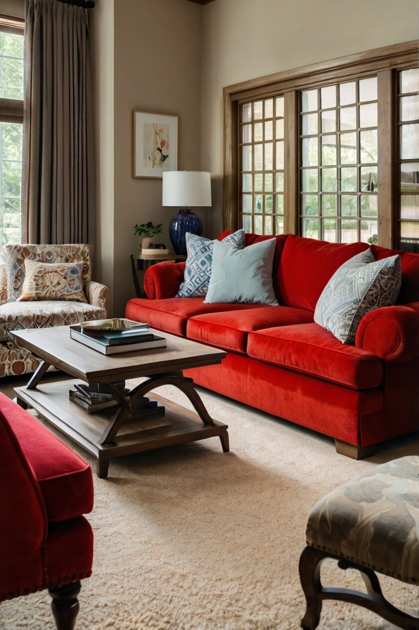
Beige carpet serves as a lovely backdrop that won’t overwhelm, allowing the walls to take more of a starring role in the overall aesthetic.
However, picking the right wall color for beige floors requires finding a balanced match that provides visual interest without discord.
In this article, I will explore 15 top recommendations for wall paint colors that work especially well with beige carpeting.
Whether you’re aiming for a bright and airy vibe or something richer and deeper, one of these versatile palettes is sure to pair beautifully.
Here are 15 color picks for walls that go with beige carpet:
Light Gray

I view interior design through a sartorial lens.
Light gray walls paired with beige carpet is a chic yet neutral combination that balances contrast with cohesion.
Light gray has the versatility of charcoal without being as severe.
It adds definition to beige carpet in the same way a pinstriped blazer brings tailored lines to a creamy button-down.
The light gray serves as your “statement color” while beige acts as the canvas, letting the shade sing without clashing.
Just like a quality fabric, light gray provides texture that prevents the space from feeling flat.
It lends visual interest while allowing the warm beige fiber to flexibly “layer” underneath as your base.
Together they produce dimensionality and movement within the neutral palette.
Opting for a light, cool-toned gray maintains brightness so the arrangement doesn’t come across as dull.
The beige tempers any harshness than deeper charcoal may impart.
Their balancing act achieves a sophisticated merger of dark and light for a polished, pulled-together aesthetic.
In short, this color combination exhibits perfect proportion—one shade gives while the other takes so they play off each other’s strengths in a harmonious whole, just like the synergistic layers of a well-tailored look.
Light gray walls with beige carpet is a chic template that will never go out of style.
White
I appreciate white walls with beige carpet as a crisp, clean slate that acts as the perfect blank canvas.
Just like a pristine white blouse allows accessories and trousers to shine, white walls let the warm texture of the beige carpet take center stage.
The high-contrast combination keeps things fresh and current.
It’s a minimalist take on neutrals that makes a bold style statement without bold colors.
Together, white and beige achieve an effortlessly chic vibe that is endlessly versatile – much like a little black dress that pairs well with any shoes or jacket.
The bright, sun-washed white acts much like bias-cut silk – it flows beautifully around the curves of a room while making the entire space feel lifted and airy.
At the same time, the cozy beige carpet anchors it all with soothing substance, just as crepe de chine lends gentle drape.
Their balance of crisp versus cushy parallels textural contrasts that are key to sophisticated fashions.
Most importantly, this fresh color scheme leaves ample room for personal touches and interior “accents” much like statement jewelry, patterned scarves or texture plays elevate a monochrome outfit.
With white walls, beige carpet serves as the foundation for endless seasonal style updates.
Together, they define the clean, livable aesthetic that is always in fashion.
Cream

I’m drawn to the cozy yet polished vibe of cream walls paired with beige carpet.
Their near-matching tones create an enveloping sense of warmth, akin to a sumptuous cashmere sweater.
Cream takes the edge off of stark white without muddying the color palette.
Its subtle difference from the beige carpet produces harmony rather than high contrast.
This relaxed interplay is like mixing versatile knit and flannel fabrics for an easy, layered look.
The cream acts as a silky lining to the carpet’s plush exterior.
Their blurred boundary has a smoothing effect much like a fluid bias cut.
It provides comforting continuity throughout the space rather than visual lines of demarcation between surfaces.
Together, the gentle colors evoke the broken-in feel of beloved vintage linen.
Their lived-in tones feel immediately comfortable and welcoming.
The coziness is enhanced much like textural accents on furnishings, from plush pillows to frayed jute rugs.
In both fashion and interiors, cream and beige form an easy partnership that flatters every season.
Their nonchalant take on neutrals projects effortless style from every angle.
Light Taupe

I see light taupe walls with beige carpet as a chic way to play with dimension within an understated neutral palette.
The subtle contrast is like adding an touches of cream to beige – it creates visual interest without overwhelm.
Taupe adds warmth and depth to light-reflecting beige, bringing out its best qualities much like contour enhances complexion.
Together they exude sophistication, much like a monochrome outfit is elevated with the subtlest patterns, accents or sheers.
The beige serves as the perfect backdrop to let the taupe take the lead, but not overpower.
Their balanced alliance makes the space feel polished and purposeful without pretension – much like mix of matte and sheen brings tactile pops to streamlined separates.
This muted color scheme also maintains flexibility.
Just as separates in neutral tones can span many moods, so the versatile beige and taupe backdrop allows for lively accents and accessories.
Overall, the light taupe walls create flattering dimension to the cozy beige carpet.
Their synergy hits the sophisticated sweet spot.
Light Yellow

Light yellow has the energizing effect of a bright blazer or statement heels that perk up plain beige.
Its subtle use of color adds personality without discord.
The pale tone acts like a touch of saffron or sunshine yellow cashmere – it warms the beige without diminishing its versatility.
Together, they project the beachy ease of a cropped linen combo or sundress, perfect for casual living spaces.
Just as white jeans and a lemon top can tie-dye effortlessly, the layered look of light yellow walls and beige carpet creates a balanced, luminous ensemble for the home.
Their interaction provides harmony through contrasts in temperature rather than value.
It’s a dynamic, upbeat take on neutrals.
Much like decorating with patterned pillows or a striped rug, the pale yellow enlivens without restricting other styling options.
Overall, this color combination brings a welcome vibrancy that leaves abundant room for seasonal styling adjustments, just as a basic sundress allows endless fun accessories and footwear play.
It’s a fresh, cheerful design that stays forever on-trend.
Light Green
The light green has the soothing effect of a relaxed knit or linen top layered over beige pants – it brings out natural undertones yet provides breathing room.
Together they create a blend somewhere between freshly-mown grass and new leaves, evoking feelings of tranquility much like sustainability-dyed fabrics in organic hues.
The pale shade acts as a complement rather than contrast, allowing the beige carpet to anchor the color story like an eco-friendly boot or sandal grounding an outfit.
Their balanced pairing has an organic appeal like combining natural fibers, lending harmony to any style of decor whether modern or rustic.
Subtle texture and vibrancy emerge from the juxtaposition, keeping the palette soft yet engaging like delicate florals on a muted backdrop.
This adaptable background leaves options to accessorize with greenery, artwork, woven pieces – paralleling renewable materials tailored for any season.
Much like outfitting for coastal gardens or mountain getaways, light green and beige bring a relaxed sense of ease and renewal to contemporary living spaces.
Their synergy is forever in vogue.
Pale Blue

A pale blue wall acts as a serene counterpart to beige carpet much like a breathable cotton sundress pairs with tan or nude accessories.
The soft hue has a calming effect similar to casual vacation wear, transporting the mind elsewhere.
When used in a lighter, faded tone, blue creates harmony rather than contrast on a beige backdrop.
It enhances the peacefulness without visual imbalance, Just as ribbed knits or gauzy kimonos can be layered over neutral solids.
Together, the pale blue and beige exude simplicity and luxury, akin to linen or silk fabrics that gain character through minimal laundering.
Their synergy feels fluid and lived-in and works for any mood or season much like versatile basics.
Stylish accents can then be added to the understated palette, mirroring how scarves, jewelry or footwear transform a neutral outfit.
Functioning like a blank canvas, the colors welcome personal expression without restriction.
Overall, pairing a light, sky-tinged blue with beige carpet cultivates serenity and sophistication.
Their balanced partnership is forever on-trend yet timeless.
Dusty Rose

A blush pink-toned dusty rose warms up beige carpet much like cerise or mauve cashmere brings a soft flush to a neutral sweater or top.
The faded, dusty quality creates harmony rather than high contrast, allowing both the rose and beige tones to blend beautifully like mohair blended with wool.
It enhances the carpet’s warmer undertones in a flattering way, balancing delicate femininity with easy sophistication – similar to pairing cropped culottes with a ruffled blouse.
The vintage-inspired rose works for any decorating style, from beachy bohemian to traditional glam.
Its flexibility is like a ballet flat that dresses up or down easily.
Textural layering comes alive through their synergy, as the soft rose complements beige in a bucolic, pastoral manner like printed muslin complements linen.
Emotive yet serene, their cohesion has wide appeal – just as rose hues make any skin tone glow whether in lipstick or blush application.
Overall, dusty rose walls and beige carpet create a welcoming intimate ambiance through simplicity and balance of tones.
The ensemble remains forever on trend.
Gray-Brown
A taupe-brown shade adds depth and dimension to a space without optic intensity.
It provides the same grounding effect as neutral woven layers like herringbone or hounds tooth.
The gray undertone prevents the brown from pulling too warm against beige.
Their synergy has subtle richness like chocolate cashmere or a soft leather tote accenting camel layers.
Together the colors convey prestige and heritage but in an understated way.
They cultivate timelessness much like investment silhouettes in durable fabrics meant to patina beautifully.
Gray-brown lends itself to seamless transitions between traditional and contemporary accents.
Its malleability allows for versatile styling parallel to a camel coat pairing with cultural jewelry or footwear.
The beige acts as the supporting material, highlighting subtle texture within the gray-brown field.
Their balanced integration gives permission to tap into many aesthetics like mixing ethnic patterns with solids.
Overall, this pairing achieves polished gravitas through earthy color marriages that feel effortlessly put together yet invitingly lived-in.
A timeless neutral ensemble.
Salmon
A coral-pink salmon adds a pop of color that feels vibrant yet cozy against beige carpet.
It livens the space much like a bright blazer or scarf against neutral separates.
The tone brings to mind ocean sunsets or tropical blooms, balancing the carpet’s relaxed feel with summery cheerfulness.
It has an upbeat yet grounded effect.
Subtle sheen from the salmon mimics the luminosity of silk or satin, creating flattering dimensional interplay with the beige fiber.
Their balanced interaction has wide appeal, whether in modern condo or beach rental.
It’s a vibrant yet calming ensemble reminiscent of seaside style.
Both the salmon and beige act as canvas for complementary accents, from shell decor to jute rugs – much like accessories complete an outfit’s effortless vibe.
Being a natural flush, salmon enhances every skin tone – translating to its ability to pair gracefully with diverse furnishings as well.
Overall, this pairing infuses refreshing energy into neutral spaces through a softly brightening coral tone that feels fresh and flattering from season to season.
Light Wood
Light wood brings texture and warmth to beige without overwhelming it.
The tone has the layered look of soft birch or maple much like linen paired with cashmere.
Its pale pigment allows the grain and subtle variegations to shine through, creating organic movement reminiscent of textured fabrics like slubby cotton.
Against beige, the wood takes on golden amber undertones that flatter natural lighting in a way akin to how tan or Together they project comfort and luxury, evoking laidback elegance like breezy sundresses of linen and lace.
Both wood and carpet serve as a sophisticated blank slate, welcoming accent pieces and artwork to anchor various moods and seasons.
Their synergy feels simultaneously fresh and heritage-inspired, appropriate for any style be it coastal, country or vintage industrial.
Light wood leaves space to enhance with woodland-inspired textures from rattan to macramé, just as breezy separates pair well with woven accessories.
Overall, the pairing brings warmth and depth to the neutral space through natural elements that truly stand the test of stylistic time.
A balanced foundation for endless seasonal enhancements.
Chocolate
Chocolate brown adds richness and contrast without being overly bold.
It has the plushness of a wool or cashmere coat against nude or tan layers.
The saturated tone enhances surrounding neutrals like how defined eyes bring out nude lip color.
Its dimensionality is flattering.
When used in a deeper shade, chocolate feels luxurious and sophisticated – like pairing cream cable knits with leather pants or a skirt.
Textures emerge between the smooth carpet and matte brown, creating balanced interplay similar to mixing fine knits with soft leather accessories.
Earthy warmth pervades in a grounding way that feels opulent yet casual.
It has versatility to suit both modern and traditional spaces.
Beige allows the brown to shine as the star factor, performing a supporting role much like solid tops under printed separates or jackets.
Together they make a statement while leaving room for richly colored accents and patterns, akin to how statement jewelry punctuates a monochrome look.
The chocolate brown and beige combination conveys prestige through a sensual, balanced marriage of tones with timeless appeal.
Dusty Lavender
Dusty lavender infuses a space with femininity and charm without being too delicate.
Its warm undertone resembles the soft hue of blush cashmere.
Paired with beige, the dusty lavender enhances the carpet’s warmth in a lovely, muted way – like teaming a dusky mauve top with camel pants.
The vintage-inspired shade feels romantic and pastoral.
It lends an air of relaxed sophistication to both modern and traditional interiors.
Subtle texture emerges between the smooth carpet pile and matte lavender paint, creating visual synergy akin to mixing knits and tweeds.
Both colors act as a serene backdrop, allowing furnishings and decor to shine in the same way neutral separates showcase patterned scarves or jewelry.
Their balanced pairing feels peaceful yet engaging, suited to welcoming informal gatherings much like an easygoing outfit of draped silks.
Multiple accent palettes may be incorporated seasonally, keeping the lavender and beige everlasting – just as staple neutrals dress up or down with ease.
The feminine lavender tone combined with neutral beige cultivates relaxed charm through a pretty yet grounded aesthetic that stands the test of time.
Grayed Olive
A grayed olive wall color adds depth and warmth to neutral spaces.
Its mossy tone has an organic texture reminiscent of velvet or tactile wools.
When paired with beige, the grayed olive enhances underlying natural notes without overwhelming.
Their synergy has yin and yang balance like olive and cream mixed fabrics.
Together the colors feel heritage-inspired yet versatile, suited to both rustic and contemporary interiors.
They possess the adaptability of earthy, camel-colored separates.
Beige allows the grayed olive hue to shine as a subtle statement tone, serving as complement rather than contrast much like solid pants let a graphic sweater take focus.
Dimension emerges from their interaction, much like slubbing adds lively movement to otherwise muted pieces.
The palette feels lush and layered.
Accent pieces in varied textures, like jute, macramé and wood, feel at home framed by the nature-inspired foundation.
Overall, grayed olive creates warm nuance amid neutrality, establishing a backdrop with organic richness and relaxed sophistication for endless seasonal personalization.
Its style is forever relevant.
Putty
A putty wall color brings warmth and calmness to the space.
Its pale taupe hue has an organic texture like soft linen or slubby cotton.
When paired with beige, the putty enhances the carpet’s natural undertones in a soothing way – like wearing cream knits with pale denim.
Their muted interaction feels light and breezy.
It lends versatility to both casual and formal interiors much like linen dresses up or down with ease.
Subtle texture emerges between the smooth carpet pile and matte putty paint, creating balanced visual movement akin to textured fabrics.
Together the colors leave space for rich accents and patterns while feeling freshly layered, much like how statement jewels stand out against pared-back neutrals.
Multiple decorative palettes may be incorporated seasonally while keeping the putty-beige foundation rooted, just as linen coordinates endlessly.
Overall warmth imbues through their partnership creating a tranquil yet engaging backdrop suited for relaxed modern living much like easygoing natural fibers.
The putty colorway enhances neutral foundations with calming substance and versatility for a look that remains timelessly on trend.
As a fashion designer understands, color pairing plays a pivotal role in establishing a space’s aesthetic cohesion and mood.
When selecting hues for walls to complement beige carpet, thoughtful attention to harmony, balance, dimension and versatility will cultivate sophistication and long-lasting style.
Much like putting together an emotive yet pragmatic outfit, choosing paint colors that bring out natural undertones in the carpet without overwhelming allows both elements to shine through beautifully on their own or when combined.
The right tints provide substance without sacrificing calmness.
Whether opting for soft pastels, moody earth tones, vibrant pops or neutral deep shades, wall colors that enhance carpet textures through synergy rather than contrast create dynamism and visual interest.
They establish a sense of warmth inviting to both the occupant and guest.
Furthermore, such balanced pairings serve wonderfully as a blank slate for seasonal personalization through layered fabrics, patterns, artwork and accents.
Just as quality basics remain forever trend-right when diversified appropriately.
Ultimately, taking inspiration from color marriages found in fashion makes interior design an expressive extension of one’s personal style.


