remember the first time I walked into my current home.
The warm, honeyed glow of the golden oak floors instantly caught my eye.
They were breathtaking, but I was stumped when it came to picking the right wall paint to complement them.
I spent hours (okay, weeks) obsessing over paint swatches, testing different shades, and researching what would bring out the best in those floors without clashing or overwhelming them.
It wasn’t until I finally nailed the perfect combination that the room truly came alive.
If you have golden oak floors and you’re scratching your head over what color to paint your walls, I’ve got you covered:

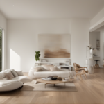
Soft Gray: The Modern Neutral

If you’re aiming for a clean, modern look, soft gray is a stellar choice.
Golden oak floors have warm undertones, and pairing them with a cool-toned gray creates a balanced contrast.
The gray softens the warmth of the wood while letting its natural beauty take center stage.
For a truly harmonious vibe, go for a light gray with just a hint of beige or greige (gray + beige).
This subtle warmth in the paint helps tie the walls and floors together without feeling too stark or cold.

You also have versatility with soft gray because it works beautifully in almost any room—whether it’s a living room, bedroom, or even kitchen.
To make the space pop, you can add accent pieces like navy or charcoal throw pillows, rugs, or wall art.
If you want to keep the look minimalistic, stick to white or soft neutral décor.
Soft gray is a timeless choice that works wonders in making golden oak floors feel fresh and updated.
Tap to Explore These Beauties
See my ideas in action 👇 Tap any image to explore full details.
Warm White: The Classic Complement

Sometimes, simplicity is key, and nothing beats the timeless appeal of warm white walls.
A warm white paint emphasizes the golden tones in your oak floors without competing with them.
This pairing creates a bright, airy atmosphere that feels clean but still inviting.
Look for whites with creamy or buttery undertones rather than stark, pure whites, which can feel too cold against warm wood.
Warm white is especially lovely in spaces that get a lot of natural light, as the sunlight will enhance the subtle warmth in both the wood and the walls.

Another bonus?
Warm white acts as a blank canvas for your décor.
You can introduce pops of color through furniture, artwork, or textiles without worrying about clashing with your walls or floors.
If you love that timeless, cozy, yet elegant aesthetic, warm white is a no-fail option.
Sage Green: The Earthy Charmer

For a splash of color that still feels soft and soothing, sage green is a fantastic option.
This muted green has gray undertones that balance beautifully with the golden hues of oak floors.
Sage green brings a touch of nature indoors, creating a serene and grounded space.

It works especially well in living rooms and bedrooms, where you want to foster a relaxing vibe.
Pair sage green walls with natural textures like woven baskets, linen curtains, or a jute rug to enhance the earthy appeal.

One of the best things about sage green is its adaptability—it can feel modern, traditional, or even a little bohemian depending on how you style the rest of the room.
If you’re someone who loves a hint of color without going overboard, sage green offers just the right amount of personality while keeping things calm and cohesive.
Navy Blue: The Bold Statement

Feeling daring?
Navy blue is a bold and sophisticated choice that pairs beautifully with golden oak floors.
The deep, rich color creates a striking contrast against the warmth of the wood, creating a dramatic yet balanced look.
Navy works particularly well in spaces where you want to make a statement, like a dining room or a home office.

Find Your Room’s Color Palette
Tap a vibe — get a curated 5-color palette with hex codes you can copy ✨
💭 I Wrote a Book About My Biggest Decorating Mistakes!
When I decorated my first home, I thought I knew what I was doing. Spoiler: I didn’t. 😅
💸 I bought a sofa way too big for my living room. Paint colors that looked amazing in the store but terrible on my walls.
To prevent the room from feeling too dark, balance navy walls with light-colored furniture or trim.

White baseboards, creamy curtains, or light-colored upholstery can help brighten the space and keep it from feeling heavy.
Another tip: add metallic accents like gold or brass, which complement both navy and oak floors beautifully.

Navy blue is a bold move, but when done right, it can elevate your space and make those golden oak floors stand out in the best way possible.
Taupe: The Subtle Sophisticate

If you’re after a neutral paint color with more depth than white or gray, taupe is an excellent choice.
Taupe is a warm, earthy color that sits somewhere between beige and gray, making it a perfect partner for golden oak floors.
The key to choosing the right taupe is to look for one with warm undertones to complement the honey tones in the wood.
This pairing creates a cozy, sophisticated atmosphere that works well in living rooms, bedrooms, or even hallways.

Taupe is incredibly versatile, making it a great backdrop for both modern and traditional décor styles.
It pairs beautifully with cream or white accents, as well as darker wood furniture, giving you plenty of options when it comes to styling your space.

To add a little drama, you can incorporate metallics like bronze or copper in your lighting fixtures or decorative accents.
Taupe is one of those “just right” colors—neutral enough to let your golden oak floors shine but rich enough to add character to the room.
Mushroom Beige: The Cozy Neutral

Mushroom beige is another warm-toned neutral that complements golden oak floors beautifully.
It’s slightly darker and earthier than taupe, with a bit of a gray-brown undertone that adds dimension to your walls.
This shade works exceptionally well if you’re looking to create a cozy, inviting space that feels grounded and timeless.
Mushroom beige has a naturally calming effect, making it ideal for bedrooms, dens, or family rooms where you want to unwind.
Pair it with soft, cream-colored textiles, natural wood furniture, and greenery to enhance its warm, earthy vibe.
If you want to add a pop of contrast, deep greens or navy accents can look stunning against mushroom beige walls and golden oak floors.
This color strikes the perfect balance between neutral and bold, allowing your space to feel stylish yet understated.
What’s Your Decor Personality?
5 questions · 30 seconds · Instant style match 🏡
Charcoal Gray: The Luxe Contrast

If you’re craving something a little moodier, charcoal gray could be just the ticket.
This deep, rich shade creates a striking contrast with golden oak floors, giving your room a modern, high-end feel.
Charcoal gray works particularly well in larger spaces or rooms with plenty of natural light, as the darker color can make a smaller, dimly lit room feel cramped.

To keep the look balanced, pair charcoal gray walls with lighter furniture, white trim, or metallic accents like brushed nickel or chrome.
The cool tones in charcoal gray create a beautiful counterbalance to the warm undertones in your oak floors, achieving a look that feels fresh and contemporary.

This is an especially great option for dining rooms or offices where a dramatic, polished aesthetic is the goal.
If you’re ready to make a bold statement and elevate your space, charcoal gray might just be the showstopper you’re looking for.
Soft Blue: The Airy Escape

Soft blue walls paired with golden oak floors create a light and breezy atmosphere that feels like a breath of fresh air.
This color works particularly well in bedrooms, bathrooms, or any space where you want to evoke a sense of calm and relaxation.
Opt for a blue with subtle gray undertones to keep it from feeling too bright or juvenile.

The cool tones in soft blue contrast gently with the warm hues of golden oak, creating a balanced and serene aesthetic.
For a coastal-inspired look, pair soft blue walls with white trim, wicker furniture, and natural textures like sisal rugs or linen curtains.

If you lean more toward modern décor, sleek white or gray furniture and silver accents can give the space a contemporary edge.
Soft blue is one of those colors that instantly makes a room feel tranquil, making it a perfect complement to your golden oak floors.
Terracotta: The Warm Embrace

Terracotta is a rich, earthy color that brings out the warmth in golden oak floors.
Its reddish-orange undertones create a cohesive, welcoming vibe that feels grounded and inviting.
This color works wonderfully in spaces where you want a cozy, rustic aesthetic, like a living room or kitchen.

To avoid overwhelming the space, balance terracotta walls with neutral furniture, soft cream accents, and natural materials like wood or stone.
Terracotta pairs especially well with greenery, so consider adding a few potted plants to complete the look.

This color also works beautifully with bohemian or southwestern-inspired décor, making it a great choice if you love that warm, eclectic style.
Terracotta is bold yet approachable, giving your space a unique personality while fully embracing the golden tones in your floors.
This or That?
Pick your fave — see what other readers chose! 👀
Blush Pink: The Subtle Romantic

Blush pink might not be the first color you think of, but it’s a surprisingly stunning choice for golden oak floors.
This soft, muted pink has warm undertones that complement the honeyed hues of the wood, creating a space that feels elegant and feminine.
Blush pink works particularly well in bedrooms, nurseries, or even bathrooms where you want a touch of softness and sophistication.
Pair it with white or cream accents to keep the look light and airy, or introduce metallic touches like rose gold or brass for a more glamorous vibe.
💭 I Wrote a Book About My Biggest Decorating Mistakes!
When I decorated my first home, I thought I knew what I was doing. Spoiler: I didn’t. 😅
💸 I bought a sofa way too big for my living room. Paint colors that looked amazing in the store but terrible on my walls.
Blush pink is also incredibly versatile—it can feel modern, vintage, or even a little whimsical depending on how you style the rest of the room.
If you’re ready to step outside the box and try something fresh yet timeless, blush pink might be the perfect fit.
Olive Green: The Natural Connection

For a rich, earthy look that feels deeply connected to nature, olive green is a fantastic choice.
This muted green has warm undertones that pair beautifully with golden oak floors, creating a harmonious and grounded space.
Olive green works particularly well in dining rooms, offices, or even entryways where you want to make a strong yet natural statement.

To balance the depth of olive green, incorporate lighter furniture, neutral accents, and plenty of natural light.
You can also enhance the natural vibe by adding wood or leather furniture and plenty of greenery.

Olive green is a bold yet versatile color that adds depth and character to any space, making it a perfect companion for your golden oak floors.
Quick Design Dilemma
Cast your vote — see what other readers think! 🤔
Rich Cream: The Cozy Glow
Rich cream is a slightly warmer, deeper version of white that creates a cozy, inviting atmosphere.
This color enhances the honey tones in golden oak floors, making the entire room feel warm and cohesive.
Rich cream works beautifully in almost any space, from living rooms to kitchens to bedrooms.
Pair it with soft, neutral furniture and natural textures like woven baskets or linen curtains to create a relaxed, homey vibe.
For a more polished look, add metallic accents like gold or bronze, which complement both the walls and the floors.
Rich cream is a timeless, versatile choice that will never go out of style.
Pale Lavender: The Unexpected Elegance
If you’re looking for a color that’s soft, sophisticated, and a little unexpected, pale lavender might be just the thing.
This subtle purple hue has gray undertones that keep it feeling modern and understated rather than overly sweet.
Pale lavender creates a gentle contrast with golden oak floors, resulting in a space that feels fresh and elegant.
This color works particularly well in bedrooms or bathrooms, where it adds a touch of serenity and charm.
Pair it with white or gray accents to keep the look cohesive, or introduce metallics like silver for a more luxurious feel.
Pale lavender is a unique yet approachable choice that brings out the best in your golden oak floors.