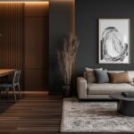


hen choosing colors for flooring and walls, it’s important to pick shades that complement each other and create a cohesive look and feel for the room, don’t you agree?
Light brown flooring is a very versatile option that pairs well with many different wall colors.
In this article I will explore 20 wall color options that work well with light brown floors.
Pairing the right hues can make a space feel warm and inviting.
The selections below include light, medium and darker tones that all harmonize nicely with beige or tan flooring.
Whether you’re looking for a neutral backdrop or want to add some visual interest, keep reading to find on-trend wall colors that will match light brown floors beautifully.

Light Gray
Both light gray and light brown are neutral colors that don’t compete for attention.
This allows them to complement each other without clashing.
Light gray has subtle cool undertones similar to light brown floors.
This unifies the color scheme and makes the floor and walls feel cohesive.
Light gray is a lighter color than the floor.
It helps make the room feel brighter, airier and more open.
The light floor and walls bounce light around well.
As a neutral hue, light gray goes with many decor styles.
It acts as a crisp, clean backdrop that doesn’t detract from furniture, art or other features.
Light tones disguise dust and dirt better than dark colors.
This makes light gray low-maintenance as a wall color near high-traffic areas.
The light gray and brown color pairing is a classic that never goes out of style.
It lends rooms a sophisticated yet comfortable ambiance.
Together, the light floor and walls create a sense of increased space because they don’t optically shrink the room size.
Light gray complements light brown floors as they are similar neutral hues that blend beautifully while also making rooms feel light, bright and spacious.
It’s a perfect wall color match.
Tap to Explore These Beauties
See my ideas in action 👇 Tap any image to explore full details.
Off-White
I often recommend off-white as a wall color to pair with light brown flooring.
Off-white has just a hint of color that softens the starkness of pure white walls.
It introduces subtle warmth that complements wood tones beautifully.
The slight variation from neutral white allows the off-white paint to recede and not compete with the flooring as the focal point.
It provides a balanced backdrop.
Like light gray, an off-white paint grade reflects more light than the floors.
This makes the space feel brighter and more uplifting visually.
An off-white with hints of cream, beige or yellow create coziness without looking dull or dated like an all-beige color scheme might.
The similar lightness of the off-white and floor means they visually blend together as a cohesive unit.
This creates flow throughout the home.
Lighter colors that aren’t bright white are more forgiving of imperfect walls or floors and don’t show scuffs as easily.
An off-white neutral is palatable to most clients and transitions well between styles – from modern to traditional.
It’s a safe choice.
As a designer I find off-white to be the ideal soft, luminous wall color to beautifully complement light-toned hardwood floors and make spaces feel both peaceful and polished.
Light Beige
Light beige has similar warm, earthy undertones as light brown flooring.
This creates harmonious continuity between the floors and walls.
The shade is just slightly darker than off-white but not so different that it creates unwanted contrast.
It’s a near-match.
The muted, mellow tone exudes luxury and calm.
It feels high-end despite being affordable to paint.
Light beige pairs nicely with both modern and traditional styles.
It’s a chameleon color that takes decor cues from accessories.
Small nicks or stains don’t show through light beige the way they would on pure white.
It’s very forgiving.
From living rooms to bedrooms, the warm tone promotes relaxation throughout the home.
Like off-white, light beige has enduring broad appeal that doesn’t date quickly with color trends.
The gentle hue enables seamless flow between hardwood floors and plaster or drywall surfaces.
Choosing a light beige to match light brown wood tones creates an elegant, serene interior scheme through consistent undertones and subtle contrast.
It allows the beauty of the flooring to shine.
Pale Yellow
Pale yellow is lighter and brighter than the brown flooring.
It makes the room seem more cheerful and stimulating.
The subtle difference between the yellow and brown creates visual interest without drawing too much contrast away from the floors.
Yellow has emotional power to lift moods and induce happiness.
Pale shades create a soothing yet inviting atmosphere.
Pale yellow blends with both contemporary and traditional furnishings better than bright primary yellows.
It’s a chameleon.
The warm hue emphasizes the beauty of the grain in light brown wood rather than competing against it.

💭 I Wrote a Book About My Biggest Decorating Mistakes!
When I decorated my first home, I thought I knew what I was doing. Spoiler: I didn’t. 😅
💸 I bought a sofa way too big for my living room. Paint colors that looked amazing in the store but terrible on my walls.
It provides a pop of light-infusing color compared to boring off-whites but is still calming and won’t induce eyestrain.
Pale yellow can take wear-and-tear better than most colors while easily hiding dirt or scuffs.
The soft yellow is a perennial favorite with antiseptic, sunshiny appeal that feels fresh season after season.
With its soft saturation, pale yellow plays nicely with most accent hues and decorative elements.
So in summary, pale yellow uplifts and unifies interior spaces paired with light brown floors through its cheery yet serene qualities.
It infuses life into a room.
Find Your Room’s Color Palette
Tap a vibe — get a curated 5-color palette with hex codes you can copy ✨
Light Taupe
I appreciate how light taupe has subtle sophistication without feeling sterile.
It creates a cocooning warmth.
The grayed tone implies sophistication but can also evoke textures like suede or light brushed wool.
This makes it feel interesting.
With its beige-gray blend, light taupe beautifully matches the undertones of light wood floors for continuity throughout open floor plans.
Being a grayed neutral, taupe complements furniture and decor ideas spanning rustic, modern and eclectic styles.
It’s endlessly adaptable.
The pale hue casts an uplifting glow that lets other elements shine while preventing the space from appearing dim.
Pairing taupe walls with natural light flooring provides homeowners an anchored, soothing feeling along with visual cohesion.
I find light taupe exudes luxury despite its affordability.
It’s the perfect elegant “greige” and impresses clients.
Whether mixing textures, layering patterns or curating an art collection, taupe is a perfect color flexible blank slate.
As a designer I believe light taupe is a top choice to magnify the beauty of wood flooring through its subtle sophistication and glow.
It’s a wonderfully grounding neutral.
Dusty Blue

Dusty blue evokes feelings of serenity and calm.
It offers a relaxing balance to warm wood tones.
The subtle blue-gray hue contrasts just enough with brown for visual interest without overwhelming the space.
Like pale gray, dusty blue brings a soft brightness that spreads indirect light without being stark.
This makes floors pop.
From modern farmhouse to coastal glam, dusty blue melds with various decors gracefully like a chameleon.
It’s very flexible.
The cool-toned mute backdrop emphasizes the beauty and natural texture of the brown floorboards.
Homeowners revel in the spa-like zen character dusty blue infuses regardless of a room’s intended function.
Flat or matte dusty blue delivers an organic style without glossiness that could diminish hardwood’s luster.
Lightweight dusty blue hides scratches and scuffs well as it weathers over time for an antique softened look.
So, dusty blue pairs perfectly with light brown wood as its calming nature enhances floors through serenity and subtle contrast for an effortlessly elegant space.
💭 Ever wondered what your room would actually look like rearranged?
I built a free tool that lets you drag furniture around a 2D floor plan. No signup, no catch.
See the Room Planner →Light Green
Light greens have an invigorating, youthful vibe that prevents spaces from feeling stale.
It encourages activity.
The pale green blends the refreshment of cool mint with just enough friendly grassiness to harmonize with wood tones.
Provides visual interest versus neutral grays or blues as a bolder alternative, while still respecting the floor as the focus.
Light minty greens have stood the test of time, from 70s interiors to modern farmhouses, always feeling new.
It’s a classic pop.
Light green marries well with botanicals, earth tones, and can even pair with pastels like light blue or pink without discord.
The hue has stress-reducing qualities and creates an environmental sense of nature indoors.
Homeowners appreciate this.
Great for bedrooms and living areas where homeowners want their wood floors’ natural texture emphasized in a respite kind of way.
Overall, light green evokes emotions of refreshment, rejuvenation and calm vitality.
It’s an uplifting accent to light floors.
Pale Pink
Pale pink brings a soft, romantic feel to neutral spaces without being too sweet or over-the-top.
It’s endearing.
As a pastel, pale pink provides gentle visual interest that isn’t startling or high-contrast against the wood tones.
The icy pink hue exudes calmness and respite through its association with cherry blossoms and baby pink roses.
From modern farmhouse to eclectic boho, pale pink partners beautifully with various styles in art, furniture and decor.
The softened baby pink brightens rooms naturally without harshness.
It flatters living and sleeping spaces equally.
Can perk up a space just enough for families without overwhelming young children or sophisticated adults alike.
Lightweight pale pink stands up well to scuffs and scratches over time, fading gently to soft blush.
Homeowners appreciate pink’s nurturing qualities that uplift their everyday environment without demanding attention.
Overall, pale pink makes a lovely accent for light brown floors through its understated charm, calming essence and ability to enhance a space with a gentle touch.
It warms modern tones.
Lavender
Lavender has strong associations with relaxation, sleep and stress-relief.
It sets a serene mood.
The mellow purple-gray tone provides a bridge between the warm wood and cool accents like mint or gray.
Lavender works beautifully in laidback styles that feature natural materials like wood floors and woven textiles.
It livens up neutral spaces more than light pastels but isn’t stark like bold violet.
The tone is just right.
The blended purple-gray hue lends an elegant, spa-like ambiance whether in large living areas or smaller powder rooms.
Like roses and wisteria, lavender is a perennial favorite.
Its soft beauty never feels dated or trendy.
Allows furnishings and artwork to shine as the focal points while remaining subtle enough to mix patterns too.
Overall, the airy lavender creates a comfortable, zen-like oasis that elevates wood floors in a nourishing way.
What’s Your Decor Personality?
5 questions · 30 seconds · Instant style match 🏡
Sand
Sand is a beautiful tone that closely matches the earthy undertones of light brown floors for flow and continuity.
The soft tan hue evokes relaxed, sun-kissed aesthetics that are always on-trend for coastal, southwest or desert vibes.
As a warm beige-brown, sand recedes as a quiet backdrop that allows other design elements or art to shine.
Its light mellowness has an elegant warmth suitable for both formal living areas as well as playrooms and family spaces.
Looks great with everything from farmhouse to rustic, Southwestern and contemporary furniture in wood, cane, and rugs.
Sand brightens rooms by bouncing light without overwhelming the way a lighter color might.
It’s Easy on the eyes.
This low-maintenance neutral hides marks and scuffs over time, developing a beautiful patina indoors or out.
Lets the lovely luster and tones of the natural wood grain really stand out prominently as the true focal point.
💭 I Wrote a Book About My Biggest Decorating Mistakes!
When I decorated my first home, I thought I knew what I was doing. Spoiler: I didn’t. 😅
💸 I bought a sofa way too big for my living room. Paint colors that looked amazing in the store but terrible on my walls.
Navajo White
Navajo White has the same beige-toned warmth and subtle buff undertones that complement wood floors beautifully.
The soft off-white hue evokes relaxed desert hues and works well with rustic Native American or Spanish Colonial design themes.
Its mellow neutrality allows it to blend with everything from rustic to modern styles when paired with textured fabrics, wood, or pottery.
As a very light background, Navajo White makes rooms feel brighter, more expansive and airy compared to darker colors.
Its similar lightness to the floors creates a serene matching quality without contrast that’s too stark.
The design flows seamlessly.
As an easy-to-match white tone, Navajo White is affordable and simple to paint, allowing focus on other specialty materials.
Light colors hide marks and wear well over time, retaining their fresh look without required touch ups like bolder hues.
The soft off-white exudes a relaxing, peaceful quality that accentuates wood floors’ natural warmth.

Oyster Gray
Oyster Gray has subtle blue-green undertones that impart an understated elegance suitable for any style, from traditional to modern.
The soft gray-beige hue sets a serene yet lively mood, providing visual interest without being too dark or stark.
It contrasts just enough with light brown floors for visual flow between surfaces without overwhelming the natural material.
Oyster Gray bounces light to brighten rooms while maintaining a cozy feeling through its subtle beige in a way cool grays can’t.
Blends effortlessly with complementary wood tones, as well as linen textures, earthy accents, and blues/greens for a wide range of decors.
Allows the beauty and uniqueness of floorboards to shine as the star material without competing for attention.
Less likely than off-whites to show marks over time, developing a soft patina that homeowners appreciate.
Feels elegant without stuffiness, suited to both formal and casual living spaces comfortably.
Hint of Mint
The subtle hint of cool mint lifts spirits and combats drowsiness better than neutral tones alone.
Soft enough not to be harsh or high-contrast, but lively enough to feel energizing and spa-like as an accent.
Works beautifully in eclectic styles mixing rustic wood tones with pops of fresh bright hues.
Low-saturation keeps it from feeling delicate while still adding flair.
Hides marks well over time too.
Enlivens kids’ rooms gently without overwhelming young or mature eyes alike like bolder greens.
Pairs well with varied décor styles from boho to industrial when balanced with earthy accents.
Guides the eye smoothly between warm floors and cool ceilings/trims where used, emphasizing continuity.
Allows other materials like wood and natural fibers to shine forth vibrantly while providing visual breathing room.
Reflects light beautifully to make the most of natural illumination bounces without harshness.
This or That?
Pick your fave — see what other readers chose! 👀
Light Oak
Light Oak has the same beige-tinged warmth and golden tones that beautifully complement light brown wood floors.
Using the same color family unifies the space and makes floors feel expansive rather than segmented.
The soft putty taupe tone looks elegant in any style from traditional to modern, especially when paired with wood accents.
Blends effortlessly with varied design styles from farmhouse to cabin core to coastal themes when balanced with textures.
Matches floors for flow without high contrast that could feel disjointed.
Tones meld harmoniously.
As a similar tone, it allows the beautiful grain and variations of the light wood flooring to take center stage.
Bounces ample natural light to keep rooms feeling open and illuminated while imparting warmth.
Since it coordinates so perfectly, it’s an affordable color choice requiring little else to balance the space.
✦ You Might Love This
Anyone Not Using Peel And Stick Accent Walls Is Missing Out Big Time Keep Reading →Dove Gray
Dove Gray has a subtle coolness that feels elegant and timeless without being overly stark or bland like true grays can.
Its soft gray-taupe hue promotes relaxation and focus thanks to its muted, calm qualities that don’t overstimulate.
Provides just enough distinction from the light wood for visual flow and popping grain detail without contrast overload.
Bounces light beautifully while maintaining an embraceable warmth conveyed through slight beige.
Pairs well with everything from modern farmhouse to eclectic styles when balanced with organic textures.
As a recessive neutral, it lets the beautiful tone and character of oak or hickory really stand out.
Hides everyday scuffs and dirt accumulation better over time than lighter colors like putty.
Its taupe undertones work as a bridge between floors and ceilings/trims where layers of color are used.
Like the wood itself, Dove Gray feels enduringly stylish and adaptable to future trends.
Plaster
Plaster has a similar beige-toned warmth to light wood, evoking a handcrafted tone-on-tone palette.
Its signature subtle matte finish provides an appealing background for showing off flooring details without starkness.
The softened antiquey tone lends a sense of serenity and relaxation to living spaces.
Works well in historically-inspired interiors like farmhouse or architecturally significant homes.
Its muted taupe cast harmonizes beautifully with the subtle golds in light woods.
💭 I Wrote a Book About My Biggest Decorating Mistakes!
When I decorated my first home, I thought I knew what I was doing. Spoiler: I didn’t. 😅
💸 I bought a sofa way too big for my living room. Paint colors that looked amazing in the store but terrible on my walls.
As a quiet wall, it highlights the natural beauty of the floors without competing for attention.
Both elements will develop a lovely vintage patina together over the years with minimal touch-ups.
The putty-toned plaster envelops spaces in an embraceable sense of warmth from floors to walls.
Dusty Rose
Dusty Rose brings a softly romantic feel without being overly sweet, balancing well with masculine woods.
As a matured pale pink, it feels elegant versus juvenile when decorating with light colors.
Its muted tender tone promotes relaxation and stress relief like other blush/soft pink hues.
Provides gentle visual interest that complements rather than contrasts starkly with light flooring.
Pairs beautifully with varied styles from coastal to southwestern to industrial when balanced correctly.
Like ballet pink roses, the romanticized antique rose endures as a perennial favorite shade.
Allows the beautiful grain and variegations to really take focus as the dominant material.
Can perk up kids’ rooms gently or serve as a backdrop for gatherings alike.
Its kiss of blush livens up cool natural light while still being a recessive accompaniment to the wood.
Quick Design Dilemma
Cast your vote — see what other readers think! 🤔
Linen
From a design perspective, linen is a lovely neutral that will complement wood tones beautifully.
The subtle beige-gray hue evokes a relaxed yet polished aesthetic.
Linen has an organic, natural appeal that fits with my philosophy of using eco-friendly, sustainable materials whenever possible.
The soft texture of linen works nicely as a quiet backdrop that allows other materials like wood floors to shine.
At the same time, its subtle undertones provide visual interest without being high contrast.
Linen also feels calming and Zen-like, helping to promote a sense of well-being in living spaces.
From an applications point of view, linen is very versatile – it will pair nicely with everything from modern farmhouse to coastal-inspired interiors.
The color also works well across different flooring types from wide-plank to a more rustic look.
Linen also holds up gracefully over time, blending into spaces rather than demanding attention as bolder hues might.
For my clients, linen offers a sophisticated yet livable neutral that welcomes daily living.
It also has the advantage of being budget-friendly.
Overall, as a designer, I feel linen makes a fantastic color choice for bringing warmth and harmony to rooms anchored by beautiful light wood floors.
It allows natural materials to shine through for a balanced, beautifully understated look.
Pale Lemon
Pale lemon has many qualities that would make it an appealing choice.
The soft yellow hue is cheerful and uplifting without being overly bold.
It adds warmth and brightness to a room without overwhelming the soft tones of light wood floors.
Compared to stark white, pale lemon has a touch of color that is more visually interesting.
At the same time, its low saturation keeps it from competing for attention with the flooring.
The subtle yellow undertones also help to bridge the gap between cool ceiling shades and the warmer wood.
From a style perspective, pale lemon is extremely versatile.
It will work beautifully in everything from modern farmhouse to coastal decors when paired with natural textures.
The color also complements the casual, relaxed vibe that many clients love for their main living areas.
I appreciate that pale lemon is an elegant neutral with appeal that spans generations.
It will stand the test of time without feeling dated.
The color also photographs beautifully for those who entertain or share interiors online.
Overall, pale lemon offers an uplifting backdrop that doesn’t overwhelm.
It allows the beauty and variations of the wood flooring to really shine through for an organic, harmonious look.
It’s a palette that feels fresh yet soothing for modern living.
Light Coral
Light coral is a sophisticated accent
color that can really make a visual statement when used judiciously.
The pale pinky-peach hue livens things up more than a neutral, without being too bold.
It provides a soft, romantic touch that balances nicely with the earthiness of light wood floors.
From a design perspective, light coral has mass appeal across different styles from coastal to Southwestern.
When paired with warm wood tones and natural fibers, it creates a relaxed yet polished look.
The subtle pink undertones also bridge between the golden tones of the flooring and off-white ceilings beautifully.
While coral can seem delicate, the low saturation of “light coral” makes it durable and forgiving as an everyday color.
It won’t show marks as easily as a brighter shade.
The pale tone also feels light and fresh versus overpowering.
For clients, it adds an inviting pop without compromising a sense of peaceful ambiance.
Light coral is a feel-good hue that enlivens spacious without overwhelming them.
It allows the beauty of natural materials like wood grain to shine through as the focal point.
Overall, as a designer, I think light coral offers an elegant color pop that harmonizes with the light brown flooring for an on-trend, balanced and livable aesthetic.
Selecting the right wall color to pair with light brown wood floors provides both aesthetic and functional benefits for any home.
Whether classic neutrals or on-trend pale shades, the options discussed here showcase how complementary hues can create warmth, harmony and flow throughout a space.
By thoughtfully balancing subtle color differences with the tones of the existing flooring, one achieves a cohesive palette that makes the most of natural materials.
The right backdrop also allows fixtures like flooring to truly shine as the star attraction.
Additionally, low-contrast colors that create complementary backdrops versus stark contrast prove more durable and livable over the long run.
They develop a sense of patina and character to withstand daily life’s marks and changes over years of enjoyment.
Overall, the suggestions explore how subtle layering of well-curated hues defines style while promoting relaxation and wellness.
A balanced color scheme reflects attention to detail without demanding focus.
Most importantly, it provides a beautiful showcase for the natural beauty of light wood flooring at the heart of any home.