
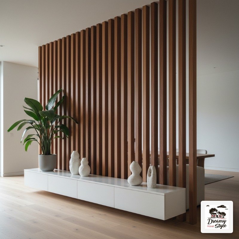

My living room and dining room are technically one room.
I say ‘technically’ because for two years I just pretended they weren’t and arranged furniture like I was daring someone to notice.
Then I put up a wood slat divider and genuinely stood there for like ten minutes just looking at it.
Not because it was perfect — it wasn’t, the first attempt was crooked and Biscuit immediately tried to chew a corner post — but because the room finally felt like it had a reason for existing.
Like someone made a decision on purpose.
That feeling?
That’s the whole thing.
And I’ve been low-key obsessed with slat dividers ever since.
Why Wood Slats Hit Different Than a Regular Room Divider
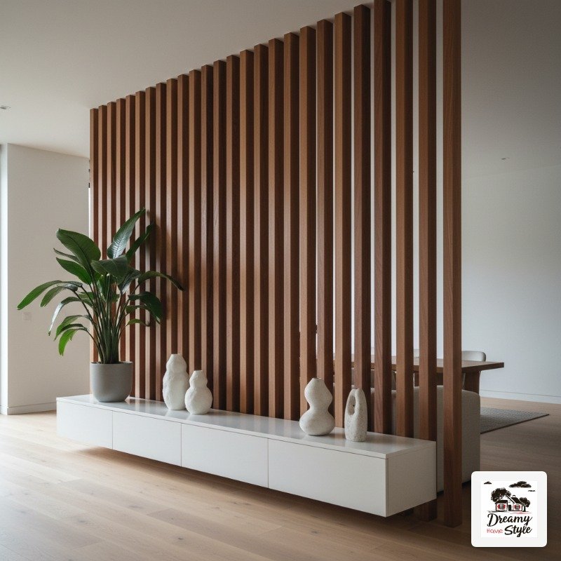
Most room dividers feel like an apology.
Like you’re saying ‘sorry, I know this is one big awkward rectangle, here’s a folding screen.’ Wood slat dividers don’t do that.
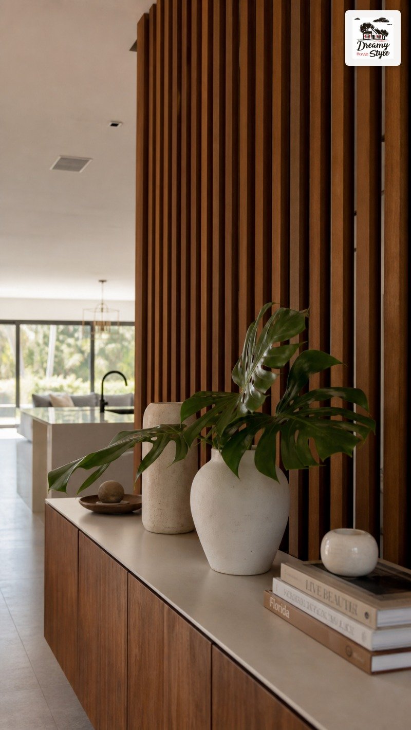
The vertical lines actually draw your eye up, which makes the ceiling feel higher.
And the gaps let light pass through so you’re not chopping the room into two dark boxes.
You get definition without losing the openness — which is, honestly, the whole dream with an open floor plan.
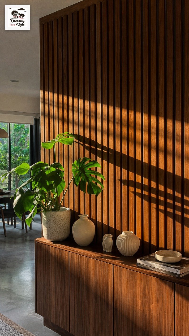
I’d tried a bookshelf divider before this.
It looked cluttered within a week because I kept piling things on it.
Slats give you visual separation without giving you more surfaces to mess up.
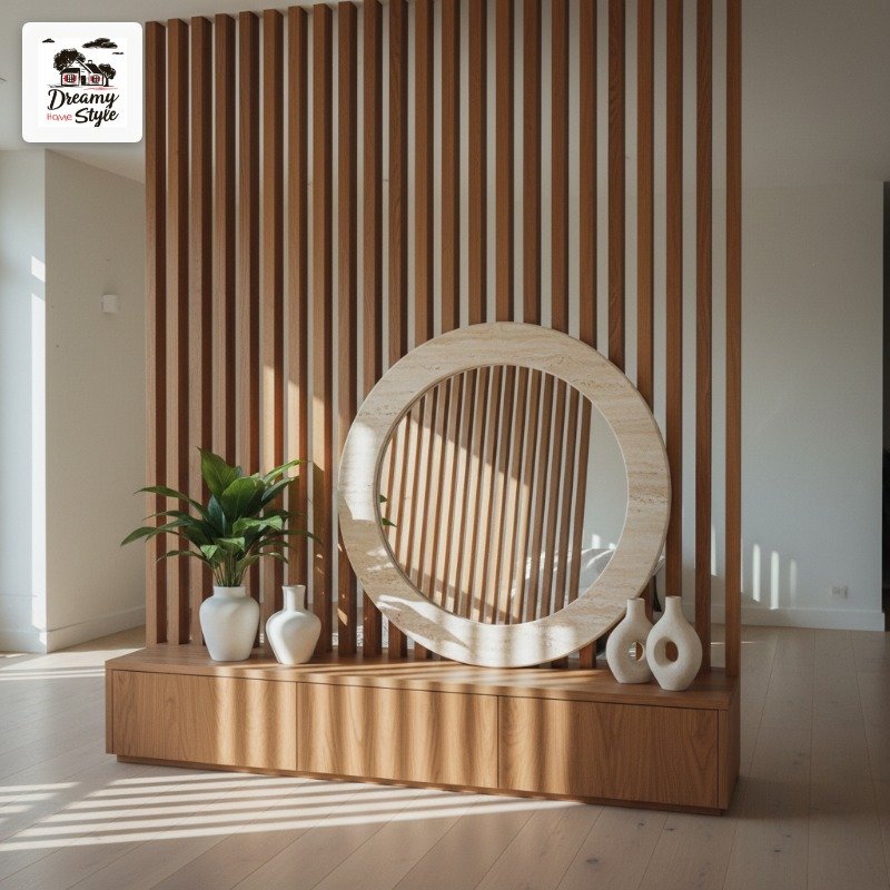
They also photograph beautifully, which I realize sounds shallow but matters when you’re trying to convince yourself a $300 weekend project was worth it.
Start Here: What to Figure Out Before You Buy Anything
Okay so I skipped this step.
I bought the wood first and then measured.
Do not do that.
Figure out your ceiling height first, then decide if you want floor-to-ceiling or floating (meaning it starts a foot off the ground or stops short of the ceiling).
Floor-to-ceiling reads more architectural.
Floating reads more decorative.
Both are valid — they just feel different in a room.
Also think about whether you want it fixed or freestanding.
Fixed means you’re committing (and probably patching holes someday).
Freestanding means you can move it when you redecorate at 11pm on a Tuesday, which I absolutely do.
Quick things to nail down before you shop:
– Ceiling height (exact, not approximate)
– Fixed vs.
freestanding
– How much light you want to keep
– Whether pets or kids will interact with it daily
– Your actual budget, not your aspirational budget
The Slim Slat Look That Feels Almost Japanese
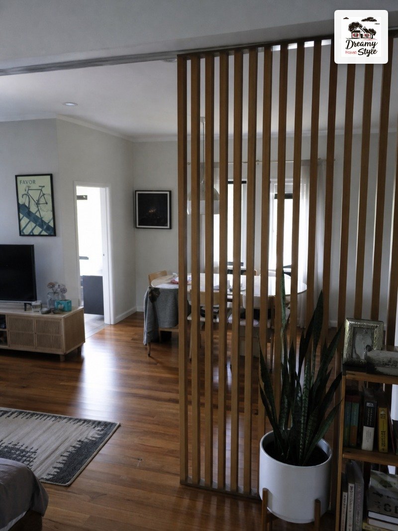
Thin slats — I’m talking 1 to 1.5 inches wide — give you this incredibly delicate, almost shoji-screen energy.
Less ‘barn door’ and more ‘spa in Kyoto.’
The spacing matters as much as the width.
Tight spacing (half an inch between slats) reads more private and dramatic.
Wider gaps feel airy and casual.
I went with about an inch of spacing in my own setup and it’s a sweet spot — you can see through it but it still reads as a wall.
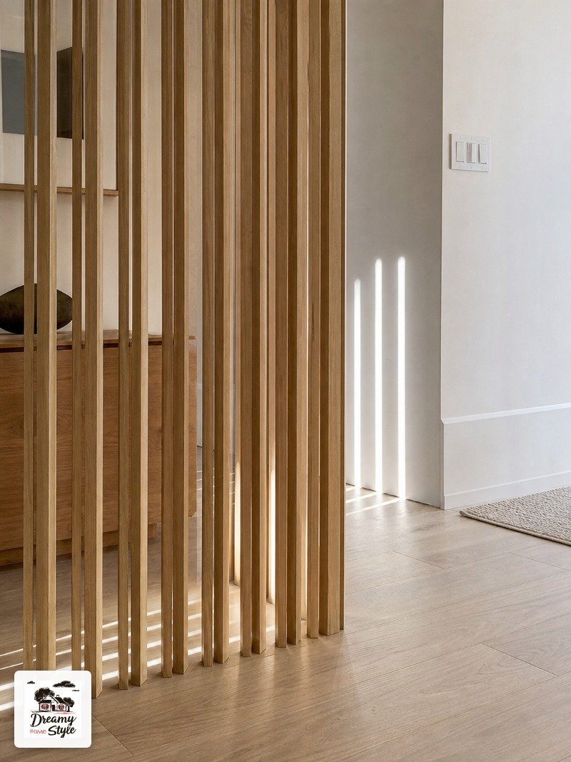
Thin slats in a lighter wood, like ash or maple, look genuinely expensive.
I found pre-cut ash dowels at the hardware store for about $2 each and built a small freestanding frame over a weekend.
Not going to lie — I was proud of myself.
This style works especially well in smaller open plans where a bulkier divider would eat the room alive.
Go Dark and Watch the Room Get Moody in the Best Way
I used to be scared of dark wood.
Felt heavy.
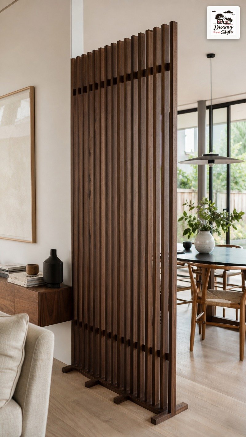
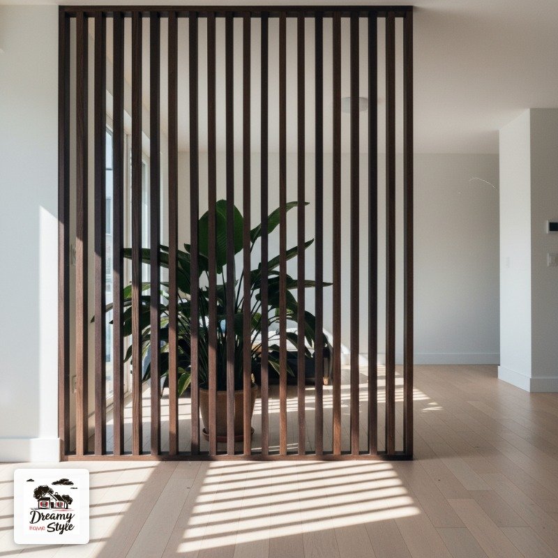
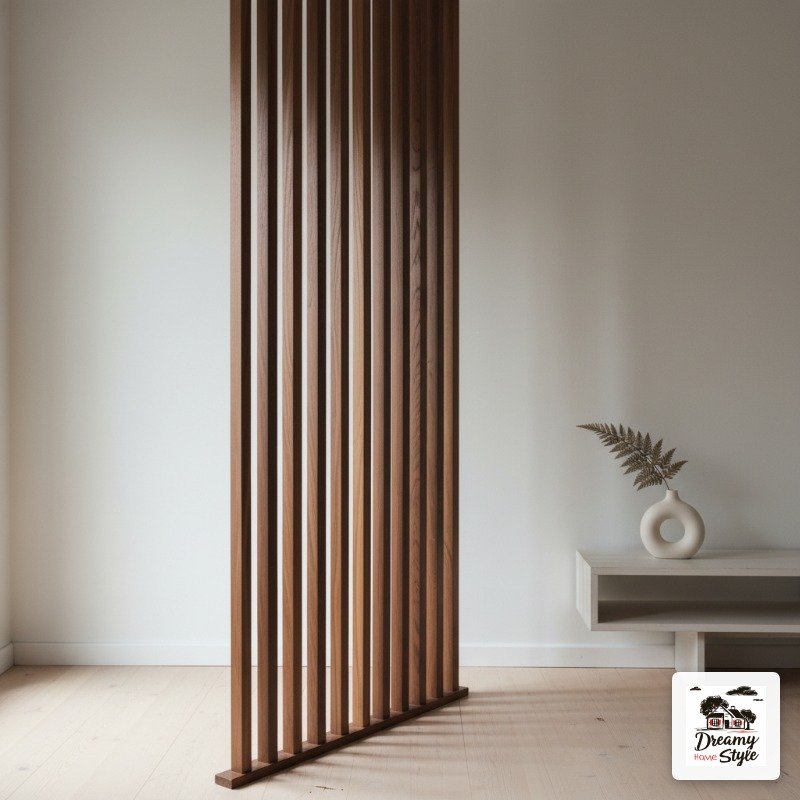
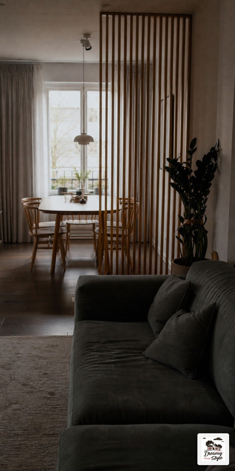
Then I saw a walnut slat divider against a white wall and I completely changed my mind.
Dark stained slats — deep walnut, ebony, even just a rich espresso — create this gorgeous contrast against pale walls and light floors.
The shadow lines they cast are sharper and more dramatic.
It honestly looks like something from a boutique hotel.
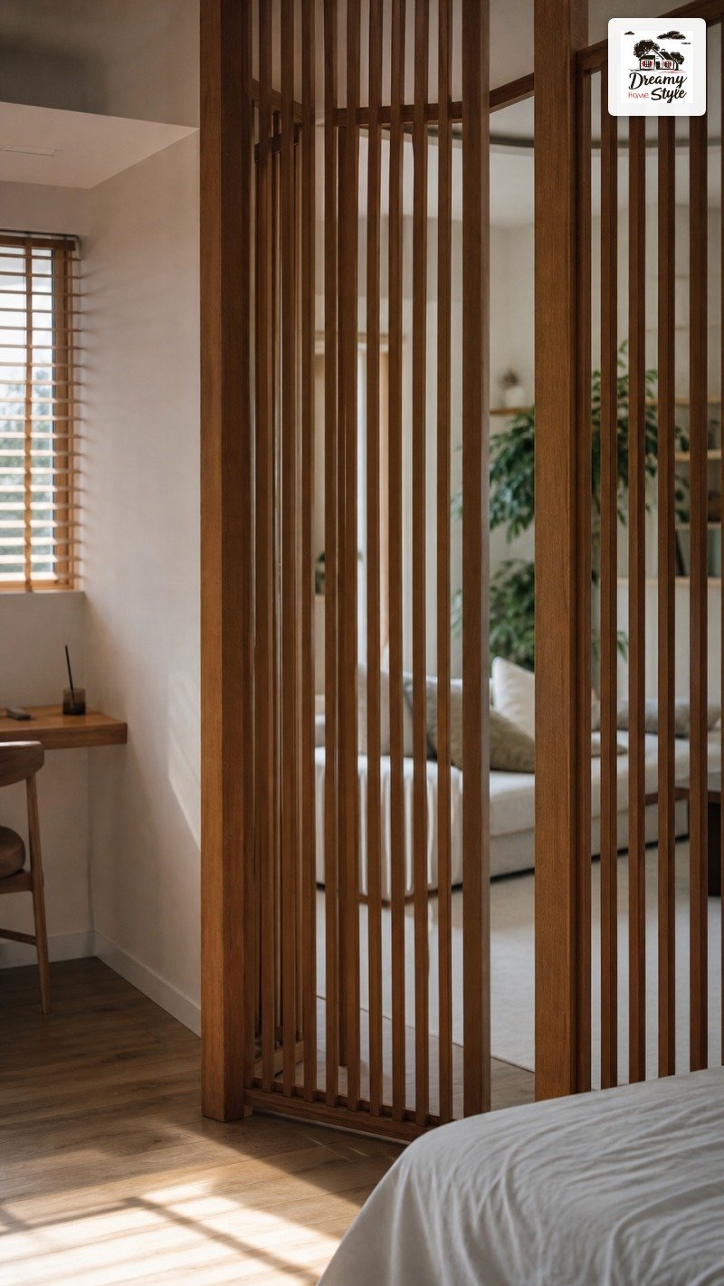
The trick is keeping everything else light.
White walls, blonde floors, simple furniture.
Let the divider be the moment.
If you’re renting and can’t stain anything, dark pre-finished wood panels from the lumber yard work too.
I’ve also seen people use dark-stained pine successfully, though pine dents easily (I found this out when Biscuit ran into mine at full speed).
The Budget Build That Looks Like You Spent More
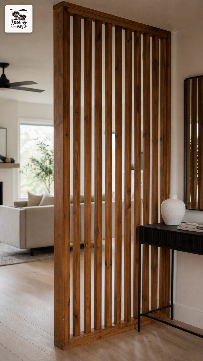
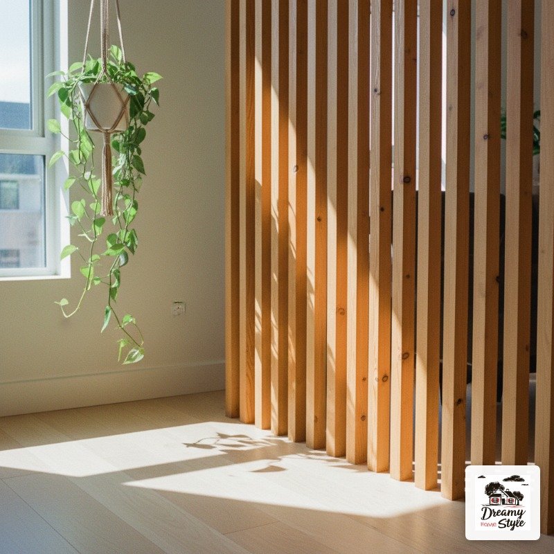
Here’s what I actually built: a freestanding frame from 2×3 lumber with 1×2 pine furring strips as the slats.
Total cost was around $85 for a 6-foot-wide, 8-foot-tall divider.
I stained it with Minwax Early American and it looks like something from a high-end interiors account.
The frame is two vertical posts with a top and bottom rail, lag-bolted together.
Slats are just screwed in with a consistent spacer — I used a spare piece of 3/4-inch plywood as my spacing guide between each slat so they’d all be even.
(This tip alone saves you twenty minutes of measuring.)
It’s not furniture-grade craftsmanship.
Up close you can tell.
But in a room?
It reads exactly the way you want it to.
Pine is soft and it will ding.
If you’ve got kids or a large dog, consider poplar instead — slightly harder, similar price, takes stain beautifully.
Ceiling-Mount It and Suddenly It Looks Built-In
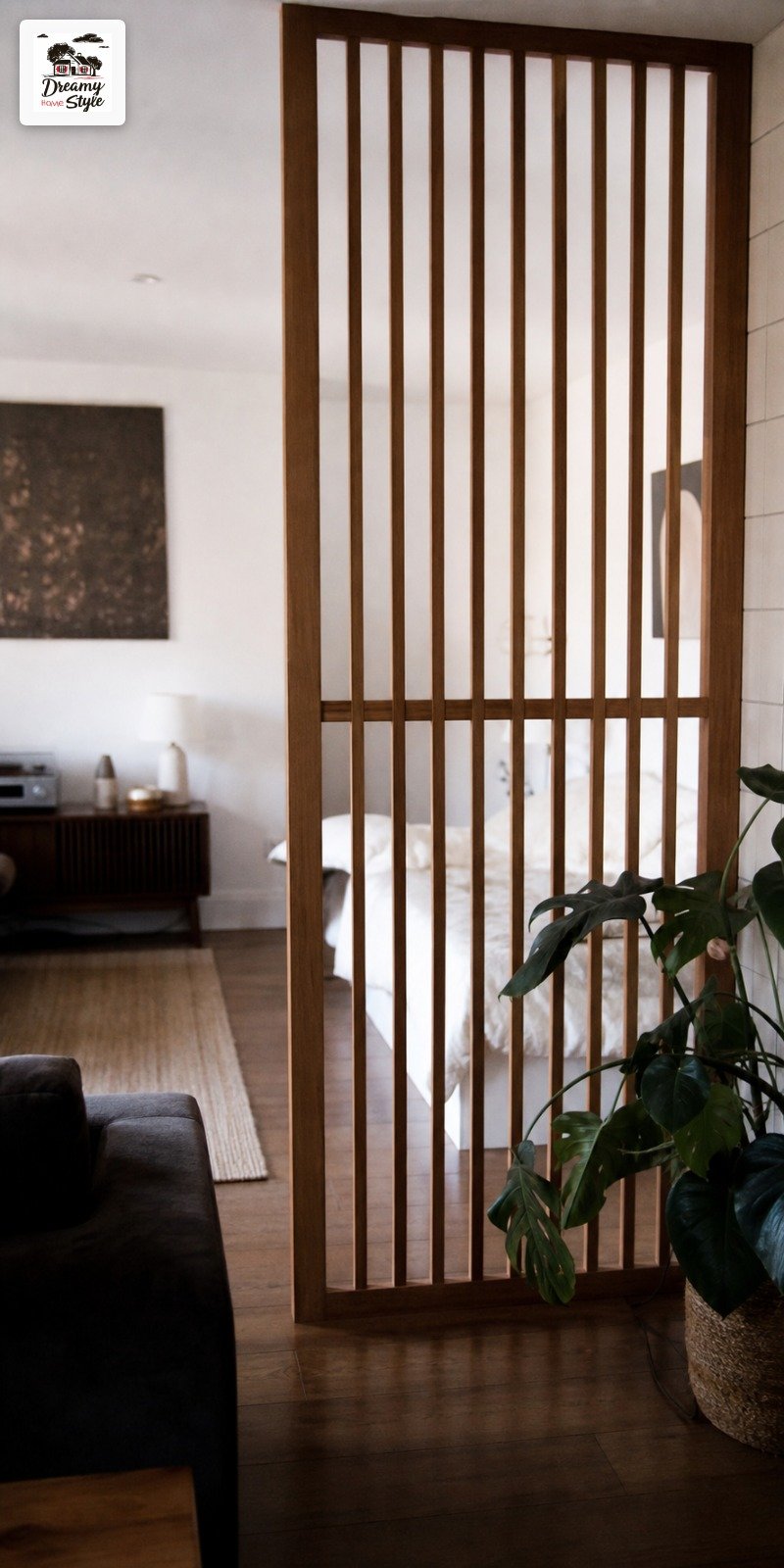
If you can run a top track or anchor a header beam to your ceiling, do it.
It makes the whole thing look architectural instead of decorative.
Like it was always there.
I added a 2×4 header across my ceiling — screwed directly into the joists — painted it the same color as the ceiling so it disappears.
The slats hang from it and rest lightly on the floor with rubber feet.
No base rail needed.
The whole thing looks clean and intentional.
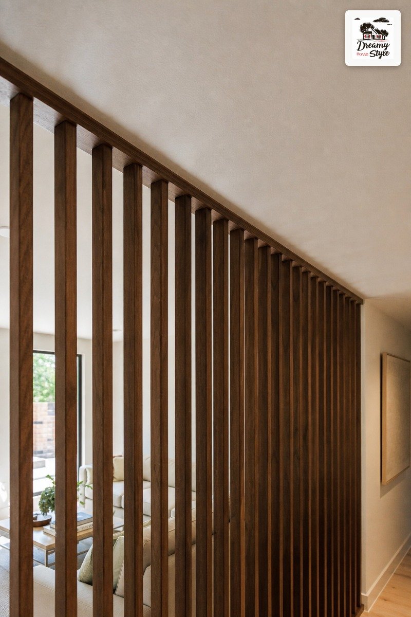
Finding your joists matters here.
I used a $12 stud finder from the hardware store and still managed to put one screw in a dumb spot (I’m fine, the ceiling is fine, we don’t talk about it).
This method works best for fixed dividers.
If you ever want to move it, you’ll be patching the ceiling — so be sure about your layout before you commit.
Paint the Wall Behind It and Double the Drama
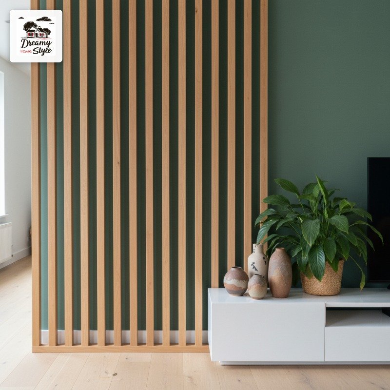
This is the move.
Paint the wall directly behind your slat divider a deep, saturated color — navy, forest green, terracotta, charcoal — and watch the whole thing turn into a focal point.
The slats sit in front of the color and it peeks through the gaps.
You get this layered depth that looks like it took way more thought than it did.
My dining room has a deep sage-green accent wall behind the divider and every single person who comes over asks about it.
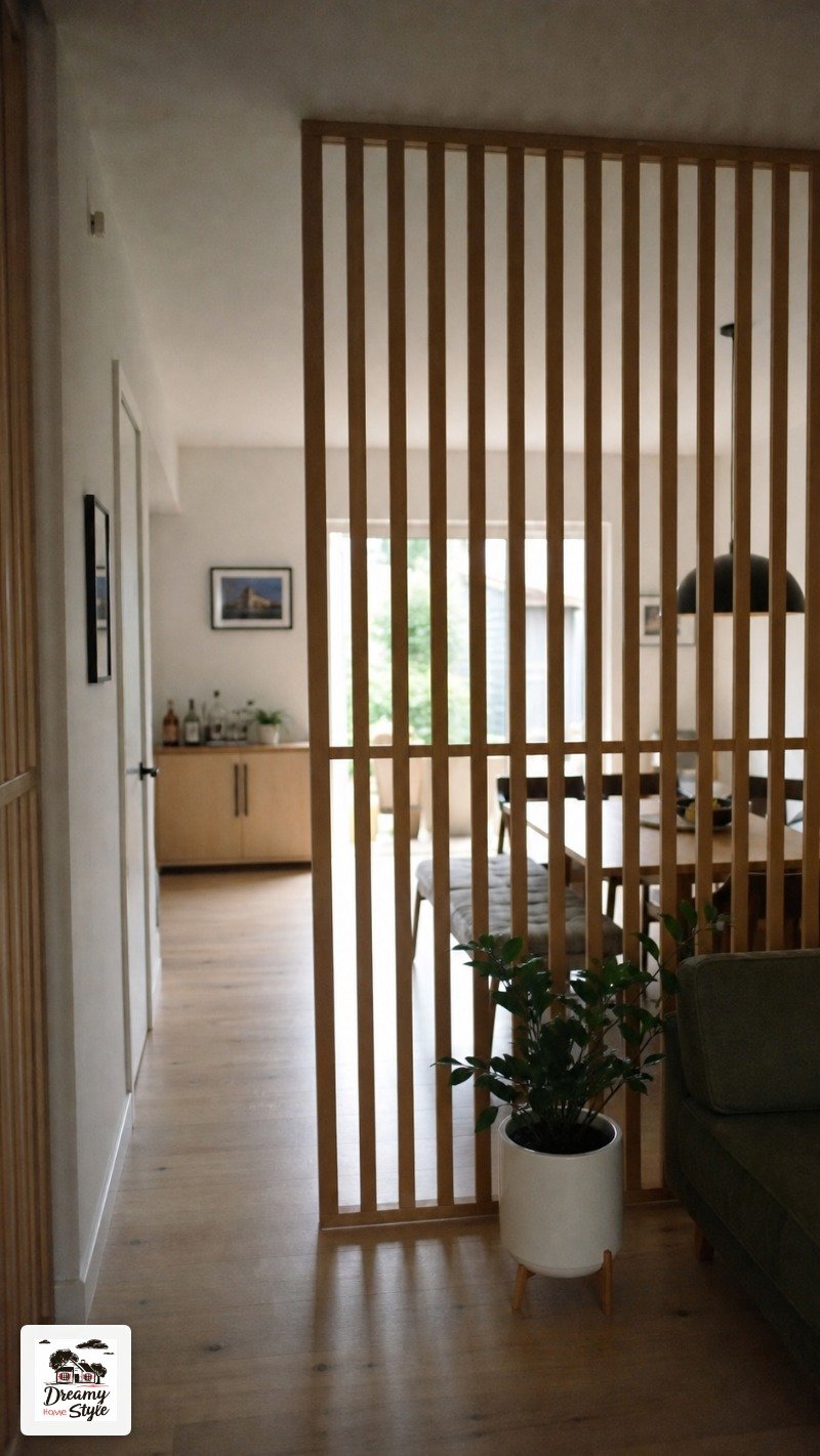
You don’t need to paint the whole wall.
A 6-foot-wide section directly behind the divider is enough.
It reads as intentional, not random.
Lighter wood tones (honey oak, natural ash) pop against deep colors.
Dark walnut works better with medium tones — olive, dusty blue, warm clay.
The Angled Layout That Breaks the Grid
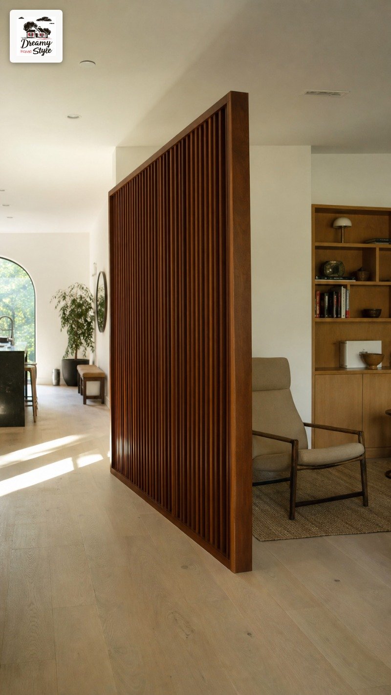
Most people set their divider perfectly parallel to the nearest wall.
Which is fine.
But setting it at a slight angle — like 10 to 15 degrees off the wall — does something interesting to a room.
It creates a wedge-shaped zone that feels more intimate.
The corner it makes behind it becomes a natural little nook.
I’ve seen this used to carve out a reading corner in a big living room and it’s genuinely clever.
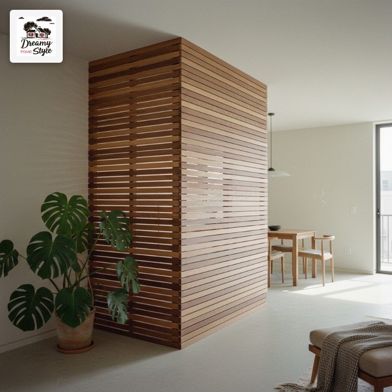
The catch is that a truly freestanding divider needs to be weighted or braced if it’s angled, because there’s no wall to lean against.
You can add a small foot base or use floor flanges to keep it steady.
This isn’t for every home or every personality.
If you like clean lines and symmetry, this will drive you crazy.
But if you like a little ‘intentional imperfection,’ it’s fun.
Style What Lives Next to It (This Is Half the Look)
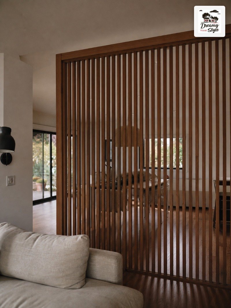
The divider itself is maybe 50% of the look.
What you put next to it is the other 50% and people skip this part.
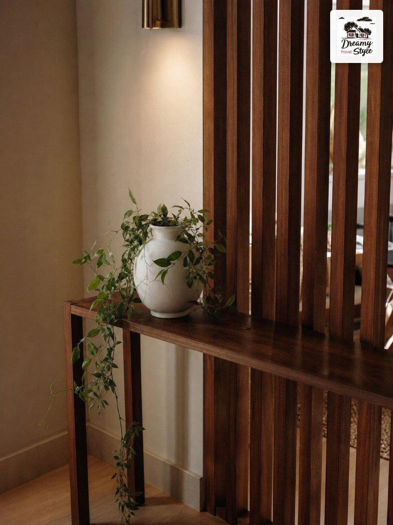
A low console or credenza running along one side of the base grounds the whole thing — it gives the divider a reason for being there, visually.
Style it simply: one large ceramic vase, one trailing plant, maybe a sculptural object.
That’s it.
I have exactly three things on mine and I had to force myself to stop at three.
Lighting matters too.
A tall arc floor lamp on one side, angled toward the slats, makes the shadow play on the wall behind it come alive in the evening.
This is honestly the detail that makes it look like a magazine photo.
Overhead lighting?
Still a crime.
Lamp only.
When Your Ceilings Are Low and You’re Nervous
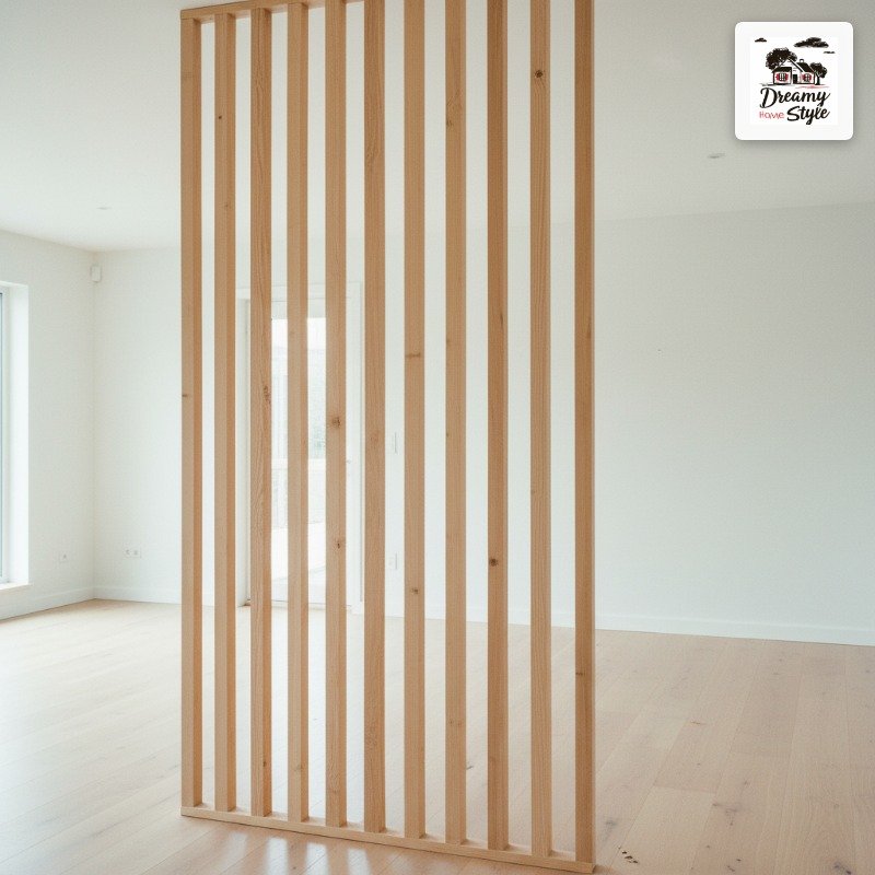
Low ceilings and tall vertical slats sounds counterintuitive, right?
It’s actually not.
Vertical lines pull the eye upward regardless of how high the ceiling actually is.
A floor-to-ceiling slat divider in a room with 8-foot ceilings still makes the room feel taller than a short, floating partition would.
I tested this in my own house (8-foot ceilings, nothing special) and the difference was real.
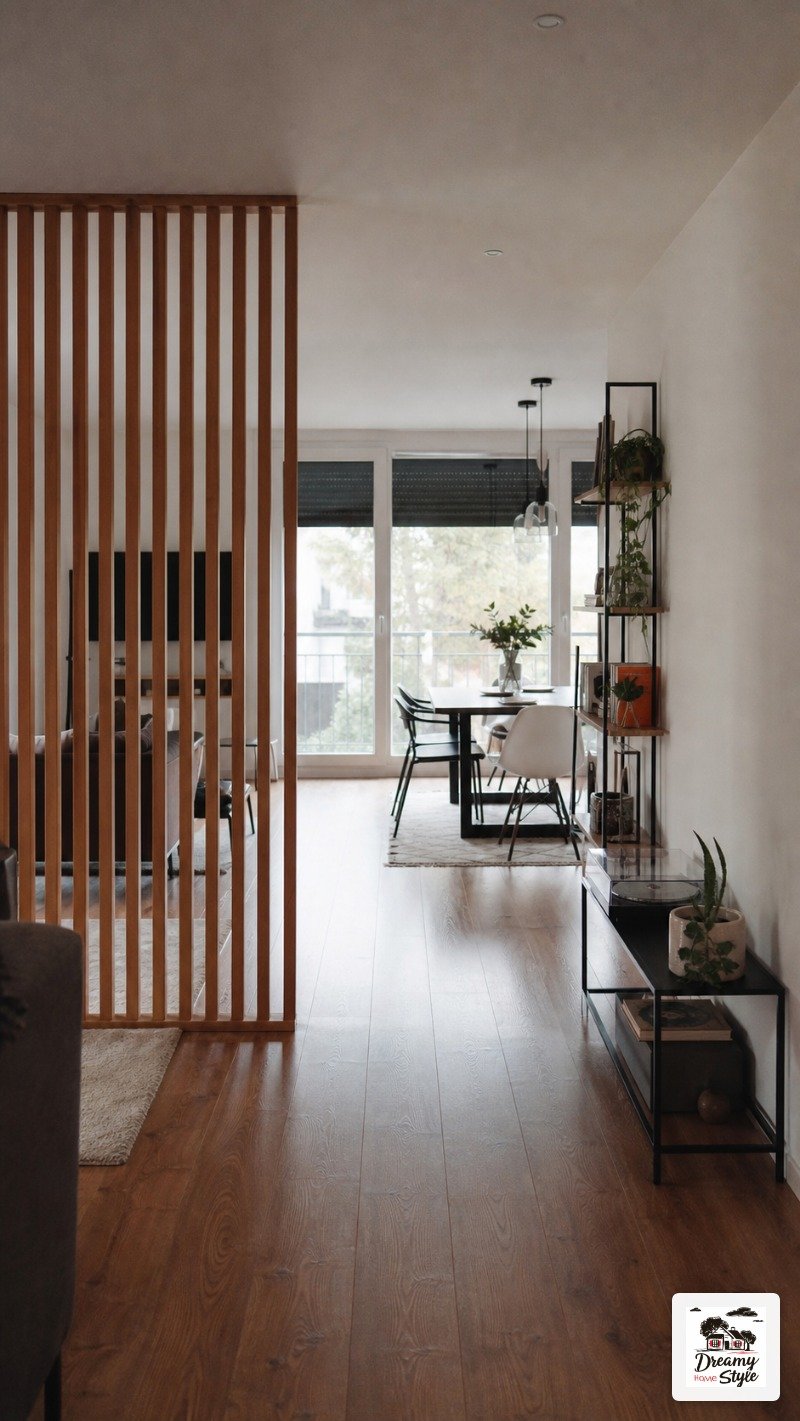
Keep slat width narrow — around 1.5 inches max — in lower-ceiling rooms.
Chunky wide boards in a low-ceiling space start to feel heavy.
Thin slats stay light.
Also, lighter wood tones help.
Pale ash or honey oak in a low-ceiling room reads as open.
Save the dark walnut for rooms that have some height to play with.
The No-Build Version for Renters
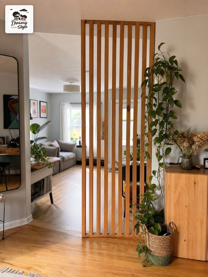
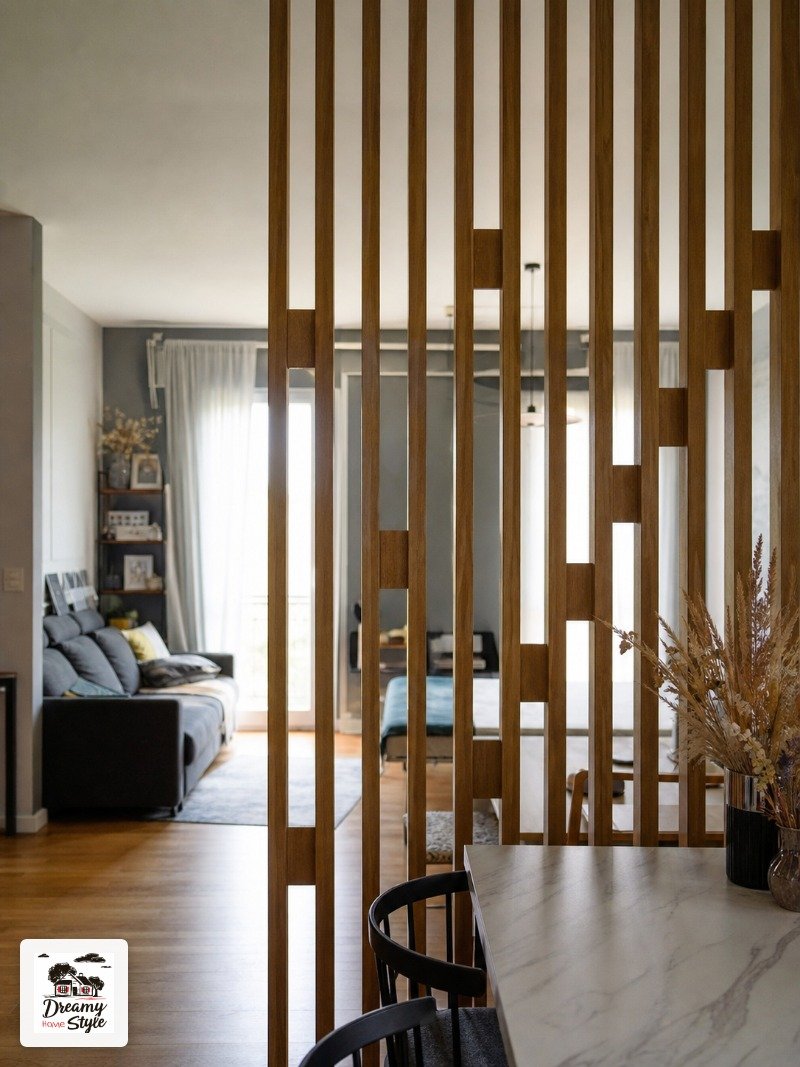
I rented for years and this is the thing no one tells you — you can fake a built-in slat divider with zero permanent changes.
The trick is a tension rod system.
Heavy-duty tension poles (the kind meant for room dividing, not shower curtains) can support lightweight wood slat panels if you build or buy the panels separately and attach them to the poles with pipe clamps.
It’s genuinely sturdy when done right.
I’ve had mine up for eight months and it hasn’t budged once, even with Biscuit investigating it aggressively.
You can also find freestanding slat screens on Amazon and Wayfair that look way better than the folding paper screens.
Prices range from about $120 to $400 depending on size and material.
The limitation is height — tension poles usually max out around 9 feet, and they don’t work if your ceiling is textured or has a popcorn situation.
Mix It With Plants and Something Happens
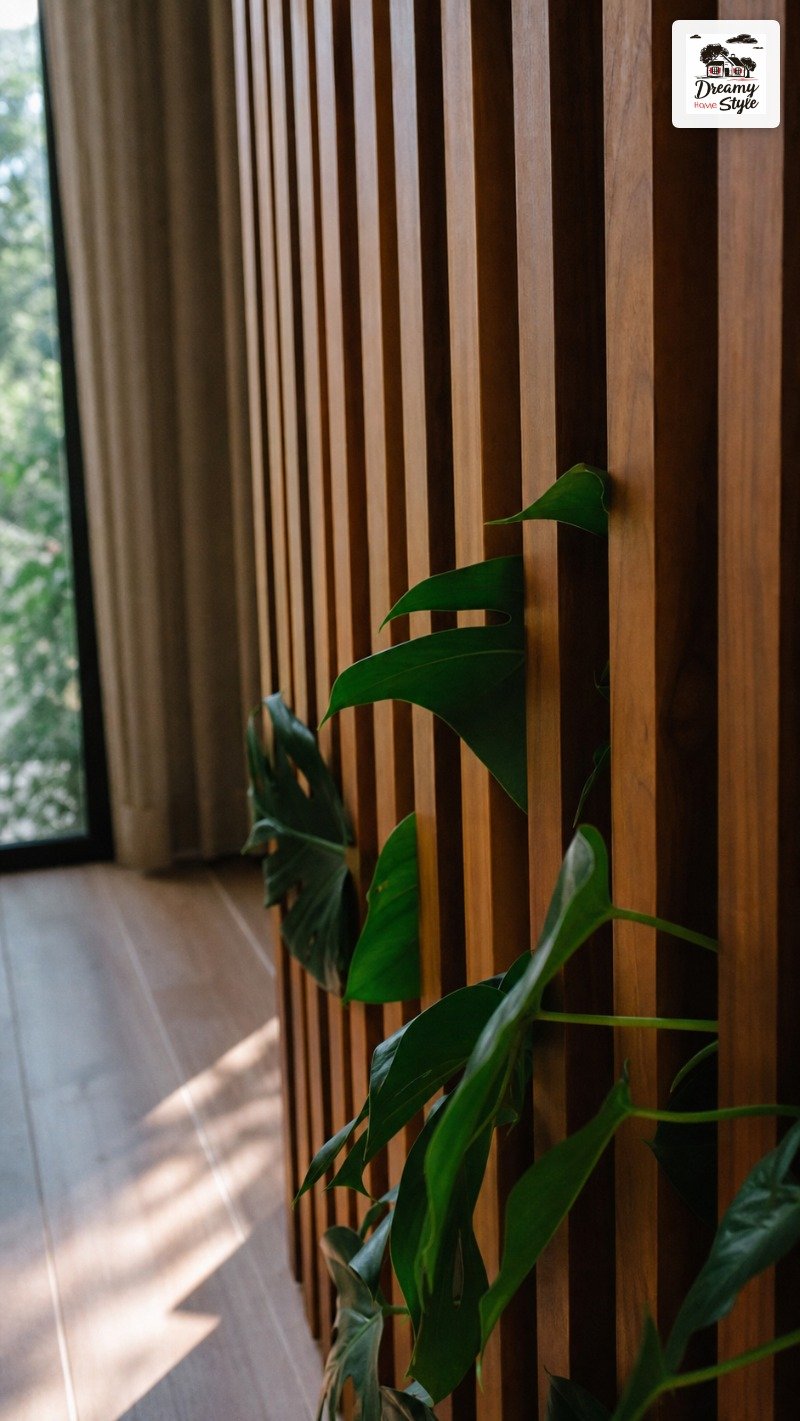
Plants and slat dividers are genuinely best friends.
I don’t know who decided this but they were right.
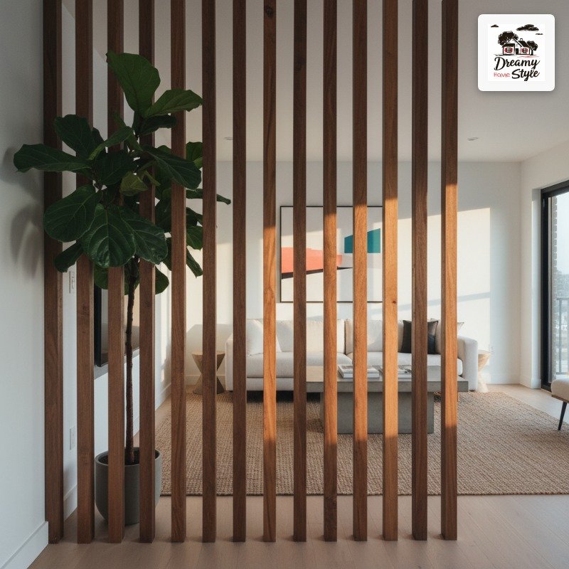
A large tropical plant — fiddle leaf, bird of paradise, something with big dramatic leaves — placed right at the base or to one side of the divider creates this layered organic feel.
The green against the warm wood is everything.
The leaves sometimes poke through the slat gaps a little and it looks intentional even when it isn’t.
Small trailing plants on top of a console beside the divider work too.
Pothos, philodendron, anything that hangs down a little.
It softens the hard lines of the wood.
One thing I’d skip: hanging plants directly from the slats.
I tried this.
The slats are not load-bearing in that direction and mine bowed slightly.
Just put the plant on the floor or on a stand beside it.
The Natural Finish That Ages Like It Was Always There
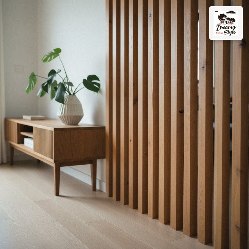
I’m a little bit against over-finishing wood at this point.
Hear me out.
A light natural oil finish — something like Rubio Monocoat or just straight teak oil — protects the wood while keeping it looking almost raw.
It gets better with time.
The wood picks up slight variations in tone, little dents become character, the grain deepens.
It looks like something you’ve owned for twenty years after about eighteen months.
Heavy polyurethane makes wood look plasticky in certain lights.
I did this on my first attempt and regretted it.
The sheen catches the light wrong and suddenly your thoughtful wood divider looks like office furniture.
If you’re using pine or another soft wood, a light wax or matte poly is fine — just stay away from high-gloss anything.
Use It to Actually Define a Home Office Corner
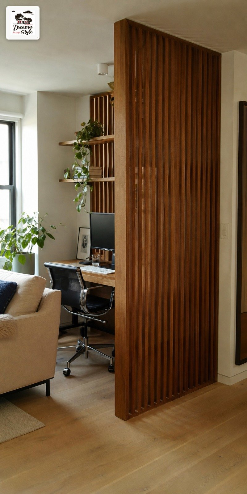
Since working from home became a permanent thing for a lot of people, the ‘desk in the living room’ situation is real and honestly kind of depressing.
A slat divider is the best thing I’ve found for making it feel less like your office invaded your home.
Place the divider at a slight angle or in an L-shape to carve out a proper desk zone.
It doesn’t need to fully enclose the space — even a single panel that separates the desk from the sofa creates a psychological shift.
You go ‘to work’ by stepping around the divider.
It sounds small.
It’s not.
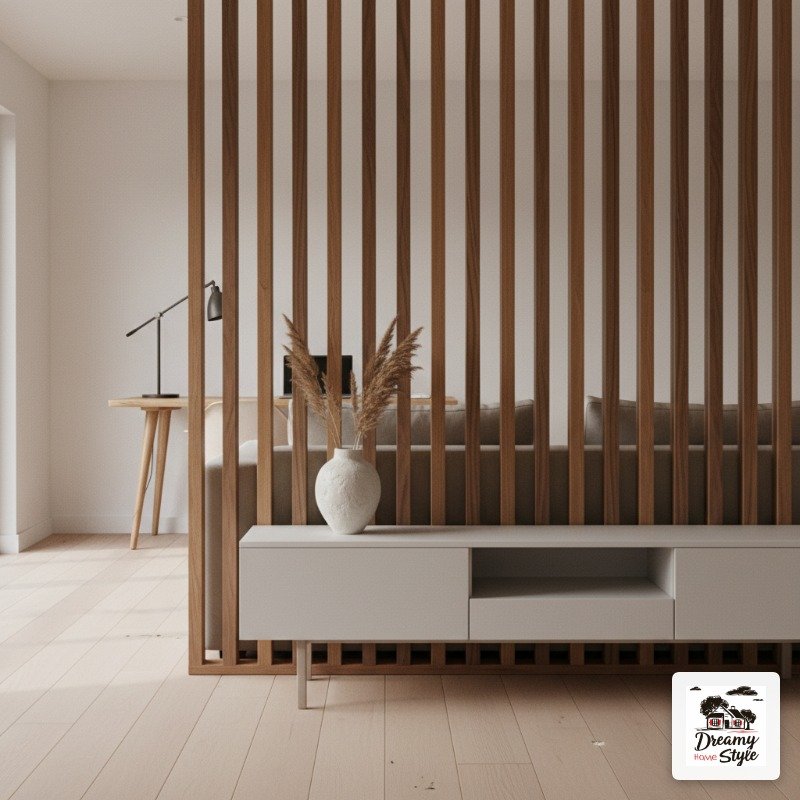
Keep the office side minimal.
The living room side can be prettier — that’s the side guests see.
Style the console, put the plant there.
This genuinely changed how I felt about my work-from-home setup.
I still have the same small house.
The divider just made it feel like two different rooms.
The Combo That Makes Everything Look Pulled Together
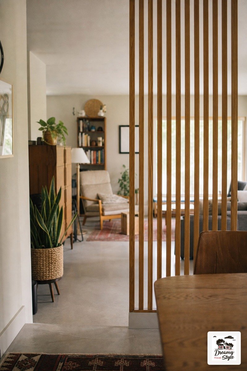
Here’s the combination that almost never fails: warm-toned wood slats, pale walls (creamy white or soft greige, not stark white), blonde hardwood or light LVP floors, and one large organic element — a big plant, a curved ceramic, something with an imperfect shape.
Add a single warm light source: a floor lamp with a linen shade, a table lamp on the console.
That’s the whole recipe.
It photographs well, it feels good to live in, and it makes an open floor plan look like someone actually thought about it.
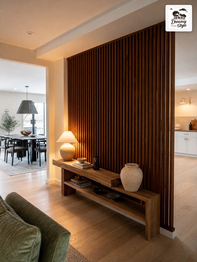
What I’d avoid: too many metals competing with each other (brass sconces AND chrome hardware AND a gold lamp base gets noisy), too many small objects on the console, and anything with a heavy pattern near the slats (the vertical lines already have rhythm — competing patterns fight each other).
Keep it quiet and warm.
Let the slats do the talking.
Related read: Things I Wish I Knew Before I Decorated My First Home — Instant PDF + Kindle download. Secure checkout by Stripe

