

I still remember standing in my hallway three years ago, paint chip in one hand, coffee going cold in the other, feeling like my house was having an identity crisis.
Every room felt like it belonged to a different family.
The living room was doing its own moody thing, the kitchen was stuck in builder-beige, and don’t even get me started on the hallway that connected them like some kind of awkward middle child.
So I did what any slightly obsessive home girl does.
I spent an entire weekend testing swatches on every wall in my house until my husband asked if we were secretly redecorating for a magazine shoot.
And that’s when I finally cracked the whole-house color code, and honestly, it changed how I think about paint forever.
My Home Used to Feel Like Five Different Houses Stitched Together

Okay so let’s talk about the problem first.
I think so many of us paint room by room, picking whatever color feels good in that exact moment.
And look, I get it, because that’s kind of fun and impulsive and satisfying in the short term.
But then you walk from your kitchen into your dining room and it’s like stepping through a portal into a totally different home.
That was me for literally years.
My kitchen was a crisp white, my living room was a deep charcoal, and my hallway was this random builder-grade tan that nobody ever chose on purpose.
It felt disjointed, kindda chaotic honestly, even though every individual room looked fine on its own.
The problem wasn’t any single color.
It was that none of them were talking to each other.
And once I understood that, I stopped thinking room by room and started thinking about my house as one continuous story.
That shift alone is worth more than any specific paint color I’m about to recommend.
So if your home feels a little scattered right now, please know it’s not your taste that’s off.
It’s just missing that thread that ties it all together.
Why Flow Matters More Than Finding the “Perfect” Individual Color

Here’s my honest opinion, and it might ruffle a few feathers.
I don’t think there’s one perfect paint color out there waiting for you.
What actually matters more is how your colors relate to each other as you move through your home.
When I walk through a house that flows, my whole body relaxes a little, even if I couldn’t tell you why.
There’s this sense of ease, like the home was designed with intention instead of assembled room by room in a rush.
Flow means your eye can travel from your entryway into your kitchen into your living room without hitting a jarring stop.
It doesn’t mean every wall is the exact same color, that would be boring and kind of sterile.
It means there’s a relationship, a rhythm, almost like a color playlist instead of one repetitive song on loop.
When I finally nailed this in my own home, guests started saying the same thing without me even asking.
They’d say it felt calm, cohesive, like a hotel almost.
And that’s the compliment that matters most to me now, more than any single room being “wow.”
So before you pick another paint chip, ask yourself how it plays with the rooms next door.
That question alone will save you so many redo weekends.
Starting With One Anchor Neutral (This Was My Game-Changing Moment)

My biggest breakthrough was picking one anchor neutral and letting it travel through most of my main living spaces.
For me, that anchor became Sherwin Williams Alabaster, and I am still, to this day, obsessed with it.
It’s warm without leaning yellow, and it’s soft without feeling flat or lifeless.
I used it in my kitchen, my hallway, my living room trim, and even parts of my primary bedroom.
Having that one consistent thread made every transition between rooms feel intentional instead of accidental.
If you’re overwhelmed by choice right now, and trust me I’ve been there, just start here.
Pick one neutral you can commit to seeing constantly, in every kind of light, morning and evening.
Live with a large sample of it for at least a few days before committing.
I taped giant poster boards of Alabaster to my walls and just watched how it shifted from soft white in the morning to a warm cream by evening.
That’s the emotional reason this step works so well.
An anchor color gives your brain a resting point as you move through the house.
It’s the visual equivalent of a familiar friend showing up in every room to say hello.
Understanding Undertones Before You Even Open a Paint Can

Okay, this is the part that trips up so many people, myself included at first.
Undertones are basically the secret hidden color inside a paint that only shows up once it’s on your actual walls.
A white can look creamy and cozy in the store and then turn oddly pink or greenish in your living room.
I learned this the hard way with a “pure white” that turned into a weird lavender-gray by 4pm in my dining room.
So now, before I commit to anything, I hold the swatch next to my flooring, my countertops, and my existing trim.
If your home has warm wood floors like mine, cooler blue-based whites can feel a little off and clinical.
I tend to lean toward warmer neutrals because my whole house has honey-toned oak floors throughout.
But if you’ve got cooler gray floors or marble countertops, a slightly cooler white might actually flow better for you.
There’s no universally right answer here, and that’s honestly freeing once you accept it.
The goal isn’t finding the most popular color on Pinterest.
It’s finding the undertone that agrees with the materials you already have.
Get this right and everything else becomes so much easier.
Letting Trim and Ceilings Create Quiet Consistency

Here’s a little hack that made a bigger difference than I expected.
I painted almost all of my trim and ceilings the same white throughout my entire main floor.
It sounds simple, maybe even a little boring, but it’s honestly one of the most powerful flow tricks there is.
When your trim colors change from room to room, your brain registers a break, even if you can’t consciously explain why.
Keeping that trim consistent creates this quiet, steady frame around every single wall color you choose.
I use Sherwin Williams Extra White on my trim because it has just enough crispness to contrast against Alabaster walls.
And my ceilings, I just keep those the same soft white everywhere, no exceptions.
This is one of those design secrets nobody really talks about at parties.
But once you notice it in a beautifully flowing home, you’ll never unsee it again.
If you’re on a budget and can only change one thing this month, honestly, start with unifying your trim.
It’s a smaller project than repainting every wall, and the payoff is surprisingly huge.
Trust me on this one, it’s basically the unsung hero of whole-house color flow.
Choosing an Accent Wall Color That Still Feels Like Part of the Family

Now, I know some of you are thinking, but Madison, I want some color, not just neutrals everywhere.
And I totally hear you, because a house without any depth can feel a little sleepy.
My rule for accent colors is that they should feel like cousins of my anchor neutral, not strangers crashing the party.
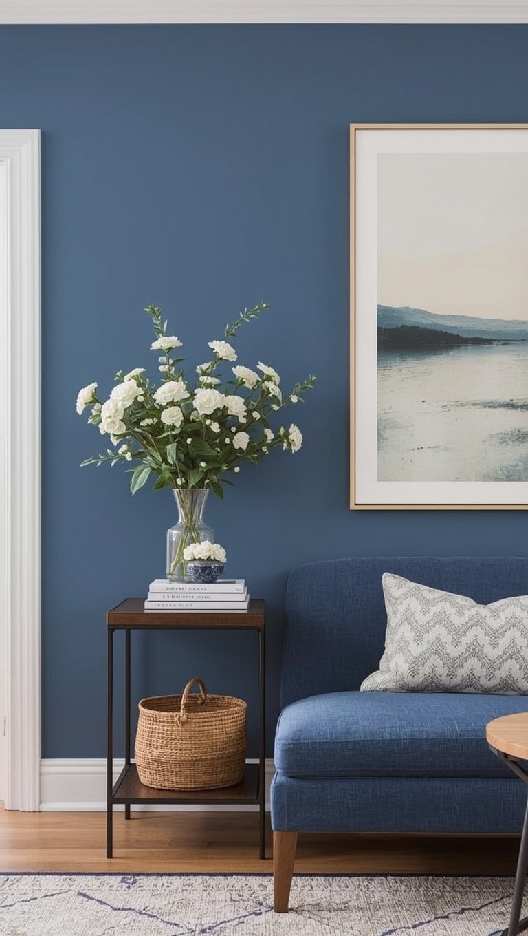
In my dining room, I went with Sherwin Williams Naval on just one wall, and it’s still connected because the room’s trim and ceiling stay consistent with the rest of the house.
The trick is repetition in small doses, not big commitment.
I brought little touches of that same navy into throw pillows in my living room and a vase in my entryway.
That repetition is what makes an accent color feel intentional instead of random.
If I had just slapped navy onto one wall and never referenced it again anywhere else, it would feel disconnected, like an afterthought.
So my advice is this: pick your accent, then find at least two or three small ways to echo it elsewhere in your home.
It could be a lampshade, a stack of books, even a ceramic bowl on your counter.
Small echoes create big cohesion, and that’s honestly the emotional magic of good color flow.
My Go-To Kitchen to Living Room Color Transition Strategy

The kitchen-to-living-room hand-off is where so many homes fall apart visually, and I get why.
These two spaces often have completely different jobs, but they usually share sightlines, so they need to relate to each other.
In my own home, I kept my kitchen cabinets in Sherwin Williams Alabaster and let my island do a soft sage in Sherwin Williams Evergreen Fog.
Then in my living room, I echoed that same sage tone through my accent pillows and a big leafy plant in the corner.
It’s subtle, but when you stand in my kitchen and look toward the living room, your eye just glides, it doesn’t jump.
If your kitchen and living room are open concept, this matters even more than you’d think.
I always tell friends to stand at the exact spot where both rooms are visible at once before choosing final colors.
That’s the real test, not how it looks isolated on one wall.
My personal tip here is to pick one shared color element, whether it’s a wall, cabinetry, or even a rug tone, and let both spaces reference it.
It doesn’t need to be identical, just related, like siblings instead of twins.
That relationship is what makes an open floor plan feel like one cohesive space instead of two rooms awkwardly sharing a wall.
Hallways and Stairwells Are Your Secret Connector Spaces

Nobody ever gets excited about their hallway, and I totally understand why.
But hallways and stairwells are actually the connective tissue of your whole-house color story.
I used to just default to whatever leftover paint I had for these spaces, and it showed.
Now I treat my hallway with the same intention as any main living space, because you pass through it constantly.
I kept mine in that same Alabaster anchor color, and it makes the transition between my bedrooms and living areas feel completely seamless.
If your stairwell has a lot of natural light, this is actually a wonderful place to be a little bolder.
I’ve seen friends do a deep, moody stairwell in something like Sherwin Williams Peppercorn, and it becomes this dramatic little moment against otherwise soft, neutral rooms.
The key is making sure it still nods back to your main palette somehow, maybe through the trim staying consistent.
My tip here is to walk your hallway slowly, like you’re a guest seeing it for the first time.
Does it feel like a bridge between spaces, or does it feel like an afterthought?
That one honest walk-through will tell you everything you need to know.
Giving Bedrooms Their Own Personality Without Breaking the Flow

Bedrooms are where I think you’re allowed to have the most fun, honestly.
These are private spaces, so they don’t need to relate to your main living areas quite as strictly.
In my primary bedroom, I went with Sherwin Williams Comfort Gray, this soft, sleepy blue-green that feels like a permanent exhale.
It’s different from my Alabaster main floor, but the undertones are still soft and warm enough that walking from the hallway into my room doesn’t feel jarring.
My rule of thumb is that bedrooms can shift in color as long as they don’t shift dramatically in warmth or saturation.
A cozy, warm-toned house shouldn’t have a stark, icy blue bedroom, that contrast can feel a little cold and disconnected.
For my daughter’s room, we chose a gentle blush that still reads soft and warm, even though it’s clearly its own distinct color.
I love that her room has personality while still feeling like it belongs to the same home.
My personal tip is to test your bedroom color right next to your hallway color before committing.
Hold them side by side in natural light and see if they feel like they’re having a conversation or an argument.
If it’s an argument, soften one of them until they agree.
Testing Colors the Right Way (Because Lighting Lies)

I cannot stress this enough, and I learned it through actual heartbreak.
A color that looks dreamy on the paint chip can look completely different once it’s actually on your wall.
Lighting changes everything, morning light, afternoon light, evening lamp light, they all shift how a color reads.
So now I always buy the large sample pots, not just those tiny chips, and I paint big swatches directly on my walls.
I watch that swatch at 8am, at noon, and again after dark with my lamps on.
It sounds excessive, I know, but it has saved me from so many expensive repaint mistakes over the years.
My favorite little hack is photographing the swatch on my phone at different times of day.
Something about seeing it through a camera lens helps me notice undertones I might miss with my naked eye.
I also always test on at least two different walls, because natural light hits each wall differently depending on which direction it faces.
North-facing rooms tend to make colors look cooler and grayer than they actually are.
South-facing rooms usually bring out warmth you didn’t even know was hiding in that can of paint.
Give yourself the grace of testing properly, your future self will thank you every single day you walk through that room.
My Personal Go-To Sherwin Williams Whole-House Palette

Alright, I promised I’d share exactly what’s on my own walls, so here it is, no secrets.
My main anchor throughout the house is Sherwin Williams Alabaster on almost every wall.
My trim and ceilings are Sherwin Williams Extra White for that soft, crisp contrast I mentioned earlier.
My kitchen island brings in Sherwin Williams Evergreen Fog as a gentle, grounding accent.
My dining room has one moody wall in Sherwin Williams Naval that I absolutely adore every time I walk past it.
My primary bedroom shifts softly into Sherwin Williams Comfort Gray for that cozy, restful feeling at night.
And my stairwell landing gets a little drama from Sherwin Williams Peppercorn, just enough to feel intentional and rich.
This palette took me honestly over a year of testing, living with samples, and second-guessing myself to land on.
But now that it’s done, my whole house feels like it was designed all at once, even though it happened slowly, room by room.
If you want a shortcut, this combination is a genuinely beautiful starting point for a warm, cohesive, modern home.
You can always swap in your own accent colors as long as you keep that Alabaster and Extra White foundation running through everything.
It’s forgiving, it’s warm, and it just works.
Optional Variations Depending on Your Home’s Style

Now, I know not every home wants the exact palette I just shared, and that’s totally okay.
If your style leans more coastal, swap Naval for a softer Sherwin Williams Rainwashed in your accent spaces.
It keeps that same calm, grounding energy but feels lighter and breezier overall.
For a modern farmhouse feel, keep Alabaster as your anchor but bring in more black accents through hardware and light fixtures instead of paint.
If you’re drawn to something moodier and more dramatic throughout, you could flip the formula and use Peppercorn or Iron Ore as your anchor instead, with Alabaster as the accent breather.
That’s honestly such a striking look when it’s done with intention.
For a soft, romantic cottage feel, swap my sage and navy accents for dusty rose tones layered against that same warm white base.
The formula stays the same no matter your style, one anchor neutral, one consistent trim color, and accents that echo each other in small doses throughout the home.
My tip here is to pick your style direction first, then choose colors that support that mood rather than chasing trends room by room.
A home that reflects an actual point of view always feels more flow-y than one built from a hundred separate trending picks.
The Small Emotional Payoff Nobody Talks About

I want to end on something that surprised me the most through this whole process.
I expected better photos, nicer compliments from guests, maybe a little more resale value someday.
What I didn’t expect was how much calmer I felt just existing in my own home every day.
There’s something deeply soothing about moving through a space that feels considered, connected, like every room is speaking the same gentle language.
I used to feel this low hum of visual stress without even realizing it, room after room competing for attention.
Now, walking from my kitchen to my living room to my bedroom feels like one long, easy breath instead of a series of little jolts.
If you’re standing in your hallway right now holding a paint chip, feeling a little overwhelmed, I promise you, start with just one anchor color.
Let it travel gently through your home before you worry about every single accent decision.
Your house doesn’t need to be perfect or magazine-ready to feel like it flows.
It just needs that one thread of intention running quietly through every room.
And honestly, once you feel that shift, you’ll wonder why you ever painted room by room in isolation.

