
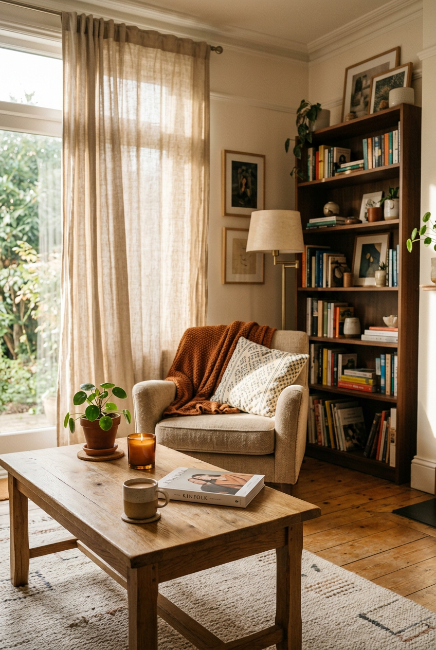

I used to think mixing wood tones was just something you weren’t supposed to do.
Like wearing two different prints at once, or putting a rug on carpet.
Someone in my life (okay, it was my very opinionated mother-in-law) once looked at my living room and said, ‘It feels a little… unfinished.’ And honestly?
She wasn’t wrong.
I had a honey-oak coffee table sitting next to a dark walnut TV console and it looked accidental, not intentional.
But here’s what I’ve learned since then — mixing wood tones isn’t the problem.
Mixing them without a strategy is.
Once I figured that out, everything clicked.
Why Mixing Wood Tones Gets a Bad Reputation
The fear is totally understandable.
You walk into a room and something feels off, but you can’t quite name it.
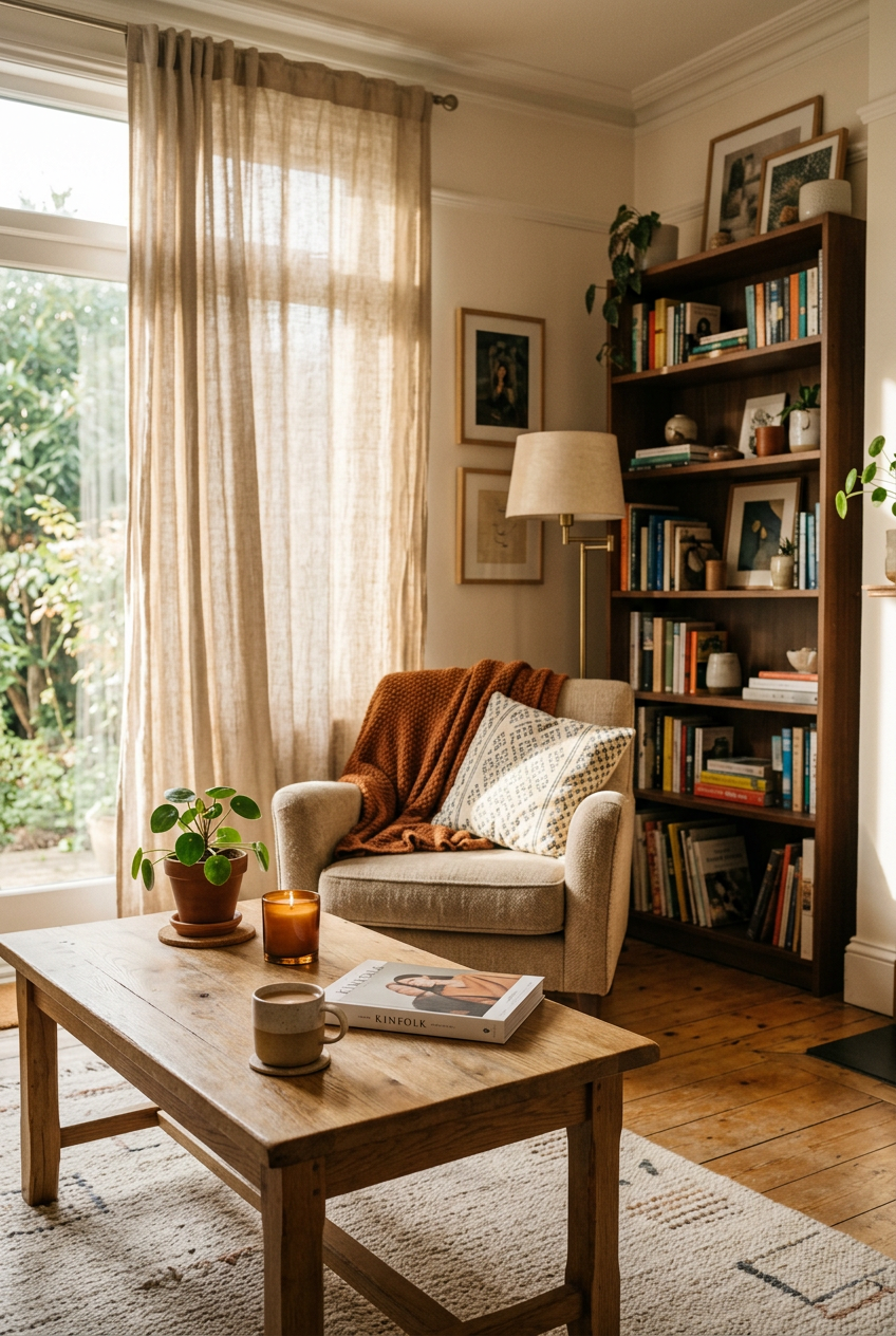
Then you realize — the floors, the furniture, and the shelving are all slightly different shades of brown, and none of them seem to be on speaking terms.
That’s the actual issue.
It’s not the mixing itself.
It’s when the tones look like they were chosen at different points in time with zero communication between them.
I think a lot of us grew up watching home makeover shows where everything matched perfectly.
Same stain, same undertone, same finish.
And that looked polished!
But it also looked a little sterile, you know?
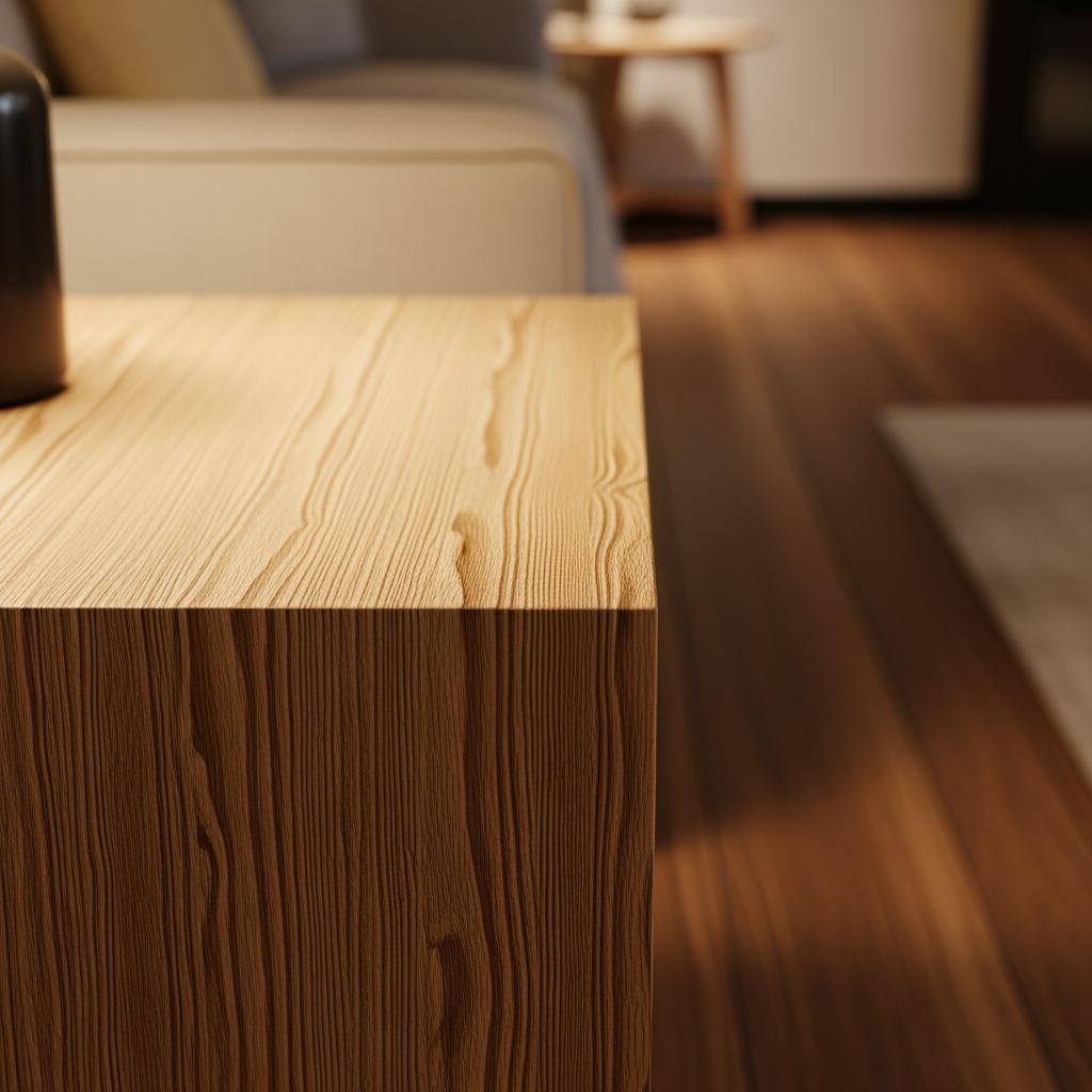
Real rooms have layers.
Real rooms have a $12 thrift-store lamp sitting next to a heirloom dresser.
And when you lean into that, instead of fighting it, something genuinely beautiful can happen.
The One Rule I Actually Follow: Vary the Tones Deliberately

If your wood tones are too similar, the eye gets confused.
It reads as a mistake, not a choice.
Think of it like this — if two shades are close but not the same, they look like they’re trying to match and failing.
But when you place a light ash next to a deep espresso, it reads as intentional contrast.
Confident, even.
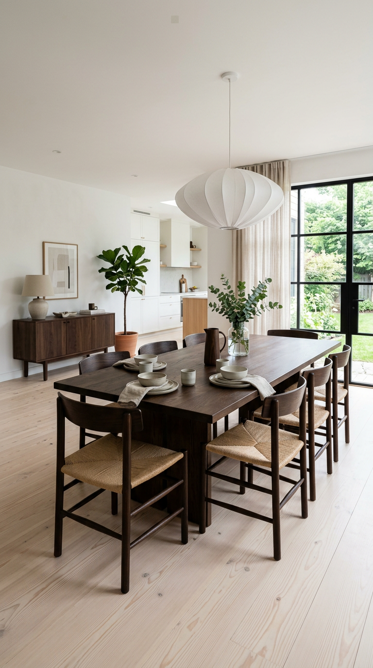
When I redid my dining area, I stopped trying to find a chair that matched my table.
Instead, I went in the complete opposite direction and found a set of lighter, natural-finish chairs.
The contrast made the whole thing feel designed.
Give your tones enough breathing room to each be their own thing.
That’s sort of the whole secret, honestly.
Understanding Undertones (This Is the Part Most People Skip)
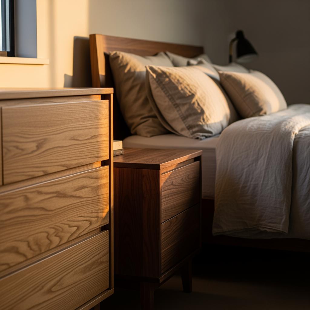
Okay, this is where things get a little nerdy, but stay with me because this is genuinely the thing that changed how I shop for furniture.
Wood has undertones just like paint does.
Some lean warm — red, orange, yellow.
Some lean cool — gray, green, even a hint of ash.
When you mix tones that have clashing undertones, that’s when a room feels chaotic.
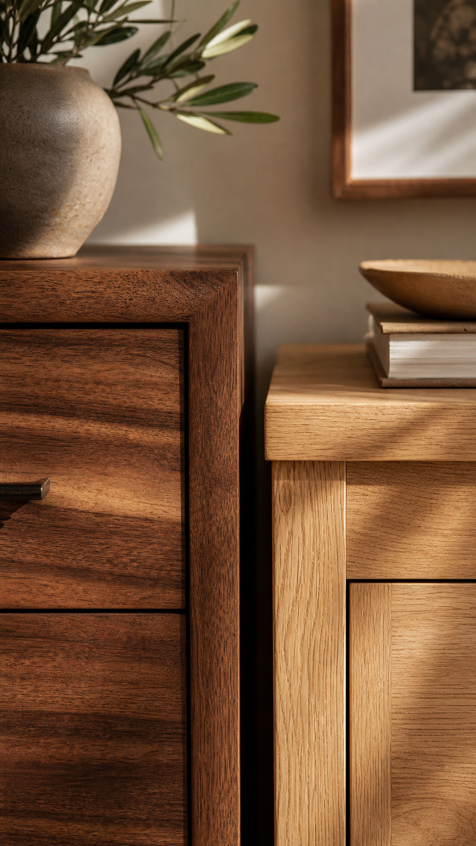
A golden oak and a cool gray-washed wood are going to fight each other all day long.
But a golden oak paired with a warm-toned walnut?
They’re basically family.
I actually made this mistake in my old bedroom.
I had a cool-toned driftwood nightstand I loved as a standalone piece, but next to my warm honey dresser it just… didn’t work.
Sold the nightstand, zero regrets.
My Favorite Starting Point: Anchor With the Floor

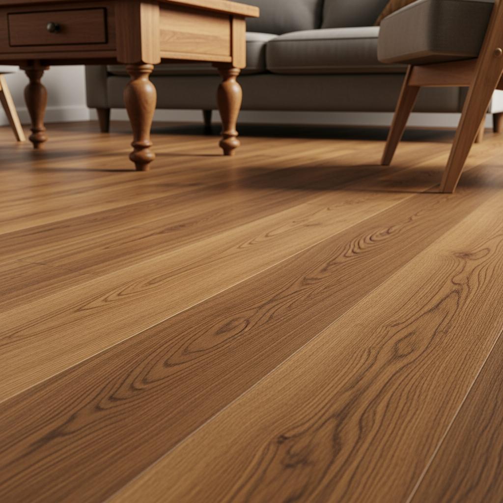
Your floor is the biggest wood surface in the room.
Period.
It sets the whole mood before a single piece of furniture walks in.
I always tell friends to start there.
Figure out what tone and undertone your floors have, and let that guide everything else.
You don’t have to match it — you really shouldn’t, actually — but you need to work with it.
If your floors are a warm, medium-brown, go lighter with some pieces and deeper with others.
That layering effect is what makes a room feel rich and collected over time.
Don’t fight your floors.
I tried to.
It was an expensive lesson.
The Role of the Dominant Tone (You Need One)
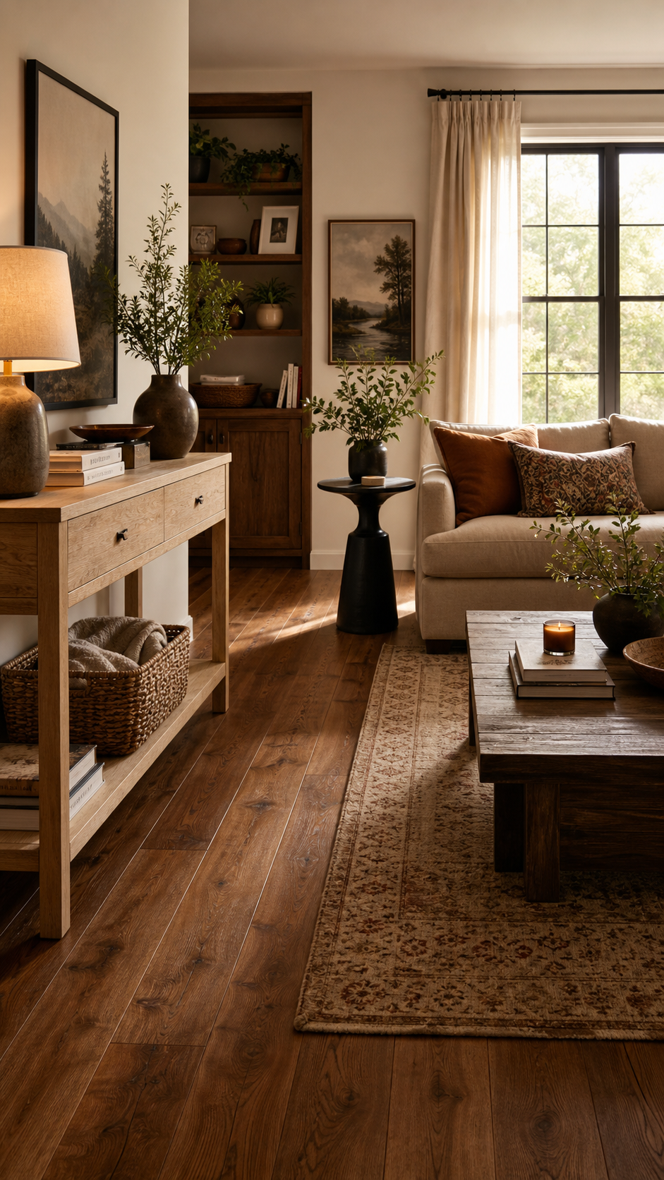
Here’s something I wish someone had told me way earlier: one wood tone needs to lead.
Just one.
Think of it like a color palette.
You’ve got a dominant, a secondary, and maybe an accent.
Same principle applies to wood.
Your dominant tone might be your floors or a large furniture piece.
That’s the anchor.
Everything else plays a supporting role.
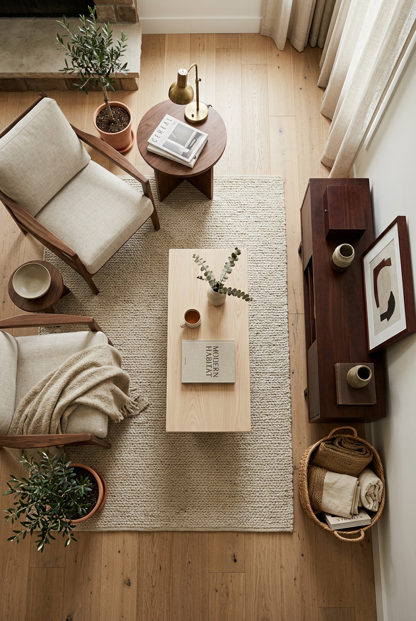
In my living room, the dominant tone is the warm pecan of my floors.
The secondary is the white oak of my media console.
And I’ve got one little dark mahogany accent table tucked near the window that adds depth without taking over.
Without that hierarchy, the room would feel like a wood sample display at a hardware store.
How to Use a Rug to Bridge Two Very Different Tones
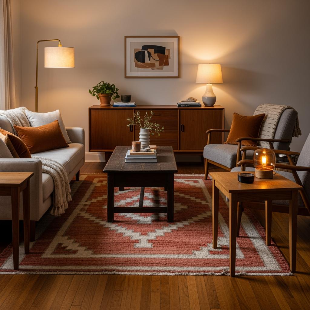
A rug is honestly one of the most underrated tools in a room.
Not just for comfort — for visual harmony.
When you have two wood tones that feel like they’re not quite connecting, a rug with warm, earthy tones can sort of act as a mediator.
It pulls the eye away from the contrast and gives the brain something soft to land on.

I layered a vintage-style wool rug in terracotta and cream over my floors, and suddenly my mismatched wood pieces looked like they were meant to be together.
I’m not even exaggerating.
Look for rugs that echo at least one warm undertone from your wood.
It doesn’t have to be obvious — it just has to rhyme.
Mixing Finishes vs. Mixing Tones — They’re Not the Same Thing
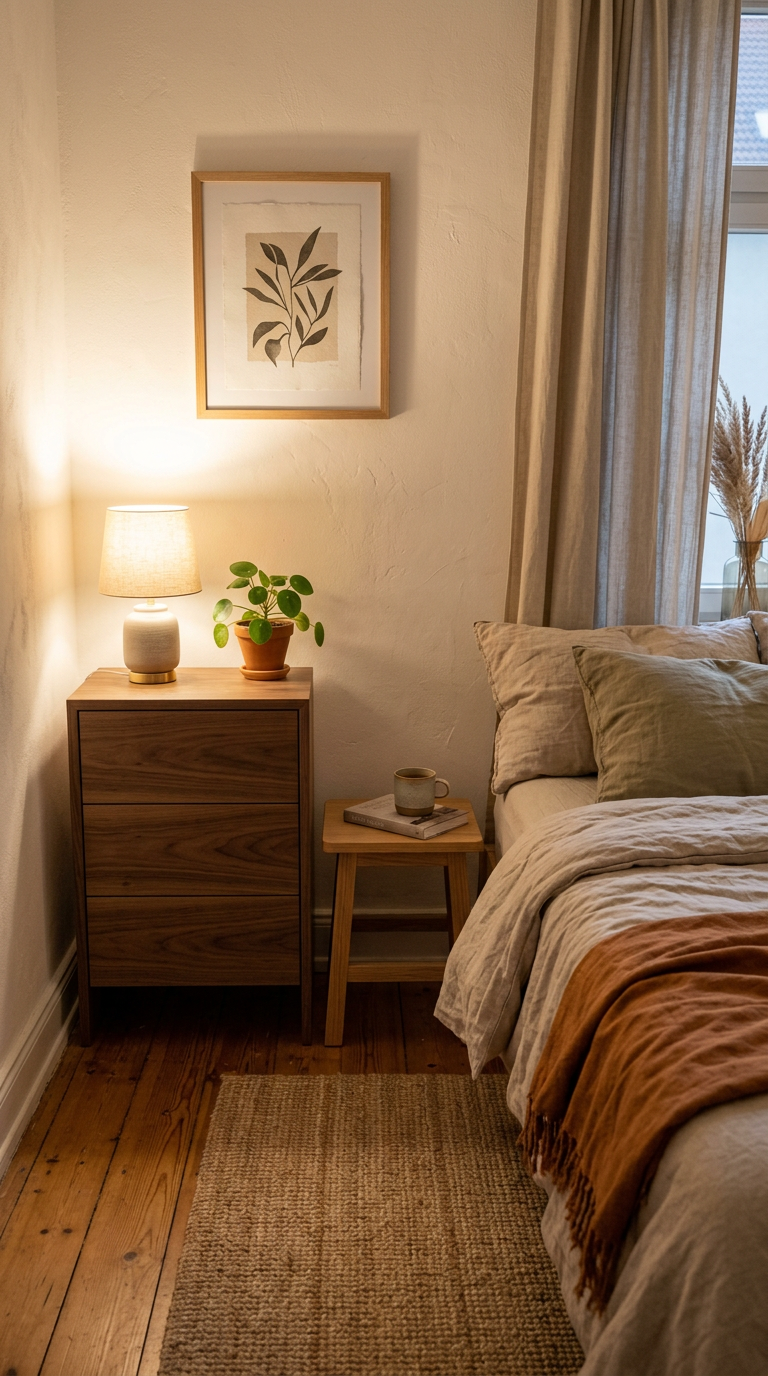
This one tripped me up for a while.
Tone is about color — light, dark, warm, cool.
Finish is about texture — matte, glossy, distressed, smooth.
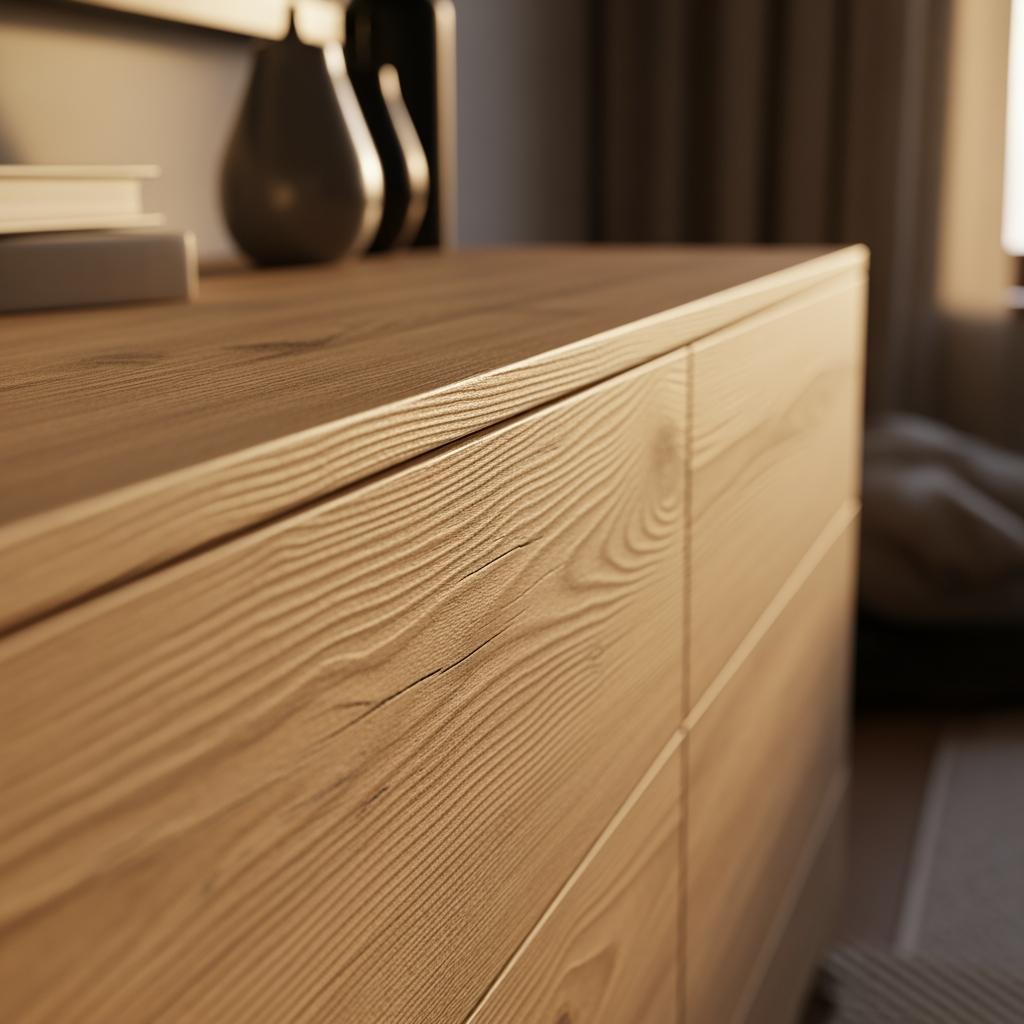
You can have two pieces that are the same tone but totally different finishes, and they’ll still feel like separate things.
A matte white oak and a glossy white oak in the same room?
Weird tension.
Mixing different tones in the same finish family is actually one of the easiest ways to make a room feel cohesive.
Everything matte.
Everything lightly brushed.
The consistency of finish acts like a visual thread.
I switched out a high-gloss side table for a matte version in roughly the same tone and the whole corner of my bedroom calmed down immediately.
The Magic of Introducing a Painted Piece

Sometimes the best way to break up a wood-heavy room is to bring in a piece that isn’t wood at all.
A white bookshelf
.I know that sounds counterintuitive when we’re talking about wood tones.
But a painted piece acts as a visual pause.
It gives the eye a rest and actually makes the wood elements around it look more intentional.
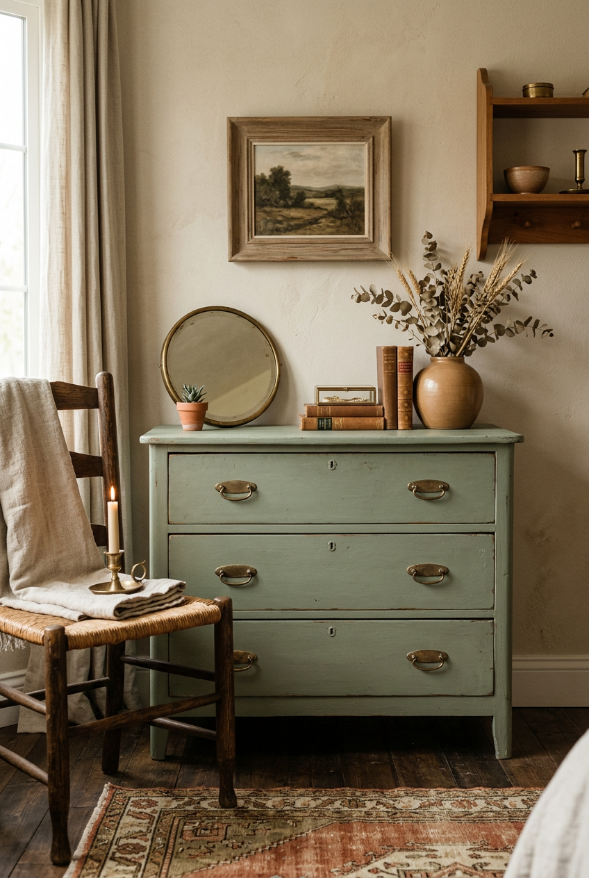
When I tackled my cramped guest room last fall, I brought in a sage-green nightstand I’d been sitting on for months.
Suddenly the warm pine bed frame and the darker wood desk stopped competing — they were framing the painted piece together.
A little non-wood goes a long way.
What Metals Have to Do With All of This
Stay with me here.
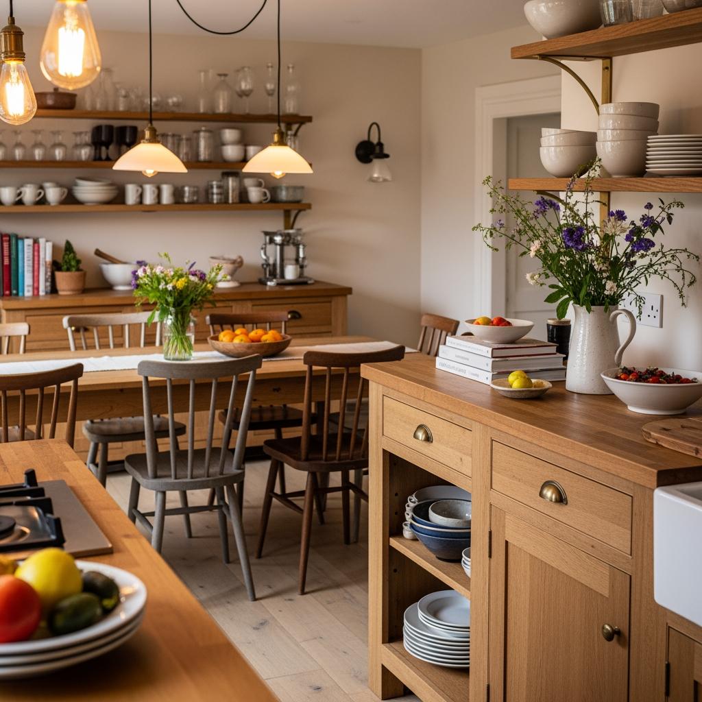
Your metal finishes — hardware, light fixtures, curtain rods — are quietly influencing how your wood tones read.
Warm metals like brass and gold play up the warm undertones in wood.
They make honey and walnut tones feel rich and intentional.
Cool metals like chrome or brushed nickel?
They can feel great with gray-toned woods but they’ll kind of flatten a warm wood.
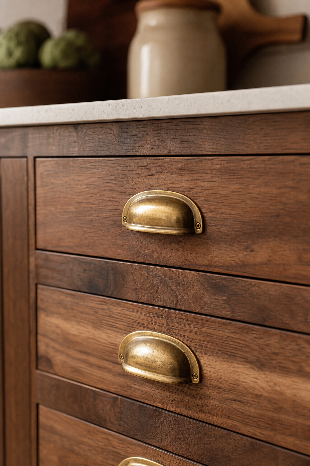
I switched my kitchen cabinet hardware from brushed nickel to unlacquered brass and suddenly my butcher block countertop looked like it belonged there.
Same countertop, completely different feeling.
Seriously, don’t overlook this.
It’s one of those details that’s easy to change and makes a big difference.
Leaning Into the Collected-Over-Time Look

Here’s an opinion I hold firmly: a room that looks like it was all purchased in one Saturday shopping trip is not the goal.
The most beautiful spaces I’ve ever walked into felt lived-in.
Gathered.
Like each piece had a story and a reason for being there.
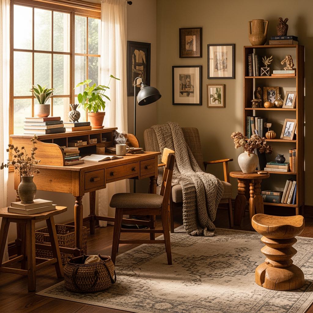
Mixing wood tones is actually one of the fastest ways to get that feeling.
A vintage side table.
A brand-new credenza.
A passed-down rocking chair.
None of them match, but all of them belong.
Give yourself permission to stop chasing a perfect set.
The mix is the point.
How Scale and Shape Help (or Hurt) the Mix

Two pieces of furniture can be totally different wood tones, but if they’re similar in scale and visual weight, they’ll still feel related.
Think about it.
A chunky, low-profile coffee table and a chunky, low-profile media console — even in different tones — share a language.
They’re speaking the same design dialect.

Where things go sideways is when you mix wildly different silhouettes AND wildly different tones at the same time.
That’s just too much variation for the eye to process.
Pick your battle.
Either contrast the tone or contrast the shape.
Not both at once.
Shopping Secondhand With Mixed Tones in Mind
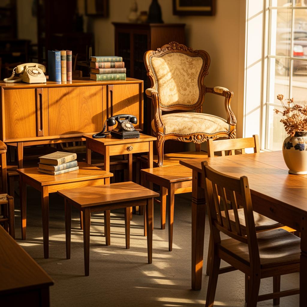
I actually think thrifting and vintage shopping are where mixed-wood rooms shine the most.
When you’re buying secondhand, you’re almost never going to find two pieces in the same stain.
But that’s the gift.
You end up with that collected, layered look without even trying.
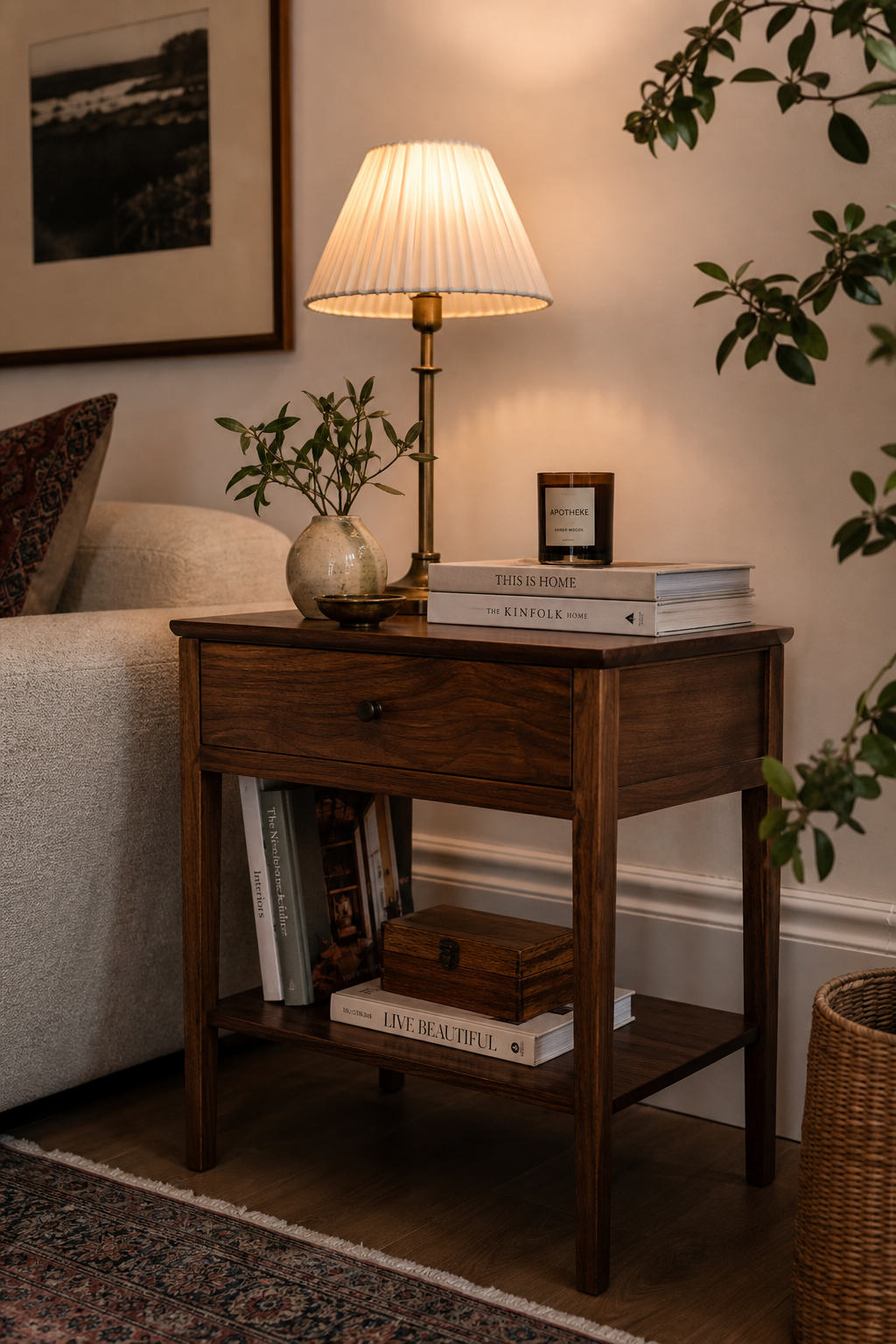
My tip: always take a photo of what’s currently in your room before you go shopping.
Pull it up in the store and hold the potential new piece next to it mentally.
Does it contrast enough to feel intentional?
Does it share an undertone family?
You’ll know.
That $34 walnut side table I found at an estate sale is one of my favorite things I own.
It doesn’t match anything.
It goes with everything.
The Greenery Factor Nobody Talks About
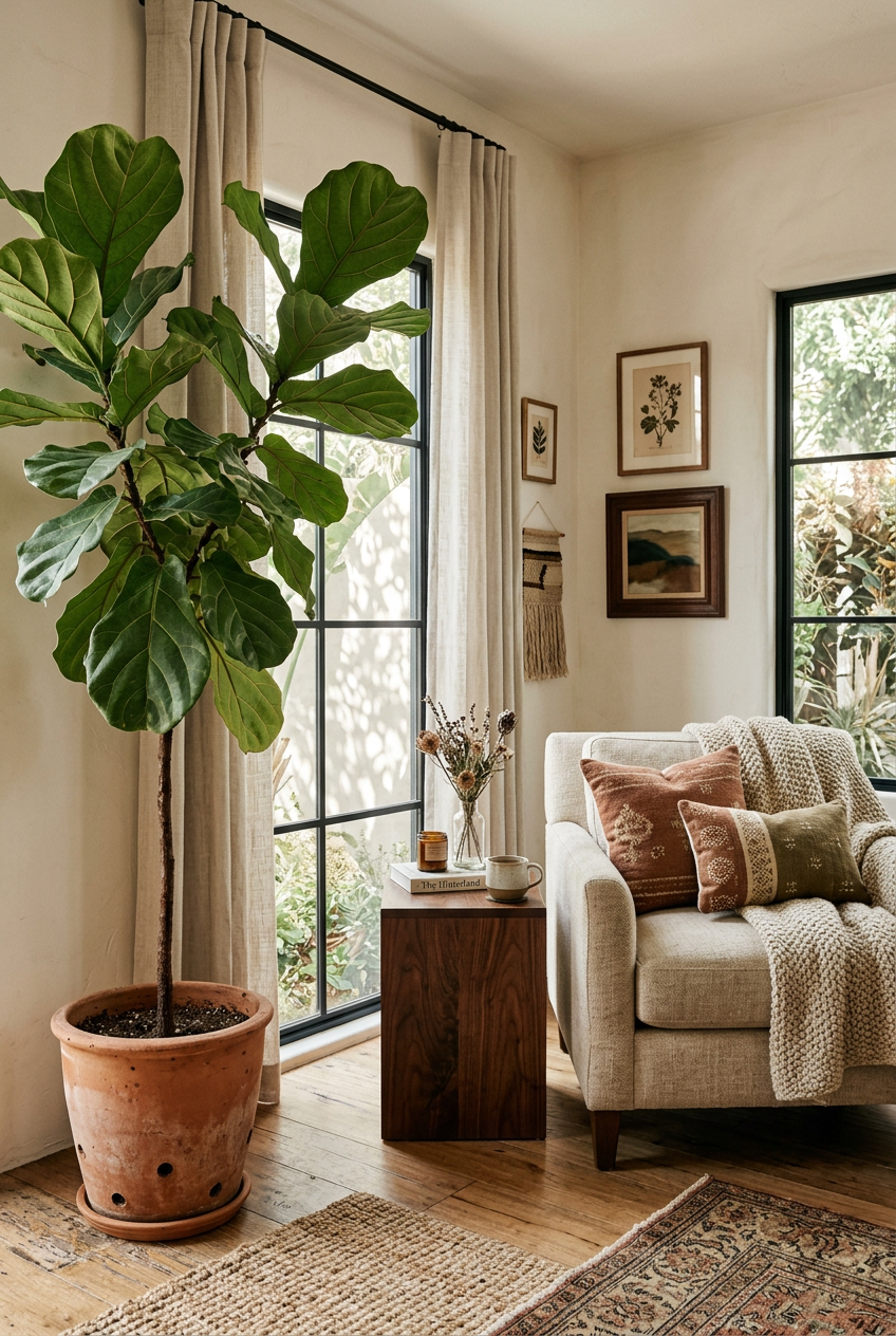
Plants.
I’m obsessed with them for so many reasons, but one of the most underrated is how they interact with wood.
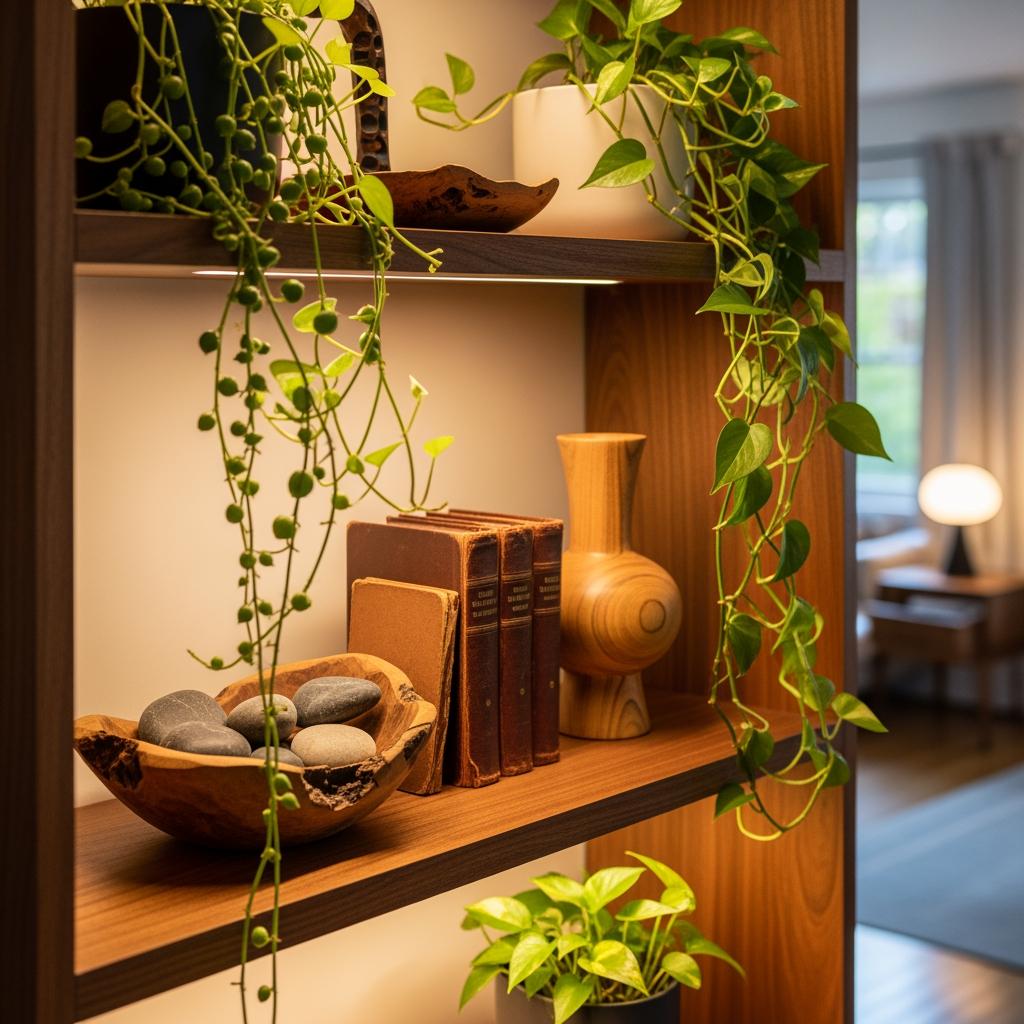
Green is the one color that gets along with every wood tone.
It doesn’t clash with warm browns, it doesn’t fight cool driftwood grays.
It just sort of smooths everything over.
When I have a corner that feels tonally chaotic — too many competing woods in one zone — I add a plant.
A big leafy fiddle fig, a trailing pothos on a shelf, even a tiny succulent on a side table.
The organic texture of leaves next to wood grain is one of those combinations that just works.
Every single time.

