
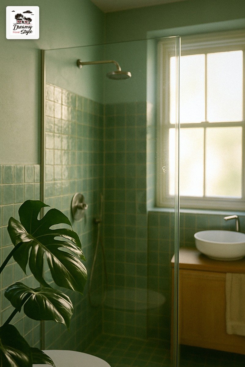

I genuinely ugly-cried the first time I stepped into a hotel spa bathroom.
Not because anything was wrong.
Because everything was so right — the soft green walls, the warm stone floor, the way the light came in and just sat there like it had nowhere better to be.
I came home and stared at my yellowed grout and the sad beige we’d inherited from the previous owners and thought, okay.
I’m doing this.
It took me about eight months, two regrettable paint samples, and one really humbling trip to a tile showroom — but I figured out the palette.
And I’m handing it to you so you don’t have to cry in a hotel bathroom to get there.
The Palette That Started This Whole Obsession
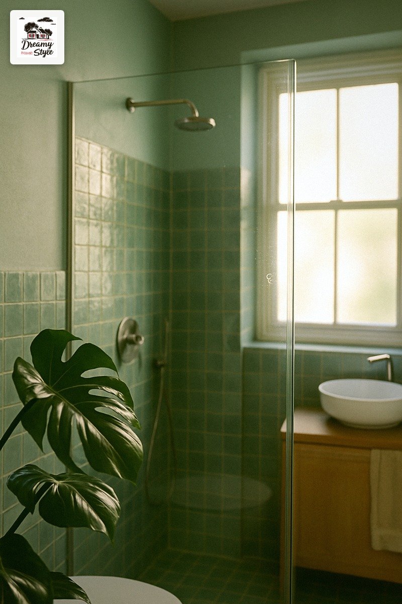
Sage green, seafoam, warm stone, and soft white.
That’s it.
That’s the whole thing.
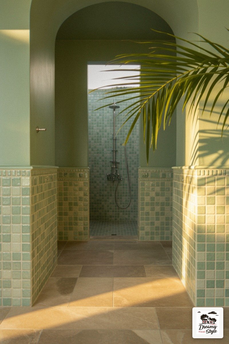
I know it sounds simple, and it is — but the magic is in how these four live together.
Sage is earthy and grounded.
Seafoam is a little dreamy, a little coastal without being nautical.
The stone anchors everything so it doesn’t float away into Pinterest-fantasy territory.
And the white keeps it from going dark and moody.
The first time I tried to put together a spa bathroom palette I went full gray and it felt like a dentist’s office.
So I’m not saying gray is wrong — I’m saying it wasn’t right for this.
This palette is warmer, softer, and honestly a lot more forgiving on skin tones in bathroom light.
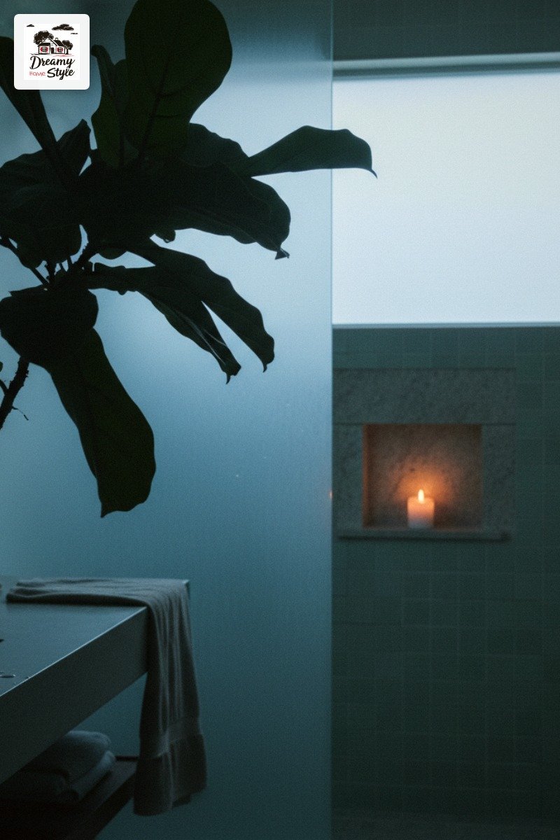
Start here.
Everything else builds off these four.
Sage Green on the Walls Is Non-Negotiable (In My House)
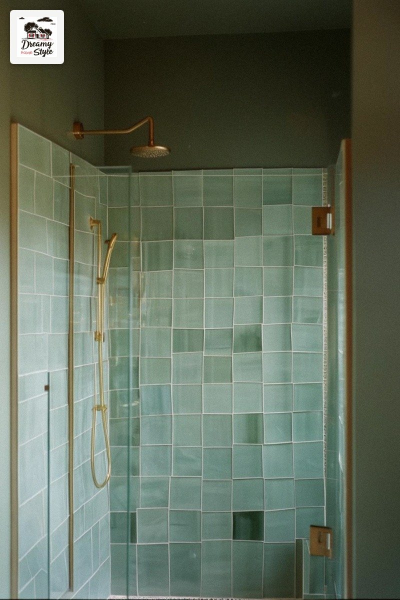
I will fight anyone on this.
Sage green on bathroom walls is the single best decision I’ve made since adopting Biscuit.
It’s one of those colors that looks completely different depending on the light — in the morning it’s almost neutral, in the afternoon it goes a little warm and golden, and in the evening under a lamp it gets deep and earthy.
It does all the work for you.
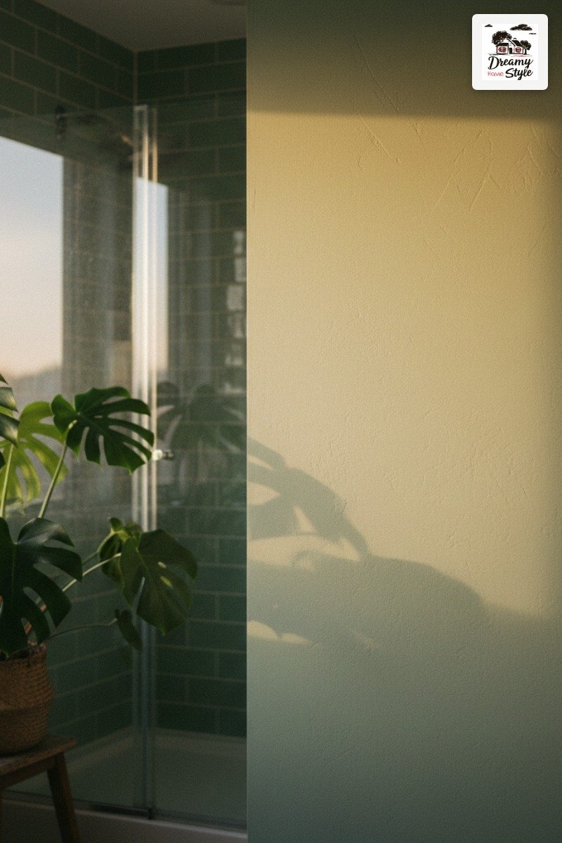
I used a matte finish because I don’t like shiny walls (personal hill I will die on), but a satin would work fine and is easier to wipe down.
My shade was something close to Benjamin Moore’s Saybrook Sage, though I mixed a custom version with my local hardware store because I’m that person.
Paint it all the way up to the ceiling.
Don’t stop at the trim line.
It makes the room feel taller and more intentional.
Zellige Tiles or the Lookalike That Saved My Budget
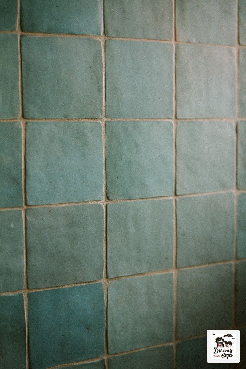
Real zellige tile is gorgeous and also wildly expensive.
I’m talking $40 to $60 per square foot, which for a full shower surround is basically a car payment.
I found a ceramic zellige-style tile at a tile liquidator for $8.50 a square foot and it looks so similar that my sister-in-law thought I’d gone off the deep end financially.
I hadn’t.
I was very financially responsible.
(I was not financially responsible in other areas of this reno but the tile was not the problem.)
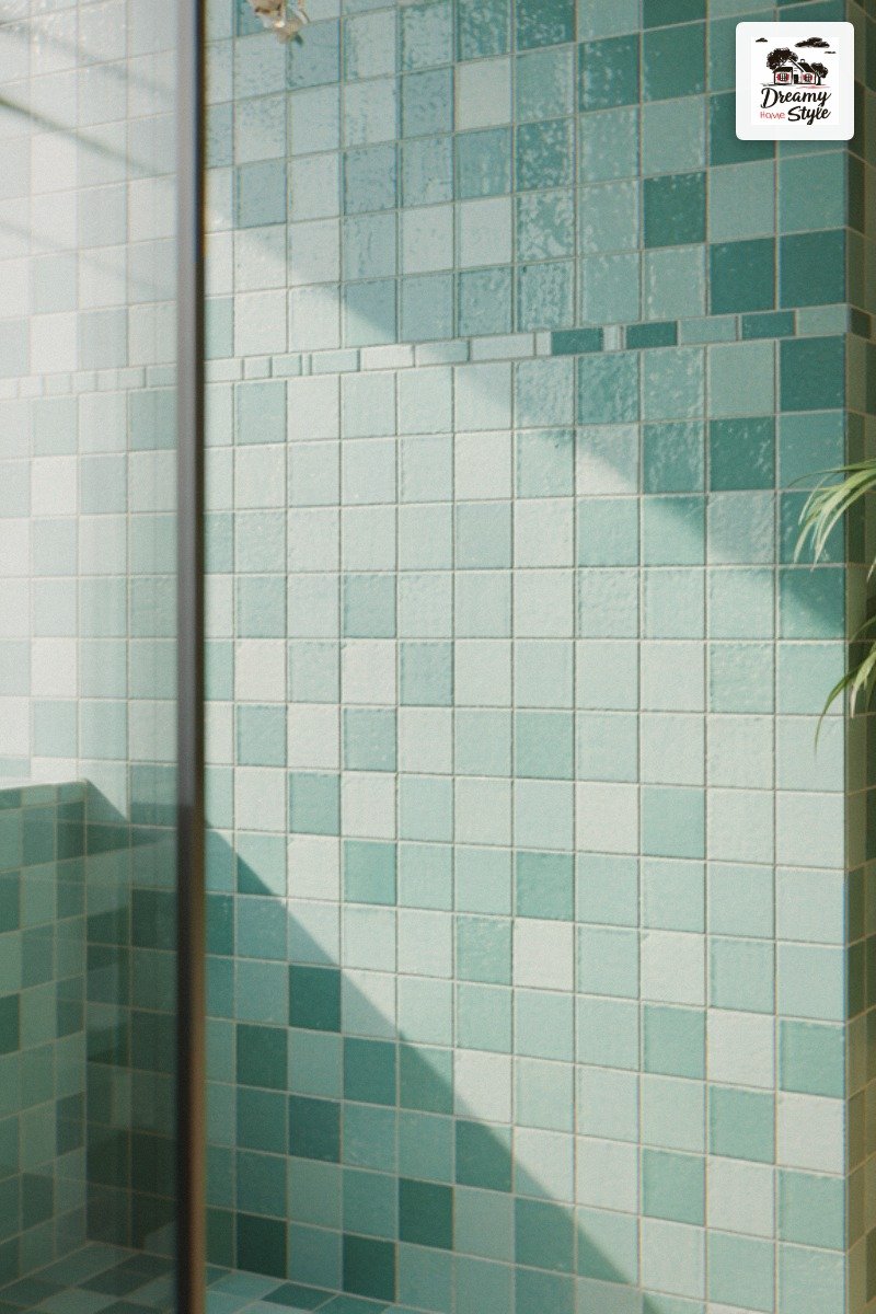
The seafoam colorway is the one to look for — not mint, not teal.
Seafoam.
It’s the version that has a little gray in it, a little green, a little blue, and it shifts in the light just like real zellige does because of the uneven glaze surface.
Lay them in a simple stacked horizontal pattern.
You don’t need a fancy layout when the tile itself is already doing all the visual heavy lifting.
The Floor Tile Decision That Changed Everything
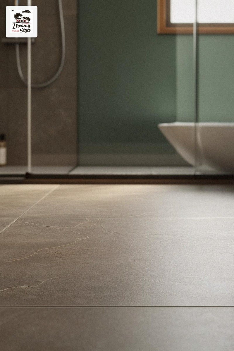
I almost did white subway tile on the floor.
I’m glad I didn’t.
The warm stone-look porcelain tile — something in a greige or taupe with natural veining — is what grounds this whole palette.
Without it, the sage walls and seafoam tiles can start to feel a bit cold and floaty.
The floor brings in that warm, earthy, you’ve-been-to-a-real-spa feeling.
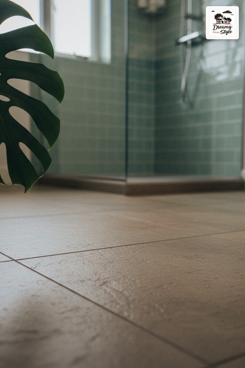
Go with a large format tile if your bathroom is bigger than, say, 50 square feet.
I used a 24×24 inch stone-look tile and the fewer grout lines made the space feel significantly bigger.
In my smaller guest bath I used a 12×24 and it still worked well.
Matte or honed finish, not polished.
Polished stone-look tile in a wet bathroom is a fall waiting to happen and also shows every single water spot.
Please Don’t Skip the Tropical Plant
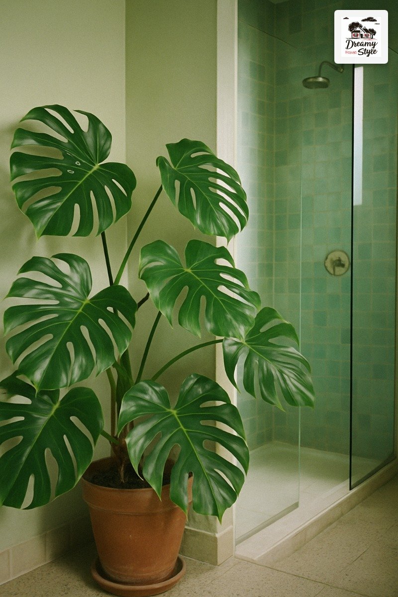
I’m serious.
One big leafy plant changes the whole mood of this palette.
In the reference photo that started this whole obsession for me, there’s a large tropical plant in the foreground — and it’s not decoration, it’s punctuation.
It tells your eye that this is a living, breathing space.
It makes the green walls feel intentional instead of accidental.
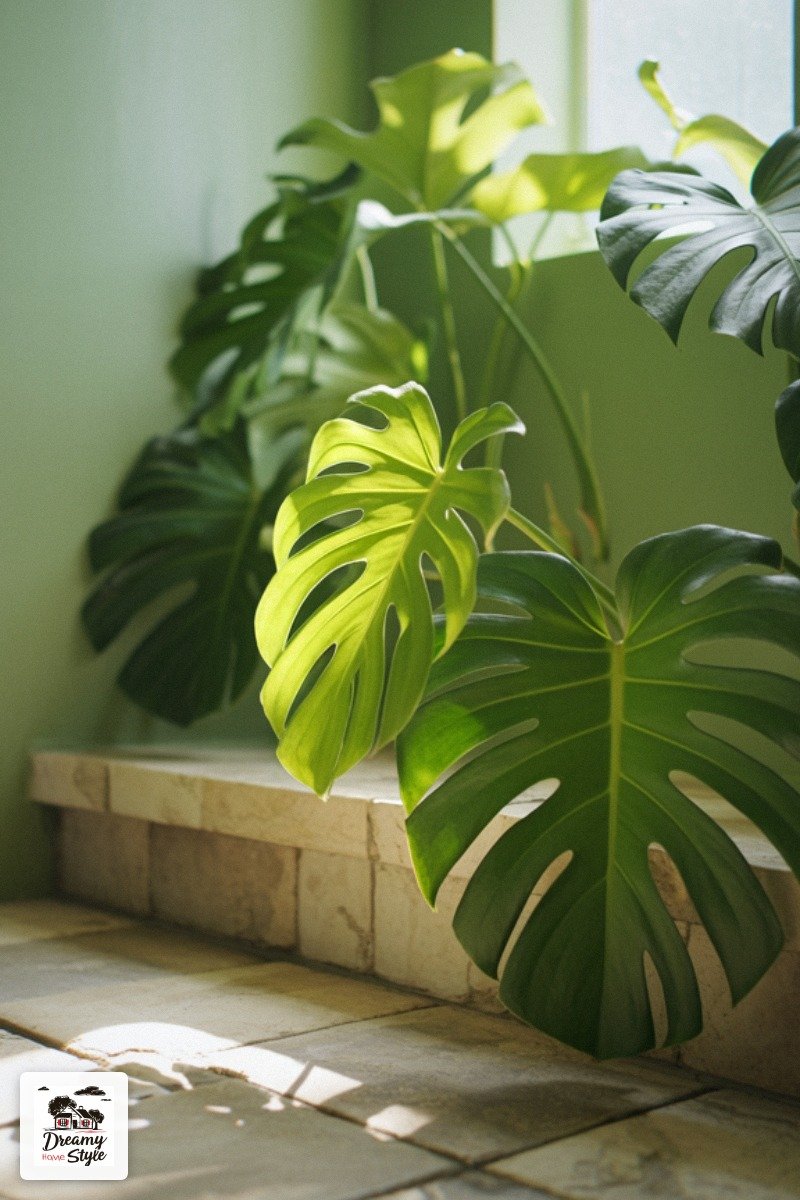
Bird of paradise if you have the ceiling height.
Monstera if you don’t.
Both love the humidity and low-medium light of a bathroom.
I’ve had my monstera in my bathroom for two years and it’s the happiest plant I own (Biscuit has not eaten it yet, which is honestly a miracle).
Put it in a simple pot.
Terracotta, warm stone, matte cream.
Don’t overthink the vessel — the plant is the statement.
Natural Light Is Doing Half the Work Here
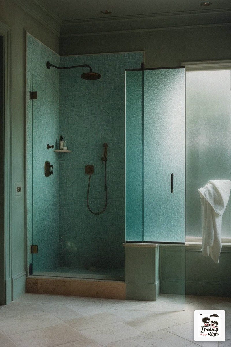
This palette lives and dies by its light.
In harsh overhead fluorescents it’ll look flat and a little sad — and I say this with love because I made this mistake in my first test room.
If you can swing a frosted window or a skylight, do it.
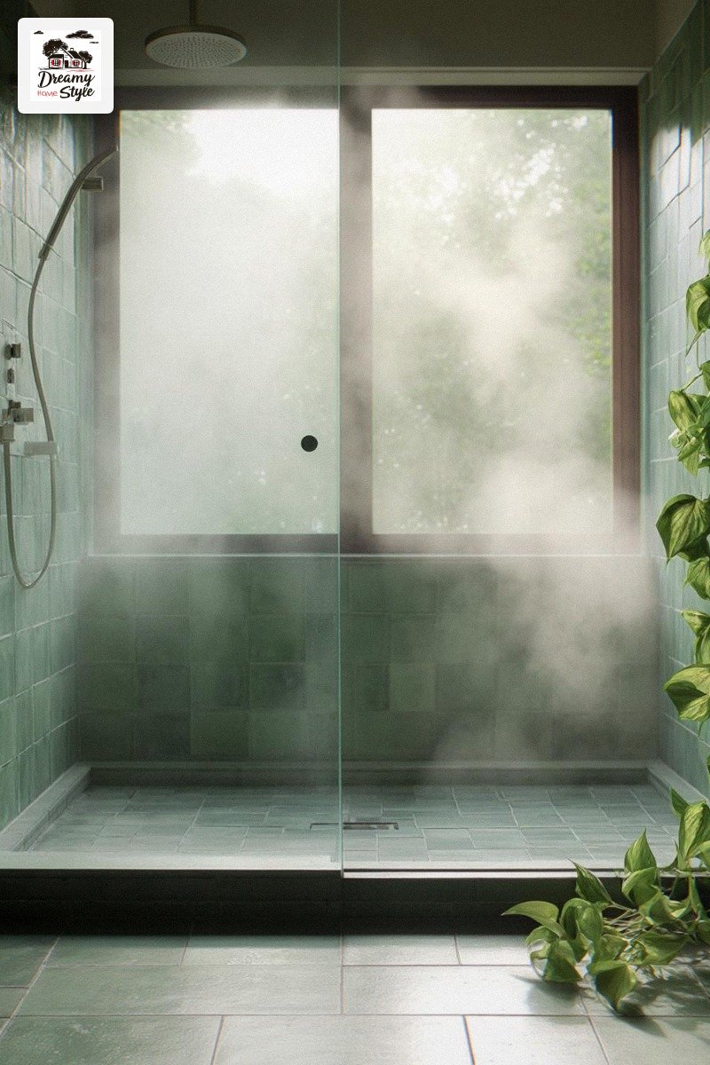
The soft diffused light that comes through frosted glass is exactly what activates the variation in zellige tile and makes the sage walls glow instead of just sit there.
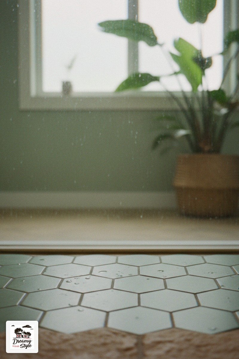
I added a frosted film to my existing bathroom window for about $30 from the hardware store.
Took me 45 minutes and one YouTube video.
It was the cheapest upgrade in the whole reno and genuinely one of the most impactful.
Also: overhead lighting is still a crime and I stand by that.
Add a wall sconce or two on either side of the mirror.
Your face will thank you.
The White Trim That Ties It All Together (Without Taking Over)
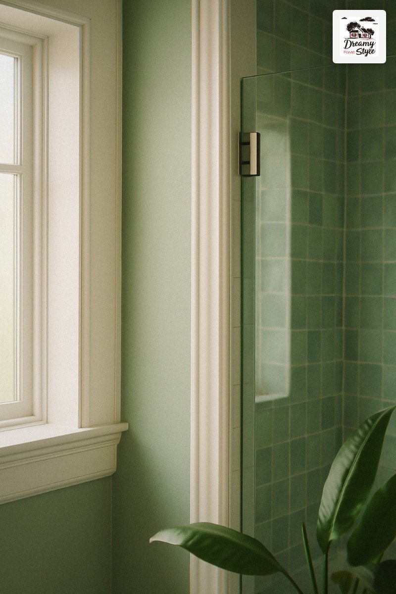
White trim in this palette is like a quiet person at a party who somehow makes everyone feel better.
You don’t notice it much, but you’d notice if it were gone.
I went with a warm white, not a cool bright white.
The difference matters a lot here.
Bright white against sage green reads a little stark.
Warm white — something creamy, with just a hint of yellow or blush in it — softens everything and connects back to the warm stone floor.
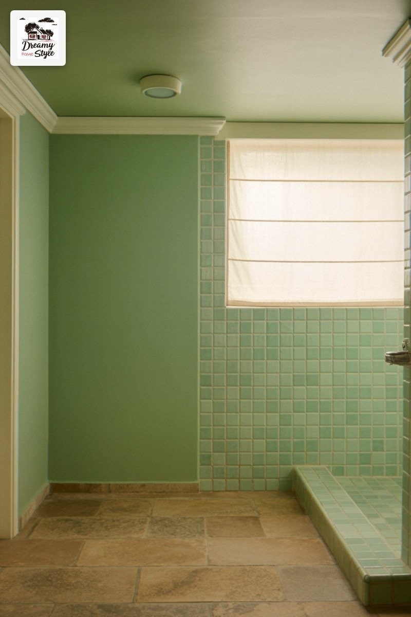
Benjamin Moore Chantilly Lace is what everyone recommends and it’s good but a little too cool for this palette in my opinion.
I used White Dove and it was perfect.
(I also tried Cloud White and it was also good, so honestly you can’t go too wrong in that family.)
Paint the ceiling white too.
Especially if you’ve got the walls going all the way up in sage — the white ceiling keeps the room from feeling like you’re inside a terrarium.
Grout Color Is a Personality Test
I used to think grout was just grout.
I was naive and young (I was 29).
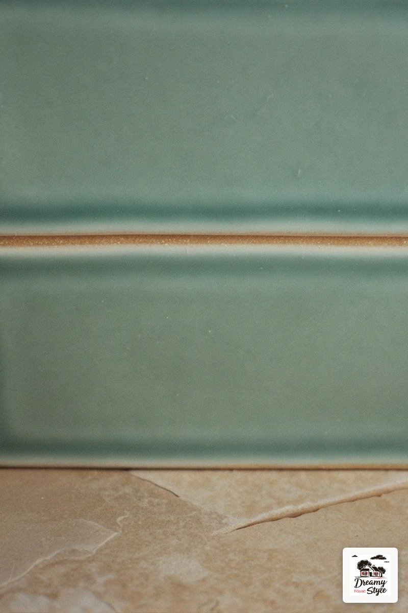
For the seafoam zellige tiles, use a grout that’s close to one of the mid-tones in the tile — not white, not charcoal.
Something sandy or warm gray.
White grout makes the tile pattern look like graph paper.
Dark charcoal grout is a bold move that can work but it pulls attention away from the tile’s natural texture variation, which is the whole point of zellige-style tile.
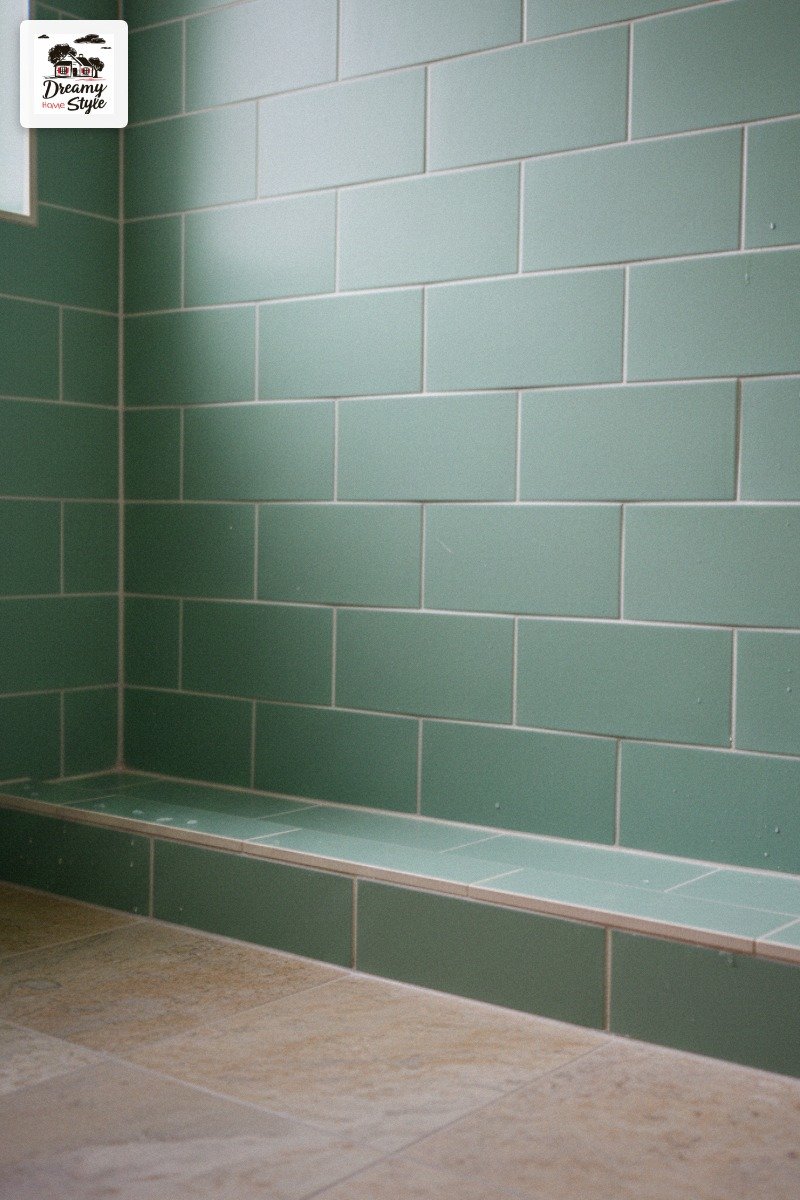
For the stone floor, I went with a grout one shade darker than the tile.
It’s a very small detail but it makes the floor look like real stone because actual stone floors don’t have perfectly matched grout.
Also: seal your grout.
I didn’t on my first tile project.
I have regrets.
Frameless Glass Shower: Worth Every Penny or Annoying to Clean?
Both.
It’s both.
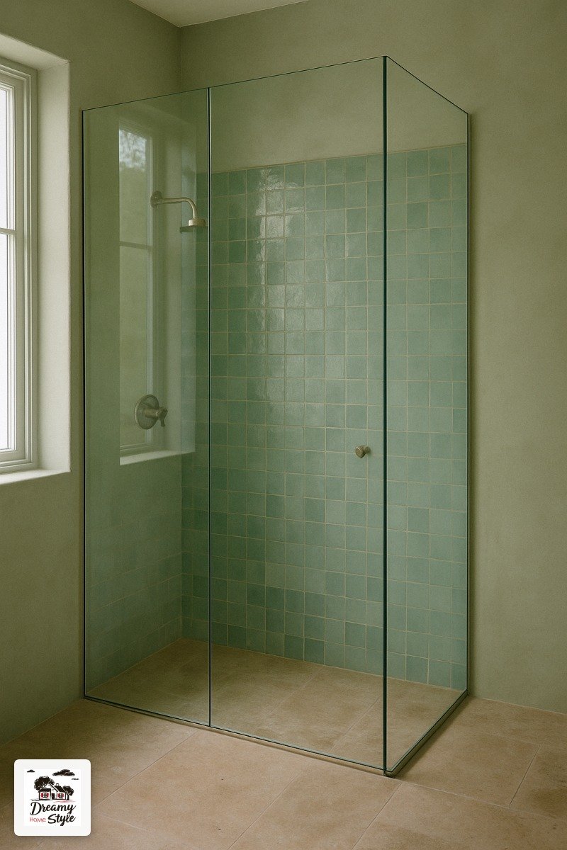
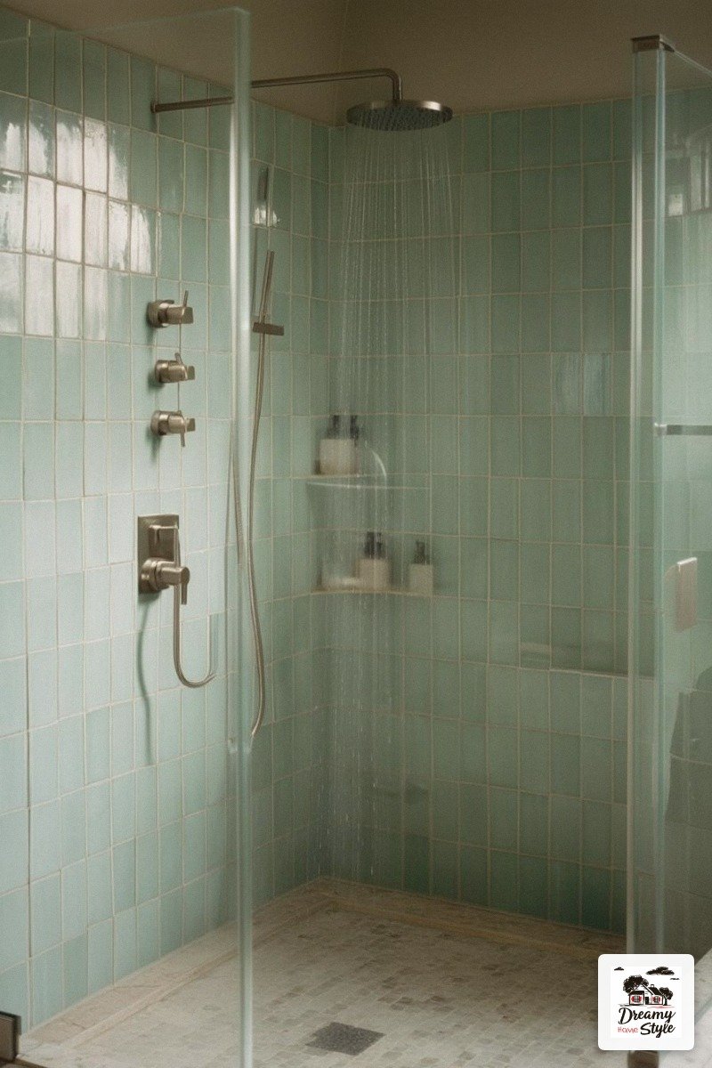
The Frameless Glass Enclosure is what makes this bathroom look like a spa instead of a nice bathroom.
The uninterrupted sight line from the front of the room all the way through to the tile and the window is the whole visual payoff.
If you’ve got a framed shower with a metal track at the bottom, you know what I mean — the eye just stops there.
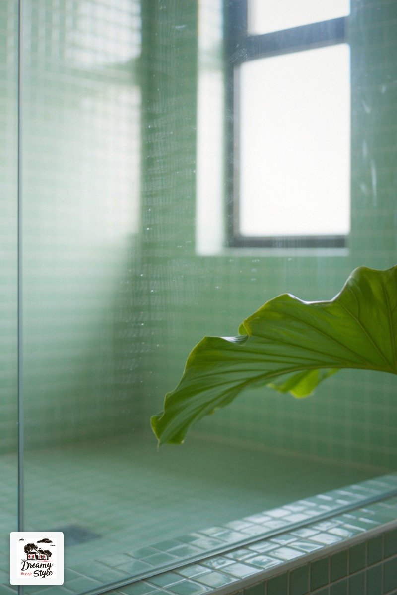
I use a squeegee every single time I shower and I keep a little spray bottle of diluted white vinegar on the shelf for weekly wipe-downs.
Is it extra?
Maybe.
But the difference between a clean frameless glass panel and a water-spotted one is the difference between “spa” and “neglected gym locker room.”
If frameless glass is out of budget, a simple pivot door in a minimal frame is fine.
Just avoid the white or brass framing if you want that airy open feeling — matte black or brushed nickel disappears better.
Hardware and Fixtures: Where I Almost Lost the Vibe
I originally ordered champagne bronze fixtures for this bathroom.
They arrived, I held one up to the tile, and I immediately returned them.
In this palette, warm brushed nickel is the sweet spot.
It’s not as cold as polished chrome and not as warm as brass — it sits right in the middle and lets the wall and tile colors be the story.
I got my towel bar, toilet paper holder, and shower fixtures from a mid-range brand and spent maybe $180 total.
They look genuinely expensive in photos.
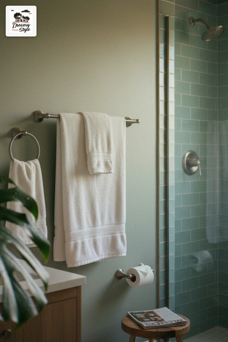
Matte black also works here, especially if you want a little contrast.
I’ve seen it paired with seafoam tiles and it’s kind of stunning.
But it reads more modern and editorial — if you want that warm, soft, organic spa feeling, stick with brushed nickel or warm silver.
One thing I wish I’d known: buy all your fixtures from the same line, not the same finish.
“Brushed nickel” varies wildly between brands.
Accessories That Earn Their Place on the Shelf
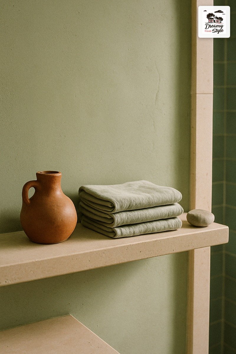
I have a rule: if it doesn’t serve a function or if I wouldn’t buy it at a thrift store for $4, it doesn’t live in my bathroom.
For this palette, keep accessories in warm neutrals and natural materials.
A couple of small terracotta or cream vessels.
A woven basket for towels on the floor.
One or two stones or a piece of driftwood if that’s your thing (it’s my thing).
Nothing that competes with the tile or the walls.
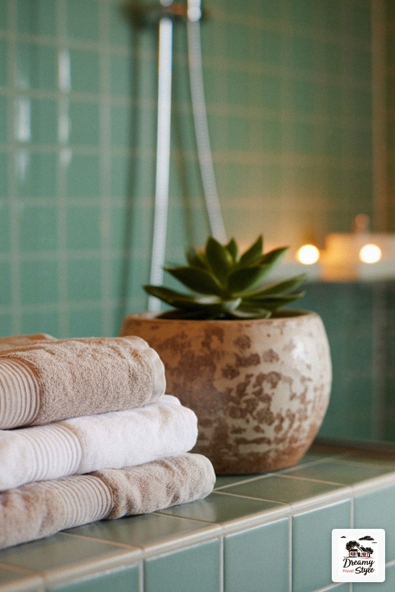
I found a set of linen hand towels in a pale sage at HomeGoods for $12 and they look like they were custom made for this bathroom.
Linen always looks expensive and it air-dries fast, which matters more than people admit.
Resist the urge to fill every surface.
The breathing room is the point.
A spa bathroom with a cluttered counter is just a bathroom.
The Vanity Situation and Why I Kept It Simple
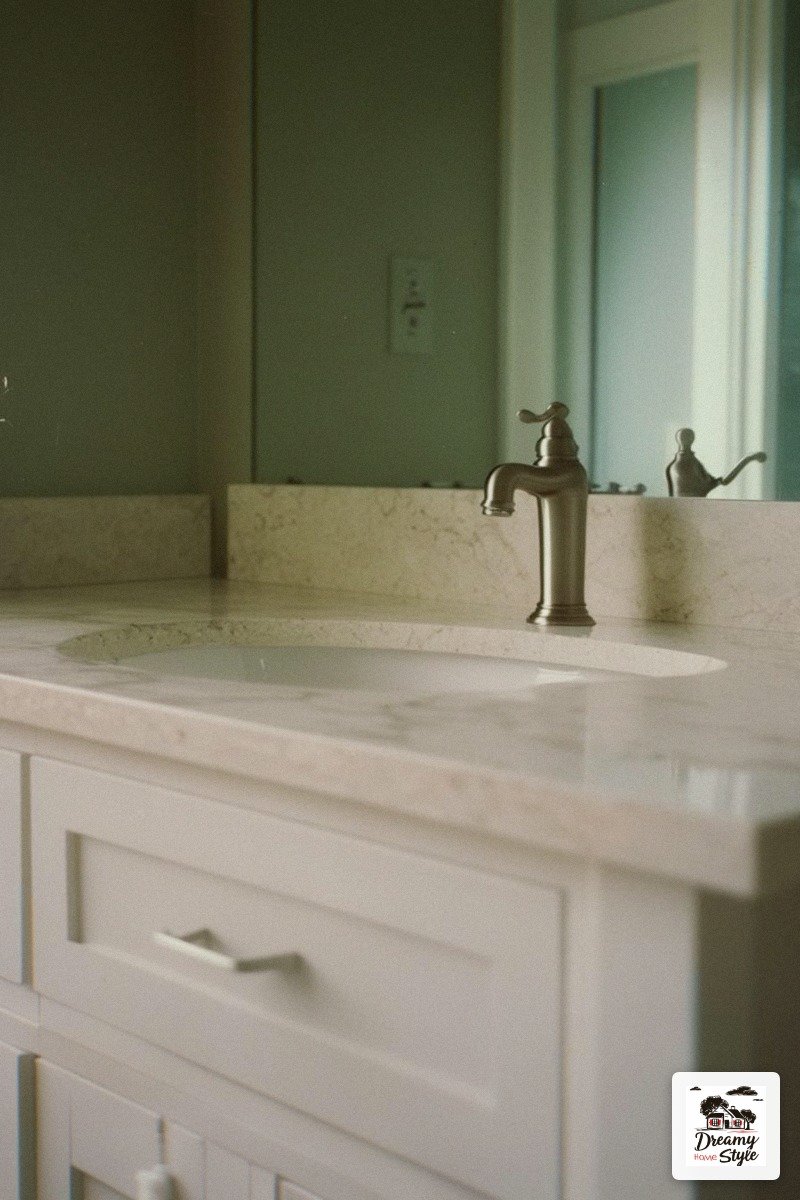
I kept my existing vanity and repainted it.
Warm white.
Done.
Here’s my honest take: a custom vanity is beautiful and also costs more than my first car.
In a bathroom that has this much going on with the tile, the wall color, and the floor, a simple white vanity actually reads as intentional restraint.
It’s the quiet piece that lets everything else pop.
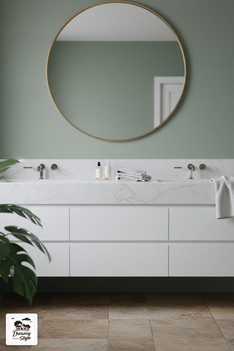
If you’re buying new, a shaker-style vanity in warm white or a natural wood finish both work perfectly here.
The natural wood option is especially gorgeous because it echoes the stone floor and the tropical plant — everything starts to feel connected.
Skip the vessel sink for this vibe.
Undermount or integrated sink, warm white countertop in quartz or marble look.
Clean lines.
The vanity is not the feature.
The One Spot Most People Forget (And I Did Too)
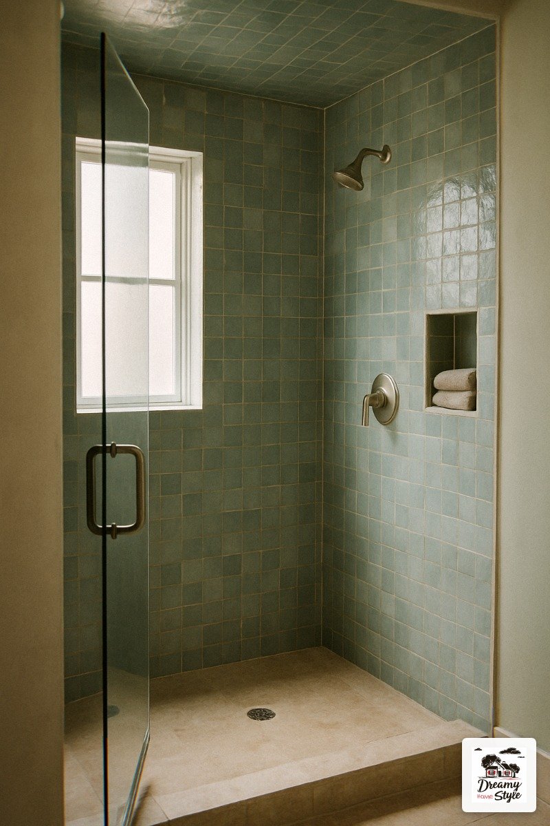
The ceiling above the shower.
I painted mine the same warm white as the rest of the ceiling and it looks fine.
But I’ve since seen bathrooms where they extend the zellige tile up one or two rows and onto the ceiling inside the shower enclosure and it looks absolutely unhinged in the best way.
If you’ve got a little extra tile left over and the ceiling height to work with, do it.
It’s maybe 3-4 extra square feet of tile and it makes the shower feel like a cave in the most luxurious possible way.
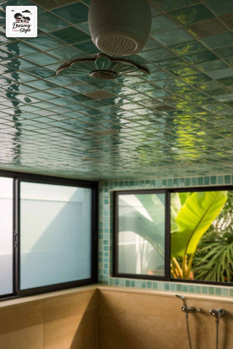
I’m planning to do this in my guest bath reno next spring.
I’ve been saving the offcut tiles from this project specifically for it.
The other forgotten spot: the back of the bathroom door.
A coat hook in brushed nickel and a single fluffy robe hanging there makes the whole bathroom feel like you’ve arrived somewhere.

