
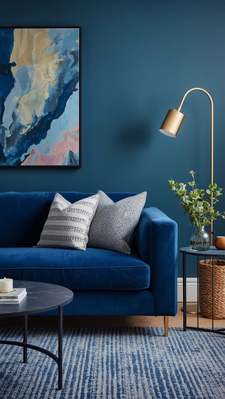

I still remember the exact moment I fell in love with blue rooms.
It was a rainy Tuesday, I was sitting on my sister’s new sofa, and the whole room just felt like a deep breath.
Not cold.
Not stiff.
Just calm.
That’s the thing about blue that nobody really tells you.
It’s not a “trend color,” it’s a mood, and once you find the right shade, your living room stops feeling like a showroom and starts feeling like a hug.
So if you’ve been eyeing blue for your own space but you’re a little nervous about commitment, I get it, I was there too.
Let’s talk through my favorite ways to bring it in, one cozy layer at a time.
Start With a Statement Wall in Navy or Slate

This is where I always tell people to start.
One wall, painted in a deep navy or a soft slate blue, and suddenly the whole room has a backbone.
I did this in my own living room a few winters ago.
I picked the wall behind my sofa, and I remember standing back after the second coat just grinning like an idiot.
It felt intentional, like the room finally had a point of view.
The trick is picking one wall, not all four, at least not right away.
A single statement wall gives you depth without swallowing all your natural light.
And if you’re worried about it feeling heavy, pair it with white trim and lighter furniture to keep things breathing.
My honest tip: test the paint at night too, not just during the day.
Blue can shift dramatically under lamp light, and you want to love it in both.
If you’re renting and can’t paint, a large framed textile or a big piece of blue art does something similar.
It’s not quite the same drama, but it’s a lovely little cheat.
Either way, this one move sets the tone for everything else on this list.
Layer Blue Textiles for Instant Coziness

Okay, this one is my favorite because it costs almost nothing and changes everything.
Throw pillows, a chunky knit blanket, maybe a patterned rug with blue running through it.
That’s it, that’s the hack.
When I redid my own living room, I started here before I touched a single wall.
I grabbed two textured pillows in a dusty denim blue and one soft blanket in a slightly deeper shade, and just seeing them on my beige sofa made the whole room feel more finished.
There’s something about fabric that paint can’t quite do.
It softens the room, it adds warmth, and it makes blue feel touchable instead of just visual.
My personal rule is to mix at least two shades of blue in your textiles, never just one flat tone.
A dusty blue pillow next to a deeper indigo throw creates this little visual rhythm that feels curated, not matchy.
And if you’re someone who likes to switch things up seasonally, this is the easiest swap in the world.
Cozy blue knits for fall and winter, then a crisp linen blue for spring.
Honestly, if you only do one thing from this whole post, do this one.
It’s low risk, high reward, and it’s kindda the gateway drug into loving blue everywhere else in your home.
Pair Blue With Warm Wood Tones

Blue and wood together just work, and I don’t think I’ll ever get tired of saying that.
The coolness of the blue softens against the warmth of natural wood, and something about that combo feels grounded.
My own coffee table is a warm honey oak, and it sits right in front of a slate blue sofa, and every time I walk into the room it just feels right.
Not staged, not cold.
Just right.
If your furniture is already dark wood, lean into a lighter, dustier blue so the room doesn’t feel too heavy.
But if your pieces are lighter, like a blonde or natural oak, you can go a little deeper and moodier with your blue without it feeling like a cave.
I always tell people to bring in wood through more than just furniture too.
Think a wooden picture frame, a rattan lamp base, or even Exposed Wood Beams if you’re lucky enough to have them.
The warmth from the wood keeps blue from ever feeling icy or sterile.
And honestly, this pairing photographs so beautifully in natural light, which is a nice little bonus if you love sharing your space.
It’s one of those combinations that just feels timeless, not trendy, and that’s exactly the vibe I’m always chasing in my own home.
Add Brass or Gold Accents for Contrast

If blue is the calm, brass is the spark.
I learned this the hard way in my first apartment, where everything was blue and silver, and the room just felt flat.
The second I swapped in a brass lamp and a few gold picture frames, the whole space lit up, literally and emotionally.
There’s something about that warm metallic glow against a cool blue backdrop that feels a little glamorous without trying too hard.
My favorite way to do this is through lighting first.
A brass floor lamp or a gold-finished pendant does so much heavy lifting.
Then I layer in smaller touches, like a gold-rimmed mirror, drawer pulls, or even a simple vase.
You don’t need much, just enough to catch the eye and warm things up.
If gold feels too bold for your space, aged brass or a soft champagne finish gives you the same effect but quieter.
I’ve also noticed that mixing metals actually works beautifully with blue, so don’t stress about matching every single fixture.
A little brass here, a little matte black there, it all somehow plays nice against a blue backdrop.
This tiny detail is the difference between a blue room that feels sleepy and one that feels alive.
And once you see it done well, you’ll start noticing brass and blue together everywhere, I promise.
Make a Blue Velvet Piece Your Focal Point

There is nothing, and I mean nothing, quite like blue velvet catching the afternoon light.
I saved up for a velvet accent chair in a deep teal blue a couple years back, and it is still the piece everyone comments on when they walk into my living room.
Velvet has this way of holding color so richly, it almost looks like the fabric is glowing from the inside.
My tip here is to pick one hero piece, not several.
A single velvet sofa, chair, or even an ottoman gives you all that luxurious texture without overwhelming the room or your wallet.
I chose a chair because I wasn’t ready to commit a whole sofa to velvet, and it turned out to be the perfect low-risk way to test the look.
If you’re nervous about upkeep, go for a performance velvet instead of the traditional kind.
It looks just as rich but stands up so much better to daily life, spills, and, if you’re like me, an overly affectionate cat.
Style it with simpler, more neutral pieces around it so the velvet gets to be the star.
A plain linen sofa next to a jewel-toned velvet chair is one of my favorite contrasts in design.
It just feels a little indulgent, in the best possible way.
Go Coastal With Blue and White

There’s a reason this combo never really goes out of style.
Blue and white together just feels like fresh air, like a window cracked open on the first warm day of the year.
I did a mini refresh in my living room using this palette a few summers ago, swapping in white curtains, a blue and white striped throw, and one ceramic vase, and the whole room instantly felt lighter.
This is such a forgiving palette if you’re someone who likes to keep things simple.
White walls, white or cream furniture, then blue coming through in smaller doses, pillows, art, maybe a rug.
My favorite version of this uses a soft chambray blue rather than anything too saturated, because it keeps the whole look feeling breezy instead of nautical or theme-y.
If you want it to feel a little more grown up and less beachy, skip the stripes and go for solid blocks of color instead.
A creamy white sofa with one deep blue accent chair reads as classic, not coastal cliché.
I love this combination especially for rooms that don’t get a ton of natural light, because all that white keeps things feeling open and airy.
It’s simple, it’s timeless, and it genuinely never feels dated, which is saying a lot in this industry.
Try a Monochromatic Blue Palette

This one takes a little more courage, but oh my gosh, the payoff is so good.
A fully monochromatic blue room, meaning several shades of blue layered together with no other color competing, feels incredibly sophisticated.
I tried this in a client’s reading room once, mixing a pale sky blue on the walls with a mid-tone denim sofa and a deep navy rug, and it felt like stepping into a really expensive hotel lobby.
The key to making this work is variation in texture, not just color.
Matte walls, a slightly sheen velvet chair, a woven jute rug with blue undertones.
All that texture keeps the eye moving so the room never feels flat or one-note.
My personal tip is to use the lightest shade on your largest surface, usually the walls, and save your deepest, richest blue for something smaller like an accent chair or a set of curtains.
This creates a gentle gradient effect that feels intentional rather than accidental.
If you’re nervous about going full monochrome, start small in a powder room or a reading nook before committing your whole living room.
Once you see how calming and cohesive it feels, though, I have a feeling you’ll want it everywhere.
It’s one of those looks that feels risky on paper but so soothing in real life.
Soften the Blue With Greenery

Blue and Green together is basically nature’s own color palette, so it makes total sense that it works so well indoors too.
I added a big leafy plant next to my navy accent wall last spring, and it was honestly the missing piece I didn’t know I needed.
The green softened all that deep blue and made the whole corner feel alive instead of static.
My favorite plants for this are ones with big, glossy leaves, like a fiddle leaf fig or a monstera, because they create real contrast against blue’s coolness.
If you don’t have a green thumb, and I say this with zero judgment because I’ve killed my fair share of plants, a few well-placed faux ones work just fine too.
The important thing is scale.
One or two larger plants make more of a visual impact than a bunch of tiny ones scattered around.
I also love tucking a small plant onto a side table near a blue velvet chair, just to break up all that rich color with something organic and textured.
There’s an emotional reason this combo works so well too.
Blue can read as a little serious or moody on its own, but green brings in life, growth, and softness.
Together they feel balanced, like a deep breath after a long day, which is honestly the whole point of a living room anyway.
Mix Multiple Shades of Blue in One Room

I used to think you had to pick one blue and stick with it everywhere.
Turns out, that’s actually the opposite of what makes a room feel rich and layered.
In my own space, I’ve got a dusty periwinkle on one pillow, a deep indigo on my rug, and a soft slate on my curtains, and somehow it all just works together beautifully.
The trick is thinking of blue almost like a neutral, the way you’d mix different shades of beige or gray.
As long as your blues share a similar undertone, either all warm or all cool, they’ll blend instead of clash.
My tip is to pick your boldest blue first, usually your biggest piece like a sofa or a rug, and build the lighter shades around it.
This keeps the room from feeling like it’s fighting with itself.
I also love using one metallic or neutral element, like a cream throw or a light wood table, as a little resting point for the eye between all those blues.
It sounds like it might feel chaotic, but in person it reads as effortless and layered, almost like the room evolved naturally over time.
That’s honestly the vibe I’m always going for, a room that feels collected and lived-in rather than perfectly matched from a single catalog page.
Start Small With Blue Accessories

If you’re still on the fence about committing to blue in a big way, start here.
A few accessories, that’s genuinely all it takes to test the waters.
I always tell friends who are nervous about color to grab a couple of blue ceramic vases, a stack of blue-spined books, or even just one patterned throw pillow before doing anything more permanent.
When I was first easing into this look, I bought one blue glass vase from a little shop I loved, and it sat on my mantel for months before I added anything else.
Slowly, one piece became three, and three became a whole cohesive look I actually planned out.
This approach is so gentle on your budget too, which I really appreciate because redecorating can get expensive fast.
My favorite starter pieces are usually candles in blue vessels, a stack of coffee table books with blue covers, or a small blue-toned throw draped over the arm of a chair.
None of these require any real commitment, and you can always swap them out if you change your mind later.
I think this slow, layered approach is honestly the best way to figure out which shade of blue you actually love living with.
Sometimes it takes a little trial and error, and that’s completely okay.
Create a Cozy Blue Reading Nook

There is something so inviting about a little reading corner dressed in blue.
I carved one out of an awkward, unused corner in my living room last year, just a small armchair, a floor lamp, and a blue mohair throw, and it’s become my favorite five square feet in the whole house.
The color choice matters so much here because you want something that feels calming, not stimulating, since you’re presumably trying to relax or unwind in this spot.
I went with a soft, muted blue-gray for my chair, and paired it with a warm wood side table so the whole corner felt cozy rather than sterile.
My tip is to always add a soft light source nearby, a warm-toned lamp works so much better here than any overhead lighting.
Blue can feel a little cool under harsh light, but under a warm lamp glow it turns almost buttery and soft.
I also love tucking a small basket nearby for blankets or current reads, just to keep the whole nook feeling functional and lived-in rather than staged.
If you have a window nearby, even better, natural light plus a blue palette is basically a recipe for the coziest little escape in your home.
Honestly, this is the corner I find myself drawn to every single evening, and I don’t think that’s a coincidence.
Try a Blue Ceiling for a Little Drama

Okay, this is the one that surprises people the most, but hear me out.
Painting your ceiling a soft, dreamy blue, sometimes called “haint blue” in Southern design traditions, adds the most unexpected little wow moment to a room.
I did this in my own living room almost on a whim, and I remember standing underneath it right after the paint dried, just staring up like a little kid.
It made the ceiling feel higher somehow, almost like a soft sky was floating above the room.
My tip is to go a few shades lighter on the ceiling than whatever blue you’re using on your walls or furniture, so it doesn’t feel heavy overhead.
A pale, almost powdery blue works beautifully here, even in rooms that already have some deeper blue elements happening below.
This trick works especially well in rooms with lower ceilings, because the cool tone tricks your eye into perceiving more height and space.
I also love how it catches light differently throughout the day, sometimes looking almost lavender in the morning and more true blue by evening.
It’s such a small, affordable change, just one ceiling, but the emotional impact is honestly bigger than most of the “big” renovations I’ve done.
If you want your living room to feel just a little magical, this is genuinely my top recommendation.
Mix Patterns With Blue as Your Anchor

Once you’re comfortable with blue as your base, patterns are where the real fun starts.
I used to be so scared of mixing patterns, convinced I’d get it wrong, but using blue as a common thread made it feel almost foolproof.
In my own space, I’ve got a striped pillow, a small floral throw, and a geometric rug, and the only thing tying them all together is that they each include some shade of blue.
My tip is to vary the scale of your patterns, so pair a bold, large-scale print with something smaller and more subtle, rather than two prints of similar size competing for attention.
A big botanical print on a chair paired with a tiny gingham pillow, for example, feels playful rather than cluttered.
I also love keeping one pattern solid-colored in blue, just to give the eye a little rest between all the busier prints.
This is where a room starts to feel really personal, like it reflects an actual person’s taste rather than a showroom display.
I genuinely think pattern mixing is one of the most underrated ways to make a blue room feel unique to you.
It takes a little practice, and yes, sometimes a little trial and error, but once it clicks, you’ll never want a boringly matched room again.
Related read: Things I Wish I Knew Before I Decorated My First Home — Instant PDF + Kindle download. Secure checkout by Stripe

