
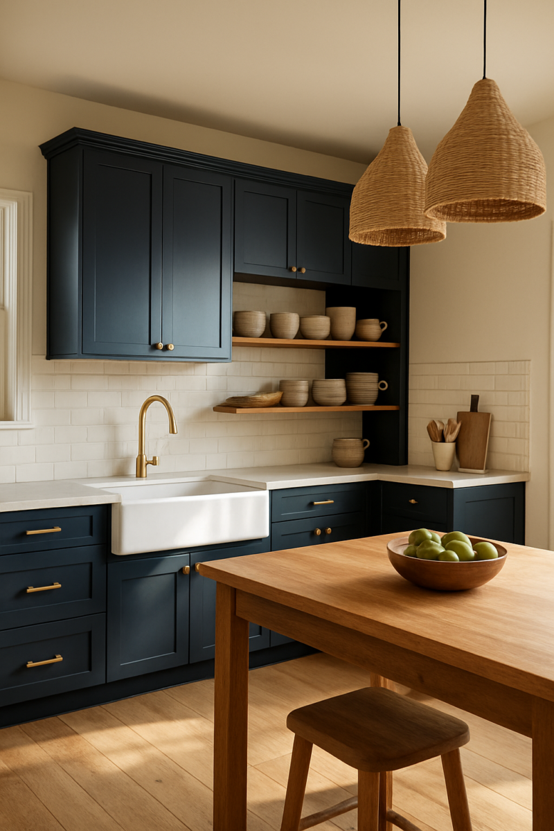
Short answer: the kitchen color schemes that work in the most kitchens are white with warm wood, navy blue with brass, and a soft sage green.
Going modern?
Black and White with one wood tone is the classic.
The bolder schemes, like purple with brass or pink with green, can look amazing too.
They just need a bigger, brighter room and a lot more restraint.
What decides it isn’t the trend.
It’s your kitchen: how much daylight it gets, how big it is, and what you’re keeping (the floor, the counters).
So here are 13 color schemes, each with where every color goes, which kitchen it suits, and the one way it goes wrong.
White kitchens: when “clean” actually means boring

White is the scheme most people land on, and the reason is usually fear, not love.
White cabinets, white walls, white counters, zero contrast anywhere — that’s not timeless, honestly, that’s just scared.
Committing to an actual color feels risky.
I get it.
A warm wood floor, or open shelving with some real texture piled on it, is what actually saves white from going flat and sterile.
White cabinets against a honey-toned oak floor look clean and lived-in.
White cabinets on top of white tile with a white quartz counter, with nothing warm anywhere?
To me that looks like a box you store food in.
And don’t get me started on dog hair against all that white.
Biscuit sheds like it’s a full-time job, and every tumbleweed of fur shows up twice as bad on a white floor.
This works best in kitchens with decent, consistent natural light, where white has something to bounce off of.
In a dark, north-facing room, white doesn’t glow, it goes gray and dull and kind of sad, and no amount of fairy lights fixes that.
The mistake almost everyone makes is matching every white finish to the exact same shade, thinking that’s what makes it look “put together.”
It doesn’t.
Turns out it just flattens the whole room into one undifferentiated blob.
You need the walls slightly different from the cabinets, slightly different from the trim, or your eye has nothing to grab onto.
Navy blue and brass: the safe way to look expensive

Navy and brass is the kitchen equivalent of a navy blazer with gold buttons.
Reliable.
A little boring if you’ve seen it a hundred times on Pinterest.
But, no joke, it earns its reputation, because it genuinely works in a wide range of kitchens.
Dreamy has a whole post on navy blue kitchen cabinets if you want to go deeper.
Navy belongs on the lower cabinets or just the island, not everywhere (an island is plenty of navy for one kitchen, trust me).
Keep your upper cabinets white or a pale cream (they’re the cabinets in your line of sight, usually hung about 18 inches above the counter), and the navy stays grounded instead of turning the whole room into a cave.
Brass goes on the hardware and the faucet, or maybe just one pendant light over the island, not splashed across every surface.
And the undertone of navy matters more than people think: a cool-leaning navy reads sharp and crisp under daylight bulbs, while a warmer navy suits a room that’s bathed in yellow-toned light from incandescent fixtures or late afternoon sun.
The mistake that makes this look like a showroom instead of an actual home: brass on every single cabinet pull.
When every knob and handle matches, it stops feeling collected and starts feeling like a kit you ordered off a website.
Use it on the island, or on just the faucet and one light fixture, and let the rest of the hardware be quieter.
Honestly?
A little mismatched is what makes a kitchen look like someone actually lives there.
Green cabinets: the color that forgives almost any kitchen

Green is the one trendy kitchen color that actually deserves the hype, and it’s my favorite on this whole list.
I’ll die on this hill too.
There’s a shade of green that works in nearly any size room, in nearly any light, which is more than I can say for navy or black.
The trick is matching the undertone to your room.
A muted sage suits a small or dim kitchen because it’s quiet, it doesn’t fight for attention the way a bolder color would.
Deep bottle green is gorgeous but needs a big, bright kitchen to actually breathe in.
Otherwise it starts to feel heavy and closed-in.
And skip chrome hardware entirely.
Green paired with brass (mismatched thrift-store pulls totally count) or an unlacquered brass that’ll patina over time feels warm and intentional.
Green paired with chrome goes cold fast, like a hospital cabinet that happens to be green.
The mistake I see constantly: picking a “green” that’s actually a disguised gray-blue in certain light.
You get it home, paint a cabinet, and under your kitchen’s actual bulbs it looks indecisive, not intentional, kinda like it can’t commit to being either color.
Test it against your actual cabinets, not a paint chip under store lighting.
Black and white: the contrast that needs a buffer

Straight black and white with nothing in between looks more like a dentist’s office than somewhere you’d actually make toast, I swear.
Most people need a buffer tone even if they’d never admit it out loud.
Black works best on the lower cabinets (everything below the standard counter height of 36 inches), maybe the island, with white uppers keeping the room from feeling top-heavy and dark overhead.
This combo wants strong, consistent natural light to really sing.
In a dim room, flip the ratio: lead with white, and use black only in thin strokes, like a window frame or a light fixture, instead of covering entire cabinet runs.
The mistake that shrinks a room instead of sharpening it: pure black on every lower cabinet in a small, low-light kitchen.
It feels decisive in photos and claustrophobic in person.
It can feel like the walls closed in overnight.
Pale yellow: the underrated pick for dark kitchens

Pale yellow gets dismissed as grandma’s kitchen color, and that’s honestly unfair, because it’s one of the only colors that can make a windowless or north-facing kitchen feel sunny without going stark white on you.
It’s the one I’d pick for a dark kitchen, because it makes the room feel awake in the morning, which matters a lot when you’re stumbling in at 6am for coffee and the room still looks like a cave.
Put it on the walls or the upper cabinets, where it can catch and soften whatever light you do have.
Undertone is what actually matters here: a yellow with gray or green mixed in avoids that dated, straight-up-banana look from the seventies.
Pick a yellow that leans orange instead, and you’re suddenly in dated-and-heavy territory rather than soft and warm.
This color is best suited to kitchens with little or no direct sun, where it’s doing the work of mimicking daylight rather than competing against real sunlight pouring in.
Blue and green together: proof that “clashing” colors can cohabit

Blue and Green sit close enough on the color wheel that most people assume they’ll clash the second you put them in the same room.
The actual trick isn’t blending them, it’s separating them.
Keep blue and green on different zones entirely.
Island in one, perimeter cabinets in the other, rather than mixing them on the same cabinet run where they’ll muddy together into something murky.
This needs a kitchen with enough wall and cabinet surface for each color to claim its own space, so it works in larger kitchens.
A tiny galley kitchen just reads busy, because there’s no room for the eye to separate the two.
The mistake that ruins this pairing: choosing a blue and green that are too close in tone.
From a few feet back, the kitchen doesn’t look like two intentional colors, it looks like one confused color that can’t decide what it wants to be.
Gray kitchens: the one everyone picks and immediately regrets

Gray became the default kitchen color because it’s inoffensive, not because it’s actually good.
Honestly, most gray kitchens would look better in almost any other neutral on this list.
Chasing the “right” gray is how people end up buying sample pot after sample pot.
If you keep circling gray, try a warm greige instead.
There, I said it.
The undertone decision matters a lot here.
Cool gray under daylight-leaning bulbs or north-facing light can look cold and almost institutional, like a rental kitchen rather than a home.
Warm greige suits rooms that already have warmer ambient light, incandescent bulbs or afternoon sun pouring in.
Either way, gray needs help from a second material or it reads like an unfinished basement: a wood counter, a brass fixture, a patterned backsplash tile, something with texture or warmth to lean against.
The mistake that makes a gray kitchen feel damp instead of calm: choosing a cool blue-gray in a room with little natural light.
It doesn’t read serene, trust me, it reads like a room that never quite dries out.
Red and wood: the combination people are afraid to try

Everyone’s scared of red in a kitchen because they’re picturing full-on fire-engine red everywhere: walls and cabinets both painted red.
That’s not the point, honestly.
The whole point is one dose of red, and letting the wood do the rest of the work.
A muted brick or terracotta red works beautifully on an island against natural wood cabinetry, or as a backsplash tile (go full height, not just the usual 4 inches above the counter), never the whole kitchen.
This suits kitchens that already have Warm Wood Tones on the floors and cabinets.
If you fight that wood with a cool-toned red instead of a warm brick shade, it looks jarring, like two rooms got mashed together by accident.
The mistake that turns a cozy kitchen into a diner: red across every single cabinet instead of as one accent.
One island.
One wall.
That’s it.
Three-tone kitchens: black and white plus wood

This combo photographs beautifully.
I love it, kinda.
It’s also genuinely hard to pull off in a small kitchen, because three finishes crammed into a tight space stop looking put-together and start looking busy.
In a narrow galley kitchen, three finishes is one too many.
The move is to give each finish its own job.
Black goes on the lower cabinets, white takes the upper ones.
Wood gets the island or open shelving, so nothing’s competing for the same visual space.
This needs a kitchen with distinct zones, an island with real walkway around it, separate from the perimeter cabinets, so the split reads as a decision rather than a random scatter.
Sketching the zones first on Dreamy’s free 2D room planner makes this way easier.
The mistake: spreading all three colors evenly across every surface instead of assigning each one a clear zone.
When black and white and wood all get mixed on the same cabinet run, your eye doesn’t know where to land.
Purple and brass: the one people don’t trust and should

Purple gets treated like a novelty color, something for a kid’s room, not a grown kitchen.
I think that’s a mistake.
But a dark, dusty purple with brass trim can look as sophisticated as navy, honestly.
I don’t think it’s had its moment yet.
A deep plum or aubergine on the island, paired with brass hardware and pale walls around it, keeps the color from tipping into childish or overpowering territory.
This is better suited to larger kitchens with good light, because in a small, dim kitchen, a deep purple can genuinely swallow the room whole.
The mistake that tips the whole thing into costume territory: picking a bright or cool-toned purple instead of a muted, warm one.
Bright purple reads like a prop.
Dusty plum reads like a decision.
Pink and green together: softer than people assume

Pink and green has an image problem, and it’s entirely because people reach for the saturated, candy versions instead of the muted ones.
Bubblegum pink and kelly green together reads like a toy aisle, honestly.
Not what most of us want our kitchen to feel like.
Swap in a dusty rose on the cabinets with a deep, mossy green island (or flip it, rose on the island, green on the perimeter) and suddenly it reads grown-up instead of nursery.
This works best in kitchens with plenty of white or neutral wall space, so the two colors have room to breathe instead of competing for attention on every surface.
The mistake: pairing a bright pink with a bright green.
Playful in a kid’s bedroom.
Cartoonish in a kitchen where you’re trying to make dinner.
Rustic neutrals: the combination for a house that already has history

Rustic neutrals get dismissed as boring next to anything bold and trendy.
But if your house already has existing wood trim, original floors with eighty-year-old scratches in them, uneven plaster walls, and baseboards painted over a dozen times, fighting all that history with a trendy color is the actual mistake, not the neutrals themselves, honestly.
Layer warm wood cabinets, a stone or butcher-block counter, a cream wall, and whatever trim’s already there, and texture starts doing the work that color usually does.
This works especially well in older houses, like the older house I’m slowly fixing up, where a crisp white or stark black scheme would just clash against trim that’s already not interested in being modernized.
The mistake: using rustic neutrals with zero texture variation.
Flat tan walls and flat tan cabinets, and suddenly it’s not warm, it’s just beige and kinda lifeless.
Mix something matte against something glossy, then throw in rough against smooth, or the whole thing falls flat.
Rainbow kitchens: how to use five colors without looking like a toy store

A rainbow kitchen isn’t actually about using more color.
It’s about using more restraint everywhere else, so the color you do add has room to actually work.
Borrow the old 60-30-10 decorating rule of thumb: one dominant neutral, white or wood, as roughly 60 percent of what you see, a second color around 30 percent, and the brights in the last 10 percent or so.
In practice that means two or three bright colors living only on lower cabinet fronts or bar stools, never on walls and cabinets both.
This works best in large, well-lit kitchens, where your eye has enough physical space to separate each color instead of blurring them together.
In a small kitchen, the exact same colors become visual noise instead of personality.
The mistake: treating every surface as an opportunity for a new color.
Instead, pick your neutral base first, then limit yourself to two or three bright spots, max, and stop there.
Trust me, it’s always tempting to add a fourth.
Choosing between these: undertone and light first, then size
Most people pick a kitchen color from a photo online instead of from their own room’s actual light.
That’s backwards.
And it’s the real reason so many kitchens get repainted way sooner than anyone planned.
North-facing kitchens cool colors down.
South and west-facing kitchens warm them up.
So test any color at the actual wall, at different times of day.
Paint a big sample board, tape it up, and look at it morning and evening for a few days before you buy the gallon.
I like doing this on a weekend, when I’ve actually got time to sit with a coffee and watch the light move.
Small kitchens read busier with more than two finishes going at once.
Large kitchens can handle three or four without tipping into chaos, because there’s enough square footage to let each one hold its own space.
The mistake: picking a swatch under store fluorescents, or worse, on a phone screen, instead of holding it against your kitchen’s own windows and whatever you’re not replacing (the floor and the counter, mostly).
Not sure yet?
Try it on a photo of your own kitchen with the free room paint visualizer before you buy a sample pot.
Committing without a redo in two years
The kitchens that get redone every few years are almost always the ones picked to match a trend instead of a room.
That’s an expensive lesson, and one I’d rather you skip.
Pick based on your room’s actual conditions over whatever’s trending this year, and keep half an eye on your budget while you’re doing it.
And keep one element flexible so you’re not locked in forever: hardware, or whatever you’ve got styled on open shelves.
Those are the cheapest way to shift a scheme’s whole feel later without touching cabinets or walls at all.
Swap brass for black hardware, rearrange what’s sitting on the open shelf, and the kitchen feels different without a single can of paint involved.
The schemes that actually last are the ones chosen for a room’s light and size, not for how gorgeous they looked on someone else’s kitchen in someone else’s house with someone else’s windows.
Related read: Things I Wish I Knew Before I Decorated My First Home — Instant PDF + Kindle download. Secure checkout by Stripe