


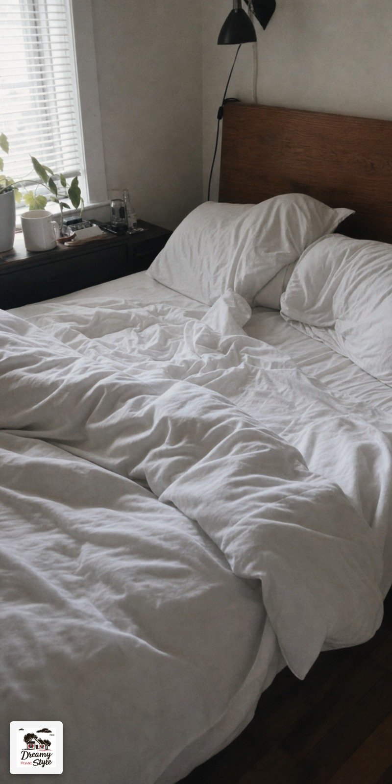
I slept on white bedding for three years because I thought that’s what ‘grown-up’ bedrooms looked like.
Crisp, calm, hotel-y.
And honestly?
I was bored out of my mind every single morning.
Then one Sunday I grabbed a dusty marigold quilt from the thrift store for $8 and a faded blue striped pillow off the clearance rack, threw them on the bed just to see, and stood there in the doorway for a full minute.
Biscuit jumped up and immediately shed on everything, which, fine.
But the room felt alive in a way it never had before.
That was the start of something I genuinely can’t undo.
Why White Bedding Is Quietly Draining You

I know, I know.
White bedding photographs beautifully.
Every design account you follow swears by it.
But here’s what nobody says out loud: white bedding in an actual lived-in home turns gray within six weeks and shows every coffee drip, every paw print, every Tuesday.
Beyond the maintenance thing, there’s something emotionally flat about climbing into a colorless bed every night.
Your bedroom is the first thing you see in the morning and the last thing you see at night.
That’s a lot of hours staring at nothing.
I’m not saying white is wrong for everyone.
If it genuinely makes you feel serene, keep it.
But if you’ve been vaguely unsatisfied with your bedroom for a while and can’t figure out why, I’d bet money the bedding is part of it.
Color does something to your nervous system.
Warmth, texture, a little visual surprise.
It makes the room feel like yours instead of a showroom no one actually lives in.
The Combo I Accidentally Discovered at a Thrift Store
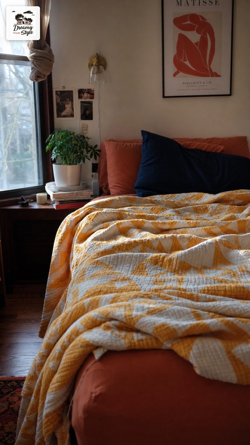
The marigold quilt was the starting point.
Thick cotton, slightly faded in that perfect sun-worn way, a small geometric pattern in cream and rust.
It was folded on a shelf between some truly unfortunate floral curtains and I almost missed it.
I paired it with a terracotta-colored fitted sheet I already owned (originally bought for my guest room, never used) and one deep cobalt blue euro pillow I found in the same thrift run.
That’s it.
Three pieces.
The combination shouldn’t work on paper.
Yellow-orange, dusty red, and a strong blue.
But it did something warm and sort of sun-soaked, like a bedroom in southern Portugal, which I have never been to but now feel like I’ve visited every night.
Total cost: the quilt was $8, the sheet had been sitting in my closet, and the pillow was $4.
Twelve dollars.
I’d spent more on a latte that same week.

How to Pick Your Anchor Color Without Overthinking It
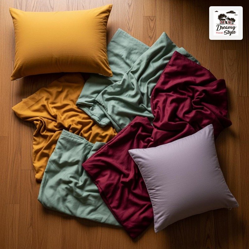
The anchor color is just the loudest one.
The one the whole thing is built around.
For me it was the marigold.
For you it might be a deep sage green, a faded burgundy, a dusky lilac.
Pick one that genuinely excites you, not one you think is ‘safe’.
Here’s something I changed my mind about: I used to think the anchor color had to match the wall color or at least relate to it.
That’s not true.
Sometimes contrast is the whole point.
My bedroom walls are a warm greige and the marigold fights them in the best possible way.
A solid rule I’ve found: if you’re nervous about a color, buy a pillowcase in it first.
Cheapest experiment you can run.
If you hate it after three days, you’re out $6, not $60.
Don’t pick a color because it’s trending.
Pick it because it makes you feel something when you look at it.
That’s genuinely the whole selection process.
My Exact Color Pairing Formula (It’s Not Actually a Formula)

I’ve tried a lot of combinations at this point.
Sage green with cream and a rust throw.
Navy with dusty pink and natural linen.
Mustard with forest green.
Some worked, some were objectively a disaster (the navy-and-dusty-pink phase still haunts me a little).

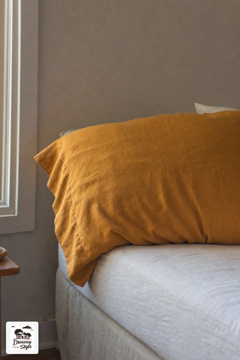
The thing that seems to work most consistently is this: pick one warm, one cool, and one neutral.
Not in equal amounts.
The neutral should be the quietest.
Think of it as the thing that stops the other two from yelling at each other.
So: marigold (warm) + cobalt (cool) + terracotta (warm-neutral that sort of mediates).
The terracotta isn’t fighting to be noticed.
It’s just there, holding everyone together.
This isn’t a strict rule.
Rules in decorating kind of annoy me.
But if you’re standing in a store paralyzed by choices, this framework gives you something to lean on.
Texture Is Doing Half the Work (Seriously)
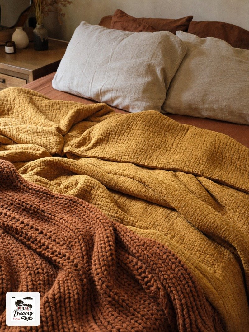
Color gets all the credit but texture is the reason colorful bedding looks rich instead of just loud.
A flat, shiny polyester throw in a bold color looks cheap.
A slightly nubby woven cotton in the same color looks intentional.
When I added a chunky knit throw in a burnt amber to my setup, the whole thing suddenly felt like a real bedroom and not a mood board experiment.
The weight of it, the visual depth.
It’s not just about how it looks, it’s almost about how it makes you feel standing in the doorway.
Mix your textures on purpose.
Smooth fitted sheet, textured quilt, nubby or velvet pillow.
One woven element and one soft element is a pretty reliable starting point.

I made the mistake early on of buying all smooth, all matte pieces thinking it would look cohesive.
It looked boring.
Cohesion comes from color, not from everyone having the same surface finish.
The Pillow Situation (And Why Less Is More, Usually)
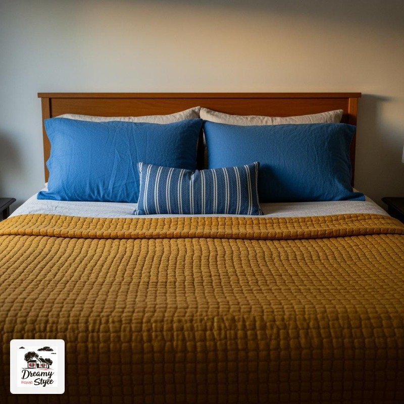
I used to pile on every pillow I owned because I’d seen it done on Instagram and it looked luxurious.
In real life it mostly just meant I was moving twelve pillows off the bed every night and dumping them on the floor where Biscuit immediately claimed them.
For a colorful bedding setup, pillows are where you can afford to be a little bolder because they’re the easiest thing to swap out.
One or two euro shams in a contrasting color, your two sleeping pillows in something neutral, maybe one lumbar pillow if you’re feeling ambitious.
That’s enough.
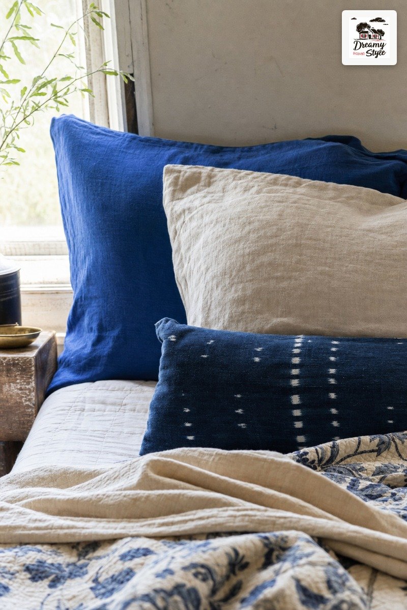
The lumbar pillow is optional but I genuinely love it.
A small punch of a third color or a fun texture right at the front of the setup.
Mine is a faded indigo with a subtle stripe and it cost $11 at HomeGoods.
Don’t let the pillow situation stress you out.
Seriously.
It’s the most fixable part of any bedding situation.
What to Do When Your Partner Hates Color
This is a real conversation I had to have.
My partner’s decorating instincts run toward ‘does it come in gray?’ and mine run toward ‘what if we tried paprika?’.
We’ve reached a détente.
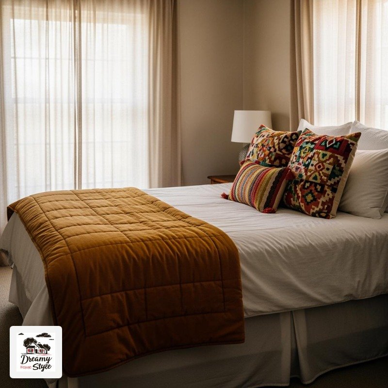
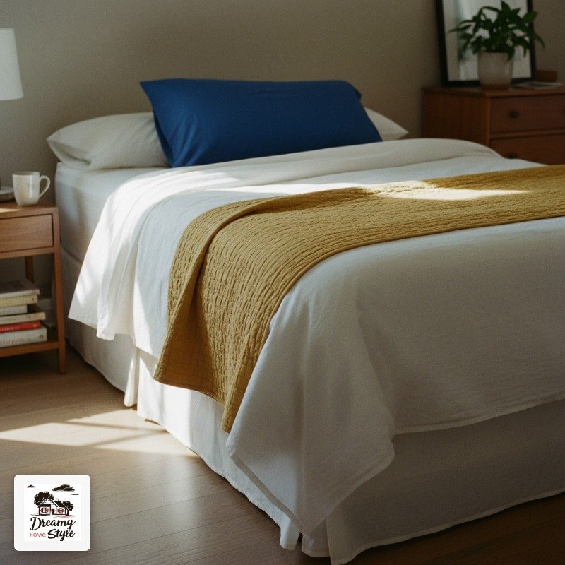
The trick that actually worked for us: keeping the sheets neutral.
Like, truly neutral.
White or natural linen fitted and top sheet.
Then all the color lives in the quilt and the pillows, which are sort of on ‘my’ side visually and can be pushed aside at bedtime.
It sounds like a compromise but it actually looks better than going full color on everything.
The neutral sheets ground the whole thing and make the colors read as intentional rather than overwhelming.
I will say: after about two months of living with it, he admitted the room felt warmer.
He didn’t fully endorse the cobalt pillow but he stopped sighing at it, which I’m counting as a win.
Thrift Store and Secondhand Finds That Actually Work
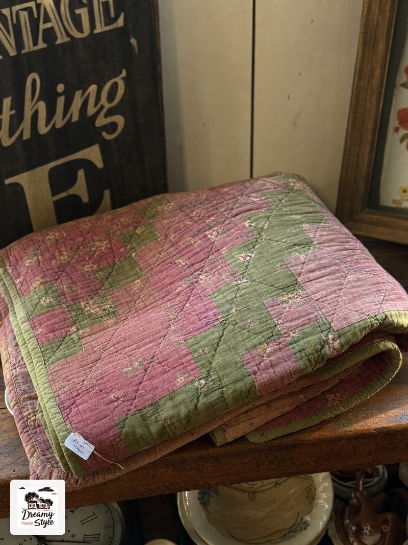
Most of my best bedding pieces have come from thrift stores, the Facebook Marketplace, or the clearance bin at TJ Maxx.
I know some people are squicked out by secondhand bedding and that’s valid, wash everything twice on hot, problem solved.
What to look for: 100% cotton is almost always the right answer.
It washes better, ages better, and feels better than blends.
Check the tag before you grab anything.
Quilts in particular are amazing thrift finds because they’re bulky and expensive new but show up constantly at secondhand shops.
I’ve found some genuinely beautiful handmade quilts for under fifteen dollars.
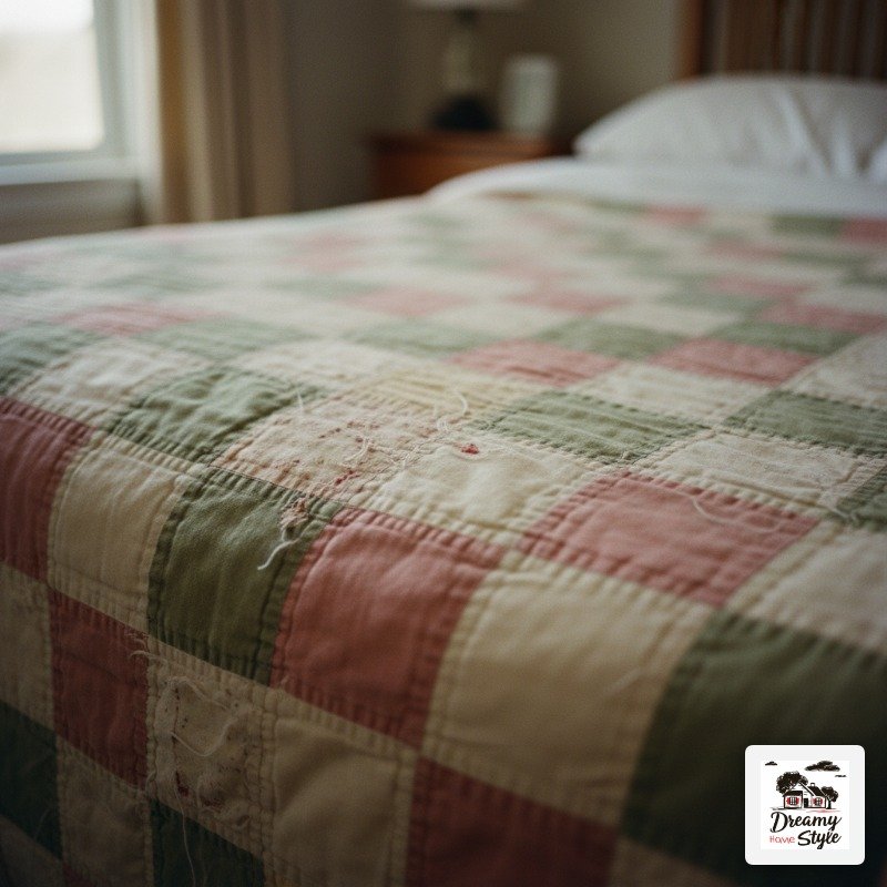
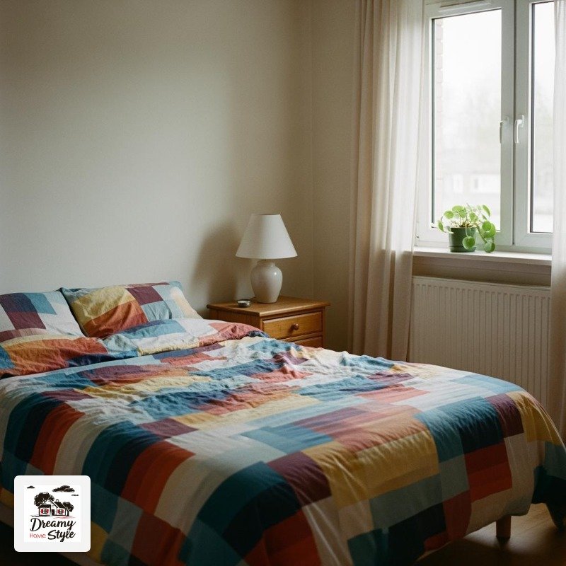
The one on my bed right now has a faint patchwork of dusty rose and olive green that I’d never have thought to buy new but absolutely love.
Avoid secondhand synthetic fills if you can.
They get lumpy and weird in the wash.
Stick to cotton or buy your duvet insert new and just find a secondhand cover.
How Seasonal Color Swaps Changed My Life, Honestly
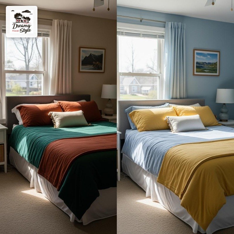
I don’t believe in one permanent bedding setup anymore.
I swap the quilt and a couple of pillows seasonally and the whole bedroom feels refreshed without touching anything else in the room.
It costs almost nothing if you shop secondhand and store things in a vacuum bag.
Fall and winter: I go deeper and warmer.
Spice tones, forest green, rust, chocolate brown.
More texture too, heavier quilts, a fleece throw under everything for when the house gets cold.

Spring and summer: lighter and a little breezier.
Faded coral, periwinkle, soft butter yellow.
Thinner cotton.
I switch to a quilt instead of a full comforter the second it hits sixty-five degrees at night.
The seasonal swap also keeps me from getting bored.
I’m a person who gets bored.
Having permission to change the whole mood of the room every few months is genuinely something I look forward to.
My Biggest Colorful Bedding Mistake (And How to Avoid It)
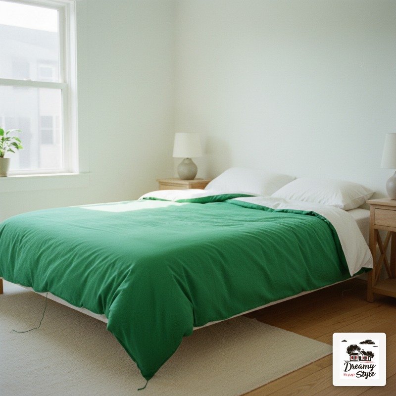
I once bought a bright, saturated emerald green duvet cover because I was obsessed with it in the store.
I mean it was gorgeous.
Jewel-toned, almost velvety looking.
I got it home, put it on the bed, and immediately felt like I was sleeping inside a snooker table.
The problem wasn’t the color itself.
It was the saturation.
Fully saturated, zero-fade, super-bright colors are a lot in a bedroom.
They can feel energizing in a way that actually works against sleep and rest.
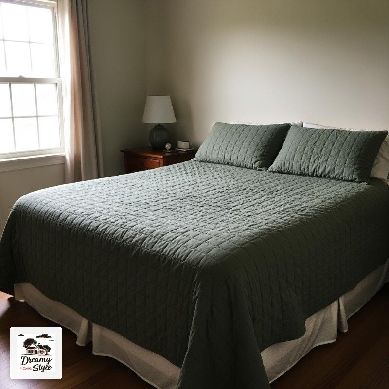
What I’ve learned: go for colors that have a little gray or brown mixed in.
Dusty, muted, ‘dirty’ versions of colors.
Dusty sage instead of lime green.
Ochre instead of lemon yellow.
Terracotta instead of tomato red.
They look richer anyway.
The emerald duvet cover is now on the guest bed, which gets used four times a year, and honestly it looks great in there.
So, not a total loss.
The Seven-Day Test and What Actually Happens
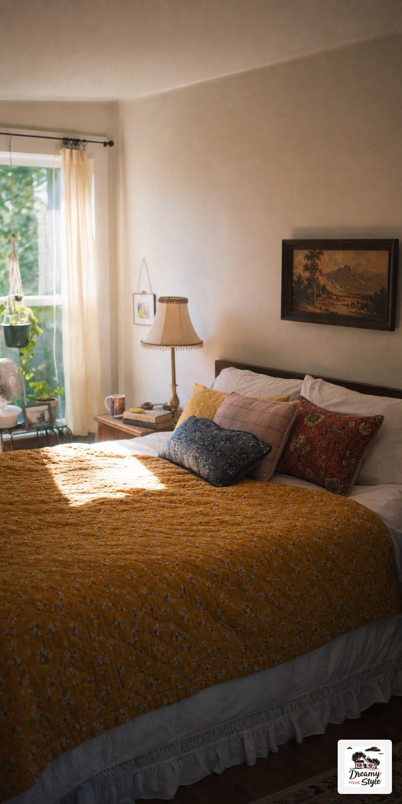
When I tell people to try a new bedding combo for seven days, they usually expect me to say that by day seven they’ll love it and never go back.
And yeah, that’s often true.
But what I’ve actually observed in myself is that by day three the bedroom starts to feel like mine in a new way.
It takes a couple of days for your eye to adjust to color.
Day one it might feel like a lot.
Day two you stop noticing it and just see your room.
Day three you start to really settle into it.
If by day five you still hate it, it’s not for you and that’s fine.
But most people who try it and stick it out report back that they couldn’t go back to white.
I’ve yet to have someone tell me they tried colorful bedding for a full week and rushed to return to beige.

Give it the full week.
Don’t judge it on day one.
That’s the whole thing.
Budget Breakdown: What You Actually Need to Spend

You don’t need to blow a budget on this.
I want to be really clear about that.
My current bedding setup cost me under forty dollars total, and I get compliments on my bedroom more than any other room in the house.
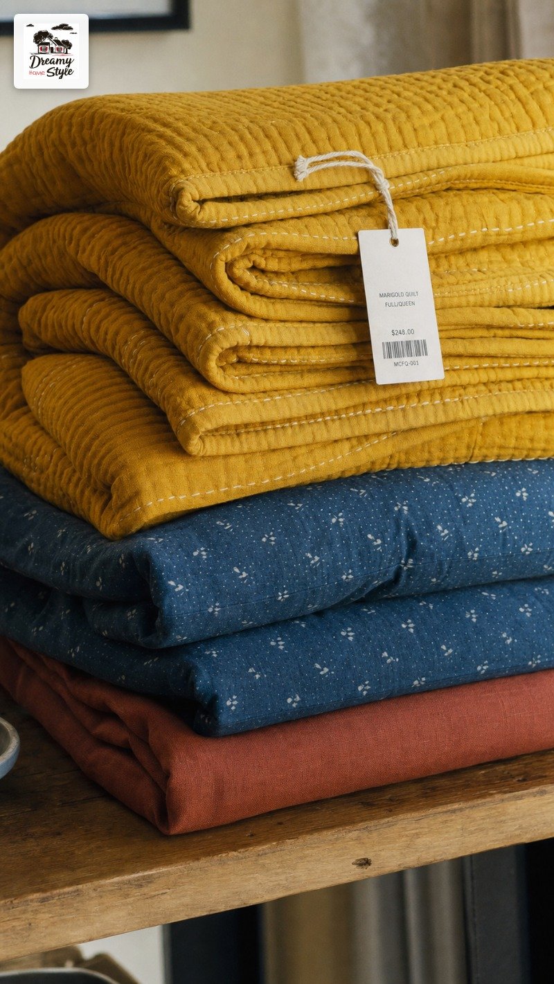
If you’re starting from scratch and buying everything new: a decent cotton quilt at Target or IKEA runs about thirty to fifty dollars.
Fitted sheet, maybe fifteen.
A couple of pillowcases, ten to fifteen.
You can do a full setup for under a hundred dollars easily.
If you go secondhand for at least the quilt: budget twenty to thirty dollars for the whole refresh.
Honestly, less if you already have neutral sheets.
The one thing I’d say is worth spending a bit more on is the fitted sheet because you’re sleeping on it directly.
A scratchy cheap fitted sheet ruins even the most beautiful quilt situation.
(I learned this the expensive way, by buying a scratchy cheap fitted sheet and then buying a better one a week later.)
How to Style the Rest of the Room So It Doesn’t Fight the Bedding
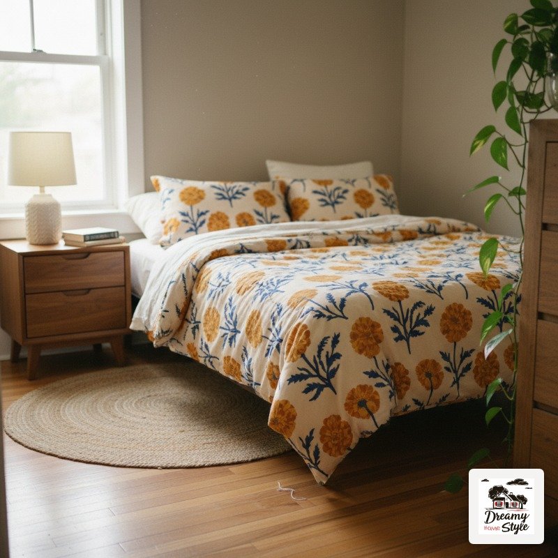
Once you’ve committed to colorful bedding, the instinct is to start adding more color everywhere.
Resist that for a second.
The bedding works best when the rest of the room gives it space.
Keep your walls neutral or at least softer.
Your nightstands, your lamp, your rug if you have one: natural wood, muted tones, simple shapes.
The bed is the focal point.
Let it be.
I have a warm wood nightstand, a $12 thrift-store ceramic lamp in a creamy off-white, and a jute rug on my side of the bed.
Nothing competing.
The colorful bedding is the only thing saying anything loud, so it can say it clearly.
The one exception I make: I let plants do color too.
A trailing pothos on the dresser, a little succulent on the windowsill.
Green is sort of neutral enough that it plays nice with almost any bedding palette without stealing focus.
Overhead lighting in the bedroom is still a crime, by the way.
Warm lamp light only.
It makes every colorful bedding setup look approximately forty percent better.
Related read: The IKEA Kallax Bible — Instant PDF + Kindle download. Secure checkout by Stripe

