

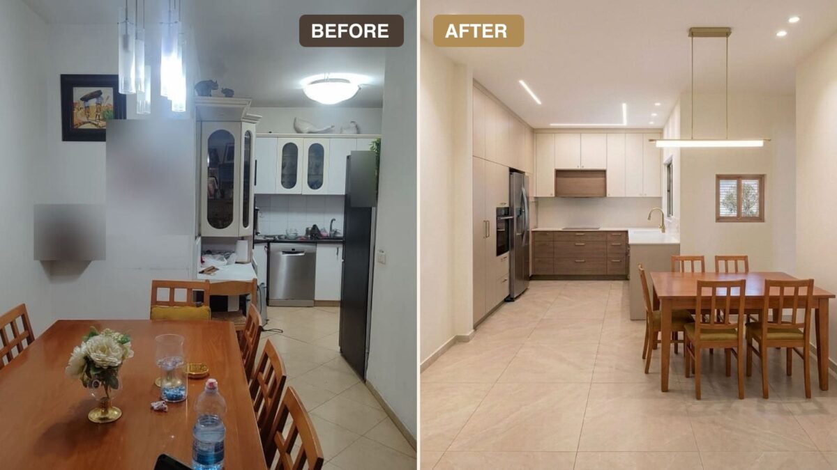
This is a real home and the real plan we made for it: a kitchen, a dining room that swallows a spare bedroom, a living room and two bathrooms.
Every “before” below is the homeowner’s own photo.
Every “after” is the plan drawn onto that same photo with AI, before anyone picked up a hammer.
So it’s a before-and-after of the decisions, not of a finished remodel.
We changed the family’s names, so we’ll call her Linda.
I’m showing you a plan instead of a finished job because the plan is where the money gets saved or lost.
And honestly, most before-and-after photos you see online are lit differently, not decorated differently.
I’ll come back to that, because these pictures do it too.

What Linda asked for
She sent photos of every room, a hand-drawn sketch with her wall lengths, and a list.
We kept her list as the first page of the plan, and every line points to the page that answers it.
Here’s the short version:
- Take down the wall between the dining room and the spare bedroom, and make the kitchen entrance bigger.
- A kitchen in mocha, beige and brown. No glass cabinet doors, and no shelves full of ornaments.
- Cabinets that are practical inside. That was the thing she cared about most.
- Keep her dining table. Could an island fit too?
- A cognac faux-leather sofa that’s safe with the dog.
- A home for the TV, and something for the 5′3″ × 3′11½″ hole in the wall under it.
- Both bathrooms cream and brown, but not the same.
- Few pieces of furniture. Open floor.
I love a list like this.
It tells you what to protect (the table, the open floor) before you start falling for pretty pictures.
Two walls come down, in one straight line
Today the dining room and the spare bedroom are two rooms.
Their shared wall comes down, and so does a wooden partition behind the fridge that sits on the same line.
Then the kitchen opens 8′7½″ wide onto one long dining room, about 21′ long and 9′2″ deep.

Here’s the part I’d want someone to tell me.
Our first round of pictures put the kitchen behind the wrong wall.
We got the walls wrong, and every “after” looked great and was useless.
So the plan now starts with one boring step: we draw the floor plan and the homeowner confirms it before a single picture is made.
One view still took 12 tries before the old bedroom stopped coming out as deep as the kitchen with a window the size of a balcony door.
And no, a picture can’t tell you if a wall holds up the house.
Our plan says it plainly: an engineer checks both walls first.
If one carries weight, it gets a beam, and the layout still works.
If you’re wondering about your own wall, our load-bearing wall checker walks you through the clues you can check yourself, and tells you when you can’t tell from the room.
Kitchen: same layout, drawers instead of doors
Linda had already picked her layout (we call it Plan A) from our first round, so this round changed what’s inside and the colors.
Two small changes to the layout itself: every door is solid now, and the filtered-water tap gets its own spot next to the sink.
My rule here is simple, and it’s the one we gave her: drawers, not doors, in every low cabinet.
A drawer brings the pots to you.
A door makes you kneel and dig.

- A tall pantry with 5 pull-out baskets.
- An oven at waist height (its bottom at about 35½″), the microwave above it. No bending.
- Her side-by-side fridge in a 39½″ niche, with about 2″ of air behind and above it.
- Three deep pot drawers under the cooktop, and a swing-out shelf in the corner cabinet.
- A coffee and tea station with two outlets, one of them on a timer.
- A dishwasher right of the sink, so it shares the sink’s water and drain.
Then the same kitchen in four color schemes, since she wanted mocha and beige and brown without it getting dark.
Our pick was mocha oak below and on the tall wall, with the upper cabinets in Sherwin-Williams Creamy (SW 7012) and brushed brass handles.
My favorite of the other three is the calmest: every cabinet in Shiitake (SW 9173).
If you like that one, our post on taupe kitchen cabinets is all about that color family.
One honest thing about the stone: choose matte.
A honed quartz hides crumbs and fingerprints.
With as much coffee as I drink, I’d take matte every time.
Dining room: the table stays, the numbers decide the island
She asked two things that fight each other: keep the table, and maybe add an island.
So we measured instead of guessing.
This new room is 9′2″ deep.
Her table is about 6′6½″ × 3′3½″, which leaves about 35½″ behind each chair.
That’s enough to sit down, not enough to walk behind someone.
And an island needs about 3′3½″ of free floor on every side to walk and open drawers.
Put both numbers together and you get the answer: a slim 6′ × 3′ island fits in front of the kitchen only if the table moves into the old bedroom.
You can run your own room through our kitchen island size calculator and the dining table size calculator.
We drew four ideas.
Our pick skips the island, and I’d skip it too.
Her table moves next to the old bedroom’s window, a long brass pendant goes over it (about 47″ long, two-thirds of the table, its bottom 31½–37½″ above the top), and the rest stays open.
She said she wanted open floor, and an island would’ve eaten it.
Living room: where does the TV go?
Her TV sat in a niche with glass shelves of ornaments around it, and a 5′3″ × 3′11½″ hole under it.
We gave her two answers.
Our pick closes the whole niche with warm mocha wood slats, floor to ceiling.
Her TV hangs where it is now and the hole disappears behind the slats.
Our other idea turns the niche into an electric fireplace and moves the TV to another wall.

In our pick the sofa sits about 9′10″ from the TV, which is why the plan says 65–75″ for the screen, with its middle about 42″ off the floor.
Those numbers come from our TV size and height calculator.
And the sofa is cognac faux leather.
Dog hair wipes right off it, which matters to me more than I’d like to admit, because Biscuit sheds on everything I own.
If you’re weighing a fireplace instead, we’ve got a whole post of fireplace TV wall ideas.
Guest bathroom: goodbye tub, hello shower
Out goes the bathtub.
A walk-in shower 3′3½″ deep takes its place, with one fixed glass panel and no step, just a slim drain in the floor.
A floating 60 × 18 in mocha vanity with a white quartz top goes on the other wall.
She asked for two different walls, so the shower gets big travertine-look tiles and the vanity wall gets mocha ribbed tiles.

Two small numbers that make a big difference: mirror lights at about 65″ from the floor, so they light your face and not the top of your head, and a quiet fan of about 100 CFM.
Our bathroom fan size calculator does that math for your room.
Owners’ bathroom: a tiny room, kept calm
This one is 5′3″ × 5′7½″.
Nothing moves.
Same size, same places, everything new: a 32 × 32 in glass shower, a 28½″ brown cabinet with a white top, a wall-hung toilet (easy to clean under, and the floor looks bigger), walnut-look slats behind it, and a cream floor with little brown flecks.

Our pick is different from the guest bath on purpose.
Walnut with shiny cream tiles here, travertine with mocha there.
Same family of colors, two personalities.
If the speckled floor is your thing too, here are more terrazzo bathroom ideas.
Now look at the light, because it’s lying a little
Go back up and compare the pairs.
Every “after” picture is bright and warm in every corner.
Some of that is the plan.
A lot of it is the AI, which lights every room like a showroom.
That’s my point about before-and-after photos in general: half the “wow” is light.
So our plan puts real numbers on it, room by room.
In the kitchen: 8 small ceiling spots of 450 lumens each.
That’s 3,600 lumens, a little over the 3,150 our lighting calculator asks for in a room that size, plus an LED strip under the upper cabinets.
In the open dining room, about 12 spots and a pendant.
Everything sits on a dimmer, all in one warm color of light (2700–3000 K) through the whole open room, so the kitchen and the dining and living room match.
And light the walls, not just the floor: wall lamps, the LED on the TV wall, the strip under the cabinets.
You know my feelings about overhead lighting.
On a dimmer, with lamps doing the cozy part, I’ll allow it.
What we’d tell anyone before the builder starts
Our plan’s last page isn’t pretty.
It’s the one that saves money, and it’s my favorite page.
- Measure again. Her sketch said the kitchen opening is 8′7½″ plus a 1′3½″ piece of wall, which makes 9′11″. But the back wall measured 9′7″. One of those numbers is about 4″ off, and cabinets are ordered to the inch.
- Buy the appliances first. Her fridge niche is 39½″ because of that fridge. A side-by-side is about 28½″ deep, not the 16½″ we first had for it.
- Things on the wall move with the wall. An air conditioner plus the switches and outlets on that wall all need a new home, and the old bedroom’s wood floor changes to the same cream tile as the rest.
- Do it in order. First the engineer’s OK, then the walls come down, then the electrician and plumber, one new floor, the bathrooms, the kitchen cabinets, paint (big samples first), and lamps and curtains and furniture last.
Our whole-house renovation planner gives you the same kind of order for your own rooms, from a published contractor’s guide, with a budget split per room.
Try it on your own home
Everything above came from a few free tools and a lot of measuring.
You can start the same way:
- Whole-house renovation planner: your rooms and wishes in, the order of work and a budget per room out.
- Whole-house color palette builder: one palette that flows through the rooms you can see from each other, with real paint codes. Linda’s was cream walls (SW 7012 Creamy) and one taupe accent wall (SW 7038 Tony Taupe), with mocha wood, cognac leather and brass.
- Can this wall come down? It shows you the clues for your wall, and what the open room gains.
- Interior designer cost calculator: what a designer would charge for your rooms, so you know what a plan is worth.
Every room of Linda’s plan is also saved in our free 2D planner, in feet and inches.
Open her kitchen and dining room, move a piece, and you’ll see how much 35½″ behind a chair really is.
And if you’d rather hand the whole thing to us, this exact plan is what our Dreamy Home Plan makes for your rooms, on your own photos.
You can read the full 24-page sample there first.
It’s Linda’s.