ight wood tables bring a warm, airy feel to your dining space, creating the perfect canvas for your meals and gatherings.
But have you considered how the right placemat color can completely transform this centerpiece?
The perfect placemats don’t just protect your beautiful wood surface – they enhance it, complement your decor, and create a striking visual foundation for your table settings.
With my color insights, you’ll be able to confidently choose placemats that not only protect your cherished light wood table but elevate your entire dining experience.

Navy Blue: Classic Elegance Meets Modern Style


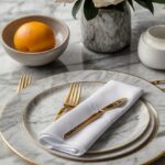
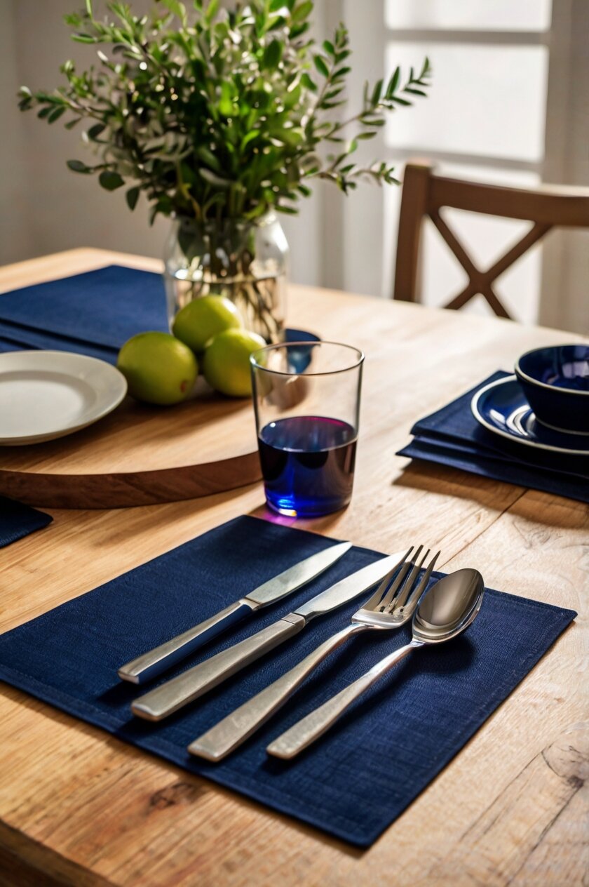
Navy blue placemats create a striking contrast against the light tones of your wood table, bringing instant sophistication to your dining area.
This deep, rich color acts as an anchor that makes the warm honey tones in your light wood pop beautifully.
Navy is versatile enough to work year-round, but feels especially appropriate during fall and winter months when deeper colors feel cozier.
For a polished look, pair navy placemats with white dishes and silver flatware, allowing the deep blue to serve as a dramatic backdrop.
The nautical association of navy blue makes it perfect if your home has any coastal or maritime-inspired decor elements.
Navy placemats work wonderfully with brass or gold accents, creating a luxurious color combination that feels both timeless and on-trend.
Consider textured navy placemats, like linen or cotton with visible weaving, which add dimension while still showcasing the natural beauty of your light wood table.
For casual everyday dining, navy denim placemats offer durability while maintaining that classic blue appeal.
During holidays, navy placemats can serve as the perfect background for festive centerpieces and seasonal decorations.
The formality of navy makes it appropriate for dinner parties and special occasions without feeling overly stuffy.
If you’re looking for longevity in your decor choices, navy is a classic that rarely goes out of style, making it a smart investment.
With navy placemats, your light wood table takes on a more substantial, grounded appearance in your dining space.
For a cohesive look, consider adding small navy accents elsewhere in your dining area, like napkins, artwork, or chair cushions.
Tap to Explore These Beauties
See my ideas in action 👇 Tap any image to explore full details.
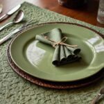
Sage Green: Natural Harmony and Serene Vibes
Sage green placemats create a beautiful organic partnership with light wood, as both elements reflect the natural world.
This soft, muted green brings a calming presence to your dining space, perfect for creating relaxed meal environments.
The earthy undertones in sage complement the natural grain patterns in your light wood table without competing for attention.
During spring and summer, sage placemats feel especially appropriate, bringing the freshness of outdoor greenery to your indoor dining.
For a cohesive natural look, pair sage placemats with cream or beige napkins and natural fiber elements like wicker or rattan.
Sage green works beautifully with botanical themes, making it perfect if you often decorate your table with fresh flowers or plants.
The versatility of sage allows it to work equally well in country farmhouse settings or more modern, minimalist dining spaces.
With sage placemats, you can easily coordinate seasonal table décor throughout the year, from spring florals to fall harvest themes.
This gentle green creates a soft contrast with light wood, defined enough to distinguish your place settings without harsh visual boundaries.
If your dining area gets plenty of natural light, sage placemats will reflect this beautifully, changing subtly throughout the day as lighting shifts.
For formal occasions, sage placemats pair elegantly with gold or brass accents and white china for an elevated natural aesthetic.
The restful quality of sage creates a welcoming atmosphere that encourages diners to linger and enjoy their meals without feeling rushed.
Consider layering different shades of green in your table setting – sage placemats with darker green napkins or lighter green glassware – for a dimensional monochromatic look.
Crisp White: Timeless Brightness That Highlights Wood Grain
White placemats create a clean, bright foundation that allows the unique grain patterns and warm tones of your light wood table to truly shine.
This timeless color choice brings a fresh, airy quality to your dining space regardless of your interior design style.
With white placemats, you’re creating a versatile base that works with any color scheme you might introduce through dishes, napkins, or centerpieces.
The contrast between white placemats and light wood offers just enough definition to frame your place settings elegantly without overwhelming the natural beauty of the wood.
For a modern, Scandinavian-inspired look, white cotton or linen placemats with visible texture add subtle interest while maintaining clean lines.
During summer months, white placemats create a refreshing, cool foundation that feels especially appropriate for casual brunches or outdoor dining brought inside.
For special occasions, white placemats provide the perfect backdrop for colorful holiday decorations, allowing seasonal colors to pop dramatically.
If you love changing your table decor frequently, white placemats are the ultimate chameleon, adapting beautifully to any color story you wish to create.
Consider white placemats with subtle details like hemstitching or light embroidery if you want to add a touch of elegance without introducing color.
The brightness of white placemats can visually expand your dining space, making the table appear larger and more open.
For durability concerns, look for white placemats made from washable materials like cotton duck or treated fabrics that resist stains while maintaining that crisp look.
White works particularly well if your dishware has patterns or colors, as it allows those pieces to be the stars of your table setting.
With white placemats, you’re creating a gallery-like setting where the natural beauty of both your light wood table and your carefully chosen tableware can be fully appreciated.
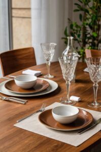
Terra Cotta: Warm Mediterranean Flair
Terra cotta placemats bring a warm, earthy richness that beautifully complements the natural tones in light wood tables.
This orange-brown hue draws out the warmer undertones in woods like pine, maple, or ash, creating a harmonious color relationship.
With its strong connection to pottery and earthenware, terra cotta brings a handcrafted, artisanal quality to your dining experience.
This color feels especially appropriate during autumn months when your table decor might include harvest themes or Thanksgiving celebrations.
Terra cotta placemats pair beautifully with turquoise or blue accents, creating a classic Mediterranean color scheme that feels both timeless and fresh.
For a cohesive look, consider matching terra cotta placemats with similarly colored candles or small pottery pieces as part of your centerpiece.
The warmth of this color creates an inviting atmosphere that encourages lingering conversations and comfortable dining experiences.
Terra cotta works particularly well if your dining space features other natural elements like exposed wood beams, stone, or plants.
For outdoor dining brought inside, terra cotta placemats help maintain that al fresco feeling with their connection to earth and clay.
Consider terra cotta placemats with subtle patterns or textural elements that add visual interest while maintaining the warm color story.
This earthy tone creates a grounding presence that makes your dining table feel like the heart of the home.
If your light wood table has golden or honey-colored undertones, terra cotta placemats will emphasize these warm aspects beautifully.
For a complete look, pair terra cotta placemats with other earthy tones like olive green napkins or cream-colored dishes for a naturally coordinated table setting.

Find Your Room’s Color Palette
Tap a vibe — get a curated 5-color palette with hex codes you can copy ✨
💭 I Wrote a Book About My Biggest Decorating Mistakes!
When I decorated my first home, I thought I knew what I was doing. Spoiler: I didn’t. 😅
💸 I bought a sofa way too big for my living room. Paint colors that looked amazing in the store but terrible on my walls.
Pale Gray: Subtle Sophistication and Modern Appeal
Pale gray placemats offer a contemporary neutral that allows your light wood table to remain the visual centerpiece while providing subtle definition.
This soft, sophisticated color brings a modern edge that works beautifully in minimalist or Scandinavian-inspired dining spaces.
The cool undertones in pale gray create a pleasing contrast with the warmer tones typically found in light wood, creating visual balance.
For year-round appeal, pale gray placemats provide a versatile foundation that works with virtually any seasonal decor or color scheme.
With their understated elegance, gray placemats allow your dishware and table accessories to stand out while maintaining a cohesive look.
The neutrality of pale gray makes it perfect for mixing with accent colors through napkins, centerpieces, or seasonal decorations.
Consider textured pale gray placemats, like those with a linen finish or subtle weave, which add dimension without competing with the wood grain patterns.
For formal dining occasions, pale gray creates a sophisticated backdrop that elevates white china and silver flatware to elegant heights.
During winter months, pale gray placemats feel especially appropriate, echoing the quiet tones of the season while maintaining warmth through the wood table.
This color choice works particularly well in dining spaces that feature other gray elements, like chairs, wallpaper, or decorative accents.
The subtle nature of pale gray allows it to recede visually when you want your food presentation or table decorations to be the focal point.
For homes with contemporary decor, pale gray placemats help bridge the gap between natural wood elements and more modern components.
Consider pale gray placemats with simple finishing details, like clean edges or minimal stitching, to maintain that sleek, modern aesthetic while complementing your light wood table.
Mustard Yellow: Bold Accent with Retro Charm
Mustard yellow placemats inject a vibrant energy into your dining space while still complementing the natural tones of light wood tables.
This warm, golden-yellow hue creates a cheerful foundation for your meals without overwhelming the natural beauty of the wood.
With mid-century modern appeal, mustard placemats add a touch of retro charm that feels both nostalgic and currently on-trend.
The richness of mustard creates a welcoming atmosphere, particularly effective during fall and winter when warmer colors feel cozy and appropriate.
For a coordinated look, pair mustard placemats with navy blue or deep teal accents to create a balanced and contemporary color story.
The golden undertones in mustard placemats can draw out similar honey tones in lighter woods like pine, oak, or maple.
Consider mustard placemats as a way to introduce color if the rest of your dining space features neutral tones, creating a focal point at the table.
For maximum impact, pair mustard placemats with white dishes, allowing the bold color to frame your place settings dramatically.
During autumn gatherings, mustard placemats provide the perfect complement to seasonal decor featuring harvests, pumpkins, or golden foliage.
The unexpected but harmonious pairing of light wood with mustard yellow creates a curated look that shows thoughtful design choices.
If you’re hesitant about using bold colors, mustard offers a versatile option that reads almost as a neutral while still adding personality.
Consider mustard placemats with subtle texture or simple patterns that add visual interest without competing with the bold color.
For an even more coordinated look, echo small touches of mustard elsewhere in your dining space through artwork, cushions, or decorative objects to tie the look together.
💭 Ever wondered what your room would actually look like rearranged?
I built a free tool that lets you drag furniture around a 2D floor plan. No signup, no catch.
See the Room Planner →Black: Dramatic Contrast for Modern Impact
Black placemats create the most dramatic contrast against light wood, instantly adding sophistication and visual weight to your dining table.
This bold choice frames your place settings with definition, creating clear boundaries that make each element of your table setting pop.
For contemporary or minimalist homes, black placemats offer the perfect high-contrast foundation that aligns with modern design principles.
The stark contrast between black placemats and light wood creates a graphic, photogenic quality that looks stunning in person and in photographs.
When paired with white dishes and simple silverware, black placemats create a classic monochromatic look that never goes out of style.
For special occasions, black placemats elevate your dining experience, creating a restaurant-quality ambiance that feels luxurious and intentional.
Consider textured black placemats, like those with a subtle pattern or woven quality, which add dimension to this solid dark color.
The dramatic nature of black means you can keep the rest of your table setting relatively simple while still achieving a designed look.
Black placemats are exceptionally practical, as they hide stains and marks better than lighter colors while maintaining their striking appearance.
For holiday tables, black placemats provide a sophisticated backdrop that allows colorful decorations and centerpieces to truly shine.
If your dining chairs or light fixtures include black elements, matching placemats create continuity throughout your dining space.
The powerful contrast of black against light wood draws attention to the beauty of the wood grain, highlighting natural patterns and variations.
Consider black placemats as an anchor in an otherwise light and airy dining space, providing visual grounding that balances the overall room design.
What’s Your Decor Personality?
5 questions · 30 seconds · Instant style match 🏡
Coral Pink: Playful Warmth with Contemporary Flair
Coral pink placemats bring an unexpected pop of color that somehow manages to complement light wood tones beautifully.
This warm, peachy-pink hue adds a playful energy to your dining space while still feeling sophisticated and intentional.
For spring and summer table settings, coral placemats create a fresh, vibrant foundation that feels seasonal and bright.
The warmth in coral pink works particularly well with the golden undertones often found in light maple, pine, or ash tables.
Consider coral placemats as a way to introduce a feminine touch that balances the masculinity sometimes associated with wood furniture.
Pairing coral placemats with white dishes and gold flatware creates an elegant, on-trend look perfect for brunches or dinner parties.
For a coordinated color story, match coral placemats with napkins in complementary hues like navy, teal, or sage green.
The energetic nature of coral makes it perfect for morning or daytime gatherings where a boost of color feels especially appropriate.
With their contemporary feel, coral placemats add a modern touch even to traditional dining spaces or vintage light wood tables.
Consider textured coral placemats, like those with a linen finish or subtle pattern, which add dimension to this vibrant color.
For homes with a boho or eclectic style, coral placemats can be one element in a layered, colorful approach to table setting.
The cheerful quality of coral creates an inviting atmosphere that encourages conversation and connection around your light wood table.
If you enjoy entertaining, coral placemats provide a memorable design element that guests will notice and appreciate as part of your thoughtful hosting.
Natural Burlap or Jute: Rustic Texture That Enhances Wood Tones
Natural burlap or jute placemats create a perfect textural harmony with light wood tables, enhancing the natural element in your dining space.
These earthy, neutral placemats bring a rustic, organic quality that celebrates rather than competes with the wood grain of your table.
The woven texture of burlap or jute adds visual interest through its distinctive pattern while maintaining a color palette that complements light wood tones.
For farmhouse, coastal, or nature-inspired decor styles, these natural fiber placemats reinforce your design theme perfectly.
The slight color variations found in natural fibers create subtle depth that adds dimension to your table setting without overwhelming it.
Burlap or jute placemats pair beautifully with simple white dishes and natural linen napkins for an effortlessly coordinated organic look.
During summer months, these natural placemats bring an outdoor quality indoors, perfect for casual dining or garden-inspired gatherings.
The textural contrast between smooth wood and roughly woven placemats creates a pleasing sensory experience that adds interest to your dining table.
Consider these placemats as a way to introduce layered neutrals, creating depth through texture rather than bold color contrasts.
For holiday tables, natural burlap or jute creates a perfect rustic foundation for seasonal decorations from spring flowers to fall foliage.
The durability of these natural fibers makes them practical choices for everyday use, developing character over time like your wood table itself.
The warm, natural tones in burlap and jute draw out similar honey or golden hues that might be present in your light wood table.
For an even more natural dining experience, pair these textured placemats with other organic elements like wooden serving pieces or stone accessories.
✦ You Might Love This
Dining in Style: 10+ Perfect Placemat Colors for Your White Table" Keep Reading →This or That?
Pick your fave — see what other readers chose! 👀
Burgundy: Rich Sophistication with Seasonal Versatility
Burgundy placemats bring a rich, sophisticated color depth that creates beautiful contrast against the lighter tones of your wood table.
This deep red-purple hue adds warmth and elegance to your dining space, creating an intimate atmosphere perfect for dinner gatherings.
For fall and winter dining, burgundy placemats offer seasonal appropriateness that feels cozy and timeless.
The depth of burgundy creates a luxurious foundation for white dishes, making everyday meals feel more special and intentional.
Consider burgundy placemats for holiday entertaining, as they work beautifully with both Thanksgiving harvest themes and Christmas decorations.
The formal quality of burgundy elevates your light wood table, adding a touch of traditional elegance even to more casual wood styles.
Pairing burgundy placemats with gold accents creates a rich, regal combination that feels perfect for special occasions or festive gatherings.
💭 I Wrote a Book About My Biggest Decorating Mistakes!
When I decorated my first home, I thought I knew what I was doing. Spoiler: I didn’t. 😅
💸 I bought a sofa way too big for my living room. Paint colors that looked amazing in the store but terrible on my walls.
For year-round use, consider burgundy placemats in lighter fabrics like cotton or linen which keep this deep color from feeling too heavy in warmer months.
The contrast between light wood and burgundy creates a balanced visual weight, with each element complementing rather than competing with the other.
Consider textured burgundy placemats, which add dimension through woven patterns or subtle designs while maintaining the rich color story.
For wine lovers, burgundy placemats create a thematic connection to your favorite beverage, adding another layer of meaningful design to your dining space.
The timeless quality of burgundy makes these placemats a lasting investment that won’t quickly go out of style or feel trendy.
For a coordinated look, echo small touches of burgundy in other dining room accessories like candle holders, napkin rings, or subtle decor elements.
Aqua Blue: Refreshing Coastal Vibe
Aqua blue placemats bring a refreshing pop of color that creates a beautiful contrast against light wood, evoking coastal or waterside dining.
This light, bright blue-green hue adds an instant freshness to your dining space, particularly welcome during spring and summer months.
For homes with coastal, beach, or nautical themes, aqua placemats reinforce this design direction while complementing your light wood table.
The cool tones in aqua provide pleasing contrast to the warmer undertones typically found in light wood like pine, maple, or ash.
Consider aqua placemats paired with white dishes and natural linen napkins for a clean, breezy look perfect for casual entertaining.
During warm weather months, aqua placemats create a cooling visual effect that makes your dining space feel more refreshing.
The cheerful nature of aqua blue encourages lighthearted conversation and creates an uplifting atmosphere around your dining table.
For homes with open concept living areas, aqua placemats can connect your dining space to blue elements you might have in adjacent living spaces.
Consider aqua placemats with subtle patterns like small geometric prints or watercolor effects that add dimension without overwhelming.
The versatility of aqua allows it to pair beautifully with other colors like coral, navy, or white for coordinated table settings.
For outdoor-inspired dining, aqua placemats help bring that open-sky, water-adjacent feeling to your indoor meals.
The unexpected pairing of aqua with light wood creates a contemporary look that feels both designed and approachable.
For year-round use, deeper aqua tones can transition into fall and winter months while still maintaining that distinctive refreshing quality.
Quick Design Dilemma
Cast your vote — see what other readers think! 🤔
Plum Purple: Elegant Depth with Contemporary Edge
Plum purple placemats bring a rich jewel tone that creates sophisticated contrast against the lighter finish of your wood table.
This deep, complex purple adds an unexpected color dimension that feels both classic and contemporary at once.
For evening entertaining, plum placemats create an intimate, elevated atmosphere that makes dinner parties feel special.
The royal associations of purple bring a subtle luxury to your dining space without feeling overly formal or stuffy.
Consider plum placemats paired with gold accents and cream-colored dishes for an elegant color combination perfect for special occasions.
During fall and winter months, plum provides seasonal richness that feels cozy while still remaining distinctive from typical autumn colors.
For homes with eclectic or artistic decor, plum placemats add a creative color choice that shows personality and design confidence.
The depth of plum creates a strong foundation that frames your place settings dramatically against light wood.
Consider textured plum placemats, like those with a velvet finish or subtle pattern, which add tactile interest to this rich color.
The versatility of plum allows it to pair beautifully with both warm tones like amber or gold and cool tones like silver or gray.
For holiday tables, plum placemats provide a sophisticated alternative to traditional red and green, creating memorable table settings.
The contrast between light wood and deep plum creates a balanced visual weight that makes your dining table a focal point.
If you enjoy dramatic table settings, plum placemats provide that perfect deep base that allows other elements to stand out brilliantly.
Olive Green: Earthy Sophistication with Timeless Appeal
Olive green placemats create a natural partnership with light wood, bringing an earth-tone harmony that celebrates organic materials.
This rich, muted green adds depth to your dining space while still complementing rather than competing with your light wood table.
For year-round versatility, olive green transitions smoothly between seasons, feeling fresh in spring and cozy in fall.
The natural quality of olive green works particularly well if your dining area features plants, botanical prints, or garden views.
Consider olive placemats paired with cream or white dishes and wooden serving pieces for a cohesive natural table setting.
For homes with a Mediterranean or Tuscan influence, olive green placemats reinforce this design direction beautifully.
The traditional associations of olive green bring a timeless quality to your dining space that resists trending in and out of fashion.
For formal occasions, olive placemats provide a sophisticated base that elevates your table settings without feeling overly bold or bright.
Consider textured olive placemats, like those with visible weaving or subtle patterns, which add dimension to this earthy color.
The versatility of olive allows it to work equally well with rustic farmhouse tables or more refined Scandinavian light wood styles.
For wine tastings or dinner parties, olive placemats create an elegant foundation that complements food presentation beautifully.
The subtle color contrast between light wood and olive green creates a layered neutral effect that feels designed yet natural.
If your dining chairs or nearby upholstery features olive or similar green tones, matching placemats create a thoughtfully coordinated dining space.