ave you ever wondered what dining table would look best with your beautiful dark hardwood floors?
The perfect dining table not only serves as a gathering place for meals and memories but also needs to complement your gorgeous floors.
When these two elements work together, your dining space transforms from ordinary to extraordinary.
You want something that balances your floor’s deep tones without making the room feel too dark or heavy.
Let’s explore together my favorite colors here:

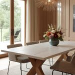
Classic White Tables: Bright Contrast That Never Goes Out of Style


White dining tables create a stunning contrast against dark hardwood floors that instantly brightens your entire dining space.
This pairing is perhaps the most versatile option on our list because it works with absolutely any decorating style.
You might worry that white feels too stark or clinical, but against rich dark floors, it actually creates a sophisticated, balanced look.
White tables reflect light around the room, making spaces with dark floors feel more open and airy.
This is especially helpful if your dining area doesn’t get a lot of natural sunlight.
The crisp contrast between dark and light creates a visual anchor in your room that draws attention in the best possible way.
Think of your dark floor and white table as the perfect backdrop for colorful dishware, bright centerpieces, or patterned chair upholstery.
For modern homes, consider a glossy white lacquer table with clean lines and minimal detailing.
If your style leans more traditional, look for white tables with carved legs or decorative edges that add character while maintaining that bright contrast.
Farmhouse enthusiasts will love how a distressed white table with a bit of intentional wear brings casual charm to dark floors.
One practical advantage of this pairing is that the white table helps balance rooms that might otherwise feel too dark with deep-colored flooring.
Maintenance is something to consider with white furniture, but many modern white tables come with durable, easy-clean finishes.
Even tables with painted white legs and natural wood tops offer that desired contrast while being more forgiving of everyday marks.
During different seasons, you can easily transform the look of your white table with tablecloths, runners, or centerpieces without worrying about color clashes.
Consider how the undertones in your dark floors might influence your white choice – warmer dark woods pair beautifully with creamy whites, while cooler-toned floors match well with bright whites.
The beauty of white is its timelessness – unlike trendy colors that might feel dated in a few years, the classic white-and-dark-wood combination has remained stylish for centuries.
Tap to Explore These Beauties
See my ideas in action 👇 Tap any image to explore full details.
Natural Oak Tables: Warm Complement to Dark Floors
Natural oak dining tables offer a beautiful middle ground when paired with dark hardwood floors, creating a layered wood look that feels organic and cohesive.
This combination works because oak’s typically lighter, honey-toned finish provides enough contrast without competing with your dark floors.
You’ll notice how the natural wood grain in both elements creates a connection that feels intentional rather than matched.
Oak’s warm undertones bring out similar warm qualities in dark flooring, especially if your floors are walnut, mahogany, or dark-stained oak.
This pairing creates a sense of depth and richness that single-tone rooms often lack.
Many designers consider this combination perfect for creating spaces that feel both sophisticated and livable.
The textural interplay between your oak table’s grain pattern and your floors adds visual interest without requiring additional decorative elements.
Oak dining tables are particularly versatile because they come in so many different styles – from clean-lined Scandinavian designs to chunky farmhouse tables.
You might be surprised by how even with two wood elements, the room doesn’t feel overwhelming or too “woody” when one is significantly darker than the other.
For spaces that feel too formal with stark contrasts, this natural wood pairing creates a more relaxed, welcoming atmosphere.
Oak’s durability makes it practical for everyday dining, developing a beautiful patina over time that only enhances its character.
If you’re concerned about matching woods, remember that varied wood tones actually create more sophisticated spaces than perfectly matched ones.
The key is ensuring there’s enough contrast between your floor and table – oakʼs naturally lighter coloration provides this beautifully.
Consider how light hits your dining space – natural oak reflects more light than darker woods, helping brighten rooms with limited natural lighting.
This combination works exceptionally well in transitional homes that blend traditional and contemporary elements because it feels both timeless and current.
Black Tables: Bold Statement with Dramatic Effect
Black dining tables paired with dark hardwood floors create a sophisticated, dramatic look that makes a confident design statement.
This monochromatic approach might seem counterintuitive, but when done right, it adds remarkable depth and elegance to your dining space.
You’ll find that rather than making the room feel smaller, this pairing creates a cohesive foundation that can actually make spaces feel more intentional and well-designed.
The subtle contrast between your black table and dark wood floors creates a layered effect that highlights the unique grain patterns and undertones in both surfaces.
This combination works particularly well in rooms with plenty of natural light or spaces where you want to create an intimate, cozy dining experience.
Black tables come in countless styles, from glossy modern designs to matte-finished farmhouse pieces, allowing you to maintain this dramatic pairing while honoring your personal aesthetic.
Design experts often recommend this pairing for dining rooms where you want the focus to be on beautiful place settings, colorful food presentations, or statement lighting fixtures.
The monochromatic base allows other elements in your dining room to shine without competition.
You might worry about too much darkness, but balancing with lighter chairs, bright art, or a colorful rug easily prevents the space from feeling too heavy.
Black tables are exceptionally practical for families since they hide marks and spills better than lighter options while creating a sophisticated backdrop for everyday dining.
Consider how different black finishes interact with your floors – high-gloss black reflects light dramatically, while matte black creates a more subtle, velvety appearance.
This pairing works beautifully in both contemporary settings with clean lines and traditional spaces with more ornate furniture details.
The key to success with this combination is creating textural contrast – if your floors have a smooth finish, consider a black table with more texture, or vice versa.
Another advantage is versatility with décor – like a little black dress, a black dining table pairs beautifully with virtually any accent color you might want to introduce seasonally.
For added interest, consider black tables with subtle details like carved edges, distinctive legs, or mixed materials like black metal bases with wood or stone tops.

Glass Tables: Creating Visual Space and Elegance
Glass dining tables offer a brilliant solution when you want to showcase your dark hardwood floors while maintaining an open, airy feeling in your dining space.
The transparent nature of glass creates an almost magical floating effect that allows your beautiful floors to remain visible throughout the room.
You might be surprised how this seemingly simple choice can make modest dining areas feel significantly larger and less crowded.
Glass reflects light throughout your space, brightening rooms that might otherwise feel too dark with deep-colored flooring.
This pairing works particularly well in contemporary or transitional homes where clean lines and visual lightness are design priorities.
The contrast between substantial dark floors and weightless glass creates a compelling design tension that adds sophistication to your dining area.
Glass tables come in many forms, from completely transparent options to those with frosted patterns or tinted surfaces that can complement your floor’s undertones.
Consider how the table base interacts with your floors – chrome or brushed metal bases create modern contrast, while wood bases can echo your floor’s warmth.
One significant advantage of glass tables is their chameleon-like ability to work with any design changes you might make in the future.
Practical benefits include easy cleaning and resistance to staining, though you’ll want to wipe them regularly to maintain their crystal-clear appearance.
For families with young children, look for tempered glass options with rounded edges for safety and durability.
Glass tables can be found with various edge treatments – from simple clean edges to beveled details that catch light beautifully across your dining space.
You’ll notice how glass tables create interesting shadow patterns on your dark floors when light filters through windows or from pendant lights above.
Round glass tables are particularly effective in smaller dining spaces with dark floors, as they eliminate corners and further enhance the sense of openness.
This pairing allows your dark hardwood floors to remain the star of the show while providing a functional, beautiful dining surface that complements rather than competes.
Find Your Room’s Color Palette
Tap a vibe — get a curated 5-color palette with hex codes you can copy ✨

💭 I Wrote a Book About My Biggest Decorating Mistakes!
When I decorated my first home, I thought I knew what I was doing. Spoiler: I didn’t. 😅
💸 I bought a sofa way too big for my living room. Paint colors that looked amazing in the store but terrible on my walls.
Gray-Washed Tables: Sophisticated Neutral That Balances Darkness
Gray-washed dining tables provide a sophisticated, contemporary counterpoint to dark hardwood floors without creating harsh contrast.
This subtle neutral brings a cool, calming presence to dining spaces that might otherwise feel too warm or heavy with dark wood flooring.
You’ll notice how gray’s chameleon-like quality helps it adapt to changing light conditions throughout the day, looking slightly different but always harmonious with your floors.
The weathered or distressed finish typically found on gray-washed pieces adds textural interest that complements the natural grain patterns in your hardwood floors.
This pairing works exceptionally well in transitional homes that blend traditional architecture with more contemporary furnishings.
Gray tables come in countless shades – from pale dove gray that almost reads as white to deeper charcoal tones that create more subtle contrast with dark floors.
Design experts often recommend this combination for homeowners who want something less expected than white but more versatile than bold colors.
The gray-dark wood combination creates a sophisticated foundation that works beautifully with nearly any accent color you might want to incorporate through chairs, lighting, or tableware.
You’ll find gray-washed tables in many styles, from farmhouse to Scandinavian to industrial, making it easy to find one that reflects your personal aesthetic.
One practical advantage is that gray tables show less dust and fewer fingerprints than either very dark or very light options, making them lower maintenance for busy households.
Consider how the undertones in your gray table relate to your dark floors – warmer grays with taupe undertones complement reddish dark woods, while cooler bluish grays pair beautifully with espresso or ebony floors.
This combination creates a balanced, grounded feeling that many find conducive to relaxed, comfortable dining experiences.
Gray-washed tables often feature visible wood grain beneath the color, creating a subtle connection to your hardwood floors without being too matchy.
For smaller dining areas with dark floors, lighter gray tables help prevent the space from feeling closed in or too heavy.
This pairing has remarkable staying power in terms of design trends, offering contemporary appeal without the risk of looking dated in a few years.
Walnut Tables: Rich Tonal Variation That Complements Dark Floors
Walnut dining tables create a sophisticated, rich pairing with dark hardwood floors that celebrates the natural beauty of wood.
This combination works because walnut typically has a medium-dark tone that contrasts subtly but distinctly with very dark floors like ebony or dark-stained oak.
You’ll notice walnut’s distinctive grain patterns and color variations bring visual interest and depth that flat-colored tables can’t match.
The warm chocolate-brown tones in walnut often have reddish or purplish undertones that create a harmonious relationship with similarly toned dark floors.
This pairing creates an elegant, timeless aesthetic that works in both traditional and contemporary dining spaces.
Walnut naturally develops a beautiful patina over time, meaning your dining set will only grow more distinctive and character-filled with use.
Design professionals often recommend this combination for creating dining rooms with a sense of intimacy and refinement.
You might appreciate how walnut’s natural variation helps hide minor marks and scratches, making it practical for everyday family dining.
Consider how walnut’s rich color creates a visual bridge between very dark floors and lighter elements in your dining room like chairs or wall color.
The similar depth but distinct character of walnut against dark floors creates a layered, collected-over-time feeling that instantly makes spaces feel more established and thoughtful.
💭 Ever wondered what your room would actually look like rearranged?
I built a free tool that lets you drag furniture around a 2D floor plan. No signup, no catch.
See the Room Planner →For homes with open floor plans, this pairing helps define the dining area with a cohesive wood story that feels intentional rather than matched.
Walnut dining tables are available in countless styles, from mid-century modern classics to traditional carved pieces to live-edge contemporary designs.
You’ll find that walnut’s natural luster catches light beautifully, creating highlights and shadows that bring visual movement to your dining space.
This combination works particularly well in spaces with abundant natural light, where subtle differences between the woods become more apparent throughout the day.
For those seeking timeless appeal, few wood combinations have the staying power of walnut furniture paired with dark hardwood floors – it’s been considered elegant for centuries.
What’s Your Decor Personality?
5 questions · 30 seconds · Instant style match 🏡
Marble-Topped Tables: Luxurious Contrast with Natural Appeal
Marble-topped dining tables create a striking luxurious statement when paired with dark hardwood floors.
This combination brings together nature’s finest materials in a way that feels both opulent and organic.
You’ll notice how marble’s typical white or light gray base color creates beautiful contrast against dark floors while its distinctive veining adds movement and visual interest.
The natural variation in each marble slab means your table will be genuinely unique – no two marble tables are exactly alike.
This pairing works exceptionally well in both traditional dining rooms and more contemporary spaces, as marble has remarkable design versatility.
Marble’s cool surface creates a pleasing temperature contrast with wood’s natural warmth, adding another sensory dimension to your dining experience.
Consider how different marble varieties interact with your specific floor tone – white Carrara with subtle gray veining creates stark contrast, while creamier marbles like Calacatta or Emperador offer more subtle differentiation.
The weight and substance of marble create a grounding effect that balances perfectly with the solid foundation of dark hardwood.
You might appreciate how marble’s reflective surface bounces light around rooms with dark floors, helping spaces feel brighter and more open.
For practical considerations, remember that marble-topped tables often feature wood bases, allowing you to introduce complementary wood tones that connect with your flooring.
Design experts often suggest this pairing for creating dining spaces with timeless elegance that won’t feel dated as trends change.
The natural materials connection between your floors and table creates a cohesive design story even though their colors and textures differ significantly.
Marble’s inherent coolness makes it perfect for warm climates or sun-filled dining rooms where its temperature remains comfortable year-round.
You’ll find that marble-topped tables come in various shapes and styles, from round pedestal designs to rectangular farmhouse tables with marble tops.
While requiring some care to prevent staining, today’s marble tables often feature protective sealants that make them more practical for family dining than in years past.
Painted Blue Tables: Unexpected Pop of Color with Timeless Appeal
Blue painted dining tables create a refreshing counterpoint to dark hardwood floors, introducing personality and color while maintaining sophistication.
This unexpected pairing works because blue is considered a neutral in many design contexts, versatile enough to complement rather than compete with your floors.
You’ll find that navy blues create a rich, dignified look, while azure or cobalt bring energetic contrast that enlivens your dining space.
The cool tones in blue provide pleasing balance to the typically warm undertones present in dark wood flooring.
This combination works particularly well in coastal, traditional, or cottage-style homes but can be adapted to nearly any aesthetic through the specific blue shade and table style.
Consider how different blue intensities affect your space – deeper blues create subtle contrast and formal elegance, while brighter blues make more playful, casual statements.
Blue’s association with water and sky brings a naturally calming presence to dining areas, creating spaces that feel tranquil and welcoming.
You might be surprised how this color combination makes meals more visually appealing, as blue provides an excellent backdrop for food presentation.
For practical benefits, blue tables hide minor marks and scuffs better than light neutrals while still brightening spaces more effectively than dark tables.
This pairing allows tremendous versatility with dining chairs – from natural wood tones to whites, grays, or complementary colors like coral or yellow.
Design experts often recommend this combination for homeowners who want to introduce color without committing to permanent elements like painted walls.
Blue painted tables come in countless styles, from distressed farmhouse pieces to sleek modern designs with just a touch of color on the legs or edges.
You’ll notice how different light conditions throughout the day make this pairing especially dynamic, with the blue tones shifting slightly from morning to evening.
Consider how blue connects to other elements in adjoining spaces – picking up tones from kitchen backsplashes, living room accessories, or artwork creates cohesive flow.
This combination has remarkable staying power because blue has been a beloved interior color for centuries, meaning your investment will remain stylish for years to come.
Mixed Material Tables: Creating Dynamic Balance with Dark Floors
Mixed material dining tables offer fascinating visual complexity that beautifully complements dark hardwood floors.
This modern approach combines elements like wood, metal, glass, stone, or concrete in a single piece, creating multi-dimensional interest.
You’ll find this pairing particularly effective because it allows you to incorporate elements that both contrast with and complement your dark floors simultaneously.
Consider tables with metal bases and wood tops, where the metal creates stark contrast while the wood top establishes a connection to your flooring.
This combination works well in contemporary, industrial, or transitional homes where unexpected material pairings are celebrated rather than avoided.
Mixed material tables often feature interesting textural variations that add another layer of visual interest against the consistent surface of hardwood flooring.
You might appreciate how these tables can bridge different design elements in open floor plans, helping connect your dining space to kitchen or living area aesthetics.
Tables combining light woods with black metal create particularly effective contrast against dark floors while maintaining a cohesive overall look.
For practical benefits, many mixed material tables are designed for durability, with surfaces selected specifically for their resistance to stains, scratches, and heat damage.
This approach allows you to incorporate current design trends through smaller elements without committing to entire pieces that might feel dated later.
Design experts often recommend this option for homeowners who appreciate eclectic styles or who are transitioning between different design aesthetics.
You’ll notice how mixed material tables often incorporate varying heights, shapes, or planes that create dynamic visual movement against the horizontal plane of your flooring.
These tables frequently become conversation pieces, adding personality and interest to dining spaces beyond their simple functional purpose.
Consider how specific material combinations affect the mood of your space – wood and glass create lighter, airier feelings, while wood and concrete establish more substantial, grounded atmospheres.
This versatile pairing allows you to express individual style while still honoring the beautiful foundation your dark hardwood floors provide.
This or That?
Pick your fave — see what other readers chose! 👀
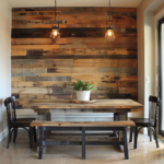
Reclaimed Wood Tables: Rustic Charm with Character and Sustainability
Reclaimed wood dining tables pair exceptionally well with dark hardwood floors, creating spaces with soul, history, and environmental consciousness.
This combination works because reclaimed wood typically features varied coloration, creating natural contrast with your floors even when both elements are relatively dark.
You’ll notice how the weathered patina and visible history in reclaimed pieces add character that newer furniture simply cannot match.
The textural interest in reclaimed wood – with its knots, nail holes, and wear patterns – creates compelling visual contrast against more uniform dark flooring.
This pairing feels particularly appropriate in homes with architectural history or those aiming for farmhouse, industrial, or rustic aesthetic appeal.
Reclaimed tables often incorporate multiple wood tones within a single piece, creating a built-in color story that complements dark floors without matching them exactly.
You might appreciate the sustainability aspect – reclaimed wood gives new life to materials that might otherwise be discarded while reducing demand for newly harvested lumber.
Consider how reclaimed wood’s typically warmer, amber-to-gray tones create a welcoming counterpoint to very dark espresso or ebony floors.
💭 I Wrote a Book About My Biggest Decorating Mistakes!
When I decorated my first home, I thought I knew what I was doing. Spoiler: I didn’t. 😅
💸 I bought a sofa way too big for my living room. Paint colors that looked amazing in the store but terrible on my walls.
This combination signals a comfort with imperfection and authenticity that makes dining spaces feel genuinely livable and welcoming rather than precious or formal.
Design experts often recommend this pairing for creating dining areas with emotional resonance – spaces that tell stories and invite connection.
You’ll find reclaimed wood tables in many styles beyond just farmhouse, including sleek contemporary designs with cleaner lines that maintain the wood’s characteristic patina.
The inherent durability of old-growth lumber used in many reclaimed pieces means these tables often withstand family use beautifully, developing even more character over time.
For practical considerations, reclaimed wood’s varied coloration hides marks and spills better than uniform surfaces, making it family-friendly despite its uniqueness.
This pairing works particularly well in open-concept homes, as reclaimed wood’s distinctive appearance helps define the dining area as a separate zone without requiring walls.
Consider how the history embedded in reclaimed pieces – whether from old barns, factories, or other structures – adds narrative depth to your dining space that new furniture cannot provide.
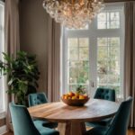
Round Pedestal Tables: Shape Variation That Softens Dark Floors
Round pedestal dining tables create beautiful harmony with dark hardwood floors by introducing softer geometry that balances the linear planks below.
This combination works particularly well because the circular shape provides visual relief from the straight lines and rectangular patterns of hardwood flooring.
You’ll notice how round tables create better traffic flow in dining spaces, with no sharp corners to navigate around, which showcases more of your beautiful dark floors.
Pedestal bases require fewer legs than conventional tables, creating an uncluttered look that allows your eye to appreciate more of the floor’s rich coloration.
This pairing feels especially appropriate in smaller dining areas where the absence of corners helps spaces feel larger and more open.
Round tables foster more intimate, egalitarian conversation since everyone sits equidistant from each other, creating dining experiences that feel more connected and engaging.
Consider how different pedestal styles affect the overall look – chunky carved pedestals create traditional elegance, while sleeker central columns establish more contemporary appeal.
You might appreciate how round tables can comfortably seat more people when entertaining compared to rectangular tables of similar square footage.
The contrast between a light-colored round table and dark floors creates a striking focal point that anchors dining spaces beautifully.
Design experts often recommend this pairing for families with young children, as the absence of sharp corners creates safer environments while still looking sophisticated.
You’ll find round pedestal tables available in countless materials – from painted wood to natural oak to marble-topped – allowing you to select the perfect surface to complement your floors.
For practical considerations, remember that round tables typically require less clearance space around them compared to rectangular options.
This combination works well in both defined dining rooms and open-concept spaces where the distinctive shape helps establish the dining area without walls.
Round tables create interesting shadow patterns on dark floors, especially when placed near windows or under statement lighting fixtures.
Consider how the continuous curve of a round table softens rooms with many hard angles and straight lines, creating more visual comfort and balance against your dark hardwood foundation.
Quick Design Dilemma
Cast your vote — see what other readers think! 🤔
Mid-Century Modern Tables: Retro Cool That Celebrates Wood Tones
Mid-century modern dining tables create a perfect partnership with dark hardwood floors, celebrating wood’s natural beauty through distinctive design.
This pairing works because mid-century pieces typically feature warm wood tones like teak, walnut, or rosewood that contrast beautifully with darker flooring.
You’ll notice how the characteristic tapered legs of mid-century tables create visual lightness that prevents spaces with dark floors from feeling too heavy or grounded.
The clean lines and minimal ornamentation of these tables allow both the furniture and your floors to showcase their natural wood grain without competition.
This combination feels particularly appropriate in homes with architectural features from the same era or in contemporary spaces seeking warmth with historical reference.
Mid-century tables often incorporate subtle organic curves that soften the linear patterns of hardwood flooring, creating pleasing geometric variation.
Consider how the typically warm undertones in mid-century woods complement similar undertones in your dark floors without directly matching them.
You might appreciate how these tables frequently feature slightly raised edges or distinctive shapes that create visual interest against the consistent plane of your flooring.
The modest scale of many mid-century pieces prevents dining areas from feeling overcrowded, allowing more of your beautiful floors to remain visible.
Design experts often recommend this pairing for creating dining spaces that feel both current and timeless, as mid-century design continues its remarkable popularity decades after its origin.
You’ll find that authentic vintage pieces develop beautiful patinas over time that echo the natural aging of your hardwood floors, creating spaces with lived-in elegance.
For practical considerations, many reproduction mid-century tables offer modern durability while maintaining the distinctive aesthetic of the originals.
This combination works particularly well in homes seeking to balance minimalist tendencies with natural warmth, as mid-century design accomplishes both simultaneously.
The distinct historical reference of mid-century furniture adds character and personality to dining spaces without requiring additional decorative elements.
Consider how the cultural associations with mid-century design – optimism, functionality, democratic design – can influence the feeling of your dining area beyond mere aesthetics.
Concrete-Top Tables: Industrial Edge with Neutral Versatility
Concrete-topped dining tables create unexpected modern contrast with dark hardwood floors, bringing together industrial edge and natural warmth.
This striking combination works because concrete’s typically pale gray coloration provides clean contrast against dark flooring while its raw, organic nature complements wood’s natural origins.
You’ll notice how concrete’s slightly imperfect surface texture creates compelling visual tension against the more uniform finish of hardwood floors.
The substantial weight and visual heft of concrete establishes a strong presence that can hold its own against the dominant visual impact of dark flooring.
This pairing feels particularly appropriate in loft-style spaces, modern homes, or interiors seeking to blend industrial and natural elements.
Concrete’s neutral gray tones work with any color scheme, making it incredibly versatile for future design changes while maintaining its beautiful relationship with your floors.
Consider how concrete’s cool coloration and temperature create pleasing sensory contrast with the warmer appearance and feel of wood.
You might appreciate how modern concrete tables often feature surprising elements like embedded materials, colored pigments, or distinctive edge treatments that add unique character.
The inherent durability of properly sealed concrete makes these tables practically indestructible, ideal for active households or dining spaces that see heavy use.
Design experts often recommend this pairing for creating dining areas with contemporary sophistication that avoids feeling cold or sterile thanks to the wood flooring’s natural warmth.
You’ll find concrete tables available with various base options – from industrial metal to warm wood – allowing you to further fine-tune how they relate to your floors.
For practical considerations, today’s concrete tables are typically much lighter than they appear, with many using modern composite materials that mimic solid concrete’s appearance.
This combination works beautifully in open-concept spaces where the distinctive concrete surface helps define the dining area as a separate zone without requiring walls.
Concrete’s slightly porous nature develops subtle character changes over time, creating a living finish that, like your hardwood floors, tells the story of your home’s life.
Consider how this material pairing brings together the best of natural and man-made elements – the organic variation of wood with the engineered precision of concrete – creating spaces with compelling design tension.