ave you ever stood in a furniture showroom, staring at your beautiful light brown table, completely bewildered about which chair colors would create the perfect dining ensemble?
The interplay between table and chair colors forms the backbone of your dining area’s aesthetic identity, creating either visual harmony or unfortunate discord.
Light brown tables, with their warm, inviting tones, offer a versatile foundation for countless design possibilities, acting as chameleons in the world of interior design.
The right pairing doesn’t just please the eye; it expresses your personal style, complements your existing décor, and can even influence the mood of your dining experiences:
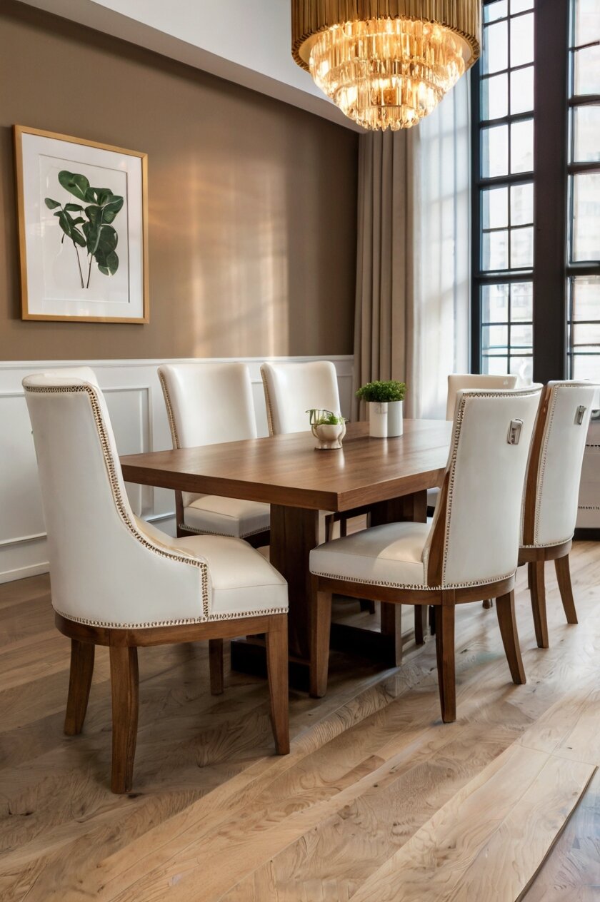
Classic White Chairs


White chairs stand as the quintessential pairing for light brown tables, creating a timeless contrast that brightens any dining space.
The pristine nature of white against the warm tones of light brown creates a visual relationship that feels simultaneously clean and cozy.
When you select white chairs, you’re choosing versatility that adapts effortlessly to seasonal decor changes without creating visual competition.
White chairs reflect more light than darker alternatives, making your dining area appear more spacious and airy—particularly beneficial in smaller rooms or spaces with limited natural light.
The neutrality of white allows the wood grain and natural beauty of your light brown table to remain the focal point, highlighting its craftsmanship and organic texture.
This pairing works exceptionally well in coastal, Scandinavian, farmhouse, and modern minimalist interiors, where clean lines and uncluttered aesthetics reign supreme.
Consider white chairs with subtle variations in texture—perhaps a glossy finish for contemporary spaces or a matte, slightly distressed finish for more rustic environments.
The maintenance factor deserves consideration, as white chairs will show dirt and stains more readily than darker options, particularly in households with young children or frequent entertaining.
Performance fabrics and wipeable materials like vinyl, plastic, or painted wood make practical choices for white dining chairs in active households.
You might explore different silhouettes to add visual interest—perhaps mixing sleek, modern white chairs with a more traditional light brown table for an eclectic, transitional look.
For added dimension, look for white chairs with subtle details like gentle curves, textured upholstery, or interesting back designs that prevent the pairing from feeling flat or uninspired.
The contrast between white chairs and a light brown table creates natural visual boundaries, helping to define the dining area in open-concept floor plans.
This classic combination provides a neutral foundation that welcomes accent colors through table linens, centerpieces, wall art, or nearby decorative elements—offering endless opportunities for personalization without major furniture investments.
Tap to Explore These Beauties
See my ideas in action 👇 Tap any image to explore full details.
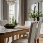
Natural Beige and Cream Chairs
Beige and cream chairs create a soft, harmonious relationship with light brown tables, offering subtle contrast while maintaining a cohesive, organic aesthetic.
When you choose these neutral tones, you’re embracing a design approach that feels effortlessly sophisticated and grounded.
The visual relationship between these colors is one of gentle coordination rather than stark contrast, creating a sense of intentional harmony that feels both relaxed and refined.
Beige and cream variations—from warm ivory to cooler taupe—allow you to fine-tune the warmth of your dining ensemble to complement existing elements in your space.
This palette works exceptionally well in transitional, traditional, and organic modern design schemes where natural materials and subdued elegance are prioritized.
Textural variation becomes particularly important with this neutral pairing—consider chairs with visible weaving, bouclé upholstery, or natural linen covers to introduce tactile interest.
The subtle nature of this combination creates an excellent backdrop for more dramatic elements elsewhere in your dining area, such as bold artwork, statement lighting, or colorful table accessories.

You’ll find this pairing particularly accommodating if you enjoy changing your decor seasonally, as beige and cream chairs adapt beautifully to different accent colors throughout the year.
One practical advantage of this color combination is its forgiving nature regarding dust and minor stains, making it more maintenance-friendly than pristine white while still maintaining a light, airy quality.
Consider mixing different shades within the beige and cream family for a tone-on-tone effect that adds visual depth without introducing new colors to your scheme.
This pairing excels in spaces that receive abundant natural light, where subtle variations in tone become more apparent and create gentle visual movement throughout the day.
For added interest, look for beige or cream chairs with contrasting details—perhaps natural wood legs that pick up the tone of your light brown table or subtle piping in a complementary hue.
The overall effect of light brown tables with beige or cream chairs creates a dining area that feels welcoming, serene, and timelessly elegant without appearing contrived or overly designed.
Soft Gray Chairs
Soft gray chairs offer a contemporary counterpoint to light brown tables, creating a sophisticated balance between warm and cool tones.
When you introduce gray into your dining ensemble, you’re embracing a modern neutrality that feels both current and enduring.
The inherent versatility of gray makes it function almost as a chameleon—taking on subtle blue, green, or purple undertones depending on your specific selection and surrounding elements.
This color pairing creates a visual foundation that works beautifully across diverse design styles, from industrial modern to transitional, Scandinavian to new traditional.
Light brown’s natural warmth prevents gray chairs from feeling cold or sterile, while gray’s contemporary edge keeps the wood tones from appearing dated or overly traditional.
Consider the undertones carefully when selecting gray chairs—warmer grays with taupe undertones will create more harmony with light brown, while cooler blue-grays will establish greater contrast.
The sophistication of this pairing makes it particularly appealing in urban environments or for those who appreciate understated elegance without excessive formality.
Textural elements become especially important with gray chairs—consider materials like velvet, tweedy fabrics, or performance linen to add tactile interest to this neutral combination.
This color relationship creates an excellent foundation for introducing metallic accents in your dining area—brass or gold elements will enhance the warmth, while chrome or nickel will amplify the contemporary quality.
One significant advantage of gray chairs is their practical nature—showing less dirt than lighter options while still maintaining a visually lighter presence than dark chairs.
For added visual interest, consider gray chairs with distinctive silhouettes, whether that means sculptural forms, interesting back designs, or contemporary proportions.
This combination works particularly well in spaces with abundant natural light, which highlights the subtle interplay between the warm brown tones and cooler gray notes.
The inherent flexibility of this pairing allows your dining area to evolve over time—accommodating changing artwork, accessories, and even wall colors without requiring furniture replacement.
Navy Blue Chairs
Navy blue chairs create a striking yet sophisticated juxtaposition with light brown tables, introducing depth and character while maintaining design harmony.
When you select navy blue seating, you’re embracing a color that functions almost as a neutral while still making a definitive statement.
The contrast between the coolness of navy and the warmth of light brown creates visual tension that keeps your dining area feeling intentional and curated rather than predictable.
This pairing works across an impressive range of interior styles—from coastal and nautical to traditional, transitional, and even contemporary settings.
Navy’s inherent association with stability and tradition adds gravitas to your dining space, making it feel established and thoughtfully designed.
The dark nature of navy grounds the lighter elements in your space, creating visual weight that can help balance rooms with high ceilings or abundant natural light.
Consider different fabric textures when selecting navy chairs—velvet creates luxury, linen offers casual sophistication, and performance fabrics provide practicality for active households.

Find Your Room’s Color Palette
Tap a vibe — get a curated 5-color palette with hex codes you can copy ✨
💭 I Wrote a Book About My Biggest Decorating Mistakes!
When I decorated my first home, I thought I knew what I was doing. Spoiler: I didn’t. 😅
💸 I bought a sofa way too big for my living room. Paint colors that looked amazing in the store but terrible on my walls.
This color combination creates an excellent foundation for introducing metallic accents—brass or gold hardware and accessories will enhance the warmth, while silver or chrome will emphasize contemporary elements.
One practical advantage of navy chairs is their forgiving nature regarding stains and everyday wear, making them suitable for family dining areas or frequent entertaining.
For a cohesive look, consider pulling the navy tone into other elements within the space—perhaps through artwork, table linens, or decorative accessories.
In smaller dining areas, consider navy chairs with open backs or streamlined silhouettes to maintain visual lightness despite the deeper color.
The classic nature of this pairing ensures longevity in your design scheme, withstanding trend cycles while continuing to feel fresh and intentional.
For more casual dining environments, consider navy and light brown with textural elements like rattan, jute, or natural fibers to create a relaxed yet polished atmosphere.
Sage Green Chairs
Sage green chairs introduce a natural, organic complement to light brown tables, creating a dining ensemble that feels both fresh and grounded.
When you choose this subtle green hue, you’re bringing the harmony of nature indoors, establishing a connection between your interior spaces and the natural world.
The mutually organic qualities of light brown wood and sage green create a relationship that feels inherently harmonious rather than contrived or trend-driven.
This color pairing excels in spaces that embrace biophilic design principles, where natural materials, plant life, and earth-inspired colors create restorative environments.
Sage green’s understated quality allows it to function almost as a neutral while still introducing noticeable color to your dining area.
The complementary relationship between these colors stems from their positions on the color wheel—brown contains orange undertones, while sage green often carries subtle blue notes, creating pleasing visual tension.
Consider the specific shade carefully—greener sages will emphasize the contrast with brown, while grayer sages will create a more subdued, sophisticated relationship.
This combination works exceptionally well in spaces with abundant natural light, which enhances the subtle variations and natural qualities of both colors.
For material consideration, sage green upholstery in natural fabrics like cotton, linen, or hemp reinforces the organic quality of this pairing.
The calming properties of sage green make it particularly appropriate for dining spaces, where relaxed, unhurried meals contribute to overall wellbeing.
This color pairing creates an excellent foundation for introducing other natural elements—perhaps rattan accessories, stone tableware, or botanical prints.
One practical advantage of sage green is its middle-tone quality, which conceals everyday wear better than very light or very dark alternatives.
For visual consistency, consider repeating the sage tone in subtle ways throughout your space—perhaps through botanicals, ceramics, or textile accents.
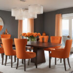
Warm Terracotta or Rust Chairs
Terracotta or rust chairs create a bold yet harmonious companion to light brown tables, establishing a dining ensemble rich in earthy sophistication.
When you opt for these warm, clay-inspired tones, you’re embracing colors with ancient architectural roots that bring timeless character to contemporary spaces.
The relationship between light brown and terracotta creates a monochromatic harmony—both colors share warm undertones but differ enough in saturation to create visual distinction.
This color combination exudes Mediterranean, Southwestern, or desert-inspired ambiance, bringing sun-baked warmth to your dining experience regardless of your geographic location.
The inherent coziness of this pairing makes it particularly suited to spaces where you want to encourage lingering conversation and unhurried meals.
Consider the specific shade carefully—brighter terracottas create more energy and drama, while muted rust tones offer subtle sophistication and greater versatility.
This pairing works exceptionally well in dining spaces that receive warm evening light, which enhances the rich undertones of both colors.
Textural variation becomes crucial with this tone-on-tone approach—consider nubby fabrics, subtle patterns, or varied finishes to prevent visual flatness.
One advantage of terracotta and rust is their historical presence across diverse design traditions, from Moroccan to Mexican, Italian to Indigenous, allowing you to incorporate global influences authentically.
These warm hues create natural visual contrast with green plants, making this an excellent pairing for dining areas where botanicals play a significant role.
For balance in contemporary spaces, consider terracotta chairs with clean, modern silhouettes to prevent the color combination from feeling overly rustic or themed.
This color relationship establishes an excellent foundation for introducing complementary blues or greens as accent colors through textiles, artwork, or tableware.
The inherent relationship between these earth-derived colors—wood and clay—creates a dining environment that feels simultaneously grounded and vibrant, timeless and of-the-moment.
What’s Your Decor Personality?
5 questions · 30 seconds · Instant style match 🏡
Black Chairs
Black chairs create dramatic contrast with light brown tables, establishing a dining ensemble with unmistakable graphic impact and contemporary edge.
When you select black seating, you’re embracing a bold statement that remains timelessly relevant regardless of shifting design trends.
The stark contrast between light brown’s warmth and black’s definitive presence creates visual tension that energizes your dining area with intentional design confidence.
This pairing works across diverse aesthetic approaches—from modern farmhouse to industrial, mid-century modern to contemporary minimalist.
Black’s inherent sophistication elevates the casual warmth of light brown, creating a balanced composition that feels simultaneously approachable and refined.
Consider the specific finish carefully—matte black creates subtle, sophisticated contrast, while glossy black introduces reflective properties that add dimension.
This combination creates an excellent foundation for introducing metallic accents—brass or gold will enhance the warmth, while chrome will emphasize contemporary elements.
One practical advantage of black chairs is their exceptional durability regarding visible wear, making them suitable for high-traffic dining areas and family use.
For visual cohesion, consider repeating black elements elsewhere in your space through lighting fixtures, window frames, or decorative accessories.
In smaller dining areas, consider black chairs with open backs, slender profiles, or transparent elements to maintain visual lightness despite the deep color.
The timeless quality of this pairing ensures design longevity, allowing your dining ensemble to remain relevant as surrounding elements evolve.
For added dimension, explore black chairs with interesting textural elements—perhaps leather with visible grain, textured fabrics, or mixed materials.
This high-contrast pairing creates natural definition for your dining area, particularly beneficial in open-concept spaces where visual boundaries help establish functional zones.
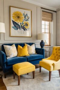
Mustard Yellow Chairs
Mustard yellow chairs introduce vibrant energy and unexpected sophistication when paired with light brown tables, creating a dining ensemble that feels both current and timeless.
When you choose this golden hue, you’re embracing a color with historic design precedent that continues to feel fresh and relevant in contemporary contexts.
The relationship between light brown and mustard yellow creates natural harmony—both colors share warm undertones while differing enough in saturation to create visual distinction.
This color pairing works remarkably well across diverse design approaches—from mid-century modern to contemporary eclectic, global-inspired to new traditional.
Mustard’s inherent warmth enhances the inviting quality of dining spaces, creating environments that feel simultaneously energizing and comfortable.
Consider the specific shade carefully—yellows with more ochre or amber undertones will harmonize more seamlessly with brown, while brighter mustards will create more pronounced contrast.
This combination creates natural visual balance—the restrained neutrality of light brown allows the expressive quality of mustard to shine without overwhelming the space.
For material consideration, mustard yellow in textural fabrics like velvet, bouclé, or woven textiles adds dimensional interest to this already dynamic pairing.
One significant advantage of mustard is its ability to introduce noticeable color while remaining sophisticated enough for long-term livability, unlike brighter yellows that may tire more quickly.
This color pairing creates an excellent foundation for introducing complementary blues or purples as accent colors through artwork, textiles, or decorative objects.
For contemporary spaces, consider mustard chairs with clean, minimalist silhouettes to prevent the combination from feeling overly vintage or retro-inspired.
The mood-enhancing qualities of yellow make this an excellent choice for dining areas, where social connection and positive experiences are paramount.
This unexpected yet harmonious pairing demonstrates design confidence, creating a dining ensemble that feels personally curated rather than prescribed by current trends.
💭 Ever wondered what your room would actually look like rearranged?
I built a free tool that lets you drag furniture around a 2D floor plan. No signup, no catch.
See the Room Planner →Light Pink or Blush Chairs
Light pink or blush chairs create an unexpectedly sophisticated counterpoint to light brown tables, introducing subtle color while maintaining an elegant, restrained palette.
When you select these gentle rosy hues, you’re embracing a color combination that feels simultaneously fresh and timeless, contemporary and classic.
The contrast between the coolness of pink and the warmth of light brown creates visual interest while remaining harmonious enough for long-term livability.
This pairing excels across diverse style approaches—from Scandinavian modern to transitional, contemporary feminine to eclectic bohemian.
The inherent softness of blush tones balances the structured quality of dining furniture, creating environments that feel both organized and welcoming.
Consider the specific shade carefully—pinker blushes will create more noticeable contrast with brown, while peachy blushes will harmonize more seamlessly with warm wood tones.
For material consideration, blush velvet creates luxurious texture, while linen or cotton offers a more casual, light-filled quality to this sophisticated pairing.
This combination creates an excellent foundation for introducing metallic accents—brass or gold hardware enhances the warmth, while silver or chrome adds contemporary contrast.
One advantage of light pink is its unexpected versatility—functioning almost as a neutral in many design contexts while still introducing subtle color and personality.
For balance in contemporary spaces, consider light pink chairs with clean, modern silhouettes to prevent the color from feeling overly feminine or precious.
This understated pairing allows your dining area to adapt to seasonal changes through table linens, centerpieces, and decorative elements without requiring furniture updates.
The unexpected nature of this combination demonstrates design confidence, creating spaces that feel personally curated rather than derived from standard design formulas.
For cohesive design, consider repeating blush tones in subtle ways throughout your space—perhaps through artwork, ceramics, or textile accents that tie the dining area to surrounding rooms.
This or That?
Pick your fave — see what other readers chose! 👀
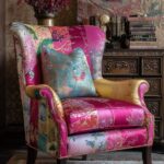
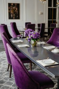
Rich Emerald Green Chairs
Emerald green chairs introduce luxurious depth and natural vibrancy when paired with light brown tables, creating a dining ensemble that feels both bold and timeless.
When you select this jewel tone, you’re embracing a color with historical significance in design that continues to feel fresh and relevant in contemporary contexts.
The relationship between light brown’s natural warmth and emerald’s rich coolness creates visual tension that energizes your dining space with intentional contrast.
This pairing works across diverse aesthetic approaches—from classic traditional to contemporary glam, eclectic maximalist to refined transitional.
Emerald’s association with nature brings biophilic elements indoors, creating dining environments that feel simultaneously sophisticated and connected to the natural world.
Consider the specific shade carefully—bluer emeralds will create more pronounced contrast with brown, while yellower greens will harmonize more seamlessly with warm wood tones.
For material consideration, emerald in plush velvet creates luxurious depth, while structured fabrics like twill offer a more tailored approach to this dynamic pairing.
💭 I Wrote a Book About My Biggest Decorating Mistakes!
When I decorated my first home, I thought I knew what I was doing. Spoiler: I didn’t. 😅
💸 I bought a sofa way too big for my living room. Paint colors that looked amazing in the store but terrible on my walls.
This color combination creates an excellent foundation for introducing metallic accents—brass or gold enhance the luxurious quality, while chrome or nickel add contemporary edge.
One significant advantage of emerald green is its ability to introduce bold color while remaining sophisticated enough for long-term enjoyment, unlike trendy brights that may tire quickly.
For balance in more traditional spaces, consider emerald chairs with classic silhouettes that reference historical precedents while remaining fresh.
The inherent richness of this pairing establishes your dining area as a deliberate focal point within open living spaces, creating visual destination that draws people together.
This sophisticated combination demonstrates design confidence, signaling spaces created with intention rather than defaulting to safer neutral pairings.
For visual cohesion, consider repeating emerald tones in subtle ways throughout your space—perhaps through botanicals, artwork, or decorative objects that connect the dining area to surrounding rooms.
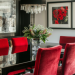
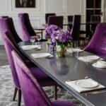
Burgundy or Wine Chairs
Burgundy or wine chairs introduce rich, sophisticated color when paired with light brown tables, creating a dining ensemble that balances warmth with depth.
When you select these deep red hues, you’re embracing colors with historical design significance that continue to convey timeless elegance in contemporary settings.
The relationship between light brown and burgundy creates natural harmony—both colors share warm undertones while differing enough in saturation to create visual distinction.
This pairing excels across diverse style approaches—from traditional and classic to transitional, industrial to global-inspired contexts.
Burgundy’s association with fine dining, wine culture, and hospitality makes it particularly appropriate for dining spaces where gathering and entertaining are prioritized.
Consider the specific shade carefully—redder burgundies create more energy and drama, while purple-leaning wines offer subtle sophistication and greater versatility.
For material consideration, burgundy in rich leather creates timeless luxury, while velvet offers plush texture that enhances the inherent depth of this color pairing.
This combination creates an excellent foundation for introducing metallic accents—antiqued brass or gold enhance the traditional quality, while blackened metals add contemporary edge.
One significant advantage of burgundy is its exceptional ability to conceal stains and everyday wear, making it practical for dining areas that see frequent use.
For balance in contemporary spaces, consider wine-colored chairs with clean, modern silhouettes to prevent the color combination from feeling overly traditional.
The inherent richness of this pairing establishes your dining area as an intentional focal point, signaling spaces designed for connection and memorable gatherings.
This sophisticated color relationship demonstrates design confidence without relying on trends, creating dining environments that feel personally significant rather than transient.
For seasonal adaptability, burgundy chairs allow your dining area to transition seamlessly from everyday use to holiday gatherings without requiring additional elements.
Quick Design Dilemma
Cast your vote — see what other readers think! 🤔
Warm Tan Leather Chairs
Warm tan leather chairs create tonal harmony with light brown tables, establishing a dining ensemble rich in natural materials and timeless appeal.
When you select this classic material and color combination, you’re embracing a pairing that transcends design trends while maintaining perpetual relevance.
The relationship between light brown wood and tan leather creates subtle variation within a cohesive color family—different enough to create visual interest while maintaining overall harmony.
This pairing excels in diverse design contexts—from modern farmhouse to mid-century modern, industrial to warm minimalist, traditional to contemporary organic.
The inherent natural quality of both materials establishes an authentic foundation that feels grounded, honest, and intentionally curated rather than mass-produced.
Consider the specific leather finish carefully—distressed or vintage-look leathers create casual warmth, while smooth, uniform leathers establish more refined sophistication.
This combination creates an excellent foundation for introducing contrasting elements—whether through modern lighting, contemporary art, or unexpected accent colors.
One significant advantage of tan leather is its exceptional aging quality—developing a rich patina over time that enhances rather than diminishes its appeal.
For visual diversity, consider tan leather chairs with interesting silhouettes or distinctive design details that prevent the tonal relationship from appearing too uniform.
This pairing creates natural invitation for introducing textural contrast through table linens, ceramics, or glassware that complement the substantial quality of leather and wood.
The inherent warmth of this combination establishes dining environments that feel immediately welcoming, encouraging relaxed conversation and extended gatherings.
This material-focused approach demonstrates design confidence through simplicity—relying on quality and natural beauty rather than trend-driven color or pattern.
For visual cohesion, consider repeating leather elements in other areas of your space—perhaps through occasional furniture, accessories, or decorative details that connect the dining area to surrounding rooms.
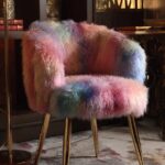
Mixed Chair Colors
Mixed chair colors introduce playful sophistication and personal expression when paired with light brown tables, creating dining ensembles that feel deliberately curated rather than mass-produced.
When you embrace this approach, you’re moving beyond conventional matching sets to establish spaces that reflect more authentic, evolved design sensibilities.
The unifying presence of your light brown table anchors diverse chair colors, providing consistent foundation that allows for controlled variation.
This approach works particularly well in eclectic, bohemian, collected, and personality-driven interiors where design rules are thoughtfully bent rather than strictly followed.
The key to successful mixed chair arrangements lies in identifying an underlying principle—whether that’s consistent silhouettes with varied colors or complementary color theory with diverse forms.
Consider establishing a limited palette of 2-4 chair colors that relate to each other through color theory relationships—perhaps analogous blues and greens or complementary blue and orange.
This approach creates excellent opportunity for incorporating vintage or found chairs, bringing sustainability and character to your dining ensemble.
One significant advantage of mixed seating is the ability to evolve your collection gradually, adding chairs individually rather than investing in complete matching sets.
For visual cohesion, consider chairs with some unifying element—perhaps similar materials, comparable scale, or related design periods.
This combination creates natural opportunity for conversation and personal expression, as each chair can reflect different aspects of your design personality or family history.
The inherent customization of this approach establishes dining environments that feel uniquely yours rather than replicating widely available design formulas.
For practical flexibility, mixed chairs allow you to adjust your seating arrangement based on specific needs—perhaps including armchairs at table ends or introducing chairs with varying levels of comfort.
This sophisticated approach demonstrates design confidence and maturity, signaling spaces created through thoughtful curation rather than one-time purchasing decisions.