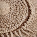
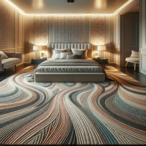
ave you been staring at your light gray carpet wondering what wall color would look best with it?
Light gray carpet creates a versatile foundation for almost any design style you can imagine.
The right paint color can completely transform how your space feels – making it warm and cozy, bright and energetic, or calm and sophisticated.
Some colors will make your space feel larger and more open.
Others will create a cozy, intimate atmosphere that wraps around you like a warm blanket.
Get ready to see your light gray carpet in a whole new light, so Let’s Go:

Pure White: The Timeless Classic


Pure white walls with light gray carpet create a clean, timeless look that never goes out of style.
White paint reflects the most light, making your space feel bigger and brighter instantly.
This combination serves as the perfect backdrop for any decorating style you might prefer.
The contrast between white walls and light gray flooring creates a natural flow through your space.
Your eyes move smoothly from the grounding carpet up to the airy walls without any jarring transitions.
Think of this pairing as creating a gallery-like setting where your furniture and decor become the stars of the show.
When selecting the right white, look for pure whites rather than those with strong undertones that might clash with your carpet.
Benjamin Moore’s “Chantilly Lace” or Sherwin Williams’ “Extra White” are excellent options that maintain a clean look.
This color combination works wonderfully in smaller spaces that need to feel larger.
The light-reflective qualities of both the white walls and light gray carpet maximize natural light.
Your room will feel fresh and open, even if it doesn’t get much natural sunlight.
For added interest, consider incorporating different textures through furniture and accessories.
Since the color scheme is neutral, textures become more important for creating visual interest.
The white and light gray combination offers incredible versatility for seasonal decor changes.
You can easily swap out accent colors through pillows, throws, and artwork without having to repaint.
This color scheme brings a sense of calm to any space, making it particularly suitable for bedrooms and home offices.
The lack of strong colors reduces visual stimulation, helping create a peaceful environment.
If you’re concerned about white walls feeling too stark, consider using white with the slightest hint of warmth.
Even a tiny touch of cream can soften the look while maintaining the bright, open feeling.
This combination pairs beautifully with both warm and cool accent colors.
You truly can’t go wrong with this classic choice that designers have relied on for decades.
Tap to Explore These Beauties
See my ideas in action 👇 Tap any image to explore full details.
Soft Blue: Creating Tranquil Spaces
Soft blue paint creates a naturally calming atmosphere when paired with light gray carpet.
These colors together evoke the peaceful feeling of cloudy skies, making them perfect for bedrooms and relaxation spaces.
The cool undertones in both light gray and soft blue create a harmonious flow throughout your room.
This color combination has been shown to lower heart rates and reduce stress, according to color psychology research.
When selecting the perfect soft blue, look for options with gray undertones to complement your carpet beautifully.
Paint colors like Benjamin Moore’s “Breath of Fresh Air” or Sherwin Williams’ “Misty” create this serene effect perfectly.
Your light gray carpet will appear more sophisticated when paired with these subtle blue tones.
The combination works particularly well in spaces where you want to create a sense of expansion and openness.
Soft blue walls visually recede, making your room feel larger than it actually is.
This color pairing brings the peaceful outdoor feeling of sky and clouds into your interior spaces.
For a more dynamic look, consider using slightly different shades of soft blue on different walls.
The light gray carpet will tie the various blues together while keeping the space cohesive.
Your furniture choices become more flexible with this color combination as both warm and cool tones work well.
Natural wood furniture adds warmth to balance the coolness of the blue and gray.
This color scheme adapts beautifully to changing light throughout the day.
Morning light brings out the brighter blue tones, while evening light enhances the gray undertones for a cozier feel.
Metallics like silver and chrome accent this color combination beautifully, adding sophistication and shine.
For a more contemporary look, incorporate black accents through picture frames or furniture legs.
This soft blue and light gray pairing creates a timeless look that won’t quickly go out of style.
Unlike trendy bold colors, you won’t find yourself wanting to repaint in a year or two.
Your light gray carpet provides the perfect neutral foundation that allows the soft blue to be the star of the show.
Warm Greige: The Perfect Neutral Balance
Greige – that perfect blend of gray and beige – creates a sophisticated warmth when paired with light gray carpet.
This combination brings together the best qualities of cool grays and warm beiges for a balanced, inviting space.
Your light gray carpet will look intentional rather than simply builder-grade when paired with well-chosen greige walls.
The subtle warmth of greige prevents your space from feeling too cold or institutional.
When selecting the perfect greige, examine the undertones in your carpet to guide your choice.
If your carpet has blue-gray undertones, look for greiges with similar cool qualities like Sherwin Williams’ “Agreeable Gray.”
For carpets with warmer taupe undertones, consider Benjamin Moore’s “Revere Pewter” for beautiful cohesion.
This color combination creates a sophisticated backdrop that works with virtually any design style.
Whether your furniture is modern, traditional, or eclectic, greige walls and light gray carpet provide versatile foundation.
Your room will have a pulled-together, designer look with this subtle color pairing.
The slight contrast between walls and floor creates visual interest without being overwhelming.
Greige walls reflect light beautifully, enhancing both natural and artificial lighting in your space.
This color combination works particularly well in open floor plans where you need colors to flow seamlessly.
The subtle difference between the light gray carpet and greige walls creates just enough definition without choppy transitions.
Your artwork and decorative accessories will stand out beautifully against this neutral backdrop.
Consider this combination for spaces where you entertain frequently, as it creates an elegant, welcoming atmosphere.
The versatility of greige means you can easily change accent colors through seasons or as trends evolve.
For a more dramatic look, use a darker greige to create more contrast with your light gray carpet.
This creates a cozier, more intimate feeling while maintaining the sophisticated neutral palette.
Natural elements like wood, stone, and plants look particularly stunning against this color combination.
The organic materials bring life and texture to the neutral backdrop of greige and light gray.
Your light gray carpet becomes an intentional design element rather than just a practical flooring choice.

Pale Sage Green: Bringing Nature Indoors
Pale sage green walls create a refreshing, nature-inspired look when paired with light gray carpet.
This soft, muted green has just enough gray in it to coordinate beautifully with your carpet while adding subtle color.
Your space will feel connected to the outdoors with this gentle nod to nature.
Sage green has been shown to reduce anxiety and promote feelings of well-being, making it perfect for any room where you want to relax.
When selecting the right shade, look for sage greens with gray undertones rather than yellow-based greens.
Options like Benjamin Moore’s “Quiet Moments” or Sherwin Williams’ “Sea Salt” create this effect perfectly.
This color combination works wonderfully in spaces that overlook gardens or natural settings.
The sage green walls seem to extend your outdoor views while the light gray carpet grounds the space.
Your room will have a timeless, sophisticated feel that doesn’t scream “trendy” but still feels current.
Unlike brighter greens, sage won’t overwhelm your space or compete with your decorative elements.
This color pairing creates a gender-neutral palette that appeals to everyone in your household.
It’s neither too feminine nor too masculine, making it perfect for shared spaces.

Find Your Room’s Color Palette
Tap a vibe — get a curated 5-color palette with hex codes you can copy ✨
💭 I Wrote a Book About My Biggest Decorating Mistakes!
When I decorated my first home, I thought I knew what I was doing. Spoiler: I didn’t. 😅
💸 I bought a sofa way too big for my living room. Paint colors that looked amazing in the store but terrible on my walls.
The soft contrast between walls and floor creates visual interest while maintaining a serene atmosphere.
Natural light enhances the subtle beauty of sage green, bringing out different undertones throughout the day.
Your furniture will look amazing against sage green walls, whether you prefer light neutrals or darker wood tones.
This versatile color combination serves as a beautiful backdrop for both modern and traditional design elements.
For a more dynamic look, consider using sage green on just one accent wall with lighter neutrals elsewhere.
Your light gray carpet will tie the different wall colors together seamlessly.
Botanical prints and natural materials enhance this nature-inspired color scheme beautifully.
Consider adding elements like rattan, jute, or natural wood to complete the organic feeling.
This color combination brings a spa-like tranquility to bathrooms and bedrooms especially.
The cool undertones in both colors create a sense of cleanliness and calm.
Your light gray carpet will look intentionally chosen rather than builder-grade when paired with thoughtful sage green walls.
Rich Navy Blue: Creating Dramatic Contrast
Rich navy blue walls create a striking, sophisticated contrast against light gray carpet.
This bold pairing makes a confident design statement while remaining timeless and elegant.
Your room instantly gains architectural interest from the dramatic color difference between floor and walls.
Navy blue has long been considered a “new neutral” by designers because of its versatility and timeless appeal.
When selecting the perfect navy, look for blues with gray undertones to coordinate beautifully with your carpet.
Benjamin Moore’s “Hale Navy” or Sherwin Williams’ “Naval” create this dramatic yet sophisticated effect.
This color combination works particularly well in dining rooms, libraries, and home offices.
The navy walls create a sense of intimacy and focus that enhances these purposeful spaces.
Your light gray carpet prevents the navy from feeling overwhelming or making the space too dark.
The reflective quality of the lighter floor balances the depth of the navy walls.
This color pairing creates the perfect backdrop for making artwork and metallic accents pop.
Gold, brass, and silver hardware and accessories shine brilliantly against navy walls.
Your furniture will stand out beautifully against this dramatic backdrop, especially light-colored pieces.
For maximum impact, consider white or cream upholstery to create stunning contrast against the navy.
This color combination works in both traditional and contemporary spaces depending on your accessories.
Traditional moldings and classic furniture create a timeless, elegant look against navy walls.
Your light gray carpet anchors the space while allowing the navy to be the star of the show.
Consider using this bold color in smaller spaces like powder rooms or hallways for dramatic impact without commitment.
The contrast between navy walls and light gray carpet creates natural visual flow through your space.
Your eyes are drawn up from the light floor to the dramatic walls, creating a sense of height and dimension.
This color combination offers excellent practicality, as navy hides marks and imperfections better than lighter colors.
For a less dramatic approach, consider using navy on just one accent wall while keeping other walls lighter.
Your light gray carpet will tie the different wall colors together beautifully.
Warm Taupe: Creating Cozy Comfort
Warm taupe walls bring subtle sophistication and cozy comfort when paired with light gray carpet.
This versatile neutral sits between gray and brown, offering warmth without being too beige or yellow-toned.
Your space will feel instantly welcoming and grounded with this elegant color combination.
Taupe has been a designer favorite for decades because it creates warmth without limiting your design options.
When selecting the perfect taupe, look for options with gray undertones to coordinate with your carpet.
Benjamin Moore’s “Pale Oak” or Sherwin Williams’ “Accessible Beige” offer this perfect warm-but-not-yellow quality.
This color pairing works particularly well in spaces where you want to create a sense of relaxation and comfort.
The subtle warmth of taupe walls against light gray carpet creates an embracing, nurturing feeling.
Your furniture and accessories pop beautifully against this neutral backdrop, regardless of their color.
This versatile combination supports any accent color you might choose, from bright jewel tones to subtle pastels.
Taupe walls reflect light beautifully while still adding depth compared to white or lighter neutrals.
The slight contrast between walls and floor creates subtle definition without stark transitions.
💭 Ever wondered what your room would actually look like rearranged?
I built a free tool that lets you drag furniture around a 2D floor plan. No signup, no catch.
See the Room Planner →Your space will have an upscale, curated look that appears intentionally designed rather than randomly assembled.
This color combination works with virtually any design style from traditional to contemporary.
Taupe and light gray create a perfect backdrop for natural materials like wood, leather, and stone.
These organic elements add texture and character to the sophisticated neutral backdrop.
This color pairing creates excellent flow throughout open-concept spaces.
The subtle color difference defines different areas while maintaining visual cohesion.
Your light gray carpet appears more luxurious when paired with taupe walls that enhance its sophisticated quality.
For added interest, consider adding texture to your taupe walls through techniques like lime washing or subtle pattern.
The textured walls will create beautiful dimension against the smooth surface of your carpet.
This combination ages gracefully and won’t quickly look dated like more trendy color choices.
Your investment in painting will have longevity with this timeless color pairing.
What’s Your Decor Personality?
5 questions · 30 seconds · Instant style match 🏡
Soft Lavender: Adding Subtle Color
Soft lavender walls create an unexpected yet sophisticated pairing with light gray carpet.
This delicate purple hue adds subtle color while maintaining the serene, neutral foundation of your space.
Your room will feel unique and thoughtfully designed with this less common color choice.
Lavender has been shown to promote relaxation and creativity, making it perfect for bedrooms and creative spaces.
When selecting the right lavender, look for highly muted versions with gray undertones.
Paint colors like Benjamin Moore’s “Lavender Mist” or Sherwin Williams’ “Sensitive Tint” create this subtle effect.
This color combination works beautifully in spaces where you want a touch of feminine energy without being overly girlish.
The gray carpet balances the traditionally feminine lavender with its more neutral presence.
Your light gray carpet will take on a slight lavender cast as the wall color reflects onto it, creating cohesion.
This color pairing creates a sophisticated backdrop for both silver and gold accent pieces.
For a more dramatic look, consider deeper eggplant or purple tones on just one accent wall.
Your light gray carpet will anchor these deeper purple tones beautifully.
This color combination brings a unique personality to your space without being overwhelming.
Unlike bold primary colors, soft lavender creates interest while remaining livable for everyday use.
Your furniture will look amazing against lavender walls, especially white, cream, or natural wood pieces.
This color pairing works well in spaces where you want to create a sense of calm and tranquility.
The slightly cool tones of both lavender and light gray create a peaceful, serene atmosphere.
For added interest, consider incorporating different textures through upholstery and window treatments.
Since the color scheme is subtle, textures become more important for creating visual interest.
This color combination offers sophisticated versatility for seasonal decor changes.
Summer accessories in aqua or green transform the room differently than winter accessories in deeper purples or blues.
Your light gray carpet creates a neutral foundation that allows the subtle lavender to shine without competition.
Consider this combination for spaces where you spend quiet time reading, meditating, or relaxing.
The gentle lavender promotes restful activities while the gray grounds the space.
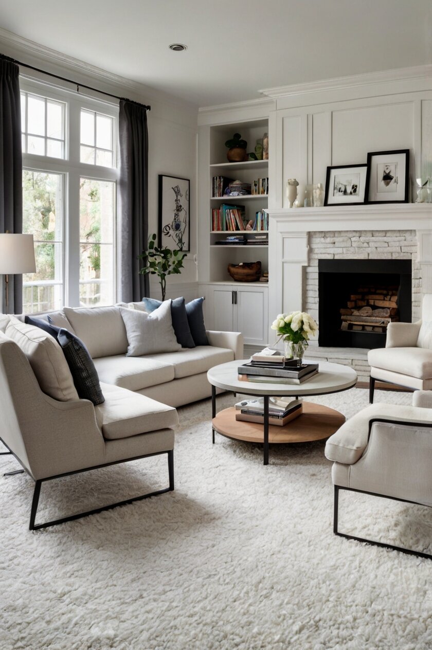
Crisp Light Gray: Monochromatic Elegance
Light gray walls paired with light gray carpet create a sophisticated monochromatic look that designers love.
This tone-on-tone approach brings subtle dimension and elegance to your space without harsh contrasts.
Your room will have a cohesive, curated look that feels intentionally designed rather than randomly assembled.
When selecting the perfect gray for your walls, choose a shade slightly lighter or darker than your carpet.
This subtle variation creates just enough visual interest while maintaining the seamless look.
Paint colors like Benjamin Moore’s “Gray Owl” or Sherwin Williams’ “Light French Gray” work beautifully for this approach.
This monochromatic scheme creates the perfect backdrop for colorful art and accessories to shine.
Without competing wall colors, your decorative elements become the stars of the show.
Your space will feel larger and more open with this continuous color flow from floor to walls.
The lack of contrast creates visual expansion that makes even smaller rooms feel more spacious.
This color combination works particularly well in modern and contemporary spaces.
The clean, minimal palette supports sleek furniture lines and architectural details.
Your accent colors can easily be changed seasonally or as trends evolve with this neutral foundation.
Consider this approach for open floor plans where you want seamless transitions between spaces.
The monochromatic gray palette creates excellent flow throughout connected rooms.
For added interest, incorporate different textures through upholstery, window treatments, and accessories.
Since the color scheme is subtle, textures become essential for creating visual interest and depth.
Your metallic accents will pop beautifully against this neutral backdrop – consider mixing metals for added dimension.
This color combination has timeless appeal that won’t quickly look dated like more trendy color choices.
Light gray on light gray creates a peaceful, serene environment perfect for bedrooms and relaxation spaces.
The lack of contrasting colors reduces visual stimulation, helping create a restful atmosphere.
Your furniture options become incredibly flexible with this neutral backdrop supporting any wood tone or upholstery color.
This approach offers sophisticated simplicity that never goes out of style.
Butter Yellow: Adding Warmth and Cheerfulness
Butter yellow walls bring unexpected warmth and cheerfulness when paired with light gray carpet.
This sunny hue transforms your space instantly, creating a welcoming atmosphere that feels like perpetual sunshine.
Your light gray carpet balances the yellow perfectly, preventing it from becoming overwhelming or too childish.
When selecting the right yellow, look for muted, creamy shades rather than bright or acidic versions.
Paint colors like Benjamin Moore’s “Philadelphia Cream” or Sherwin Williams’ “Butter Up” create this warm, sophisticated effect.
This color combination works particularly well in spaces that lack natural light.
The yellow walls reflect and amplify available light while the gray carpet grounds the space.
Your mood will be positively affected by this color pairing, as yellow has been shown to promote optimism and energy.
This makes it perfect for kitchens, breakfast nooks, and home offices where positive energy is beneficial.
The contrast between warm yellow walls and cool gray carpet creates a beautiful temperature balance in your space.
Consider this combination for north-facing rooms that tend to feel cold and unwelcoming.
The butter yellow adds the warmth these spaces naturally lack.
Your furniture and accessories will pop beautifully against this cheerful backdrop.
Both light neutrals and dark wood tones work extremely well with this color combination.
This pairing creates a versatile foundation that works with many different design styles.
From farmhouse to contemporary, butter yellow and light gray adapt beautifully to your preferred aesthetic.
For a more dynamic look, consider using butter yellow on just one accent wall with lighter neutrals elsewhere.
Your light gray carpet will tie the different wall colors together seamlessly.
This color combination creates excellent flow between indoor and outdoor spaces, especially in rooms that overlook gardens.
The nature-inspired colors bring the outdoor feeling inside your home.
Your light gray carpet appears purposefully chosen rather than builder-grade when paired with thoughtful butter yellow walls.
For added sophist.
ication, consider incorporating gray accents through pillows, throws, or artwork.
These gray accents will tie back to your carpet and create cohesion throughout the space.
This unexpected color pairing brings personality and warmth without being trendy or short-lived.
This or That?
Pick your fave — see what other readers chose! 👀
Charcoal Gray: Creating Sophistication and Drama
Charcoal gray walls create a bold, sophisticated contrast against light gray carpet.
This dramatic pairing makes a confident design statement while remaining elegant and timeless.
Your space instantly takes on a more architectural, intentional feel with this striking color combination.
The deep charcoal walls recede visually, making your space feel larger despite the darker color.
When selecting the perfect charcoal, look for true grays without strong blue or brown undertones.
Benjamin Moore’s “Wrought Iron” or Sherwin Williams’ “Iron Ore” create this sophisticated effect beautifully.
This color combination works particularly well in media rooms, home offices, and dining rooms.
The darker walls create a sense of intimacy and focus perfect for these purposeful spaces.
Your light furnishings will stand out dramatically against the charcoal background, creating stunning visual impact.
This contrast works especially well with light upholstery, artwork, and decorative objects.
The light gray carpet prevents the space from feeling too dark or cave-like, as can happen with dark walls and dark flooring.
Your room will have beautiful balance between the dramatic walls and the lighter, reflective quality of the carpet.
💭 I Wrote a Book About My Biggest Decorating Mistakes!
When I decorated my first home, I thought I knew what I was doing. Spoiler: I didn’t. 😅
💸 I bought a sofa way too big for my living room. Paint colors that looked amazing in the store but terrible on my walls.
This color pairing creates a perfect backdrop for making metallic accents truly shine.
Gold, brass, and chrome hardware and accessories pop brilliantly against charcoal walls.
For added sophistication, consider incorporating different textures through upholstery and window treatments.
The dramatic color contrast makes texture even more important for creating depth and interest.
Your light gray carpet creates a natural visual flow, drawing the eye upward to the dramatic walls.
This vertical movement makes ceilings appear higher and spaces feel more expansive.
This color combination offers excellent practicality, as charcoal walls hide marks and imperfections better than lighter colors.
Consider using this bold approach in smaller spaces like powder rooms or dining areas for maximum impact.
The confined space actually enhances the dramatic effect of the dark walls.
Your artwork will look gallery-worthy against charcoal walls, creating a sophisticated showcase for your collection.
This color pairing creates a timeless, elegant look that transcends trends.
Blush Pink: Creating Subtle Warmth
Blush pink walls create an unexpectedly sophisticated pairing with light gray carpet.
This subtle, barely-there pink adds gentle warmth without becoming too feminine or childish.
Your space will feel instantly more welcoming and flattering with this color combination.
When selecting the perfect blush, look for highly muted pinks with gray undertones.
Paint colors like Benjamin Moore’s “Pink Bliss” or Sherwin Williams’ “Romance” create this subtle sophisticated effect.
This color combination works beautifully in spaces where you want to create a sense of softness and comfort.
The gentle warmth of blush walls against light gray carpet creates an embracing, nurturing feeling.
Your skin tone will look amazing in this space, as blush pink is universally flattering to all complexions.
This makes it perfect for bedrooms, dressing areas, and powder rooms.
The subtle contrast between walls and floor creates visual interest while maintaining a serene atmosphere.
This color pairing creates an elegant backdrop for both silver and gold accent pieces.
For a more contemporary look, pair blush walls with black accents and your light gray carpet.
This creates a sophisticated modern look that balances feminine and masculine elements perfectly.
Your furniture will look stunning against blush walls, especially wood tones and neutral upholstery.
This color combination works well in spaces that don’t get much natural light.
The warm pink walls counteract the coolness often found in darker spaces.
Blush pink has been shown to reduce stress and promote feelings of tranquility and nurturing.
This makes it perfect for spaces where you want to unwind and relax.
Your light gray carpet provides the perfect neutral foundation that allows the subtle blush to shine without competition.
Consider this combination for spaces where you want to create a sense of intimate sophistication.
The gentle pink promotes connection while the gray grounds the space.
This color pairing offers versatility for seasonal decor changes through accent colors.
Winter brings opportunities for deeper burgundies and navies while summer opens up to corals and turquoise accents.
Your light gray carpet appears more intentional when paired with thoughtfully selected blush pink walls.
Quick Design Dilemma
Cast your vote — see what other readers think! 🤔
Mint Green: Creating Fresh Energy
Mint green walls bring refreshing energy and timeless charm when paired with light gray carpet.
This cool, crisp color creates a bright, cheerful space that feels clean and invigorating.
Your room will have a youthful yet sophisticated vibe with this unexpected color combination.
When selecting the perfect mint, look for options with gray undertones rather than blue or yellow bases.
Paint colors like Benjamin Moore’s “Soft Mint” or Sherwin Williams’ “Breaktime” create this fresh effect beautifully.
This color combination works wonderfully in spaces where you want to create an energizing atmosphere.
The clean, crisp mint walls promote productivity and focus, making this perfect for home offices or craft rooms.
Your light gray carpet creates a sophisticated foundation that prevents the mint from feeling too childish or trendy.
The gray grounds the playful mint tone, creating a balanced, mature space.
This color pairing creates a perfect backdrop for both vintage and contemporary design elements.
Mint has retro appeal that works beautifully with mid-century furniture while still feeling current and fresh.
Your wood furniture will look amazing against mint walls, especially mid-tone woods like walnut or maple.
This color combination brings a spa-like freshness to bathrooms and bedrooms especially.
The cool undertones in both colors create a sense of cleanliness and calm.
For a more dynamic approach, consider using mint on just one accent wall with lighter neutrals elsewhere.
Your light gray carpet will tie the different wall colors together seamlessly.
This color combination creates excellent flow between indoor and outdoor spaces, especially in rooms that overlook gardens.
The nature-inspired mint brings the outdoor feeling inside your home.
Your accessories pop beautifully against this color combination, especially items in coral, navy, or gold.
These accent colors create stunning contrast against the mint walls and light gray carpet.
This color pairing provides refreshing versatility that adapts to many different design styles.
From coastal to Scandinavian, mint and light gray work well with various aesthetic directions.
Your light gray carpet appears intentionally chosen rather than builder-grade when paired with thoughtful mint walls.
For added sophistication, incorporate gray accents through pillows, throws, or artwork to tie back to your carpet.
Rich Terra Cotta: Adding Warmth and Character
Rich terra cotta walls bring unexpected warmth and earthiness when paired with light gray carpet.
This clay-inspired color creates a grounding, organic feel that balances beautifully with the cooler gray tones.
Your space will feel instantly more inviting and unique with this distinctive color combination.
When selecting the perfect terra cotta, look for warmer, earthier options rather than those with too much orange.
Paint colors like Benjamin Moore’s “Warm Sienna” or Sherwin Williams’ “Rustic Red” create this sophisticated earthy effect.
This color combination works particularly well in gathering spaces like living rooms and dining areas.
The warm walls promote connection and conversation while the light gray carpet keeps the space from feeling too intense.
Your light gray carpet prevents the terra cotta from becoming overwhelming, creating perfect balance in your space.
The coolness of the gray tempers the warmth of the terra cotta, resulting in harmony rather than competition.
This color pairing creates a perfect backdrop for Southwestern, Mediterranean, or global-inspired decor.
Natural materials like wood, leather, and woven textiles look stunning against this color combination.
Your space will have a collected, well-traveled look that feels personal rather than generic.
Consider this approach for spaces that feel too sterile or lack architectural interest.
The rich terra cotta adds instant character and depth to otherwise plain rooms.
Your furniture will stand out beautifully against terra cotta walls, especially pieces in cream, tan, or natural woods.
This color combination offers excellent practicality, as terra cotta hides marks and scuffs better than lighter colors.
For a less dramatic approach, consider using terra cotta on just one accent wall with lighter neutrals elsewhere.
Your light gray carpet will tie the different wall colors together beautifully.
This color pairing creates a timeless look inspired by natural materials that never truly go out of style.
Unlike trendy colors, this earthy tone has been used in homes for centuries across many cultures.
Your metallic accents will shine brilliantly against terra cotta walls – especially brass, copper, and bronze.
These warm metallics enhance the earthy quality of the walls while adding sophistication.
This combination brings the beauty of natural landscapes indoors, creating a connection to the earth elements.
The terra cotta evokes clay and sunset hues while the gray suggests stone and minerals.