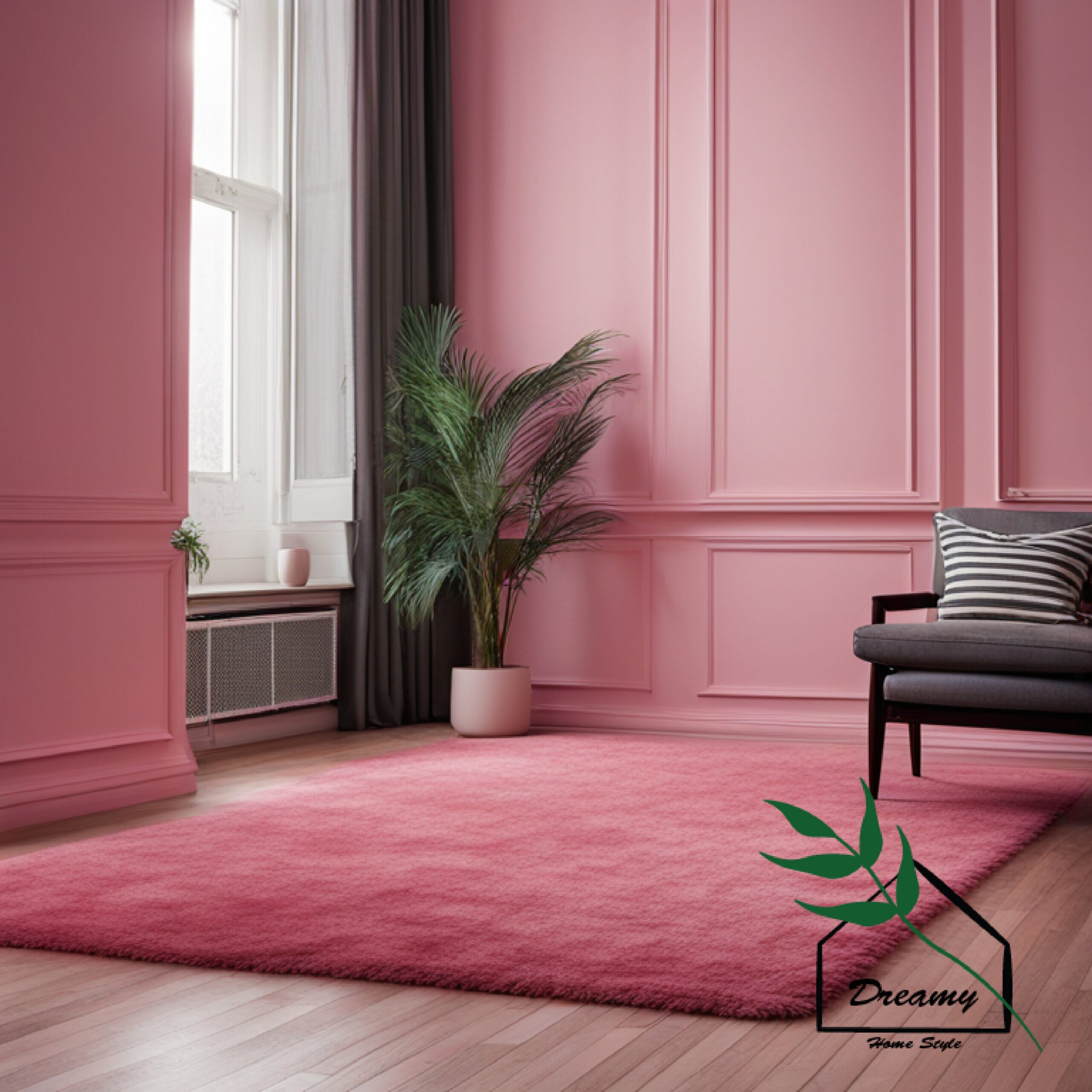
I’ve always loved the look of pink and white walls.
There’s just something so fresh, bright, and cheerful about that color combination.
But finding the right carpet to go with those walls can be tricky.
You want something that complements the colors without clashing or looking too busy.
After lots of trial and error with carpet samples over my many years of decorating, I’ve narrowed down the 17 best carpet colors for pink and white walls.
Whether you prefer warm, cozy tones or cool, soothing hues, you’ll find a match made in decorating heaven!
Neutral Tones
Neutral Tones Complement Without Clashing.
The key benefit of neutral toned carpets with pink and white walls is that they complement without clashing.
Soft beiges, warm taupe, light tans, and muted grays provide a subtle backdrop that lets the vibrant wall colors shine.
While the neutral carpets share an underlying warmth with the pink walls, their lighter, more muted tone creates appealing contrast.
Going several shades lighter or darker than the walls keeps things visually interesting.
Neutral toned carpets unite all the elements of the room, from white trim to colorful accents.
Their flexibility to work with both warm and cool palettes helps bridge different hues into one cohesive look.
Since beige, taupe and gray carpets don’t compete for attention, the vibrant pink and white walls take center stage.
The neutral base highlighted the bright colors without dimming their impact.
Neutral toned rugs can adapt as you update accents and furnishings over time while still complementing the constant of your pink and white architecture.
Their versatility makes them a low-risk choice.
So embrace the beauty of understatement and let your pink and white walls shine by choosing a neutral foundation underfoot.
The results will feel uniquely fresh and colorful but still soothingly coordinated.
Warm taupe carpeting has subtle undertones of brown and gray that provide an earthy, grounded contrast to bright pink walls.
The hint of color connects with the walls while the muted tone lets them stand out.
For a relaxed yet refined look, light beige carpeting has golden undertones that tie back to lighter pink walls.
The soft hue feels feminine without overpowering the pink’s brightness.
Cooler pale gray carpeting beautifully complements vibrant pink walls by providing subtle contrast.
The airy, ethereal quality plays up the pink’s warmth and grounds the space.
Rich yet neutral cream carpeting pairs perfectly with both intense fuchsias and soft blush pink walls.
The creamy beige hue connects with rosy undertones but is still light enough not to dull the vibrant colors.
While neutral wall-to-wall carpeting sets the ideal backdrop, consider a muted pattern rug in taupe and cream abstract shapes or varied beiges.
This adds visual interest while remaining neutral.
When choosing neutral toned rugs, opt for lighter, warmer hues next to intense pinks and deeper, cooler tones alongside pastel pink walls.
Coordinating the undertones is key for a seamless designer look.

Beige
Beige carpets have inherent warmth that relates beautifully to pink walls while avoiding a matchy-matchy look.
The rich, earthy tone connects the palette while still providing some contrast.
From light sand to toasted almond, beige rugs add a hint of elegance and refinement to pink and white rooms.
The neutral tone keeps things grounded yet upscale.
Deeper beige hues like hazelnut and khaki make vibrant fuchsia or magenta walls pop even more.
The darker neutral backdrop highlights brighter shades.
Conversely, pale beige carpets can soften and complement walls in lighter blush pinks or coral shades.
The light rug keeps things airy.
From warm camels to cool stones, beige offers incredible range.
Adjust the intensity and undertones to perfectly match light or bright pink walls.
So embrace the versatile power of beige!
Its flexibility to shift between earthy and elegant makes it ideal for accentuating pink’s glow whether walls are vivid or demure.

Light Gray
Light gray carpeting provides subtle yet impactful contrast against warm pink walls.
The cool, neutral hue makes the pink seem even richer.
Pale gray rugs seem tailored and refined next to brightly colored walls.
The combination feels elevated and polished.
Airiness is light gray’s signature.
Using a light gray carpet makes the whole room feel more spacious, open and illuminated.
Gray adapts easily from day to night.
In daylight, a pale gray rug emphasizes vibrant pinks while taking on a moody vibe after dark.
Look for light grays with subtle blue or purple undertones.
These bring out the best in pink walls through similarly cool, harmonious undertones.

Pattern Potential
I highly recommend a dynamic color like Pattern Potential for interiors with pink and white walls.
Available through Valspar’s 2023 Color Campaign, Pattern Potential brings imaginative contrast to feminine spaces needing a dash of saturated brightness.
At first glimpse, Pattern Potential reads as crimson coming alive with pops of raspberry.
But within its rich pigment lie surprising notes of scarlet, garnet, coral and deep cherry tied together by a red base that ignites without overwhelming adjacent soft hues.
White walls serve as the perfect canvas for such confident color.
When coupled with romantic blush pink walls elsewhere as an accent, Pattern Potential contributes flair and personality.
I suggest embracing this vibrant red in small doses through toss pillows, area rugs and artwork.
Just like adding vibrant embroidery or handprint details to a couture dress invigorates the entire design, thoughtful red accents focused in select spots energize a room’s overall color story.
Pink and white interplay feels whimsical and nostalgic on its own so intense color hits viscerally awaken spaces from sweetness-induced reverie.
In interior design, high contrast color calls us to attention then inspires us into action upon closer inspection of beauty often missed in the comfortable familiar.
Just as crimson petals command notice against pale cherry blossoms and bridal lace, dramatic red makes quieter pink and white shine.
So for fanciful interiors ready to spark courageous creativity, embrace vivid Pattern Potential among the familiar.
Then see comfort zones widen as imagination catches fire in the most inspiring way.

Blush Pink
I wholeheartedly recommend adding blush pink accents to interiors with existing light pink and white walls.
The three hues create dreamy spaces bursting with springtime charm.
Few colors feel as friendly and romantic as the softest shade of rose quartz pink.
Associated with flowers like peonies and ranunculus, blush pink carries a timeless quality evocative of English cottages and French patisseries.
When coupled with girlish pink walls and bright white trims, blush pink accessories like throw blankets and cafe curtains balance sweetness with light sophistication.
I suggest a muted milk-tinged pink for maximum livability.
While vivid fuchsia makes a bold impact, blush pink’s innocence plays beautifully off more subtle wall colors without competing.
The result is a comfortably chic English garden mood where imaginations feel gently awakened.
If the goal is to encourage creativity, color-infused cheer, or craft room inspiration overflowing with possibilities, weave blushing pink touches like pillows, ceramic vases and textiles throughout predominantly pink and white spaces.
Then watch personal havens boost nurturing femininity with uplifting details pretty enough to stand the test of time.

Warm Tones
As a home fashion designer, I highly recommend embracing warm accent colors to make pink and white walls glow with soft radiance.
Sun-kissed hues like sand, ivory, peach and buttercream add another layer of heat, bringing interiors to life.
By nature, walls painted a light pink take on an ethereal, romanticized quality.
White trims usually accompany to maximize the dreamy effect.
Though beautiful, monochromatic pink color schemes can risk feeling dated or flat without thoughtful contrast.
Warm accent colors remedy that with their cozy, familiar essence.
Handcrafted textiles like coir rugs, woven throws and rattan furniture uphold pink and white’s feminine base while contributing toasty dimension for visual interest and added functionality.
Touches of peach and sand welcome in the color of daybreak and petal dust for spaces exuding nurture and positivity.
I suggest weaving tactile, nature-embraced warm pieces into predominantly chic taupe interiors.
Together the pairing feels timelessly joyful and collected without trying too hard.
Ultimately the most enduring interiors influence our energy patterns on a subconscious level.
Warmth on top of sweetness achieves just that.

Camel
I enthusiastically recommend adding camel accents to interiors featuring pink and white walls.
The earthy neutral grounds the femininity in natural finesse.
Few colors imbue spaces with raw yet refined texture like sun-kissed camel.
Evocative of a desert dweller’s reliable cloak against harsh elements, rich camel leather, shearling and woven wool add hints of nomad style perfect for tempering sweet pastels.
The interplay resembles English rose gardens flanked by sturdy clay walls blanketed in vines – where resilience blooms bright thanks to protection.
Beyond upholding functionality for high-traffic spaces, camel upholstery and throw pillows provide down-to-earth contrast to fanciful pink walls producin ideal vignettes for displayng spun sugar porcelain or French cream linens.
Unlike stark neutrals, camel warms from within like wagons burdened with precious cargo crossing gold-tinged dunes.
That natural earthiness stands time’s test in any well-loved interior.
So for fanciful spaces seeking subtle funky contrast, introduce camel by way of Public-Pyramids-ruins rugs, ottomans laden with glossy magazines and corduroy pillows perfect for nodding off.
Then watch comfort rise as pink and white walls meet camel’s gritty golden glamour for that covetable collected-over-time look.
Light Brown
The earthy essence grounds the femininity in organic warmth.
Few materials imbue spaces with raw yet refined texture like light brown wood reminiscent of birch trees with flecks of cream and caramel.
Often associated with Scandinavian design and hygge lifestyle ethos, light brown wood floors, furnishings and accents add an approachable aesthetic perfect for tempering fanciful pink walls with cozy functionality.
Beyond providing durable surfaces for family living, maple end tables stained an airy brown support vases of blush peonies without overpowering their delicate nature.
Like wise linen couches upholstered in muted gold leather serve as the perfect grounded foil for floating shear pink curtains filtered by afternoon light.
Light brown’s steadfast presence fosters an environment where creativity and conversation flow uninhibited.
So for whimsical spaces seeking reliable charm that stands the test of time, introduce light brown wood elements by way of arched floor mirrors, custom shelves and farmhouse dining tables.
Then watch comfort rise as sugar-spun pink walls meet earthy light brown textures for that covetable blend of cottage coziness and luxe livability.
Cool Tones
I highly recommend embracing cool-toned accents to provide an uplifting counterbalance in spaces dominated by soft pink and white walls.
Serene blues and greens let pink’s sweetness shine while contributing quiet sophistication.
By nature, lightly pigmented pink walls evoke imagery of flowers, silk and romance.
Crisp white trims maximize the delicate dreamlike effect.
Though beautiful, predominantly pink interiors risk skewing saccharine without thoughtful contrast.
That’s where muted cool tones work wonders.
Hand-carved furniture finished in celadon green, pillows woven from blue linen fibers, and matte nickel floor lamps uphold pink and white’s delicate femininity while providing the refreshing essence of spring dew and December fog.
These oceanic blues, soothing sage greens and misty grays awaken interiors from sleepy princess status with lighthearted contrast.
I suggest blending tactile cool pieces into mostly pink and white spaces to achieve balance between playful and refined.
The synergy feels both timeless and collected thanks to color components equally weighted in personality.
Cool over sweet just may be the secret recipe for enduring interior design sure to refresh and inspire indefinitely.
Powder Blue
This timeless color trio evokes old world romance and heirloom quality meant to be passed down generations.
Few colors feel as gently uplifting as ethereal powder blue, the misty sky moments before the break of dawn.
Associated with hyacinth blooms, vintage milk glass and robin’s eggs, powder blue adds a dash of timeworn charm to interiors much like yellowed love letters and well-read clothbound novels.
Against predominantly girlish pink walls and clean white trims, touches of French blue provide lowkey contrast through salvaged painted cabinets, stonewashed linen throws and café curtains filtering morning rays.
Powder blue grounds pink’s precious sweetness in wisdom and comfort earned slowly over time through lives well lived.
Ultimately such featherlight color pairings influence us on a deeply personal level over trendy looks soon outdated.
So for fanciful spaces longing for that inheritable je ne sais quoi tying it all together, blend heirloom powder blue within predominantly pink and white interiors.
Then watch comfort rise as decades meld seamlessly into beauty meant for right now yet truly built to last well beyond present pleasures.
Lavender
This harmonious color trio blends femininity with imagination for spaces bursting with ethereal charm.
Few colors feel as whimsical as the multi-dimensional hue of lavender, associated with springtime irises, violet sunsets and English cottages.
When paired with blushing pink walls and bright white trims, unexpected pops of lavender in accessories like ruffled throw pillows and lamp shades contribute an air of romanticism on par with freshly picked wildflowers artfully arranged on a weathered desk.
Together, white walls, cameo pink built-ins and unexpected lavender furnishings like a refinished vanity turned beverage bar create vignettes transporting inhabitants to idyllic scenes set in the English countryside or French gardens.
Lavender grounds pink’s preciousness in contrasting color that ignites creativity and conversation rather than overwhelming fairer tones.
If the design goal is to build recreational spaces fertilizing inspiration through beauty, gently wake up predominately pink and white interiors with imaginative splashes of lavender in textiles, ceramic pieces and beyond.
Then watch personal haven transform into relaxing retreats that feel both familiar and fascinating all at once.
Rose
Much like a jewel-toned thread woven throughout a tapestry, metallic rose gold adds a touch of luxurious contrast and shine perfect for fanciful spaces.
Few metals feel as romantically opulent as the multi-dimensional hue of rose gold, associated with peony blossoms, champagne bubbles and starlit skies.
When paired with blushing pink walls and bright white trims, unexpected pops of rose gold in accessories like geometric sconces and velvet pillows contribute an air of celebration and artistic glamour.
Together, white walls, ballerina pink built-ins and glistening rose gold furnishings like an abstract framed mirror or marble and metal console table create vignettes transporting inhabitants to Gatsby-era scenes full of effervescence and textural intrigue.
Rose gold upholds pink’s preciousness with contrasing warmth ideal for lively interiors.
If the design goal is to build recreational spaces radiating beauty and creative abundance, gently wake up predominately pink and white interiors with sparkling touches of rose gold in metal finishes, textiles and artwork.
Then watch personal havens transform into relaxing galleries encouraging both imaginative escapism and meaningful connections long into the night.
Dusty Pink
Dusty Pink blends sweet femininity with vintage glamour for spaces exuding nostalgic charm.
Unlike vivid fuchsia, muted dusty pink features undertones of rose, lilac and natural cream for a uniquely weathered aesthetic, as if pigments were left to fade just enough by the gentle hand of time.
When paired with bright pink walls and crisp white trims, unexpected pops of smoky pink in details like velvet pillows and painted antique dressers contribute romantic depth on par with timeworn love letters tied in satin ribbon.
Together, white shiplap walls, ballet pink cabinetry and weathered pink lounge chairs create vignettes transporting inhabitants to English countryside cottages or French salons of eras past.
Dusty pink grounds bright pink’s playfulness in contrasting earthbound elegance that awakens spaces from adolescent whimsy into enduring sophistication.
If the design goal is to cultivate recreational spaces blooming with layers of heritage beauty, gently rouse predominately pink and white interiors with poetic infusions of smoke-tinged Cumberland pink in furnishings, fixtures and textiles.
Then watch personal havens evolve into dreamscapes delivering both familiar comfort and mysterious allure in equal measure.
Pale Pink
I wholeheartedly recommend embracing pale pink accents within interiors featuring predominant baby pink and white walls.
The tonal pink scheme blends sweet femininity with ethereal charm for spaces feeling both nostalgic and freshly imaginative.
Unlike vivid punchy pinks demanding attention, muted pale pink features undertones of cream, peach and desert rose for a uniquely delicate aesthetic evocative of longing and new beginnings.
When paired with bright pink walls and clean white trims, gossamer pale pink additions like linen curtains and refinished vanities contribute romantic intrigue on par with love poems left on park benches.
Together, white shiplap walls, tickled pink cabinetry and weightless pale pink lounge chairs create vignettes transporting inhabitants to English countryside cottages or French parlour rooms brimming with possibilities once fear and overthinking lose their power.
Pale pink grounds exuberant pink’s playfulness in contrasting vulnerability that awakens spaces from adolescent whimsy into purposeful serenity.
If the design goal is cultivating recreational spaces blooming with ethereal beauty and meaning, gently rouse predominately pink and white interiors with sheer infusions of Petal Kiss pink in billowing textiles, polished stone surfaces and artwork.
Then watch personal havens evolve into daydream sanctuaries delivering clarity, vision and childlike renewal when we need it most.
Coral
Like an artist thoughtfully mixing custom pigments, a touch of orange-kissed coral energizes feminine spaces with playful verve.
Unlike deeply saturated primaries which can overwhelm lighter wall colors, punchy coral contributes a distinctly tropical energy through its bursts of clementine, melon and gerbera daisy tones.
When woven tastefully within soft pink walls and bright white trims, coral additions like an acid-washed abstract painting, velvet pillows or custom ceramic vases awaken interiors with joyful vivacity on par with ocean reefs teeming with life.
Together, white shiplap walls, ballet slipper pink cabinetry and spirited coral furnishings like a Lucite breakfast nook set create youthful vignettes perfectly suiting creative individuals and busy families needing both inspiration and efficient functionality.
Ultimately vibrant accent colors should bring delighted grins not furrowed overwhelm.
If the design goal is cultivating recreational spaces radiating upbeat energy with no saturation fatigue, inject predominantly pink and white interiors with playful pops of mood-lifting coral.
Then watch personal havens transform from demure to dazzling thanks to strategic color risks that pay off in smiles.
Salmon
I enthusiastically recommend embracing salmon accents within interiors featuring predominant rose pink and crisp white walls.
The peachy hue provides natural contrast, warmth and vibrancy.
Unlike primary reds which may overwhelm soft pink walls, punchy salmon contributes a distinctly vibrant energy through its bursts of coral, melon and gerbera daisy tones.
When woven tastefully within blush pink walls and bright white trims, salmon additions like a handwoven wool pillow, plein air painting or accent chair awaken interiors with vivacity on par with seaside sunsets.
Together, white shiplap walls, petal pink cabinetry and spirited salmon furnishings like a hand-thrown vase create lively vignettes perfectly suiting creative individuals and busy families needing both inspiration and efficient functionality.
Ultimately vibrant accent colors should electrify not overwhelm.
If the design goal is cultivating recreational spaces radiating upbeat energy with no color chaos, inject predominantly pink and white interiors with playful pops of mood-lifting salmon in accessories and textiles.
Then watch personal havens transform from demure to dazzling thanks to considered color risks that pay off in cheer that lasts.
Light Sage Green
The earthy yet verdant hue grounds femininity in organic charm.
Unlike primary greens which may overwhelm soft pink walls, punchy light sage contributes a distinctly vibrant energy through its bursts of chartreuse, pistachio and celery tones.
When woven tastefully within rose pink walls and bright white trims, sage green additions like a botanical print pillow, ceramic garden stool or accent mirror awaken interiors with the freshness of spring rain.
Together, white shiplap walls, ballet slipper pink cabinetry and lively sage furnishings create cheerful vignettes perfectly suiting nature lovers, creatives and busy families needing both inspiration and efficient functionality.
Ultimately vibrant accent colors should electrify not overwhelm.
If the design goal is cultivating recreational spaces radiating upbeat energy with no color chaos, inject predominantly pink and white interiors with playful pops of mood-lifting light sage across accessories and textiles.
Then watch personal havens transform from demure to dazzling thanks to considered color risks that pay off in cheer that lasts.
Seafoam Green
The soothing aquatic hue provides natural contrast and breezy coastal vibes.
Unlike primary greens which may overwhelm soft pink walls, punchy seafoam contributes a distinctly serene energy through its bursts of oceanic, celery and spruce tones.
When woven tastefully within pink walls and bright white trims, seafoam additions like a striped decorative pillow, ceramic vase or accent mirror awaken interiors with the lush freshness of ocean mist.
Together, white shiplap walls, ballerina pink cabinetry and breezy seafoam furnishings create cheerful vignettes perfectly suiting nature lovers, creatives and busy families needing both inspiration and efficient functionality.
Ultimately vibrant accent colors should enhance not overwhelm.
If the design goal is cultivating recreational spaces radiating upbeat energy with no color chaos, inject predominantly pink and white interiors with playful pops of mood-lifting seafoam across accessories and textiles.
Then watch personal havens transform from demure to dazzling thanks to considered color risks that pay off in cheer that lasts.
Robin’s Egg Blue
I wholeheartedly recommend embracing robin’s egg blue accents within interiors featuring predominant ballet pink and clean white walls.
This harmonious color trio blends femininity with vintage charm for spaces feeling softly uplifting.
Few colors feel as cheerily nostalgic as the misty hue of robin’s egg blue, conjuring images of vintage milk glass, antique ceramics and cozy pastel cottages.
When paired with candy pink walls and bright white trims, unexpected pops of powder blue in accessories like linen pillow shams and glass lamp bases contribute approachable contrast on par with wildflowers casually arranged.
Together, white shiplap walls, tickled pink built-ins and weathered robin’s egg blue antique furnishings create vignettes transporting inhabitants to eras past while remaining perfectly livable for present needs.
Robin’s egg blue grounds pink’s playfulness in stability that awakens spaces from adolescent whimsy into enduring sophistication.
If the design goal is fostering recreational spaces blooming with layers of heritage beauty and meaning, gently rouse predominately pink and white interiors with poetic infusions of timeworn blue across furnishings, fixtures and textiles.
Then watch personal havens evolve into dreamscapes equally devoted to comforts new and old.
Pearl Gray
This harmonious color trio blends femininity with refined contrast for spaces feeling both soothing and quietly elegant.
Few neutrals feel as sophisticatedly versatile as the multi-dimensional hue of pearl gray, conjuring images of coastal pearls, silver rain and refined restraint.
When paired with blushing pink walls and crisp white trims, unexpected pops of heathered gray in accessories like knit pillows and ceramic lamp bases contribute an approachable contrast on par with orchestra members carefully tuning instruments before a symphony.
Together, white shiplap walls, camellia pink built-ins and smoky pearl gray lounge chairs create vignettes transporting inhabitants to Parisian studios and English gardens where creativity flows unrushed by worries of the wider world.
Pearl gray grounds pink’s gentle sweetness in steadfast tranquility that awakens spaces from adolescent whimsy into mindful adulthood.
If the design goal is fostering recreational spaces blooming with layers of heritage beauty and meaning, gently rouse predominately pink and white interiors with grounding infusions of feather gray across furnishings, fixtures and textiles.
Then watch personal havens evolve into retreats equally devoted to beauty, clarity and connection.
Lilac
his harmonious color trio blends femininity with vintage charm for spaces feeling softly nostalgic.
Few colors feel as cheerily nostalgic as the multi-dimensional hue of lilac, conjuring images of spring irises, antique silk gowns and English lavender fields.
When paired with bashful pink walls and bright white trims, unexpected pops of wistful lilac in accessories like linen curtains and ceramic vases contribute approachable contrast on par with wildflowers casually gathered in a meadow.
Together, white shiplap walls, tickled pink built-ins and weathered lilac antique furnishings create vignettes transporting inhabitants to eras past while remaining perfectly livable for present needs.
Lilac grounds pink’s preciousness in stability that awakens spaces from adolescent whimsy into enduring sophistication.
If the design goal is fostering recreational spaces blooming with layers of heritage beauty and meaning, gently rouse predominately pink and white interiors with poetic infusions of antique lilac across furnishings, fixtures and textiles.
Then watch personal havens evolve into dreamscapes equally devoted to comforts new and old.
Buttercream
I enthusiastically recommend embracing buttercream accents within interiors featuring predominant baby soft pink and crisp white walls.
The rich tone provides natural contrast and warmth, like the first spot of sunlight in a frosted morning.
Unlike primary yellows which may overwhelm soft pink walls, saturated buttercream contributes a distinctly cozy energy through its bursts of creamy vanilla, spun sugar and marshmallow tones.
When woven tastefully among rose quartz walls and bright white trims, buttercream additions like a cable knit pillow, ceramic vase or accent mirror awaken interiors with the comfort of freshly baked delicacies.
Together, white shiplap walls, ballet slipper pink cabinetry and buttery buttercream furnishings create cheerful vignettes perfectly suiting bakers and busy families needing both inspiration and efficient functionality.
Ultimately vibrant accent colors should enhance not overwhelm.
If the design goal means cultivating recreational spaces radiating snug cheer with no color chaos, inject predominantly pink and white interiors with playful pops of mood-lifting buttercream across accessories and textiles.
Then watch personal havens transform from demure to hygge thanks to considered color risks that pay off in comfort that lasts.
So there you have it—17 carpet hues for making your pink and white walls look their beautiful best.
From cozy beiges to soothing grays, you can set just the right tone for every style.
Let the colors inspire you to create a space that’s totally you.
What color speaks to your style sensibilities?


