I remember the time I moved into my first apartment.
The walls were this calming shade of dove gray, and I was stoked to decorate my own space for the first time.
But when it came to picking out a carpet, I was stumped.
I wanted something that would complement the walls but also stand out.
It took a bit of trial and error, but I finally found the perfect match.
Now, I’m here to share some of that wisdom with you.
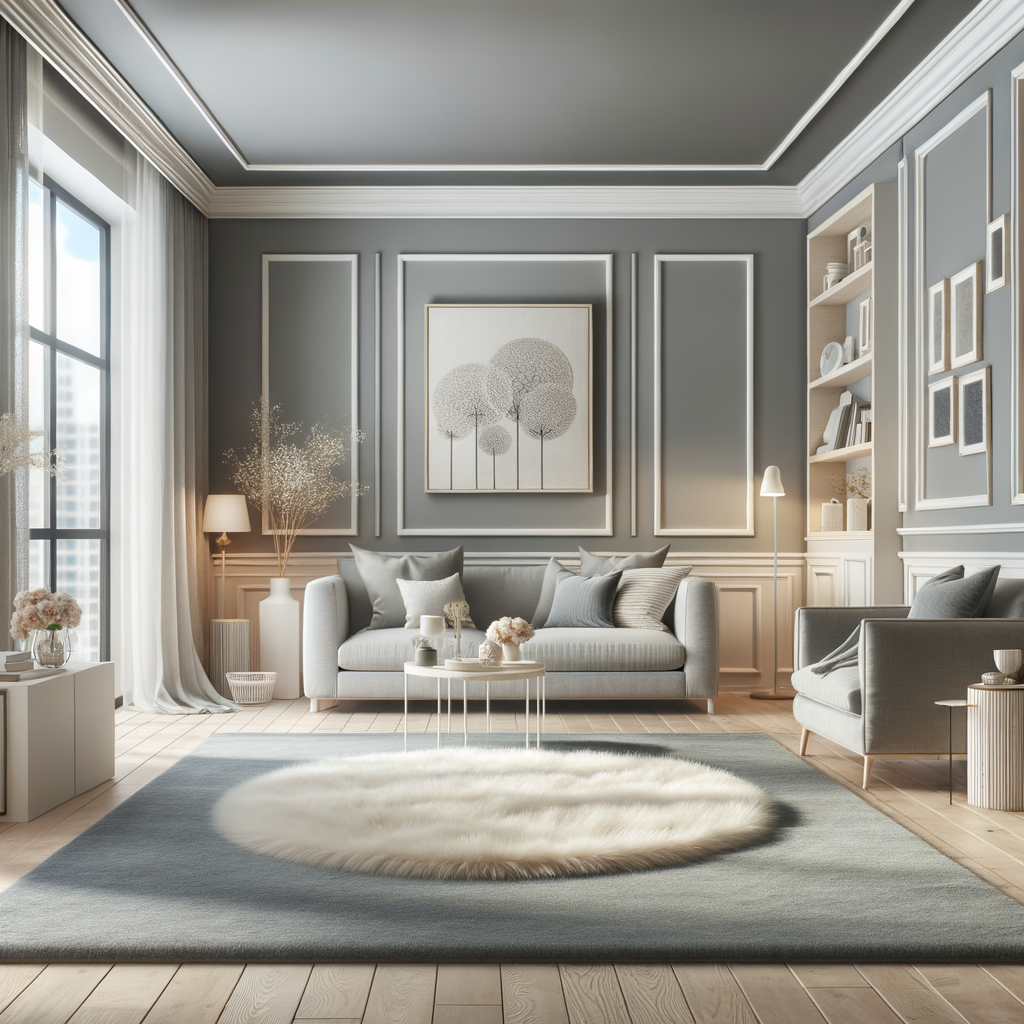
Choosing the right carpet color for dove gray walls can transform your room from blah to breathtaking.
It’s not just about aesthetics; the right carpet can also influence your mood and the room’s ambiance.
Dove gray is a super versatile color because it’s neutral, so it pairs well with a wide range of hues.
This means you’ve got a lot of options to play with!
✨Click to Get My 101 FREE Designer Room Ideas
Cream: A Canvas of Comfort

Cream carpets are the chameleons of the interior design world.
They can adapt to any setting — from the rustic charm of a cottage to the sleek lines of a modern loft.
This color reflects light, contributing to a brighter, airier feel in a space that might otherwise seem enclosed.
It can help to visually enlarge a room, making it appear more expansive and open.
The beauty of a cream carpet lies in its effortless blend with other colors.
It can serve as a neutral stage for your furniture and decor to shine, allowing for bold patterns, textures, and colors to stand out.
Imagine a room with dove gray walls, a cream carpet, a sapphire blue sofa, and golden throw pillows — the cream carpet ties these elements together with grace and fluidity.
However, cream is not just a backdrop.
It can be a feature in its own right — the star of the show.
Picture a room with understated elegance: dove gray walls, a cream carpet with a subtle geometric pattern, and accents of brushed nickel and crystal.
In this setting, the carpet isn’t just a surface to walk on; it’s a key piece that completes the sophisticated aesthetic.
Choosing the right shade of cream is crucial.
You’ll find an array of cream tones, from those with yellow undertones that bring a cozy warmth, to cooler creams that lean towards taupe, offering a more contemporary feel.

Consider the natural lighting of your room when selecting your shade, as this can impact how the color is perceived.
Black

Now usually black is a no-go with gray walls since it can make a space feel dingy.
But used right, black can look super stylish and make the gray really pop.
The key is going for a smaller black rug instead of wall-to-wall.
That way the gray still takes center stage while the black adds drama.
A jet black shag rug could give your living room an edgy rock star vibe.
Or go for a black braided jute number to blend modern with industrial.
Chenille or plush black rugs feel lux as a Cadillac, glamorous without tryhard vibes.
Distressed black leather rugs scream rebellious but still mesh with cool gray.
Even a simple black sisal circle rug could tie the room together in a modern Zen kinda way.
Just be sure not to go too big with black or it may suck the light out.
With gray walls as the anchor, a small black rug can totally work to make a statement.
Charcoal

Charcoal is like a sleek black lite – it’ll vibe with gray without overwhelming the space.
Go for a soft heathered charcoal for an elegant lux look that feels rich and sophisticated.
Dark graphite gray charcoal adds depth and accentuates the walls in a modern way.
A fluffy charcoal shag or plush rug feels cozy-chic, perfect for curling up with your morning coffee.
Charcoal sisal feels industrial and edgy but the texture keeps it from feeling too stark.
Distressed charcoal jute has a well-worn look that pulls rustic and industrial styles together.
Wool charcoal rugs pair heavy hygge vibes with contemporary gray walls.
Charcoal seagrass channels beachy breeziness in a color that complements dove gray.
For a youthful look, pair charcoal with pale pastel accent colors throughout the room.
The charcoal ties into the gray while adding depth and visual interest to balance lightness.
It lets the gray shine without disappearing into the background like a true neutral homie.
Soft White
At first glance white seems like it would clash totally with gray walls.
But use the right soft, muted white and it can make the space feel bright and fresh.
Go for an off-white, cream, or ecru rug instead of blinding sterile white.
Shades like ‘winter white’, ‘french vanilla’ or ‘ivory coast’ have subtle warmth.
Textured whites like bleached jute or ribbed sisal add depth and visual interest.
Distressed white looks lived-in instead of pristine and balances contemporary design.
Fiber choices matter too – wool coats a white in a softer way than polyester.
The key is choosing a soft white that doesn’t fight the gray but makes it pop.
A white rug also makes other colors in the room really sing next to warm gray walls.
It gives a fresh, light feeling to cozy up gray without overpowering its sophistication.
Soft white is risky but could totally pay off if you find the right muted, cozy tone.
✨Click to Get My 101 FREE Designer Room Ideas
Electric Blue
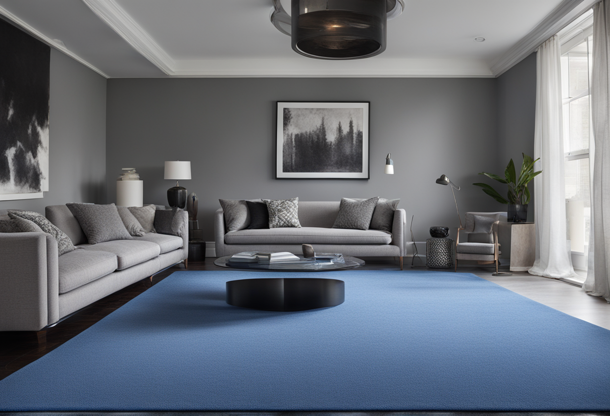
Now blue and gray might seem like an unexpected combo, but electric blue could totally work.
The key is choosing the right vibrant blue shade instead of something too bright.
‘Electric indigo’ has beautiful undertones that make gray seem sleek and moody.
‘Crushed cobalt’ adds a dramatic pop without overwhelming the space.
A high-quality textured rug in ‘ultramarine’ feels urban and artsy without trying too hard.
Bring the walls into the future with a ‘lapis lazuli’ shag rug that’s dignified yet eye-catching.
Distressed denim blue jute feels beachy and lived-in to balance a cool color pop.
Small accents in complementary teals or purples make the blue feel curated instead of random.
While shocking at first, electric blue could totally make dove gray feel energized and vibrant.
It’s risky but might pay off big if you find the right dramatic saturated shade.
Just be sure the rug isn’t too big or it may overwhelm – keep electric blue contained.
Taupe
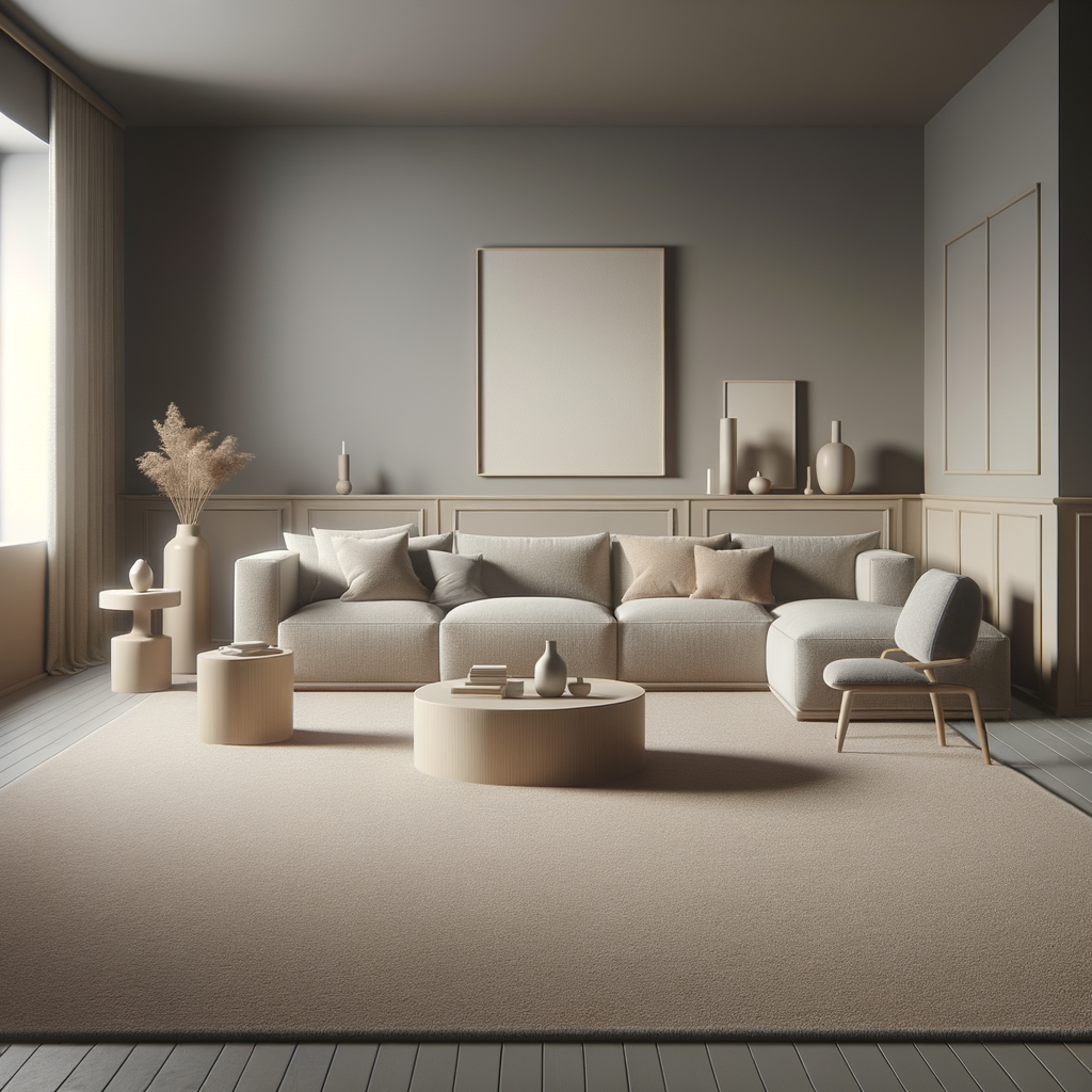
You really can’t go wrong with a classic neutral taupe rug alongside gray walls.
Taupe complements without competing, allowing the gray to shine in a palette that feels polished and pulled together.
Shades like ‘pastiche’, ‘cashmere’ or ‘mountain fog’ hit that sweet sophisticated yet cozy spot.
‘Truffle’, ‘merlot’ or ‘dove feather’ taupes lean warmer for inviting hygge.

Textured taupes like hemp, sisal or jute add richness without diverting the eye too much.
Distressed taupe leather offers edge balanced with elegance for a space that feels grown.
Taupe meshes fluidly with grays, letting you play up the gray walls in a palette that feels effortlessly cohesive.
It makes the perfect background for art, decor, and furnishings to really sing without competing for attention.

Taupe is a versatile hue guaranteed to vibe with dove gray now and forever without looking dated.
Stick with a soft neutral taupe and your space will feel polished, pulled together and peaceful.
Sunny Yellow
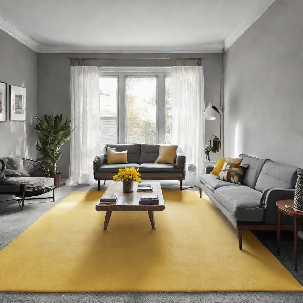
Yellow seems like an unlikely pick alongside cool gray walls, but it could totally work with the right tone.
‘Goldenrod’ yellow feels warm and happy without being overly bright.
‘Mustard seed’ adds cheerfulness in a hue that’s vibrant yet grounded.
‘Saffron’ yellow has beautiful rich undertones that make gray seem sleek and sophisticated.
‘Sandstone’ brings the beach indoors in an earthy tone that complements steel wool gray.
Distressed jute or sisal rugs in ‘maize’ feel casual yet polished and balance contemporary gray.
A splash of yellow creates a palette that feels sunny instead of dull, energized instead of sleepy.
It makes gray feel fresh and modern when paired with yellows in the mellow tones of ‘vanilla’ or ‘mimosa.’
The key is finding a cheerful yellow in a tone that feels balanced and enhances gray instead of overwhelming it.
With the right mellow yellow, those gray walls will feel bright, cheerful and far from bleak.
Lush Green: Nature’s Embrace
Green carpets bring the tranquility and vitality of nature into your home.
Think of the refreshing shade provided by a canopy of leafy trees or the peaceful ambiance of a moss-covered forest floor.
Green pairs beautifully with dove gray walls, creating an organic and restorative space that promotes relaxation and calm.
✨Click to Get My 101 FREE Designer Room Ideas
Ocean Teal: Serene and Stylish
Teal carpets draw inspiration from the depths of the ocean and the patina of aged copper.
This sophisticated hue combines the calming properties of blue with the renewal qualities of green.
Teal carpets can serve as a statement piece, offering a chic and serene backdrop that complements the coolness of dove gray walls and adds a touch of elegance to any decor.
Powder Pink
Pink may seem an unexpected choice for gray walls, but powder pink could look really chic.
“Ballerina” pink adds a soft pop of femininity without veering sweet or saccharine.
“Blush” pink feels sophisticated and grown-up, balancing modern gray’s coolness.
“Dawn” pink has a naturally pretty tone that makes gray seem bright yet calming.
Fuzzy “cotton candy” pink shag feels playful in an indulgent, luxurious way.
Distressed sisal or jute rugs in “rosehip” tones feel beachy yet pulled together and stylish.
The right soft pink adds romanticism to gray without skewing overly precious.
Pair powder pink with cool accents like navy, mint or lavender for an artistic vibe.
Gray looks modern and sleek set against extremely pale pinks like “wisteria” or “seashell.”
Go delicate with the pink and it could make your space feel feminine, grown and romantic all at once.
Fiery Red: Bold and Passionate
A fiery red carpet can transform a room with its bold and passionate hue.
It’s like the red velvet curtains in an old theater or a classic cherry-red Mustang – it screams confidence.
This color can make a large room feel cozier and more intimate, providing a strong contrast against dove gray walls that can energize and stimulate the senses.
Royal Purple: Luxurious and Majestic
Royal purple carpets are the embodiment of luxury and grandeur.
They remind you of the plush robes of kings and queens or the deep color of a field of lavender.
Purple is a rich, deep color that can make your space feel more opulent and regal, creating a stunning visual effect when paired with the neutrality of dove gray walls.
✨Click to Get My 101 FREE Designer Room Ideas
Earthy Brown: Grounded and Reliable
Earthy brown carpets are like the solid ground beneath your feet — grounded, reliable, and rich.
They bring to mind the strength of an ancient oak tree or the comfort of a well-worn leather chair.
Brown carpets can give your room a natural, grounded feel, making it a perfect sanctuary.
Midnight Blue: Deep and Reflective
Midnight blue carpets are deep, reflective, and calming.
They bring to mind the tranquil depths of the night sky or the mysterious allure of the deep sea.
This color can add a layer of sophistication and tranquility to a room, serving as a bold yet calming foundation that pairs well with dove gray walls.
Golden Beige: Warmth and Elegance
Golden beige carpets provide warmth and elegance, reminiscent of the golden sands of a sunlit beach or the soft glow of twilight.
This color adds a touch of understated luxury and pairs beautifully with dove gray walls to create a space that is both welcoming and refined.
Silver: Futuristic Sheen
Silver carpets can give your space a modern, futuristic sheen.
It’s like the gleaming chrome of a classic car or the shimmer of moonlight on water.
Silver can brighten up a room, reflecting light and adding a touch of glam without overwhelming the serene palette created by your dove gray walls.
✨Click to Get My 101 FREE Designer Room Ideas
Beige: Neutral Warmth
Beige carpets are the perfect neutral, offering warmth without saturation.
They’re like the soft, sandy beaches that go on for miles or the comfort of an oatmeal sweater.
Beige offers versatility and warmth, making it an ideal choice for those seeking a carpet color that complements without competing with the dove gray walls.
Jade Green: Exotic and Balanced
Jade green carpets are exotic yet balanced, reminiscent of the precious stone or the lush greenery of a tropical haven.
This color brings an element of sophistication and serenity to a room, harmonizing with dove gray walls to create a refreshing and chic space.
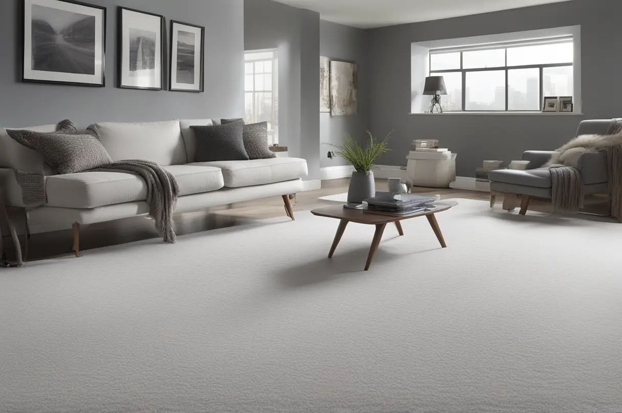
Cloud White: Ethereal Lightness
Cloud white carpets are the epitome of ethereal lightness and simplicity.
They bring to mind the fluffy clouds on a sunny day or the pristine beauty of freshly fallen snow.
White carpets can make a room feel larger and brighter, offering a peaceful and clean canvas that allows other elements in the room to shine against the dove gray walls.
Warm Grays
If you want something punchier than taupe but not too bold, warm grays are the move.
‘Dove smoke’ is perfect cause it matches the wall color but darker for contrast.
‘Pewter’ has blue-gray undertones that give it depth without harshness.
‘Iron’ is manly but in an earthy way, the brown in it makes it cozy.
‘Graphite’ has charcoal flecks that make it dramatic without being too dark and dreary.
Warm grays have brown in them, adding hygge without taking focus from the gray walls.
My fave is ‘storm’ – it’s like the sky right before a rainstorm, moody and atmospheric.
Off-Whites
Off-whites like linen, driftwood and fog make a space feel brighter while meshing with gray.
I love ‘linen’ for its subtle tan-beige tone that looks clean but not too pristine.
‘Driftwood’ has warmer tones that give a casual, seaside vibe without colors that are too bright.
‘Fog’ is like a pale gray that lifts up the room without distracting from the walls.
‘Sea salt’ is similar to fog but with hints of beige that complement gray nicely.
‘Antique white’ has a yellowed tone that makes it feel vintage and cozy instead of sterile.
The key is choosing an off-white that enhances the gray instead of fights it.
Pale Blues
Blues pop next to gray without dominating the space.
‘Robin’s egg’ is a perfect pale sky blue to lift up the gray.
‘Denim’ adds an elemental wash without being too strong.
‘Powder’ is like a soft robin’s egg but with subtle purple undertones.
‘Hurricane’ has subtle green tones that complement slate without fighting it.
‘Morning mist’ brings to mind misty shorelines, ethereal and calming.
Navy or cobalt would overpower dove gray, but pale blues make it sing.
Neutrals With Texture
Textured rugs add visual interest to basic neutral colors.
Jute, sisal and sea grass bring nature into modern or minimalist rooms.
I’m feeling a rustic jute rug in ‘clay’ or ‘flint’ to pair earthy textures with gray.
Sisal rugs come in cool colors like ‘fog’ or ‘sky’ for a breezy beach vibe.
Seagrass is durable and comes in shades like ‘linen’ or ‘driftwood’ to channel coastal vibes.
The textures make neutral colors feel unique and help tie natural elements together.
Now I just gotta choose – these rug colors will all vibe dope with my gray walls!.
Top 10+ Match-Ups for Dove Gray Walls
| Rank | Why It Works | |
|---|---|---|
| Cream | 9.5 | Offers a timeless look that provides a warm base, reflecting light to make rooms appear larger and more inviting. |
| Black | 8.0 | Creates a bold contrast, giving a room a modern edge and sophistication. |
| Charcoal | 8.5 | Adds depth and creates a chic, monochromatic aesthetic. |
| Soft White | 8.2 | Brightens spaces and serves as a clean backdrop for any decor style. |
| Electric Blue | 7.8 | Brings a vibrant energy and pop of color that can act as a room’s focal point. |
| Taupe | 9.0 | Provides a warm, neutral canvas that’s cozy and pairs well with natural materials. |
| Sunny Yellow | 7.5 | Infuses cheerfulness and a welcoming vibe, great for energizing a space. |
| Lush Green | 8.3 | Brings in an element of nature and tranquility, complementing the gray without overwhelming. |
| Ocean Teal | 8.6 | Offers a serene yet stylish look that can make a statement or act subtly. |
| Powder Pink | 7.7 | Soft and romantic, it adds a gentle touch of color and pairs well with metallics. |
| Fiery Red | 7.9 | Makes a bold statement, adding passion and drama to the room. |
| Royal Purple | 8.1 | Introduces a sense of luxury and depth, ideal for creating a focal point. |
| Earthy Brown | 9.2 | Gives a room a grounded, natural look that’s both reliable and comforting. |
| Light Gray | 9.4 | Creates a seamless look that’s sophisticated and modern with endless decor possibilities. |
| Midnight Blue | 8.4 | Adds a touch of mystery and depth, creating a tranquil and sophisticated ambiance. |
| Golden Beige | 9.1 | Exudes understated elegance and warmth, perfectly complementing the cool gray. |
| Silver | 8.7 | Brings a modern and slightly glam look that can brighten and add a unique dimension to the space. |
| Beige | 9.3 | Acts as a warm neutral that’s both versatile and inviting, pairing well with a variety of decor. |
| Jade Green | 7.6 | Provides an exotic touch that’s balanced and sophisticated, much like the precious stone itself. |
| Cloud White | 9.0 | Evokes an ethereal and clean aesthetic that amplifies natural light and creates a sense of spaciousness. |
