Beige floors are a popular choice for many homes due to their versatility and ability to work with a variety of color schemes.
However, choosing wall colors that complement beige floors can sometimes be challenging since beige is a neutral tone.
The right paint colors can make your beige floors really stand out in a room, while the wrong colors may cause the floors to blend into the background.
Let’s find the perfect wall colors to highlight your beige flooring and tie your whole room together in style:
Light Aqua


Light aqua introduces a breath of fresh marine air to the neutral palette.
The subtle contrast creates visual pop while respecting warm beige undertones.
Choosing a pale cyan or mint aqua ensures cohesion with sandy wood or stone floors.
Together they conjure feelings of a coastal retreat or breezy poolside escape.
Works beautifully for bedrooms, living rooms and spa-like bath spaces near water.
Furnishings stand out vibrantly against the calming aqua-beige backdrop.
Consider soft gray, peach or white accents that enhance the seaside vibe.
Over time, similar tones will wear in harmoniously for a seamless fade.
Large windows allow the soft hues to reflect light like a tropical lagoon.
Elevates neutral floors from dull to luminously refreshing through pale aqua.
Perfect for cultivating an ambiance of peaceful relaxation near ocean or lake.
In essence, light aqua pairs beautifully with beige floors, imparting relaxed seaside spirit.
Madison’s Current Obsessions
The Illusion of Space: 12+ Paint Colors That Magically Expand Any RoomLight Gray


Choosing a very light gray, almost approaching white, allows the beige floors to take center stage while providing just enough contrast.
Darker grays could overwhelm the neutral beige.
The subtle contrast prevents the space from feeling flat and monotone while still maintaining a relaxing, warm aesthetic from the beige floorboards.
Light gray is durable and hides dirt/scuffs well, making it a good choice for high-traffic areas like living rooms with beige hardwood that will see lots of use.
It works in any style from modern minimalism to traditional styles.
Pair it with contemporary furniture for a sleek look or classic furnishings for a cozy vibe.
Gray tones down warm wood tones without making the space feel too cool/cold.
Beige floors warm it up slightly.
Accent walls in colors like blush, taupe or pale green look beautiful with light gray and beige.
It provides a blank canvas to add touches of décor.
Light enters rooms painted light gray and bounces off beige floors for an airier, brighter ambiance.
Consider a light warm gray that has subtle beige undertones for maximum cohesion with beige floors.
Proper lighting showcases the beautiful interplay between the subtle light gray and beige shades.
Design Your Dream Room in Minutes!
🏡 Start Creating FREE →Madison’s Current Obsessions
Matching the Ideal Wall Colors with Dark Brown Carpet : My 6+ PicksOff-White


Off-white is nearly indistinguishable from the beige flooring but provides enough subtle contrast to create definition and visual interest.
The two colors blend together seamlessly for a cohesive monochromatic look that appears clean and polished.
An off-white that is slightly warmer in tone than stark white complement the undertones commonly found in beige flooring materials.
Together, the off-white and beige exude a light, airy and spacious vibe while also feeling comfortable and warm.
Scratches and scuffs blend in easily over time so the colors hold up well to daily wear and tear.
It’s a great neutral pairing that allows furniture, artwork and accessories to stand out as the focal points.
Off-white photography nicely against the beige backdrop for an elegant yet understated aesthetic.
The minimal contrast flatters beige floorings made from materials like engineered hardwood, laminate and tile.
Consider off-whites with subtle textures like a soft sheen finish for low contrast that fuses the two tones.
Proper lighting prevents the space from feeling flat or boring given the similar tones of off-white and beige.
Madison’s Current Obsessions
Your White Kitchen's Best Friend: 8+ Wall Color Ideas You'll LovePale Yellow


Pale yellow introduces a soft pop of color without being overly bright or high contrast against beige floors.
The subtle yellow tone lifts and warms up the neutral beige, making the space feel cheerful and sunny.
It has all the welcoming qualities of yellow but in a very light, soft shade that doesn’t overwhelm the beige.
Pair it with white trims and off-white ceilings for a cohesive color scheme that enhances the yellow hue.
Looks especially nice in south-facing rooms where it bounces natural light.
Works well for casual, comfortable family spaces or bright, airy kitchens and dining areas.
Timeless enough for contemporary or traditional interiors.
Consider an almost chartreuse or buttery tone of pale yellow that has beige undertones.
Accent pieces in pale coral, blush or mint complement the soft color palette.
Proper lighting maintains the feeling of light and brightness without pale yellow looking washed out.
Hides scratches and scuffs over time as it wears into the beige floors.
Madison’s Current Obsessions
45+ Modern Wall Colors For Dark Brown FloorsDusty Blue


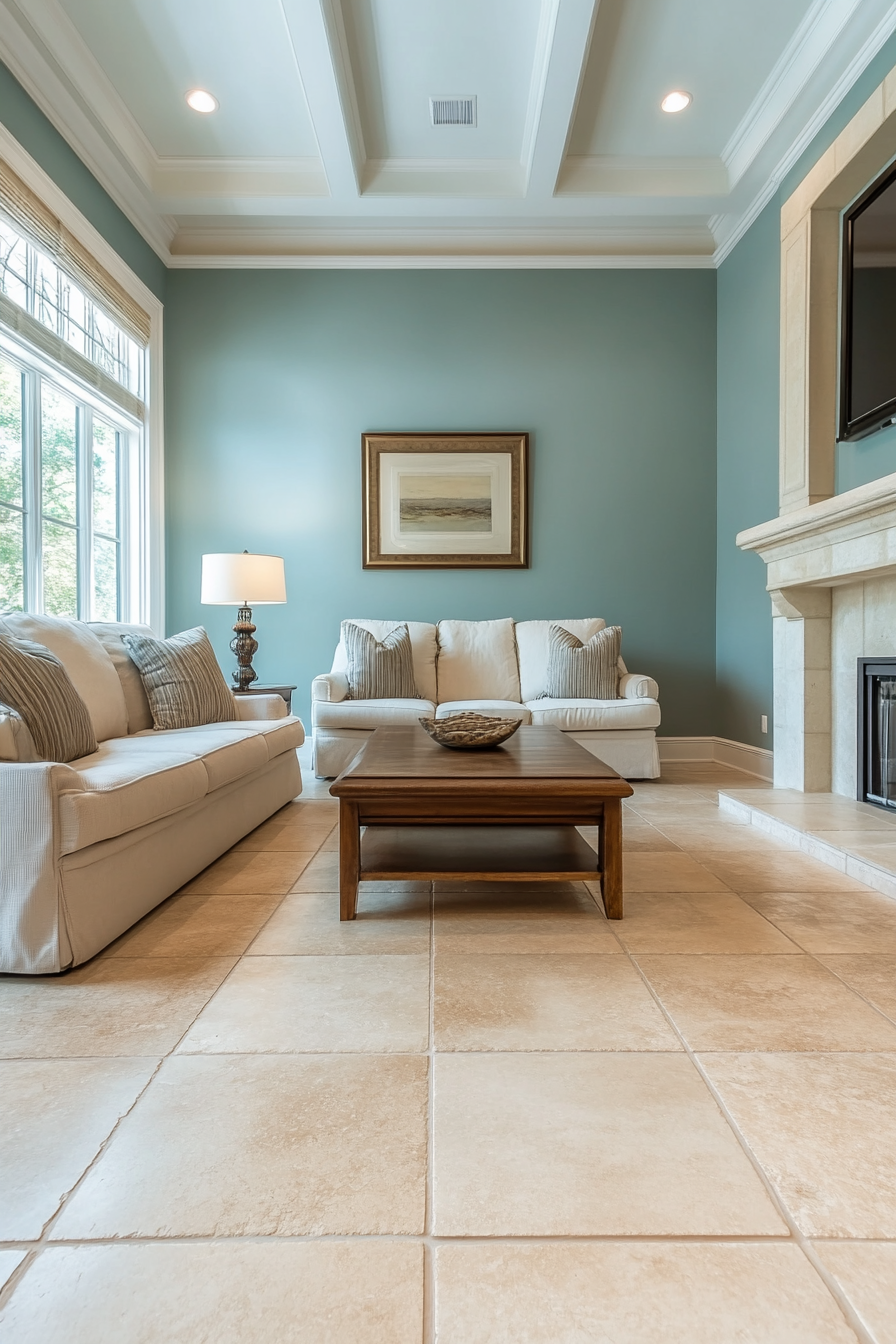
Dusty blue is a neutral, muted shade of blue that pairs beautifully with beige floors.
The subtle contrast creates visual interest while allowing the warmer beige tones to shine through.
It has a soft, calming effect like light gray but adds more personality with undertones of blue.
Works well for living rooms, bedrooms, and Zen-inspired spaces where tranquility is important.
Pair with soft accents like drifting clouds or chevron patterns painted on the wall.
Consider adding warmth to the space with wood furniture, creamy textiles and natural materials.
Dusty blue photographs as simple sophistication against the beige backdrop.
Hides dirt and scuffs over time yet maintains an uncluttered look as the colors blend together.
Chooses a cool-toned dusty blue to balance out the mellow beige without either color appearing washed out.
Create light, airy vibe that flatters beige flooring materials like hardwood, tile, or luxury vinyl.
Perfect for coastal, beachy homes or those seeking a peaceful landscape color palette.
Madison’s Current Obsessions
What Color Walls go With Light Brown Furniture Top 20 PicksBlush Pink


Blush pink is a soft, subtle shade of pink that enhances the neutral beige floors.
It adds delicate femininity and warmth to the space without being too bold or high contrast.
The light, romantic blush works especially well in bedrooms, nurseries, or powder rooms.
Pairs nicely with white or light gray trims/moldings for a cohesive color scheme.
Looks fresh and youthful yet still sophisticated enough for adult spaces.
Combines well with pale wood furniture, gauzy fabrics, and floral patterns.
Consider an almost peachy-pink or rose-toned blush to better complement beige.
Accentuate with touches of corals, mint greens, or blush shades throughout.
Proper lighting maintains the softness without the blush appearing harsh against beige.
As it wears into the floors over time, blush pink creates a unified paired-down look.
For a vintage vibe, use blush pink on only one wall as an accent against beige floors.
Madison’s Current Obsessions
Top 15 Carpet Colors for Slate Blue Walls?Light Green


Light green is a refreshing, natural color that lends itself well to beige floors.
The subtle contrast between the two lights colors is soft and serene.
Conjures feelings of tranquility like sea glass or fresh leaves without being too strong.
Works well for spa-inspired bathrooms, airy kitchens, or living rooms with houseplants.
Choose a pale apple or sage green tone that has beige undertones.
Accent with natural wood, rattan, and botanical prints for a calm, organic ambiance.
Light green enhances the warm, organic appeal of materials like stone tile, terracotta, or wood floors.
Over time, it subtly merges with beige while maintaining visual interest.
Consider an off-white ceiling or trim for balanced flow throughout the space.
Perfect for those seeking a meditative, nature-inspired modern interior.
Large windows allow the green and beige to bounce natural light.
Madison’s Current Obsessions
What Color Walls Go With Dark Brown Furniture : Top 20+ PicksLight Taupe


Light taupe creates harmony and balance being so closely matched to beige yet with enough distinction.
The subtle neutral contrast is sophisticated and pulls the space together for a polished look.
Light taupe works with masculine or feminine styles and serves as a versatile foundation.
Pairs nicely with pale wood furnishings, crisp white trim, and subdued décor elements.
Creates an elegant backdrop for art, photographs, or design accents to stand out.
Both the taupe and beige flatter natural light and allow textures to shine through.
Covers imperfections seamlessly while maintaining visual depth over time.
Choose a cooler undertone taupe if your beige floors lean warm to balance the tones.
A versatile neutral that transitions effortlessly between styles and design eras.
Works for living rooms, bedrooms, or minimalist modern spaces seeking a spa-like vibe.
Highlights luxury materials like marble, wood, or mixed media floors to perfection.
Madison’s Current Obsessions
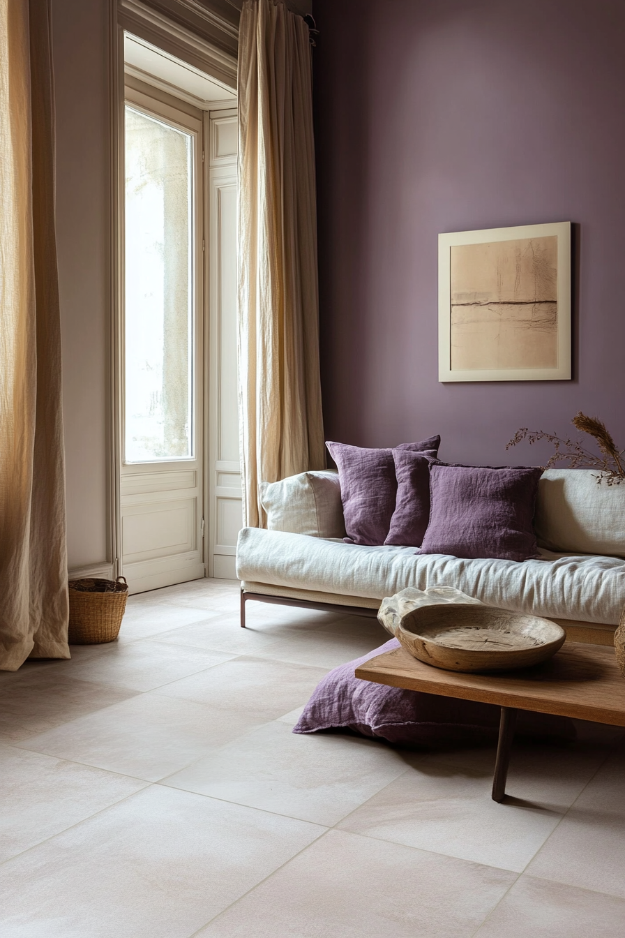
Why Peel and Stick Wallpaper is the Game-Changer Your Walls Need!Soft Purple


Soft purple livens up neutral beige floors with a delicate pop of feminine color.
The pale, muted purple tone provides gentle contrast without overwhelming the space.
Works well for bedrooms, nurseries, or lavender-inspired spaces seeking tranquility.
Pairs beautiful with white or off-white moldings/trims for a cohesive look.
Soft purple photographs nicely against the beige backdrop.
Combines well with blush pink, mint green, or soft gray accents.
Brings a romantic, dreamlike feel to the space without strong color saturation.
Choose a very pale lilac or lavender purple for maximum softness.
Over time the subtle purple blends harmoniously into the beige floors.
Flatters light-filtering beige flooring materials like wood, sisal, or seagrass.
Creates a soothing, relaxed vibe that feels graceful rather than overtly feminine.
Large windows allow the pastel tones to glow with natural light.
Madison’s Current Obsessions
Tonal Treasures: 13 Carpet Shades That Sync With Forest Green WallsPale Orange


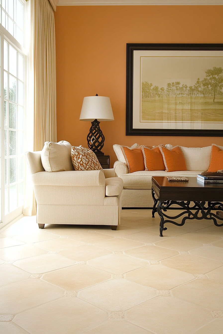
I’d like to share with you how using a pale orange wall color can beautifully complement beige flooring.
As a neutral beige floor provides a lovely foundation and backdrop in a room, pairing it with a very soft orange tone on the walls infuses a sense of warmth and welcome.
Orange is such a cheerful, uplifting color, but using it in a light, subdued shade prevents it from overwhelming the space.
The subtle contrast between the pale orange and beige creates lovely visual interest without either color competing for attention.
When choosing an orange, I suggest selecting one with hints of peach or coral undertones to ensure it coordinates seamlessly with beige flooring’s vanilla, sandy hues.
Proper lighting is also key – you want the pale orange to glow without looking too bright against the floors.
This muted pairing resonates especially well for warm, inviting spaces like dining rooms and kitchens.
In my experience designing rooms with this soft color scheme, clients always comment on how the pale orange seems to make the beige floors “pop” while maintaining an understated elegance.
It’s a timeless combination that feels relaxed and tailored all at once.
For those wanting to infuse some warmth and personality into their neutral palette, pairing pale orange walls with beige floors is a beautiful design choice.
Madison’s Current Obsessions
15 Wood Beam Ceiling Ideas to Add Character to Your Home!Light Brown


Light brown introduces subtle warmth without being overpowering like a dark brown.
The slight contrast of tones adds visual depth and definition to the space.
Choosing a tawny, putty, or sand-colored light brown ensures cohesion with beige undertones.
Together they create a cocooning, comfortable ambiance that feels polished and inviting.
Furniture stands out while maintaining a peaceful, unified color story.
Works well for living rooms, bedrooms, home offices – anywhere coziness is key.
Transitions seamlessly between modern and traditional styles.
Sits comfortably with warm woods, creams and earthy décor elements.
Over time the similar hues wear evenly for a blended appearance.
Proper lighting prevents the space from feeling flat given the tone-on-tone palette.
A beautiful choice for those seeking a tailored yet soothing neutral scheme.
Well, light brown pairs beautifully with beige floors through subtle contrast that enhances visuals without clash.
Madison’s Current Obsessions
What Unique Touch Can You Add To Your Space With Wood Slats? Let’s Discover Together!Pale Mint


Pale mint infuses a soft pop of cool color while respecting the warm tones of beige.
The subtle contrast creates visual interest without overwhelming the neutral palette.
Choosing an icy mint tone with hints of aqua ensures it plays nicely with beige’s sandy hues.
Together they conjure feelings of a seaside retreat or lush garden oasis.
Works beautifully in bedrooms, living rooms and spa-like bath spaces.
Furnishings stand out against the soothing mint-beige backdrop.
Consider pale coral, blush or white accents that highlight the breath of fresh air.
Over time, marks wear into both colors for a cohesive fade.
Large windows allow the soft tones to bounce natural light beautifully.
Elevates beige from dull to serenely light-filled through an organic pop of pale green.
A prime color choice for those cultivating an aura of tranquil respite.
Pale mint offers serenity and uplift when paired judiciously with beige floors.
Madison’s Current Obsessions
13 Wall Moulding Ideas To Add Elegance To Any RoomPale Lavender


Pale lavender infuses a soft romantic touch without overwhelming the neutral palette.
The gentle contrast creates visual interest while respecting the beige undertones.
Choose a light periwinkle or blush lavender tone that nuances nicely with beige.
Together they conjure feelings of tranquility, like drifting on a cloud.
Works beautifully in bedrooms, nurseries, powder rooms – any space where calm is key.
Furnishings and decor stand out beautifully against the ethereal lavender-beige backdrop.
Consider pale pink, mint or blush accents that lift the dreaming vibe.
Over time, the similar tones wear harmoniously for a seamless fade.
Large windows allow the peaceful tones to bounce light like a watercolor.
Elevates beige from plain to serenely dreamy through an ethereal pop of pale purple.
A perfect color choice for cultivating an aura of relaxation and repose.
In essence, pale lavender pairs tastefully with neutral beige floors, imparting an tranquil, feminine ambiance.
Madison’s Current Obsessions
Beautiful Half-Wall Paneling Ideas For Your HomeSoft Peach


Soft peach introduces a hint of warm sunshine without being overly dramatic.
The subtle contrast creates visual interest while respecting the neutral undertones of beige.
Choose a very pale blush peach tone that has tan or apricot undertones to mesh with beige.
Together they impart a relaxed, coral resort vibe without departing from the palette.
Works beautifully for kitchens, dining rooms, living spaces where entertaining is key.
Furnishings stand out vibrantly against the soothing peach-beige backdrop.
Consider pale aqua, blush or mint green accents that highlight the breath of summer.
Over time, the similar tones wear harmoniously for a cohesive fade.
Large windows allow the breezy tones to bounce warm, natural light.
Elevates neutral beige from plain to glowing through an infusion of soft peach.
Perfect for cultivating an ambiance of relaxed delight and carefree ease.
In essence, soft peach pairs beautifully with beige floors, imparting a feeling of calm sunshine.
Madison’s Current Obsessions
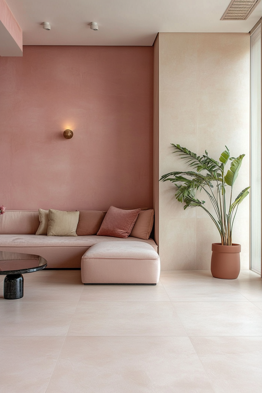
13 Paint Colors That Always Look Good in Small SpacesDusty Rose


Dusty rose introduces a touch of soft femininity without overwhelming the neutral palette.
The subtle contrast between the two muted tones creates visual interest and definition.
Choosing a pale blush or antique rose hue ensures it coordinates seamlessly with beige undertones.
Together they evoke feelings of vintage charm and romance in a relaxed way.
Works beautifully for bedrooms, living rooms, powder rooms – anywhere peace is key.
Furnishings and accents stand out beautifully against the rosy-beige backdrop.
Consider pale lavender, blush or antique white accents to highlight the vintage vibe.
Over time, the similar tones will wear evenly together for a cohesive fade.
Large windows allow the peaceful hues to blend with natural light beautifully.
Elevates neutral beige from plain to romantically vintage through a touch of dusty rose.
A lovely choice for cultivating an atmosphere of poetic daydreaming.
Dusty rose pairs tastefully with beige floors, imparting a feeling of relaxed femininity and nostalgia.
Madison’s Current Obsessions
Can You Use the Same Paint for Walls and Ceilings? Here’s What I Learned the Hard Way50+ Chic Color Combinations For Beige Floors Gallery