
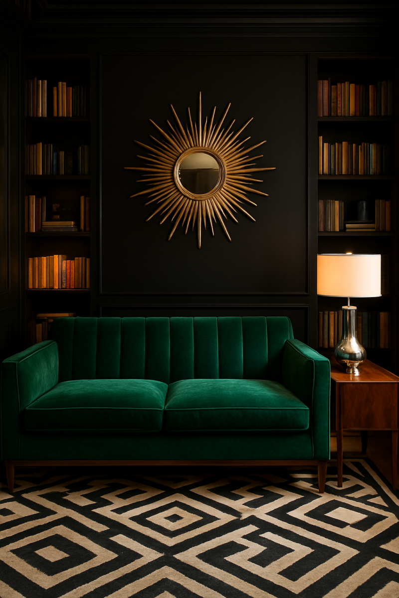
Short answer: almost any furniture color works with black walls.
White, light wood and warm cognac leather are the easiest.
The jewel tones (emerald green, teal, cobalt blue) are the most dramatic, and honestly my favorite.
What decides whether it works isn’t really the color.
It’s how much of it you use and which undertone you pick.
Black behaves like a neutral, so it doesn’t fight anything on its own.
The trouble starts when one strong color shows up in four places at once and fights the walls instead of standing out against them.
A decorator’s rule of thumb helps here: about 60 percent of what you see is the main color (your black walls), 30 percent is the big furniture, and the last 10 percent is the accent.
Some colors below are big-furniture colors (a white sofa, light wood, cognac leather), and some only work as that last 10 percent (red, orange, electric blue).
I’ll say which is which.
So here’s every furniture color I’d consider for a black room.
For each one: how much to use, the undertone to look for, and the one way it goes wrong.
White furniture: bright, but only with the right light

White is the default everyone recommends for black walls, and yeah, it works.
Crisp sofa, dark backdrop, instant contrast.
The catch is light.
A pure, blue-white sofa under cool daylight bulbs (5000K and up) can make a black room feel like a dentist’s waiting room.
All the drama the walls were supposed to bring just evaporates.
The fix is dumb simple.
Stick to one or two large white pieces, like a sofa and a console.
Don’t scatter six or seven white cushions and a couple of side tables everywhere.
Too much white and the black walls stop reading as a bold backdrop and start reading as leftover negative space.
And please, for the love of Biscuit (my dog, who sheds on every single surface in my house), use warm 2700K to 3000K bulbs.
Not the cool, blue-ish daylight ones.
An ivory or cream undertone will always read warmer and cozier against black than a stark, blue-white that leans clinical the second the sun goes down.
Gold and brass: the metal that finishes the room instead of filling it

Gold gets treated like it’s automatically glamorous the second you put it near black walls, and I get why, the photos look incredible.
The thing is, gold is a finishing metal, not a furniture color.
Put it on every drawer pull, lamp base, picture frame and table leg, and the room stops looking glamorous.
It starts looking like a hotel lobby, the kind where everything gleams at you and nothing lets you relax.
Pick two or three gold or brass moments and let them repeat: the legs of a coffee table, one lamp, a mirror frame.
Brushed or antique brass reads warmer and calmer against black than shiny, mirror-polished gold, which can look a little costume-y up close.
It works in nearly any room, dining rooms and bedrooms especially, and it’s one of the easiest ways to keep black walls from feeling cold.
Simple.
Emerald green: one jewel-toned piece, not a jungle

Emerald gets called “rich” and “luxurious” in basically every post about black walls, and nobody admits the obvious catch: it only works in a single dose.
One emerald sofa, or a pair of emerald chairs if you want symmetry.
That’s it.
One big emerald piece, and the rest of the room stays quiet.
So skip the matching emerald curtains.
Skip the emerald rug too, no matter how good the clearance deal is (and I say that as someone who can’t walk past a thrift store’s rug pile).
A second emerald piece doesn’t deepen the jewel-box effect, it just turns the room into a forest, and not the nice kind.
Go for a blue-leaning emerald over anything yellow-leaning.
The cooler, blue-ish green reads deeper and more jewel-toned against black, while a yellow-leaning green can start to look almost sickly under the wrong light.
This one suits bedrooms and formal living rooms more than a small kitchen, where all that saturation in a tight space just feels heavy instead of elegant.
Light wood: the easiest warm-up for a cold room

Nobody gives light wood enough credit on these lists, and it kinda bugs me.
Light wood does more to warm up a black room than any paint color I could name.
Black walls can get cold-feeling fast, especially in a room without a lot of natural light, and warm wood tone fixes that faster than anything else on this list.
Don’t just toss in one small side table and call it done.
Bring light wood in through something with real presence.
A dining table.
Open shelving.
Flooring, if you’re redoing floors anyway.
And pick a warm, honey-toned wood over anything gray-washed or whitewashed.
The gray “driftwood” look is lovely in photos, but next to black it tends to look tired rather than warm.
An old honey-oak table off Facebook Marketplace will do more for a black room than any amount of gray wash.
This pairing works in nearly any room in the house, which makes it the most forgiving thing on this entire list.
Nervous about black walls at all?
Start here.
It’s the one I’d pick for my living room, no contest.
Blush pink: the softest pairing, also the easiest to get wrong

Every roundup pitches blush and black as romantic, and it can be, but it’s genuinely the hardest color on this list to judge from a photo.
Pink reads completely differently depending on the undertone and the light, more than almost any other color here.
Keep blush to one accent chair, or a set of four cushions.
Never a full sofa.
A whole blush sofa against black walls starts to feel like a nursery that wandered into the wrong room.
Look for a warm, slightly peachy blush; it holds its warmth against black walls in a way that feels soft without going flat.
A cool, grayish-lilac pink, on the other hand, tends to go muddy and sad next to black, like it lost a fight with the wall color.
I’d tell you to hold a blush fabric swatch at least 4 inches square up in your own room for 2 days, in daylight and lamp light, before you buy a second piece in that color.
The swatch under store lighting lies to you constantly.
This one suits bedrooms and reading nooks far more than living rooms or kitchens, where it can feel a little precious.
Dark leather: not as foolproof as it looks

Everyone assumes dark leather is the obvious safe match for black walls.
Dark plus dark, how could that go wrong?
Hear me out: it’s actually the pairing most likely to swallow an entire room if the lighting isn’t doing real work.
A cognac or chestnut leather sofa reads as actual furniture against black walls.
You can see its shape, its texture, the way light catches the grain.
True black leather, though, can basically disappear into the wall behind it, especially once the sun goes down.
In a dim den you honestly can’t tell where a black sofa ends and the wall begins once it’s dark out.
It needs layered lamp light, not one ceiling fixture doing all the work, or the whole seating area turns into a dark blob the second it’s dark outside.
This pairing suits dens and studies really well, rooms that are allowed to feel enclosed and a little cave-like at night.
Less great in rooms that need to feel open and usable during the day.
A small home office with one window, dark leather and black walls can start to feel like a cave you got stuck in.
Electric blue: exactly one loud piece

Most posts file electric blue under vague “bold accent” advice and leave it there, which isn’t actually useful.
Here’s my rule: one piece.
A chair, an ottoman, maybe a bold little bench by the entry.
Not a sectional, not two chairs flanking a sofa.
One.
Two saturated blue pieces next to black walls stop looking dramatic and start looking like a nightclub at 1am.
Go for a true, saturated cobalt rather than anything grayed-out or pastel.
A washed-out blue just looks indecisive against black, like it couldn’t commit to being either neutral or bold.
This pairing is at its best in living rooms and home offices that get strong daylight.
The daylight keeps the blue energetic instead of murky (evenings are another story, so plan your lamps).
Charcoal and gray: safe only if it actually contrasts

Gray gets handed out as “the safe choice” constantly.
I get why.
But there’s a trap hiding in that advice.
If your gray is too close in depth to the black wall behind it, you lose the whole point of pairing them together.
The room just reads as one big dark mass instead of two distinct tones talking to each other.
A mid-tone gray sofa creates real, visible contrast against black walls.
You can actually see the furniture as a separate object in the room.
A charcoal that sits too close to the wall’s own depth flattens everything out, which is the single most common way this pairing goes boring.
A charcoal sectional right up against a black wall can lose its outline once the light drops.
Go warmer, slightly brown-toned gray over a cool blue-gray if you want to soften the black walls rather than intensify their coolness.
And whatever gray you land on, bring in a textured rug (big enough that 12 to 18 inches of floor shows around it) or a chunky knit throw, something with actual texture, or the whole room goes monochrome and a little lifeless.
Red furniture: oxblood works, cherry doesn’t

Red against black gets called dramatic in every single post about this topic, full stop, no nuance.
But bright cherry red next to black walls doesn’t read as dramatic to me.
It reads closer to a sign you’d see outside a diner than a sophisticated design choice.
One red chair, or an ottoman, is plenty.
Really.
Red multiplies visually against black faster than it does against a lighter wall color, so a little goes a long way here.
Deep brick or oxblood red is the version that actually works; it’s got enough brown and depth in it to feel grounded instead of shouting at you.
Cherry red, that candy-apple, diner-sign red, tends to push a room toward garish territory fast.
This pairing suits dining rooms and living rooms nicely.
There’s something about a deep red chair near a dinner table that feels right.
Rarely works in a bedroom, though.
Red’s stimulating in a way that fights a room that’s supposed to help you wind down.
Plus, black walls already bring plenty of drama without red amping things up.
Clear acrylic: furniture that disappears on purpose

Clear acrylic gets pitched as a clever small-space trick, and I want to push back a bit on calling it a furniture “color” at all.
It isn’t one.
What it actually does is remove a piece from the visual conversation entirely, which only helps the room if something else nearby is doing the actual color work.
But use it small.
Use it for small pieces (a side table, a single accent chair) since it genuinely visually disappears rather than balancing anything out.
A big acrylic dining table won’t “lighten up” a black-walled dining nook the way you’d hope.
The room just tends to look empty, like someone forgot to buy furniture.
Acrylic works best near at least one solid-colored piece that anchors the eye.
Without that anchor, the walls look bare even with a full dining set sitting right there.
This one suits small living rooms and entryways especially, spaces where you want the walls to stay the star and the furniture to step out of the way.
Mustard yellow: retro done right, not costume-y

Mustard against black gets filed under “retro and fun” in basically every post, and sure, there’s a retro energy to it.
But there’s a real difference between retro and costume-y, and the undertone is what decides which one you get.
One mustard chair, or an ottoman, or a set of four mustard cushions, is the right amount.
A full mustard sofa can tip into retro parody surprisingly fast.
Suddenly your living room looks like a themed diner instead of an actual home somebody lives in.
Go for a deeper, muted ochre rather than a bright, clean yellow.
The muted version sits warm and grounded against black walls.
The clean bright yellow starts to feel like a costume, like the room’s doing a bit instead of just being a room.
This pairing suits living rooms and home offices well.
Less so bedrooms, where that much energy in the color can work against actually falling asleep.
Teal: the calmer jewel tone

Most roundups lump teal in with Blue and Green and move on, which undersells it.
Teal actually behaves like a calmer, more livable version of electric blue.
It’s the jewel tone to reach for when cobalt or emerald feel like too much for your room, or for your nerves.
The same one-dose rule applies here that applies to emerald and electric blue: a single teal sofa, or a pair of teal chairs, and that’s your allowance.
A teal that leans more green sits calmer against black walls than one that leans heavily blue, which can start to edge toward that electric-blue intensity.
This color is genuinely more flexible than electric blue.
It works in living rooms and bedrooms alike, since it’s less jarring to live with day to day.
But don’t mistake “calmer” for “neutral.”
It’s tempting to treat teal like it’s safe everywhere just because it’s not as loud as cobalt.
Nope.
It still needs the same one-or-two-piece restraint as any saturated color on this list.
Teal in a rug and a sofa and a set of curtains is still too much teal.
Orange furniture: the pairing nobody recommends and should

Orange is the color most roundups skip past entirely, or mention once and move on from fast, like it’s too risky to actually recommend.
I think that’s a mistake.
A big one.
A burnt, earthy orange against black walls is honestly one of the warmest, least expected pairings on this whole list, and it deserves more attention than it gets.
Keep it to one chair or a small accent piece, because orange is one of the loudest colors you can possibly put next to black.
This is not a color you scale up.
Ever.
Burnt orange or terracotta is what I’d pick.
It’s got enough brown mixed in to feel like an earth tone that happens to be bold, not a bold color that happens to be orange.
A bright, traffic-cone orange almost never works the same way.
It reads loud in a cheap way rather than warm in an interesting one.
This pairing suits living rooms and creative workspaces, places that can handle a little visual energy.
Almost never bedrooms, and rarely dining rooms either, where it can start to feel more like a construction site than a place to eat dinner.
Undertones, light, room size, and your actual bulbs: how this actually gets decided

Most advice treats “undertone” like a throwaway word you’re supposed to nod along to.
It’s actually the whole decision, and it turns out to matter more against black than against any other wall color I can think of.
The same color family can look completely different against black walls depending on whether it leans warm or cool, and that’s exactly why online swatches lie to you so often.
Check any furniture color in daylight, then again under your actual bulbs after dark.
Black walls shift how every color reads once the sun goes down, so give a swatch 3 days in the room before you decide, and look at it again 1 hour after sunset.
Worth it.
I can’t stress this enough: a fabric sample that looks perfect at noon can go weirdly gray by 9pm under lamp light.
Warm-toned choices (think yellow, orange, red, gold, mustard) want warm 2700K to 3000K bulbs to hold their warmth.
Cool-toned choices (blue, teal, emerald, gray) can actually handle a slightly higher 3500K light without feeling harsh, since they’re already leaning cool to begin with.
And room size and daylight matter just as much as the color itself, which is the part most people forget when they fall for a photo of somebody else’s moody black living room.
Small or low-light rooms do better with lighter furniture, your whites and light woods.
Large, bright rooms can handle the saturated or darker choices without feeling cramped.
A tiny guest room with one north-facing window is not the place for a cobalt blue sectional, no matter how good it looked in the store.
Settling on one: the only rule that matters here
The real decision here was never actually about which color is “best” for black walls.
It’s about how much restraint you’re willing to use.
Every color on this list, from the easiest white sofa to the riskiest emerald statement, fails the exact same way: too much of it, too fast.
Whichever one you land on, start with one or two pieces and live with them for 2 weeks before you add more.
That’s my rule for anything bold.
Sit in the room at night for 10 minutes with only the lamps on.
Sit in it on a gray Tuesday afternoon too, not just the one golden-hour evening when everything looks good, because weirdly that’s the light you’ll live with most.
Sorting out a rug or carpet for a black-walled room too?
That’s its own decision with its own rules, and Dreamy’s carpet guide for black walls covers that whole other half of the puzzle.
There’s no single correct color among these thirteen sitting here waiting to be crowned the winner.
Your room’s actual light and actual size will narrow this down for you far more than your personal taste ever will, and honestly, that’s kind of a relief.
One less thing to agonize over at 11pm with paint swatches spread across the floor and Biscuit lying on top of half of them.