Oh, cinnamon red walls.
They’re warm, they’re bold, they make a room feel alive.
But here’s the thing—finding the right carpet to go with them can feel like a puzzle.
I get it because I’ve been there, staring at samples, wondering if I’m about to make a huge mistake.
The truth is, the floor can either make those gorgeous walls pop or totally clash with them.
And I want you to feel confident about your choice.
So I’m sharing all my favorite carpet colors that work beautifully with cinnamon red walls—colors that feel warm, welcoming, and absolutely magical together.

Creamy Ivory Carpet for a Soft, Elegant Look


Ivory carpet is one of my absolute favorites with cinnamon red walls.
It creates this beautiful balance—your walls get to be the bold star while the floor stays soft and calming.
I love how ivory doesn’t compete with the red but instead makes it feel warmer and more inviting.
It’s like wrapping your room in a gentle hug.
If you want your space to feel elegant without being too dramatic, this is it.
The light color also makes the room feel bigger and brighter, which is perfect if you’re working with a smaller space.
I’ve seen this combo in living rooms and bedrooms, and it always looks so pulled together.
One thing to keep in mind—ivory does show dirt more easily, so it might need a little extra care.
But honestly, the beauty is worth it.
If I had cinnamon red walls in my bedroom, I’d probably go with a plush ivory carpet first.
It just feels so cozy and feminine, and I’m obsessed with that soft contrast.
You can add some darker throw rugs or furniture to ground the space if you want more depth.
But the ivory itself?
Pure magic.
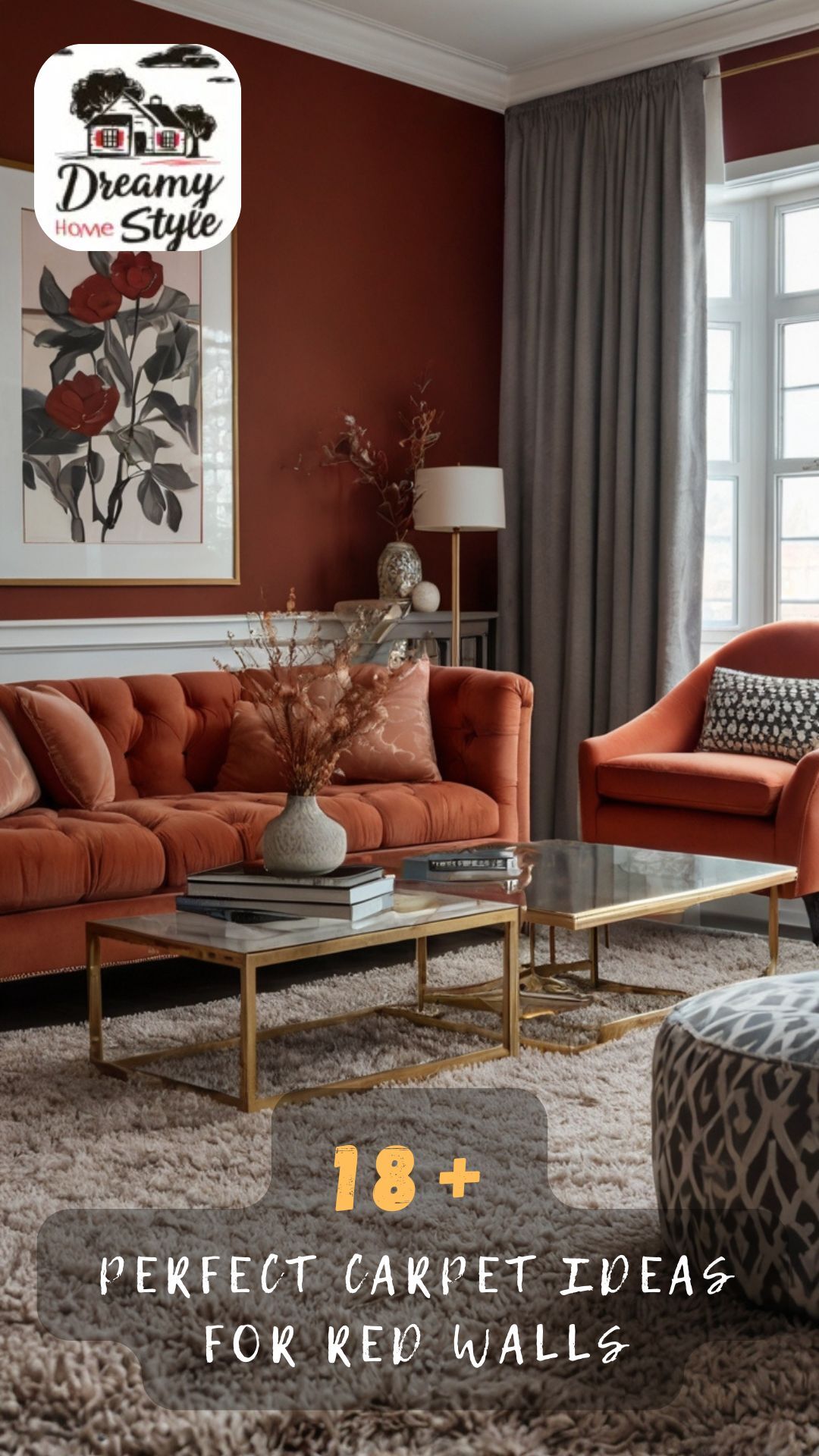
Warm Beige Carpet for Cozy Harmony


Beige is one of those colors that just works.
It’s warm, it’s neutral, and it plays so nicely with cinnamon red.
I think of beige as the friend who gets along with everyone—it never causes drama, and it always makes things better.
With cinnamon red walls, a warm beige carpet creates this seamless flow that feels natural and comforting.
The colors are in the same warm family, so they hug each other instead of clashing.
This is perfect if you want your room to feel cozy without being overwhelming.
I love using beige in spaces where I want people to relax—like a den or a reading nook.
It doesn’t demand attention, but it quietly makes everything feel right.
Plus, beige is super practical because it hides dirt and wear better than lighter colors.
If you have kids or pets, this might be your best friend.
The beauty of beige is that you can go lighter or darker depending on your vibe.
A lighter beige feels airy and soft, while a deeper tan adds more richness.
I’d personally lean toward a medium warm beige—something with golden undertones that echoes the warmth in your walls.
Taupe Carpet for Sophisticated Balance


Taupe is that gorgeous in-between color that’s not quite beige, not quite gray.
And with cinnamon red walls, it’s absolutely stunning.
I think taupe brings a level of sophistication that feels modern and timeless at the same time.
It cools down the warmth of the red just a little, so your room doesn’t feel too hot or intense.
But it still stays in that cozy, welcoming zone.
If I wanted my space to feel elegant and put-together, taupe would be high on my list.
It’s one of those colors that works in any room—living room, bedroom, hallway, you name it.
Taupe also pairs beautifully with almost any decor style, from traditional to contemporary.
I’ve seen it look amazing with brass accents, wooden furniture, and even pops of turquoise or navy.
The neutral base lets you play with other colors in your pillows, art, and accessories.
One of my favorite things about taupe is how it changes in different lighting.
In natural light, it can look soft and warm, and in the evening, it takes on a more muted, elegant tone.
That versatility makes it feel fresh all day long.
If you want something that feels grounded but not boring, taupe is your answer.
Golden Honey Carpet for Sunlit Warmth


Golden honey carpet is for when you want your room to feel like pure sunshine.
This color has rich, warm undertones that make cinnamon red walls glow.
I’m talking about that toasty, golden beige that feels like a warm breakfast on a Sunday morning.
It’s cozy, it’s inviting, and it makes you want to curl up with a good book.
If you love warm tones and want to fully embrace that vibe, this is the move.
The golden hues in the carpet echo the warmth in your red walls, creating a cohesive, wrapped-in-warmth feeling.
I think this works especially well in rooms with lots of natural light because it just radiates.
But even in a room with less light, it brings its own kind of glow.
Golden honey carpet feels a bit vintage in the best way—like something you’d find in a charming old home with character.
I’d pair this with wooden furniture, cozy textiles, and maybe some greenery to keep it from feeling too monochrome.
One thing I love is how it makes metallic accents pop—think gold picture frames or brass lamps.
This combo feels rich without being stuffy.
If I wanted a space that felt warm, happy, and full of life, golden honey would be my pick.
Soft Gray Carpet for Modern Contrast


Gray might seem like an unexpected choice with cinnamon red, but hear me out.
A soft, warm gray can create the most beautiful modern contrast.
I’m not talking about a cool, icy gray—that would clash.
I mean a gray with warm undertones, maybe with a hint of taupe or greige.
This color cools down the intensity of the red walls just enough to make the room feel balanced and fresh.
I love this combo in contemporary spaces where you want a little edge but still warmth.
The gray acts as a neutral anchor, letting your red walls be bold without overwhelming the room.
It’s sophisticated, it’s chic, and it feels really current.
If you’re someone who loves modern design but still wants coziness, this is perfect.
Soft gray also works beautifully with almost any accent color—navy, blush, mustard, emerald green.
You have so much freedom to play with your decor.
I’ve seen this look amazing with white trim, black accents, and natural wood tones.
The key is making sure your gray has enough warmth so it doesn’t feel cold against the red.
If I were decorating a modern living room or office, this would be my go-to.
Charcoal Gray Carpet for Bold Drama


If soft gray isn’t your thing, maybe charcoal is calling your name.
Charcoal gray carpet with cinnamon red walls is bold, dramatic, and totally gorgeous.
This is for someone who isn’t afraid of a moody, statement-making space.
The dark floor grounds the red walls and creates this rich, cocooning feeling.
I think of it as wrapping your room in warmth and depth.
It’s perfect for a library, a home theater, or a cozy bedroom where you want to feel enveloped.
Charcoal also hides dirt and stains like a dream, which is a huge bonus.
I love how this combo feels both modern and classic at the same time.
It works with velvet furniture, leather chairs, and lots of soft lighting.
The contrast between the dark floor and the warm walls creates visual interest that’s really striking.
One thing I’d suggest is making sure you have enough lighting in the room so it doesn’t feel too dark.
Table lamps, floor lamps, and maybe some candles can keep the vibe cozy instead of cave-like.
I’d also add some lighter accents—cream pillows, a soft throw, maybe some gold or brass decor.
This look is not for the faint of heart, but if you love drama, it’s absolutely stunning.
Chocolate Brown Carpet for Rich Depth
Chocolate brown carpet is like the best kind of comfort food for your floors.
With cinnamon red walls, it creates this rich, layered look that feels warm and inviting.
I’m obsessed with how these two colors play together—they’re both earthy and cozy.
It’s like being wrapped in a warm blanket on a fall evening.
If you want your space to feel grounded and full of depth, this is the combo for you.
Brown and red are both warm tones, so they naturally harmonize without fighting each other.
I think this works especially well in traditional or rustic-style homes.
Imagine wooden furniture, leather accents, and maybe some warm metallic touches like copper or bronze.
The chocolate carpet adds a foundation that feels solid and timeless.
It’s also incredibly practical—brown hides everything, which is perfect for high-traffic areas.
I’d use this in a family room, a den, or even a bedroom where you want that cozy retreat feeling.
One of my favorite things about this pairing is how it makes the room feel cohesive and intentional.
You can layer in textures like wool, velvet, and linen to add even more richness.
If I wanted a space that felt warm, welcoming, and totally comfortable, chocolate brown would be my answer.
Sage Green Carpet for Unexpected Freshness
Okay, this one might surprise you, but sage green carpet with cinnamon red walls is stunning.
It’s unexpected, it’s fresh, and it brings a whole new energy to the space.
I love how the soft, muted green cools down the warmth of the red without clashing.
It’s like bringing a little bit of nature indoors.
If you want your room to feel unique and full of personality, this is such a fun choice.
Sage green has those earthy, calming vibes that balance out the boldness of cinnamon red.
I think this combo works beautifully in a bedroom, a bathroom, or even a creative workspace.
It feels organic, peaceful, and a little bit whimsical.
The green adds a layer of visual interest that makes the room feel curated and thoughtful.
I’d pair this with natural wood tones, cream accents, and maybe some botanical prints.
The vibe is cozy cottage meets modern eclectic.
One thing I love is how this color combo changes with the seasons—it feels fresh in spring and cozy in fall.
If you’re someone who loves color and isn’t afraid to try something different, this is magic.
Trust me, sage and cinnamon red are a match made in design heaven.
Navy Blue Carpet for Classic Elegance
Navy blue carpet might sound bold, but with cinnamon red walls, it’s pure elegance.
This is a classic combo that feels sophisticated and timeless.
I think of navy as the grown-up version of blue—it’s rich, it’s deep, and it commands respect.
With warm red walls, it creates a beautiful contrast that feels both cozy and refined.
If you want your space to feel polished and intentional, this is a gorgeous choice.
Navy grounds the warmth of the red and adds a layer of cool depth that’s really striking.
I love this in a dining room, a study, or a formal living room.
It feels traditional but not stuffy, especially if you mix in some modern elements.
Think brass fixtures, white trim, and maybe some patterned pillows or curtains.
Navy also works beautifully with leather furniture and dark wood.
The richness of the blue carpet makes the whole room feel luxurious.
One of my favorite things about this combo is how versatile it is—you can go traditional or contemporary depending on your decor.
I’d add some lighter accents to keep the room from feeling too dark.
If I wanted a space that felt elegant and timeless, navy would absolutely be on my list.
Dusty Rose Carpet for Soft Romance
Dusty rose carpet with cinnamon red walls is like a dream for anyone who loves romantic, feminine spaces.
This is soft, it’s pretty, and it feels like a warm hug.
I’m obsessed with how the muted pink tones in dusty rose complement the warmth of cinnamon red.
They’re in the same color family but different enough to create interest.
If you want your room to feel cozy, welcoming, and full of charm, this is it.
Dusty rose has this vintage elegance that makes everything feel special.
I think this works beautifully in a bedroom, a dressing room, or even a cozy sitting area.
It’s perfect if you love that soft, lived-in, cottagecore vibe.
The rose tones add a layer of warmth and femininity that’s really lovely.
I’d pair this with creamy whites, soft grays, and maybe some gold accents.
The vibe is elegant but not fussy—comfortable but still beautiful.
One thing I love about dusty rose is how it changes in different lighting.
In bright light, it looks soft and airy, and in the evening, it takes on a richer, cozier tone.
If I wanted a space that felt romantic and inviting, this would be my absolute first choice.
Terracotta Carpet for Earthy Harmony
Terracotta carpet with cinnamon red walls is like doubling down on warmth—and I’m here for it.
This combo is earthy, rich, and full of character.
I love how terracotta has those clay-like, natural tones that echo the warmth in your red walls.
It’s like bringing the beauty of the desert or a Tuscan villa into your home.
If you want a space that feels grounded, organic, and full of life, this is stunning.
The key is choosing a terracotta that’s a bit different in tone from your walls so they don’t blend into each other.
Maybe your walls are more red, and your carpet leans more orange or brown.
That subtle difference creates depth without being jarring.
I think this works beautifully in Southwestern, Mediterranean, or boho-style homes.
Imagine woven textiles, wooden furniture, and lots of greenery.
The terracotta carpet adds a foundation that feels warm and welcoming.
It’s also incredibly practical—it hides dirt and wear really well.
I’d use this in a living room, a sunroom, or even a hallway.
One of my favorite things about this pairing is how it makes the room feel cohesive and intentional, like everything belongs together.
If I wanted a space that felt warm, earthy, and full of personality, terracotta would be my pick.
White or Off-White Carpet for Crisp Brightness
White or off-white carpet with cinnamon red walls is bold, bright, and absolutely beautiful.
This is for someone who loves contrast and isn’t afraid of a statement.
I think of white carpet as the ultimate luxury—it’s clean, it’s fresh, and it makes everything feel elevated.
With warm red walls, it creates this crisp, modern look that’s really striking.
The white cools down the warmth of the red and makes the room feel brighter and more spacious.
If you have a smaller room or limited natural light, this can be a game-changer.
I love this combo in a modern or contemporary space where you want clean lines and bold choices.
It feels sophisticated and a little bit daring.
White carpet does require more maintenance, so it’s definitely a commitment.
But if you’re willing to take care of it, the payoff is stunning.
I’d pair this with crisp white trim, modern furniture, and maybe some black or brass accents for contrast.
The vibe is clean, elegant, and full of confidence.
One thing I’d suggest is layering in some textures—soft throws, velvet pillows, maybe a cozy area rug.
If I wanted a space that felt fresh, modern, and totally unique, white carpet would be my bold choice.
Patterned or Multi-Colored Carpet for Playful Personality
If you love color and pattern, a multi-colored carpet with cinnamon red walls can be absolutely magical.
This is for someone who wants their space to feel vibrant, eclectic, and full of life.
I’m talking about carpets with patterns that include your red along with other colors like cream, blue, green, or gold.
The pattern ties everything together and makes the room feel curated and intentional.
If you want your floor to be a statement piece, this is the way to go.
I love how a patterned carpet can hide stains and wear while still looking gorgeous.
It’s practical and beautiful at the same time.
This works especially well in bohemian, eclectic, or maximalist spaces where more is more.
Imagine layered textures, lots of pillows, and decor that tells a story.
The patterned carpet becomes the foundation that brings it all together.
I’d look for a carpet that includes your cinnamon red as one of the colors so everything feels connected.
One of my favorite things about this choice is how it lets you play with lots of accent colors.
You can pull from any of the colors in the carpet for your pillows, art, and accessories.
If I wanted a space that felt fun, creative, and totally me, a patterned carpet would be my happy place.


