Navy blue walls create a bold, sophisticated backdrop for any room in your home.
This deep, rich color offers a versatile foundation that can feel both classic and contemporary depending on how you style it.
But once you’ve painted your walls this stunning shade, you might wonder what carpet color will best complement your design choice.
The right carpet can either blend harmoniously with your navy walls or create a striking contrast that makes the entire room pop.
Your carpet choice will significantly impact the overall mood and feel of your space:
✨Click to Get My 101 FREE Designer Room Ideas
1. Crisp White Carpet


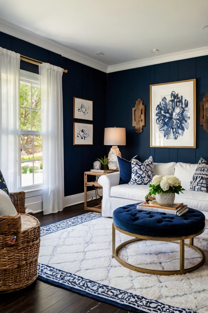
White carpet creates a stunning nautical contrast with navy blue walls that instantly brightens your space.
This classic pairing evokes a fresh, clean aesthetic reminiscent of coastal designs.
When you choose white carpet, you’re essentially creating a blank canvas that makes your navy walls the star of the show.
The high contrast between these two colors creates a dramatic yet timeless look that works in virtually any room.
White carpet helps reflect natural light, making your space feel larger and more open.
This can be particularly beneficial in rooms with limited windows or natural light sources.
For families with children or pets, consider an off-white or cream carpet that offers the same brightening effect while being more forgiving with stains.
You can enhance this color combination with gold or brass accents that pop against both the navy and white backdrop.
Adding textural elements like woven baskets, sisal rugs, or natural wood furniture helps soften the stark contrast between these two colors.
White carpet works especially well in bedrooms and formal living areas where traffic is lighter and maintenance is easier.
If you’re concerned about keeping white carpet clean, consider carpet tiles that can be individually replaced if stained.
This color combination creates a versatile foundation that works with nearly any accent color, from coral and yellow to emerald green or ruby red.
For a more contemporary look, incorporate geometric patterns through pillows, artwork, or accessories against this classic color palette.
Remember that different shades of white—from stark bright white to softer ivory or cream—will create slightly different effects against your navy walls.
Bright white creates the most dramatic contrast, while warmer whites offer a softer, more welcoming feel.
This pairing works with both traditional and modern furniture styles, making it an incredibly versatile choice for any home.
2. Soft Gray Carpet


Gray carpet offers a sophisticated, contemporary partner for navy blue walls that creates depth without overwhelming your space.
This versatile neutral complements the cool undertones in navy while maintaining a serene, balanced atmosphere.
When you select gray carpet, you’re choosing a foundation that will stand the test of time both in durability and style.
The combination creates a refined backdrop that allows your furniture and accessories to shine.
Light gray carpets brighten your room while still providing enough contrast to define the space visually.
Medium to dark gray carpets create a cozy, intimate feeling that works beautifully in bedrooms and living areas.
This pairing allows you to experiment with accent colors like mustard yellow, coral, or emerald green that pop against both gray and navy.
Gray carpet hides everyday dirt and stains better than lighter options, making it practical for high-traffic areas like family rooms.
For a luxurious feel, consider a plush gray carpet with a higher pile that adds textural interest to your navy blue room.
Patterned gray carpets with subtle designs can add visual interest while maintaining the sophisticated color palette.
The gray and navy combination works equally well in traditional, transitional, and modern design schemes.
You can warm up this cool-toned palette by incorporating natural wood elements, leather furniture, or brass light fixtures.
If your navy walls have purplish undertones, choose a gray carpet with similar cool undertones for a harmonious look.
For navy walls with more greenish-blue undertones, consider gray carpet with warmer beige undertones to create balance.
This color combination creates a perfect backdrop for black and white photography or bold abstract art that can become focal points in your room.
Gray carpet provides a calming foundation that complements navy’s natural association with peace and tranquility.
3. Beige or Cream Carpet
Beige or cream carpet creates a warm, inviting contrast to cool navy blue walls that instantly makes any room feel more welcoming.
This timeless neutral pairing offers the perfect balance between dramatic contrast and subtle sophistication.
When you choose beige carpet, you’re selecting a versatile foundation that will complement virtually any furniture style or accent color.
The warmth of beige softens navy’s potential intensity, creating a balanced, livable space.
Lighter beige carpets help brighten a room with navy walls, preventing the space from feeling too dark or closed in.
This combination works especially well in rooms that don’t receive abundant natural light, as the lighter floor helps reflect what light is available.
Beige carpets with subtle golden undertones can enhance the richness of navy blue and create a subtly luxurious atmosphere.
For a more contemporary look, consider a beige carpet with gray undertones that bridges the cool-warm divide.
This neutral pairing provides an excellent backdrop for introducing colorful accessories—imagine coral throw pillows, emerald green plants, or artwork with vibrant hues.
Beige carpet is incredibly forgiving when it comes to everyday wear and tear, making it practical for busy households.
The combination of navy and beige works beautifully in bedrooms, creating a calming sanctuary that promotes rest and relaxation.
In living spaces, this pairing offers a sophisticated yet comfortable foundation for family gatherings and entertaining.
Consider adding texture through a patterned beige carpet to add visual interest without disrupting the color harmony.
Natural elements like wood furniture, woven baskets, or stone accessories enhance the organic quality of this color combination.
The versatility of beige means you can easily update your decor without having to replace your carpet investment.
This classic pairing supports both traditional design elements like crown molding and modern features like minimalist furniture.
4. Navy Blue Carpet
Matching navy blue carpet with navy blue walls creates a bold, enveloping space that feels both dramatic and cozy.
This monochromatic approach makes a confident design statement that exudes sophistication and intentionality.
When you choose this matching combination, you’re creating a cocoon-like effect that can make even large spaces feel intimate and welcoming.
The key to success with this approach is incorporating varying textures to prevent the space from feeling flat or one-dimensional.
Consider a navy carpet with subtle patterns or a different pile height from the walls to create visual distinction between surfaces.
This tone-on-tone approach actually makes your room appear larger by eliminating the visual boundary between wall and floor.
Using the same color for both surfaces creates a seamless flow that can make ceilings appear higher and spaces more expansive.
Navy-on-navy works particularly well in media rooms or home theaters where a darker, immersive environment enhances the viewing experience.
To prevent the space from feeling too dark, incorporate ample lighting with table lamps, floor lamps, and ceiling fixtures.
White or light-colored furniture and accessories become striking focal points against this deep blue backdrop.
Metallic accents in gold, silver, or copper add necessary sparkle and reflection to break up the deep blue expanse.
This monochromatic approach can look incredibly luxurious, especially when you vary the textures between walls and carpet.
In bedrooms, this enveloping color scheme creates a restful sanctuary that promotes deep, peaceful sleep.
If full navy carpet feels too committed, consider navy area rugs over a neutral carpet or hardwood floor for a similar but more flexible effect.
The navy-on-navy look works with various design styles from traditional to contemporary, depending on your furniture and accessory choices.
Remember that different lighting will dramatically change how this color combination appears throughout the day and evening.
✨Click to Get My 101 FREE Designer Room Ideas
5. Light Blue Carpet
Light blue carpet creates a beautiful tonal relationship with navy blue walls that feels both cohesive and visually interesting.
This color combination evokes the varied blues of the ocean or sky, bringing a natural, calming influence to your space.
When you pair these different blue tones, you’re creating depth while maintaining color harmony that’s pleasing to the eye.
Light blue carpet brightens a room with navy walls, preventing the space from feeling too dark or heavy.
This combination works particularly well in bedrooms, where the soothing blue palette promotes restful sleep and relaxation.
The contrast between deep navy and light blue creates visual movement that makes your space feel dynamic yet balanced.
For a subtle approach, choose a light blue carpet with gray undertones that provides a softer transition from the deep navy walls.
If you prefer a more vibrant look, select a light blue with clearer, more saturated color to create more defined contrast.
This blue-on-blue palette provides an excellent background for both white furniture (for a crisp, clean look) or natural wood tones (for warmth).
The combination works beautifully with coastal design elements like rattan furniture, rope details, and shell accessories.
Consider adding touches of white, cream, or sand colors to complete the seaside-inspired color scheme.
Light blue carpet can make a smaller room with navy walls feel significantly more spacious and open.
This pairing allows for easy accent color additions—coral, yellow, or green accessories pop beautifully against this blue background.
In children’s rooms, this combination creates a sophisticated foundation that can grow with your child through different age stages.
The varying blue tones create a serene atmosphere perfect for home offices where concentration and calm are priorities.
Remember that blue light has been shown to promote feelings of tranquility, making this an ideal color scheme for spaces where you want to reduce stress.
6. Taupe or Greige Carpet
Taupe or greige carpet (a blend of gray and beige) offers a sophisticated neutral base that complements navy blue walls without competing for attention.
This versatile color sits perfectly between warm and cool tones, creating balance with navy’s cool depth.
When you select taupe carpet, you’re choosing a chameleon-like neutral that adapts to different lighting conditions and complementary colors.
This practical color hides daily dirt and wear better than lighter options while still keeping your space feeling open and airy.
The subtle warmth in taupe softens navy’s crispness, creating a more welcoming and livable atmosphere in your home.
This combination works exceptionally well in high-traffic areas like living rooms and hallways where practicality is as important as aesthetics.
Taupe carpet with navy walls creates a refined backdrop that allows architectural details and furniture to take center stage.
For a luxurious effect, consider taupe carpet with subtle striation or gentle patterning that adds dimension to your floor.
This neutral foundation pairs beautifully with both cool-toned accessories (silvers, blues, purples) and warm accents (brass, amber, rust).
Taupe’s flexibility means you can easily change accent colors seasonally without disrupting your room’s fundamental harmony.
In spaces with limited natural light, taupe carpet helps reflect and maximize available illumination better than darker options.
This combination works equally well in traditional spaces with classic furniture and contemporary rooms with clean-lined modern pieces.
The subdued nature of taupe allows bold artwork and statement pieces to shine without visual competition from your floors.
Consider taupe carpet with varying pile heights or subtle patterns to add textural interest while maintaining the neutral palette.
For larger rooms, this combination creates a cohesive look that ties the space together without overwhelming it.
The timeless quality of both navy and taupe means your investment will remain stylish for years to come.
7. Golden or Mustard Yellow Carpet
Golden or mustard yellow carpet creates a bold, energetic contrast with navy blue walls that instantly makes a room feel vibrant and unique.
This complementary color pairing is based on color theory fundamentals—blue and yellow sit opposite each other on the color wheel, creating dynamic tension.
When you choose yellow carpet with navy walls, you’re making a confident design statement that showcases your personal style and creativity.
The warmth of yellow carpet counterbalances the coolness of navy walls, creating perfect temperature equilibrium in your space.
This combination brings immediate cheerfulness to any room, making it ideal for spaces where you want to stimulate conversation and energy.
Yellow’s natural brightness helps reflect light, making this an excellent choice for rooms with limited natural illumination.
For a more subtle approach, consider a muted gold or amber carpet rather than a bright lemon yellow for a sophisticated take on this contrast.
This bold pairing works surprisingly well in dining rooms, where the energetic color combination stimulates appetite and conversation.
The navy and yellow combination has historical precedence in traditional design, particularly in formal settings like libraries and studies.
To balance this high-contrast pairing, incorporate neutral elements through furniture, window treatments, or accessories.
White or cream colored furniture provides visual breathing space between these two strong colors.
Natural wood tones add warmth and organic texture that complements both the navy and yellow elements.
This color combination works well with both traditional patterns like damask or toile and contemporary geometric designs.
The navy and yellow pairing feels equally at home in traditional spaces with classic furniture or modern rooms with clean lines.
For a more subtle effect, consider a patterned carpet that incorporates yellow along with neutral tones rather than a solid yellow.
This vibrant combination creates rooms with distinct personality that leave a memorable impression on visitors.
8. Emerald or Sage Green Carpet
Green carpet creates a nature-inspired color combination with navy blue walls that feels both sophisticated and serene.
This pairing draws from the natural world, evoking forests, gardens, and lush landscapes that bring organic harmony to your space.
When you choose green carpet, you’re creating a rich, jewel-toned environment in emerald or a more subdued, calming space with sage.
Emerald green carpet makes a bold statement that feels luxurious and dramatic against navy walls.
Sage green offers a softer, more subtle option that maintains the nature-inspired palette while feeling more understated.
The combination of blue and green creates a cool-toned space that feels refreshing and tranquil.
This color pairing works particularly well in bedrooms and studies where a calm, focused atmosphere is desirable.
Navy and green together create a versatile backdrop that complements both warm metallic accents like brass and cool metals like chrome.
For a cohesive look, incorporate small touches of your carpet color in accessories like pillows, artwork, or vases on your navy walls.
The navy and green combination supports various design styles from traditional to contemporary depending on your furniture choices.
This pairing can handle patterns well—consider floral, botanical, or geometric prints that incorporate both colors.
Natural wood tones add necessary warmth to this cool-colored foundation, creating balanced, inviting spaces.
In spaces with ample natural light, these colors will show their true depth and richness throughout the day.
For rooms with limited windows, ensure adequate lighting to prevent the space from feeling too dark or closed in.
This color combination works beautifully with biophilic design principles—incorporate plenty of houseplants to enhance the nature-inspired palette.
The navy and green pairing creates a perfect backdrop for artwork featuring landscapes, botanical themes, or abstract natural forms.
✨Click to Get My 101 FREE Designer Room Ideas
9. Burgundy or Wine Red Carpet
Burgundy or wine red carpet creates a rich, regal combination with navy blue walls that exudes traditional elegance and warmth.
This classic color pairing draws from historical design traditions, evoking libraries, studies, and formal dining rooms of stately homes.
When you select burgundy carpet, you’re creating an environment of depth and sophistication that feels both timeless and distinctive.
The warmth of burgundy balances the coolness of navy, creating a harmonious temperature balance in your space.
This color combination makes a room feel instantly cozy and welcoming, perfect for spaces where you entertain or gather with family.
Navy and burgundy together create a formal atmosphere that can be softened with appropriate lighting and accessories.
This rich color combination provides an excellent backdrop for antiques and traditional furniture with dark wood tones.
To prevent the space from feeling too dark or heavy, incorporate cream or gold accents that lighten and brighten the room.
Consider brass or gold fixtures and hardware that complement the warmth of burgundy while adding necessary sparkle.
This color pairing works especially well in dining rooms, where the rich hues create an environment conducive to lingering conversations.
In home offices or libraries, this combination creates a focused, scholarly atmosphere that encourages concentration.
For a more contemporary interpretation, incorporate clean-lined furniture and minimalist accessories with this traditional color palette.
Burgundy carpet helps hide stains and wear patterns, making it practical for high-traffic areas despite its rich color.
The combination of navy and burgundy creates a perfect backdrop for displaying art collections, especially gold-framed traditional paintings.
Consider adding texture through velvet furnishings or tapestry-inspired accessories that enhance the traditional feel of this color scheme.
While bold, this classic combination has proven its staying power through changing design trends, making it a worthy investment.
10. Patterned Carpet with Navy Blue Accents
Patterned carpet that incorporates navy blue creates a cohesive connection with navy walls while adding visual interest to your floor.
This design approach maintains color harmony while introducing dimension and movement to your space.
When you choose patterned carpet with navy accents, you’re creating depth without overwhelming the room with competing strong colors.
Geometric patterns offer a contemporary feel, while floral or traditional motifs create a more classic, timeless atmosphere.
Patterns that combine navy with neutrals like beige, gray, or cream create balance that works in nearly any design style.
This approach allows you to incorporate multiple colors that can be referenced in accessories and furnishings throughout the room.
Patterned carpet helps hide stains and wear patterns, making it practical for high-traffic areas like hallways and family rooms.
The visual texture created by patterns adds interest even with minimalist furniture and simple accessories.
Medium-scale patterns typically work best, as very small patterns can appear busy while oversized patterns may overwhelm the space.
For a subtle effect, choose a pattern where navy is a minor accent rather than the dominant color in the design.
Alternatively, for a bold statement, select patterns where navy becomes a major feature that strongly connects to your walls.
Consider the pattern scale in relation to your room size—smaller rooms generally benefit from smaller patterns.
Patterned carpet offers the practical advantage of disguising the inevitable spills and stains that happen in well-lived homes.
This approach works particularly well in transitional spaces like hallways, where it creates a visual connection between rooms.
Oriental or Persian-inspired patterns with navy elements create a traditional, timeless look with navy blue walls.
Contemporary geometric patterns with navy accents create a modern, fresh atmosphere that still connects with your wall color.
11. Charcoal or Black Carpet
Charcoal or black carpet creates a bold, dramatic foundation that makes navy blue walls appear richer and more vibrant by contrast.
This sophisticated dark-on-dark approach makes a confident design statement that works beautifully in both contemporary and traditional spaces.
When you choose black carpet, you’re creating a grounding effect that anchors your space while allowing navy walls to showcase their depth.
This combination creates an elegant, formal atmosphere perfect for dining rooms, home offices, or sophisticated living areas.
The slight contrast between the black floor and navy walls creates subtle definition that adds architectural interest to your space.
Dark carpet provides practical advantages for high-traffic areas, as it conceals stains and soil better than lighter options.
This dramatic pairing works especially well in rooms with abundant natural light that can balance the darkness of these rich hues.
For spaces with limited windows, incorporate ample lighting through multiple sources to prevent the room from feeling too dark.
Lighter furniture and accessories become dramatic focal points against this deep, rich background of navy and black.
Consider incorporating mirrors or metallic accents to reflect light and add necessary sparkle to this deep-toned palette.
White trim, ceiling, and architectural details create stunning contrast that defines your space when using this dark color combination.
This pairing creates a perfect backdrop for art collections, allowing paintings and sculptures to stand out dramatically.
For a luxurious approach, consider black carpet with varying pile heights or subtle patterns that add textural interest.
The combination of navy and black creates a sophisticated urban feel that works beautifully with modern, minimalist furniture.
This dark palette can make a smaller room feel more intimate and cozy, perfect for creating spaces that feel enveloping and secure.
While bold, this combination has timeless appeal that won’t quickly go out of style like trendier color combinations might.
12. Lavender or Pale Purple Carpet
Lavender or pale purple carpet creates an unexpected yet harmonious pairing with navy blue walls that feels both fresh and sophisticated.
This color combination draws from the same color family, as purple and blue sit adjacent on the color wheel, creating a naturally pleasing relationship.
When you select lavender carpet, you’re adding a subtle hint of warmth to the cool navy walls, creating perfect temperature balance.
This combination works beautifully in bedrooms, where the soothing purple tones promote relaxation and peaceful sleep.
The contrast between deep navy and soft lavender creates visual interest without harsh transitions or competing elements.
For a subtle approach, choose a very pale lavender that reads almost as a neutral with just a hint of purple undertone.
For a more defined look, select a clearer lavender that creates more noticeable contrast with your navy walls.
This color combination creates a perfect backdrop for both silver and gold accents, offering flexibility with your hardware and accessories.
Light purple carpet helps brighten a room with navy walls, preventing the space from feeling too dark or closed in.
This unique pairing allows you to express creativity and personal style while still maintaining an elegant, cohesive look.
Consider incorporating small touches of lavender in artwork or accessories on your navy walls to create a deliberate connection.
This combination works well in both traditional spaces with classic furniture and contemporary rooms with clean lines.
Lavender carpet adds an unexpected twist to navy walls that makes your space feel custom and thoughtfully designed.
For children’s rooms or nurseries, this combination creates a sophisticated foundation that can grow with your child.
The soothing quality of both blue and purple creates spaces that naturally reduce stress and promote wellbeing.
This color combination is particularly effective in home offices or studios where creativity and calm focus are priorities.
✨Click to Get My 101 FREE Designer Room Ideas
13. Patterned Multicolor Carpet
Multicolor patterned carpet that incorporates navy blue along with other hues creates a vibrant foundation that ties seamlessly to navy walls.
This bold approach allows you to introduce multiple accent colors that can be referenced throughout your room’s design.
When you choose multicolor carpet, you’re creating a focal point that adds energy and personality to your space.
Patterns that include navy blue create a direct connection to your walls, ensuring the carpet feels intentional rather than disconnected.
This approach works particularly well in family rooms, playrooms, or other casual spaces where energy and creativity are welcome.
Multicolor carpet offers practical advantages by easily hiding stains, crumbs, and everyday wear from busy household traffic.
For a more subtle effect, choose patterns where navy is prominent and other colors appear as accents in the design.
For a bolder statement, select vibrant patterns with strong contrasts that create a dramatic foundation for your space.
This approach allows you to incorporate trendy accent colors without committing to them in larger furniture pieces.
Geometric patterns create a contemporary feel, while abstract or artistic patterns can express more individual personality.
Oriental or traditional patterns that include navy along with reds, golds, and creams create a timeless, classic look.
The visual texture created by multicolor patterns adds immediate interest even to rooms with simple furniture and minimal accessories.
Consider the scale of pattern in relation to your room size—larger rooms can handle bigger, bolder patterns without feeling overwhelmed.
This approach works well for defining separate areas within open floor plans, creating visual boundaries without physical barriers.
Multicolor carpet allows you maximum flexibility when updating accessories or accent pieces over time.
While bold, this approach creates rooms with distinct personality that reflect your individual style and design confidence.
