still remember the headache I had trying to pick out carpet colors for the bedroom makeover I was doing last year.
I had just painted the walls a beautiful mint green but could not figure out which carpet hue would tie it all together.
I must have looked at like a million carpet samples!
Thankfully, I finally settled on a shade that blended perfectly.
Now I’m ready to share my top picks for stylish carpet colors that will wow with mint green walls.
Soft grays, taupes and ivories are always safe bets to complement mint green.
Bold colors like navy or cobalt blue can also look really chic when paired right.
💭 Ever wondered what your room would actually look like rearranged?
I built a free tool that lets you drag furniture around a 2D floor plan. No signup, no catch.
See the Room Planner →Light Gray
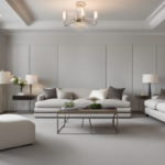
Light gray carpet is one of the top picks to pair with mint green walls because it provides a neutral backdrop that really allows the fresh mint hue to pop.
The light gray tone is super soft and subtle, so it doesn’t fight for attention like a darker shade might.
Mint green and light gray have a yin and yang thing going on – they balance each other out beautifully.
Light gray carpet feels fresh and modern against lively mint walls.
It adds sophistication and calms the space at the same time.
I find light gray is forgiving too – it goes with pretty much any style of décor from glam traditional to minimalist modern.
Whether you love shabby chic farmhouse vibes or ultra-sleek contemporary, light gray works its magic.
Best of all, this duo creates a relaxed, neutral foundation you can build on however you want.
Accent pieces and accessories in just about any other color will flow nicely.
You can even change your accents seasonally to instantly update your space.
The light gray and mint combo stays gorgeous through it all.
It’s definitely one you can feel confident committing to for the long haul.
In the end, light gray carpet pairs with mint green walls like they were made for each other.
They balance lightness and bring out the best in one another.
So if you want a fail-safe color palette with calm sophistication, this match should be at the top of your list!

Tap to Explore These Beauties
See my ideas in action 👇 Tap any image to explore full details.
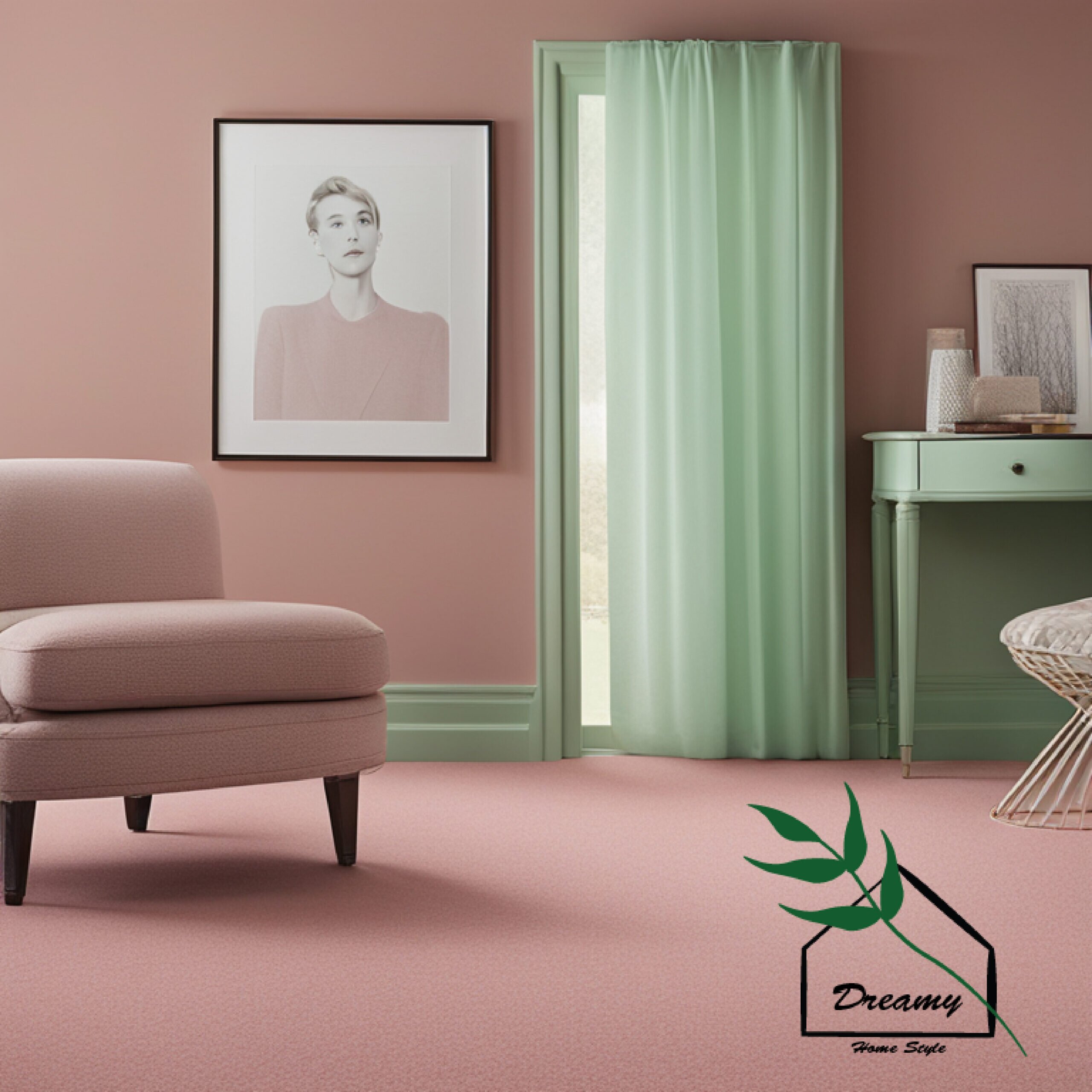
Dusty Rose
I know choosing a pinkish carpet shade may seem risky with mint green walls at first, but hear me out on why dusty rose works so well.
Where light gray provided a neutral contrast, dusty rose adds just a hint of warmth and depth to the mint color scheme.
Its soft blush hue has a subtle romantic quality that takes the edge off an all-out mint scheme.
The gentle pink tone mingles beautifully with mint green like two cheeks flushed with life.
Where mint is fresh and lively, dusty rose brings a sense of coziness and affection.
Together they form a cheerful yet inviting palate.
Dusty rose carpet absolutely charms your feet – it feels plush and comfy underfoot like a blush-colored cloud.
Decorating with accents in similar blush, rose or coral tones allows the palette to really shine.
Picture rose-colored pillows, throws and artwork.
The dash of pink pulls the minty scheme together in a feminine, balanced way.
I think it’s a playful yet chic match for bedrooms, living rooms and more.
If you want your mint green walls to feel sweet without being overly stimulating, I’d say give dusty rose carpet a chance.
Paired right with blush accents, this duo makes a statement while still promoting relaxation.
The pinch of pink is just what mint needs for complete serenity.

Sea Mist
As a interior designer, I’ve found that sea mist carpet creates a sense of calm and relaxation when paired with mint green walls.
The subtle light blue-green tones of sea mist are spiritually cleansing, like the soothing colors found in nature by the ocean.
Sea mist complements mint green in a balanced, yin-yang sort of way.
Both colors allow the other to stand out beautifully while still feeling unified.
Their soft aquatic hues transport the mind to tropical coastlines.
When decorating with this palette, I like to draws inspiration from the seaside.
Shells, driftwood, nautical art and furnishings in marine blues or seafoam bring the oceanic vibe to life.
Natural materials like woven rattan, cotton and sea grass tie it all together naturally.
The serene colors promote calm and focus.
Clients say stepping into a room with this palette feels like a mini spa escape.
It’s especially lovely in bedrooms, yoga studios or meditation areas.
In summary, sea mist carpet makes mint green walls truly sing.
Their balanced coastal colors play to each other’s strengths for a space that’s tranquil and rejuvenating for mind, body and soul.
It’s one of my favorite green and blue palettes for creating a sense of peace.

Dove Gray
Dove gray is a top choice for carpet when pairing with mint green walls because it complements the mint so beautifully.
Dove gray has subtle blue undertones that echo the refreshing qualities of mint.
The dove gray tone acts like a sympathetic color companion to the mint green walls.
Where mint is vibrant, the dove gray is soft and soothing.
They play off one another for a serene yet visually engaging vibe.
I find dove gray carpet feels luxurious underfoot in a bedroom with mint walls.
It has a sense of sophistication but remains comfortable and livable day to day.
No matter the style of your home, from slick and modern to vintage eclectic, dove gray unites tastefully with a mint backdrop.
To bring out the best in this palette, I like accessorizing with touches of silver, pewter or navy blue.
These metallic and dark blue accents pick up on the subtle gray and green undertones to further harmonize the color scheme.
It blends a spa-like relaxation with high-end charm.
Overall, dove gray makes for one of the most elegant carpet choices to pair with refreshing mint green walls.
The cool colors complement without competition for just the right tranquil and polished vibe.]


Find Your Room’s Color Palette
Tap a vibe — get a curated 5-color palette with hex codes you can copy ✨
💭 I Wrote a Book About My Biggest Decorating Mistakes!
When I decorated my first home, I thought I knew what I was doing. Spoiler: I didn’t. 😅
💸 I bought a sofa way too big for my living room. Paint colors that looked amazing in the store but terrible on my walls.
Blush Taupe
One of my favorite carpet colors to use with mint green walls is blush taupe.
The subtle pinkish-beige hue of blush taupe plays so nicely against the lively mint.
Where mint green is bright and invigorating, blush taupe has a gentle warmth that takes the edge off and creates an overall feeling of coziness.
Yet the soft pink undertones in the taupe still allow the mint to shine through vibrantly.
Blush taupe carpet has an elegant sophistication to it, but feels plush and welcoming underfoot as well.
My clients always comment on how the blush taupe ties the space together in a chic, put-together way.
When designing with this palette, I love incorporating other textures and colors within the blush and mint family.
Oatmeal, antique rose and peach accents decorate the space beautifully.
Plush throws, pillows and area rugs in similar hues really pull the color story together seamlessly.
The end result is a boudoir-inspired palette that feels utterly relaxing yet very high-end.
Blush taupe allows the minty freshness to transport the mind while still promoting total relaxation.
It’s definitely one of my tried-and-true favorites for uniting a space through its calming, sophisticated charm.

Nickel
As a designer, nickel carpet is one of my go-to choices for complementing mint green walls.
Where mint is light and airy, nickel adds textural depth and visual interest.
With its subtle tones of charcoal gray and silver, nickel carpet has a sophistication that makes a statement.
Yet its cool undertones allow the bright mint color to remain the star of the show.
I find nickel pairs especially well with modern farmhouse or industrial loft styles when paired with mint.
The metallic flecks in the nickel weave catch light beautifully and freshen up the moody vibes of those design aesthetics.
To accentuate the chic factor, I like to incorporate brushed pewter, iron or brushed bronze lighting fixtures and hardware.
Mirrors and reflective surfaces also pick up the light elegantly within the space.
Clean white walls provide a crisp background for the speckled carpet to glimmer against.
Overall, nickel marries structured modern elements with the refreshing mint backdrop.
It adds just enough vibrancy to ground vibrant mint walls while maintaining a sleek aesthetic.
The textures invite tracing imaginative patterns that soothe the mind and soul.
This dynamic duo always receives rave reviews from my clients.
Haint Blue
Haint blue gets its name from an old folk superstition that its ghost-repelling properties provide good fortune.
To me, this blue just feels full of positive energy and personality when used alongside mint.
Where mint green is fresh and light, Haint blue adds a spirited pop without overwhelming the palette.
Their balanced pastel tones feel upbeat and comforting all at once.
I find clients respond really well to this unexpected yet harmonious match.
When designing with Haint blue carpet, I like to draw decor inspiration straight from the South.
Royal or sky blue accents paired with whitewashed woods create an authentically charming coastal farmhouse vibe.
Elements like baskets of hydrangeas, shell accents and sun-faded florals bring to mind hot summer evenings on the porch.
Its happy hue transports my clients straight to simpler, brighter times every time they enter the space.
In the end, Haint blue lifts mint green up in a vibrant yet nostalgic way.
The traditional colors celebrate stories of home, family and southern hospitality together.
It’s definitely one of my favorite ambiance pairings for clients seeking whimsy and warmth.
What’s Your Decor Personality?
5 questions · 30 seconds · Instant style match 🏡
Navy
Navy blue carpet can seem like an unexpected choice to pair with mint green walls.
However, used correctly, this bold combo creates a sophisticated and impactful aesthetic.
Where mint green is light and airy, navy brings a richness and sense of luxury.
The dark tone grounds the brighter mint in a very polished way.
Though a bolder move than neutral shades, navy complements mint perfectly when balanced with the right neutral textures.
I find ivory, oatmeal and gray tones tie this color blocking duo together seamlessly.
They provide the visual breathing room necessary to let both the navy and mint sing.
Metallic gold or brass accents take this pairing to the next level of opulence.

The color contrast feels glamourous and captivating.
Clients report the navy-mint scheme imbues a space with a sense of quiet importance and refined taste.
Though dramatic, it never overwhelms when balanced as above.
For clients desiring to make a bold statement, this color coupling delivers maximum high-impact visual interest.
Used in large entryways, living rooms or formal areas, it commands attention through sophistication rather than volume.
A tailored navy carpet choice allows mint walls to shine in fresh new light.
Desert Sand
I find desert sand to be a truly versatile carpet color for pairing with mint green walls.
The warm, neutral tone infuses the fresh mint hue with a sunny Southwestern spirit.
Where mint green is light and refreshing, desert sand provides a comforting groundedness.
Its soft beige undertones feel cozy under foot like warm Arizona sands.
The subtle contrast allows both colors to shine through harmoniously.
When designing with this color palette, I like to incorporate materials and textures that reinforce the relaxed desert vibe.
Patterned pillows, rugs and art in earthy terracotta, rust and navy tones complete the aesthetic beautifully.
Woven accents in warm neutrals like seagrass, sisal and natural jute add delicate texture.
Pottery, antlers and woven baskets dotted around carry the outdoors in.
Succulents and terracotta planters lend life to the aesthetic.
Overall, desert sand marries perfectly with crisp mint green walls.
It creates an approachable south-of-the-border escape that feels cozy and rooted.
The color story transports clients to sun-drenched landscapes whether near or far.
It’s one of my favorite tranquil yet eclectic pairings.
Spruce
Spruce green carpet creates a captivating backdrop when paired with mint green walls.
While both tones evoke nature, they contrast in vibrant yet complementary ways.
Where mint is light and refreshing, spruce brings a dark evergreen depth that feels authentically woodsy.
This darker tone grounds the brighter mint hue while echoing its connection to nature.
The color story transports the mind to mossy forest glades and mountain retreats.
When designing with this palette, I draw inspiration from rustic cabin aesthetics using weathered wood, natural fibers and rustic textures.
Flannels, buffalo plaid and throws recreate the cozy atmosphere of a log cabin.
💭 I Wrote a Book About My Biggest Decorating Mistakes!
When I decorated my first home, I thought I knew what I was doing. Spoiler: I didn’t. 😅
💸 I bought a sofa way too big for my living room. Paint colors that looked amazing in the store but terrible on my walls.
Candles and vintage lanterns lend golden illumination against the deep green surrounds.
Succulents and birch logs imported from the outdoors complete the interior forest atmosphere.
Overall, spruce carpet infuses crisp mint walls with authentic woodland charm.
The darkened green feels anchored and sheltering alongside its brighter counterpart.
This grounding duo allows inner peace to flourish like nature intended.
It’s a top pick for transportive mountain escape.
This or That?
Pick your fave — see what other readers chose! 👀
Misty Olive
Misty olive carpet creates a beautifully serene backdrop when paired with mint green walls.
The soft olive hue balances bright mint in an earthy yet sophisticated way.
Where mint green is light and fresh, misty olive has depth and roots itself while also feeling ethereal.
This allows both tones to artfully stand out without competing for visual attention in the space.
I find working with this olive-mint color story gives way to organic, minimalist aesthetics.
Natural woods, rattan, and woven materials combine with soft pastels and creams for a spa-like effect.
Touches of copper and brass enhance the feel without harshness.
Plants like ferns, mosses and airy succulents lend living texture that further tie the space to nature.
Together misty olive and mint evoke images of forest clearings and Zen gardens, transporting the mind and senses.
The palette encourages stillness and inward focus through its muted yet vivid hues.
It creates balance through earthiness and escape through its connection to the outdoors.
Overall, misty olive stands as one of my favorite sophisticated carpet picks for nourishing mint green walls.
Ibis
I find that ibis carpet can be a lovely accompaniment to mint green walls.
Ibis has an elegant nature-inspired hue that harmonizes beautifully.
Where mint green is light and refreshing, ibis brings a lovely brown undertone that grounds the palette in an organic way.
The subtle contrast allows both colors to shine through while feeling unified in an aesthetically pleasing balance.
When using ibis with mint green, I like to incorporate natural textures, materials and accents that draw from the colors’ inspiration in nature.
Rattan, seagrass, driftwood and woven pieces complement the palette beautifully.
Touches of macramé, potted plants and rattan fixtures lend warmth and liveliness.
Earthy elements like beige and moss greens round out the space.
The overall atmosphere feels lush, calm and transported.
Ibis opens up creative design opportunities through its versatile brown tone.
It pairs gracefully with mint green for a look that feels coastal, natural and serene.
The colors blend effortlessly like scattered feathers or blades of beach grass to nurture well-being.
In summary, ibis carpet offers an elegant option for balancing fresh mint green walls.
Its subtle nature undertones allow both colors to shine for a visual experience as peaceful as the hues suggest.
Hint of Teal
The subtle aquatic notes in teal complement and enhance the mint in a refreshing way.
Where mint green is light and bright, hint of teal adds a calming depth thanks to its blue undertones.
This allows the focal mint hue to shine prominently while feeling harmoniously anchored.
Together, mint and hint of teal evoke imagery of ocean coves and tropical islands.
When designing with these colors, I like incorporating natural textures like seashells, driftwood and woven rattan in muted aqua, gray and white tones.
Accents layered in soft blues and aqua tie the nautical theme together beautifully.
Succulents and potted palms lend lush dimensionality.
Illumination like candles or lanterns cast a golden glow.
The overall atmosphere feels transported and revitalizing like an ocean breeze.
Subtle teal anchors the liveliness of mint green for a look that’s balanced and visually tranquil.
These oceanic hues never fail to leave clients feeling refreshed and rejuvenated in the space.
Quick Design Dilemma
Cast your vote — see what other readers think! 🤔
Bone
Bone colored carpet can be a lovely neutral complement to mint green walls.
Bone has a subtle warm undertone that balances fresh mint in a serene yet grounding way.
Where mint green is light and bright, bone feels calm and anchoring.
Its pale beige tone allows the refreshing mint hue to shine as the focal point, while still feeling harmonized rather than high-contrasted.
When pairing bone with mint green, I like to incorporate organic accents in pale wood, rattan and natural fibers to play up the relaxing neutral vibe.
Touches of flax, oat and moss green accent pillows and soft furnishings tie the palette together seamlessly.
The overall atmosphere has an elegant simplicity, yet feels deeply soothing.
Bone carpet creates a sense of tranquility that allows the refreshing mint backdrop to transport the mind.
Compared to darker neutrals, bone feels lighter and more serene underfoot.
Its pale tone feels clean and purified like smooth seashells, complementing the lively yet calming green walls beautifully.
Overall, bone provides anchorage to mint in a chilled out, spa-like way.
Robin’s Egg Blue
Robin’s egg blue makes for a lovely complementary shade when paired with mint green walls.
The subtle aquatic tones in Robin’s egg blue enhance and lift the mint in an uplifting way.
Where mint green is light and bright, Robin’s egg blue adds calm depth thanks to its soft blue undertones.
This allows the vibrant mint to shine as the focal hue while feeling beautifully balanced.
Together, mint and Robin’s egg evoke serene visions of clear skies and rolling grassy hills.
When designing with these colors, I like to incorporate natural textures like white willow branches, seashells and woven rattan in pale tones.
Accents layered in powder blue, soft grays and minty tones tie the peaceful palette together beautifully.
Succulents and air plants lend lushness without heaviness.
Illumination like candles cast a warm, dreamy glow.
The overall atmosphere has an elegant simplicity, yet feels profoundly soothing.
Robin’s egg blue creates a sense of tranquility that transports the mind through its connection to nature.
Compared to darker blues, its pale tone feels clean and pure, uplifting the lively mint walls.
This ethereal pairing never fails to leave clients feeling rested.
There are many carpet colors that can beautifully complement mint green walls.
By thoughtfully considering undertones and balancing contrasts, designers are able to craft vibrant yet tranquil spaces through color pairing.
Whether anchoring with neutrals like bone, ibis and desert sand, or using complementing shades like robin’s egg blue, teal and olive, there are many options to choose from.
Deeper complementary hues like navy and spruce also work when balanced appropriately.
The key is allowing the vibrant mint walls to shine as the focal point, while selecting carpet tones that feel grounded yet uplifting.
Incorporating accent colors, textures and natural materials that reinforce the Hues’ inspiration helps tie the palette together seamlessly.
Well-paired carpet and wall colors have the power to transform interior atmospheres.
They can transport occupants anywhere from tropical coastlines to tranquil forests simply through stimulating the imagination.
May these examples provide inspiration for crafting serene, nature-nourishing spaces through masterful use of color.